















What Makes a High-Converting Homepage Design? (12 Key Elements)


Your homepage has exactly 5 seconds to grab someone’s attention. You don’t need to wow them or blow their minds. Just need to make them care enough to keep scrolling.
Most SaaS homepages fail this test. It’s rarely because they look bad. They try to do too much at once. There’s too much text, no clear direction, and visitors are left figuring out what the product actually does. The value prop gets buried, the CTA competes with three other buttons, and the hero image is usually another lifeless stock photo of people shaking hands in a meeting room.
The truth is, you cannot build a high-converting website homepage design by simply making it look modern. In this article, we’ll break down the 12 specific elements that separate sites that actually convert from the ones people leave in seconds, using some of the best website homepage design examples in the industry.
What Is a High-Converting Homepage?
A high-converting homepage is a website's front door, designed to direct the right visitors toward a single defined action, such as a free trial sign-up, a demo booking, or a click to a feature page.
For SaaS companies, this conversion rarely means an immediate purchase. Successful companies focus on a low-commitment entry point like starting a trial, requesting a demo, or watching a product tour.
This difference is important because a great homepage layout must handle two jobs at once:
- It has to qualify the visitor (Is this product for me?)
- It has to create enough desire to drive that next step
The average SaaS landing page converts at 3.8%, but top performers convert over 10% by removing every element that does not directly drive action. When you implement the best conversion rate optimization strategy, you bridge that gap by using these 12 essential elements.
What Should SaaS Brands Keep in Mind Before Designing a Homepage?
Before you create a single layout, run your ideas through two different lenses:
The design lens
When you maintain consistency between your brand identity and your homepage, you build subconscious trust. You must also design for mobile first, as a large share of SaaS trial signups now occur on mobile devices, especially for product-led tools.
But great homepage design goes beyond aesthetics. As ThunderClap Founder Ayush Barnwal shared after auditing 100+ B2B SaaS websites, many companies still assume their conversion problems come from technical tweaks like button colors or page speed optimizations.
In reality, the biggest gaps are often strategic. The highest-converting SaaS homepages succeeded because they built trust quickly, supported self-serve buying, and communicated value with clarity.
The copy lens
Lead with outcomes instead of features. A phrase like "Close deals 40% faster" lands much harder than "AI-powered CRM." Your homepage speaks directly to one reader, your ideal customer profile, and that niche specificity builds your conversion rate.
If a visitor has to work to understand what your product does, they have already mentally left. This is why you must clearly state your value proposition at the very top of the page.
The 12 Key Elements of a High-Converting Website Homepage Design
If you want to stop the bounce rates and finally turn casual visitors into active signups, you need a web design and development blueprint that prioritizes clarity over clutter.
Here are the 12 key elements of a high-converting layout that map out exactly where your copy and design need to meet, backed by the best website homepage design examples.
1. A value proposition that lands in under 5 seconds
Before you start the design process, answer three specific questions:
- Who is this homepage for?
- What problem do they bring with them?
- What is the one action you want them to take?
The strongest SaaS homepages keep the messaging simple and outcome-focused. Your headline should use the largest typography on the page, while the subhead underneath adds clarity and context in an 18px to 20px font size. Avoid cramming the hero section with extra banners, competing headlines, or animations that distract from the core message.
A reliable homepage messaging formula looks like this:
[Verb] + [Outcome] + [For whom] + [Without what friction]
Focus on the result people want, not the category you belong to. Most buyers do not care whether you call yourself an “AI-powered collaboration platform.” They care about saving time, closing deals faster, reducing manual work, or improving performance.
We applied the same principle while repositioning Zamp's homepage. The original messaging focused on what the company did, but it didn't clearly communicate why enterprise finance teams should choose Zamp over established competitors.
We rewrote the homepage around the outcomes buyers care about, highlighted Zamp's strongest differentiators, simplified the information hierarchy, and created clearer paths to book a demo. The result was a homepage that communicated Zamp's value within seconds instead of forcing visitors to piece it together themselves.
Loom too demonstrates this perfectly on its homepage. They use the headline, "One video is worth a thousand words."
Directly underneath, their subheadline adds immediate context by stating that users can “easily record and share AI-powered video messages with teammates and customers to supercharge productivity.”
They follow this with a clear call to action to get Loom for free, and mention that millions of people across 400,000 companies choose their platform. The copy avoids technical jargon and lets the simple value proposition drive emotional connection in under a second.
2. Minimal, intentional home page navigation
Most effective home page navigation bars include only a handful of essentials:
- Product
- Pricing
- Customers or Use Cases
- Login
- Contact
- One primary CTA
Sticky navigation works especially well because it keeps the conversion path visible as users scroll through the page.
Consistency also matters more than most teams realize. Your navigation CTA should match the hero CTA exactly. Small differences, like “Start free trial” in one place and “Get started free” elsewhere, create subtle friction. Consistent language builds trust and makes the experience feel more cohesive.
Avoid mega menus that pack more than twenty links into a desktop view. You should also avoid desktop hamburger menus and navigation links that lack a clear visual hierarchy.
For example, Linear keeps its navigation bar remarkably clean. The header includes only a few top-level links like Product, Resources, Customers, Pricing, Now, and Contact, alongside a single prominent “Sign up” button.
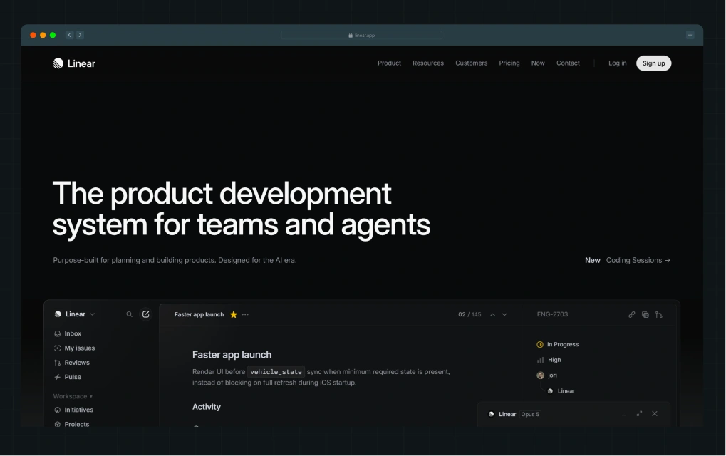
Even with a Resources section in the navigation, Linear avoids crowded menus and excessive options. The structure creates a focused browsing experience that directs attention toward the product and the sign-up action.
3. A hero section that does the heavy lifting
The hero section sits entirely above the fold. It combines your value proposition, a product visual, and your primary call to action into a single cohesive unit.
From a design perspective, your main visual must show your software in action. SaaS companies typically use interface walkthroughs, live dashboard previews, workflow animations, cursor interactions, or short product demo loops that immediately show how the platform works. To keep the section visually balanced, leave plenty of breathing room between your headline, your visual asset, and your buttons.
From a copywriting perspective, a two-button setup works incredibly well. Feature your high-intent action, such as "Start free trial," as your primary button, and place a lower-commitment option, such as "See a demo," right next to it.
To optimize this section, test your layout with heatmaps. While the button always gets the most clicks, the second most-clicked element on a software page is almost always the product graphic itself.
Freehand entered the market with a positioning challenge as much as a design challenge. Enterprise buyers first needed to understand where the platform fit within existing freight workflows. We worked with stakeholders across strategy, messaging, branding, and design to build a hero section that communicated the product's value immediately and gave the rest of the homepage a clear narrative to follow.
As Ayush explained, the project focused on aligning stakeholders around a single market narrative before translating that strategy into the website experience.
4. Visual hierarchy that guides the eye
Most users scan web pages rather than reading them word for word. As UI/UX Designer Manan Desai highlighted, visitors follow predictable F and Z-shaped scanning patterns, which makes visual hierarchy critical to a conversion-focused homepage layout.
Your most important elements must command the highest visual priority. Many brands accidentally weaken their main action by scattering their primary accent color across every button, graphic, and icon. Your primary CTA needs the strongest contrast on the entire page.
You can test your page layout by simply squinting at your screen for a few seconds:
- If decorative graphics or secondary links grab your attention first, your hierarchy needs work.
- When you blur your vision, you should only notice your headline, your primary button, and your product visual.
Intercom establishes an undeniable flow across its main layout, making it one of the best website homepage design examples for guiding a visitor's eyes straight to the call to action. They use a bold headline to state that they offer the only helpdesk designed for the AI Agent era, noting that their integrated AI agent improves every customer conversation.
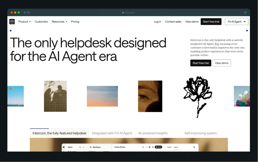
They place this text against a clean, high-contrast white background and use a bold black button for their free trial. Because their interface elements use a vibrant blue as a precise accent color, it visually ties the layout together and directs attention directly to the primary action.
5. One primary CTA with a supporting secondary
Every homepage needs one clear primary action. If visitors see too many competing CTAs, they hesitate rather than convert.
Your primary CTA should stand out visually with a filled, high-contrast button style. The secondary CTA should feel lighter through a ghost button or text-link treatment. Display both options in your hero section, and then repeat them at natural breaks throughout the page, such as after your social proof or at the bottom of feature lists.
For SaaS companies, if your main goal is to secure live platform demos, make your secondary button read "Watch a three-minute product tour" instead of introducing a second high-barrier request. When done right, this primary-and-secondary pairing allows you to target different segments without cluttering your focus.
For example, Notion's hero runs its primary CTA ("Get Notion free") alongside a supporting secondary CTA ("Request a demo").
.webp)
The first CTA appeals to individual users who want instant access. The second supports enterprise buyers who need approvals, stakeholder buy-in, or sales conversations before moving forward.
6. Social proof: Logos, numbers, and context
Social proof delivers visual evidence that real companies trust your product by displaying customer logos, user counts, and third-party ratings.
To maximize credibility, place a clean logo bar directly below your hero section. Feature a continuous selection of client logos using an infinite marquee with a muted or grayscale treatment on a solid background.
Numbers also need context to feel believable. “10,000 users” sounds generic. “10,000 marketing teams cut reporting time in half” communicates a measurable outcome people can actually care about.
Early-stage SaaS brands can still build trust without enterprise logos. Strong G2 ratings, review counts, founder-led case studies, or short customer quotes often create more credibility than anonymous logo collections.
At ThunderClap, we’ve applied this website strategy by placing an infinite-scrolling logo marquee directly below the main fold, showcasing SaaS brands such as Dropit, Amazon, Razorpay, Storylane, and Factors.ai.
We anchor this dynamic ticker with an absolute statement about helping 88+ B2B brands outpace boring competitors, right alongside a clear Clutch rating badge. (And yes, we are slightly obsessed with showcasing client love. We even built a dedicated Wall of Love and portfolio experience for it.)
7. Testimonials that convert, not just compliment
Inline testimonials provide contextual proof exactly where you make a big product claim, rather than hiding in a crowded carousel at the very bottom of the page.
Placing a specific quote adjacent to a CTA button or a pricing section creates a highly effective proof sandwich. This structure stacks your claim, your proof, and the required action together to drive conversion rates.
Strong testimonials always include three key pieces of information:
- The pain point
- A measurable business result
- Clear attribution containing a real name, photo, title, and company logo
One outcome-specific quote easily beats ten generic compliments. Always source these insights from your ideal customer profile because a small-business review on an enterprise-targeted page actively drives away large buyers.
When tax platform Zamp partnered with us, they needed to turn their software strengths into an authoritative market presence.
We overhauled their entire brand positioning around elite accuracy, built persona-driven user paths, and placed managed-service highlights directly on the front page. Backed by $30 million in funding and top G2 rankings, the updated layout gives buyers an undeniable reason to trust the platform before a sales call even starts.
8. Product visuals that show, don't tell
Your product visuals should help visitors understand the experience before they sign up. Screenshots, walkthroughs, short demos, and interactive product tours consistently outperform generic illustrations because people want to see how the product actually works.
Copy-wise, every visual asset requires a clear headline that names the underlying value rather than just labeling the feature. Writing "Your full pipeline, at a glance" lands much harder than a cold label like "Pipeline Dashboard View." Interactive product tours built on platforms like Storylane or Arcade also keep use rs engaged far longer than static images do.
ThunderClap utilized this visual philosophy when rebranding Factors.ai. They previously described their platform in flat, technical terms such as dashboards and integrations. We tied their new identity back to the Marketing Compass metaphor, using watchtower-inspired web design elements and contour lines throughout the user interface.
We paired these animations with a sharp, emotionally resonant headline: "Know how your buyers move. Run campaigns that win."
9. A feature-benefits section (not a feature dump)
Most SaaS websites overload visitors with feature grids that list capabilities without explaining why they matter.
Strong feature sections connect functionality to a real business impact. For example:
- “Automated reporting” becomes “save 12+ hours every week.”
- “Custom workflows” becomes “cut approval delays from days to 8 hours.”
The benefit matters more than the tool itself.
Layout also plays a major role in engagement. Traditional three-column icon grids have become so common that many users scroll past them automatically. Alternating layouts with visuals, use-case groupings, or modular content blocks creates much stronger engagement and scroll depth. Segmentation improves performance even further.
ClickUp executes this brilliantly by turning a standard feature list into an interactive, all-in-one ecosystem map. They completely ditch the boring checklist. Instead, they pack dozens of micro-capabilities into a massive grid layout and anchor the entire section around a prominent central block. This centerpiece splits cleanly into four primary quadrants: Projects, Docs, Brain (AI), and Chat.
Visitors skip reading a long wall of text. They instantly see every capability, click a core quadrant, and land directly on a dedicated feature page.
10. Trust signals beyond social proof
How do you prove your software is actually safe to buy before a user hands over their data?
With trust signals like security badges, compliance certifications, integration logos, and live uptime statistics.
Displaying a row of operational badges for SOC 2, GDPR, or ISO compliance near your pricing section or footer sets a professional standard. If security is a primary differentiator for your audience, elevate these details to a higher position on the page.
We implemented this structured approach during our project with FillHQ, a secure eSignature platform preparing for regulated-market expansion into healthcare and finance. The layout had to scale to support a massive SEO plan while maintaining the existing brand colors.
We built a comprehensive messaging framework and prioritized security compliance markers for HIPAA, SOC 2, and GDPR directly on the primary pages. By highlighting these non-negotiable trust signals alongside automated workflows, we positioned the brand as a credible market leader and successfully drove qualified leads straight to their enterprise demos.
11. A pricing signal or friction reducer
A pricing signal manages buyer expectations around cost and commitment right next to your primary button without requiring a full detour to a separate pricing page.
Placing a subtle note like "Free plan available" or "Plans start at $9 a month" adjacent to your call to action dramatically reduces user hesitation. You can also eliminate micro-hesitations at the exact moment of decision by adding clear friction reducers like "No credit card required" or "Cancel anytime."
Airtable handles this perfectly in their hero section and serves as one of the best website homepage design examples for getting visitors to click without hesitation.
.webp)
Their primary buttons explicitly state “Get started for free” (and “Sign up for free”). Right above the main action button, they drop a crucial friction reducer: “No code required.” This tiny phrase instantly removes the fear of technical complexity at the exact moment a user decides to click.
12. A footer that converts, not just closes
The bottom of your homepage represents a high-intent zone because visitors who scroll all the way to the end have already consumed your core message. This action signals real buying intent, yet most companies waste this valuable space on basic copyright text and messy link columns.
A lot of brands treat the footer like an afterthought: a few corporate links, legal pages, and that’s it. But Cal.com uses the entire footer as a resource hub. Instead of making you hunt around the site, they give you direct access to almost every part of their ecosystem right from the bottom of the page.
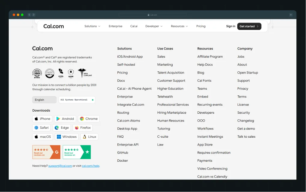
They’ve added a full grid of download buttons for iPhone, Android, and major desktop browsers alongside security and compliance badges. So the moment someone decides, “Okay, I want to try this,” they don’t have to search for the right app or next step.
What’s smart is how they’ve turned a section most users ignore into a genuine onboarding space. You’ll also find structured links for different use cases, products, and support resources, all in one place, making the footer feel less like an exit point and more like a launchpad.
{{specficBlog}}
Weak Homepage vs. Strong Homepage: What Changes at Each Element
Here’s what separates a homepage that simply looks good from one that actually converts.
Bonus read: Best B2B Website Designs: What You Should Copy to Increase Conversions
Is Your Homepage Converting the Way Your Product Deserves?
Knowing what a great homepage needs and building one that delivers are two very different problems. Most SaaS teams get stuck in the gap between them.
At ThunderClap, we approach every homepage as a strategic system, not a design exercise. We establish a clear value proposition before we touch a single layout, design a sharp visual hierarchy that makes your main button the most obvious element on the page, and embed social proof exactly where it drives action.
As Sreeram explains:
"Branding is not just about making things look good visually. It directly affects how people perceive, trust, and remember a company across the entire funnel. When the storytelling, visuals, and positioning become memorable and emotionally distinctive, people tend to connect with the brand faster and remember it much longer."
For example, when we rebuilt ClearlyRated's website, fixing their messaging wasn't even the original brief. Our audit revealed that their product pages explained what the platform did without making clear why it mattered to buyers. We rewrote the copy to lead with business impact for each ICP, and post-launch, they saw a 101% increase in active users, an 82% increase in total views, and a 14% increase in organic clicks.
{{ctaBlock}}
FAQs
1. What is a high-converting homepage?
A high-converting homepage is a webpage designed to effectively persuade visitors to complete a desired action, such as signing up, booking a demo, or making a purchase. It achieves this through clear messaging, intuitive navigation, a strong visual hierarchy, compelling CTAs, and trust-building elements.
2. What are the most important elements of a homepage design?
The most important elements of a homepage design include a clear value proposition, a strong primary CTA, product visuals, social proof, and trust signals. SaaS homepages perform best when visitors immediately understand what the product does and why it matters.
3. How does UX impact homepage conversions?
UX shapes how easily visitors navigate the homepage and take action. Confusing layouts, weak hierarchy, slow load times, and poor mobile experiences lower conversions. Strong UX keeps the experience intuitive, focused, and easy to follow.
4. What role does social proof play in homepage design?
Adding social proof on the homepage lowers the perceived risk of buying your software. For SaaS buyers evaluating multiple tools, seeing logos from recognizable brands, verified star ratings, and outcome-driven testimonials signals that the product works and that industry peers trust it.
5. How many CTAs should a SaaS homepage have?
You should use one primary call to action and one secondary option on the SaaS homepage. The primary CTA drives the main conversion goal, while the secondary CTA supports visitors who need more information before committing.
6. Should my homepage show pricing?
Your homepage does not need a full pricing table, but adding a pricing signal helps reduce hesitation. Phrases like “Free plan available” or “No credit card required” make the next step feel lower risk and more approachable.



.webp)
Browse Similar Articles


Leading 5 SaaS Branding Agencies in Florida (That Actually Understand SaaS Growth)

.svg)
How to Turn Your B2B Website into a Self-Serve Growth Engine? (PLG Ready in 2026)

9-Step Website Copy Audit Checklist to Improve Conversions (Examples from Top B2B Brands)

.webp)

How to Choose the Right Fintech Web Development Company for Your Business
Top B2B Website Design Principles That Turn Visitors into Qualified Leads
%20Audit%20That%20Actually%20Improves%20Revenue.webp)
How to Do a Conversion Rate Optimization (CRO) Audit That Actually Improves Revenue
Web Design Agency vs. Freelancer vs. In-House: What Actually Works in 2026
5 CRO Agencies in London and How to Choose the Best CRO Agency for Your Business
The Ultimate Fintech B2B Positioning Guide for 2026 (That Actually Drives Conversions)
Mapping the B2B Buyer Journey to Improve Conversions Across Every Touchpoint
.webp)
7 Best Website Maintenance Companies in India for Growth-Led B2B Teams (2026)

.webp)
8 Best Healthcare Website Design Agencies for HIPAA-Compliant Sites in 2026
How to Find the Best Web Design Company in Houston, Texas for B2B Brands (6 Best Picks)
Positioning That Wins: How to Make Complex B2B Products Clear and Compelling
The Step-by-Step Website Redesign Process B2B Teams Use to Increase Conversions (Without Killing SEO and Pipeline)
7 Best Video Production Agencies for SaaS Product Walkthroughs and Feature Videos
How to Choose the Best B2B Website Maintenance Company: 9 Questions to Ask Before You Hire One

How to Choose a Web Design Company in San Francisco in 2026 (with Examples)

10 Best Web Design Companies in Florida in 2026 and How to Choose the Right One
How to Use Brand Storytelling on Your Website to Close More B2B Deals and Build Buyer Trust
SaaS CRO Best Practices: What High-Growth Brands Do Differently to Win Conversions

How a Rebranding Agency Can Redefine Your B2B SaaS Identity and Boost Pipeline
B2B Marketing Trends in 2026 That Directly Influence Pipeline and Revenue
Top 7 Video Marketing Agencies Driving B2B SaaS Brand Awareness in 2026
Why Partnering with a B2B Brand Positioning Agency Accelerates Market Differentiation

The Complete Website Redesign Checklist for B2B SaaS Teams Ready to Scale
.avif)
9 Best Webflow Development Agencies in India for 2026 (In-Depth Review)

10 Product Marketing Companies Powering the Fastest-Growing SaaS Brands in 2026
Website Copywriting Services vs In-House: What's Right for Your Business?

How to Choose a Marketing Agency That Understands B2B SaaS Growth Metrics


How to Choose a Video Marketing Agency That Understands B2B Storytelling

Outsourcing Web Design: Cost-Benefit Analysis for Mid-Market & Enterprise Brands

From Leads to Lifetime Value: How Growth Marketing Agencies Scale SaaS Revenue
Build a B2B Website Strategy That Aligns with Sales and Marketing Goals
Webflow vs WordPress: Which Platform Is Better for Your Business Website in 2026?
Fintech Web Design That Builds Trust: 8 UX Principles Every Fintech Site Needs
Optimizing for Intent: How B2B Website Messaging and UX Changes Help Capture Top-Funnel Buyers

12 Best B2B Web Development Agencies in the US to Build Scalable Websites

From Audit to Action: 8-Step Process to Optimize Your B2B Website Strategy for 2026 Buyers
How to Design a High-Converting Landing Page from Scratch (2026 Edition)
From Click to Customer: Proven Landing Page Conversion Optimization Techniques

How to Write Website Copy That Converts: A Step-by-Step Guide for 2026

How to Optimize a Landing Page for Maximum ROI: A Step-by-Step Breakdown

AI Landing Pages That Convert: 7 Design Principles Every AI Platform Should Follow
From Traffic to Pipeline: B2B Website Growth Strategy for Scaling Teams
B2B Website Optimization Strategy: Speed, UX, SEO, and CRO in One Playbook




Interested in seeing what we can do for your website?



.webp)
