


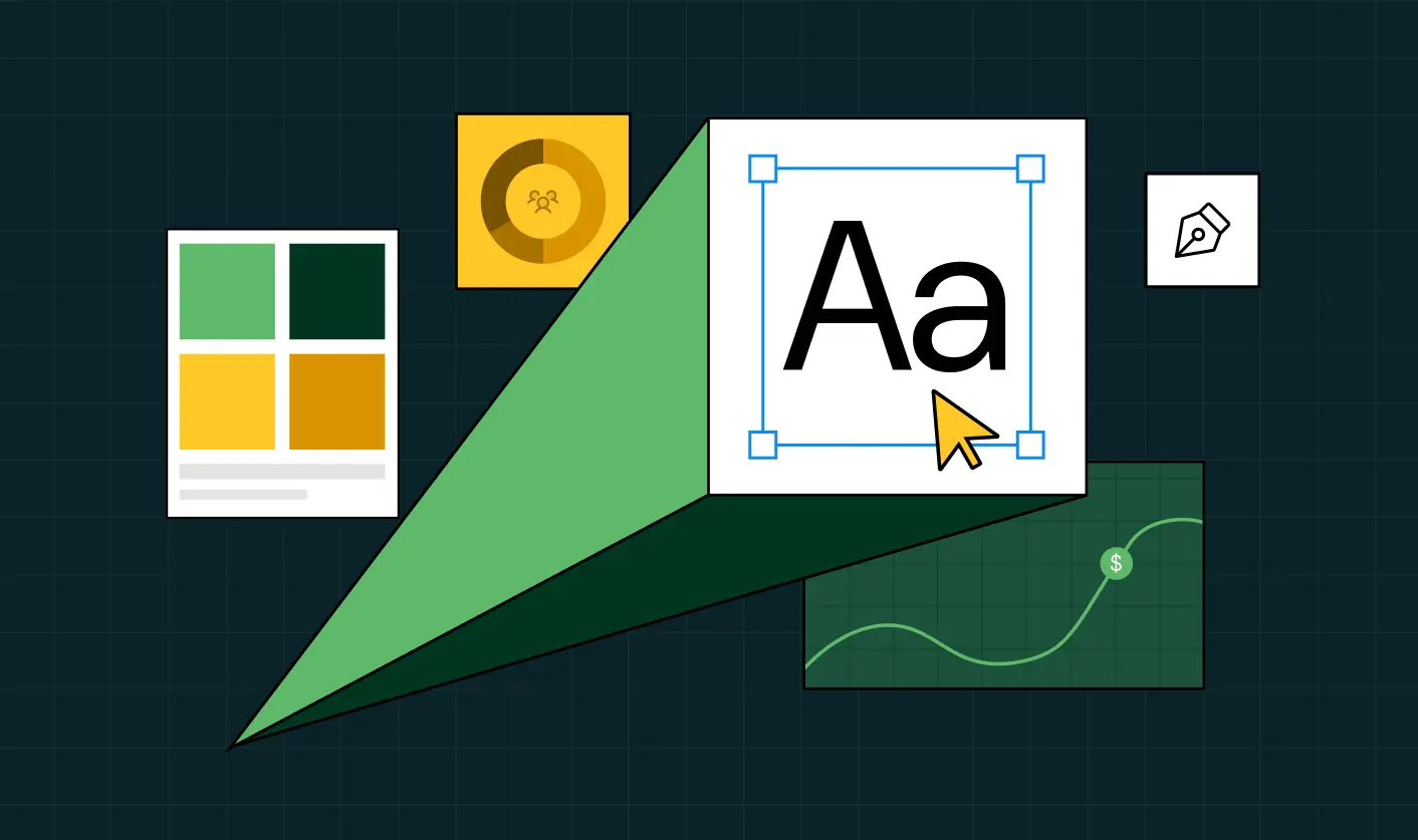
Fintech Web Design That Builds Trust: 8 UX Principles Every Fintech Site Needs

Most fintech brands fall into the growth trap. You obsess over funnels, CTAs, and paid ads, but forget what buyers actually care about: feeling safe. In fintech, the price you pay for ignoring trust is the very thing you’re chasing: conversions.
Trust begins the moment someone lands on your website. Before users trust your product, they judge your website, and if it doesn’t look credible, your funnel leaks before it even starts. That’s where fintech website design becomes your real growth driver.
With the fintech market projected to grow to over 1 trillion by 2032, earning trust is more important than ever.
After shipping 139+ websites, we know the trick is a funnel-first + trust-first UX approach. In this blog, we break down the 8 fintech UX principles we use at ThunderClap, the same ones that helped Razorpay, Zenda, Rezolv, Mysa, and other top fintechs turn their websites into trust- and conversion-driven engines.
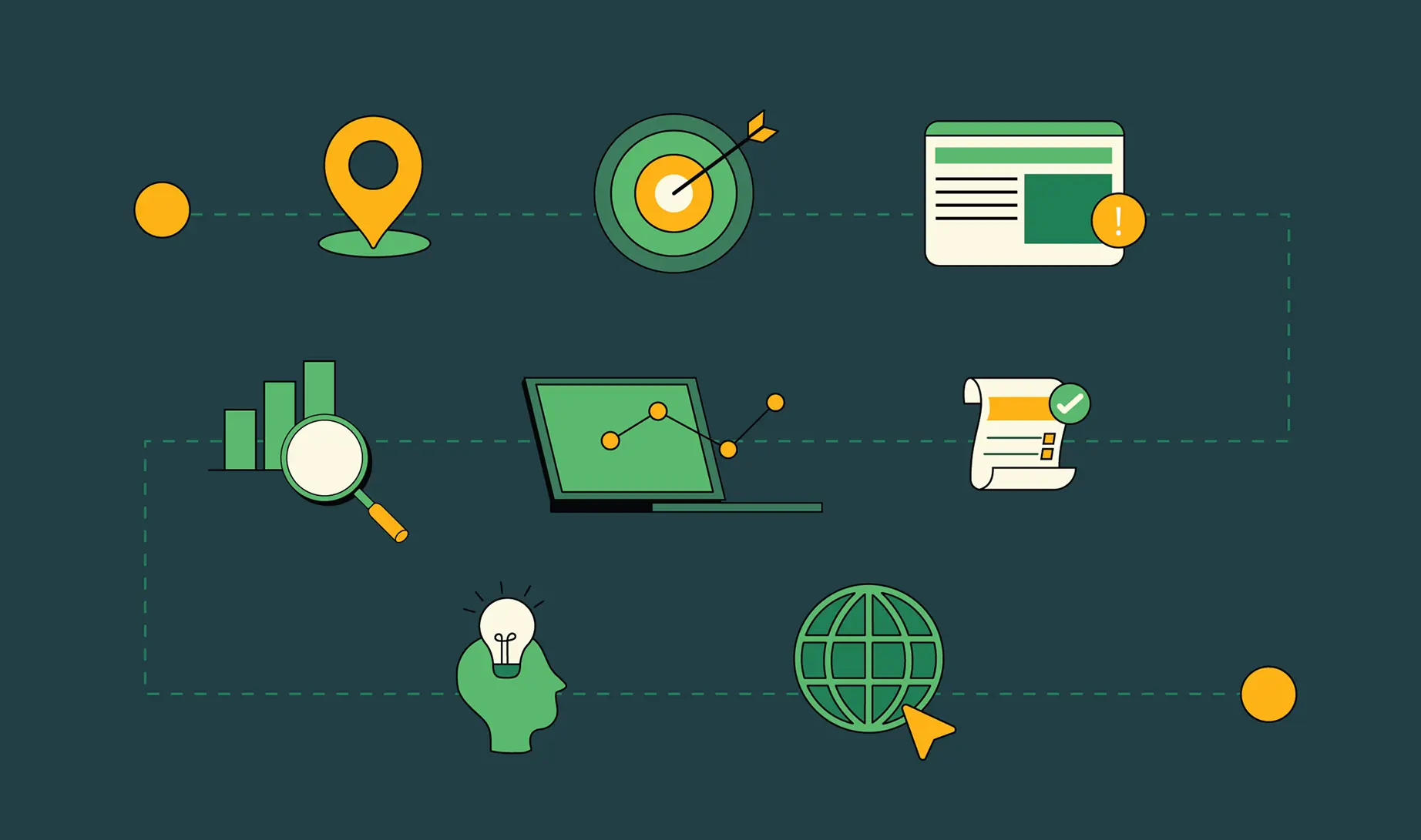
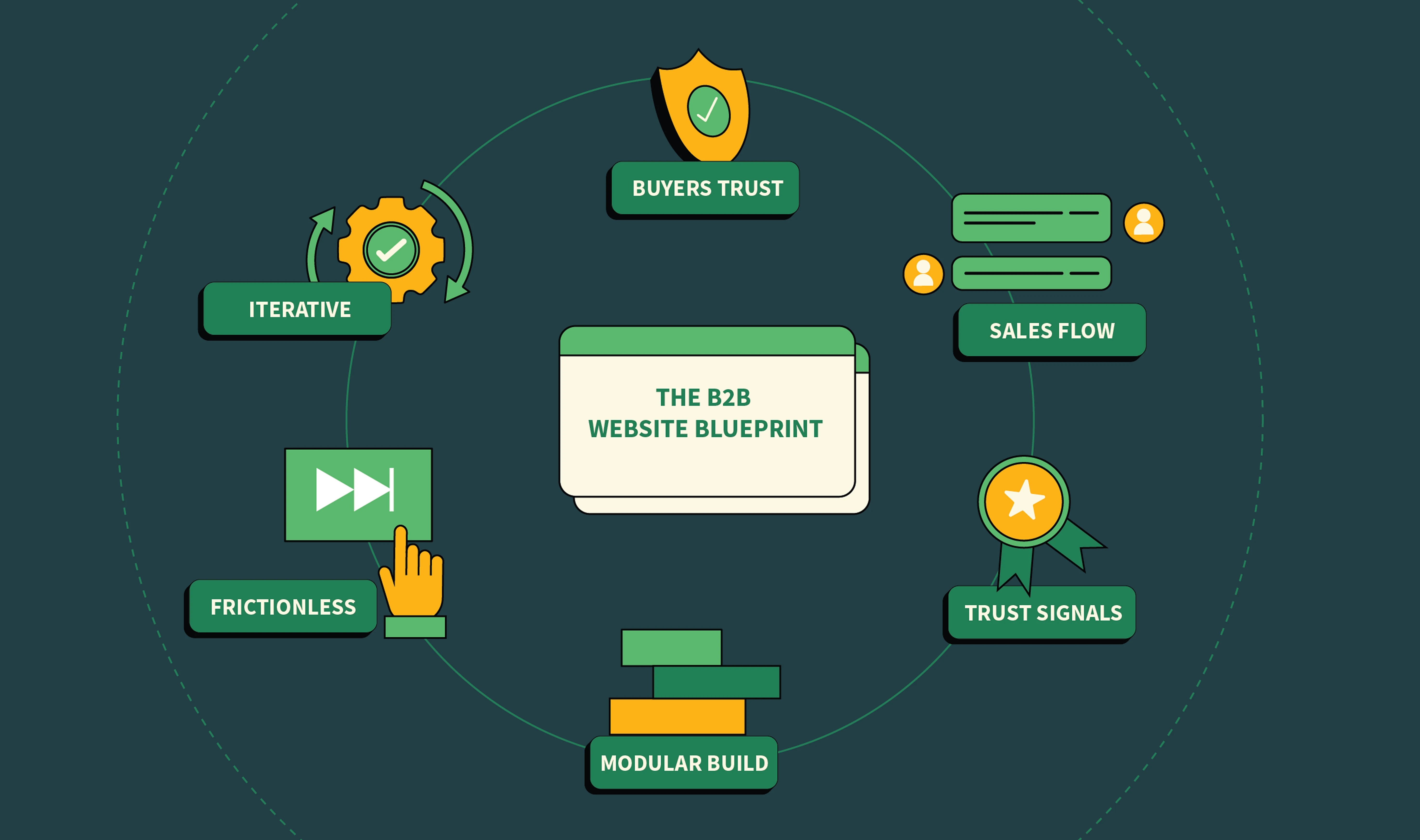
8 UX Principles Every Fintech Website Should Follow
Here are the 8 UX principles every fintech web design should follow to earn trust while driving action.
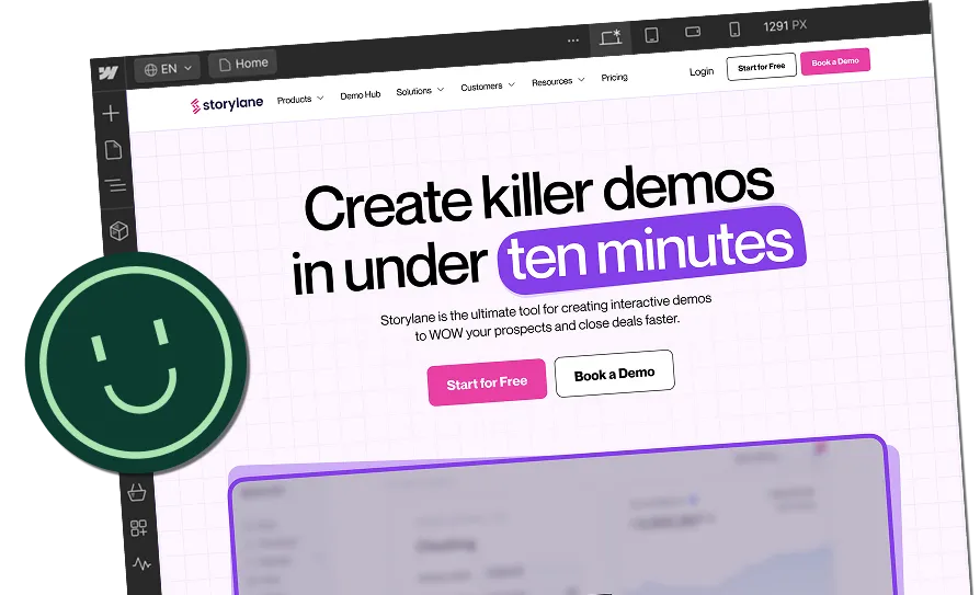
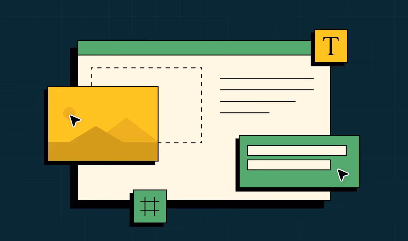
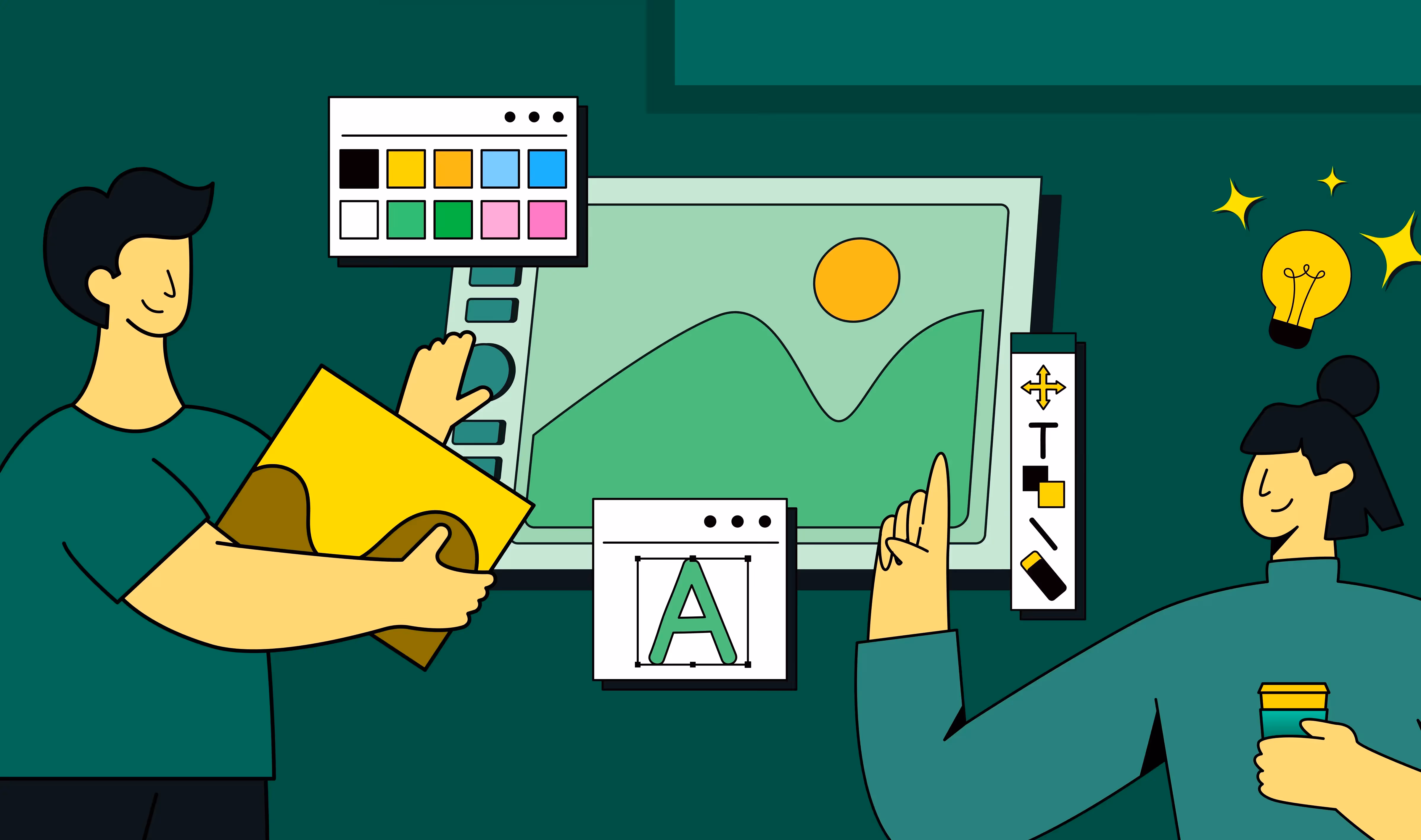
#1 Pick Clean Typography To Build Trust
Typography shapes how you get perceived by your target audience. A 2022 study on typefaces by Monotype and Neurons confirms this.
“Simple shapes of a letter—what many take for granted—can spark a cognitive and emotional reaction, leading to a subconscious judgement around a brand’s honesty, sincerity or innovation,” - Phil Garnham, senior creative type director at Monotype
In the financial services sector, it makes all the difference. The right typeface gives buyers the confidence to trust you with their money. Earlier, traditional serif fonts used to do the trick, but today, brands need to stand out while looking credible.
And according to Ayush Barnwal, Partner at ThunderClap, “the trick is to pick thin, lower weight fonts as they look clean, sophisticated and legible while adding a layer of credibility to your websites”. Cleaner and modern fonts also help create visual harmony and deliver a seamless user experience.
Principle in practice
Rezolv, one of our fintech clients, is a good example of this. As a debt collector platform selling to major banks in India, the brand needs to communicate its value while looking trustworthy. Notice how their website looks modern, approachable, and trustworthy with the right typeface!
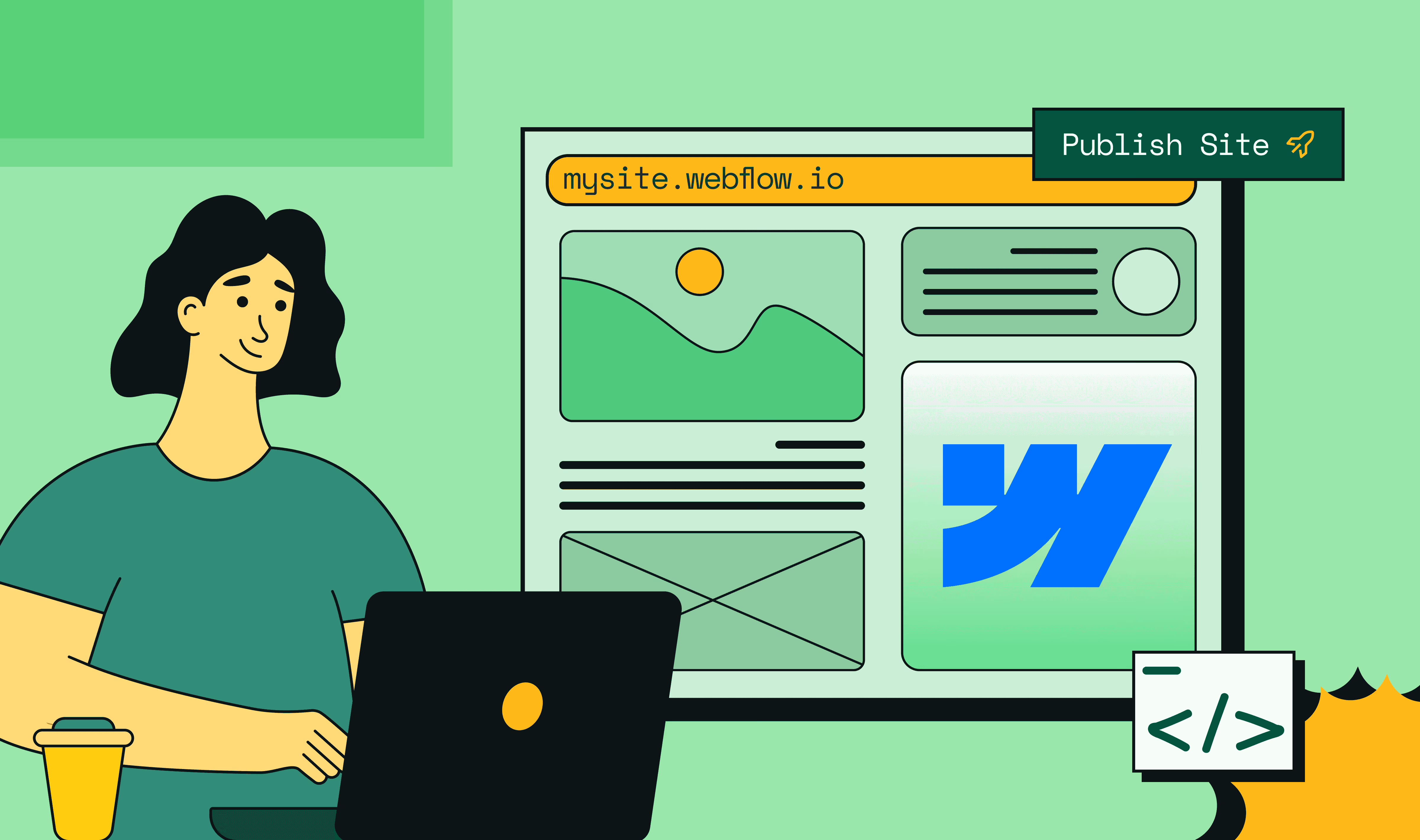
#2 Use Product Animations To Boost Conversions
“Why should I trust you over your competitors?” That essentially sums up the modern fintech buyer mindset. And often the difference comes down to how fast you can show them your product’s value.
One way is through product animations because they show and don’t just tell. When added alongside website copy, it helps buyers understand your value proposition, visualize your product, and even get a taste of it.
36% of marketers report that animated content has a measurable impact on their major KPIs. This includes looping product and feature demos, as well as ones that symbolically explain how your product works. In fact, custom-made ones are a great add-on for brand and product recall.
“And that’s exactly why 2 out of 5 of our clients, especially fintech ones, ask for product animations on their websites! It’s about taking the cognitive load off your buyers, simplifying concepts so they know what exactly they are signing up for”, says Ayush.
Principle in Practice
A perfect example of this is our client, Refo, a banking platform. Their website uses product animations to explain its core value proposition, key features, and use cases. Their animations are detailed enough to work with or without copy, instantly conveying value to users.
{{specficBlog}}
#3 Think Beyond The Color ‘Blue’ To Stand Out
Fintech brands' obsession with the color blue is no surprise. Picking a color that signals trustworthiness and stability makes sense when 90% buyers judge your brand based on color alone.
But times have changed. With digital-first millennial and Gen Z buyers, it's more about differentiation than credibility. They already trust fintech brands, but when you look like any other brand out there, with the same blue tones, fonts, and similar fintech branding voice, you force them into decision fatigue.
“The key is to think beyond the color blue. At ThunderClap, we encourage our fintech clients to be bold and experiment with different colors. While not many are brave enough to go all in, green has worked well, most see it as a safe choice”, remarks Ayush.
Also Read: Best practices in B2B web design
Principle in Practice
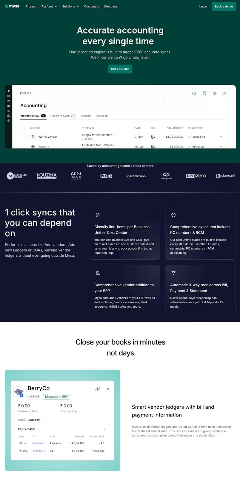
Our client, Mysa, a unified finance and banking platform, uses green against both lighter and darker backgrounds to convey trustworthiness and innovation. The choice also helps them reinforce their AI-powered identity.
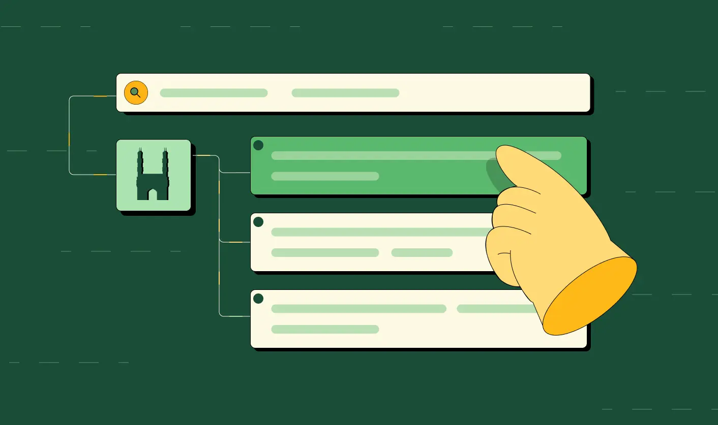
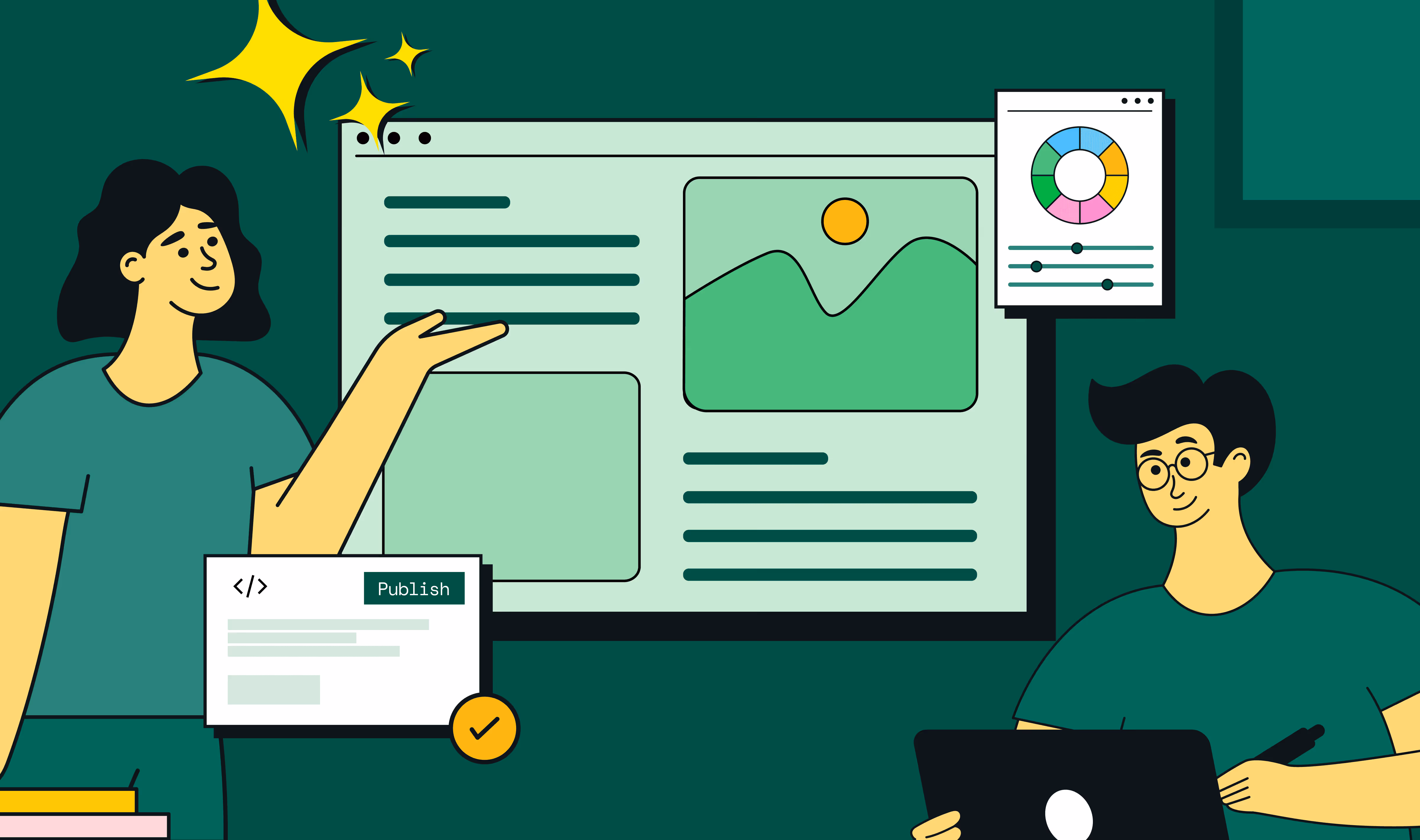
#4 Add Microinteractions To Boost Clarity And Engagement
Microinteractions are the quiet workhorses of UX website design. You might not notice them when they’re there, but you’ll definitely notice when they’re missing. And their absence is felt twice as much in fintech websites where buyers expect reassurance at every step.
These tiny design elements guide users through the websites, nudging them to take specific actions. This includes the subtle CTA color changes, pulsing hints, progress rings, and confirmation ticks.
When done right, they speed up time to value, boost engagement, and improve the overall UX.
“For fintech brands, microinteractions are a chance to actually humanize your product. Even simple things like a progress bar or breaking forms into steps stop users from feeling overwhelmed and build trust”, adds Ayush.
Principle in Practice
The best example is US-based neobank Varo’s website. It’s one of those fintech brands that don’t look like one but still nail showing product value and credibility. The website contains multiple microinteractions, like CTA color changes, a clickable stepper for copy, in-line error messages, and a real-time password checker.
#5 Use Product Videos To Deliver Faster Aha Moments
83% of buyers prefer brands using videos over written text for product explanations. That explains why Wistia ranks product videos as the most impactful video type in 2025.
And in the fintech space, that impact is twofold: they cut through the dryness of fintech concepts while building trust in buyers. It’s the shortcut buyers can take to get to the ‘what’s in it for me’ (WIIFT) fast.
And when done right, they can be a chief factor that makes your product and brand unforgettable.
“There’s no single 'best' type of product video. You can go for animated, live-action, or even hybrid ones, depending on what you want to achieve. For instance, animated videos simplify complex ideas, live-action builds trust, and a hybrid approach helps your brand stand out”, adds Ayush.
Principle in Practice
US-based fintech startup Brex’s product video on its website is a great example. In under 2 minutes, the video clearly explains their core value proposition and how the product works.
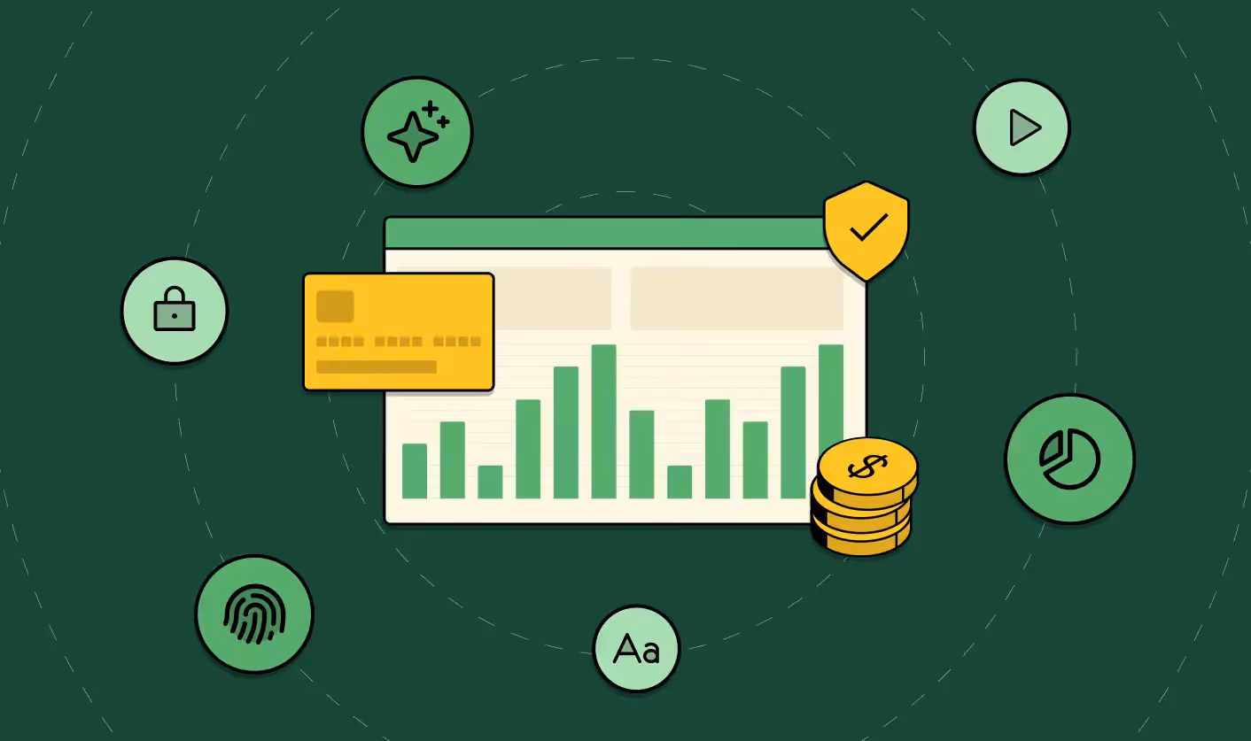
#6 Show Trust and Security Cues To Reduce Fraud Anxiety
In fintech, your battle is against fear: fear of getting scammed, hidden fees, regulatory issues, and data misuse —the list goes on.
With fraud losses increasing by 25% in 2024 compared to 2023, fintech buyers are more skeptical than ever. Bank-grade encryption means nothing if you can’t prove it to buyers. They need two layers of reassurance at every step: 1) that you are legally compliant, and 2) that you are trustworthy.
Here’s what it looks like in action on a fintech website:
1. Clear assurances at each step
Be upfront about fears and hesitations. Use microcopy to reassure them.
Example: “No hidden fees — what you see is what you pay.”
2. Allow easy corrections
Buyers fear irrevocable mistakes when it comes to banking. Alleviate this by giving them control through easy revision options.
Example: “Review and edit” option or a 30-second correction window after submitting.
3. Guide users through actionable hints
“Why do you need this information?”, “Am I doing it right?”, “Where can I find this?”. These are the questions running through a fintech buyer's mind. Contextual help at the right moment reduces hesitation.
Example: “Your account number is usually 10–12 digits. Find it in your statement.”
4. Visualize security cues
Small steps like lock icons, masking inputs, step confirmations, color cues, and placing CTAs strategically all compound to build stronger buyer confidence. Use them wherever necessary to make users feel safe.
Example: A checkmark that pops up after a successful login.
Principle in Practice
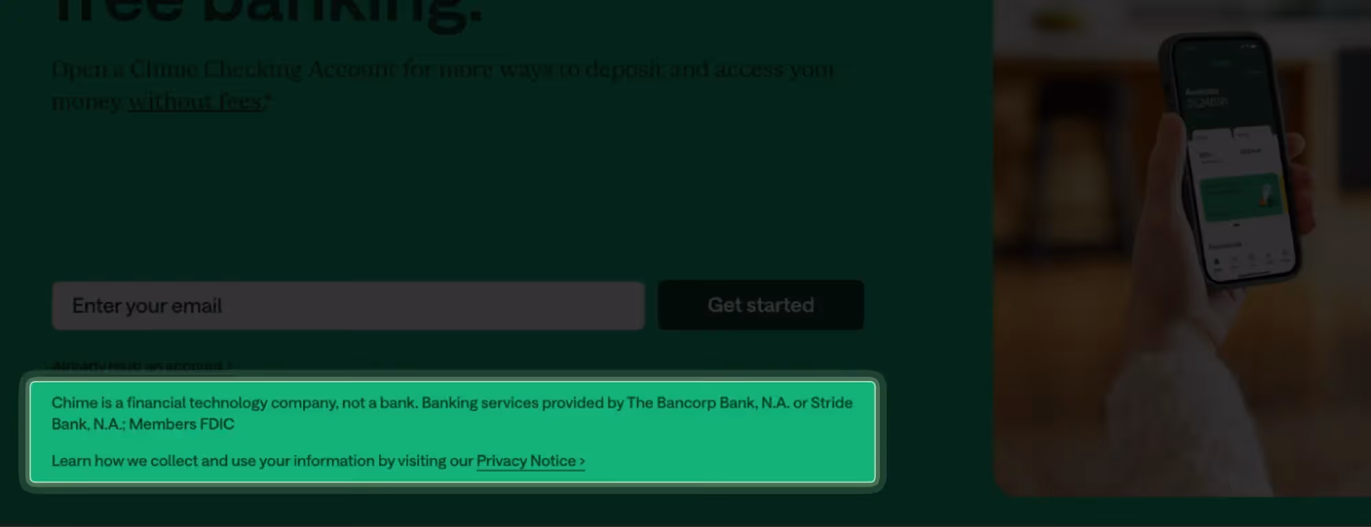

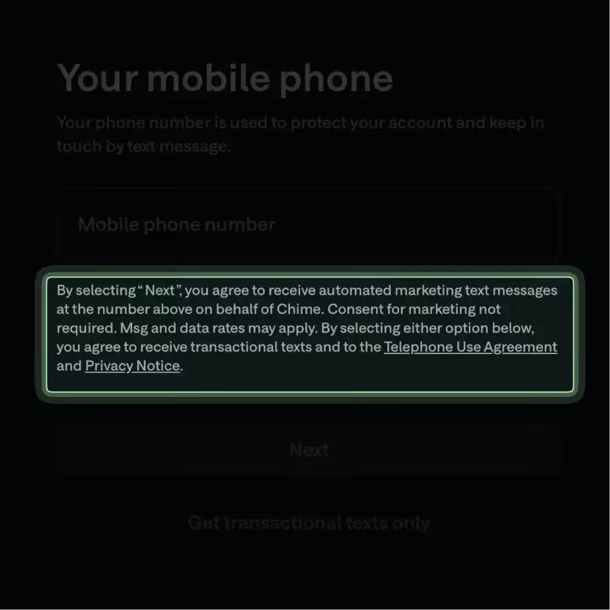
Chime checks all the boxes. From clear assurances, security cues, contextual hints, and easy edits, this finance website design is primed to ease fraud anxiety at every step.
{{specficService}}
#7 Disclose Information Progressively To Prevent Overload
Trust-first design is about earning user confidence before asking for commitment. In fintech, transparency builds trust, but that doesn’t mean dumping every detail at once. Most websites fail here, overwhelming users before they even see your offer.
It’s not about hiding information either, but disclosing it gradually so users never feel lost. Progressive disclosure in fintech web design looks like:
- Breaking crucial financial journeys into digestible steps, showing one decision per screen.
- Using progress indicators to show where users are in the process.
- Offering on-demand depth, like tooltips and collapsible FAQs, gives details without cluttering the main flow.
Principle in Practice
Stripe’s account activation process is a great example. It unfolds progressively, one step at a time, shows a progress bar at the top left, and uses tooltips and FAQ links to give helpful context.
#8 Avoid Financial Jargon To Improve Comprehension
The financial services industry is infamous for fine print and hard-to-understand language. But in fintech, when your trust factor is already at risk, every misunderstood term is a drop in the funnel.
To avoid this, make clarity and comprehension your north star in fintech copywriting. Writing in clear, everyday language benefits everyone, from non-native speakers to older adults, and reduces cognitive load.
Some fintech copywriting tips to avoid overwhelming buyers include:
- Replace insider terms with everyday language: Instead of “overdraft,” use “negative balance,” or “extra charges” for spending beyond available funds.
- Use microcopy to explain outcomes: Use “Deleting this account is permanent” instead of “Delete account.”
- Maintain consistent terminology across screens: Use “Transaction history” on all screens instead of switching between “History” or “Activity.”
- Conduct clarity testing to validate phrasing: Ask real users to explain what your product or a specific feature does based on your copy.
Principle in Practice
Our recent revamp project for Zenda demonstrates this perfectly. The website copy is written in clear, simple language, making it easy for schools and parents (their target audience) to learn the ropes of the platform.
Ready To Put These Principles Into Action?
Adhering to these 8 UX principles, from clear typography and microinteractions to product animations and social proof, gives you a head start over most competitors. But true category leadership comes from funnel-first, trust-first designs.
As a leading fintech design agency, ThunderClap delivers fintech web design services that include:
- Deep fintech expertise: Leaders in fintech branding who understand the buyer’s language, from pre-PMF startups to enterprise brands.
- Growth-driven designs: Websites that resonate with both investors and customers.
- Ability to build for scale and security: Optimized for fast-growing fintech startups without compromising security.
- Competitive timelines: Enterprise-grade fintech websites delivered in under 10 weeks.
- Impressive client roster: Trusted by top fintech brands like RazorPay, Zenda, Mysa, Refo, and Rezolv.
{{ctaBlock}}
FAQs
1. How to make your fintech websites look more trustworthy?
You can make your fintech website design more trustworthy by:
- Opting for a clean and legible typography
- Experimenting with colors other than blue
- Using animations to visualize your product
- Adding microinteractions across the website
- Priming your website for speed and performance
2. What are the common UX mistakes fintech brands commit?
Some of the most common UX mistakes fintech brands commit include:
- Visually blending in with other brands by sticking to the corporate blue color
- Using jargon-heavy language and huge walls of copy to educate the buyers
- Not adding enough social proof
3. Are fintech websites with dark themes less trustworthy?
No, dark themes in fintech website design aren’t necessarily less trustworthy. In a competitive fintech space, standing out visually matters. If a dark theme does that without confusing users, go for it. The key is to maintain trust through clarity and consistency, not just color.
4. Should fintech websites always use the color blue?
While the color blue signals trust, using it in today’s crowded fintech market is not a good move; instead, you can try colors like green, violet, and purple. Or if you are bold enough, you can even experiment with colors like neon green. The key is to have a strong ‘why’ behind it, no matter the color you choose.
5. What should be the load time of a fintech website?
The average load time of any website, regardless of the industry it belongs to, should be less than 2 seconds. Any website that takes longer affects your efficiency and credibility.
6. Does my brand need specialized fintech website design services?
The answer depends on several other factors, such as your goals and budget. For instance, if you aim for category leadership and have the budget, it makes sense to outsource your website to one of the best fintech design agencies.
These agencies, with their deep fintech expertise, let you build a website that cuts through the noise while looking trustworthy. However, if you are just starting out, it is enough to follow these eight principles rigorously.


.webp)
Browse Similar Articles
How to Find the Best Web Design Company in Houston, Texas for B2B Brands (6 Best Picks)

.svg)
The Step-by-Step Website Redesign Process B2B Teams Use to Increase Conversions (Without Killing SEO and Pipeline)
7 Best Video Production Agencies for SaaS Product Walkthroughs and Feature Videos

How to Choose the Best B2B Website Maintenance Company: 9 Questions to Ask Before You Hire One


How to Use Brand Storytelling on Your Website to Close More B2B Deals and Build Buyer Trust


Why Partnering with a B2B Brand Positioning Agency Accelerates Market Differentiation

.avif)
10 Product Marketing Companies Powering the Fastest-Growing SaaS Brands in 2026


Outsourcing Web Design: Cost-Benefit Analysis for Mid-Market & Enterprise Brands
From Leads to Lifetime Value: How Growth Marketing Agencies Scale SaaS Revenue
Webflow vs WordPress: Which Platform Is Better for Your Business Website in 2026?

Optimizing for Intent: How B2B Website Messaging and UX Changes Help Capture Top-Funnel Buyers


From Audit to Action: 8-Step Process to Optimize Your B2B Website Strategy for 2026 Buyers
How to Design a High-Converting Landing Page from Scratch (2026 Edition)


How to Optimize a Landing Page for Maximum ROI: A Step-by-Step Breakdown


AI Landing Pages That Convert: 7 Design Principles Every AI Platform Should Follow


Top 7 Webflow Integrations to Supercharge Your Website's Performance and Conversions


10 Best Web Design and Development Companies in India [B2B Focused for 2026!]

How to Choose the Best Webflow Agency: A Complete Guide for Your Business


Interested in seeing what we can do for your website?


.webp)
