


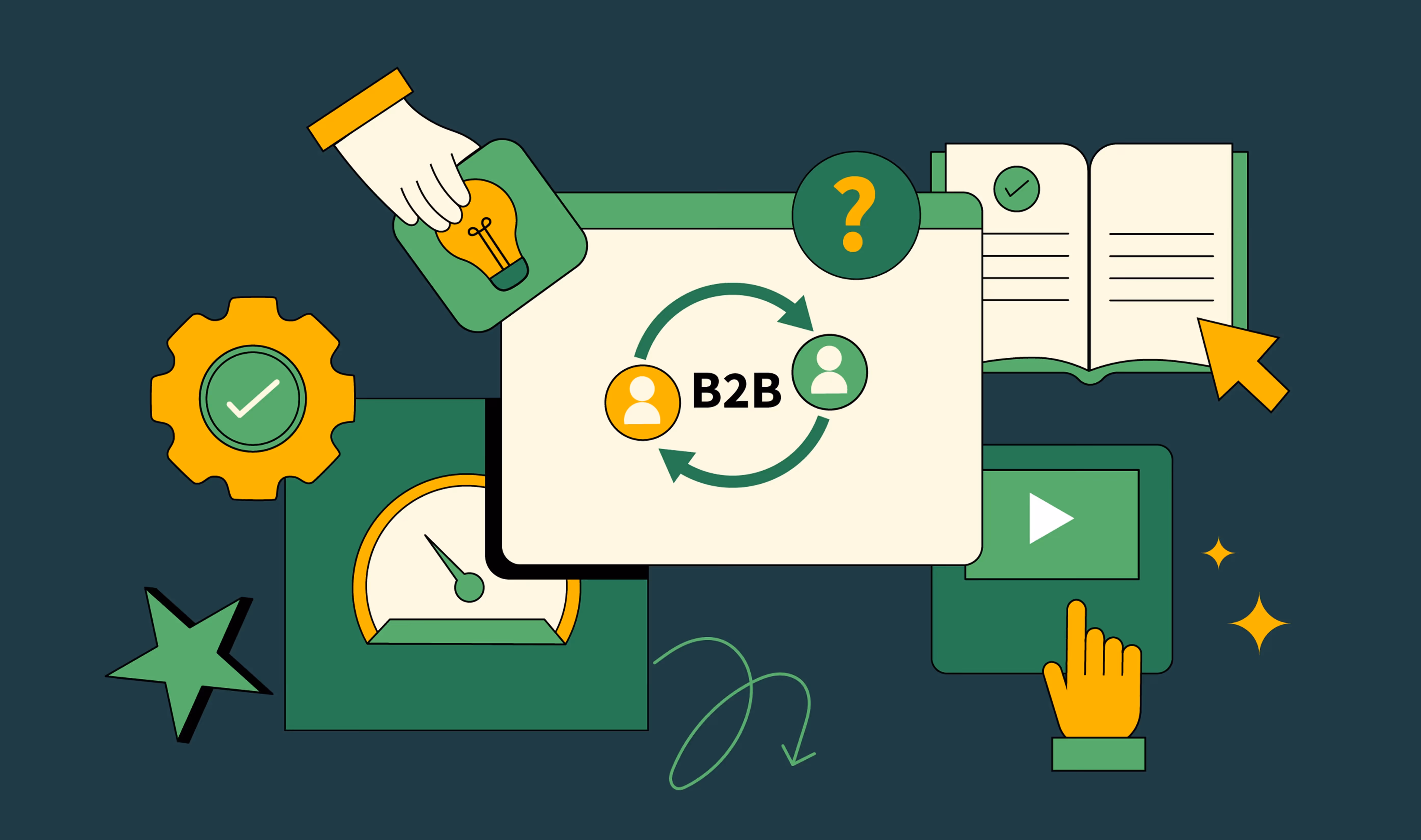
B2B Website Blueprint: 6 Best Practices for Design & Development

Most B2B websites are Frankensteins. Marketing wants a new campaign page, Product launches a new feature, and IT adds a “security” tab in the footer. After a year, you’ve got a bloated sitemap, conflicting styles, and a homepage where the headline tries to please everyone but ends up meaning nothing.
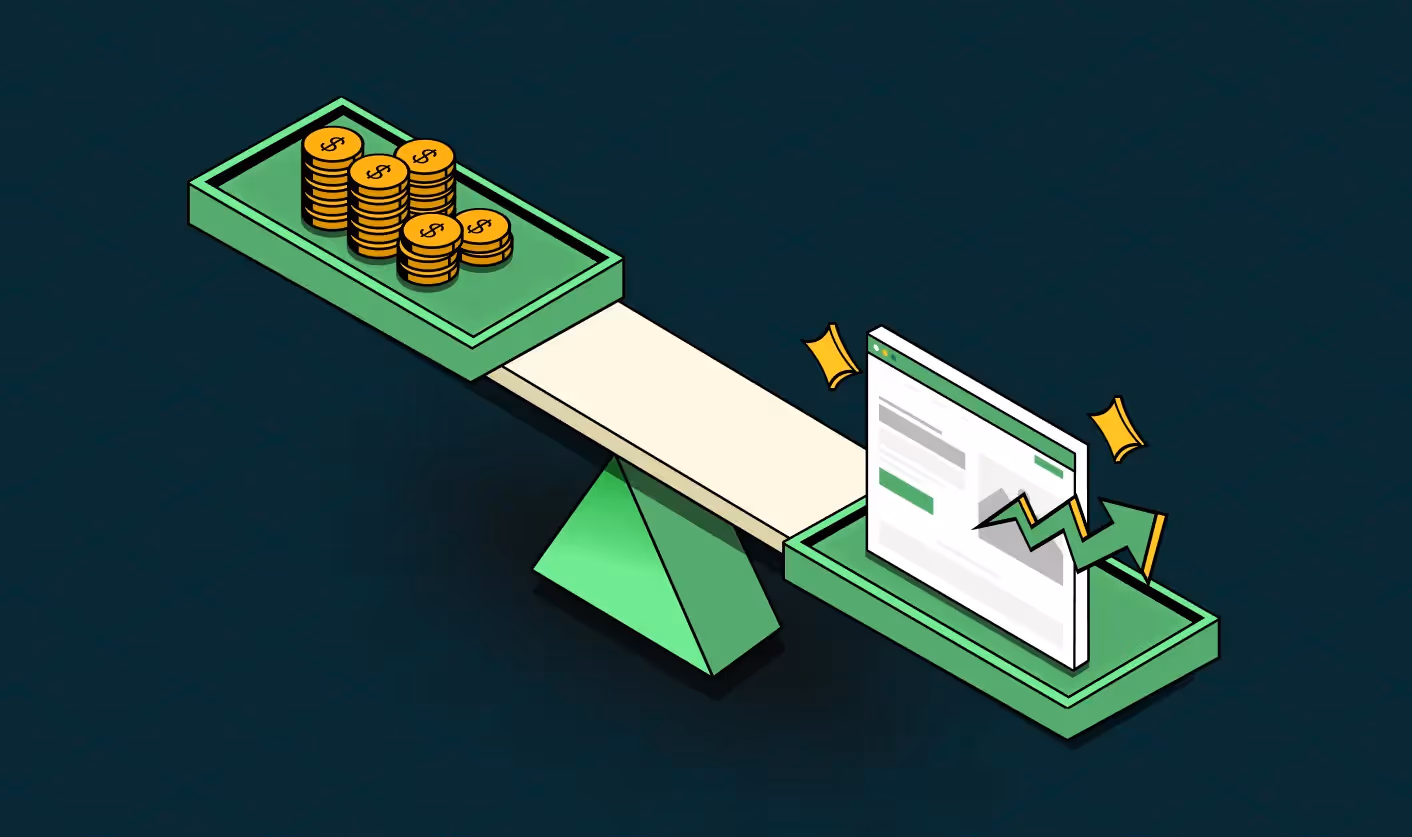
No wonder they don’t perform. The average visitor-to-lead conversion rate for B2B SaaS is ~1.4%. That means out of 1,000 visitors, just 14 engage. Compare that to 9.5% conversion on high-performing SaaS landing pages, and the growth gap becomes clear.
At ThunderClap, we’ve applied our B2B web design and development blueprint system with 129+ B2B brands, from hypergrowth startups like Storylane and Zluri to enterprises like Amazon and Razorpay. The results are consistent: scalable websites that convert curiosity into pipeline.
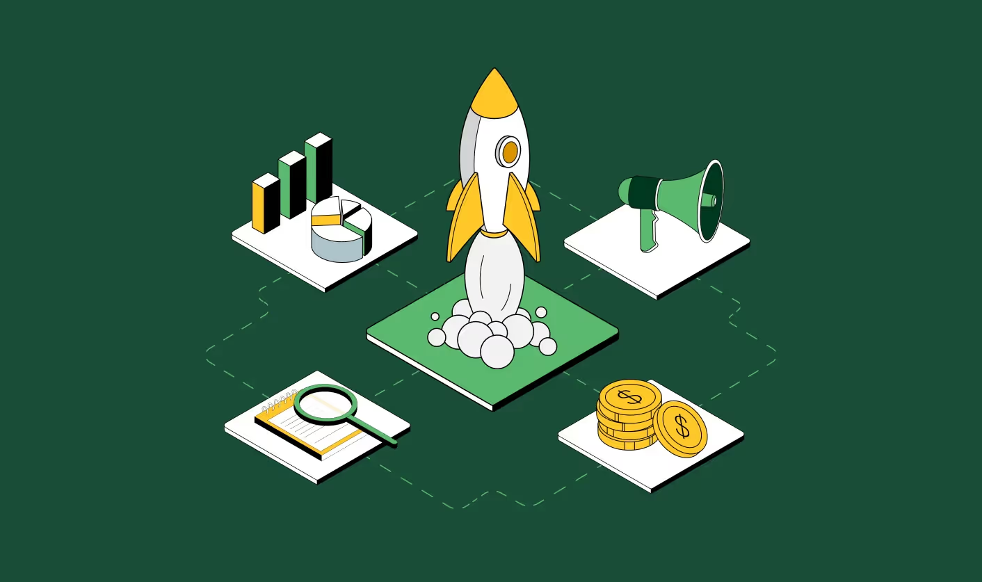
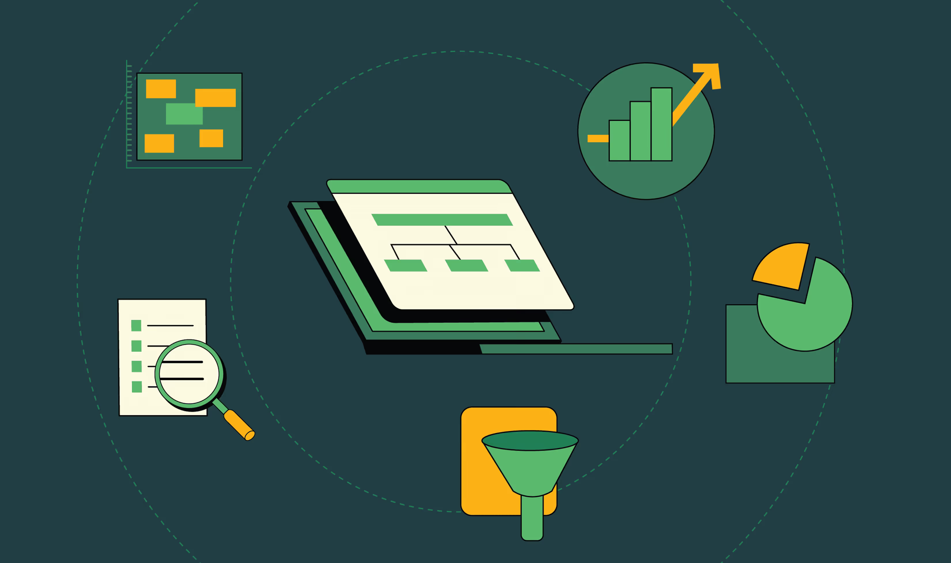
This guide lays out our six-step web design blueprint principles to transform your website into a scalable, high-performing growth engine.
TL;DR
Most B2B websites are designed as one-off projects, not scalable systems (leading to poor conversions and outdated messaging). This B2B website web design and development blueprint shows you how to flip that with a system-first approach:
- Build for real buyer anxieties (ROI, security, agility) instead of generic personas.
- Structure your site like a sales conversation—educate, demonstrate, reassure, invite.
- Design as a trust signal with whitespace, social proof, and compliance proof upfront.
- Code for iteration with modular CMS blocks so Marketing can launch in hours, not weeks.
- Remove friction with smarter CTAs, live chat, trials, and instant calendar booking.
- Treat your website like a product—test, measure, and iterate continuously.
Do this, and your B2B website becomes your best SDR.
Blueprint principle 1 → Build for real buyer anxieties, not persona slides
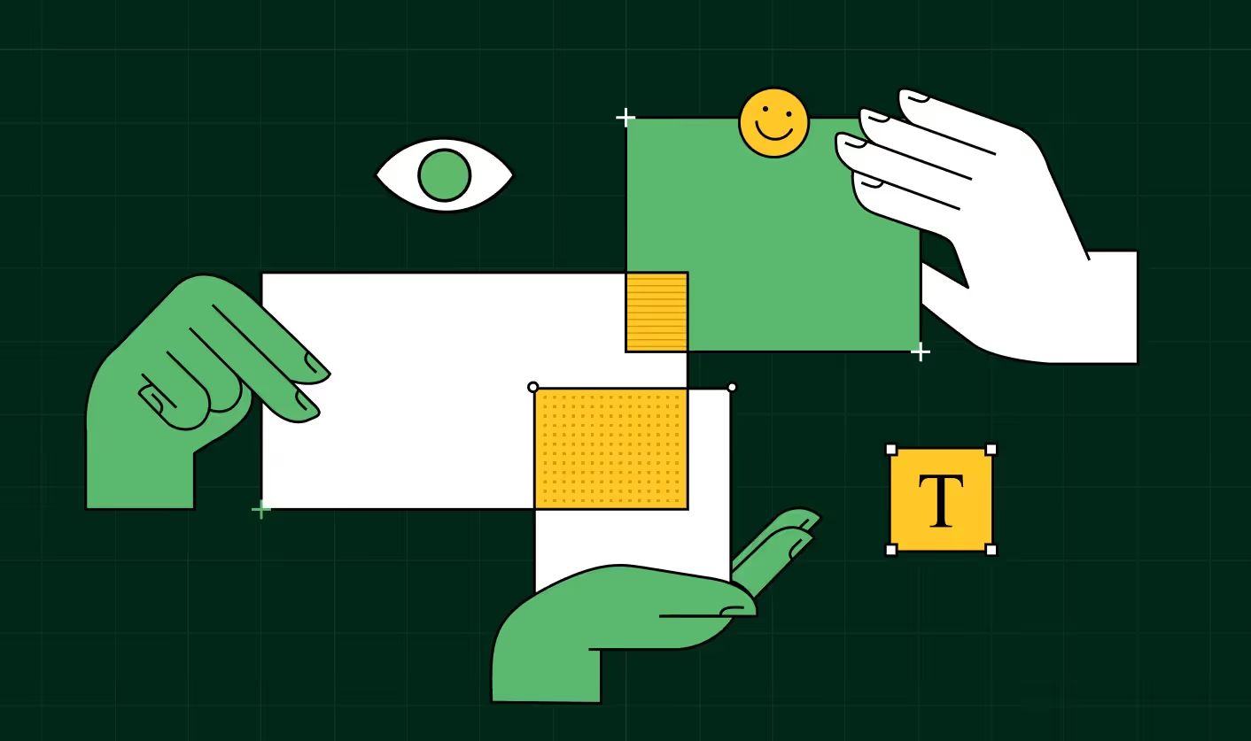
A winning B2B web design and development blueprint starts with clarity: who you’re building for, what they need to see, and what will stop them from engaging.
Unfortunately, we see a lot of B2B sites that feel like they’re talking to made-up personas (remember ‘Marketing Mary’ or ‘IT Ian’?). Marketing personas look good in a deck, but real buyers don’t care about personas. They care about risks and outcomes and need visible reassurance.
When they land on your website,
- A CMO wants to know: “Will this move the pipeline faster?” → They scan pricing, ROI tools, and case studies.
- A Head of Marketing cares: “Can my team launch campaigns without dev bottlenecks?” → They look for clarity in product flows and proof of marketing agility.
- An IT owner asks: “Is this secure?” → They hunt for SOC 2 badges, GDPR compliance, and uptime pages.
When these signals are buried, deals stall.
How to do it:
- Map the top 3 buyer roles and their anxieties.
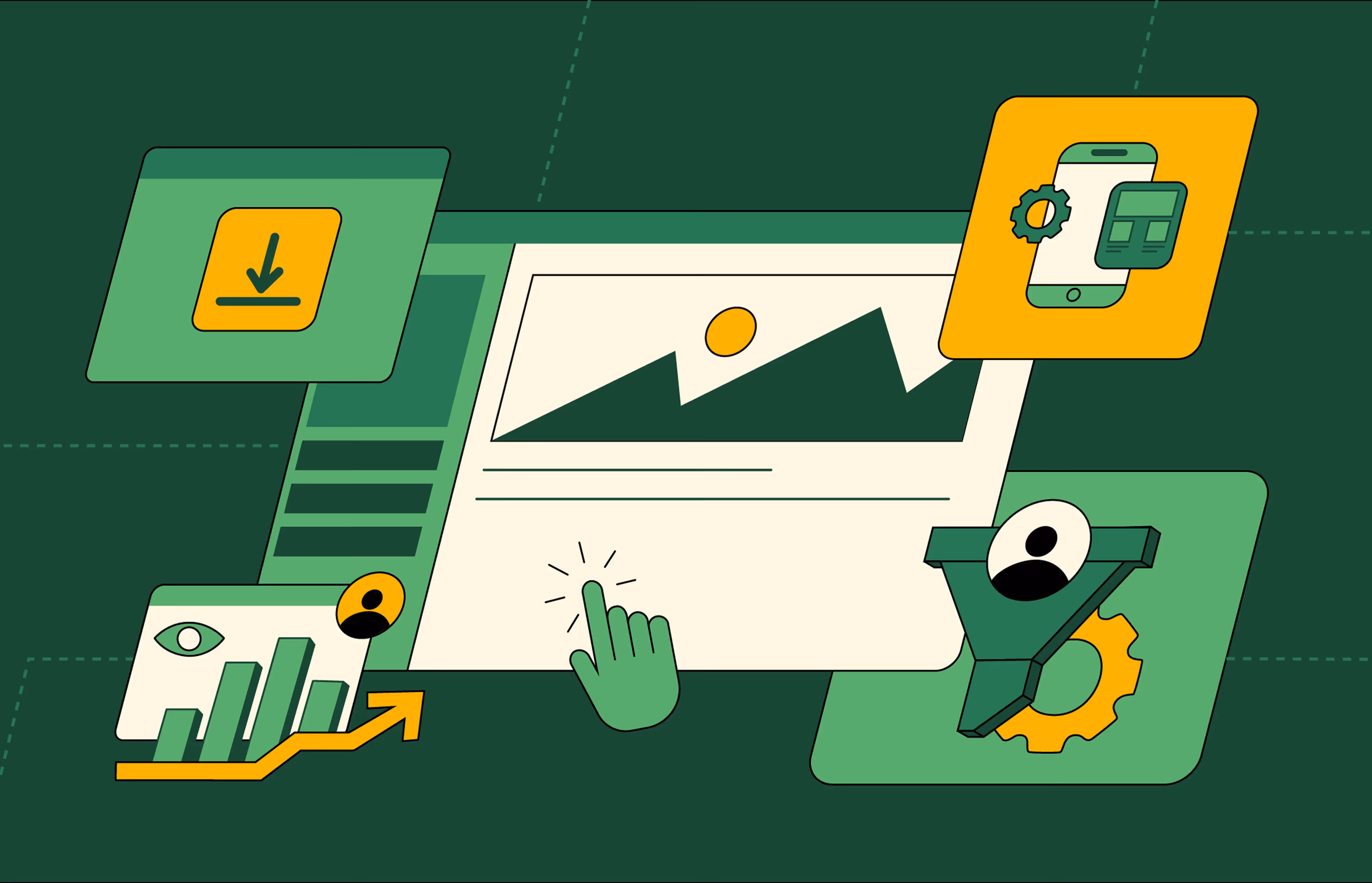
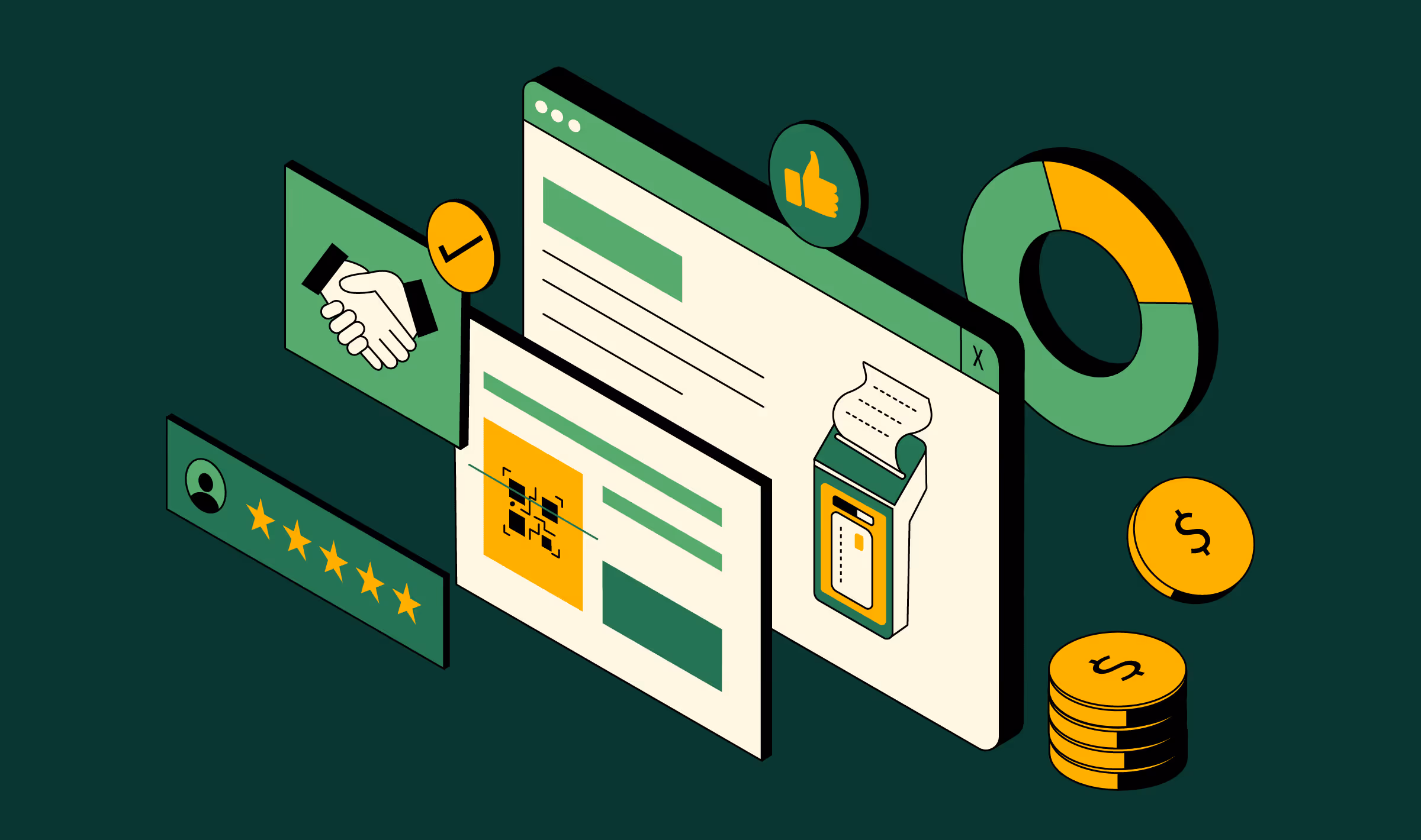
- Design homepage blocks to answer them upfront. We call these trust signals, and here are five proven trust signals that do the job.
Top SaaS Trust Signals Buyers Look For
- Build dev-ready templates so these blocks can be updated without redesign.
KPI to watch: % of sessions that reach trust-critical pages (security, compliance, integrations).
Also Read: Website Revamp: How to think about them?
Blueprint principle 2 → Structure like a sales conversation, not a sitemap
Legacy SaaS sites still use a brochure sitemap: Home → About → Features → Contact. But that doesn’t reflect how buyers evaluate software.
The high-performing pattern looks more like a sales call flow:
- Educate → resources, blogs, industry explainers
- Demonstrate → features, use cases, “vs.” competitor pages
- Reassure → testimonials, ROI calculators, compliance badges
- Invite → pricing, free trial, demo booking
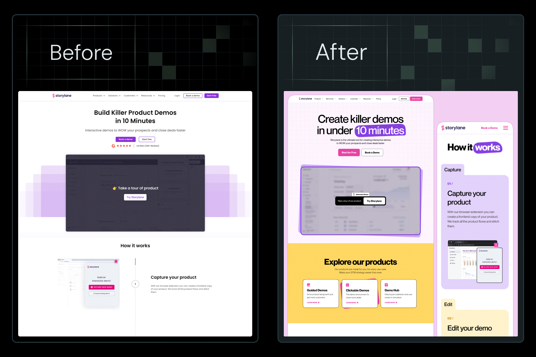
This is why Slack’s site feels natural. They have resources for the curious, crisp product walkthroughs for evaluators, and social proof everywhere for skeptics.
Now compare that to older enterprise SaaS vendors, where you need six clicks to figure out what the product does.
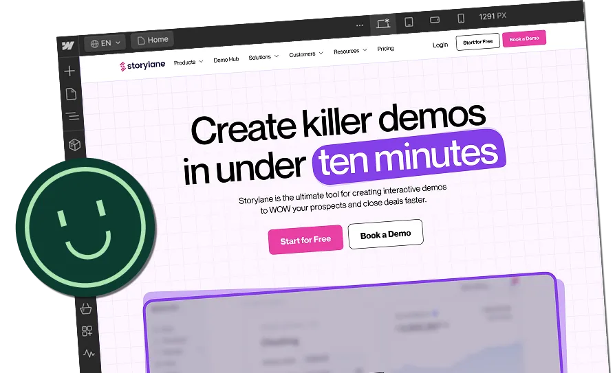
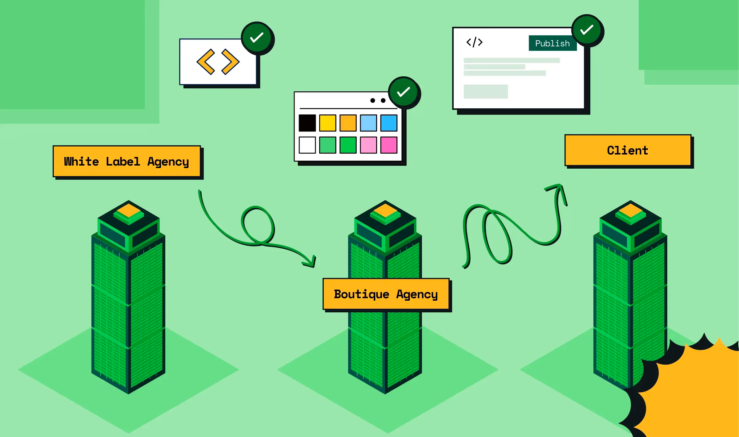
Storylane’s redesign proved that sometimes the biggest trust signal is brand personality. Without changing a single word of copy, we used mood boards, a clean-but-playful visual system, and custom illustrations to create a bold personality. This led to 36% more impressions and 30% more demo requests.
Full breakdown below:
How to do it:
- Do a website audit and break your sitemap into stages: Awareness (resources) → Evaluation (features, use cases) → Decision (pricing, demo).
- Code navigation menus modularly, so adding/removing items doesn’t break layouts.
Keep BoFU pages (pricing, comparison, security) one click away (not buried).
KPI to watch: Share of traffic hitting BoFU pages (pricing, comparison, security).
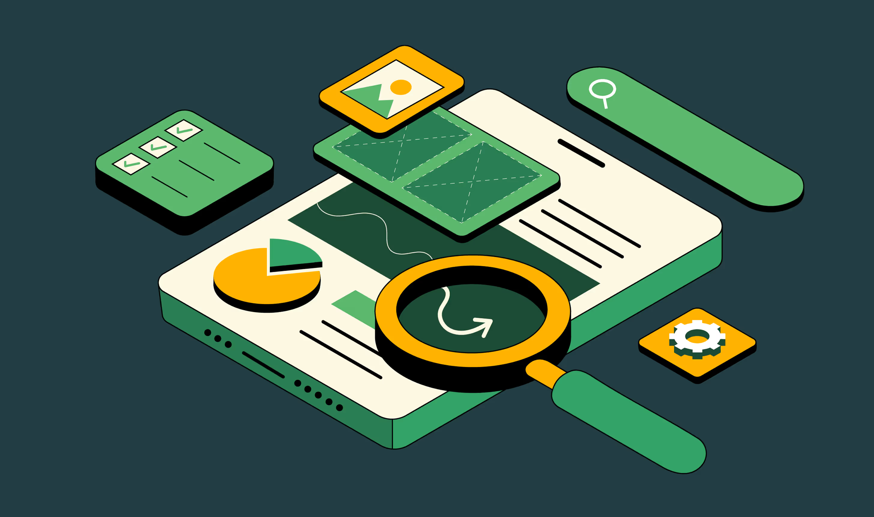
Blueprint principle 3 → Design as a trust signal, not decoration
SaaS buyers are busy, skeptical, and risk-averse. A high-converting design isn’t about looking modern. It should guide buyer perception and trust (aka de-risk decisions for buyers). With Zenda, we overhauled their design system to prioritize clarity and proof. The team loved the design, which also got nominated for Awaaards.
Let’s break down how B2B website design best practices apply design psychology to win trust and clarity.
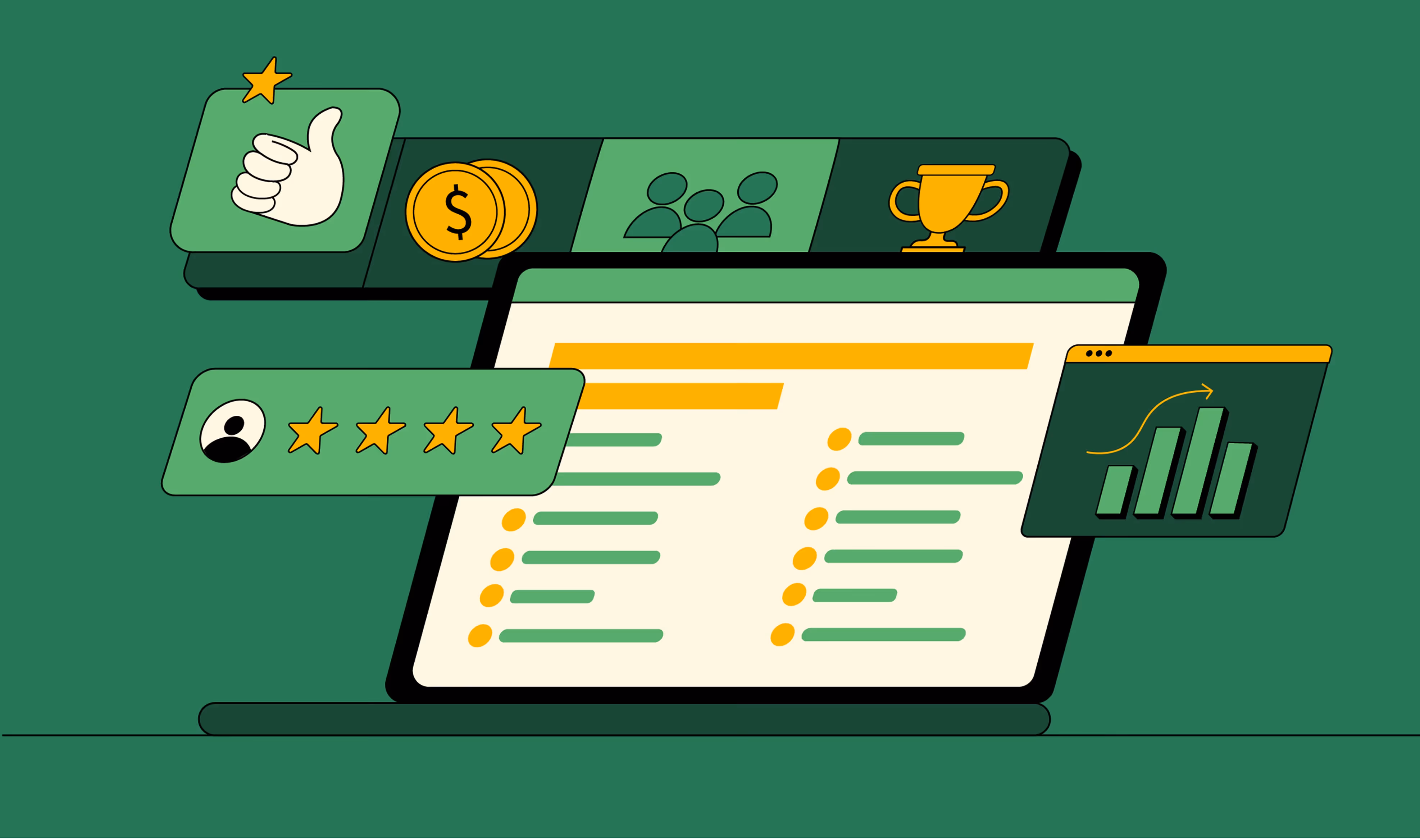
Whitespace signals confidence. That’s why Asana’s minimalist product pages feel calm, scannable, and focused. Compare that to cluttered competitors that overwhelm with jargon.
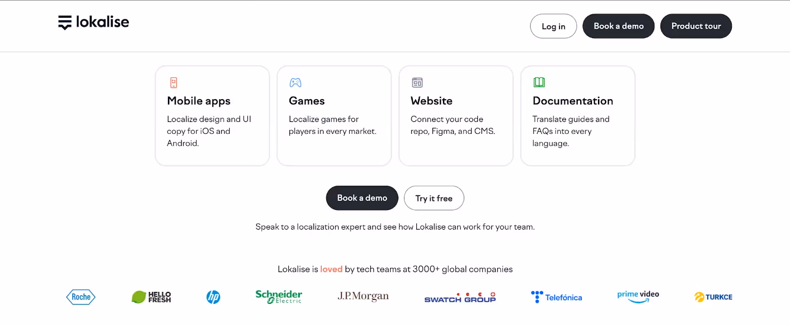
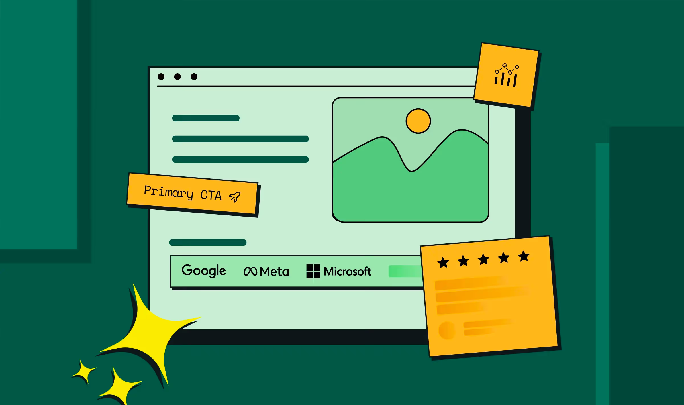
- Social proofs (logos and testimonials) are risk reducers. Lokalise doesn’t just say “trusted by companies worldwide”. They drop JP Morgan, Prime Video, and Schneider logos right under the headline and CTA buttons.
That’s shorthand for “others you respect already trust us.”
- Color psychology guides perception. Datadog’s purple stands out in a crowded cloud space; Shopify’s green reinforces growth and commerce.
The job of website design elements here isn’t to delight. It’s to reduce the buyer’s anxiety and make the next step feel obvious. Here’s a simple B2B design signal framework you can follow to check if your website visual strategy communicates trust:
{{ctaBlock}}
Design Signal Framework for B2B Websites
And yes, personalization matters! HubSpot found personalized CTAs convert 202% better than generic ones by using smart, dynamic messaging.
KPI to watch: Hero CTA click-through rates.
Also Read: A Complete Guide to B2B Web Design Best Practices
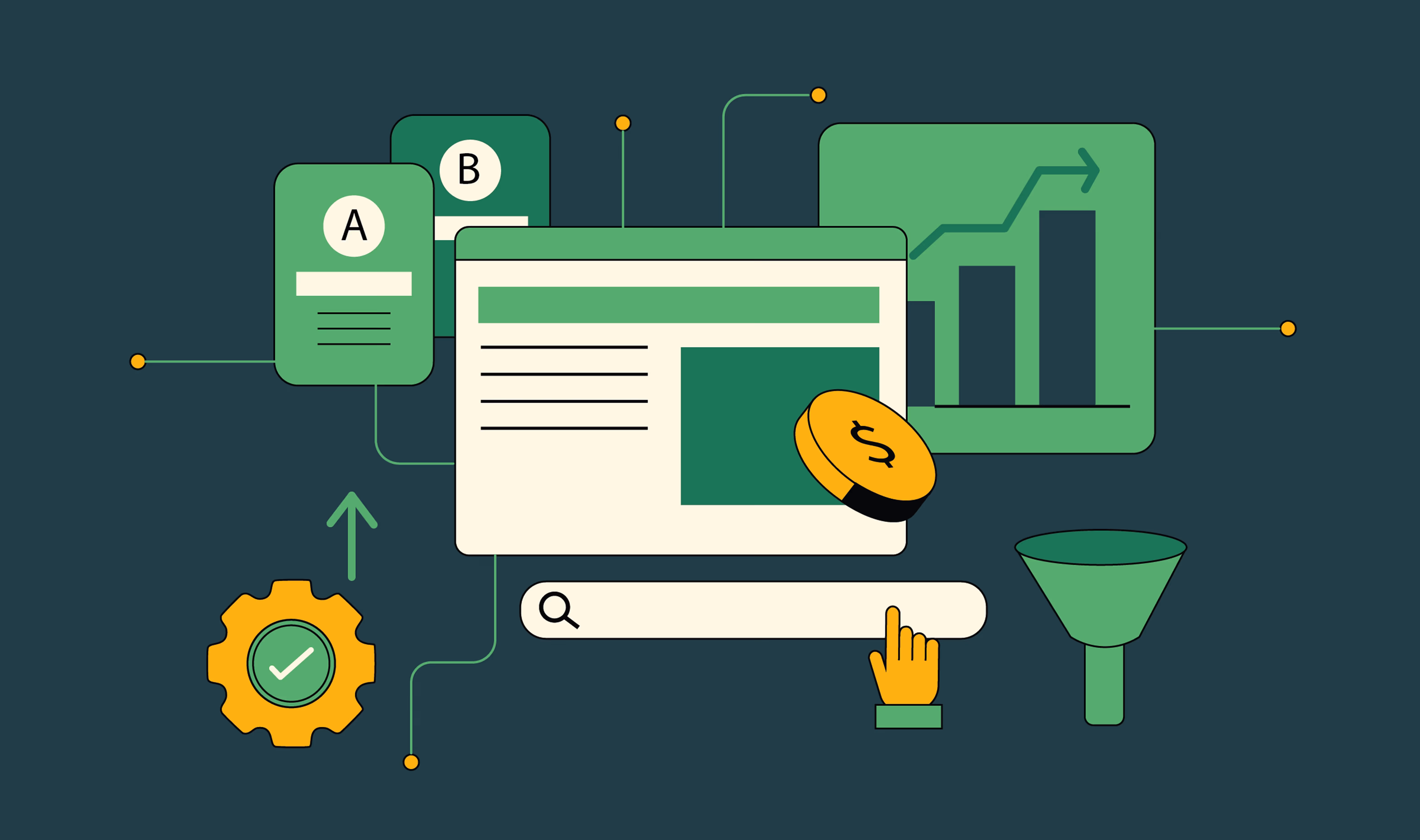
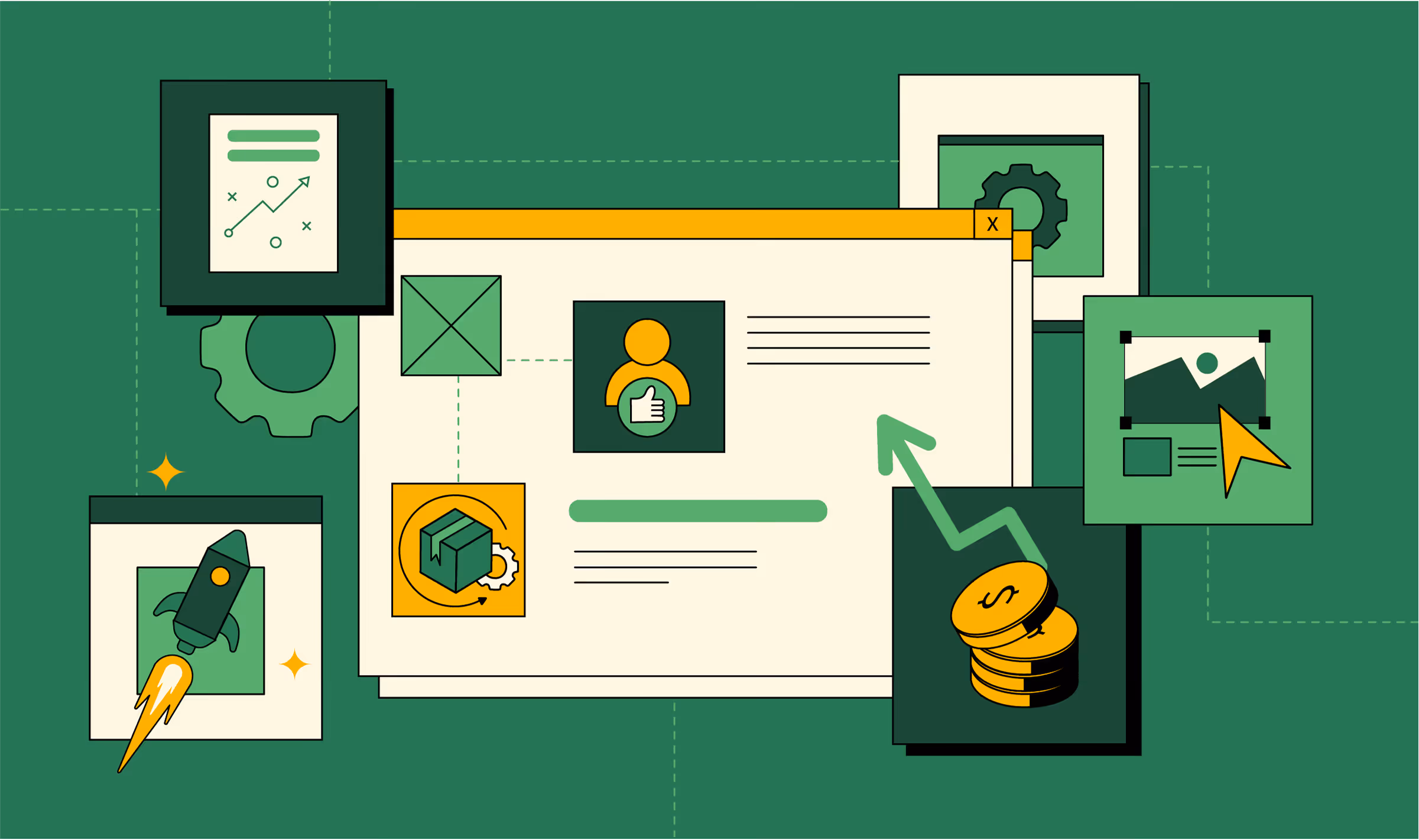
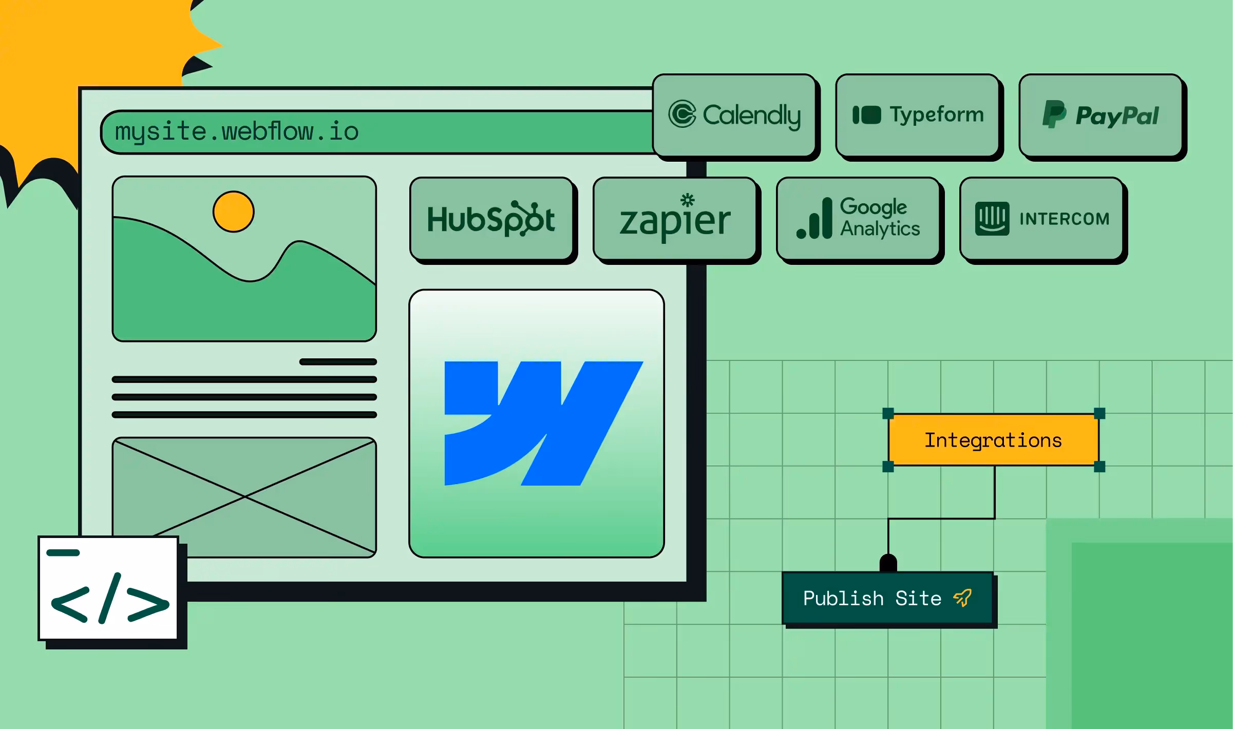
Blueprint principle 4 → Code your website for iteration, not just launch
Most SaaS teams build for “launch day.” Then marketing asks for a new industry landing page, and suddenly it’s a dev ticket that takes 3 weeks. That’s the cost of not thinking modularly.
At ThunderClap, we build modular CMS libraries: feature blocks, testimonial carousels, pricing tables (coded once, reused everywhere). Marketing launches in hours, not weeks. Dev focuses on performance and integrations, not content edits.
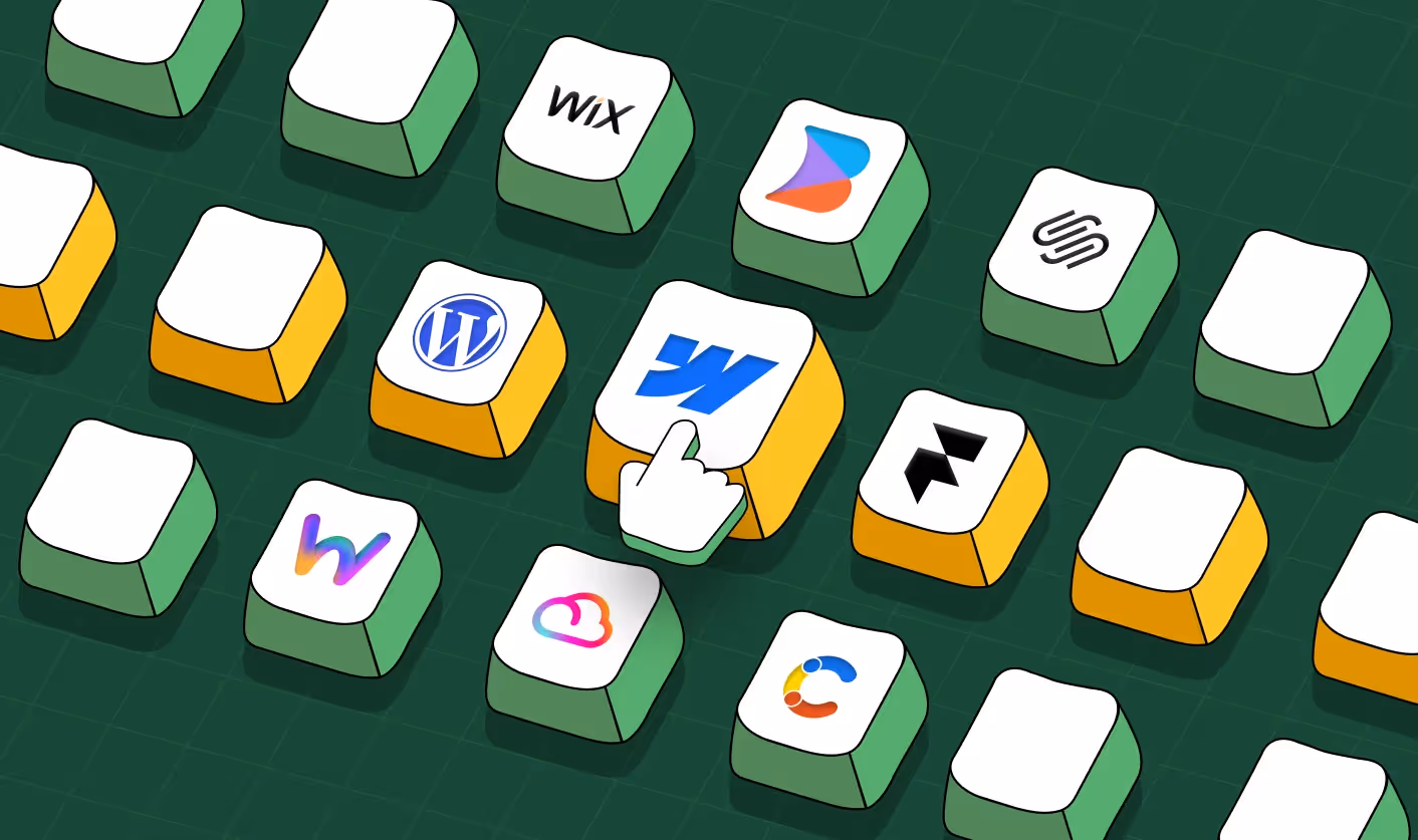
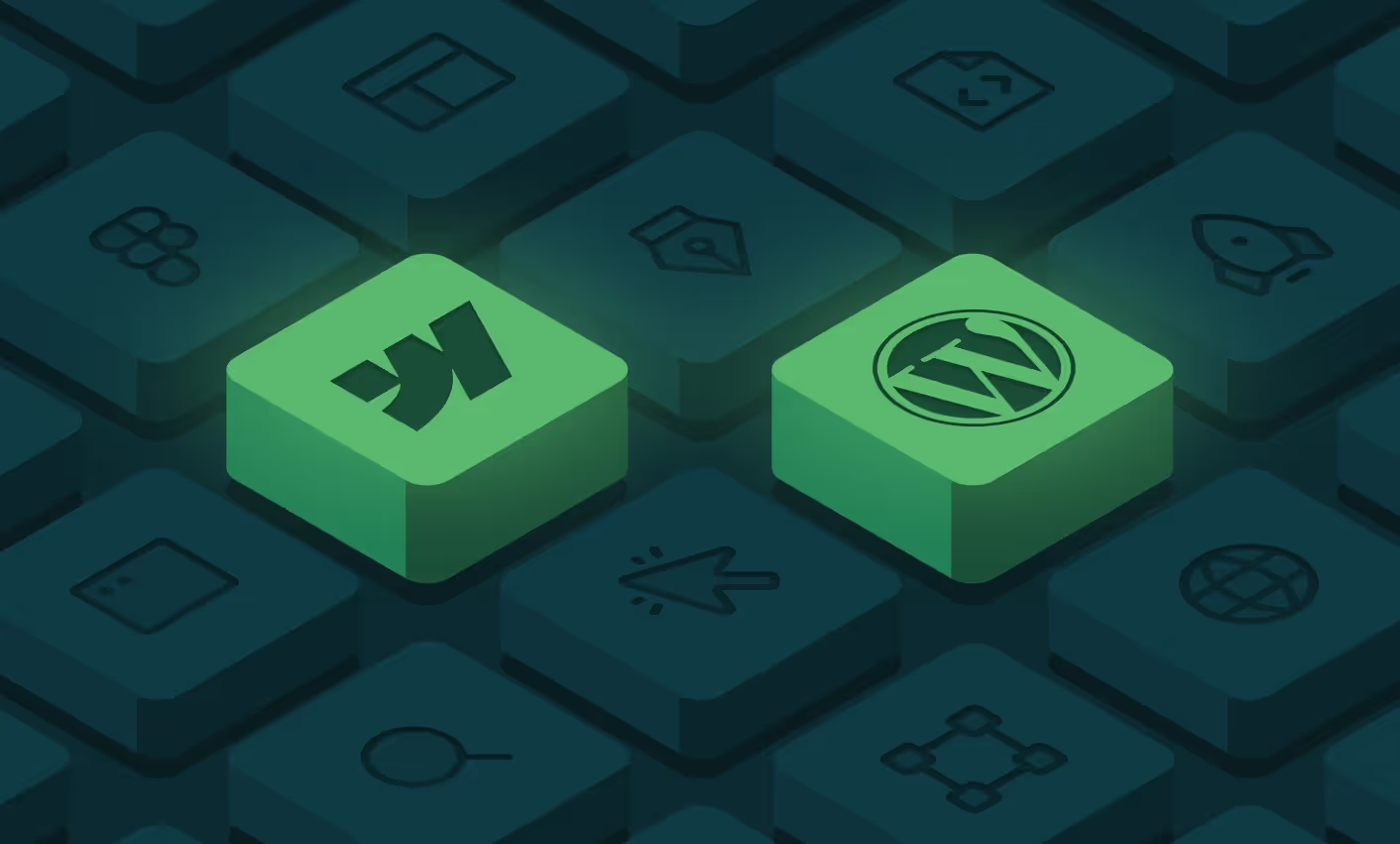
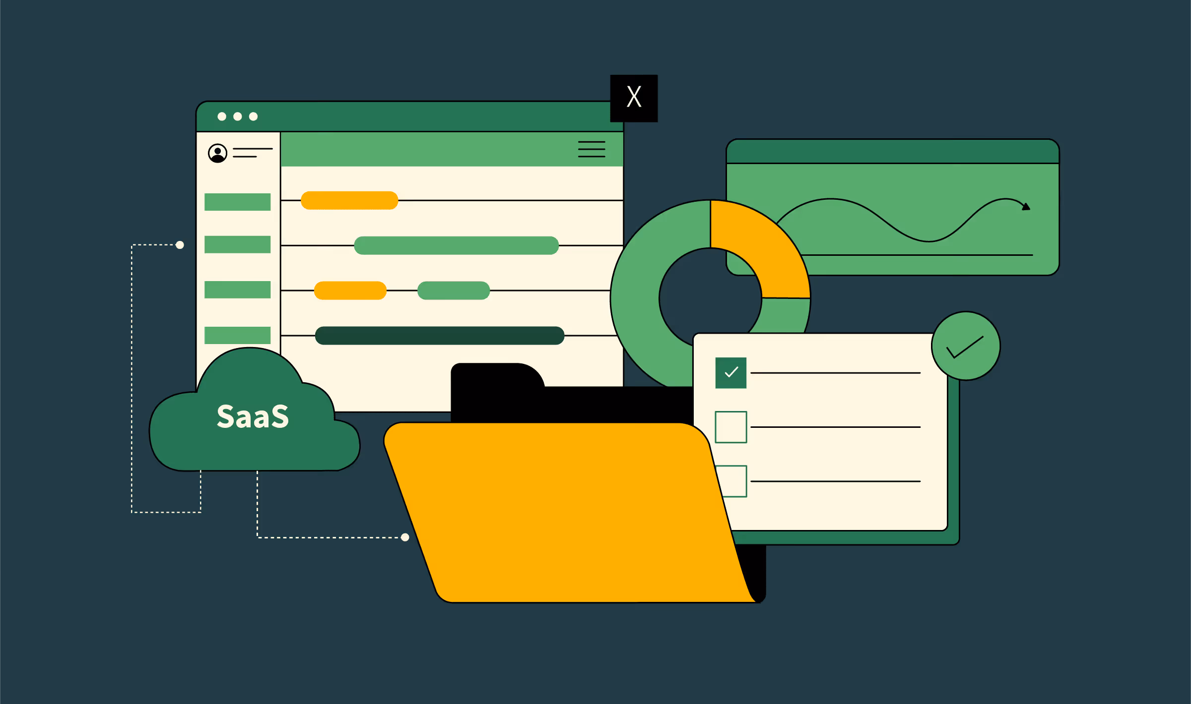
One of the common questions we get in B2B web design is choosing the right content management system for your business:
SaaS CMS Options Compared (B2B Focus)
How to do it:
- Code all blocks as modular components (hero, testimonial, pricing grid).
- Use Webflow for CMS + visual editing. Marketing can launch pages in hours, not weeks.
- Globalize design tokens (colors, typography, spacing) → updates sync sitewide.
KPI to watch: Time to launch a new campaign page. Elite SaaS: <1 day.
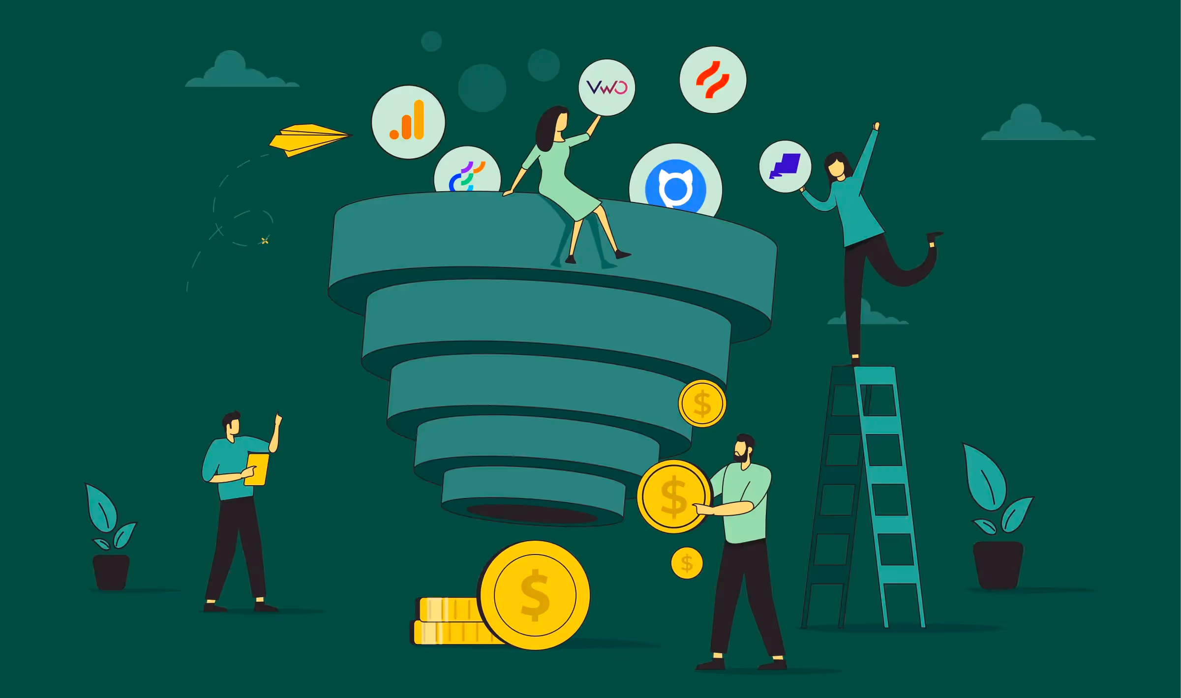
Blueprint principle 5 → Remove friction relentlessly (and then some more)
B2B SaaS conversion rates are significantly lower compared to B2C, as buying SaaS is riskier, more complex, and often involves multiple committees. That means every ounce of friction matters.
But having longer cycles doesn’t excuse poor conversion architecture. Conversions happen by climbing a ladder of offers (each reducing risk until the buyer commits). Your best bet is to offer multiple CTA paths: trial, demo, calculator.
Here are a few examples of what a bare bones offer ladder can look like.
Offer Ladder Framework
Once you have done an audit of your offer, here’s what else you should optimize for:
- Look at your forms: If visitors won’t even start the form, it’s not the fields (it’s the offer). We have seen that an ROI calculator with five fields often outperforms a vague “Request a Demo” with 3. Embed calendar booking right after the form submission to capture hot intent.
- Improve your free trials: Free trials without a card convert at ~18%, while those with a card convert at ~48%. Now, there are many variables you need to take into consideration based on whether you want volume or qualification.
Add live chat to your website: Intercom and Drift show why live chat works. Buyers evaluating SaaS have questions now, not in 48 hours when SDRs reply.
KPI to watch: Meetings per 1,000 sessions.
{{specficBlog}}
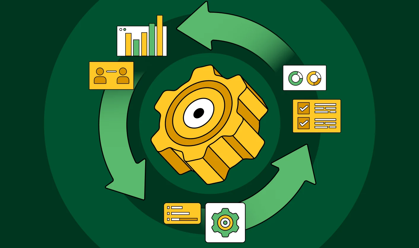
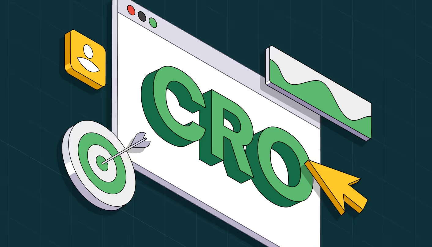
Blueprint principle 6 → Treat your website like a product
The biggest lie in B2B web projects? “We’ll relaunch and then move on.”
But most SaaS websites don’t fail at launch. They fail six months later when content is outdated, modules break, or teams can’t scale new pages without dev help. If your site isn’t designed for iteration, it’s obsolete in 12 months.
The blueprint solution is simple. Treat your site like your product: modular, iterative, evolving.
At ThunderClap, here are six monthly website health checks we recommend all our clients:
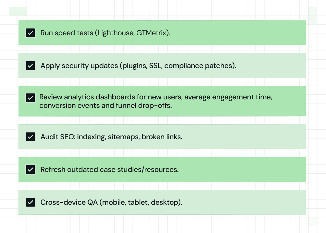
KPI to watch: Meetings per 1,000 sessions, tracked monthly. If it dips, trigger a CRO sprint.
Make your website your best SDR with ThunderClap
Most mid-market and enterprise B2B product companies face the same website challenge: their website no longer reflects who they are becoming. They’re pivoting their positioning, preparing for expansion, launching new products, or under pressure to perform at an international standard.
But their website lags behind.
At ThunderClap, we help you transform your websites into conversion-driven growth engines—accurate representations of your product, scale, and vision that finally make them stand out in your category.
Here’s what changes when you work with us:
- Instantly communicate value and positioning without confusion
- Project a premium, credible brand perception that matches your ambitions
- Scale and iterate fast with modular systems that keep your site current
- Launch a site that doesn’t just match category rivals (it beats them on clarity, UX, and design)
- Hit concrete KPIs: double demo signups, increase MQLs, lower bounce, and win awards
And we’ve seen this transformation play out across 129+ projects, including clients like Storylane, ClearlyRated, RazorPay, and Amazon. If you’re ready to make your website your best SDR, let’s talk execution.
Book a free consultation today!
{{specficService}}
FAQs
Do B2B websites need ongoing updates and maintenance?
Yes. A B2B website is a living system, not a one-off project. Without regular updates, content goes stale, compliance proof becomes outdated, and performance suffers. The best teams run weekly content or CTA tests, monthly KPI and speed audits, and quarterly UX refreshes to keep the site aligned with buyer needs.
What key features should a good B2B website have?
A strong B2B website blends trust, clarity, and conversion. That means visible compliance badges and case studies, a clear CTA ladder that guides visitors from trial to demo, and an integration hub that shows ecosystem fit. Under the hood, it needs fast load speeds and a modular CMS like Webflow so Marketing can iterate without waiting on Dev. These align with the core principles of B2B web design and development best practices.
How do I optimize my B2B website for SEO & leads?
Start with BoFU pages like pricing, competitor comparisons, integrations, and security hubs to capture in-market buyers. Optimize content for both search engines and LLMs with clear summaries, tables, and FAQs. Finally, place proof points next to CTAs and enforce a speed-to-lead SLA of under 5 minutes to prevent drop-offs. Think of this as part of your B2B web design and development blueprint for long-term growth.


.webp)
Browse Similar Articles
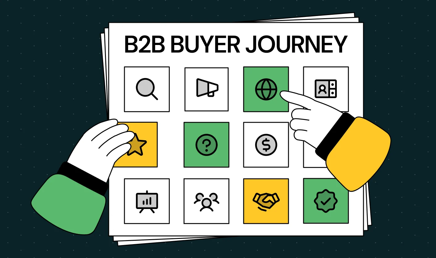
Mapping the B2B Buyer Journey to Improve Conversions Across Every Touchpoint

.svg)
.webp)
7 Best Website Maintenance Companies in India for Growth-Led B2B Teams (2026)

.webp)
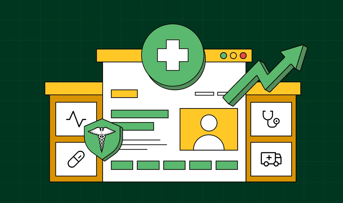
8 Best Healthcare Website Design Agencies for HIPAA-Compliant Sites in 2026

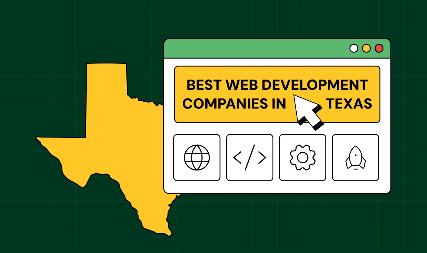
How to Find the Best Web Design Company in Houston, Texas for B2B Brands (6 Best Picks)
Positioning That Wins: How to Make Complex B2B Products Clear and Compelling

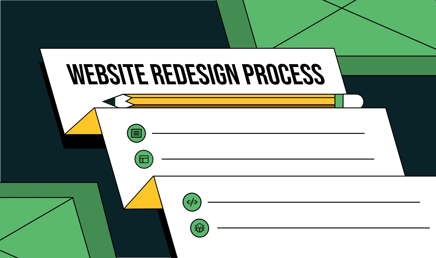
The Step-by-Step Website Redesign Process B2B Teams Use to Increase Conversions (Without Killing SEO and Pipeline)
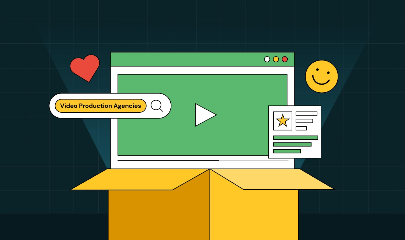
7 Best Video Production Agencies for SaaS Product Walkthroughs and Feature Videos

How to Choose the Best B2B Website Maintenance Company: 9 Questions to Ask Before You Hire One


How to Choose a Web Design Company in San Francisco in 2026 (with Examples)

10 Best Web Design Companies in Florida in 2026 and How to Choose the Right One
How to Use Brand Storytelling on Your Website to Close More B2B Deals and Build Buyer Trust

SaaS CRO Best Practices: What High-Growth Brands Do Differently to Win Conversions

How a Rebranding Agency Can Redefine Your B2B SaaS Identity and Boost Pipeline

B2B Marketing Trends in 2026 That Directly Influence Pipeline and Revenue
Top 7 Video Marketing Agencies Driving B2B SaaS Brand Awareness in 2026
Why Partnering with a B2B Brand Positioning Agency Accelerates Market Differentiation

The Complete Website Redesign Checklist for B2B SaaS Teams Ready to Scale
.avif)
9 Best Webflow Development Agencies in India for 2026 (In-Depth Review)
10 Product Marketing Companies Powering the Fastest-Growing SaaS Brands in 2026
Website Copywriting Services vs In-House: What's Right for Your Business?

How to Choose a Marketing Agency That Understands B2B SaaS Growth Metrics


How to Choose a Video Marketing Agency That Understands B2B Storytelling
Outsourcing Web Design: Cost-Benefit Analysis for Mid-Market & Enterprise Brands
From Leads to Lifetime Value: How Growth Marketing Agencies Scale SaaS Revenue
Build a B2B Website Strategy That Aligns with Sales and Marketing Goals
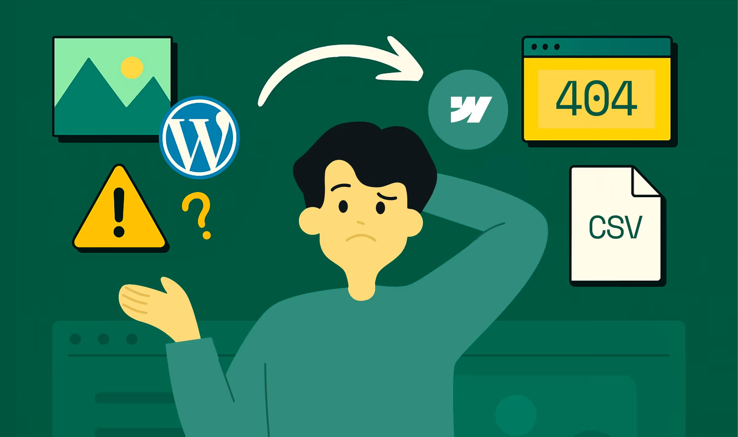
Webflow vs WordPress: Which Platform Is Better for Your Business Website in 2026?
Fintech Web Design That Builds Trust: 8 UX Principles Every Fintech Site Needs
Optimizing for Intent: How B2B Website Messaging and UX Changes Help Capture Top-Funnel Buyers


12 Best B2B Web Development Agencies in the US to Build Scalable Websites

From Audit to Action: 8-Step Process to Optimize Your B2B Website Strategy for 2026 Buyers

How to Design a High-Converting Landing Page from Scratch (2026 Edition)

From Click to Customer: Proven Landing Page Conversion Optimization Techniques

How to Write Website Copy That Converts: A Step-by-Step Guide for 2026

How to Optimize a Landing Page for Maximum ROI: A Step-by-Step Breakdown


AI Landing Pages That Convert: 7 Design Principles Every AI Platform Should Follow

From Traffic to Pipeline: B2B Website Growth Strategy for Scaling Teams
B2B Website Optimization Strategy: Speed, UX, SEO, and CRO in One Playbook

Outsourcing Webflow Maintenance vs. In-House Management: Which is Better?


SaaS Website Design That Converts: 7 Must-Have Elements to Win More Signups
Top 7 Webflow Integrations to Supercharge Your Website's Performance and Conversions

Outsourcing Web Development: Cost-Benefit Analysis for Startups & Enterprises


Interested in seeing what we can do for your website?


.webp)
