


10 Best Landing Page Designs in 2026 (With Takeaways You Can Use)


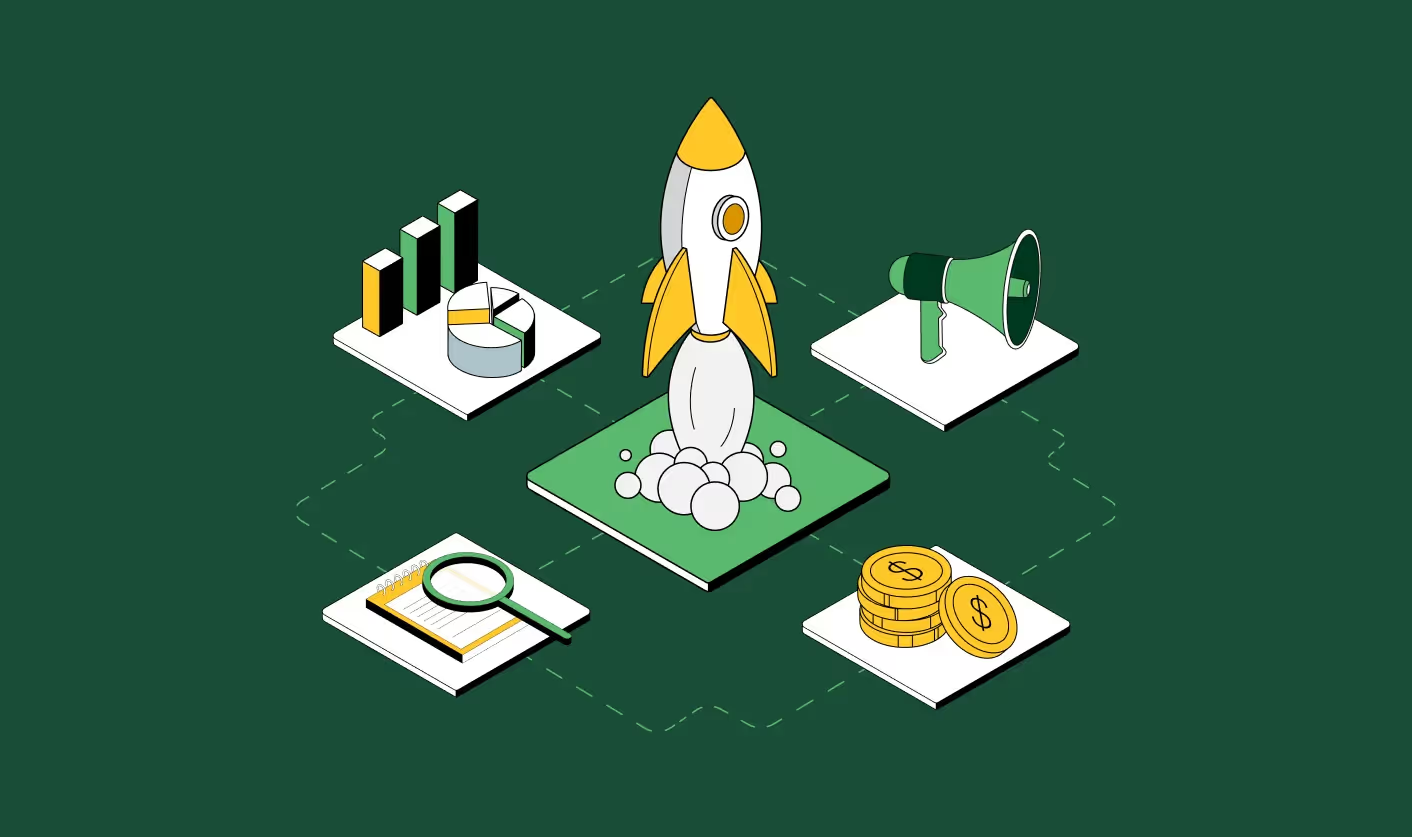
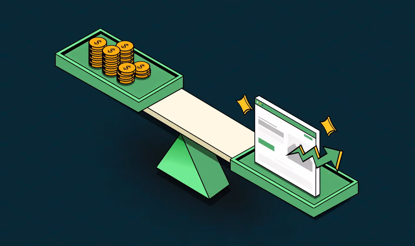
Here’s the hard truth: in 2026, your ads don’t win. Your content doesn’t win. Your targeting doesn’t win. Your landing page wins.
Why? Because it’s the one place where all your effort and spending converge (and where most brands lose the customer). You’ve paid for the click, grabbed attention for a few fleeting seconds… and if your landing page isn’t designed to convert, it’s game over.
We’ve worked on 129+ B2B websites like Amazon, Razorpay, and Factors. The difference between a good landing page and a great one isn’t subtle. It’s the difference between campaigns that bleed budget and campaigns that compound growth. That’s why we’re not here to show you a bunch of pretty pages. We’re here to break down the 10 best landing page designs in 2026, explain what makes them work, and give you takeaways you can put into practice right now.
Think of this as your landing page design inspiration playbook: part strategy, part teardown, and part checklist. By the end, you’ll know exactly how to evaluate your own pages and how to design landing experiences that don’t just look good, but actually drive conversions.
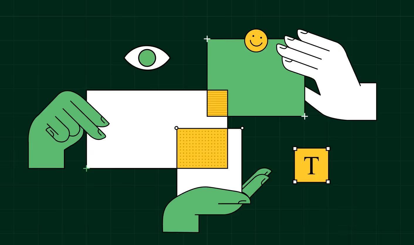
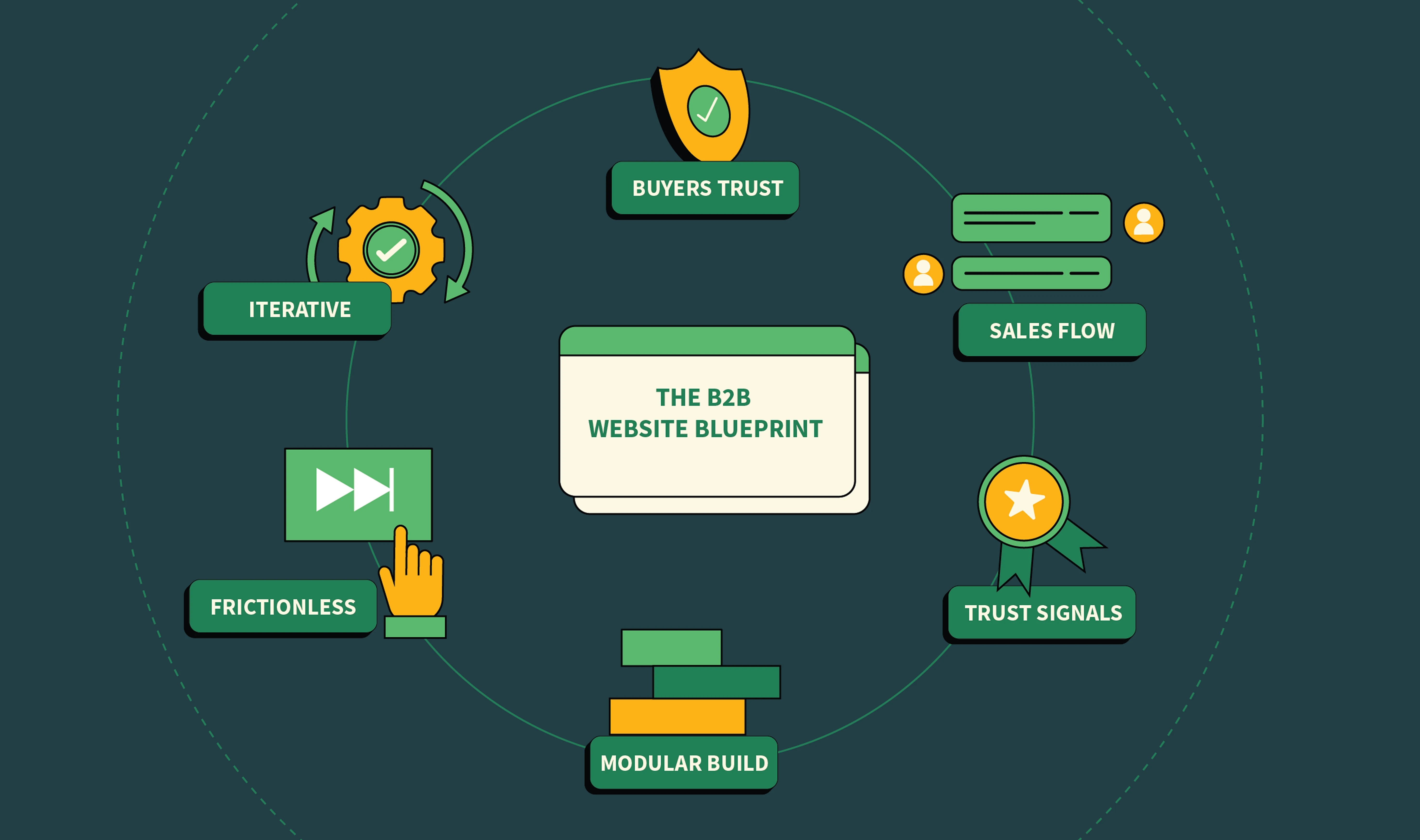
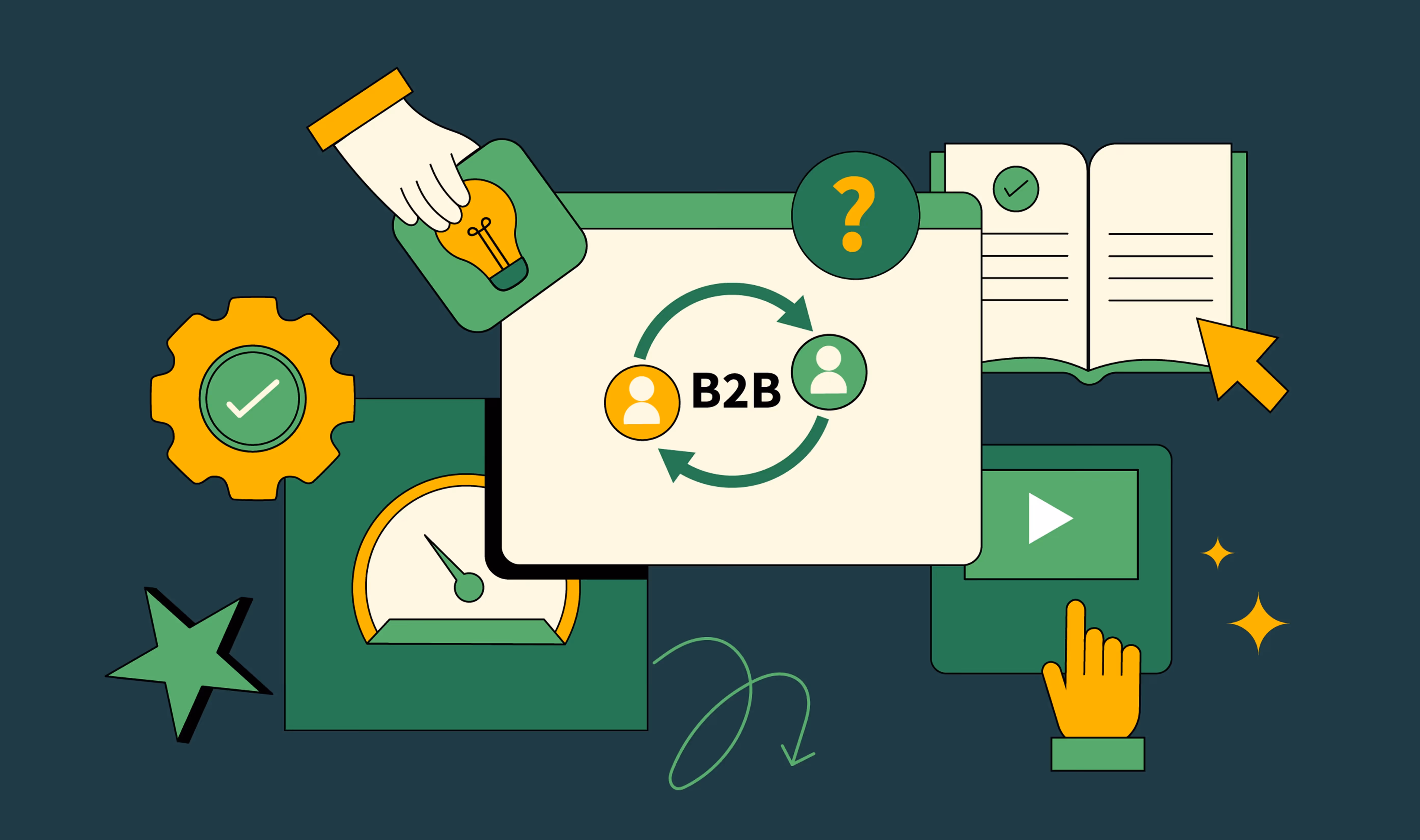
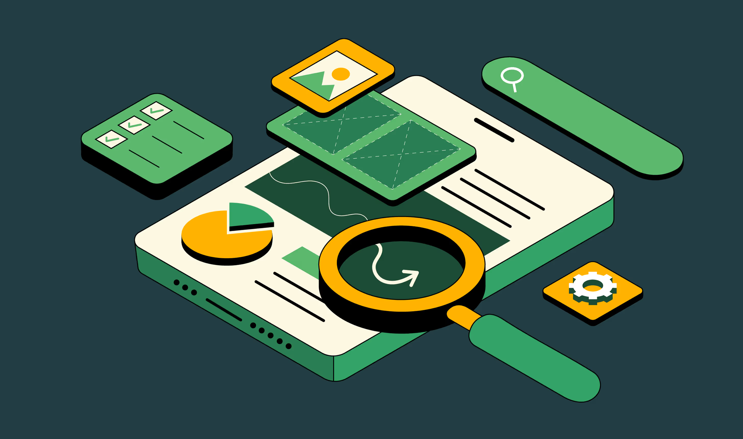
The CLEAR framework: how we evaluate landing pages
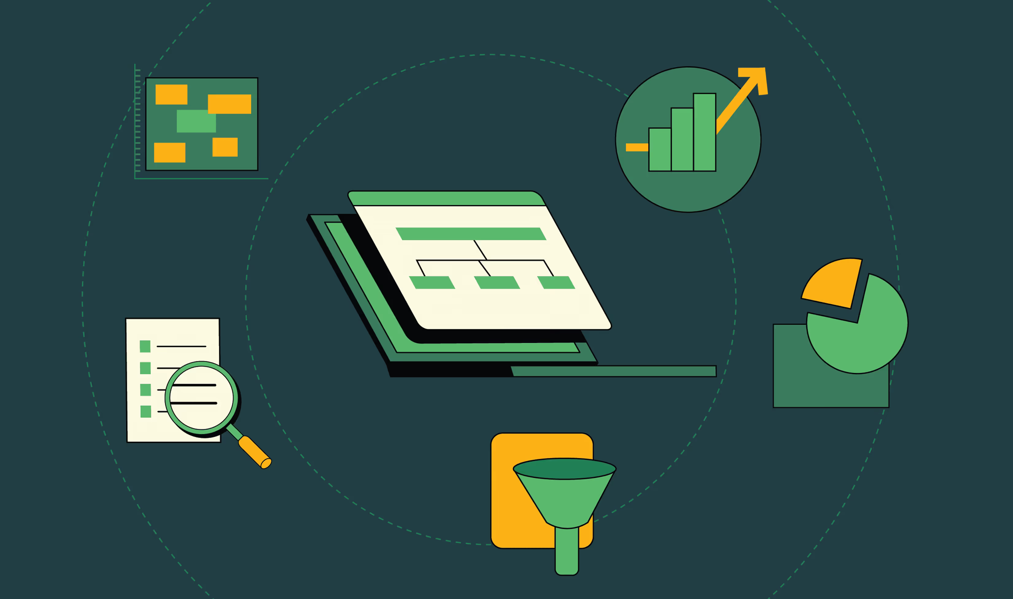
Before we dive into the best landing page design examples, let’s set the lens. A good landing page in 2026 isn’t defined by clever copy or slick design alone. You have to put all the pieces together to convert.
That’s why we use the CLEAR framework at ThunderClap for website and landing page revamps:
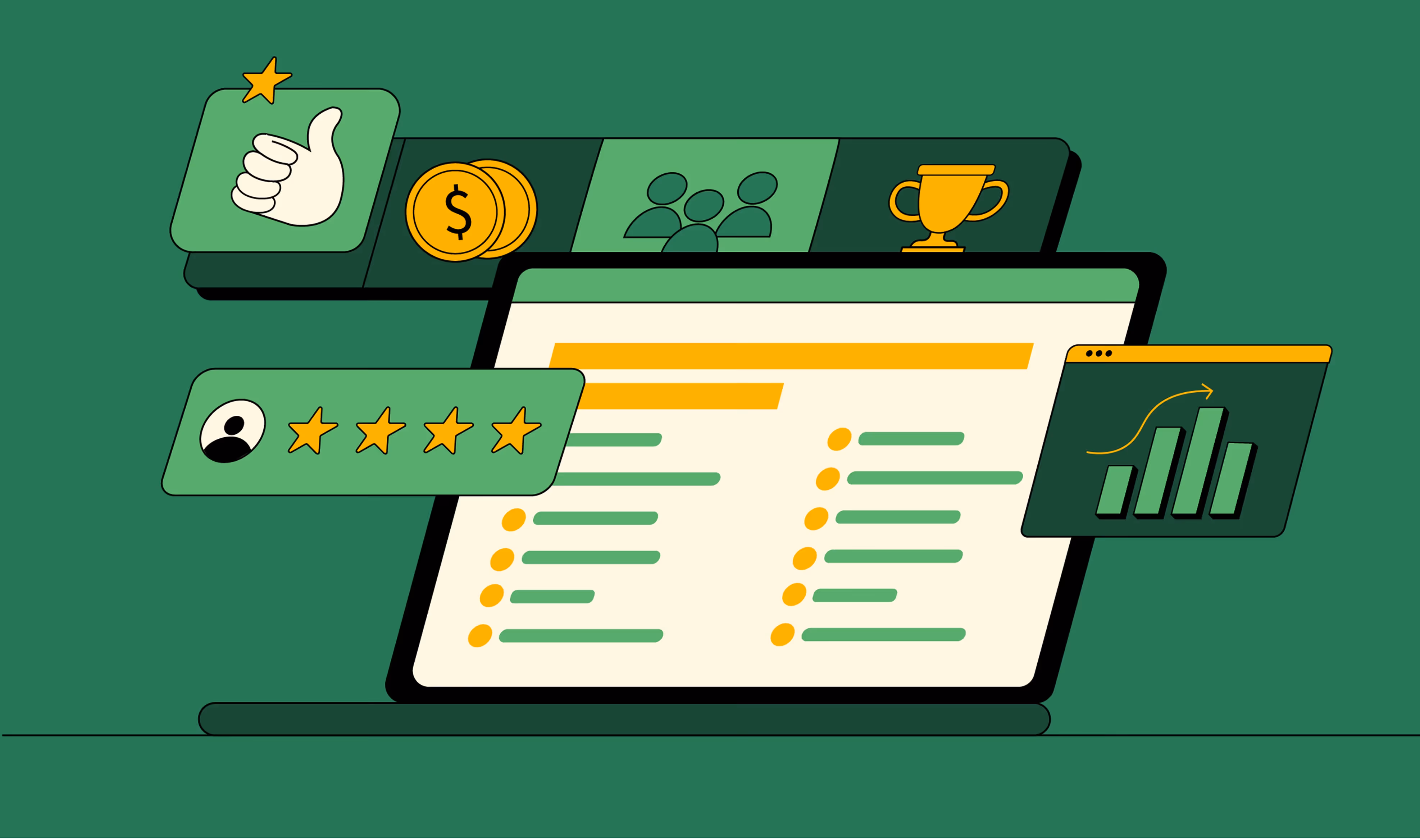
Every high-converting landing page we review below nails these elements in different ways. And the good news? You can take these patterns and apply them to your own web pages today.
We recently redesigned ConsultAdd’s website using the same principles and lifted conversions by 60%. Here’s a video walkthrough of the before and after of their home page makeover:
The 10 best landing page designs in 2026 (with takeaways)
Now that we’ve set the lens with the CLEAR framework, let’s explore how today’s top brands are applying these principles in practice. We’ve curated 10 of the best landing page designs in 2026, spanning SaaS, productivity platforms, AI startups, and communication tools.
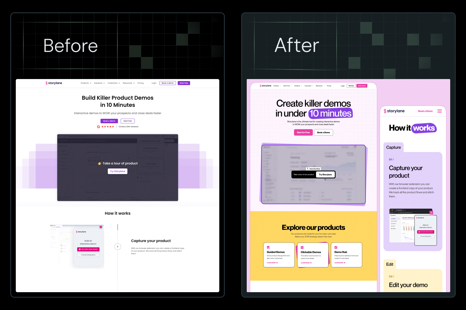
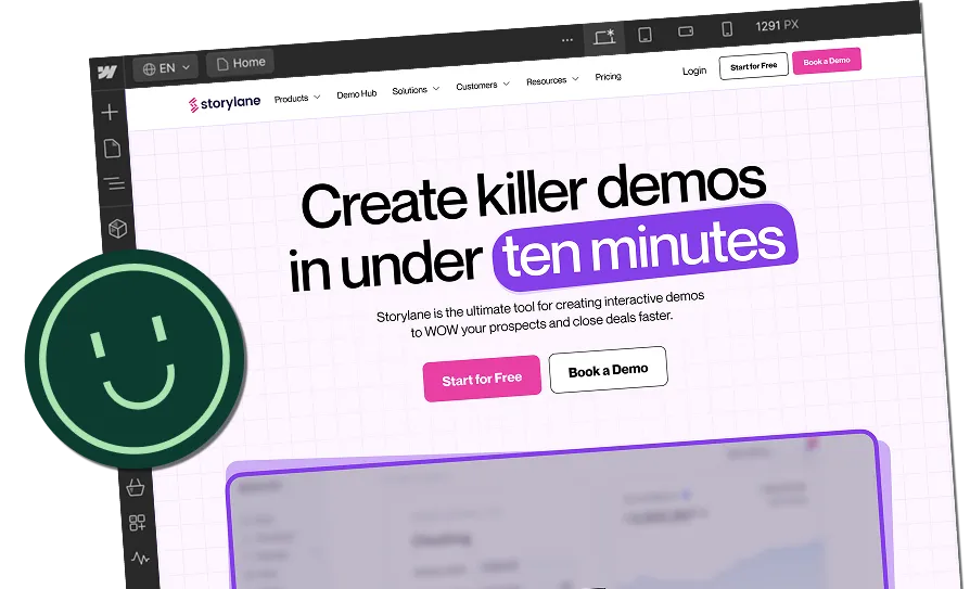
1. Storylane (a SaaS landing page where the demo is the design)
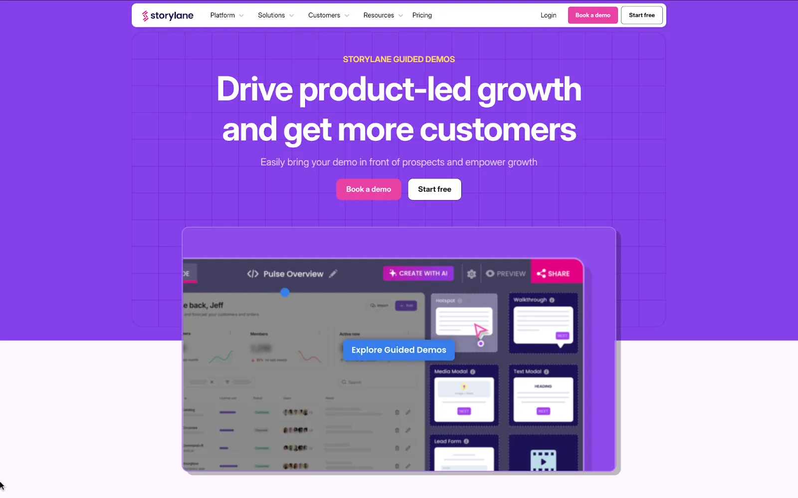
Storylane’s landing page overhaul is a masterclass in aligning design with personality. When they came to us, they had solid copy but felt their website lacked personality. Our mandate was clear: keep the words, transform the brand.
The copy stayed the same, but we changed everything around it. By introducing a bold, playful brand identity (clean fonts, a neutral base palette with pops of color, and custom illustrations), the page finally matched Storylane’s innovative positioning.
The results speak for themselves: 36% more website impressions and a 30% lift in demo requests since launch. Why? Because the design now amplifies the existing copy instead of competing with it.
The layout is modular and scannable, trust is established through logos and proof points, and the CTAs (“Get a demo”) are repeated consistently across every scroll segment.
📌 Read the full breakdown in this LinkedIn post by Kiran Kulkarni, Partner & Head of Growth at ThunderClap, including the exact design process and before/after insights.
Your takeaway from Storylane
If your product sells itself when shown, don’t bury the demo. Make it the centerpiece of your landing page and reinforce it with one clear, repeated CTA.
2. roommaster (a hospitality landing page built on trust and clarity)
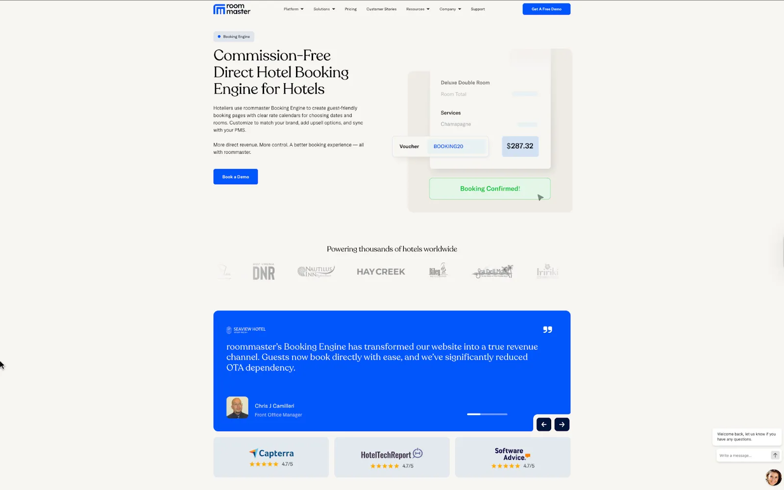
When roommaster rebranded from InnQuest, they trusted us to bring their new identity to life online. We built a landing page that makes the value proposition unmistakable: “Commission-Free Direct Hotel Booking Engine for Hotels.” Clarity is immediate, reinforced by testimonials and partner logos. We designed the layout to highlight benefits and use cases in a scannable, modular flow.
To spark emotion, we leaned on real hotel imagery, review badges, and credibility markers. For action, we kept it simple and consistent with a prominent “Get a demo” CTA. And for relevance, every section speaks directly to hoteliers who want to drive direct bookings.
Your takeaway from roommaster
Make benefits scannable. Break down key advantages into bite-sized blocks or cards that a busy reader can skim.
3. Deductive AI (a futuristic landing page example for AI startups)
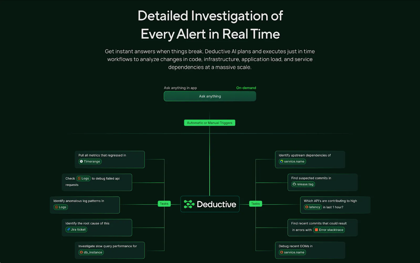
When two ex-MAANG leaders founded Deductive AI, they partnered with us to shape a bold brand identity and build a website from the ground up. We designed a dark, futuristic aesthetic to match their positioning as an “AI on-call engineer.” Clarity comes through in the concise headline and strong hero CTA.
The layout uses diagrams, flows, and modular sections to explain a complex product without overwhelming visitors. For emotion, the design leans into authority with encrypted security visuals, enterprise-grade messaging, and trusted integrations.
Action is consistent with clear CTAs (“Schedule demo”) placed across scroll depth. And in terms of relevance, every element speaks directly to technical teams who manage scale and reliability.
Your takeaway from Deductive AI
If your product is technical and complex, use visuals and modular flows to simplify the story without dumbing it down.
{{specficBlog}}
4. Factors (a B2B landing page that connects fragmented buyer signals into one story)
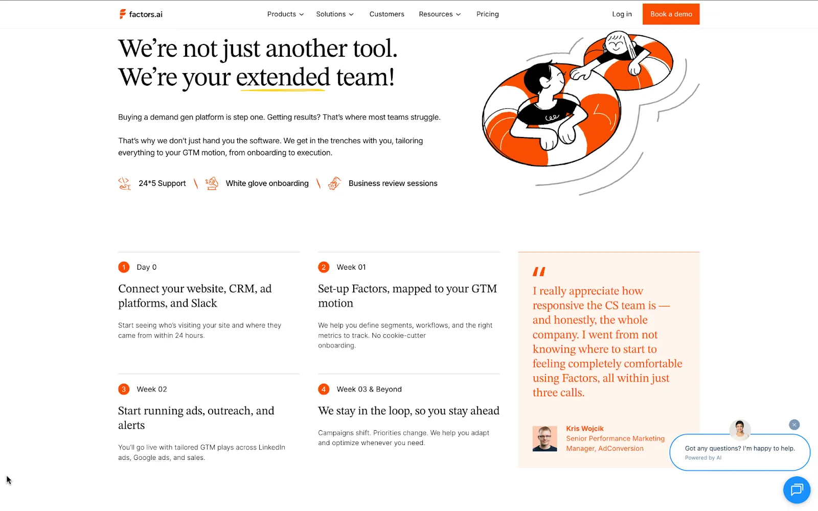
When Factors partnered with us, they wanted a landing page that could show the power of unifying scattered buyer data. We built the page to deliver clarity from the start with the headline “Know how your buyers move. Run campaigns that win.”
The layout tells a story step by step: why fragmented signals are a problem, how Factors solves it, and proof of success through testimonials and client logos. One of our favorite sections is the execution timeline section that walks visitors through the exact journey of using Factors. This narrative flow shows how insights move from messy signals to actionable campaigns in just 3 weeks (a feature most B2B pages lack).
To create emotion, we introduced bold patterns, vibrant colors, and human elements like customer quotes. Action is simple and repeated. “Get a demo” and “Learn more” CTAs guide the journey.
For relevance, enterprise-grade security badges and recognizable brands reinforce trust.
Your takeaway from Factors
If your product connects the dots, structure your landing page like a narrative (problem, solution, proof, action).
5. Mailmodo (an interactive landing page design for marketers)
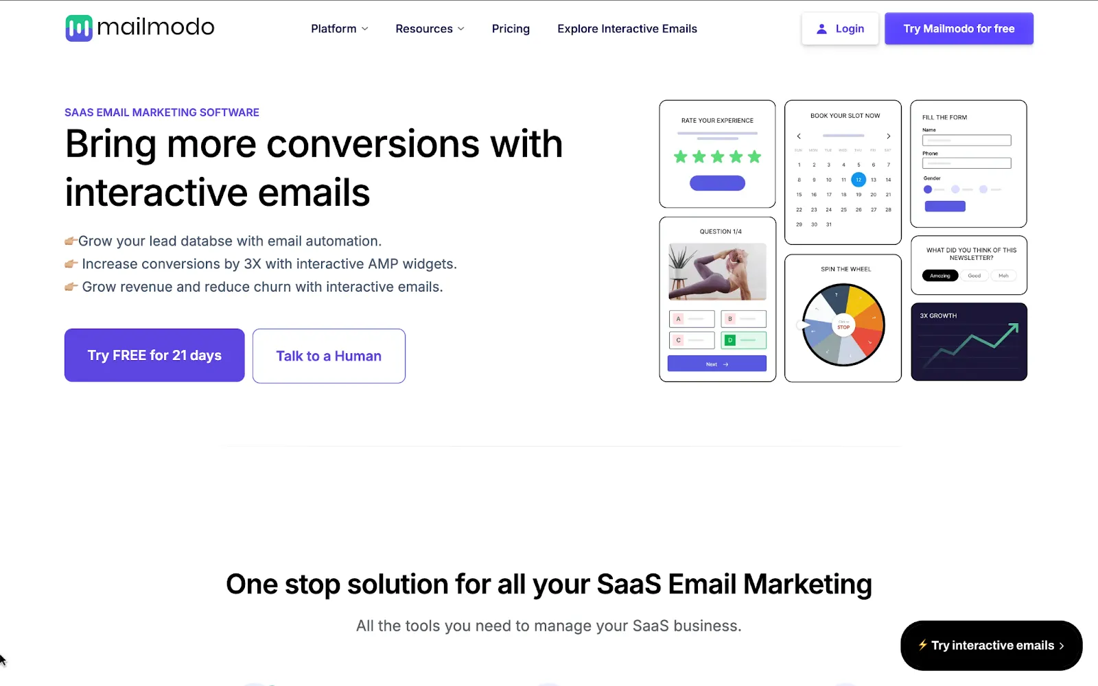
Mailmodo’s SaaS-focused landing page shows how tailoring content to a specific audience pays off. Clarity comes through the headline, “Bring more conversions with interactive emails”, followed by a subhead that positions it as “One-stop solution for SaaS email marketing.”
The layout is tailored for SaaS use cases: common flows like “user onboarding” and “feature adoption” are explained with visuals, followed by product screenshots and sample templates. Emotion is sparked through customer testimonials and logos from well-known SaaS brands, paired with ROI-focused language like “3X email conversions.”
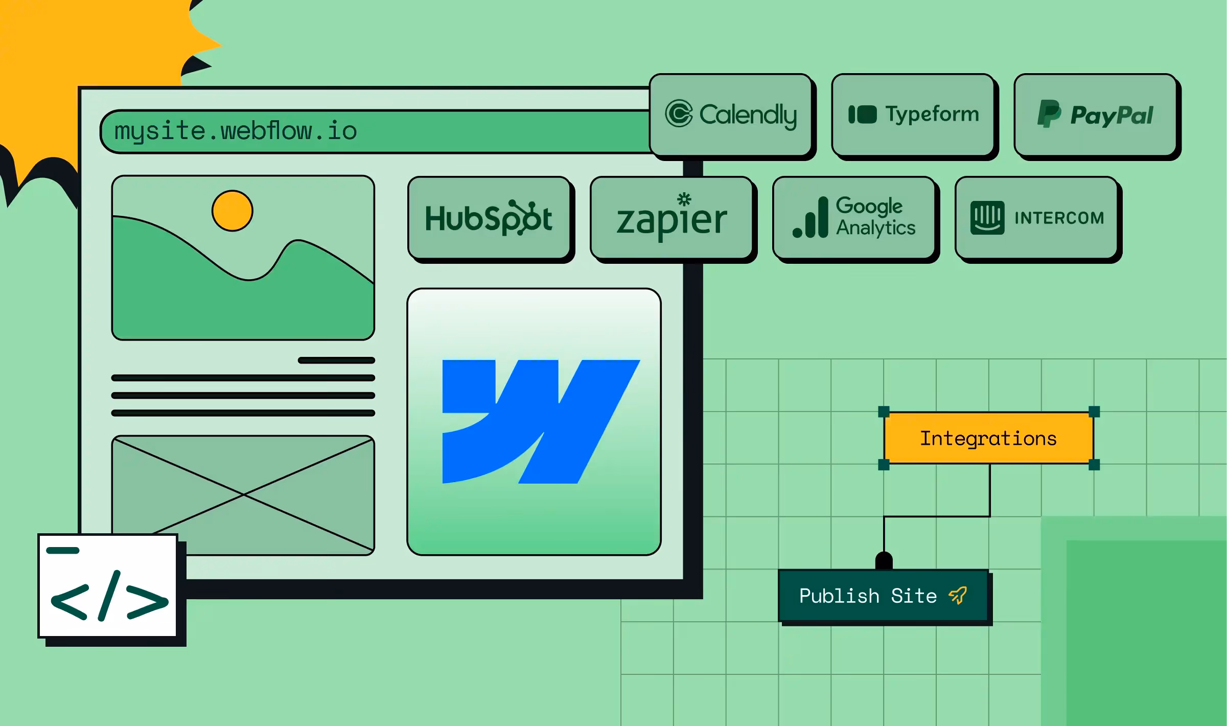
The action is consistent with “Start free trial” CTAs at natural scroll points. Relevance shines here: every example, from integrations (HubSpot, Salesforce, Zapier) to templates, is built for SaaS teams.
Your takeaway from Mailmodo
Build dedicated landing pages for your top personas or industries, showing their flows, their integrations, and their language, creates social proof.
Also read: Decoding The Above the Folds (ATF) Of 100 SaaS Brands [Backed by research]
6. Figma (a collaborative SaaS landing page that shows, not tells)
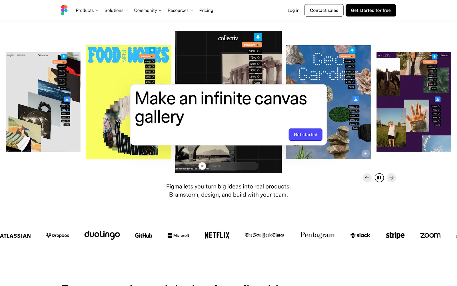
Figma’s landing page is a design-first experience that mirrors the product itself. Clarity comes from the headline “Prompt, code, and design from first idea to final product.”
The page opens with colorful project previews that set the tone. The layout is simple and visual. Screenshots, templates, and community examples show how teams use Figma. Emotion comes from bold colors, playful shapes, and proof from big names like GitHub. The action is direct. One clear “Get started for free” CTA anchors the page.
And relevance is strong because every block speaks to designers and developers working together.
Your takeaway from Figma
Use community work as proof. Highlight templates, creations, or examples from your users to show versatility and build social validation.
7. Miro (a visual landing page example that mirrors the product)
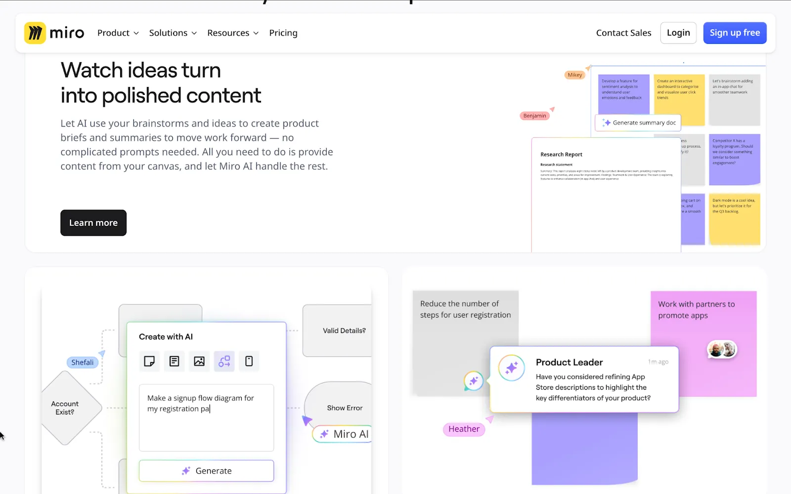
Miro takes a different route from the other pages we’ve seen. Where Figma highlights creativity and Storylane pushes demos, Miro puts collaboration at the center. Clarity comes fast: “Intelligent Canvas” plus a hero demo that shows sticky notes, flowcharts, and team comments in one place.
The layout is stacked with live-looking boards, widgets, and templates (you can almost imagine your team using it). Emotion isn’t about design flair here but togetherness. Headlines like “Collaborate as one team” and customer quotes make it feel human. Action is frictionless with “Start a demo” CTAs.
And the relevance is obvious: this page speaks to distributed teams trying to move faster together.
Your takeaway from Miro
Use templates as proof of value. Highlight ready-made templates or widgets so users know they can start fast without building from scratch.
If you run demos, use ThunderClap’s High-Converting Demo Page Playbook. We studied 30 B2B SaaS brands to identify landing page optimization strategies that leading brands employ on demo pages.
8. Loom (a video-first landing page design that builds instant connection)
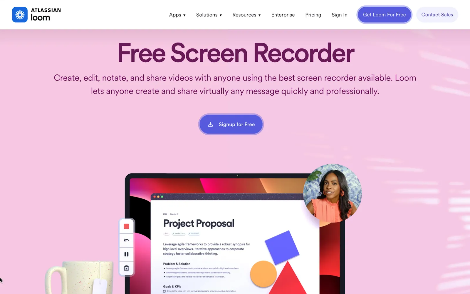
Loom’s is a landing page design inspiration if you want to lead with product in action. Clarity comes from the headline “Free Screen Recorder” and the hero visual of a recording interface with a human face on screen.
The layout is straightforward: top features in a checklist, then blocks for capture, editing, sharing, and feedback. Emotion comes through people-centered visuals and playful touches like emoji feedback.
Action is simple and consistent with “Start recording” CTAs that appear throughout. And relevance is strong because the page highlights specific use cases from project proposals to market research and availability on iOS and Android.
Your takeaway from Loom
If your product is about communication, put people at the center of your visuals, not just the tool.
Also read: 20 Proven SaaS Conversion Optimization Hacks to Boost Your Sales
9. Canva (a landing page that proves speed and scale with templates)
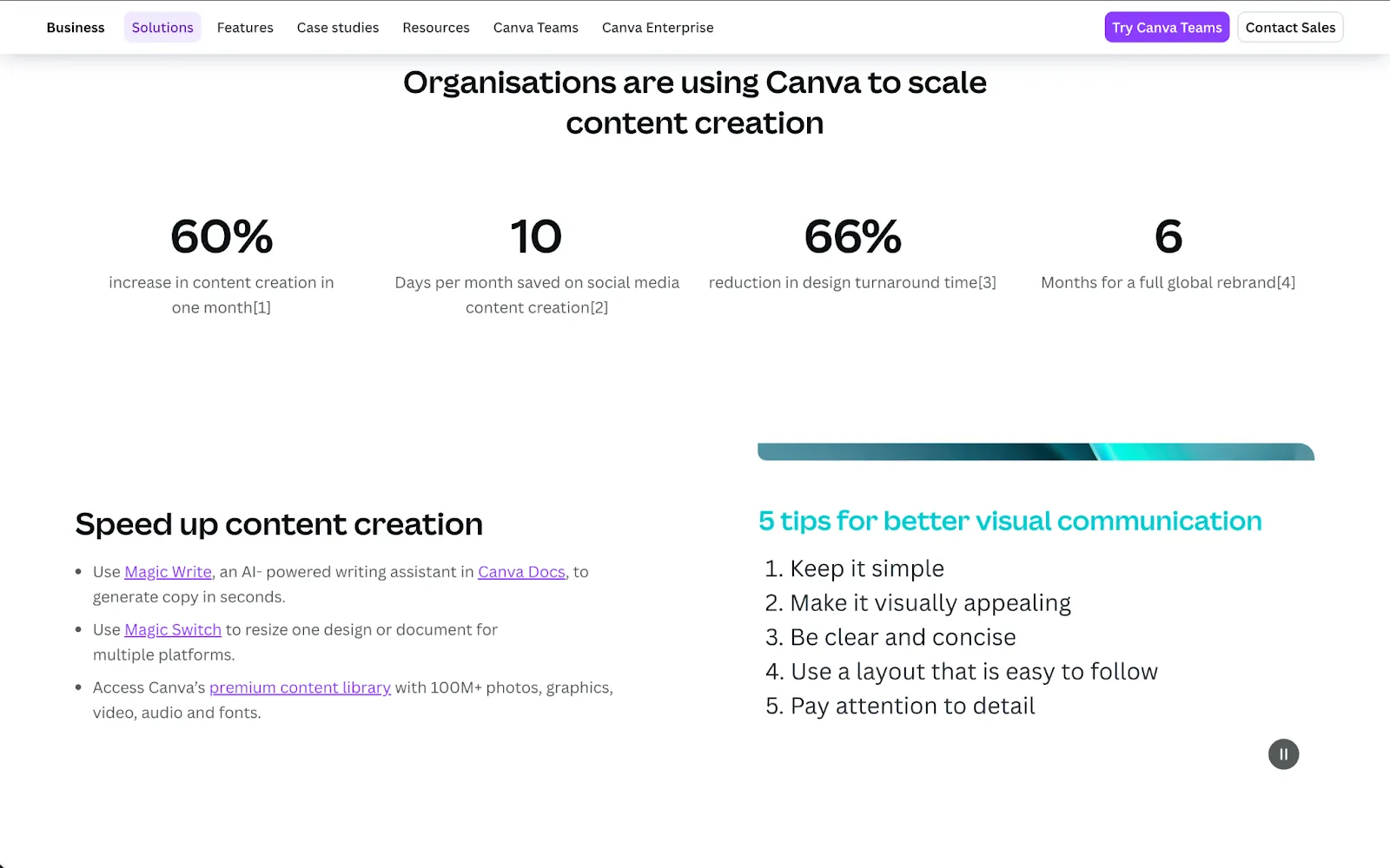
Canva’s page doubles as a product demo and a template marketplace. The headline, Create better content, faster, tells you what it does in one line. The layout then proves it. Big product screenshots sit next to template galleries, use-case blocks, and team-focused messaging. Emotion comes from bright visuals and diverse mockups that feel approachable to non-designers.
Action is simple. A single, clear CTA appears throughout. Relevance is where Canva outpaces others. It sells speed, brand control, and repeatable content workflows for teams. It pairs product features with actual templates, guides, and resources so visitors can start creating right away.
Your takeaway from Canva
Build template-driven flows for your top use cases so visitors can see how fast they can get real work done.
10. Zoom (a platform landing page built for enterprise momentum)
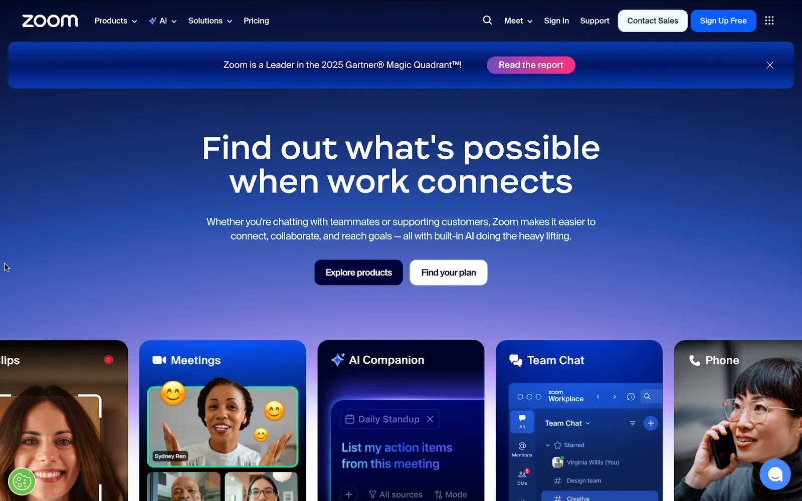
Zoom’s home page is one of the best SaaS landing page examples showing how to position a full platform without overwhelming visitors. Clarity comes from the headline “Find out what’s possible when work connects” and product cards that instantly preview core tools like Meetings, Team Chat, and AI Companion.
The layout is modular: hero → product cards → AI highlight → customer proof → use cases, each block clean and easy to scan. Emotion is built through credibility — enterprise logos, customer ratings, and stories from companies like Major League Baseball. Action is flexible: CTAs let you sign up free, explore features, or learn about AI.
And relevance is high: copy and imagery speak directly to enterprise teams managing hybrid work at scale.
Your takeaway from Zoom
If your product is a suite, structure your landing page so visitors can pick their own entry point without losing clarity.
Also read: 10 Hottest B2B Web Design Trends You Need in 2026
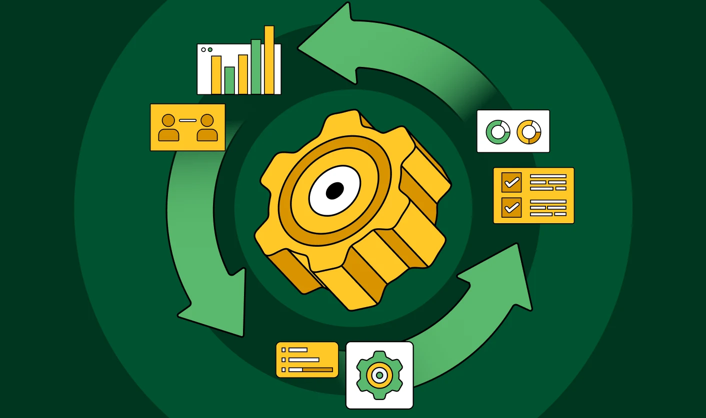
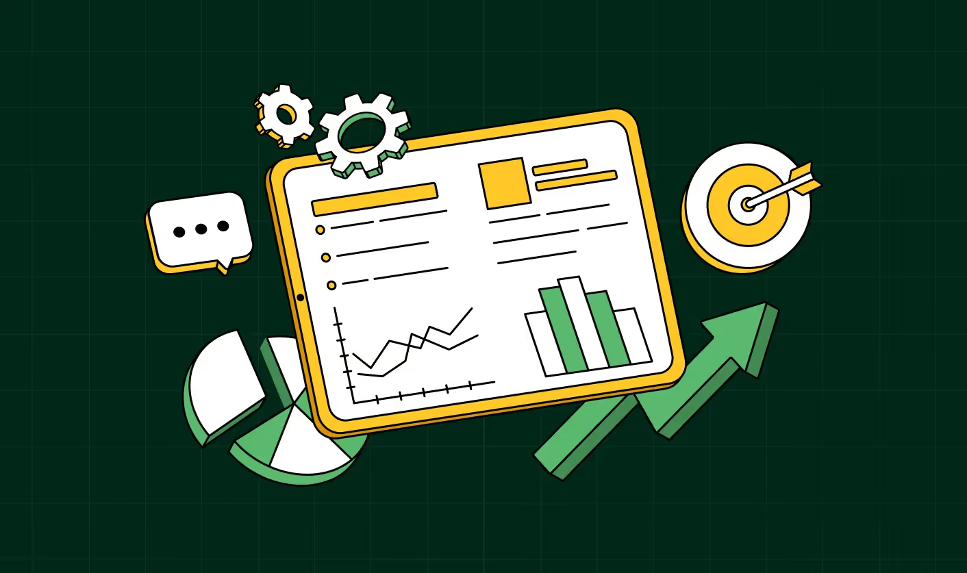
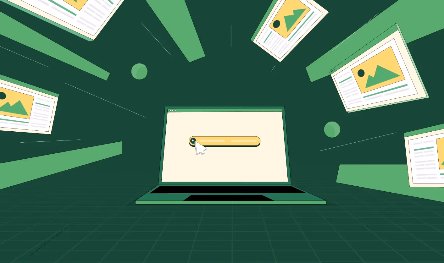
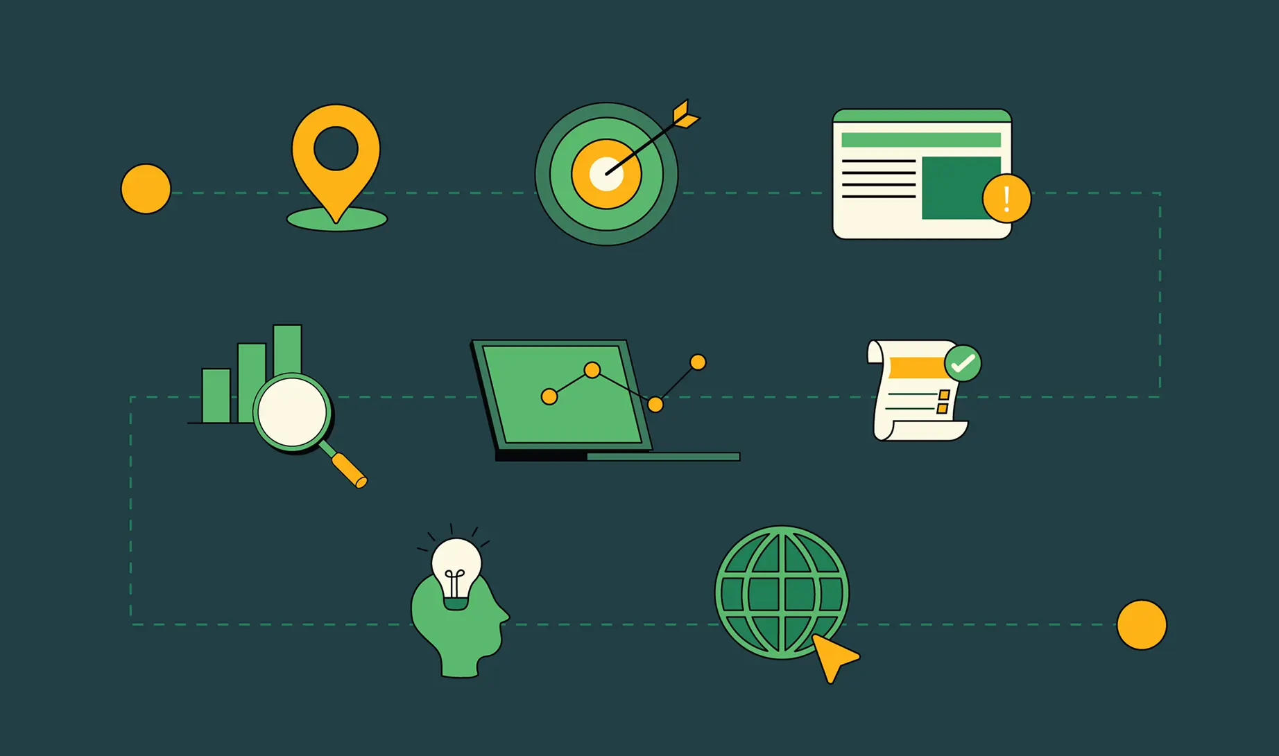
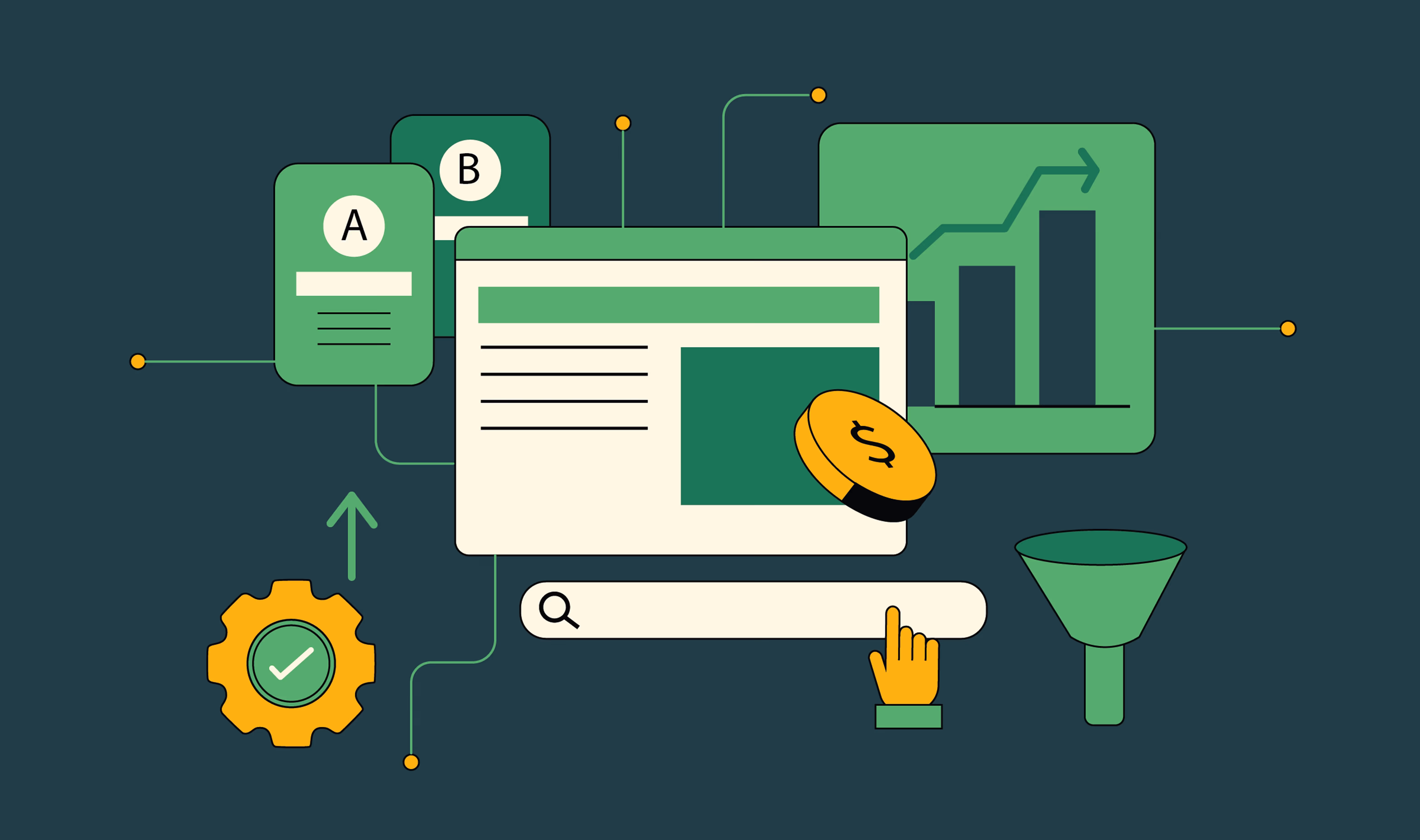
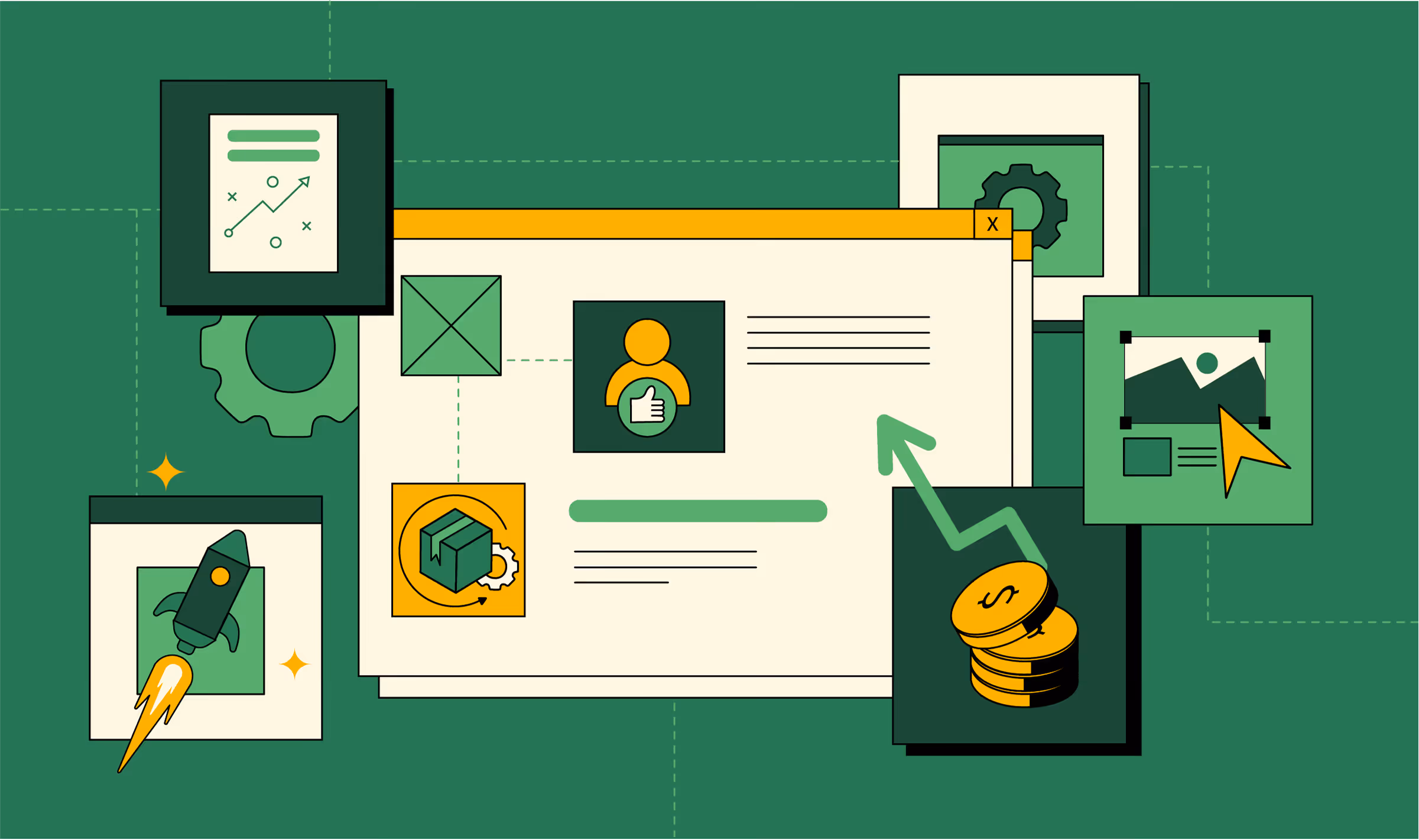
Best practices for landing page designs: apply CLEAR to your own landing pages
After breaking down the best landing page designs, we don’t want you walking away thinking, “Cool, but what do I do with this?” Inspiration is nice, but execution wins. That’s why we built the CLEAR checklist on the same framework we use at ThunderClap to help brands design landing pages that actually convert.
Here’s the quick infographic version of the CLEAR checklist:
And if you want the full details, here’s the step-by-step breakdown of each element:
Clarity
- Can a new visitor explain your offer back to you in one sentence? Test this with someone outside your team.
- Is the headline benefit-driven (what I get), not product-driven (what you do)?
- Remove jargon, acronyms, and filler — every word should earn its spot.
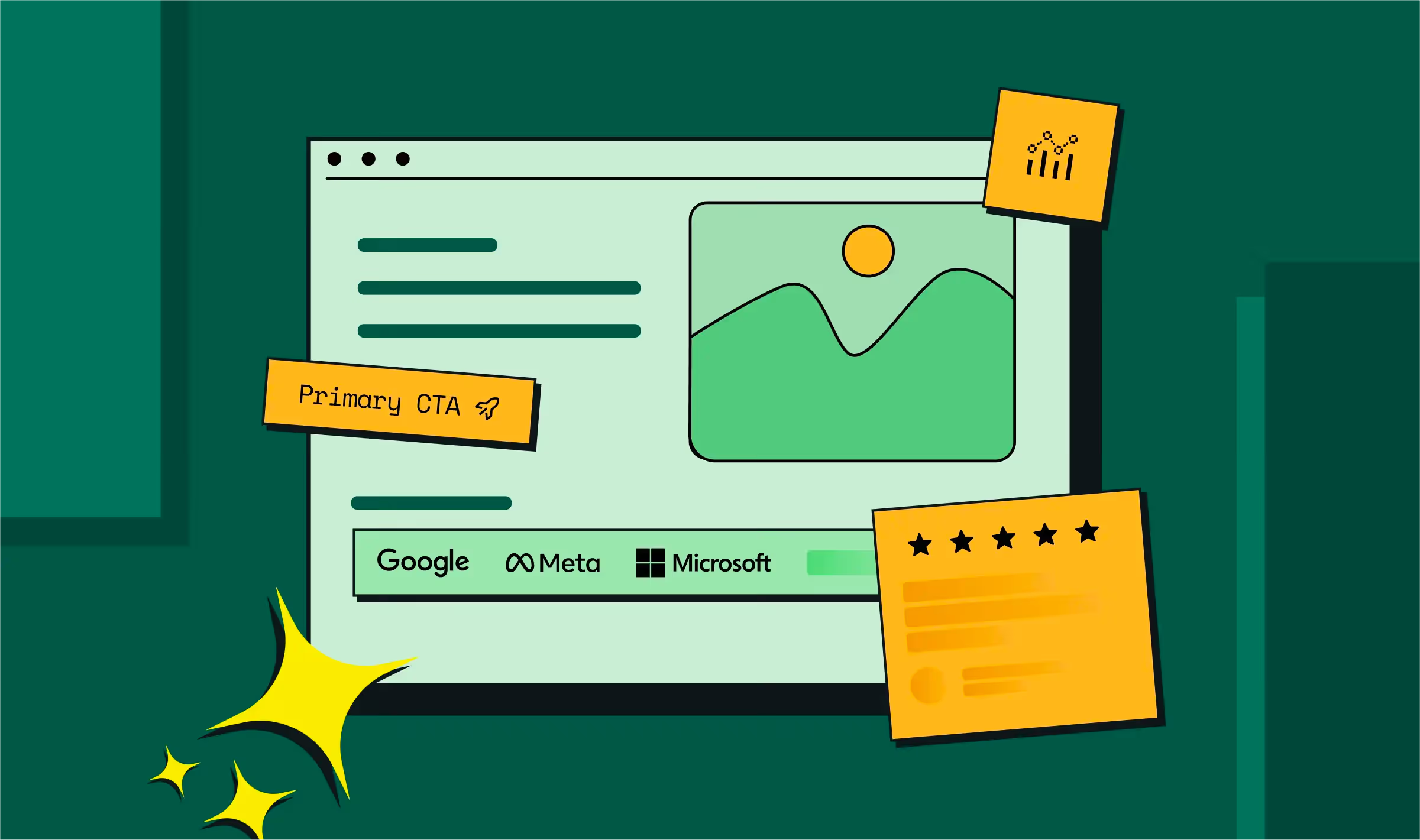
- Above-the-fold: one headline, one subhead, one CTA. Nothing more.
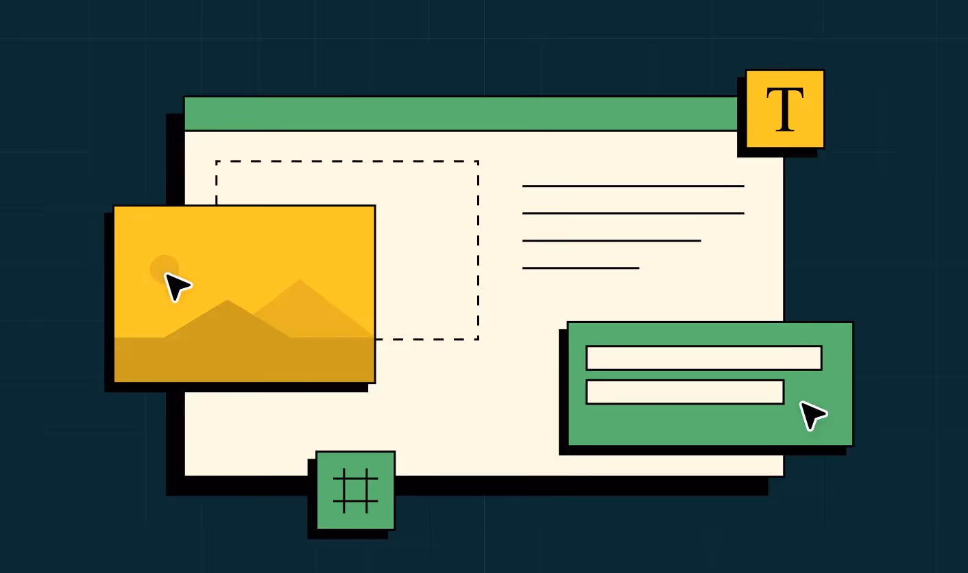
Layout
- Does your page follow a natural “F-pattern” or “Z-pattern” for scanning?
- Is the hero image aligned with the message (no random stock photos)?
- Are forms short, frictionless, and mobile-friendly?
- Have you trimmed visual clutter (multiple CTAs, carousels, distracting menus)?
Emotion
- Does your page trigger trust (logos, testimonials, case studies, security badges)?
- Are you tapping into urgency (limited seats, countdowns) or aspiration (success stories, future state)?
- Is there video, motion, or interactivity to engage beyond static text?
- Does the imagery feel human and relatable, not generic?
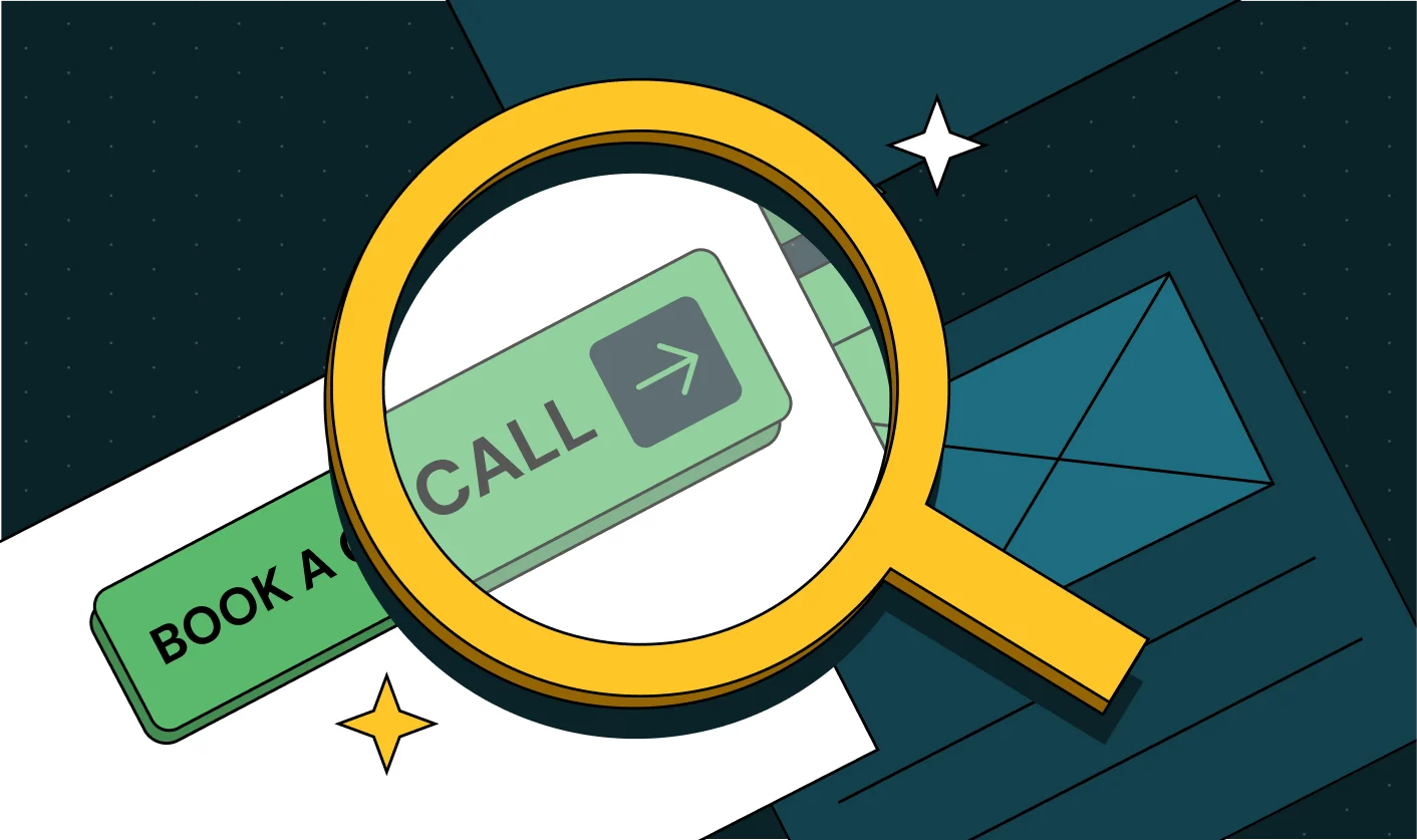
Action
- Is there exactly one primary CTA? (Sign up, Start free trial, Book a demo)
- Is the CTA button copy benefit-driven (e.g., Get started free vs. Submit)?
- Is the CTA visible without scrolling, and repeated logically as the user moves down the page?
- Do you offer a low-friction “secondary action” for fence-sitters (watch a demo, learn more)?
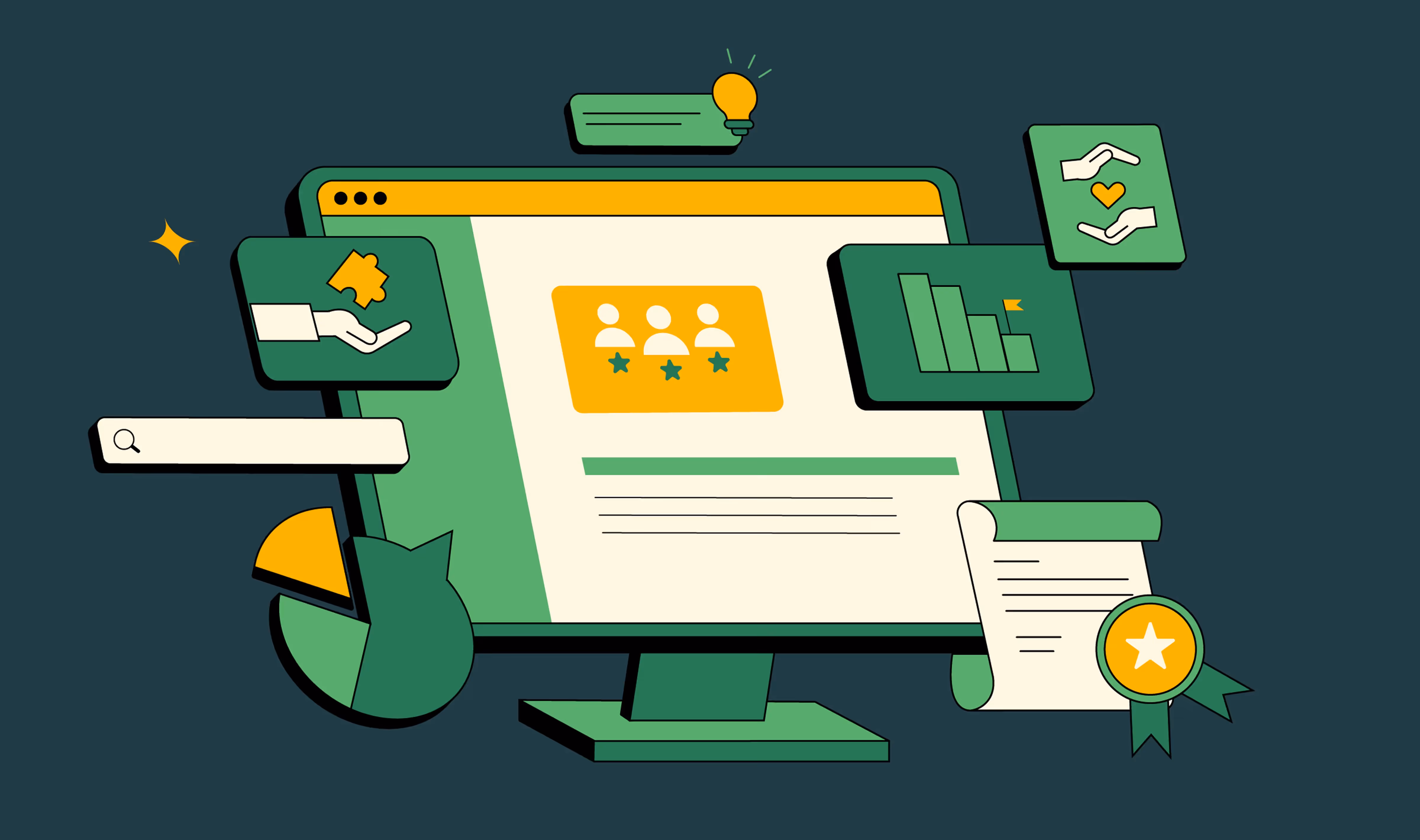
Relevance
- Does the landing page headline mirror the ad/email/search copy that brought the visitor there?
- Is the page segmented or personalized (by industry, persona, or geography)?
- Does the design work seamlessly on mobile, tablet, and desktop?
Have you tested load speed? Every second delay costs conversions.
How to use this checklist?
- Print this out
- Use it as a 5-step landing page audit
- Run every new campaign through CLEAR before launch
Turning landing pages into growth engines with ThunderClap
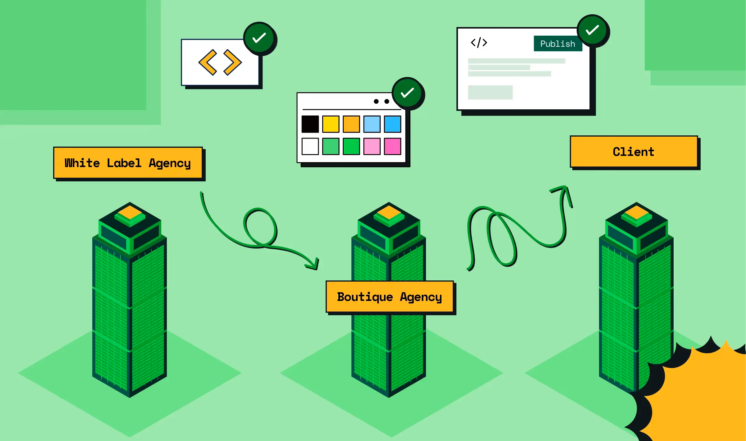
At ThunderClap, we know a landing page is never just a page. It’s your most important growth lever. We’ve optimized and redesigned 129+ B2B websites like Storylane, Amazon, Factors, roommaster, Deductive AI, and Zenda, and built their landing page experiences from the ground up.
Our work speaks for itself. Storylane lifted demo requests by 30%, and Zenda’s rebrand earned an Awwwards nomination.
Our process is proven. We start with mood boards that capture brand personality. We establish scalable systems for consistency. We bring products to life with custom illustrations, bold yet clean layouts, and trust-driven storytelling.
With us, you get:
- Bold design that matches your product’s personality.
- Scalable systems that keep visual consistency as you grow.
- CRO playbooks proven across SaaS and fintech.
- A partnership mindset (acting as an extension of your team).
If you’re ready to make your landing page your #1 salesperson, let’s talk. We’ll audit your funnel, pinpoint the leaks, and build a roadmap that gets you results in weeks, not months.
{{ctaBlock}}
FAQs
Do landing page design trends change every year?
Yes, trends in landing page design inspiration evolve constantly as user behavior and technology shift. In 2026, the best landing page designs highlight speed, AI-powered personalization, and mobile-first layouts. While core principles like clarity and strong CTAs remain timeless, keeping up with best practices for landing page designs ensures your page looks modern and drives conversions.
Can I use templates for landing pages, or should I design custom ones?
Both approaches can work. Templates are a fast way to get started, but custom designs give you more control. The best SaaS landing page examples often start with a template and evolve into custom layouts once teams see what converts. Whether you choose templates or custom, following best practices for landing page designs (clear messaging, strong visuals, and one focused CTA) is what matters most.
What are some examples of high-converting landing pages?
In 2026, some of the best landing page designs come from SaaS and fintech brands. Pages like Storylane, roommaster, and Zenda stand out because they combine clarity, trust signals, and relevance with consistent CTAs. If you’re looking for landing page design inspiration, explore the best SaaS landing page examples; they are often the clearest demonstration of how to turn design into conversions.


.webp)
Browse Similar Articles
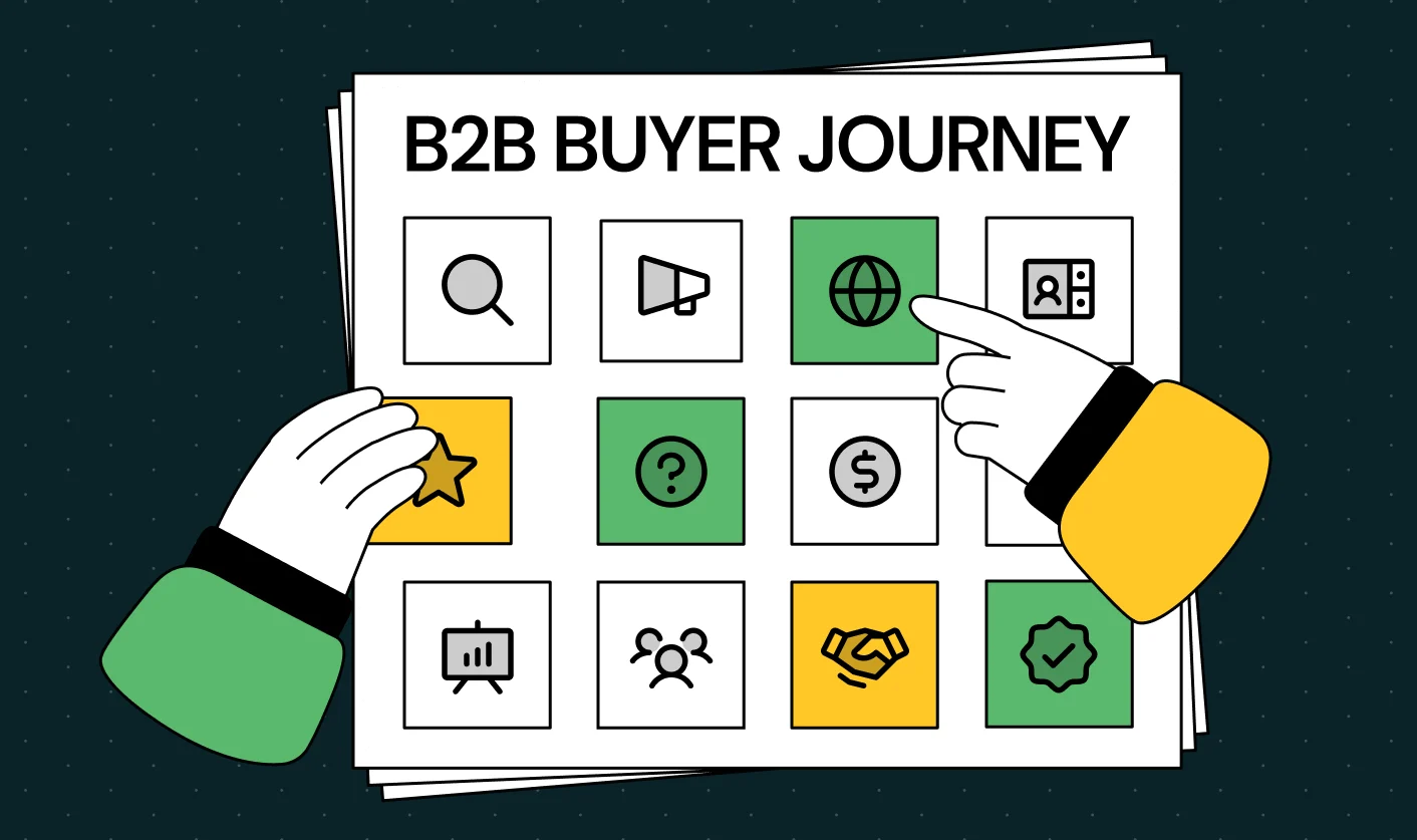
Mapping the B2B Buyer Journey to Improve Conversions Across Every Touchpoint

.svg)
.webp)
7 Best Website Maintenance Companies in India for Growth-Led B2B Teams (2026)

.webp)
8 Best Healthcare Website Design Agencies for HIPAA-Compliant Sites in 2026
How to Find the Best Web Design Company in Houston, Texas for B2B Brands (6 Best Picks)
Positioning That Wins: How to Make Complex B2B Products Clear and Compelling

The Step-by-Step Website Redesign Process B2B Teams Use to Increase Conversions (Without Killing SEO and Pipeline)
7 Best Video Production Agencies for SaaS Product Walkthroughs and Feature Videos

How to Choose the Best B2B Website Maintenance Company: 9 Questions to Ask Before You Hire One

How to Choose a Web Design Company in San Francisco in 2026 (with Examples)

10 Best Web Design Companies in Florida in 2026 and How to Choose the Right One
How to Use Brand Storytelling on Your Website to Close More B2B Deals and Build Buyer Trust
SaaS CRO Best Practices: What High-Growth Brands Do Differently to Win Conversions
How a Rebranding Agency Can Redefine Your B2B SaaS Identity and Boost Pipeline
B2B Marketing Trends in 2026 That Directly Influence Pipeline and Revenue
Top 7 Video Marketing Agencies Driving B2B SaaS Brand Awareness in 2026
Why Partnering with a B2B Brand Positioning Agency Accelerates Market Differentiation

The Complete Website Redesign Checklist for B2B SaaS Teams Ready to Scale
.avif)
9 Best Webflow Development Agencies in India for 2026 (In-Depth Review)
10 Product Marketing Companies Powering the Fastest-Growing SaaS Brands in 2026
Website Copywriting Services vs In-House: What's Right for Your Business?

How to Choose a Marketing Agency That Understands B2B SaaS Growth Metrics


How to Choose a Video Marketing Agency That Understands B2B Storytelling
Outsourcing Web Design: Cost-Benefit Analysis for Mid-Market & Enterprise Brands
From Leads to Lifetime Value: How Growth Marketing Agencies Scale SaaS Revenue
Build a B2B Website Strategy That Aligns with Sales and Marketing Goals
Webflow vs WordPress: Which Platform Is Better for Your Business Website in 2026?
Fintech Web Design That Builds Trust: 8 UX Principles Every Fintech Site Needs
Optimizing for Intent: How B2B Website Messaging and UX Changes Help Capture Top-Funnel Buyers

12 Best B2B Web Development Agencies in the US to Build Scalable Websites
From Audit to Action: 8-Step Process to Optimize Your B2B Website Strategy for 2026 Buyers
How to Design a High-Converting Landing Page from Scratch (2026 Edition)
From Click to Customer: Proven Landing Page Conversion Optimization Techniques
How to Write Website Copy That Converts: A Step-by-Step Guide for 2026

How to Optimize a Landing Page for Maximum ROI: A Step-by-Step Breakdown

AI Landing Pages That Convert: 7 Design Principles Every AI Platform Should Follow

From Traffic to Pipeline: B2B Website Growth Strategy for Scaling Teams
B2B Website Optimization Strategy: Speed, UX, SEO, and CRO in One Playbook
Outsourcing Webflow Maintenance vs. In-House Management: Which is Better?

SaaS Website Design That Converts: 7 Must-Have Elements to Win More Signups
Top 7 Webflow Integrations to Supercharge Your Website's Performance and Conversions
Outsourcing Web Development: Cost-Benefit Analysis for Startups & Enterprises


Interested in seeing what we can do for your website?


.webp)
