


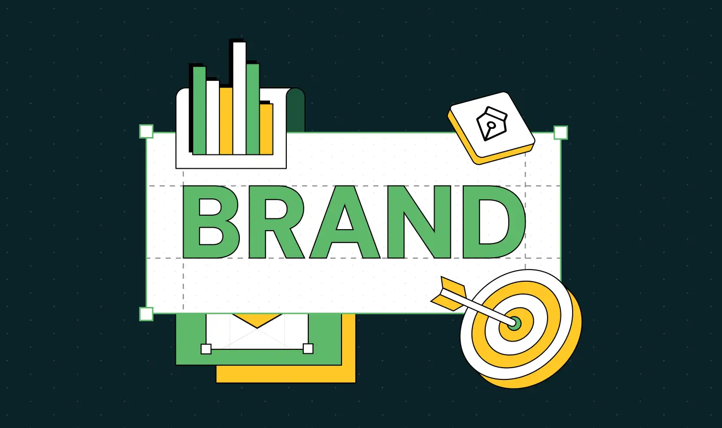
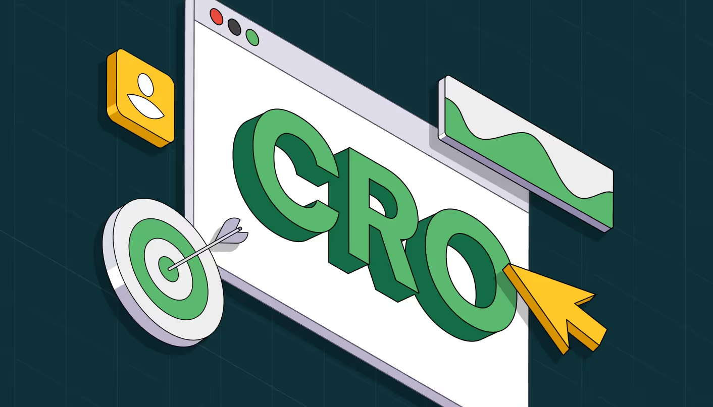
SaaS Website Design That Converts: 7 Must-Have Elements to Win More Signups

Here’s a hard truth most B2B SaaS teams learn too late: you can have a best-in-class product, a rock-solid sales process, and a funnel full of qualified leads, but if your website isn’t designed to convert, you’re leaving money on the table.
At ThunderClap, we’ve helped dozens of B2B SaaS companies fix underperforming websites with design systems rooted in conversion strategy. As a conversion-focused SaaS website design agency, we understand how user psychology, UI/UX, and storytelling intersect to drive signups, demos, and pipeline.
This isn’t just a design conversation. It’s a business one. If you want your site to work as hard as your sales team, this guide will walk you through the 7 must-have elements of a high-converting SaaS website design. Let’s get into it.
Why SaaS Website Design Matters More Than You Think
You only get one shot to make a first impression. Your SaaS website is your most important sales rep. It’s the first touchpoint for most prospects and the hub of your digital marketing funnel. Yet, the average SaaS conversion rate from visitor to lead is just 2.1% for SEO traffic-and often lower for other channels. With SaaS marketing more competitive than ever, even small improvements in conversion rates can drive exponential growth.
Key stats:
- 94% of first impressions relate to your site’s design.
- SaaS brands with optimized lead capture tools and user journeys see significant increase in conversions and MRR.
- In 2025, AI-driven personalization and seamless user experiences are top SaaS marketing trends.
And with buyers increasingly self-educating before ever talking to sales, your website must:
- Educate and qualify users quickly
- Demonstrate product value
- Guide users to take action
This is where conversion-first B2B SaaS website design and development make all the difference.
7 Must-Have Elements for High-Converting SaaS Website Design
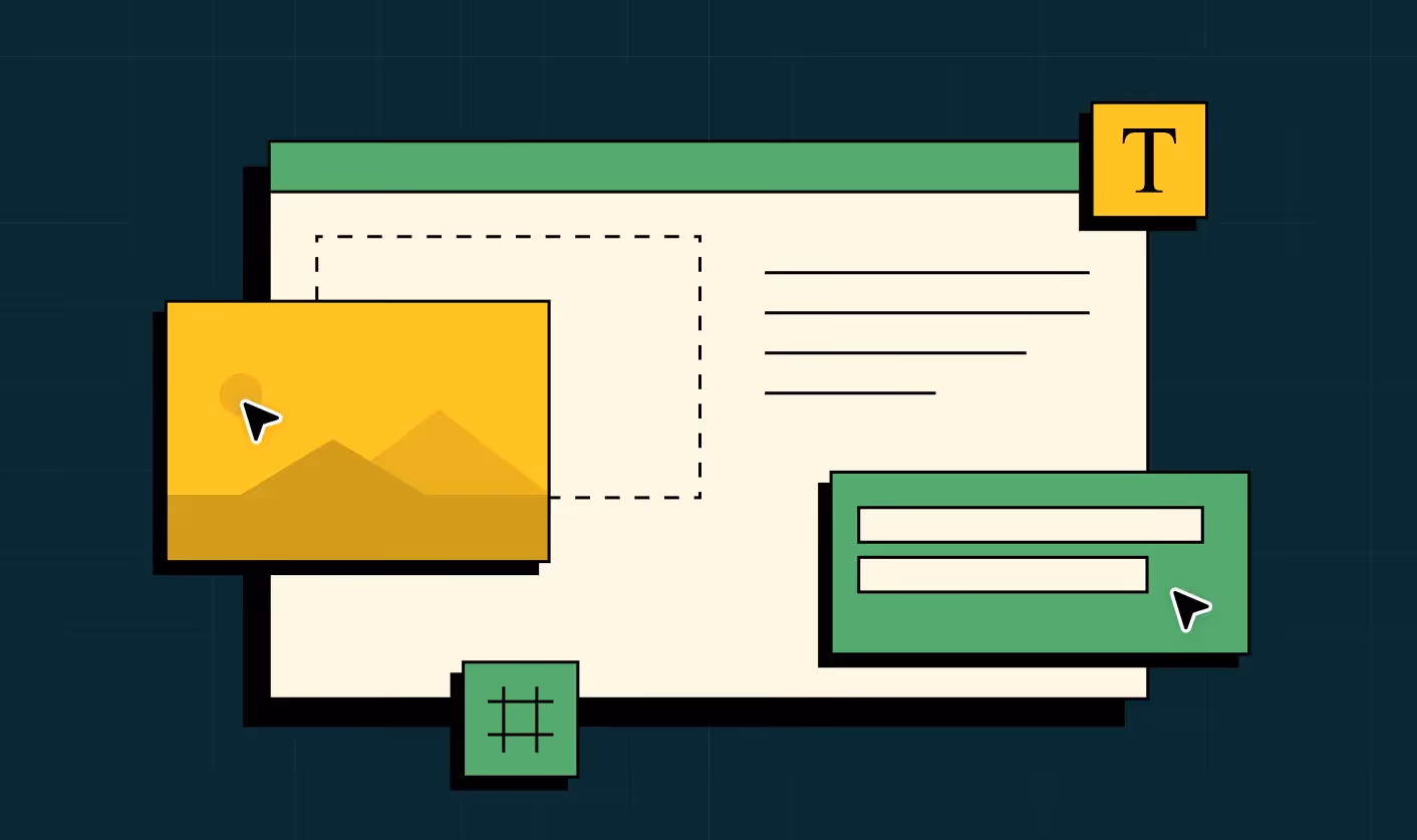
1. Homepage Conversion Flow Structure
Why it Matters
A homepage is not a brochure. It functions as a guided sales conversation. Every section should move prospects closer to clarity and action. The winning structure mirrors the buyer’s decision path: Hero → Proof → Pain → Solution → CTA.
Open with a Hero that reflects the visitor’s world, not your product. Lead with a pain or desired outcome that resonates instantly. Clarity and empathy beat cleverness.
Follow with Proof to establish trust early. Logos, metrics, and recognizable clients build confidence before evaluation begins.
Then highlight the Pain. Articulate the frustration and cost of the status quo with specificity. Make the problem undeniable so urgency builds naturally.
Present your Solution as the clear path to relief and progress. Emphasize outcomes and transformation, supported by simple visuals or demos.
Close with a focused CTA. Offer a primary conversion path plus a softer option for those still evaluating.
This flow guides visitors from recognition to conviction to action.
Example
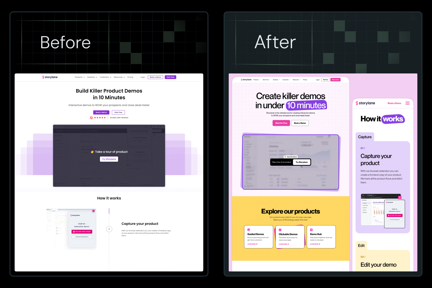
RoomMaster nails this with: “The complete hospitality platform built for the way you actually work”
Why it Works
- It highlights the value prop upfront
- It uses active, persuasive language
- It speaks to hospitality leaders who are obsessed with a great guest-experience
- The subheadline follows up with clear positioning and audience fit
The design supports this messaging with clean, white space that centers attention on the headline and CTA. The above-the-fold hero includes only the essentials: one CTA button and a product illustration that immediately shows users what the product looks like in action.
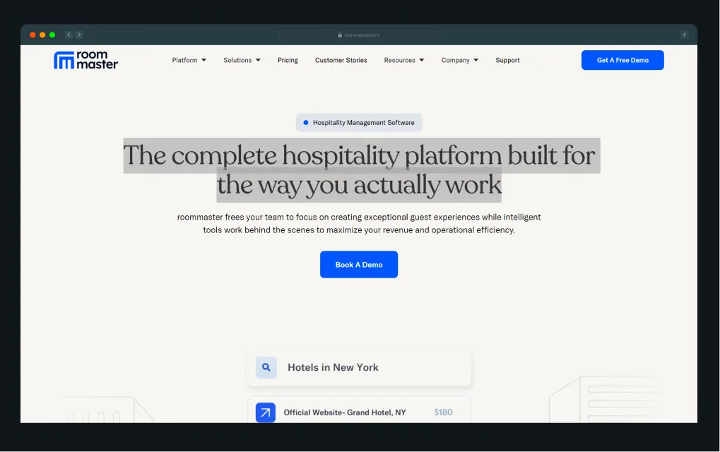
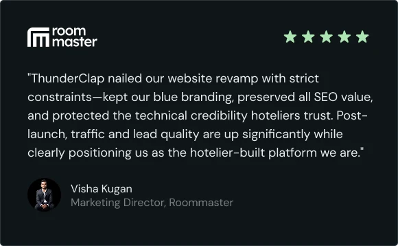
In partnership with ThunderClap, roommaster achieved an 80% lift in demos and organic traffic post-revamp! Read the full breakdown by Ayush Barnwal, Partner & CEO, ThunderClap.
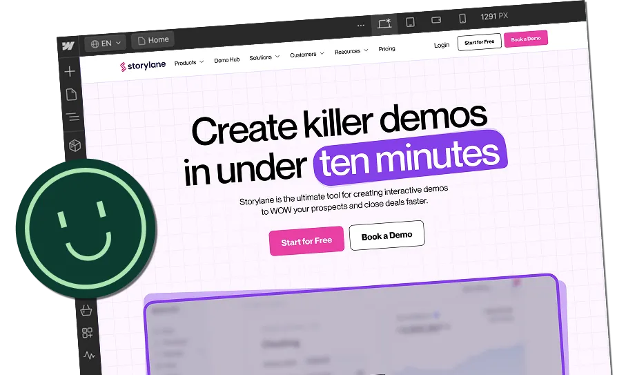
2. Above-the-Fold CTAs
Why it Matters
Your hero section should do more than look good. It should drive action. CTAs like “Start Free Trial,” “Book a Demo,” or “See It in Action” should be prominent, value-driven, and repeated thoughtfully.
Example
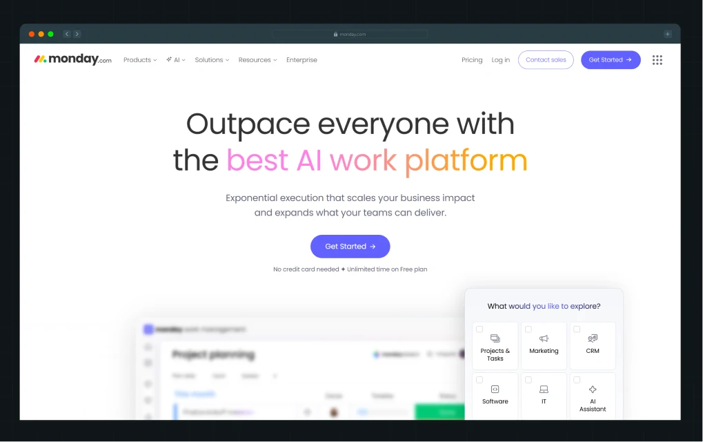
Monday.com places multiple CTAs above-the-fold, each aligned with the user’s likely intent. Every CTA caters to different entry points in the user journey. The main CTA “Get Started” or “Request a demo” is visually prominent with a contrasting button color, making it impossible to miss.
Why it Works
- The hero section includes a visual of the dashboard, contextualizing what users will experience
- The supporting copy highlights a pain point and resolution (“Manage everything in one workspace”)
- Scroll-triggered sticky CTAs keep the action accessible across the journey
3. Compelling Social Proof
Why it Matters
Generic testimonials like ‘Great product!’ or ‘5 stars!’ don't move the needle. Prioritize proof that speaks to business impact, speed, and relevance.
Structure testimonials to answer real buyer questions and quantify results. Focus on: Clear Problem → Solution → Result narratives.
Example
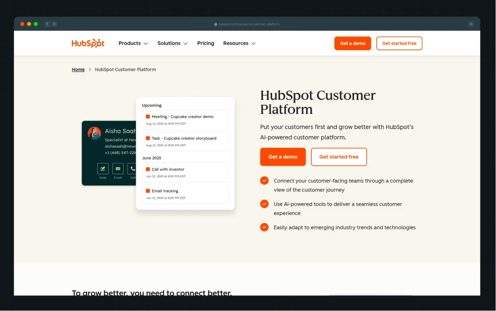
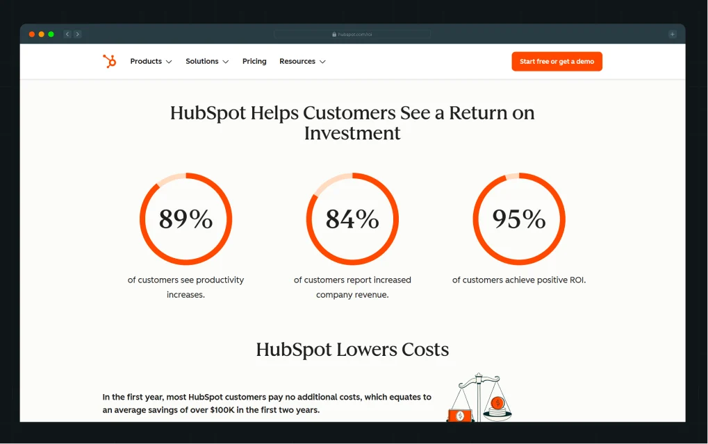
HubSpot integrates social proof throughout the homepage and key landing pages. At the top, you’ll see a grid of well-known customer logos that builds immediate credibility. Scroll further and you’ll find well-researched and data-backed ROI reports filled with testimonial quotes and customer success videos.
Why it Works
- Logos provide instant recognition and trust
- Testimonials are paired with metrics (“50% increase in lead conversion”)
- Case studies add depth and emotional connection
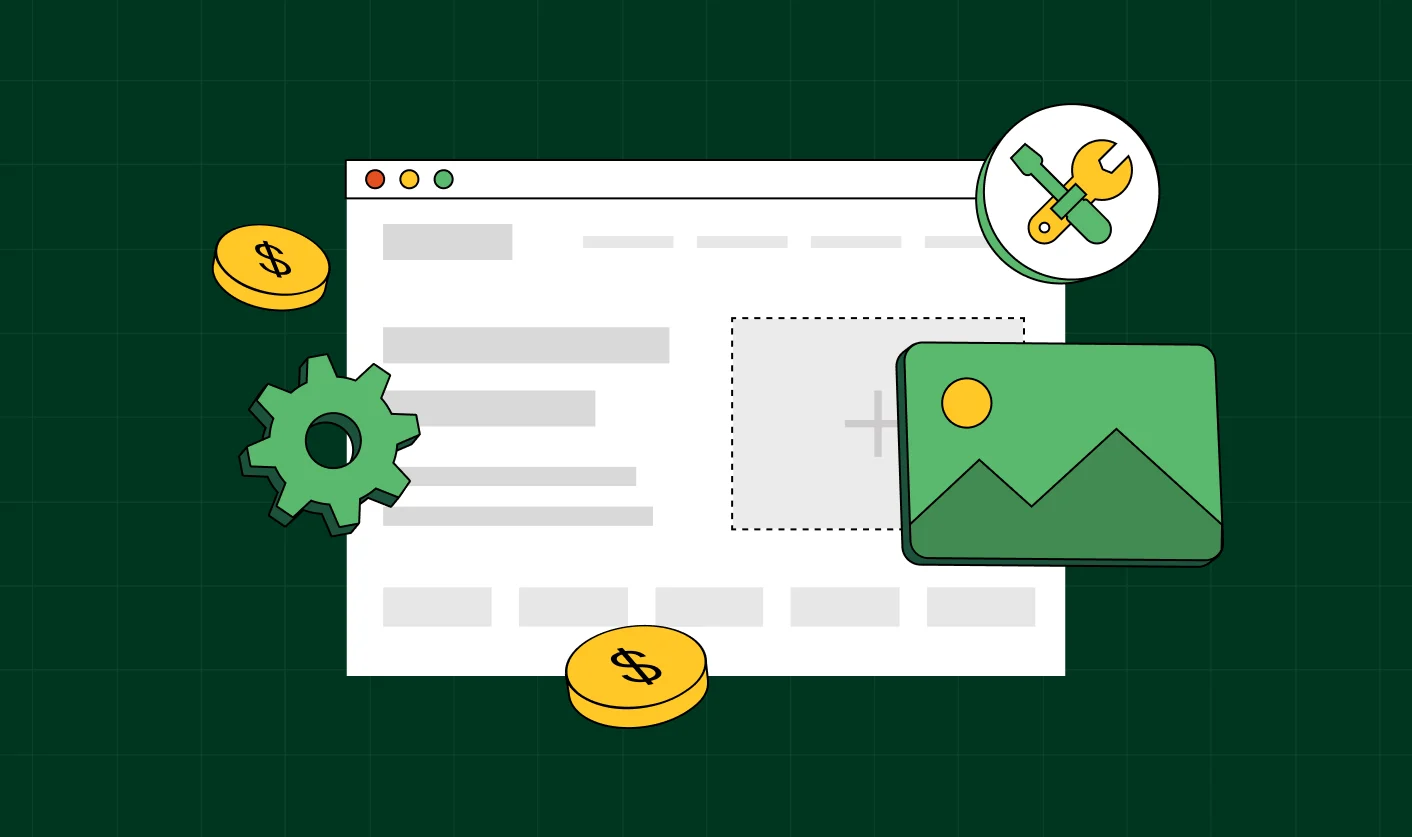
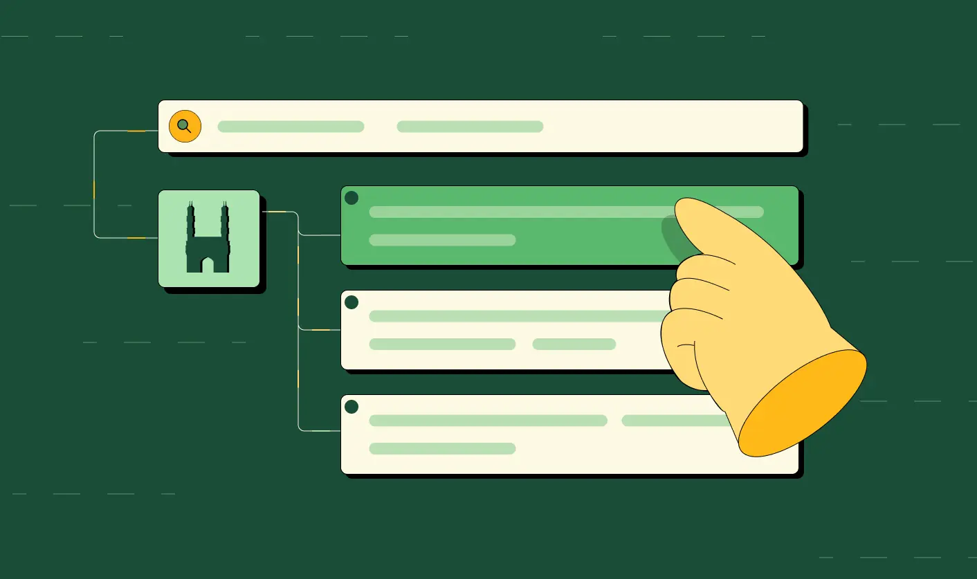
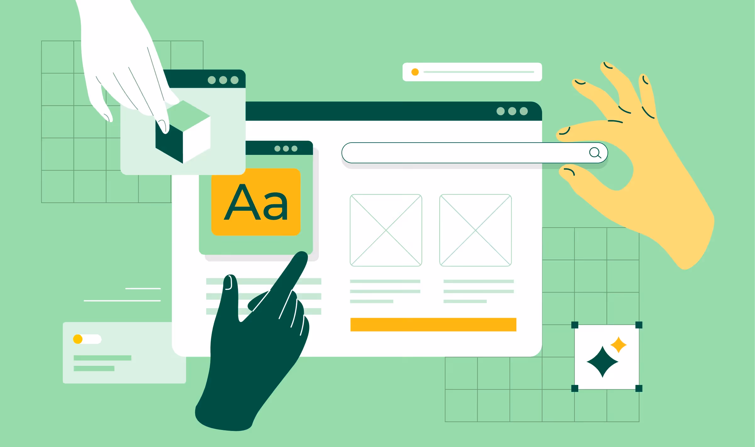
4. Feature-Driven Visual Hierarchy
Why it Matters
The best SaaS website designs organize content around benefits, not just features. Strategic layout and hierarchy guide the user journey and spotlight high-value differentiators.
Example
Airtable delivers an excellent example of visual hierarchy in action. Their homepage is structured in clean, modular sections that highlight use cases like “Marketing,” “Product Operations,” and “Portfolio Project Management.”
Why it Works
- Each section includes an icon, headline, short description, and in-product visual
- Users can scan and understand capabilities without reading blocks of text
- The color palette subtly differentiates between sections without overwhelming
This modular approach makes it easy for users to self-identify which feature set applies to them, increasing engagement.
.webp)
{{specficBlog}}
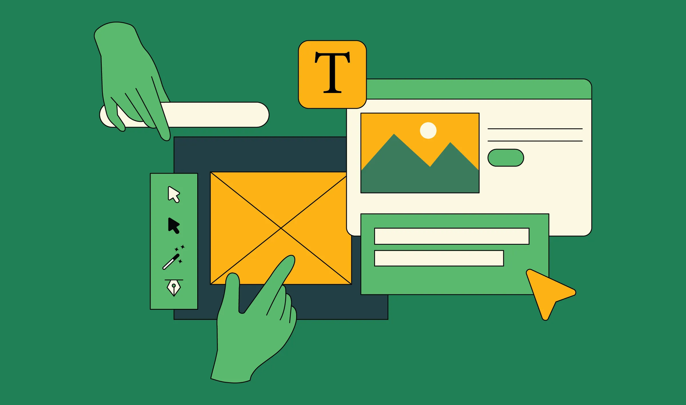
5. Seamless Navigation & UX Flow
Why it Matters
Users won’t convert if they can’t find what they’re looking for. Your navigation should be intuitive, with clearly labeled menu items and logical IA.
Example
Segment keeps its navigation streamlined with a focus on Jobs-to-Be-Done. Rather than just “Features” or “Pricing,” the nav includes items like “Solutions” (segmented by persona), “AI Solutions” for keeping up with the fast-paced market, and “Case Studies” for building user trust.
Why it Works
- The nav menu prioritizes ICP-specific journeys
- Dropdowns include distinctive typography and short descriptions, adding clarity
- On scroll, the sticky nav keeps the CTA button always within reach
.webp)
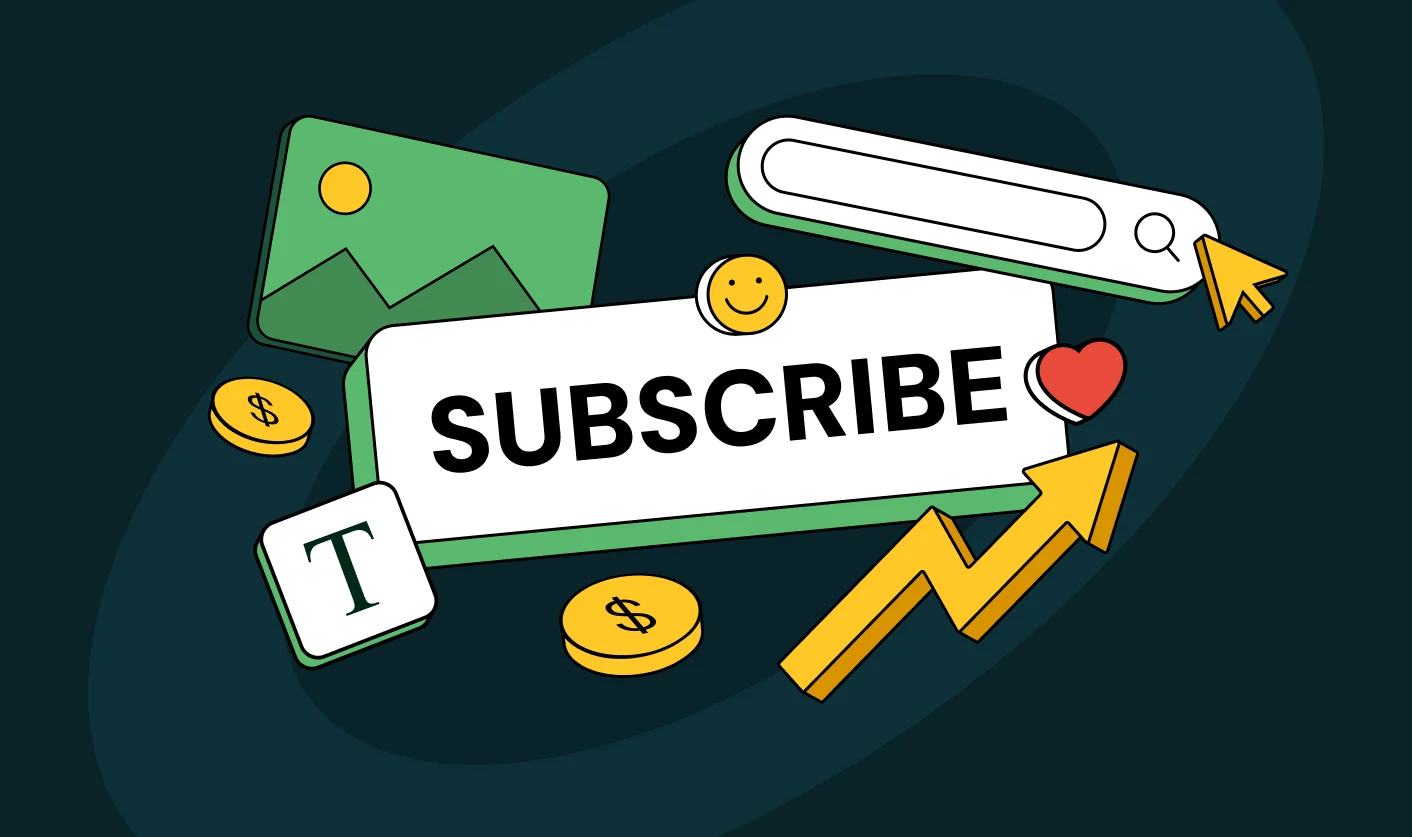
6. Performance-Optimized Signup Forms
Why it Matters
Sign-up forms are conversion chokepoints. Most B2B SaaS brands lose qualified prospects because they demand too much upfront. Every additional field increases friction and reduces conversions.
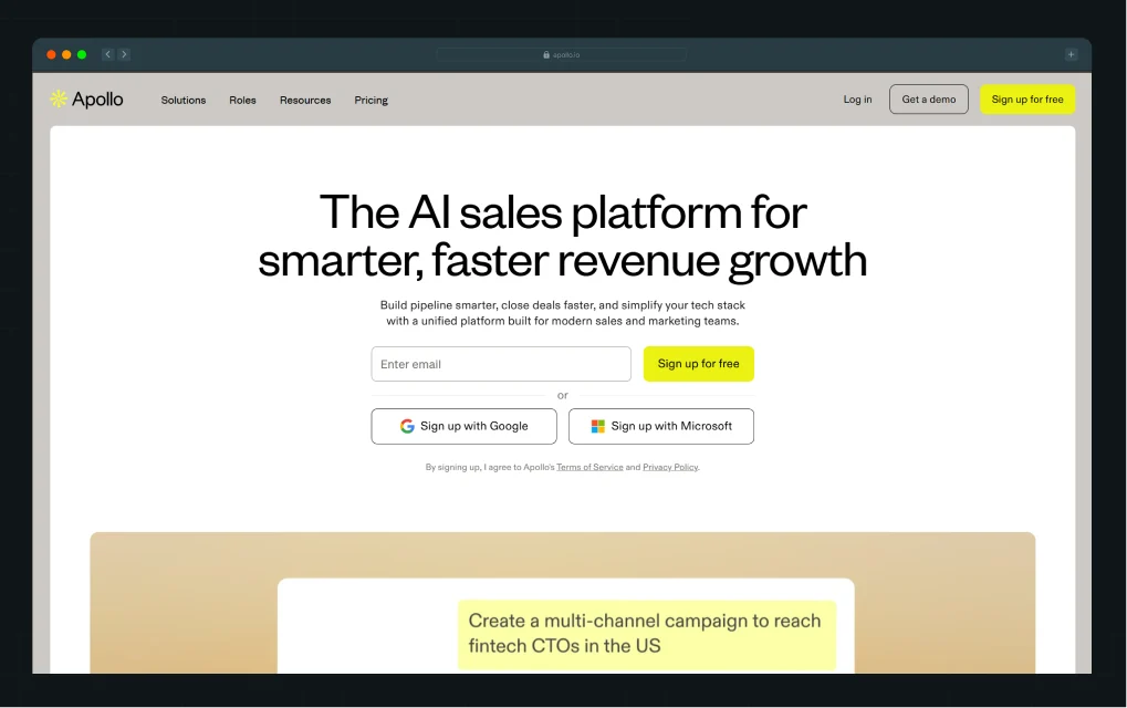
Start With Single-Field Capture. Companies like Apollo.io, Notion, and Slack begin with one field. The objective is simple: capture the email, remove decision fatigue, and get prospects into the product or funnel quickly.
Use Progressive Profiling. Collect context over time instead of overwhelming users at first touch.
Offer Social Login. It feels like simply unlocking access, not creating yet another profile. When additional fields are necessary, optimize every interaction point.
Example
Signup forms on Apollo.io are streamlined for conversion. The main signup uses a single-field email form to reduce hesitation and push users into the product experience instantly. The form is visually prominent, using whitespace and clear labels to guide users. Error handling is user-friendly, and the process is mobile-optimized.
Why it Works
- The form’s placement is directly following a compelling CTA
- Such laser-focused sign-ups are designed for instant conversions
- No-fluff sign ups have the most effective user conversion rates
7. Conversion-Focused Mobile Design
Why it Matters
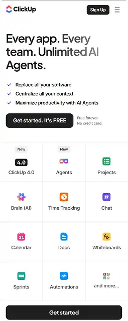
Over 50% of B2B buyers now engage with vendor content on mobile. If your site doesn’t work beautifully on small screens, you’re bleeding opportunities.
Example
ClickUp delivers a mobile-first experience that mirrors its desktop website function. The mobile version of the homepage keeps CTA buttons sticky at the bottom, prioritizes one-column layouts, and collapses content into expandable accordions.
Why it Works
- Large, thumb-friendly buttons simplify navigation
- Visual hierarchy is preserved without overwhelming
- Key actions are accessible without scrolling

Bonus: SaaS Website Design Inspiration
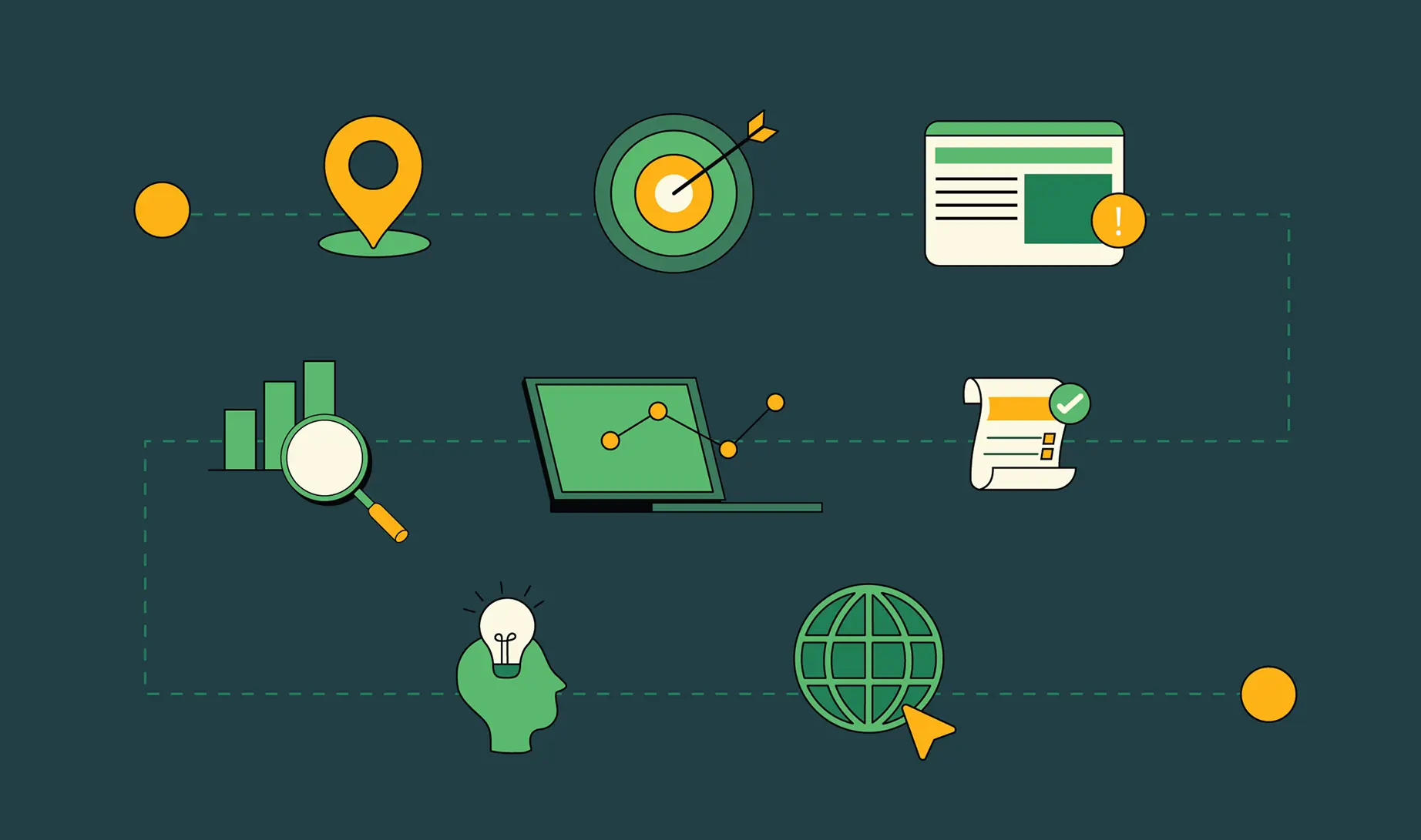
A SaaS website must function as an experiment. Design without validation is guesswork. Every element should be tested against real user behavior to improve conversion velocity and pipeline quality.
1. Establish a Testing Plan
Prioritize experiments that influence revenue, not cosmetic tweaks. Focus on:
- Messaging tests
- CTA language and placement
- Social proof formats: logos vs quantified results vs video
- Form length trade-offs
- Pricing page transparency vs sales-led paths
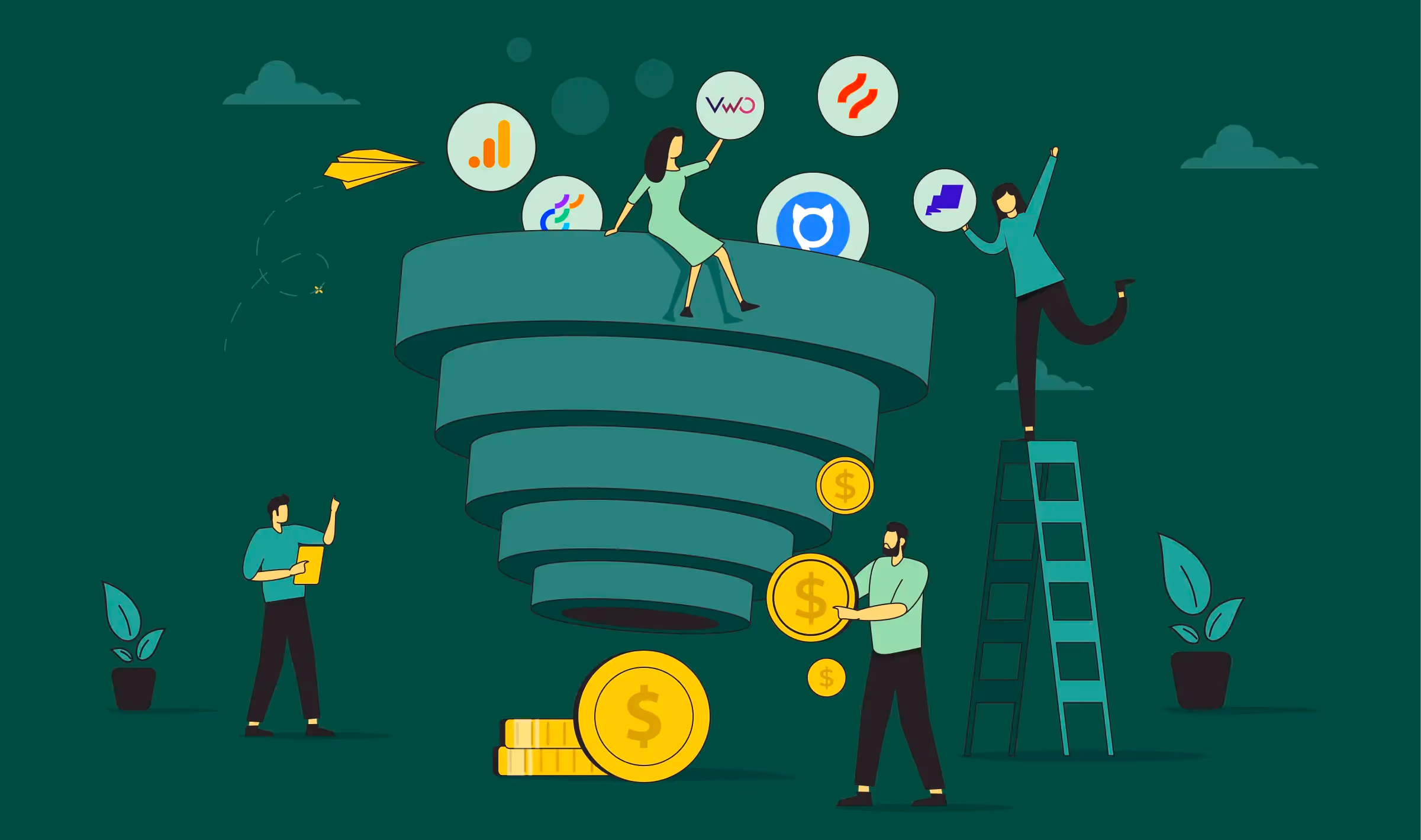
2. Use the Right Analytics Stack
Measure what users do and why they do it.
- GA4 for funnel tracking, source attribution, and conversion events
- Webflow Analyze for visual behavior patterns directly in the build layer
- Hotjar heatmaps, recordings, and surveys to surface friction and intent signals
{{specficService}}
Monitor funnel drop-offs, gather behavioral insights, and iterate relentlessly. Conversion is a continuous discipline, not a design phase.
3. SaaS Website Design Inspiration
Need ideas? Here are a few of the best SaaS website designs worth bookmarking:
- Linear: For its minimal UI and lightning-fast performance
- Slite: For its editorial storytelling and animation
- Gong: For its bold colors and sales-driven positioning
Or check out ThunderClap’s portfolio for examples of conversion-first B2B SaaS website design and development done right.
What to Look for in a SaaS Website Design Agency
Not all design partners understand the complications of SaaS growth.
Here’s what sets a true partner apart:
- A fine understanding of SaaS funnels and MQL/PQL flows
- In-house Webflow and no-code development capacity
- SEO best practices baked into the design process
- Proven track record in B2B SaaS website redesigns
At ThunderClap, we work with ambitious SaaS teams to turn websites into revenue engines. From messaging strategy to visual hierarchy and performance optimization, our process is built to drive outcomes.
Your Website Is Either Selling or Stalling
Your website is more than a touchpoint. It’s your product’s first impression and your brand’s biggest conversion lever. If your SaaS site isn’t converting, it’s time to rethink the design.
By integrating these 7 elements, from value proposition clarity to mobile UX, you’ll build a website that not only looks great, but performs.
Let ThunderClap help you get there. Want a SaaS website that converts better, faster? Book a demo with ThunderClap today and let’s turn your site into your strongest growth asset.
{{ctaBlock}}


.webp)
Browse Similar Articles
How to Find the Best Web Design Company in Houston, Texas for B2B Brands (6 Best Picks)

.svg)
The Step-by-Step Website Redesign Process B2B Teams Use to Increase Conversions (Without Killing SEO and Pipeline)
7 Best Video Production Agencies for SaaS Product Walkthroughs and Feature Videos

How to Choose the Best B2B Website Maintenance Company: 9 Questions to Ask Before You Hire One


How to Use Brand Storytelling on Your Website to Close More B2B Deals and Build Buyer Trust

Why Partnering with a B2B Brand Positioning Agency Accelerates Market Differentiation

.avif)
10 Product Marketing Companies Powering the Fastest-Growing SaaS Brands in 2026


Outsourcing Web Design: Cost-Benefit Analysis for Mid-Market & Enterprise Brands
From Leads to Lifetime Value: How Growth Marketing Agencies Scale SaaS Revenue
Webflow vs WordPress: Which Platform Is Better for Your Business Website in 2026?

Fintech Web Design That Builds Trust: 8 UX Principles Every Fintech Site Needs
Optimizing for Intent: How B2B Website Messaging and UX Changes Help Capture Top-Funnel Buyers


From Audit to Action: 8-Step Process to Optimize Your B2B Website Strategy for 2026 Buyers
How to Design a High-Converting Landing Page from Scratch (2026 Edition)

How to Optimize a Landing Page for Maximum ROI: A Step-by-Step Breakdown

AI Landing Pages That Convert: 7 Design Principles Every AI Platform Should Follow


Top 7 Webflow Integrations to Supercharge Your Website's Performance and Conversions


10 Best Web Design and Development Companies in India [B2B Focused for 2026!]

How to Choose the Best Webflow Agency: A Complete Guide for Your Business


Interested in seeing what we can do for your website?


.webp)
