


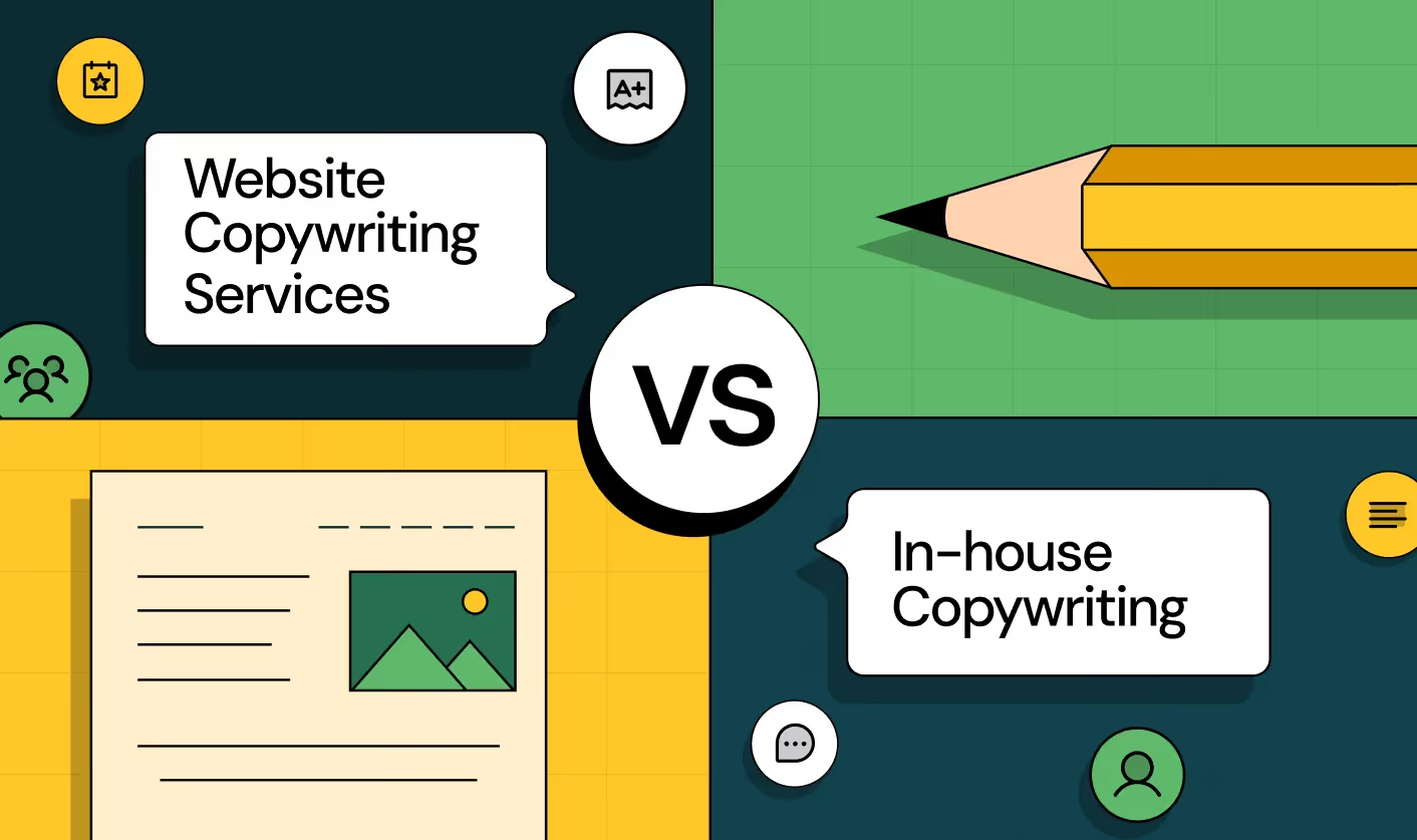
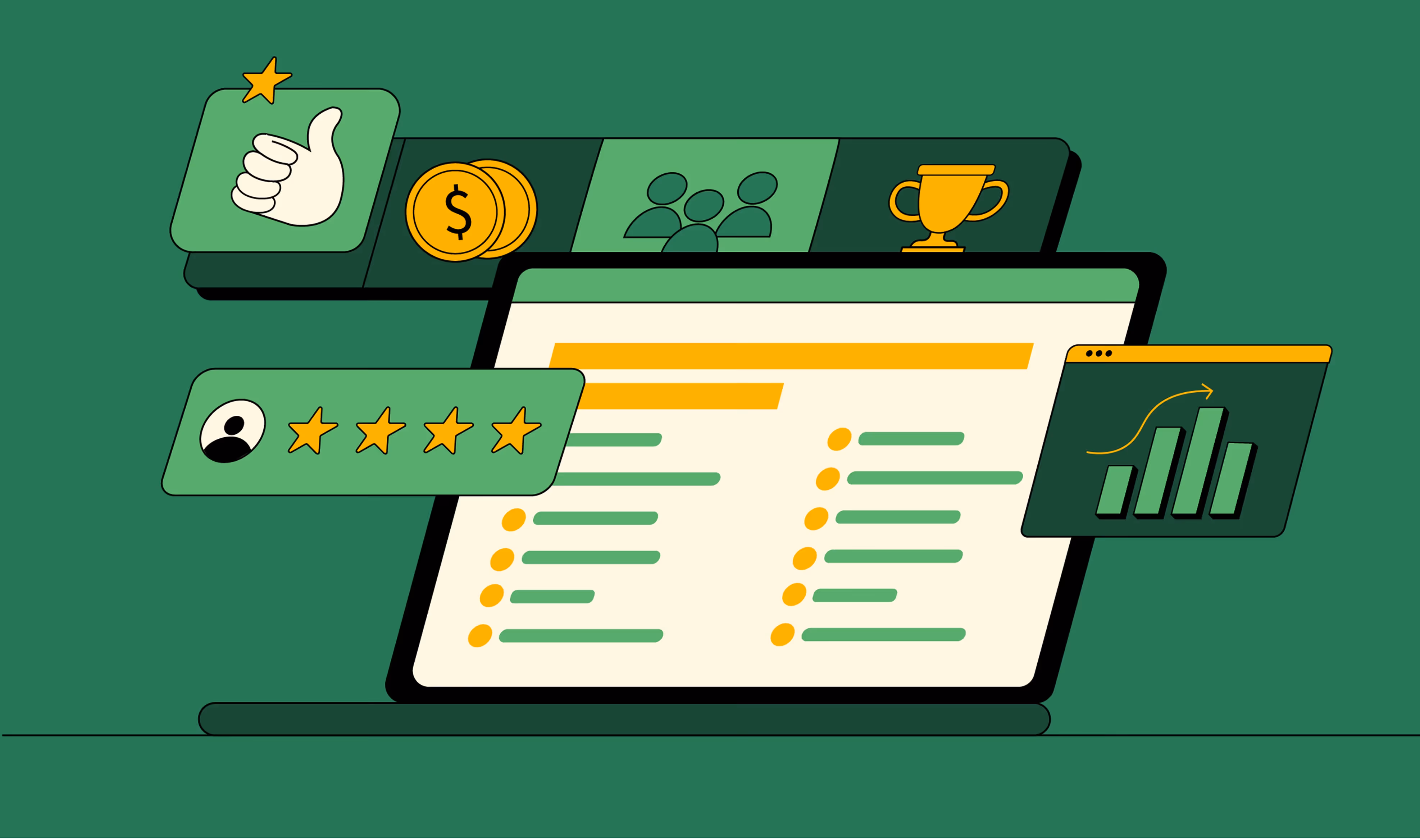
Optimizing for Intent: How B2B Website Messaging and UX Changes Help Capture Top-Funnel Buyers

Your website gets 10,000 visitors per month. But your conversions? Barely 0.5%.
The gap feels massive. Your first thought? "Are we attracting the wrong ICP?"
Sometimes, yes. But often? It’s a website messaging problem or, more specifically, an intent problem.
95% of your website visitors aren't ready to buy when they land on your site. They're researching. Quietly weighing options. Comparing features. Most people will decide who to buy from long before they speak with a salesperson.
Most B2B websites ignore these low-intent visitors entirely. They optimize for the 5% ready to convert right now, adding hard CTAs every chance they get.
The 95%? They bounce and remember the competitor who actually helped them learn.
Here's the reality: when you guide low-intent visitors through the funnel, nurturing them, aiding their research, instead of offering an ultimatum (convert or get lost), they self-qualify. They arrive at sales more educated and more sales-ready.
Brands like Semrush, Zapier, and Monday.com already know this. They capture ToFU buyers early, and by the time those buyers are ready to choose, the decision feels obvious.
Last month, I studied 50+ top B2B brands to uncover how they're doing it.
Here are 5 B2B website messaging and UX tactics they use to turn casual researchers into trial users without turning your site into a brochure or drowning sales in junk leads.
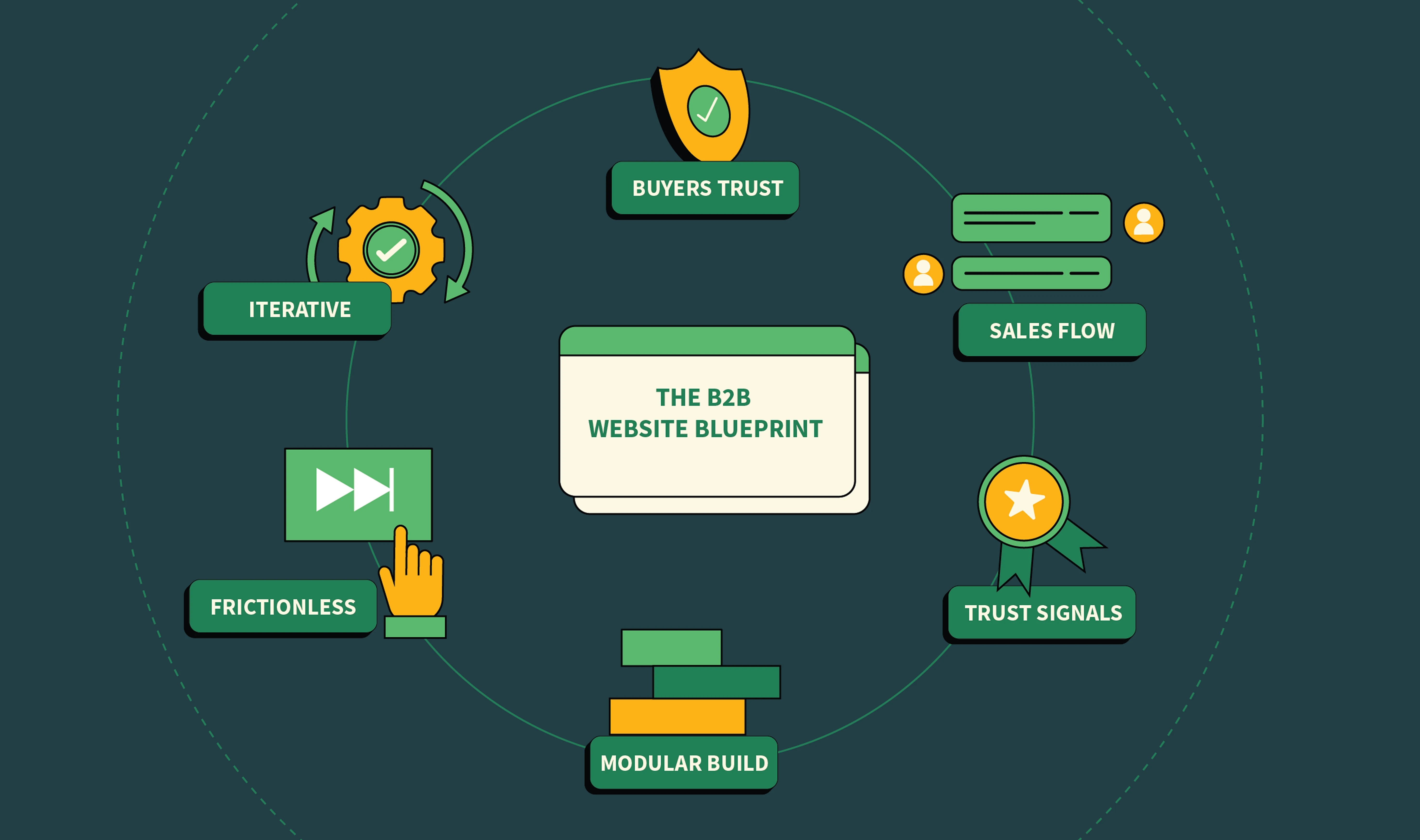
5 B2B Website Messaging and UX tactics to Capture and Move TOFU Buyers Across the Funnel (From Top Brands)
Here are the best B2B website messaging and UX changes brands like Zapier, Semrush, and Monday.com have applied to their websites to capture and convert TOFU buyers.
1. Use contextual CTAs in blogs to turn casual researchers into product testers
Here's something most marketers commit without remorse: they slap hard CTAs like "Book a demo" or "Start a free trial" on every blog post out there. One of the root causes of this intentional amnesia? Teams can't track soft CTAs without a sophisticated attribution infrastructure.
No neat way to tie CTAs like "Check out the templates" to the pipeline means no executive buy-in (they care about MQL → SQL conversions after all). So most settle for an all-or-nothing gamble with hard CTAs, even when they know the reader isn't ready to buy yet.
“When we audit blog flows at ThunderClap, the biggest friction isn’t the content, it’s the CTA. Hard CTAs stop the journey too early. TOFU users need pathways, not pressure”, says Kiran Kulkarni, Partner and Head of Growth at ThunderClap.
But there's a smarter alternative: contextual CTAs.
They're soft, intent-aligned prompts that match the buyer's topic of research and their stage in the journey. In other words, it's the opposite of asking a casual researcher to jump on a 30-minute call when they barely know your product.
Principle In Action: Semrush
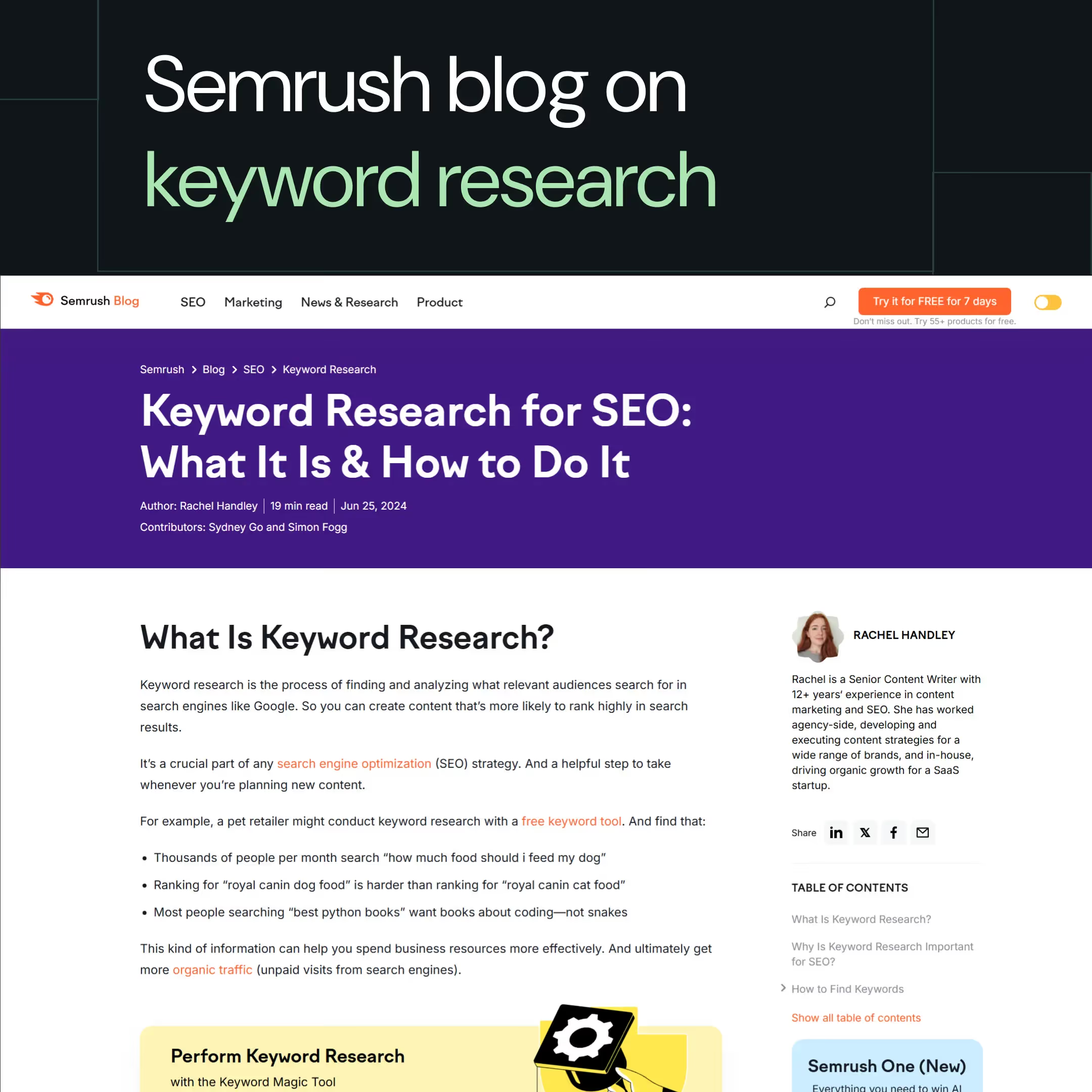
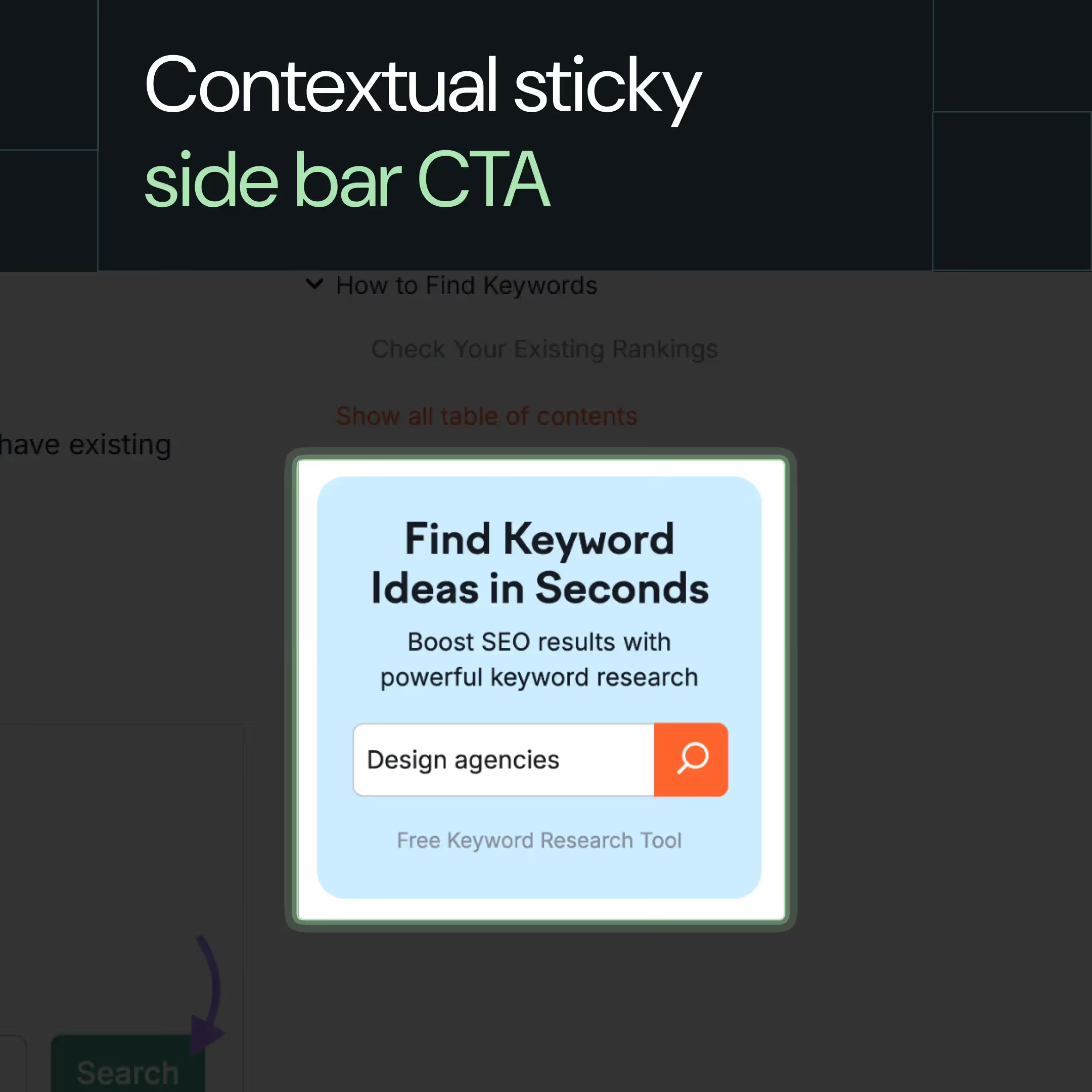
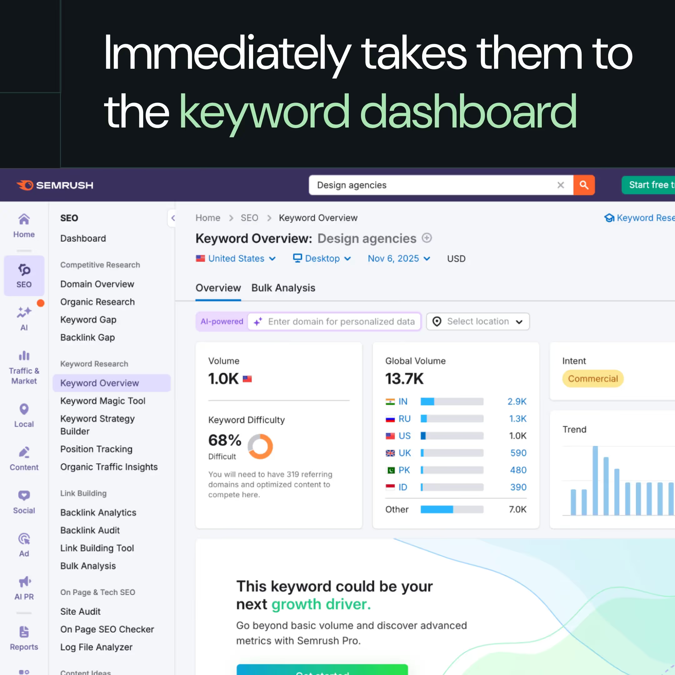
Semrush nails the art of contextual, cluster-based CTAs. In their blog "Keyword Research for SEO: What It Is and How To Do It?", they use a sticky sidebar CTA "Find Keyword Ideas in Seconds," that leads directly to their free Keyword Research Tool.
Why It Works
- Buyer intent match: Someone reading about keyword research is already exploring tools. A low-friction CTA promising immediate action persuades even casual visitors to try the product because it matches their current research mode.
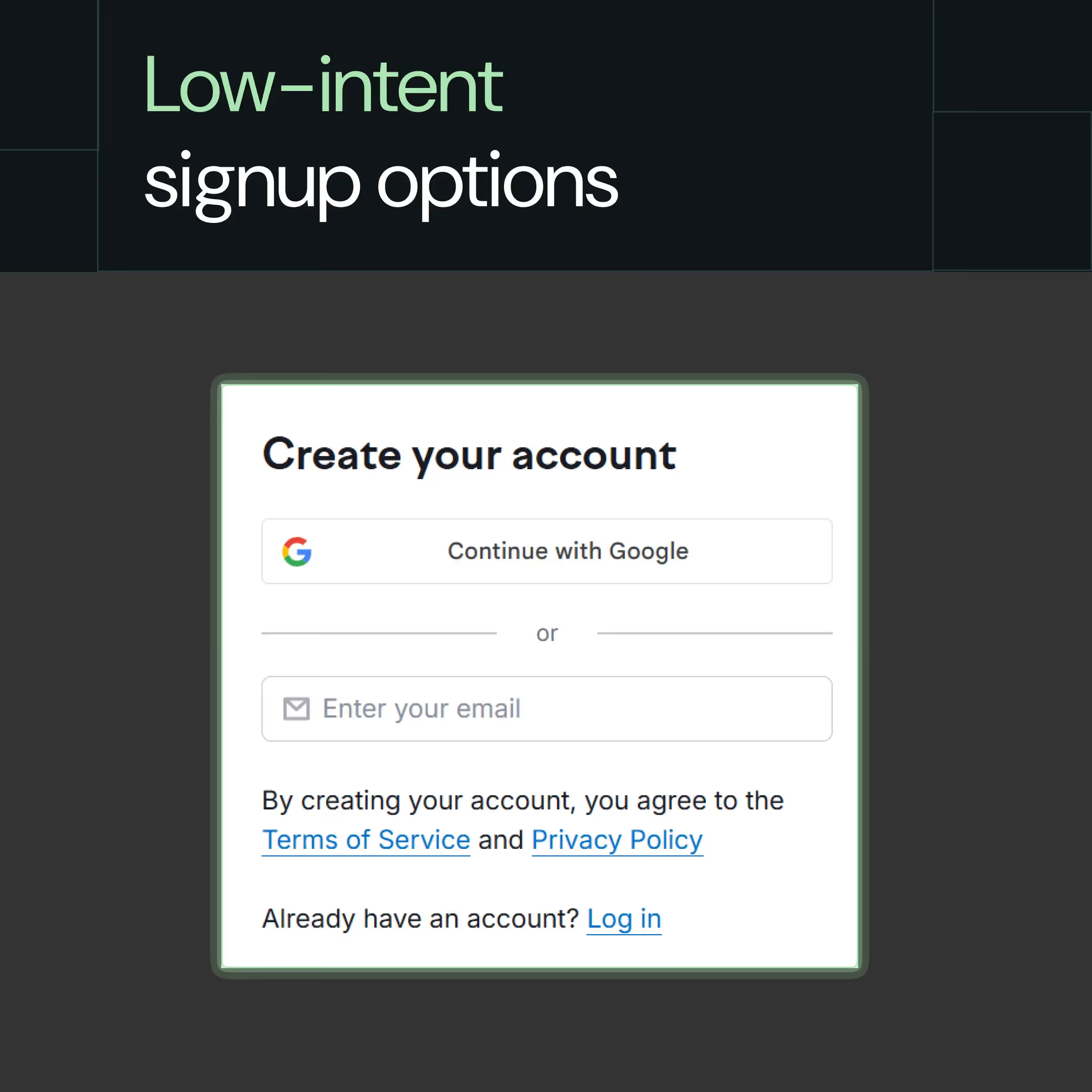
- Natural progression: One-click Google signup → test the product → experience quick value → explore more features → hit usage limits → upgrade to paid.
- Immediate value: Google Sign-up eliminates password fatigue. One click drops users straight into the workspace with live keyword data. No unwanted form fills, just instant payoff to build trust quickly.
How to Apply This
- Audit your top 10 blog CTAs. Do they match the topic, intent, and journey stage? Or are you asking for demos on beginner-level educational content?
- Swap generic CTAs for contextual ones based on topic clusters:
Example 1: Blog about "email deliverability" → CTA: "Test your sender score free"
Example 2: Blog about "landing page optimization" → CTA: "Analyze your page speed now"
Example 3: Blog about "SEO audits" → CTA: "Run a free site crawl"
- Test placements using CRO tools like heatmaps and A/B testing tools. Inline CTAs (embedded naturally within the text) perform 121% better than bottom-of-post banners, according to Invespcro. But validate with your own data, every audience behaves differently.
2. Use intent-led flows to turn ‘how-to' queries into actions
With LLMs answering straightforward queries instantly, the value of basic how-to content is declining. As Userpilot's VP of Marketing, Emilia Korczynska, noted: "You don't need perspectives and information gain for straightforward queries."
This means that ToFU content must move from explaining how to do something to enabling someone to do it immediately.
In other words, you should optimize for time-to-value instead of just information depth. Your ToFU buyers don't always want a 1,500-word blog; the trick is to understand their intent.
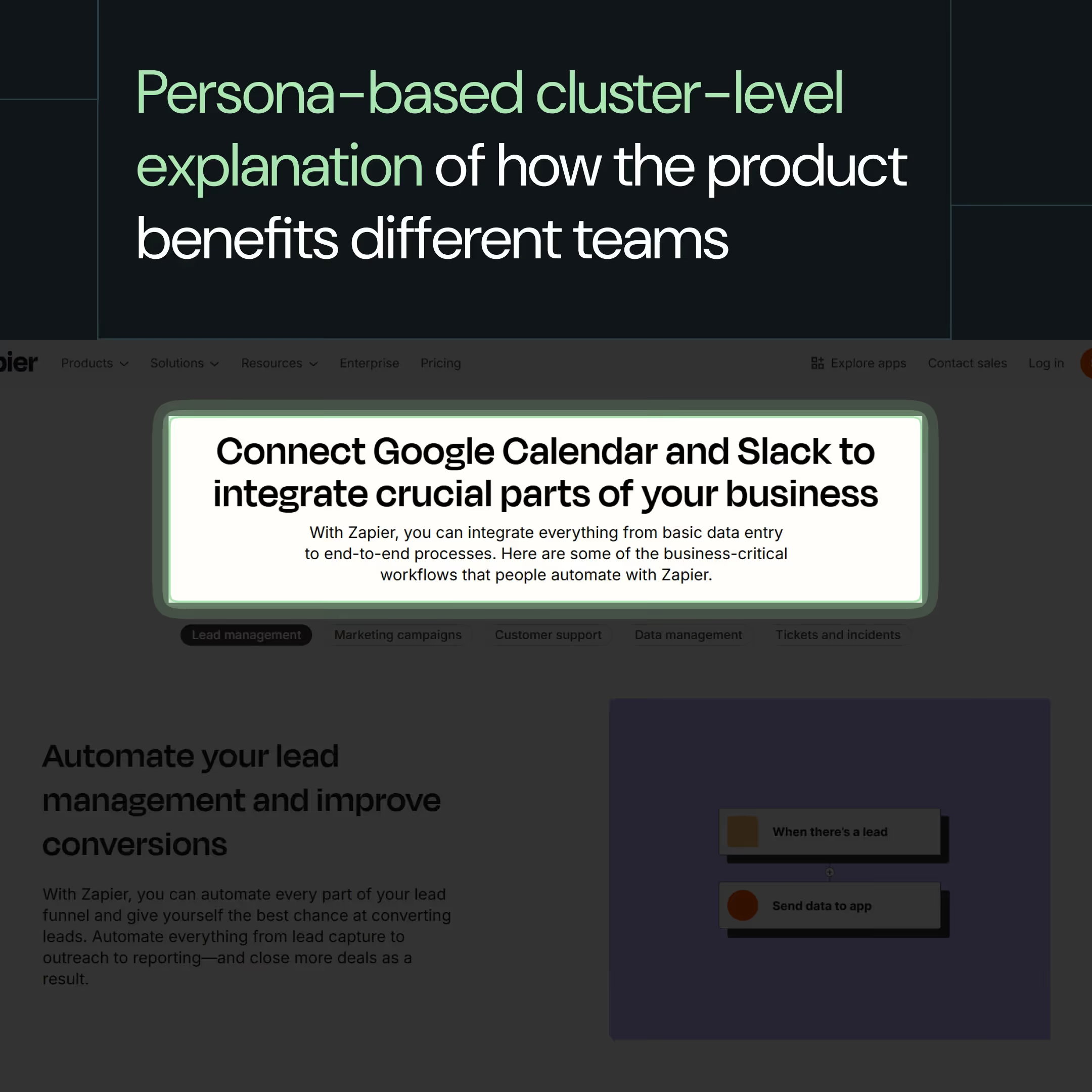
Principle in Action: Zapier
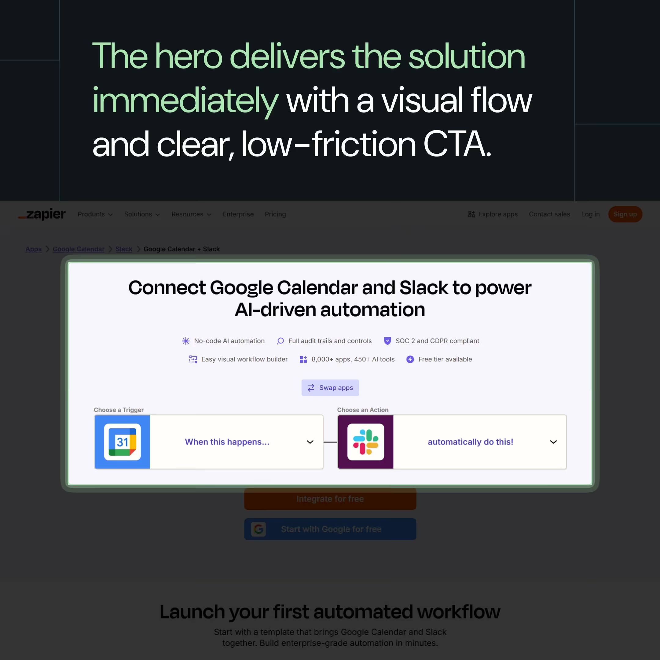
Zapier is a brand that understands this. They know that someone searching "how to connect Slack with Google Calendar" is actually looking for ways to connect them. Instead of educational blog posts, Zapier directs users to integration-specific landing pages that treat the product as the solution to the search query.
On the landing page, you'll find:
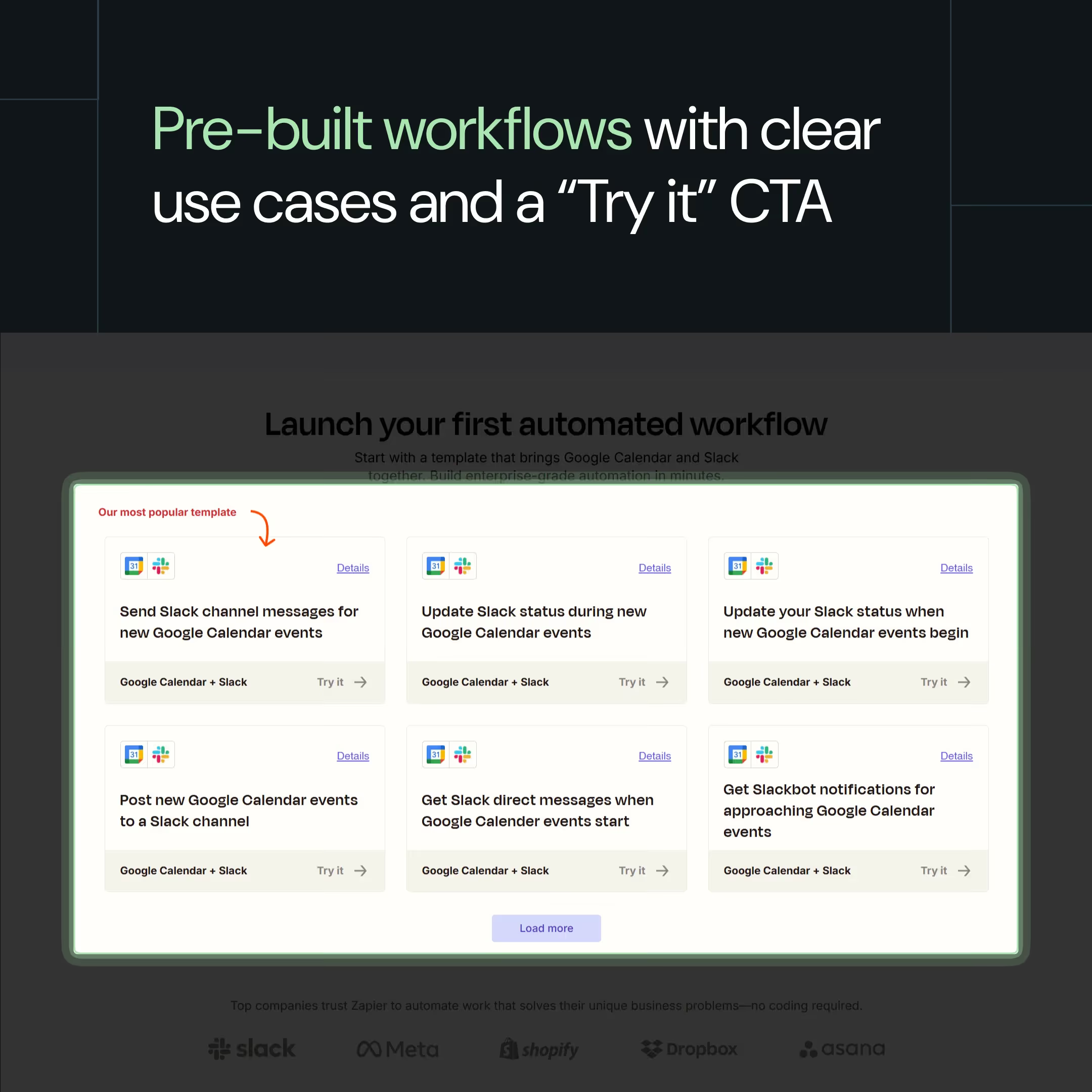
- Pre-built workflow templates you can use immediately
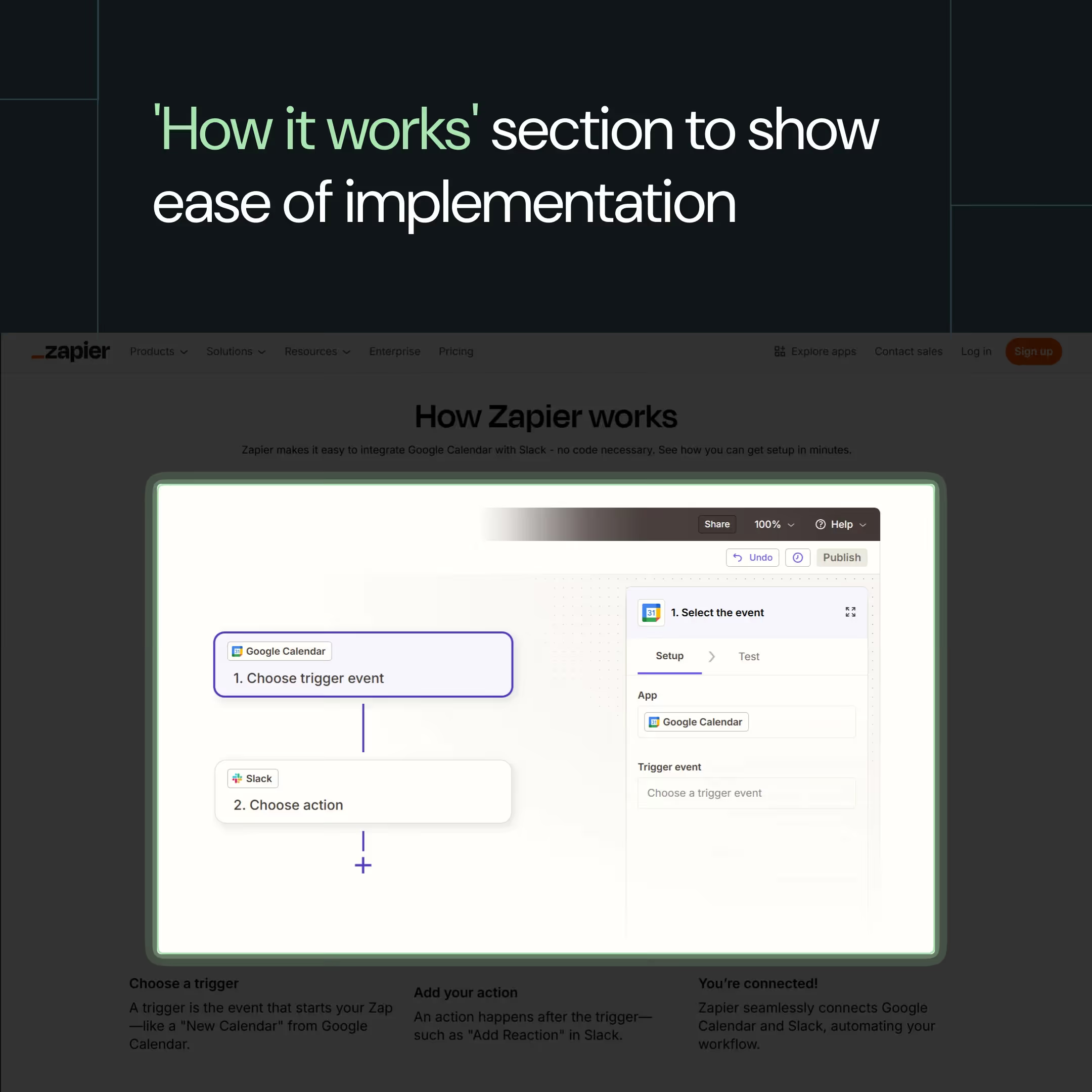
- Visual explanation of how the integration works (trigger → action → connected)
- Popular use cases showing what workflows others have created
Why It Works
Action-intent capture: The brand identifies TOFU keywords with action intent and uses them to increase product trials.
Positions the product as the solution: Zapier's win is that they position themselves as the fastest and easiest solution. The 3-step visual, choose trigger → add action → you're connected, acts as a powerful call-to-action inviting people to try it.
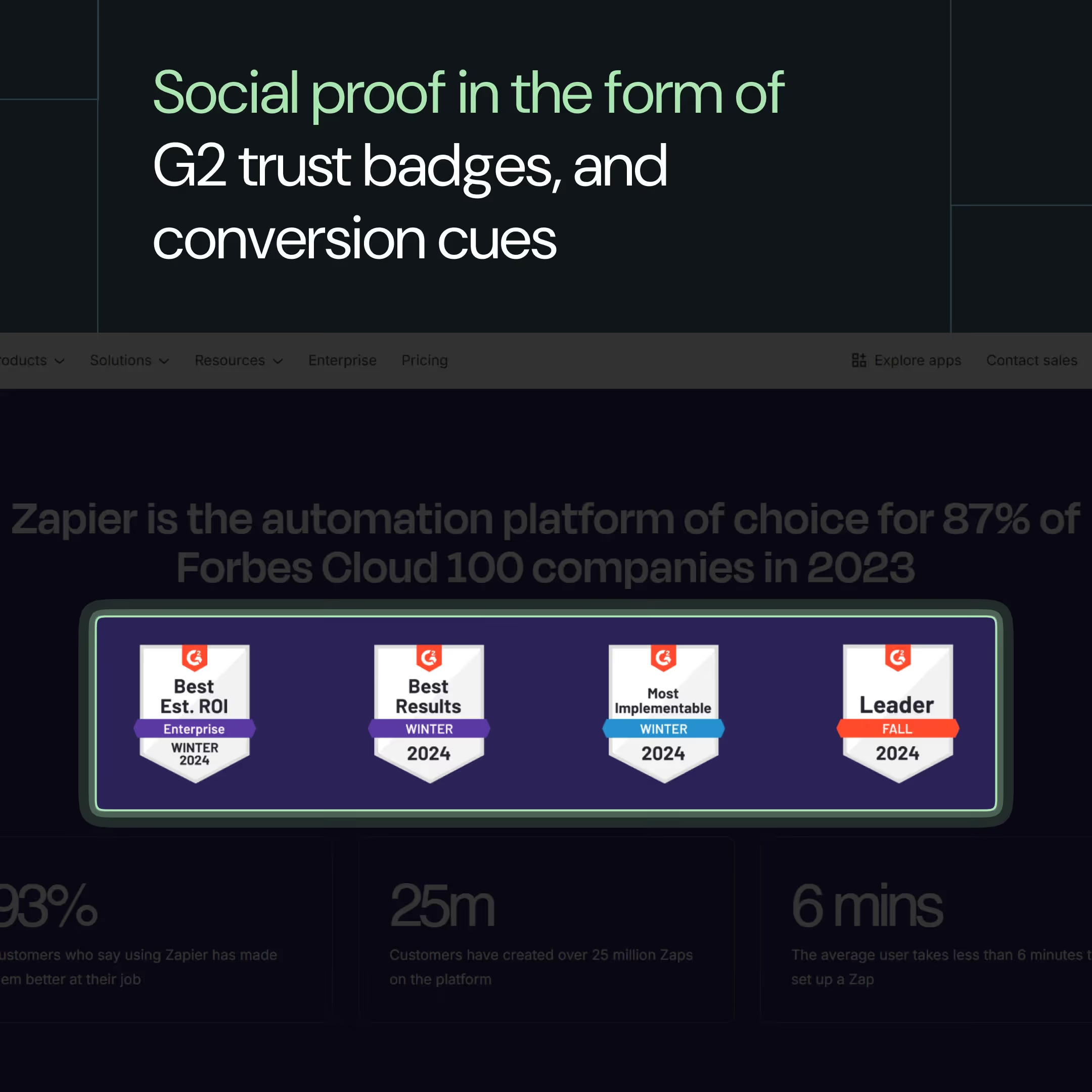
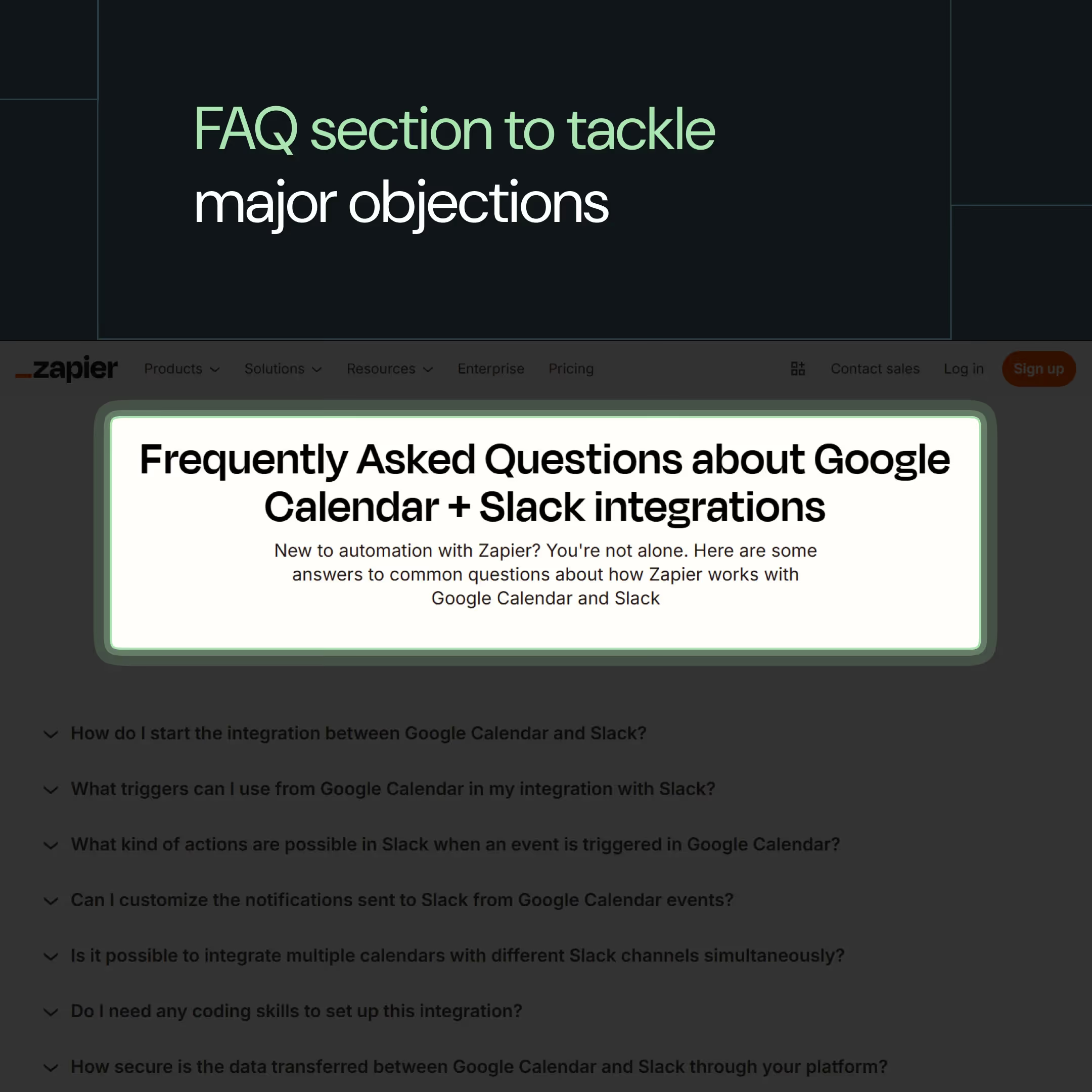
Progressive information release: Zapier layers information by scroll depth. The hero delivers the solution immediately. The next section presents pre-built workflows with clear use cases and a “Try it” CTA. Next, we consider how it works for clarity, followed by security, documentation, and social proof for reassurance.
How to Apply This
1. Find top-of-funnel how-to pages with action intent.
- Video-making software → "how to embed videos in blogs"
- Project management tool → "how to track project milestones"
- Email marketing platform → "how to schedule email campaigns"
2. Ask if your product can be the direct answer to this query: If yes, map the shortest path from search to action with fewer steps, a minimal learning curve, and the fastest time-to-value.
3. Design the page to minimize time-to-value, the foundation of any high-converting landing page
- Hero section → Answer the intent directly
- 2nd fold → Workflows and 'How it works' to show the ease of implementation
- 3rd fold → Persona-based cluster-level explanation so different teams can see value.
- 4th and further folds → Social proof, security cues, and FAQs to build trust.
{{specficBlog}}
3. Embed chat widgets on websites to enable self-serve
According to Wynter Buyer Journey Research, 91% of buyers self-educate before getting on a call with a salesperson. They prefer doing their research, creating shortlists, and forming their own POV first. And for 97%, the website is their go-to channel for research.
Most B2B websites recognize this and offer multiple options for self-education, including interactive demos, product tours, persona pages, and resource hubs. However, at times, it becomes a double-edged sword, overwhelming buyers with the decision of which path to choose.
Should they start with blogs, an interactive demo, or go down the resource rabbit hole? Which one would provide them with a holistic view and lead them to a decision more quickly? Unfortunately, it's not easy for buyers to find the most impactful, TOFU-safe paths on a website.
High-performing B2B websites solve this by guiding visitors down the right path, rather than overwhelming them with too many options.
“If you want more TOFU conversions, stop giving visitors ten doors. Give them one question that leads to the right door.”
- Ayush Barnwal, Partner and Head of Design at ThunderClap
Also Read: Website strategy to optimize for the modern B2B buyer
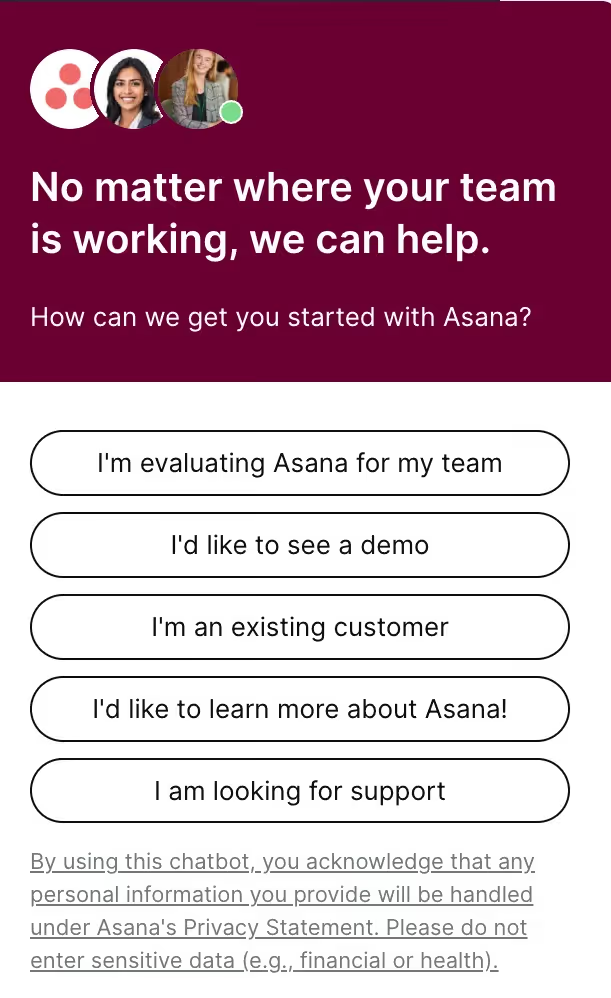
Asana's chat widget eliminates the guesswork. Instead of making visitors navigate through menus, it asks one simple question: "How can we get you started with Asana?"
Then it offers five clear options:
- I'm evaluating Asana for my team,
- I'd like to see a demo,
- I'm an existing customer,
- I'd like to learn more about Asana
- I am looking for support
Why It Works
- Reduces cognitive load: From the entry point, buyers are guided to their respective choices, eliminating the need to navigate complex pathways and multiple competing options.
- No compulsion: Asana conveys that not being sales-ready is perfectly fine by giving "Learn more" and "See a demo" options equal weight.
- Meets buyers where they are: A high-intent prospect isn't force-fed TOFU information, and a TOFU buyer isn't pushed into the wrong funnel. Each buyer is met exactly where they are and directed to paths that suit their current level of awareness and funnel stage.
How to Apply This
- Reverse-engineer your current TOFU buyer navigation paths to identify points where they may feel overwhelmed or where too many options are presented.
- Add a chat widget or triage tool that allows visitors to self-select their journey based on a single question: "What brings you here today?" or "How can we help you get started?"
- Map each option to a specific path: explorers receive educational content, evaluators access comparison resources, demo-ready buyers connect with sales, and existing customers gain support.
4. Design your homepage to guide buyers from awareness to action
Your homepage must serve buyers at three journey stages simultaneously. Early researchers need to know what you do, evaluators need to understand why you're different, and ready buyers require proof to trust you.
At ThunderClap, we see the same pattern in almost every website audit before a redesign: about 46% of sites are built only for high-intent visitors. They skip what the product is and jump straight to what it promises, leading with outcome language that means nothing without functional context.
Think 'accelerate pipeline' (Outcome) instead of 'sales engagement platform' (functional context)
But the reality tells a different story. Wynter research shows that 46% of B2B buyers leave websites when they don't understand what a product does.
This doesn't mean info-dumping on every buyer, but rather designing your homepage as a progressive funnel moving buyers from awareness to action.
Each section should deepen understanding as visitors scroll. The hero section establishes what you do to your target audience in simple words. The middle sections show how you solve specific problems. Bottom delivers proof and conversion options.
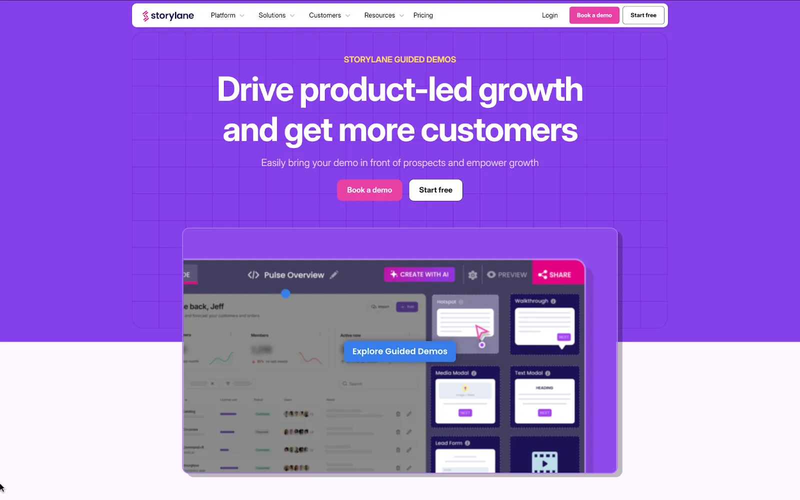
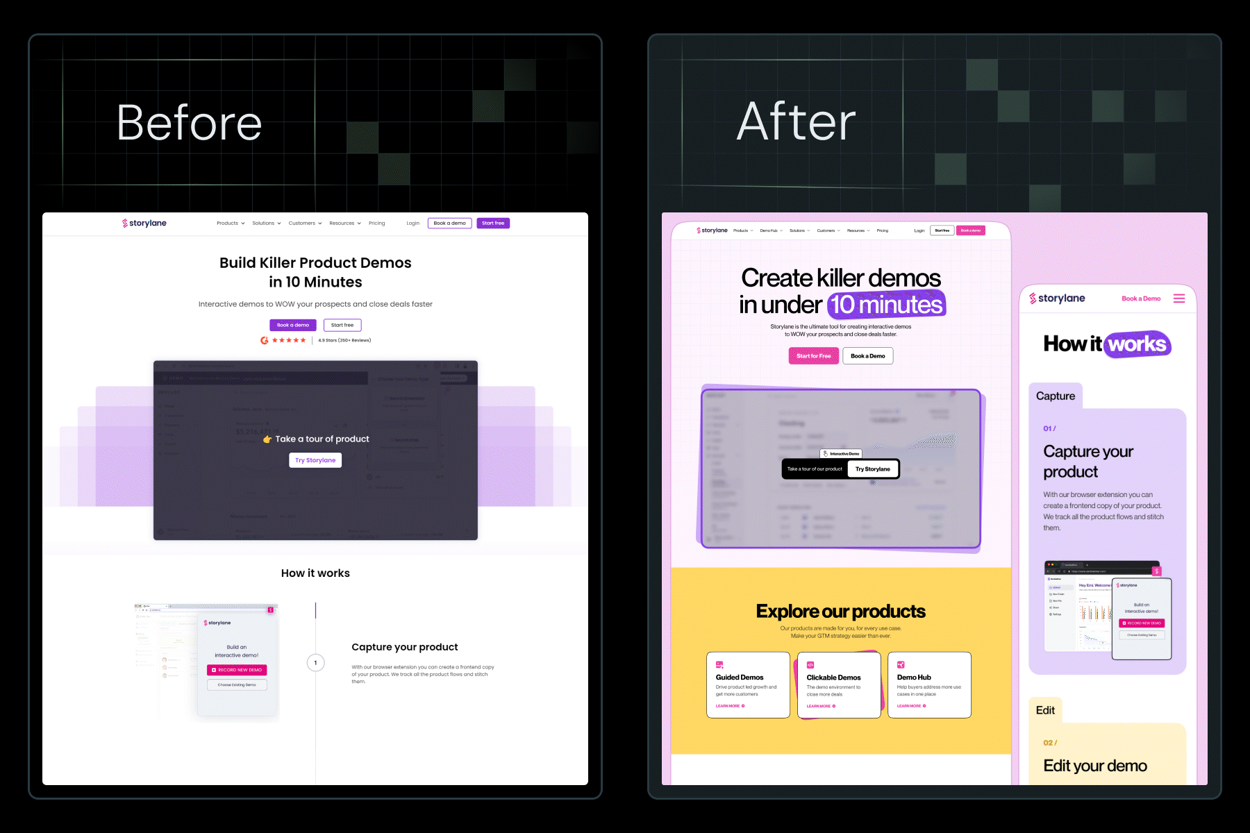
Storylane's homepage doesn't force buyers through a funnel; instead, it mirrors one. Each section aligns with a different stage of intent: clarity for ToFU buyers, exploration for MoFU, and social proof for BoFU. However, it also provides ready-to-buy visitors with direct CTAs upfront, allowing them to act without needing to scroll.
It’s the same reason we kept Storylane’s copy untouched during their redesign at ThunderClap. When the messaging is this clear, all you need is the right structure, and that alone boosted their demo requests by 30%.
Why it works:
Progressive context building: Early sections answer "what is it?" clearly, setting the foundation for detailed sections like "how it works" and "who's it for." This layering prevents overwhelming ToFU buyers with information overload.
Non-linear navigation: While it resembles a vertical funnel visually, it functions as an open map. High-intent CTAs appear throughout, letting BOFU/MOFU buyers choose their path at any stage without forced scrolling.
Intent-matched engagement: Each section serves a different buyer. TOFU visitors explore and learn, MOFU buyers try the interactive demo, and BOFU buyers either convert through a free trial or dig deeper into social proof.
Also Read: How to write website copy that converts
How to apply:
1. Map your current homepage to buyer stages and identify gaps using ThunderClap’s CERTTN Messaging Audit Framework.
2. Structure your content flow:
- Hero: Functional clarity first
- Second fold: How it works
- Middle: Persona-specific value
- Lower sections: Progressive proof
- Throughout: Dual-path CTAs
3. Test conversion points by scroll depth. Refine based on where different buyer segments engage and convert.
{{specficService}}
5. Use intent-based questions to turn ToFU browsers into trial users
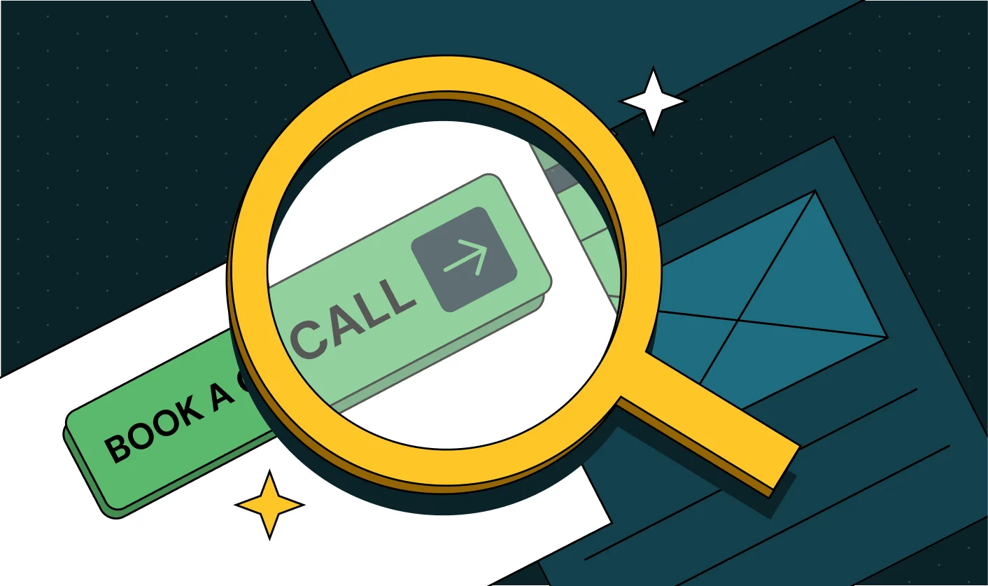
Most B2B homepages use low-commitment CTAs like 'Start Free Trial'. But even these have a certain level of friction associated with them as they make the ask before they show relevance. It's like a therapist asking, "Ready to book 10 sessions?" before understanding what brought you in.
Factor this with the fact that 25% of users quit if they don't see value immediately, and that friction compounds. One way to reduce it? Start in medias res—in the middle of things.
Ask one qualifying question first. Then drop visitors into a tailored experience based on their answer. This way, they're already using it before they realize they've "started."
Principle in Action: Monday.com
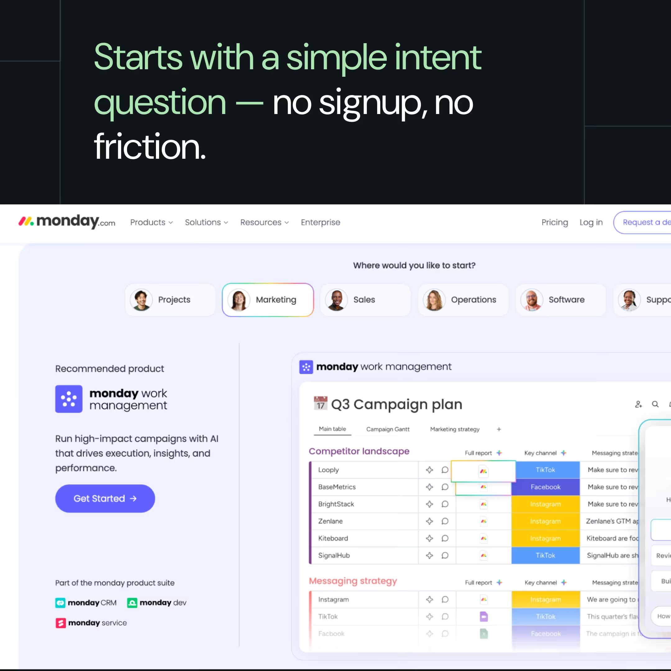
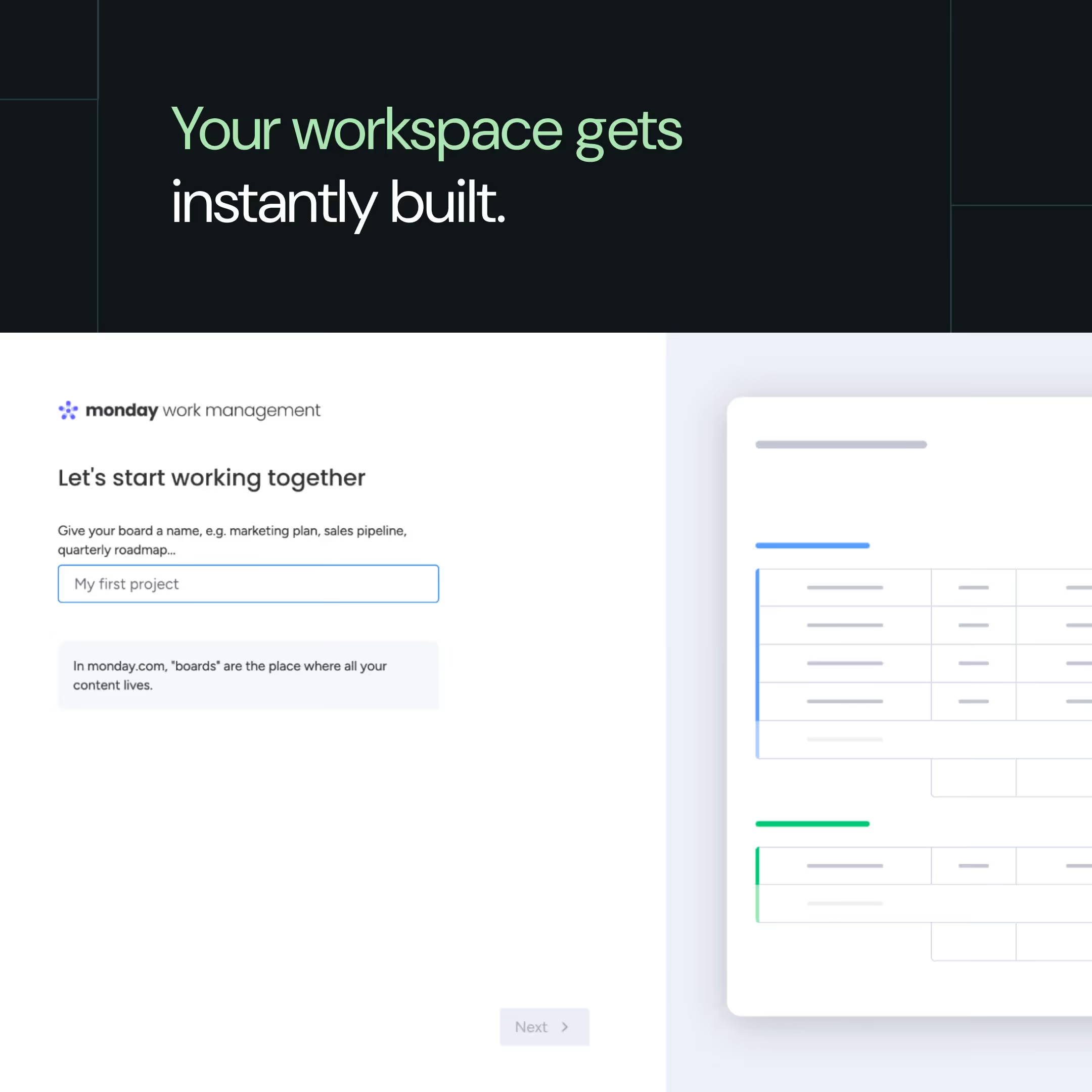
“Most websites force users to decide too early. Monday flips that; it guides the decision for them. That’s why even low-intent visitors keep going.”, observes ThunderClap’s Creative Director, Ragini Ramanathan.
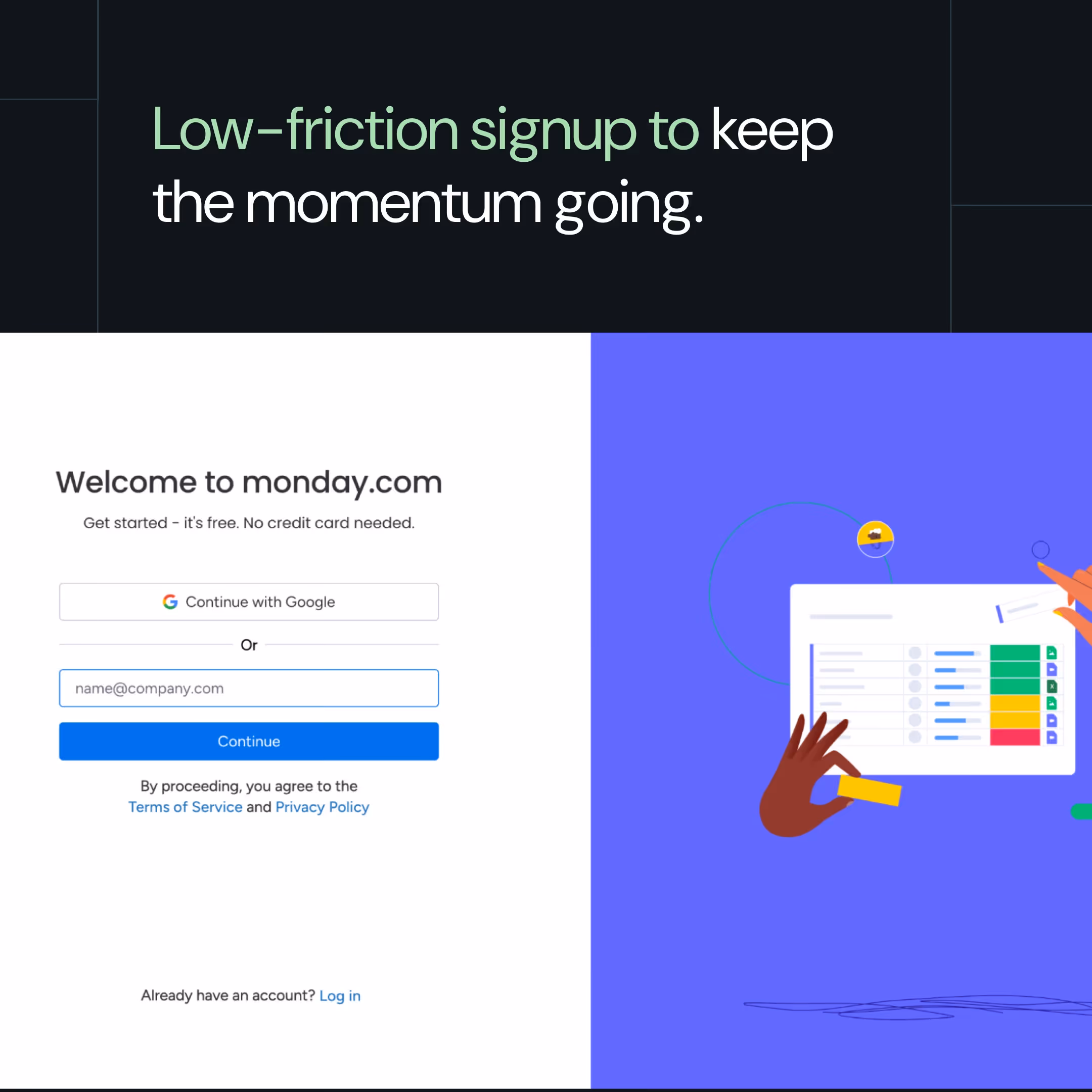
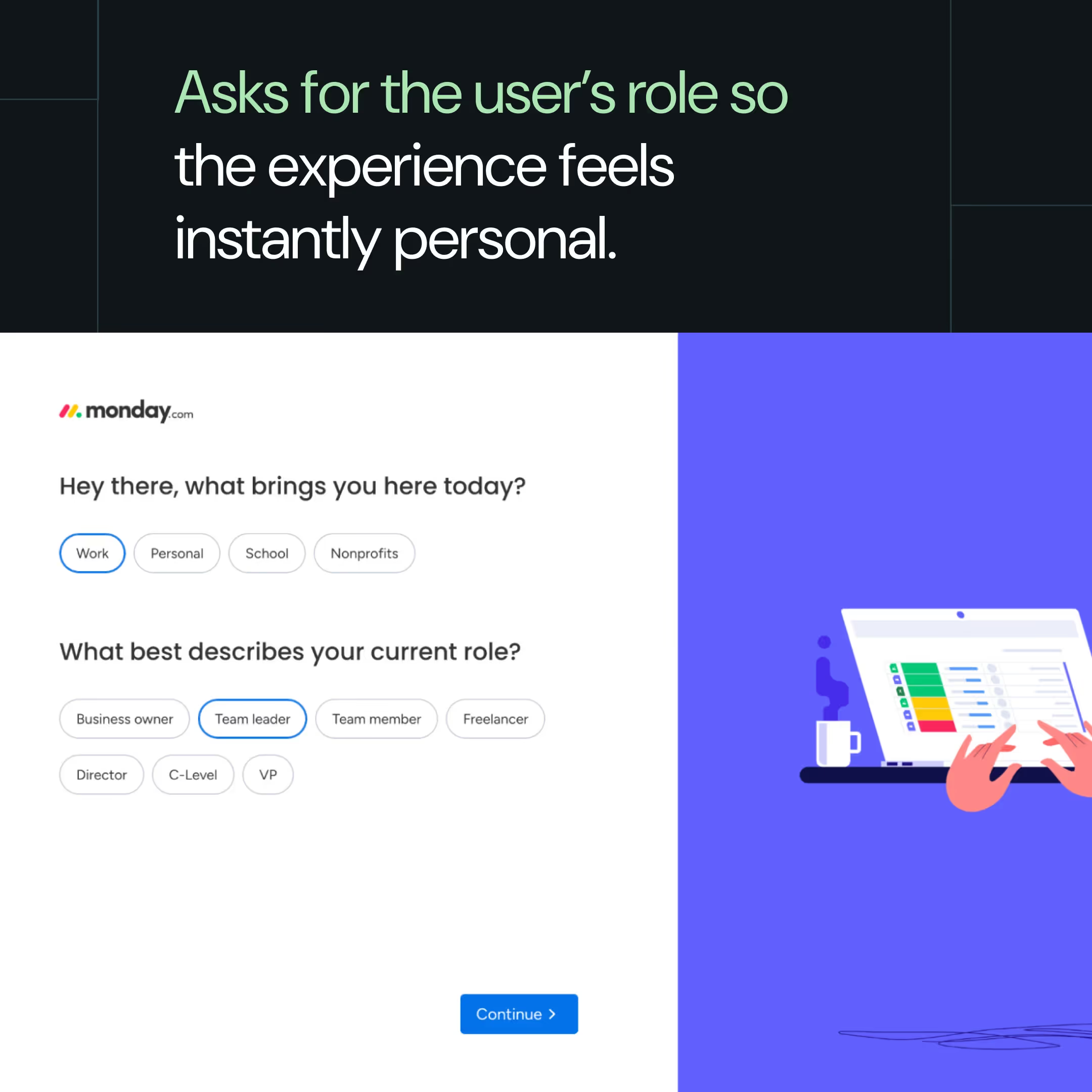
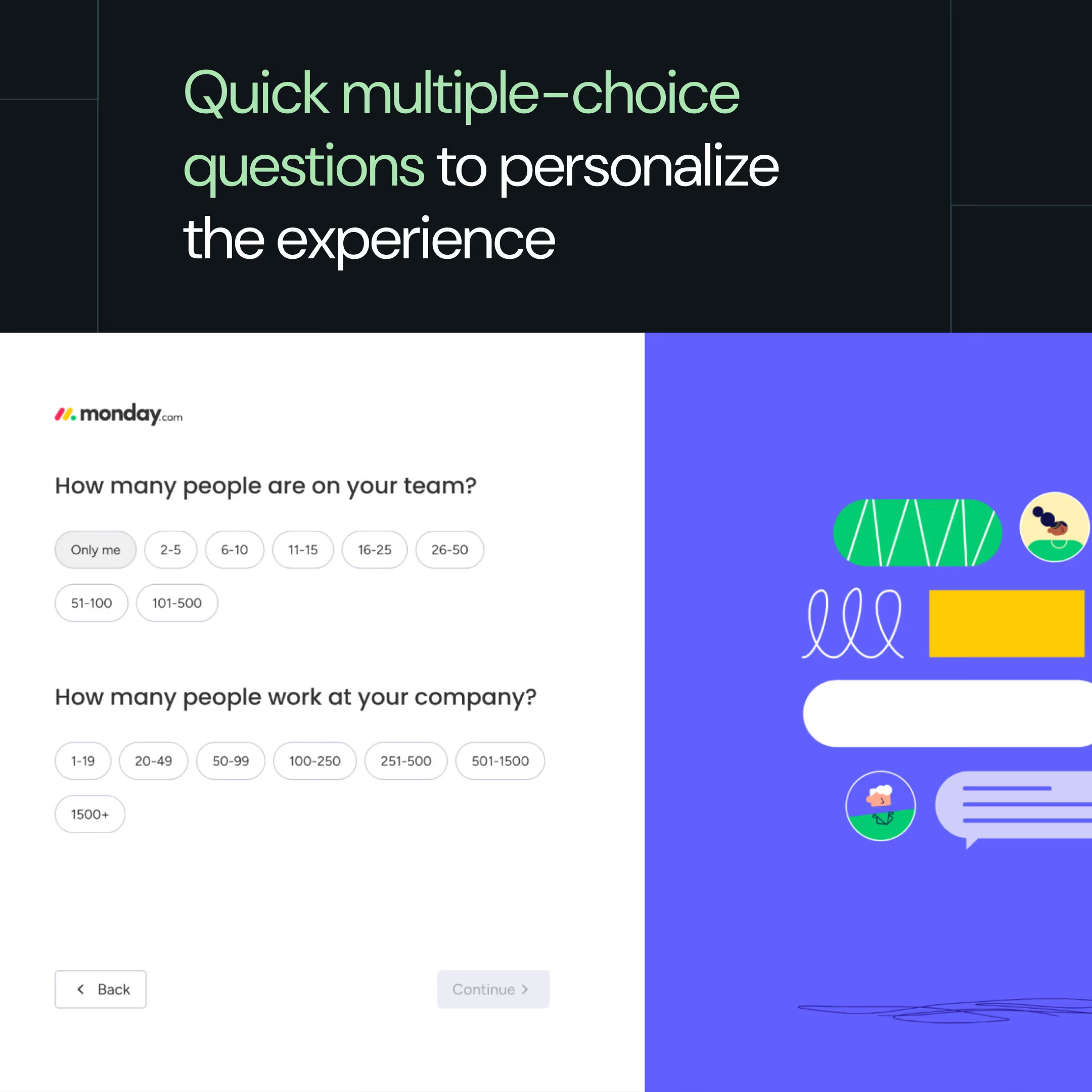
Monday's homepage has an interactive selector that opens with the question: "Where would you like to start?" Visitors choose from roles and use cases, making even low-context (ToFU) users feel oriented right away.
That one click leads to a low-friction Google signup, followed by short multiple-choice questions: role, team size, focus area. As you answer, your workspace builds automatically. You understand the product in seconds, simply by using it.
Why it works:
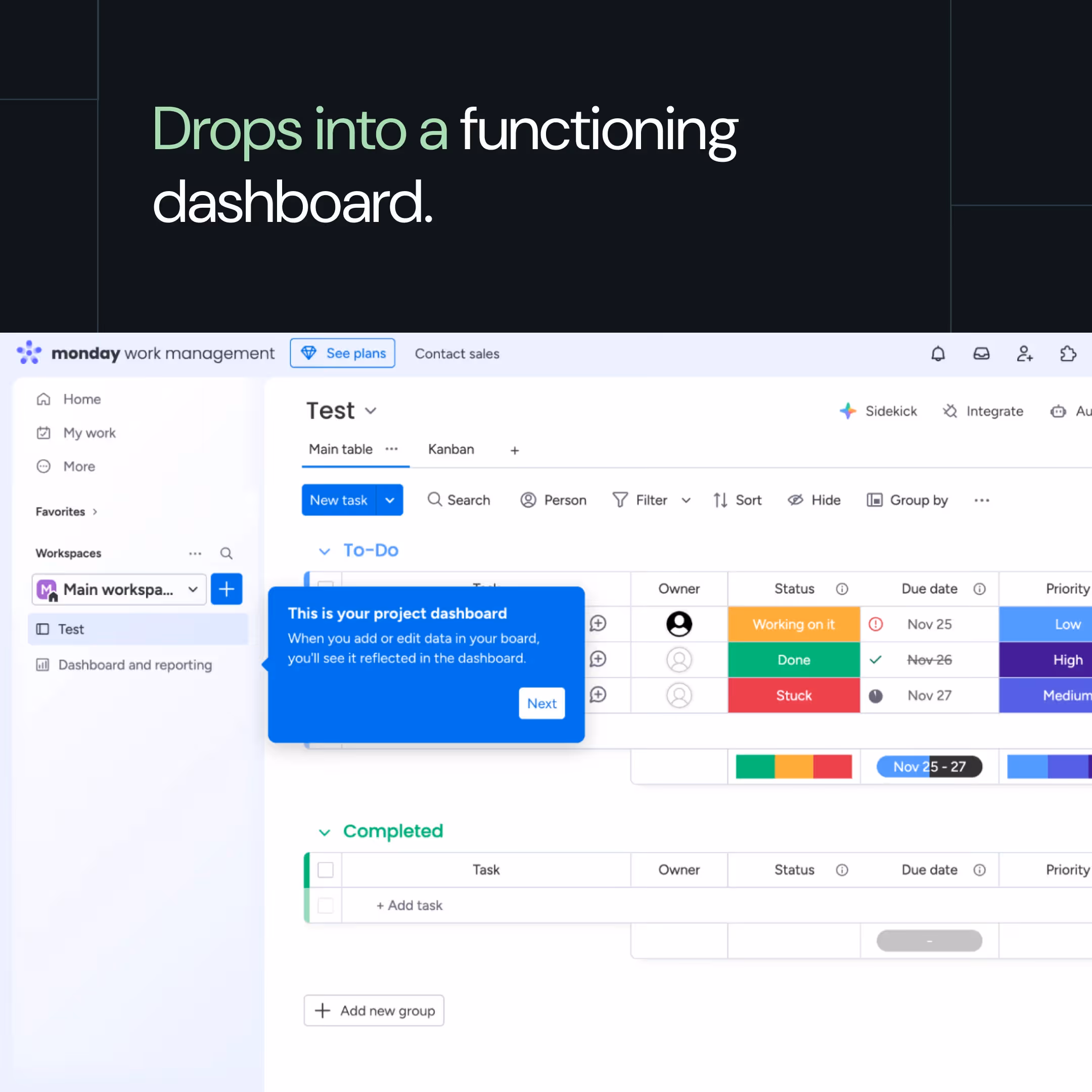
No configuration burden: Every question gives you options to click. You're not staring at a blank field wondering what to type. Monday picks the structure, columns, and layout based on what you chose. You just click.
Removes the "I need to learn this first" hesitation: ToFU buyers often delay signup, thinking they need to research or watch tutorials first. Monday removes that friction: "Don't worry, we'll set it up for you."
Product as the teacher: Most products point you to help docs or onboarding videos. Monday just hands you a working board. You drag tasks, change views, and click around. The product teaches itself.
How to apply:
1. Find what makes each ICP's setup different.
- For design tools, it's whether they're making a logo or a website.
- For CRMs, it's their sales process, for example, whether they track inbounds, outbounds, or renewals.
2. Turn those into quick intent questions.
- For design tools: "What are you creating today?" → Logo / Website / Social post
- For CRMs: "What do you want to track first?" → Inbound leads / Outbound deals / Renewals
3. Use option-based follow-up questions instead of open-ended ones. Let users click through in seconds. The faster they move through questions, the faster they see value.
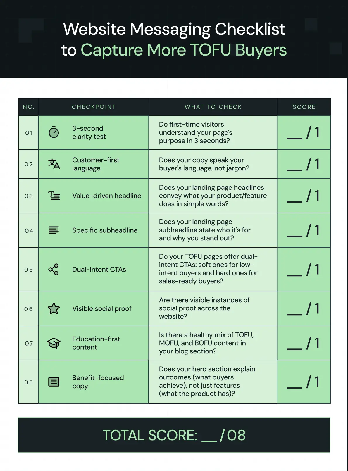
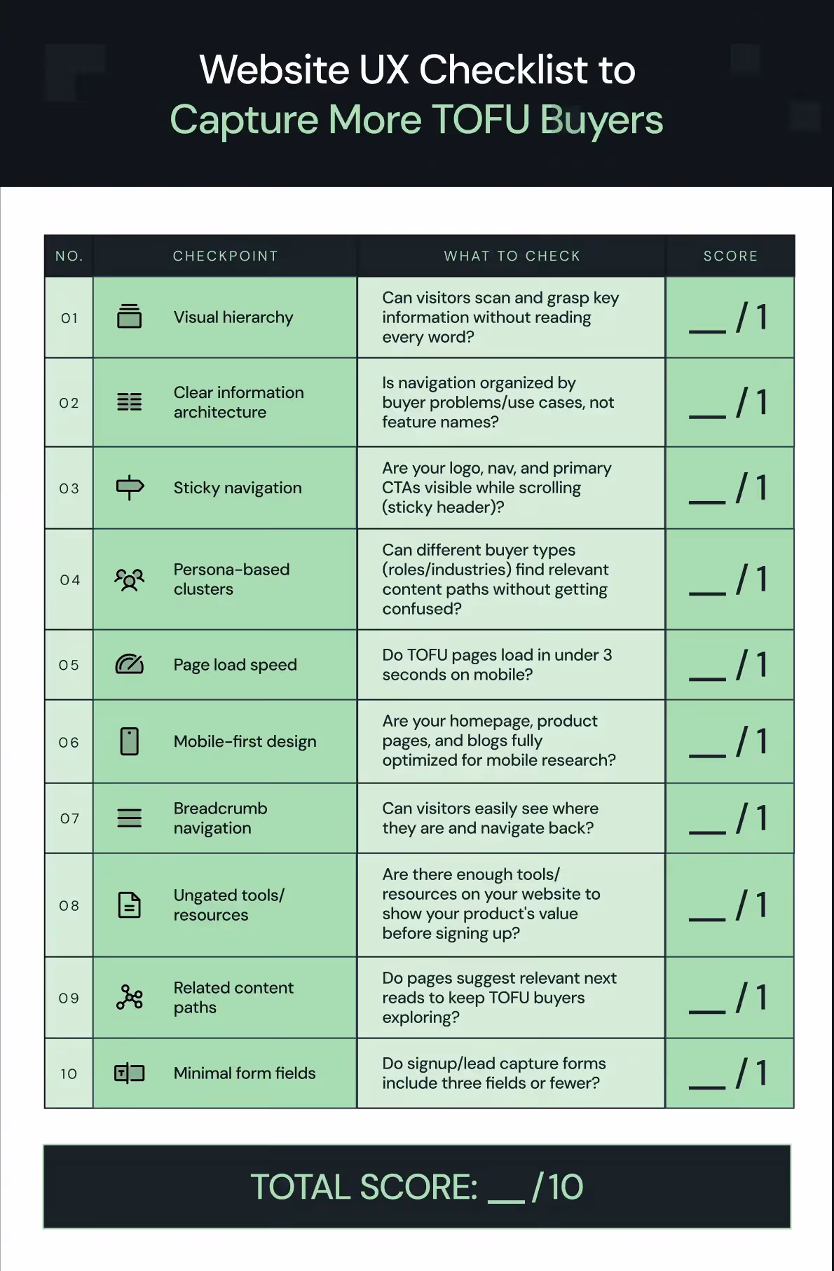
TOFU Optimization Basics: Website Messaging & UX Checklist
The above tactics complement a solid B2B website optimization strategy to increase your TOFU → MOFU conversions and stand out from your competitors. But if you are starting out, you should focus on the basics first.
Here's an interactive Google Sheet to help you audit your B2B website messaging and UX in under 2 minutes.
How to use this checklist:
1. Grab ThunderClap’s self-scoring messaging and UX checklist to capture more TOFU buyers here
2. Make a copy of it: File → Make a copy
3. Start with the tab: Website Messaging Checklist to Capture More TOFU Buyers
4. For each question, pick 1 for yes and 0 for no from the dropdown
5. Follow the same steps for the tab: Website UX Checklist to Capture More TOFU Buyers
6. Find your cumulative score and remarks at the bottom of the UX tab and take the necessary next steps
And here’s what you’ll be scoring:
1. Website Messaging
Optimizing website messaging for B2B conversions starts with capturing TOFU buyers through clear value, buyer-first copy, and intent-aligned CTAs.
Website UX
Optimizing B2B website UX means making it effortless for TOFU buyers to explore your product through intuitive UI, accessible resources, mobile-first design, and fast load times.
Optimize Your Messaging and UX for TOFU Buyers with ThunderClap
Start by auditing the basics first. Use the self-scoring checklist to see if your current B2B website messaging and UX strategies are strong enough to move TOFU buyers across the funnel. Once they are dialed in, layer on advanced tactics like contextual CTAs (easiest of the lot) or intent-based onboarding.
At ThunderClap, we help B2B brands do both: fix the foundation and implement the advanced tactics. Here's why 88+ brands have already trusted us with their website design and messaging:
Conversion-focused designs backed by strategy: As a Webflow Enterprise Partner, we combine expertise and proven frameworks to build websites that look stunning and drive results: increased demo signups, MQLs, and real pipeline growth.
B2B industry expertise: We've redesigned 140+ websites for SaaS, B2B, FinTech, AI, and venture capital companies, including brands like Amazon, Razorpay, and Storylane. We also conduct monthly research on over 50 top brands to identify conversion patterns that your competitors may not have noticed yet.
Post-launch support: We don't just launch and ghost. We act as an extension of your team, offering 30 days of complimentary post-launch support to ensure your website performs as it should.
{{ctaBlock}}
FAQs
1. Why is website messaging important for conversions?
Simple answer: buyers don’t convert if they don’t understand what your product does.
Your website messaging should clearly convey what it is, who it’s for, and how it’s different within 3 seconds of a visitor landing on your site. If not, they bounce.
2. How do I know if my B2B website messaging needs optimization?
Here are a few ways to tell if it’s time for B2B website messaging optimization:
Run a quick website design audit by asking a first-time visitor to explain what you offer, who it's for, and how it's different; if they can't, your website messaging lacks clarity.
High bounce rates or inconsistent copy across pages are also strong signs that it’s time to optimize B2B website messaging for conversions.
3. How often should I update my website messaging?
Audit your website messaging strategy with the CERTTN checklist every 3–6 months, or whenever your product, positioning, or ICP changes. Use a performance flywheel to track conversions, bounce rate, and engagement. Drops in these metrics signal it’s time for a website messaging refresh.
4. What role does storytelling play in website messaging optimization?
Storytelling makes your personalized website messaging strategy more effective by helping buyers see themselves in your product narrative. It paints their challenges and motivations from their shoes, not as a list of product features. When buyers feel understood, they’re more likely to trust your brand and take action.
5. Why does website messaging optimization matter for B2B brands?
Website messaging optimization matters for B2B brands because the buying journey involves long sales cycles and multiple stakeholders. Only intent-based, personalized website messaging ensures every visitor, researcher, evaluator, and decision-maker finds content that matches their goals and stages in the funnel.


.webp)
Browse Similar Articles

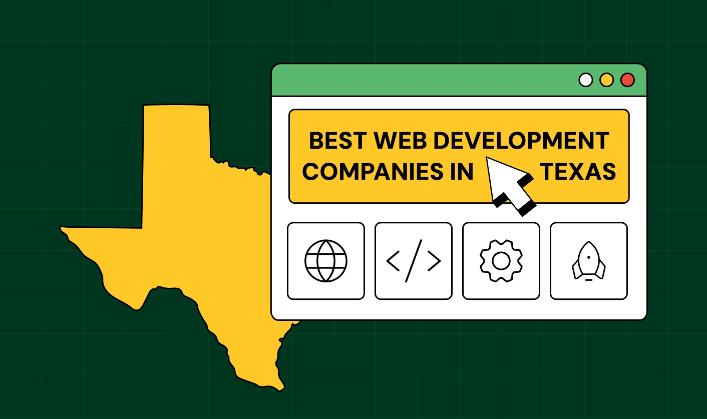
How to Find the Best Web Design Company in Houston, Texas for B2B Brands (6 Best Picks)

.svg)
The Step-by-Step Website Redesign Process B2B Teams Use to Increase Conversions (Without Killing SEO and Pipeline)
7 Best Video Production Agencies for SaaS Product Walkthroughs and Feature Videos

How to Choose the Best B2B Website Maintenance Company: 9 Questions to Ask Before You Hire One


How to Use Brand Storytelling on Your Website to Close More B2B Deals and Build Buyer Trust

Why Partnering with a B2B Brand Positioning Agency Accelerates Market Differentiation

.avif)
10 Product Marketing Companies Powering the Fastest-Growing SaaS Brands in 2026


Outsourcing Web Design: Cost-Benefit Analysis for Mid-Market & Enterprise Brands
From Leads to Lifetime Value: How Growth Marketing Agencies Scale SaaS Revenue
Webflow vs WordPress: Which Platform Is Better for Your Business Website in 2026?

Fintech Web Design That Builds Trust: 8 UX Principles Every Fintech Site Needs


From Audit to Action: 8-Step Process to Optimize Your B2B Website Strategy for 2026 Buyers
How to Design a High-Converting Landing Page from Scratch (2026 Edition)


How to Optimize a Landing Page for Maximum ROI: A Step-by-Step Breakdown

AI Landing Pages That Convert: 7 Design Principles Every AI Platform Should Follow


Top 7 Webflow Integrations to Supercharge Your Website's Performance and Conversions


10 Best Web Design and Development Companies in India [B2B Focused for 2026!]
How to Choose the Best Webflow Agency: A Complete Guide for Your Business


Interested in seeing what we can do for your website?


.webp)
