


Blogs by Kiran

Your fintech platform could be built on the most robust compliance architecture in the market, and still lose up to 70% of its users before they finish signing up. Similarly, a beautifully designed website that hasn't been architected for regulatory requirements will eventually cost you far more in fines, legal exposure, or lost banking partnerships.
The challenge for fintech brands today is finding a website development agency that understands the financial repercussions, data, trust, and design all at once. This guide breaks down exactly what separates average web development from expert fintech web development, and the five agencies that have actually cracked it.
TL;DR
- Fintech web development is fundamentally different from standard web development, as it requires security compliance, regulatory architecture (KYC, AML, GDPR), and high-converting UX to be designed together from the start rather than added later.
- Poor UX in fintech is costly, where 73% of users abandon financial applications during onboarding due to poor design, costing the industry an estimated $18 billion annually in lost customer acquisition.
- The best fintech web development services firms are not general digital agencies. They understand PCI DSS, GDPR, PSD2, and AML/KYC requirements at an architectural level.
- In this guide, we’ll cover 5 conversion-focused fintech web design agencies, including specialists in B2B SaaS CRO, enterprise UX, conversion-led web design, and full-cycle product engineering.
Why is Fintech Web Development More Complex Than Regular Web Development?
Most industries can afford to separate their marketing website from their compliance architecture. Fintech cannot.
In fintech, as Michal Skvarenina highlights, design operates under extreme constraints, where even a slight deviation in branding, UX patterns, or disclosures can break compliance or user trust.
A retail brand that launches with a poorly converting homepage loses revenue. A fintech brand that launches with a non-compliant onboarding flow or an insecure payment gateway can face regulatory sanctions, licensing revocations, or data breach liability, all of which carry a far heavier price tag than a missed conversion.
Global AML fines reached $4.6 billion in 2024, with North America accounting for 94% of that total. In the first half of 2025 alone, fines totaled $1.23 billion, a 417% increase over the same period in 2024. These numbers signal a market where regulators are actively tightening the screws, and where the consequences of getting your web architecture wrong are not theoretical.
At the same time, Fenergo's 2025 research found that 70% of financial institutions lost clients during the past year due to inefficient onboarding, up from 67% in 2024 and 48% in 2023. Every extra field in a KYC form, every slow identity verification step, every confusing dashboard navigation path translates directly into churn.
This creates a three-sided pressure on any fintech website or web application:
- Security: Data protection, encrypted transactions, secure payment gateways, and breach prevention must be part of the architecture from day one.
- Compliance: KYC verification flows, AML monitoring integration, GDPR data handling, PSD2 authentication standards, and DORA resilience requirements are non-negotiable.
- UX: Onboarding flows, trust-building interface design, and frictionless transaction paths must make a complex product feel simple enough that users complete the journey.
Fintech teams worry about one thing: "If we mess this up, will it cost us legally or financially?"
The right development partner answers that question before it's asked (via architecture).
Why Fintech Web Development Requires Both Compliance and UX
In fintech, compliance gets users through the door. UX gets them to stay. The challenge is that the two often pull in opposite directions. Identity verification, disclosures, consent requirements, and security checks add friction to the user journey. But removing them isn't an option.
The best fintech web development agencies don't treat compliance and user experience as separate workstreams. They design them together from the start.
Compliance is the baseline
Every fintech website must meet regulatory, security, and data privacy requirements. Depending on the product, that may include KYC and AML workflows, identity verification, consent management, and secure handling of customer data.
These requirements shape how users move through onboarding, account creation, and transaction flows. Getting them wrong creates legal and operational risk.
UX is where competitive advantage comes from
Compliance may be mandatory, but user experience determines whether prospects become customers.
Strong fintech UX makes complex processes feel simple. It reduces friction during onboarding, clearly explains what's happening at each step, and helps users complete critical actions with confidence.
This is important because fintech users are often making decisions involving their money, personal information, or both. Confusing forms, unclear messaging, or cumbersome verification flows can quickly lead to abandonment.
The most effective fintech websites balance trust, clarity, and conversion. They meet regulatory requirements without making the experience feel like a regulatory process.
What Makes a Good Fintech Web Development Partner?
Choosing a fintech web development partner isn't the same as hiring a design agency. The consequences are too different.
To evaluate partners systematically, use the CRUST Framework, five non-negotiable capabilities that separate genuinely fintech-ready agencies from general practitioners who've worked with a single payments brand.
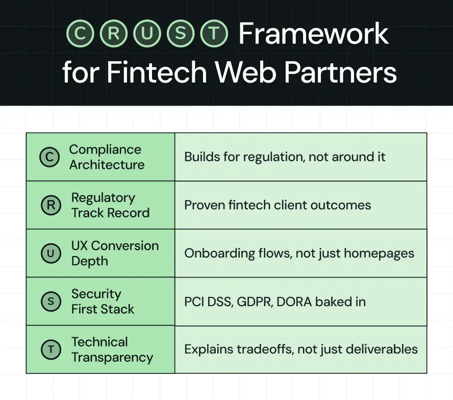
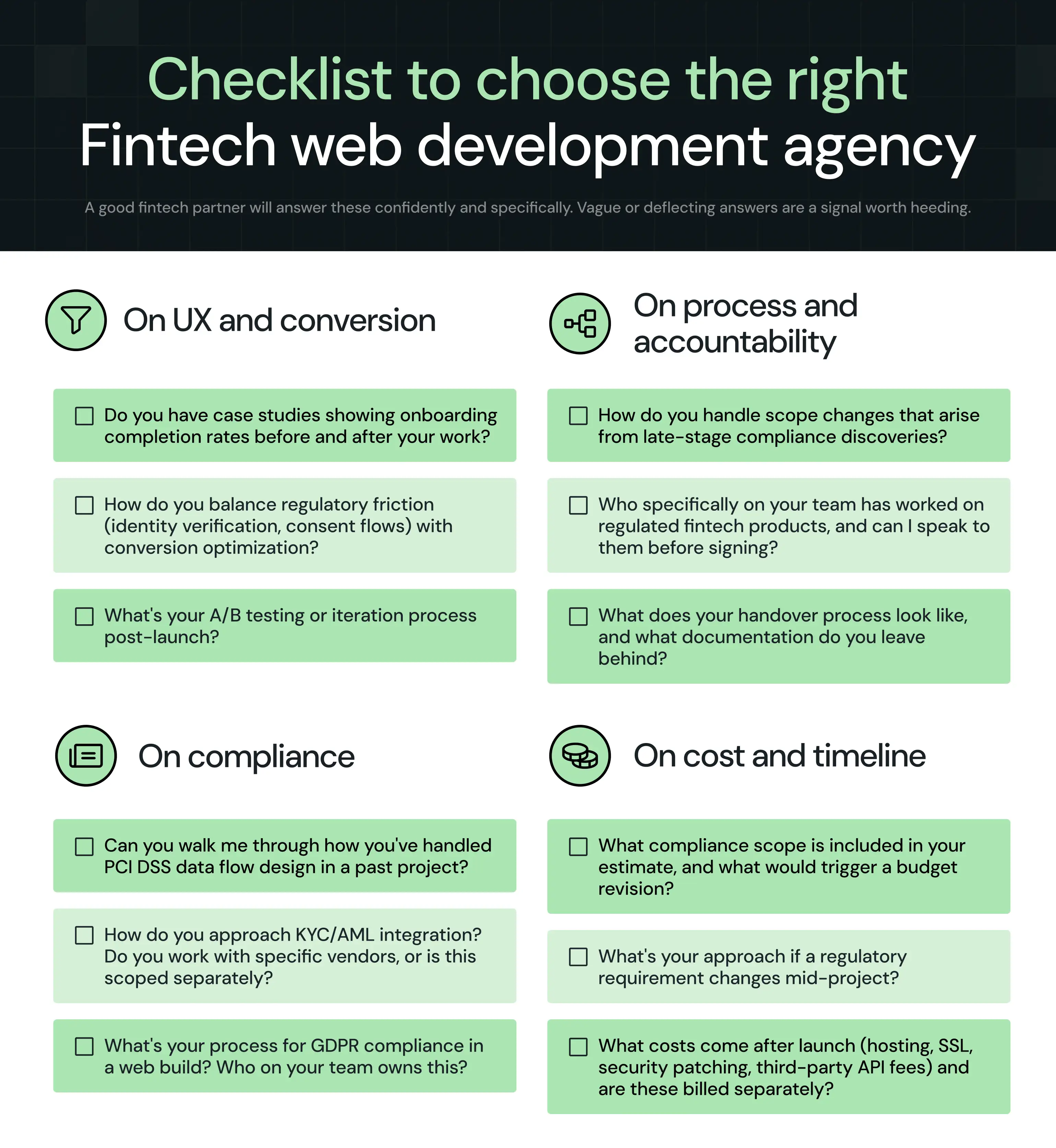
1. Compliance architecture
The agency must show experience in building regulatory requirements directly into the product's technical structure. Ask them specifically how they handle PCI DSS data flow design, GDPR data residency, and KYC vendor integration.
If the answer is, "We work with your legal team on that," keep looking.
2. Regulatory track record
Client references in fintech are not optional. Hence, ask for examples of live regulated products. Platforms that have successfully passed compliance audits, obtained PSP licenses, or launched in EU-regulated markets are meaningful proof points.
Marketing portfolio pieces are not.
3. UX conversion depth
Look for experience with the specific UX challenges of fintech: KYC onboarding flows, multi-step authentication, dashboard complexity, and trust-building design systems.
Generic conversion rate optimization experience from e-commerce does not transfer to financial products.
4. Security-first stack
The agency should be able to articulate their approach to threat modeling, penetration testing, and secure coding practices before they start.
ISO 27001 certification, SOC 2 experience, or documented security audit processes are indicators worth asking about.
5. Technical transparency
Fintech projects involve trade-offs that most web projects don’t, such as choosing between native and cross-platform development, balancing compliance needs with launch speed, and keeping UX simple while still collecting all required user data.
A good partner explains these trade-offs clearly and helps you make informed decisions, rather than silently absorbing them and billing for the consequences.
5 Best Fintech Web Development Agencies for Compliance + High-Converting UX
We evaluated over 20+ fintech web development agencies to find the ones you can rely on for secure, compliant, and high-converting fintech platforms. Below is a quick side-by-side comparison of these agencies:
Now, let’s cover these fintech agencies from the list in detail, ranked by their compliance capabilities, UX approach, security standards, and client reviews.
1. ThunderClap
.webp)
Best for: B2B SaaS and fintech brands at the growth stage (Series A–C) that need a website that converts, builds trust, and positions them as category leaders.
Would you work with a team that is as obsessed with your fintech platform’s success as you are?
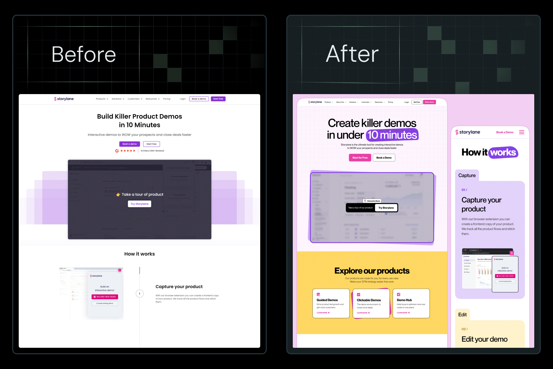
That is ThunderClap, a leading standard in fintech website design. ThunderClap is the design A-team for fintech brands, with talented designers, developers, and marketers who have helped 129+ B2B SaaS and fintech brands scale quickly. From startups to enterprises, they build websites that convert, stay compliant, and build trust.
What makes ThunderClap stand out is its obsession with results. They strategize, optimize, and deliver websites that improve lead pipeline by an average of 50%. They also bring SEO into the process from day one, so your fintech platform is built to rank and scale over time. Learn more about their process.
When the founders of Rezolv, an AI-powered fintech platform that helps financial institutions streamline and modernize debt collections, approached ThunderClap, they had strong technical expertise but lacked a brand, a website, and a clear way to explain their product.
The team built their identity from scratch, starting with a logo and visual system that reflected their approach to solving complex problems. They then developed the B2B website strategy, created clear messaging, and simplified complex financial workflows while maintaining trust and credibility. The site was built in Webflow with a focus on speed, responsiveness, and conversion from day one.
After launch, Rezolv saw higher engagement from prospects and faster adoption from target customers.
“As an early-stage company, we needed a clear brand identity and messaging before launching. ThunderClap delivered exactly that! Concise, impactful copy and branding that feels right.” - Karan Mehta, Founder, Rezolv
As Ayush Barnwal, Founder at ThunderClap, shared in a LinkedIn post, Rezolv was a stealth fintech startup founded by ex-Kissht leaders with a full suite of products for bank debt collection.
We helped them build a trusted brand, clear messaging, and a high-converting website to communicate their value to large banking clients.
This shows that ThunderClap designs with purpose. Every project starts with a deep understanding of your business, your users, their pain points, and your goals. They build fintech-specific strategies that balance compliance and trust with conversion-focused design. Their team handles everything from strategy and UX design to web development and ongoing maintenance.
Website: www.thethunderclap.com
Rating: 4.9 (Clutch)
Company size: 11-50 employees (in-house team of designers, developers, PMMs, CROs, and copywriters)
Average engagement period: 8–12 weeks for a full website revamp; ongoing retainers available post-launch
Services offered:
- End-to-end website design and development (including Webflow, WordPress, and Framer builds), Figma-to-development workflows, CMS implementation, enterprise-scale development, custom integrations, and ongoing website support and optimization
- Conversion rate optimization (CRO), SEO integration, copywriting, post-launch support (30 days included)
- Turns websites into revenue engines, not just redesigns
- Serves mid-market and enterprise B2B brands
- Creates scalable, marketer-owned CMS systems that are easy to update and future-proof
What customers have to say: "ThunderClap's speed of execution, high-quality work, and transparent communication make them stand out. It's rare to find an agency this reliable, and that's why we keep coming back." — Matt Cope, Co-founder, Overpass Studio
Notable projects/partnerships: ThunderClap brings deep expertise across SaaS, fintech, consulting, commerce, B2B services, and AI. Their clients include Shopline, Mysa, Spentra, Rezolv, and Razorpay, helping them with positioning, UX, and conversion-focused web experiences. Beyond fintech, their portfolio spans global B2B and enterprise clients such as Amazon, Storylane, Factors, Roommaster, Zamp, Dropit, Wizcommerce, and DPDZero, among others that prioritize measurable business outcomes over design alone. Their work has also received recognition through awards such as the Webby Awards and CSS Design Awards.
As a result, clients have seen up to a 50% increase in conversions, an 80% increase in demo bookings, and a 60% increase in engagement after working with the agency.
Join 88+ fast-growing fintech and B2B brands to build high-performing websites that drive measurable business results across SaaS, AI, and financial services.
{{ctaBlock}}
2. Clay
.webp)
Best for: Well-funded fintech startups and enterprise financial products that need world-class UX, product design systems, and brand identity, and have the budget for a premium engagement.
Clay is a San Francisco-based UI/UX design and branding agency with one of the most credible fintech portfolios in the market. Their work covers AI-powered financial products, trading platforms, credit tools, and digital banking interfaces.
They approach web development for fintech through the lens of behavioral science and brand cohesion, building design systems that hold up across the entire product, not just the marketing surface.
Website: www.clay.global
Rating: 4.8 (Clutch)
Company size: 11-50 employees
Average engagement period: Up to 20 weeks, depending on scope; tends toward longer strategic engagements
Services offered: UI/UX design, branding and identity, product design, web design and development, design systems, AI-powered product design
Notable projects: Coinbase, Credit Karma, Stripe, Marqeta, Lulo Bank, MoneyLion, and STC Bank.
{{specficService}}
3. CSTMR
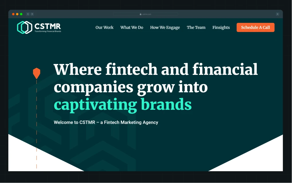
Best for: Growth-stage fintech companies (Series A–B) that need brand strategy, web development, SEO, and paid acquisition managed by a team that genuinely understands financial services regulation and audience psychology.
CSTMR is one of the few agencies on this list that positions itself exclusively as a fintech and financial services marketing and web agency. Founded by industry veterans with experience at some of the largest financial brands, they bring a decade-plus of domain knowledge to every engagement.
Their approach integrates brand positioning, fintech web design, conversion-led web development, and performance marketing into a single program, which is particularly valuable for fintech companies that need to move marketing and compliance strategy in parallel.
Website: www.cstmr.com
Rating: NA
Company size: 11-50 employees
Average engagement period: Typically ongoing retainer model (3–12+ months); strong long-term partnership culture
Services offered: Brand strategy and positioning, web design and development, SEO, content marketing, paid media, UX/UI design, conversion optimization
Notable projects: LendingTree Business Loans, ValidMind, UniTeller, Bankuity
4. Kindgeek
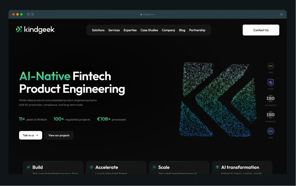
Best for: Series B+ companies, licensed fintech operators, and enterprises with complex compliance scopes.
Kindgeek is a Palo Alto-headquartered, full-cycle, AI-native fintech development company with over 200 engineers and 100+ fintech products delivered. Unlike the other agencies on this list, Kindgeek works at the product engineering layer, not the marketing or brand layer.
Their value proposition is specifically for companies where security compliance is a first-class engineering concern. PCI DSS, DORA, GDPR, PSD2/PSD3, MiCAR, and ISO 27001 are built into every pull request, not reviewed after launch.
Website: kindgeek.com
Rating: 4.8 (Clutch)
Company size: 51-200 employees
Average engagement period: 4–6+ months (MVP to full platform); white-label infrastructure can reduce time-to-market from 12+ months to weeks
Services offered: Neobank development, payment gateway integration, card issuing platforms, BaaS architecture, KYC/AML systems, AI transformation for fintech, white-label compliance-ready infrastructure, PCI DSS/DORA/ISO 27001 compliance
Notable projects: payabl, HyperJar, STCpay
5. Uitop
.webp)
Best for: Fintech companies and SaaS brands with complex, multi-feature products that need systematic UX design. Suited to growth-stage and enterprise companies with an in-house development team.
Uitop is a product design agency that has built a strong fintech specialization through deep research methodology and scalable design systems. They focus exclusively on the design and UX layer, which makes them a strong complement to an in-house engineering team or a development-focused partner like Kindgeek.
Their strength is in making complex financial products feel intuitive to non-expert users, which directly reduces support tickets, onboarding abandonment, and feature confusion.
Website: www.uitop.design
Rating: 5.0 (Clutch)
Company size: 51-200 employees
Average engagement period: 4-24 weeks; scales based on product complexity and research depth required
Services offered: UX/UI design, product research and user testing, onboarding flow design, design systems, dashboard and data visualization design, mobile app design
Notable projects: TangoPay and other fintech trading platforms, digital banking products, and investment dashboards across European and US markets.
{{specficBlog}}
Questions to Ask a Fintech Web Development Agency Before You Sign
The brief you send to an agency shapes the partner you end up with.
Before committing to any fintech web develo
How Long Does It Take to Build a Fintech Website?
The timeline in fintech web development is shaped by three variables:
- Compliance scope
- Feature complexity
- Integration depth
Compared to standard web projects, you cannot compress a fintech build by cutting QA or security audits. Instead of a missed deadline, the exposure is a compliance failure.
A realistic planning framework looks like this:
One note worth making is that the compliance discovery phase, which includes mapping regulatory requirements, jurisdictional obligations, and third-party integration complexity, should occur before the development scope is finalized. Skipping this step can mean the cost estimate range varies by ±60%. Completing it first narrows that range to approximately ±50%.
How Much Does It Cost to Build a Fintech Website?
In fintech, a website is not just a digital asset but a part of your compliance, security, and revenue system. If you build a website that converts poorly, it’d cost you in CAC. Similarly, a fintech platform that fails a compliance audit will incur fines, legal fees, and potentially the loss of its operating license.
Here's how costs typically break down:
- Strategy and discovery: $10,000–$15,000+. Positioning audits, regulatory scoping, UX research, and competitive analysis. Often compressed or skipped by clients who then pay for it later in expensive revisions.
- Design (UX/UI): $15,000–$80,000+. Ranges from a marketing site redesign (lower end) to a full product design system with onboarding flow optimization (higher end). Agencies like ThunderClap, Clay, and Uitop sit at the premium end of this range for a reason.
- Development: $25,000–$500,000+. For marketing websites, Webflow development keeps costs manageable. For regulated product platforms, full-stack development with compliance architecture, including PCI DSS, DORA, GDPR residency, commands significantly higher rates.
- Compliance architecture: $55,000–$50,000+. Often, the most underestimated line item. Includes KYC/AML vendor integration, GDPR data flow design, PCI DSS scoping, and security audit preparation.
- Ongoing maintenance and optimization: $1,500–$15,000+. Post-launch optimization, compliance updates as regulations evolve, CRO iteration, and content management.
Verdict: Which Fintech Web Development Agency Is Right for You?
Choosing the right fintech web development partner comes down to where you are in your journey, what layer of the stack you need help with, and how much compliance complexity you're carrying.
Choose ThunderClap if:
- You're a B2B SaaS or fintech brand that needs a conversion-optimized marketing website that reflects your product's maturity
- Your product and compliance team are already in place, and you need the web layer to catch up
Choose Clay if:
- You want a fintech-focused growth partner that combines web development with SEO, content, and paid media
- You need long-term marketing support, not just a website build.
Choose CSTMR if:
- You want a fintech-focused growth partner that combines web development with SEO, content, and paid media.
- You need long-term marketing support, not just a website build.
Choose Kindgeek if:
- You are building a regulated fintech product from scratch and need compliance, infrastructure, and engineering tightly integrated.
- You are focused on systems like payments, neobanking, or KYC-heavy platforms.
Choose Uitop if:
- You already have development in place and need specialized UX and product design for complex fintech flows like onboarding, verification, or financial dashboards.
ThunderClap sits at an interesting intersection for most growth-stage fintech companies. It addresses the layer that most teams underinvest in, including the positioning, messaging, and conversion architecture of the web presence, while delivering fast, structured outcomes.
For teams that already have a compliance and engineering foundation and need their website to reflect and accelerate their category leadership, it's the most direct path to measurable pipeline impact, closing the gap between how good the product is and how clearly the web presence communicates it.
{{ctaBlock}}
FAQs
1. What are the things to consider before hiring a fintech web development agency?
Start by mapping your compliance scope before you contact any agency. Know your regulatory obligations (PCI DSS, GDPR, KYC/AML, PSD2), your target jurisdiction, and your current technical infrastructure. Then evaluate agencies on their fintech-specific track record, not just their general portfolio. Ask for client references in regulated financial products, and verify that those products are live and licensed.
2. Why is compliance important in fintech web development?
Compliance is important in fintech web development because it ensures your platform complies with financial regulations such as KYC, AML, GDPR, and PCI DSS. It protects user data, prevents fraud, and avoids fines or legal issues. It also shapes how onboarding, payments, and data handling are designed from the start.
3. What features should a fintech website include?
A fintech website should include a secure payment gateway, a KYC-integrated onboarding flow, GDPR-compliant consent and data management, multi-factor authentication, clear regulatory disclosure language, and a trust-building design system (security badges, certifications, and a transparent privacy policy). For B2B fintech platforms, a demo request flow optimized for conversion is equally critical, as your website is typically the first impression for procurement decision-makers.
4. How long does it take to build a fintech website?
A fintech marketing website typically takes 8–14 weeks to build. An MVP with onboarding and basic KYC integration takes around 10+ weeks. A full platform with payment rails, dashboards, compliance systems, and API integrations usually takes 8–24 weeks. Enterprise-grade regulated products, such as neobanks or BaaS platforms, can take months to complete. Timelines are driven primarily by compliance scope, not design complexity.
5. Can fintech websites use templates?
Fintech websites can use templates, but it is usually not a good idea. Most templates are not built to meet compliance requirements or the custom onboarding flows that fintech products need. They also struggle to support trust-building design, which is important in financial services, and can make the brand look less credible to investors or partners. For most fintech companies, custom development or a heavily customized Webflow build is the standard.
6. What are common mistakes in fintech web development?
Common fintech web development mistakes include treating compliance as a post-launch step, underestimating KYC/AML complexity, and skipping regulatory discovery. Teams often prioritize visuals over onboarding conversion, hire non-specialist agencies, and face costly rework. Launching without a conversion strategy also leads to lost growth opportunities from day one.

You've spent months briefing designers, reviewing mockups, and getting stakeholder sign-off. The site launched on time, looks polished, and everyone internally loves it.
Six months later, your paid campaigns are burning budget, bounce rates haven't moved, and the leads coming through are either thin on quality or not coming through at all.
This is the most common and most expensive mistake web design buyers make: commissioning a site that was built to win internal approval rather than convert the visitors you're paying to attract. A high bounce rate means your messaging isn't landing. Low lead quality means your forms and CTAs aren't qualifying intent. Poor conversion despite solid traffic means the design is working against your funnel, not with it.
The fix isn't a rebrand or another redesign brief. It's understanding which specific design elements drive conversion and making sure every one of them is built into your site from the start.
This guide breaks down 12 website design elements that high-converting SaaS sites have in common, drawn from real projects, not design theory.
TL;DR
- Most SaaS websites look polished but fail to convert because design is treated as a visual exercise rather than a revenue system.
- The key elements of conversion-focused website design include visual hierarchy, value proposition clarity, CTA strategy, trust signals, and performance, which work together as a system rather than independently.
- Visual hierarchy, above-the-fold messaging, and CTA design are the three highest-leverage elements for immediate conversion gains.
- Trust signals, including client logos, testimonials, and case study outcomes, reduce the perceived risk that stops qualified visitors from taking action.
What are Website Design Elements (and Why Do They Matter for Conversions)?
Website design elements are the visual and functional components that determine how a website looks, feels, and guides user behavior. They include your color palette, typography, layout structure, graphic elements, UI/UX patterns, white space, imagery, and conversion mechanics like CTAs and forms.
Most teams treat these as visual decisions. They're not. Each one is a prompt that pushes the visitor toward a decision. For example:
- Color tells the eye where to look.
- Typography signals whether something feels credible or not.
- Layout answers a silent question: What should I do next?
When these signals do not work together, something subtle breaks. The visitor hesitates, which is what kills conversions before your message even lands.
High-performing SaaS companies understand this differently. They see design elements as a connected system that turns traffic into a pipeline. According to Conviva’s 2025 State of Digital Experience Report, poor digital experiences have a direct impact on revenue. In fact, 55% of consumers do not complete a purchase, 50% switch to a competitor, and 39% cancel a subscription. These gains do not come from making things look better. They come from removing confusion, building trust, and making the next step feel clear and safe. Every website interaction either builds momentum toward action or introduces doubt that pulls the visitor away.
What Makes a Website High-Converting?
Decisions.
High-converting websites are built on how decisions are shaped. Every element has a job, and that job is tied to how a visitor decides what to do next.
Before getting into the specific elements, here's the framework we use at ThunderClap to evaluate and build conversion-ready SaaS websites: The Decision Flow Framework.
Here’s what it covers:
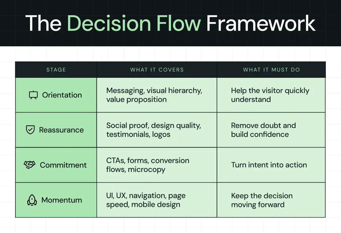
1. Orientation
Can I understand what this is and why it matters right now?
This is where messaging, visual hierarchy, and your value proposition do their work. If a visitor cannot quickly place themselves and your product in context, nothing else matters.
2. Reassurance
Is this credible and relevant to someone like me?
This is where social proof, design quality, testimonials, and recognizable signals reduce doubt. The visitor is not looking for hype. They are looking for reasons not to dismiss you.
3. Commitment
Is it worth taking the next step?
This is where CTAs, forms, and conversion flows turn passive interest into action. Small details matter here because friction and hesitation show up at the exact moment intent is highest.
4. Momentum
Is anything slowing me down or making this harder than it should be?
This is where UI, UX, navigation, speed, and mobile design either support the decision or quietly erode it.
Every design decision maps to one of these stages. If something is not helping a visitor move through this flow, it is working against you.
Which Website Design Elements Actually Improve Conversions?
The 12 elements below are drawn from real SaaS website projects. Each one has a measurable impact on visitor behavior and reflects a specific layer of the Decision Flow Framework above.
1. Visual hierarchy (guiding attention to action)
Visual hierarchy is the order in which your visitor's eye moves across the page. It determines what they see first, what they read second, and crucially, what they act on. Most websites get this wrong by design. That is, every section competes for attention equally, so nothing wins.
Eye-tracking research from the Nielsen Norman Group identified two dominant scanning patterns for web content: the F-pattern and the Z-pattern.
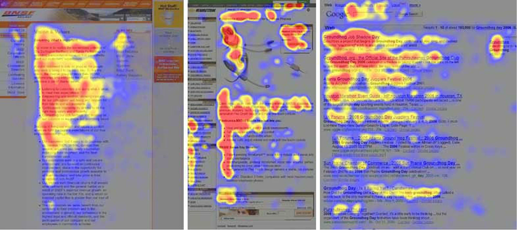
- The F-pattern dominates on text-heavy pages like blogs and pricing breakdowns. Here, users read the top line, scan down the left edge, then pick up anything that catches their eye horizontally.
- The Z-pattern is what users follow on visual-first pages like homepages and landing pages, scanning from top-left to top-right, then diagonally down to the bottom-left, finishing at the bottom-right. This is exactly where a CTA should sit.
This study tells you exactly where to place your headline, product visual, social proof, and call to action. If your most important content falls outside these natural scan paths, it simply doesn't get read.
For example, when ThunderClap redesigned the landing page for Factors.ai, the challenge wasn't the product, as it already had depth and genuine value. The challenge was clarity.
.webp)
Visitors couldn't understand what Factors did quickly enough, which made the product feel heavier than it actually was.
We rebuilt the page with a clear visual hierarchy that told a story step by step:
- Why fragmented signals are a problem
- How Factors solves it
- Proof of success through testimonials and client logos
We placed the headline, "Know how your buyers move. Run campaigns that win", precisely where the eye lands first. The layout guided visitors through each decision point without demanding they work for the answer.
As Ayush Barnwal, Partner at ThunderClap, noted, the redesign helped Factors establish a premium, globally ready brand that converted at the clarity level its product deserved.
What your visitors see first determines what they do next. Design the order of attention deliberately, and conversion follows naturally.
2. Clear value proposition above the fold
You have roughly 5 seconds to answer 3 questions for each new visitor.
What is this?
Who is it for?
Why should I care?
If your above-the-fold section can't answer all three, clearly and without scrolling, you lose them. Not necessarily to a competitor. Just to distraction and doubt.
This is one of the most common gaps in SaaS websites.
The homepage headline is either too clever to be clear, too broad to be relevant, or too feature-focused to feel like it solves anything real. Visitors don't convert when they're confused. They leave.
Unbounce's analysis of 41,000 landing pages found that copy written at a 5th-to-7th-grade reading level converts at 12.9%, while professional-level, jargon-heavy copy converts at just 2.1%, a difference of over 500%. This data doesn't suggest you should dumb things down, but simply that clarity is worth far more than cleverness.
When Zamp, a sales tax compliance platform, partnered with us, they were competing in a crowded market dominated by massive, well-funded incumbents like Avalara and TaxJar. Zamp possessed a genuinely excellent product with 99.9% filing accuracy, a two-hour onboarding process, and lightning-fast support response times.
However, the existing brand lacked the confidence to communicate those strengths effectively.
We rebuilt the brand from scratch to reflect the software's true quality. In fact, we focused on several core updates:
- Targeted messaging built specifically to resonate with corporate finance leaders and key decision-makers
- A reorganized website architecture featuring persona-driven user paths that naturally guided visitors toward booking a demo
- A premium visual identity utilizing clean typography hierarchy and balanced visual elements
- Transparent pricing and managed-service highlights are placed directly on the front page to establish trust early
The strategy succeeded because Zamp now looks and sounds like a legitimate category leader. Backed by more than $30 million in funding and top G2 rankings, the updated brand gives buyers a clear reason to trust the company before they ever jump on a sales call.
3. Strategic CTA design
Most SaaS websites have CTAs. Very few have strategic CTAs.
There's a meaningful difference between placing a button on a page and engineering a CTA that converts.
The gap lives in three places: Placement, Copy, and Contrast.
- Placement determines whether your CTA is seen. CTAs above the fold convert significantly better than those buried below content. Sticky CTAs, meaning the ones that follow users as they scroll, perform especially well on mobile, where 52.27% of global web traffic now originates.
- Copy is where most teams lose the most conversions. Generic CTA language like "Submit," "Learn More," or "Get Started" gives the visitor ...well, nothing. Action-oriented copy tied to a specific outcome gives them a reason. For instance, changing the pronoun alone, from "Start your free trial" to "Start my free trial," has been shown to lift click-through rates by up to 90%. The word "my" creates a sense of ownership and immediacy that "your" simply doesn't.
- Contrast is the visual execution. A CTA that dissolves into the background is invisible. High-contrast button colors (the ones that stand out clearly from the surrounding design without clashing with the brand palette) direct the eye precisely where you need it. Research from 1.2 million A/B tests found that red and orange buttons generate 32–40% higher click rates compared to other colors in many contexts, though the right choice always depends on the surrounding design system.
For middle-of-funnel (MOFU) visitors who aren't ready to buy but are genuinely interested, softer CTAs convert better than hard sells. A CTA like "Get a free website teardown" is designed precisely for this stage. It offers specific, immediate value without asking for a purchase commitment.
Monday.com is a masterclass in CTA architecture at scale. They place multiple CTAs above the fold, each aligned to a different user intent.
.webp)
The primary "Get Started" button uses a high-contrast color that's impossible to miss. A secondary "Request a demo" CTA sits alongside it, capturing visitors who aren't ready for self-serve. Scroll-triggered sticky CTAs keep the action accessible throughout the page without interrupting the reading experience. The result is a conversion system, not just a page with buttons.
4. Conversion-focused color palette
Color is the fastest design signal your visitor processes. Before they read a word or understand your product, color has already told them whether to trust you, pay attention, and use your CTA.
A HubSpot study found that changing a CTA button from green to red increased conversions by 21% in A/B testing. Similarly, eye-tracking research shows that users spend 42% more time engaged with colorful designs than with monochrome ones, and high-contrast elements receive 23% more clicks than low-contrast ones. These are the kind of gains most companies spend months chasing in other channels.
For SaaS, the color palette serves two conversion jobs simultaneously:
- The first is brand consistency. This means colors that feel coherent across every touchpoint build familiarity, and familiarity builds trust.
- The second is directional contrast. That is, using a distinct accent color specifically for CTAs and conversion elements so they stand out from everything else on the page.
When your CTA button shares the same color family as your hero background, it disappears. When it contrasts sharply, it commands attention.
Accessibility is the third consideration teams routinely overlook. Roughly 8% (1 in 12) of men have some form of color vision deficiency, which means a red-on-green or similarly low-contrast design locks out a meaningful portion of your audience. In fact, a 2025 research found that high-contrast, accessible color schemes perform 15% better in bright mobile environments.
NativeMSG shows color working as a strategic tool rather than a stylistic one. When we redesigned their website, the product was genuinely strong, but the existing design didn't reflect its market leadership in RCS messaging.
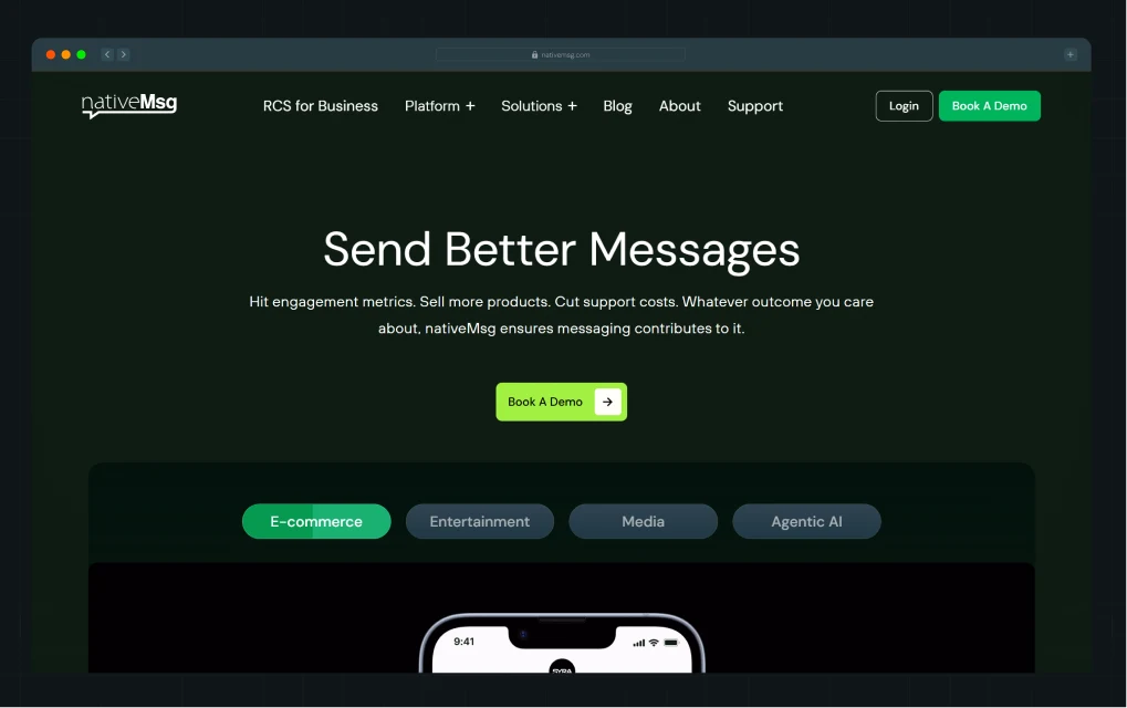
We chose a green-focused color palette deliberately, wherein green signaled clarity, growth, and differentiation in a category dominated by blue and grey. The visual system, inspired by their logo, layered structure, and reliability, is integrated into every screen.
Your color palette isn't a brand decoration. It's a conversion system with a visual identity attached.
{{specficBlog}}
5. Typography that improves readability and trust
Typography is one of the most underestimated conversion levers in SaaS website design. Most teams spend hours on their color palette and minutes on their fonts. The result is a site that looks polished from a distance but loses visitors the moment they try to read it.
In fact, readable typography improves comprehension and time on site, and both of those metrics correlate directly with conversion rates.
Typography in conversion design operates at three levels:
- Font pairing shapes personality and trust before a single word is read. A heavy, geometric sans-serif paired with a clean body font reads as confident and modern. A serif paired with a neutral sans-serif reads as authoritative and established. The pairing communicates brand character faster than copy does.
- Hierarchy tells visitors what to read in what order. Your H1 should be impossible to miss. Your H2s should feel like natural resting points as the eye moves down the page. Body copy should feel easy, not like an effort. When typographic hierarchy is weak, visitors scan randomly and miss the most important content.
- Readability is the baseline requirement for everything else. A line length between 50 and 75 characters is the proven comfort zone for continuous reading. Body text below 16px on desktop creates unnecessary strain. Left-aligned text is the most accessible choice for long-form content. When typography is readable, visitors stay longer, and when they stay longer, they convert at higher rates. Typography that serves the reader, not the brand, is what actually builds trust.
Pink Chili is a marketing agency built for Gen Z, and its website behaves exactly like one. It’s bold, unapologetic, and driven almost entirely by typography. With minimal reliance on imagery, the entire experience leans on type to carry both personality and clarity.
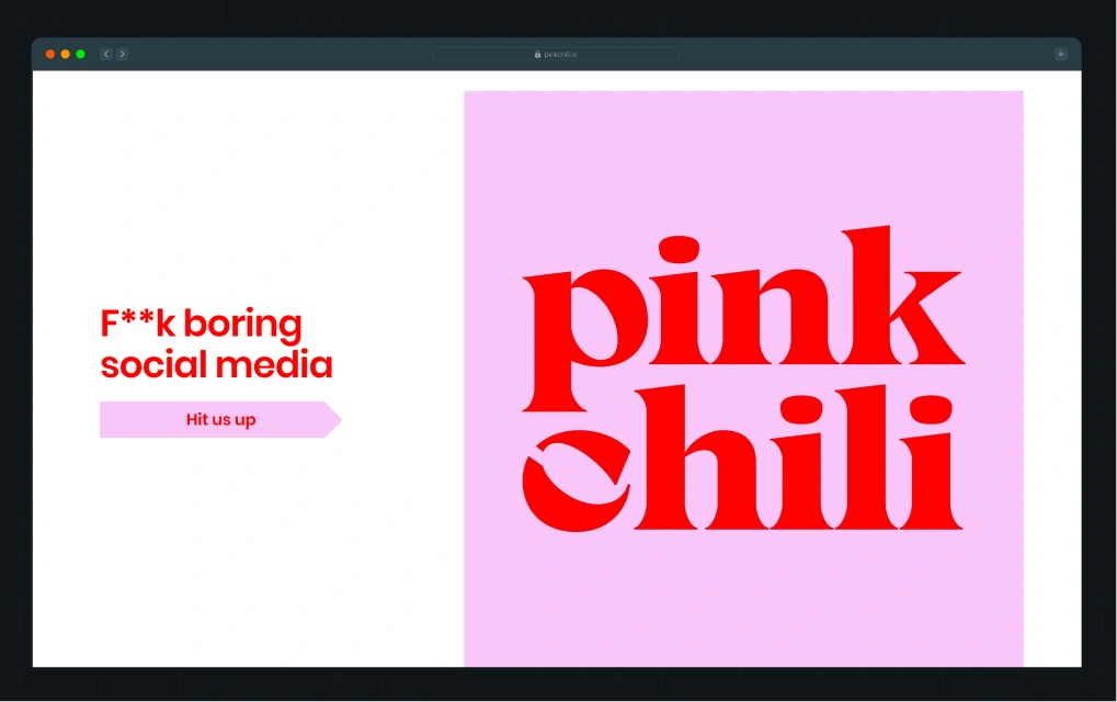
The brand name appears in an oversized, high-contrast cherry-red serif, set against a soft lavender background. The scale is aggressive, taking up most of the screen, ensuring immediate visual dominance. The serif itself has thick strokes and sharp curves, giving it a playful yet confident personality that aligns with a Gen Z audience.
What stands out is how intentional every typographic decision feels. Font size, kerning, line height, and color are all doing real work, guiding the eye, structuring the content, and maintaining rhythm across sections. Even with heavy copy, the site never feels overwhelming. It feels designed to be read.
6. UI/UX design that removes friction
Users don’t convert if they can’t find what they’re looking for, which usually comes down to navigation. If it’s unclear or poorly structured, people drop off before they even understand your product.
Your navigation needs to be intuitive. Labels should make sense instantly, and the structure should match how users think, not how your product is organized internally.
Segment does this well. Their navigation is built around user intent, not generic labels. Instead of just “Features” or “Pricing,” they use “Solutions” organized by persona, so different users can quickly find what’s relevant. “AI Solutions” speaks to a high-interest category, while “Case Studies” helps build trust without forcing users to search for proof.
.webp)
This structure removes decision fatigue. Users don’t have to guess where to go next. The dropdowns add another layer of clarity with short descriptions and clear typography, making everything easy to scan.
The experience stays consistent as you scroll. The sticky navigation keeps the primary CTA visible, so users can take action the moment they’re ready.
On mobile, this matters even more. Navigation needs to be simple, thumb-friendly, and easy to interact with. When users don’t have to think, they move faster. And when they move faster, they convert more.
7. High-impact imagery and graphic elements
Stock photos, such as the smiling team in an open-plan office, the handshake over a laptop, the abstract globe made of lines of connection, are a conversion liability. However, visitors have simply trained their brains to ignore them. These images communicate nothing and cost you the attention you could be using for real conversion work.
Authentic visuals perform very differently. For example, genuine photos can increase trust scores by up to 65% and improve conversion rates by nearly 35%, compared to generic, overly polished stock imagery. User-generated content (UGC) showing the product in a real-world context converts at rates 29% higher than product-only imagery. The pattern holds across industries, where authenticity in visuals builds the trust that copywriting often can't.
Modern web design elements have moved decisively toward contextual storytelling through visuals. The best SaaS landing pages in 2026 use the product UI as the hero image, surrounded by minimal text that frames what the user sees. They use annotated visuals that walk the visitor through a workflow without requiring them to read three paragraphs. Additionally, they use before/after graphics that make the problem and the solution immediately obvious.
When NativeMSG partnered with us, a core challenge was that prospects didn't understand what RCS messaging could actually do, as the site relied on feature lists rather than outcome visuals.
We built 40+ visual mockups with real message examples so visitors could understand the product's capabilities in minutes, not after a demo call. The visual system became the primary conversion tool, turning a complex technical explanation into an immediate, intuitive understanding.
As Ayush put it:
“Our visual-first approach helped people understand the product in minutes.”.
According to Kiran Kulkarni, Partner and Head of Growth at ThunderClap, the revamp helped NativeMSG turn their education challenge into a conversion asset, driving a more qualified pipeline from visitors who, on first contact, finally understood the product.
8. Trust signals (social proof, testimonials, and logos)
Generic testimonials like “Great product” or “5 stars” don’t build trust. They get ignored. What actually works is social proof that highlights the business impact, speed, and relevance.
Most SaaS pages do not focus on these elements. They show intent, but not proof.
Trust signals are what close that gap, and the data on how much they move conversions is unambiguous. For example:
- Products with five or more reviews are 270% more likely to be purchased than products with no reviews.
- Video testimonials increase conversion rates by 80% over text-only testimonials.
- Websites featuring user-generated content see 29% higher conversion rates than those without.
- 92% of buyers hesitate to take action when no reviews or proof points are present.
This means the absence of trust signals is itself a conversion problem, not just a missed opportunity.
For B2B SaaS, the trust signal hierarchy looks like this, from highest to lowest conversion impact:
- Detailed case studies with quantifiable ROI metrics
- Video testimonials from recognizable brands
- Client logos from companies your target audience respects
- Star ratings from third-party platforms like G2 or Clutch
- Proof metrics like "Used by 50,000+ teams"
The placement of these signals is as important as their presence. Testimonials work best near CTAs. Security badges and compliance logos belong near forms and payment pages. Proof metrics carry the most weight in the hero section, where they set the tone of credibility for everything that follows.
A good example of this is how we structure our own landing page.
.png)
Instead of pushing testimonials into a separate section, the proof appears directly within the flow of the landing experience. (Well, we do have a separate web page that showcases our work, in case you want to check it out!)
Right next to the hero, there is a detailed customer testimonial. It is specific, outcome-driven, and attributed to a real person from a recognizable company. The user does not need to search for validation. It is already there, at the exact moment they are forming an opinion.
When proof appears early and naturally, it reduces hesitation before it builds. Plus, it answers the question users are already asking:
“Does this actually work for someone like me?”
9. Fast loading speed and performance design
🧠Did You Know: Pages that load in one second have conversion rates 2.5 to 3 times higher than pages that take five seconds.
Google's research shows that 53% of mobile visitors abandon a page that takes more than 3 seconds to load. For every additional second of load time beyond that threshold, bounce probability increases by more than 30%. A one-second delay can reduce conversions by up to 7%.
For a SaaS company spending $50,000 a month on paid acquisition, a three-second load time is costing real, measurable revenue every single day.
Speed becomes a design issue the moment design choices start degrading performance. Uncompressed hero images, excessive animations built in JavaScript instead of CSS, third-party scripts loading on every page, heavy custom fonts without proper caching…and the list goes on…these are design decisions that look beautiful in a static mockup and perform poorly in the real world.
Performance design means making speed a creative constraint from the start. It means choosing lightweight animation libraries, optimizing images before they reach the CMS, using system fonts where custom fonts aren't essential, and testing load times on mobile connections.
The 88.5% of web designers who cite slow loading as the primary reason visitors leave are describing a design culture that treats performance as someone else's concern. In conversion-focused web design, performance belongs to everyone on the team.
10. Mobile-first responsive design
Over 50% of B2B buyers now engage with vendor content on mobile. If your site does not work well on small screens, you are losing opportunities before users even see your offer.
ClickUp is a strong example of a mobile-first experience that preserves the core functionality of its desktop site.
The mobile homepage keeps CTA buttons fixed at the bottom of the screen, uses a clean one-column layout, and turns longer sections into expandable accordions.
It works because:
- Large buttons make it easy to tap without mistakes
- The visual hierarchy stays clear even on small screens
- Key actions stay visible without forcing users to scroll back and forth
11. Conversion forms (structure, fields, UX)
Sign-up forms are one of the biggest conversion drop-off points in SaaS. Most brands lose qualified users here because they ask for too much information too early. Every extra field adds friction and reduces the chance of completion.
The most effective SaaS products reduce this problem by simplifying the first step.
Apollo.io, Notion, and Slack all start with minimal input forms, often just a single email field. The goal here is to get users into the product or funnel as quickly as possible.
Here’s why this approach works:
- Fewer fields reduce decision fatigue
- The first step feels effortless, which increases completion rates
- Users are more likely to continue once they have already started
Progressive profiling improves this further by collecting user information over time instead of all at once. This keeps the initial interaction simple while still building a complete user profile in the background.
Social login also reduces friction. It removes the need to create and remember another password, making the action feel like access rather than registration.
.webp)
A strong example is Apollo’s signup flow. The entry point uses a single email field placed directly after a clear call to action. The layout is clean, with strong visual hierarchy and minimal distractions. Errors are handled in-line, and the experience is optimized for mobile as well.
The effectiveness comes from simplicity. The form asks for just enough to start, not everything required to finish.
12. CMS and scalability
If your marketing team needs a developer to change a headline, update a testimonial, or add a new landing page, your website is a dependency. Every waiting period is one where underperforming copy stays live, slow pages stay slow, and leads that could have converted don't convert.
A modern headless CMS, such as Webflow, Sanity, Contentful, or similar, lets marketing and growth teams control the site without writing code. Pages can be duplicated, CTAs can be swapped, A/B tests can be launched, and new campaign landing pages can go live in hours rather than weeks.
Simultaneously, scalability in design means the website grows with the company. A SaaS company at Series A has different pages, different proof points, and different buyers than the same company at Series B. The design system should accommodate that evolution without requiring a full rebuild every 18 months. Reusable components, modular page templates, and a consistent design language make this possible. The alternative is a bespoke site built in a locked environment, which means starting from scratch every time the business changes direction or adds a product line.
When ThunderClap builds websites, post-launch ownership is a first principle. The team that briefed on the project should be able to run the site after launch. That independence is what makes the ROI of a well-designed website compound over time rather than degrade the moment the agency relationship ends.
{{specficService}}
How Do These Design Elements Work Together?
No single element on this list converts visitors on its own.
- Visual hierarchy places the right content where the eye lands.
- The value proposition gives that content meaning.
- The CTA turns that meaning into an action.
- The form captures the lead.
- The CMS makes it possible to improve every piece of that system next week.
The conversion path for a typical SaaS website looks like this:
Paid ad → Landing page (clarity + hierarchy) → CTA click (design + copy) → Form (UX + length) → Thank you page (trust + next step)
Every element in that chain is a design decision, and a weak link at any point drops the conversion rate for every strong element before it. This is why treating design elements of a website as a checklist doesn't work. A perfect CTA on a page with no clear value proposition converts no one.
At ThunderClap, we design conversion systems. The visual, the message, the mechanics, and the experience are built to work together from the first wireframe. The integration is what produces results that hold up beyond launch day.
Checklist: How to Evaluate Your Website Design?
Use this quick audit to identify where your current site is breaking the conversion chain. Go through each question honestly.
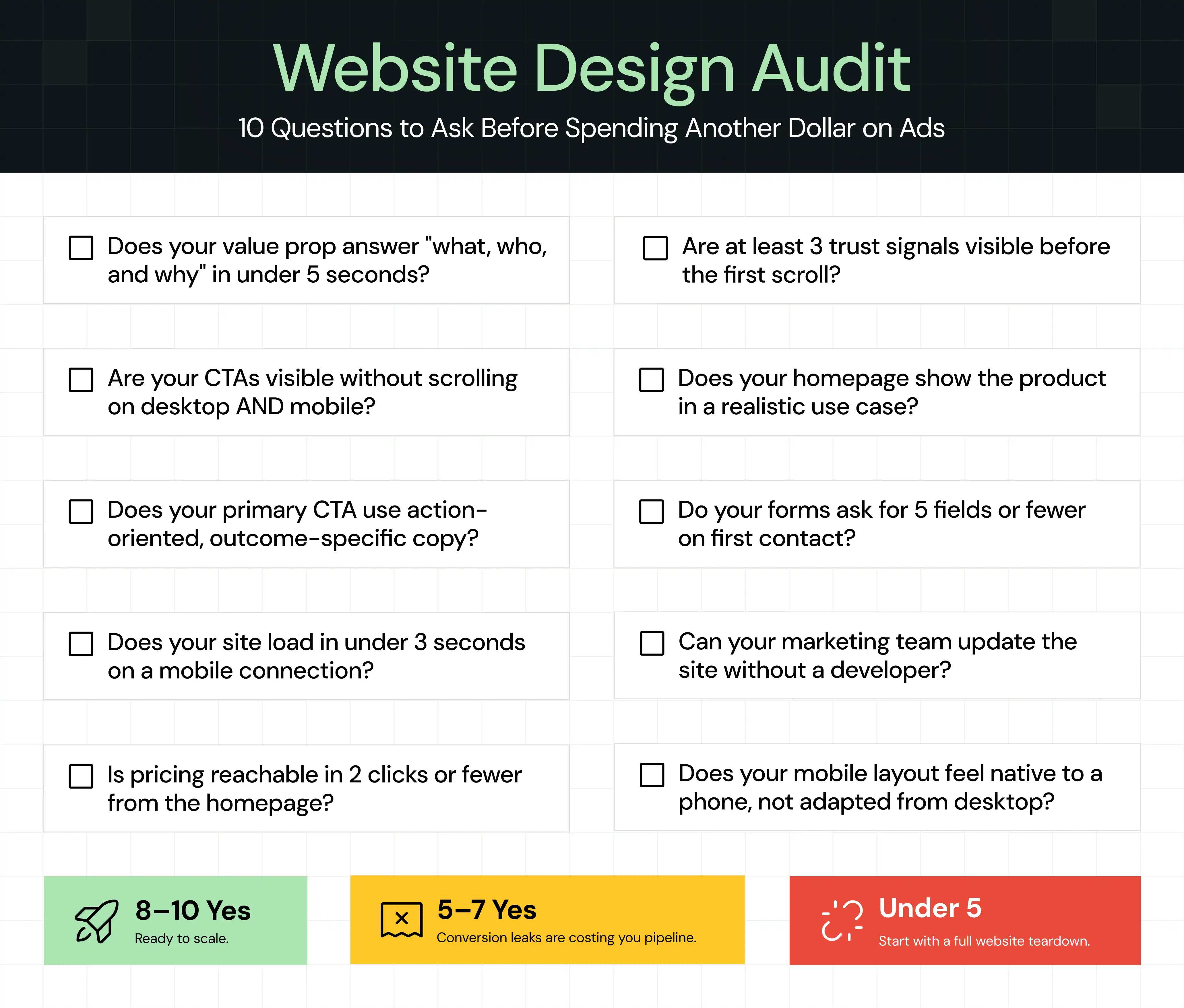
If you answered "no" to three or more, your website has conversion gaps that aren't going to close on their own. [Get a free website teardown from ThunderClap and find out exactly where you're losing leads →]
When Should You Invest in Conversion-Focused Website Design?
Not every company needs a full website overhaul right now. But there are specific signals that tell you the current site is actively costing you revenue, and that waiting costs more than acting.
- High traffic, low conversions: If your traffic is growing but demo requests, trial sign-ups, or lead form submissions aren't following, the website is the constraint.
- Rebranding or entering a new market: When your positioning changes, your website needs to adapt. A site that communicates last year's product to last year's buyer is a credibility problem with new prospects.
- Paid acquisition is increasing: Every dollar you spend on paid ads drives traffic to your website. If the site doesn't convert, you're paying for traffic that leaves. Before scaling paid spend, validate the landing experience's conversion rate.
- Sales is doing the website's job: If your sales team spends significant time in discovery calls explaining what the product does, something a well-designed homepage should have already communicated, the site is creating friction in the pipeline.
How Does ThunderClap Approach Website Design Differently?
Most design engagements start with visual references and end with a handoff. What you get is a site that looks like the inspiration deck you shared and behaves like a brochure after launch.
ThunderClap's approach starts with strategy. Before a single wireframe is drawn, here’s what we do:
- Audit the existing site for conversion gaps
- Review the messaging against what target buyers actually respond to
- Map the conversion flows the design needs to support
The visual work follows the strategic work, not the other way around.
The process is transparent at every stage. Clients see the thinking behind each design decision, not just the output. For example, when a CTA is placed above the fold, there's a reason backed by behavioral data. When a typography pairing is chosen, it connects to readability research and brand positioning. The best part is that post-launch ownership is built into every project.
{{ctaBlock}}
FAQs
1. What are design elements in web design?
Design elements in web design are the visual and structural components that shape how a visitor experiences your site. They include typography, color palette, layout, imagery, white space, CTAs, and navigation. Together, these elements control how visitors read, trust, and take action on your pages.
2. How does design impact website conversion rates?
Design directly controls whether visitors understand your offer, trust your brand, and know what to do next. Research found that a well-designed UI can lift conversions by up to 200%, and optimized UX can push that to 400%. Poor design creates friction that turns qualified visitors into lost leads before they ever reach a CTA.
3. Why are CTAs important for conversions?
CTAs are the bridge between a visitor's interest and your conversion goal. Without a clear, well-placed, and action-oriented CTA, visitors who are ready to act have no obvious path forward.
4. What is the difference between UI and UX in web design?
UI (User Interface) refers to the visual design of a page, including colors, typography, buttons, and layout. UX (User Experience) encompasses how a visitor moves through the site, including the navigation logic, the flow from page to page, and how easy it is to complete an action. Great UI attracts attention. Great UX turns that attention into a conversion.
5. Can a website redesign hurt SEO?
A redesign can temporarily affect rankings if URLs change without proper redirects, page speed drops, or content is removed. A well-executed redesign that maintains URL structure, improves Core Web Vitals, and preserves high-performing content typically improves SEO over time rather than damaging it.
6. How long does it take to design a high-converting website?
A conversion-focused SaaS website typically takes a few weeks to a couple of months from strategy to launch, depending on the scope of pages, the complexity of the design system, and how quickly feedback cycles move. Most teams see statistically significant conversion gains within 8 to 12 weeks of the new site going live.
Disclaimer: Yes, Thunderclap is on this list. First, in fact. But here's exactly why that shouldn't stop you from trusting us or reading any further.
Every agency offering website maintenance in London on this list, including us, had to earn its spot against three non-negotiable criteria:
- Website maintenance is a real service they offer, not something buried in the footer
- Proven B2B experience across industries like SaaS, fintech, and tech
- Verifiable social proof: logos, testimonials, or case studies
Anyone who didn't clear all three didn't make the cut. Including agencies we genuinely considered. We also share the exact questions you should be asking to pick the right website maintenance agency for your needs from this list.
But first!
What Does Website Maintenance Actually Mean? Isn’t It Basic Upkeep?
No, website maintenance is not just basic upkeep. It is the ongoing refinement of your website based on performance data, insights from web analytics tools, and business goals. Basic upkeep keeps your site alive by applying security patches, updating plugins, and fixing bugs when they break. While it is necessary, it is not always enough.
On the other hand, growth-led maintenance treats your website as a living asset that evolves with your B2B website strategy, business goals, and user behaviour. It includes performance monitoring, conversion rate optimization, UX improvements, and proactive fixes before problems surface.
When evaluating B2B agencies offering website maintenance in London, the difference between the two matters more than most teams realize. Here's a quick breakdown so you know exactly what to look for and what to walk away from.
Pick the agency that operates in the right column. The reason is simple. According to Webflow’s 2026 State of the Website report, 92% of leaders believe the relationship between marketing and engineering needs to improve. A reactive maintenance agency that waits for tickets only increases that gap, while a growth-led partner helps close it.
9 Best Website Maintenance Companies in London in 2026
If you're looking for reliable website maintenance services in London, here are some of the best agencies helping B2B companies keep their websites fast, secure, and conversion-ready.
1. ThunderClap
.webp)
Best for: Mid-market and enterprise B2B companies that want comprehensive maintenance that keeps their website performing and converting.
Thunderclap is a website maintenance agency that goes beyond keeping your site live. We monitor performance, improve conversions, and ensure your website keeps pace with your business goals.
After working with 88+ B2B brands across SaaS, fintech, VC, AI, and HR tech, including WizCommerce, Vunet, Amazon, Factors, and roommaster, we've likely solved a problem like yours before.
Beyond maintenance, we're a Webflow Enterprise Partner offering full website design and branding services. This makes us the perfect fit for companies that want one agency working as an extension of their team across design, development, and maintenance.
Why choose Thunderclap for B2B website maintenance?
- Growth-led maintenance: We start every maintenance project by understanding where your business is headed over the next 3-5 years. That context shapes every decision, so instead of fixing problems after they surface, we catch them before they cost you leads.
- Structured process: After 140+ website projects, our maintenance process is pretty dialled in. We begin with a discovery to map your site architecture, SEO setup, and growth goals, following proven Webflow website maintenance best practices to ensure everything is scalable from the start. From there, a shared task tracker gives you visibility into what's being worked on. Regular syncs keep things moving, and everything is documented along the way.
- Dedicated POCs: One account manager owns your project from day one. Every decision, from design and UI choices to open issues to ongoing work, is documented to ensure anyone on the team can step in without losing context.
- Handles complex requests: Most companies that build their websites with us stay for maintenance because we already know their websites inside out. Requests like custom integrations, CRM migrations, and complex form logic are normal maintenance tasks for us, not separate projects.
- Fast turnarounds: We resolve urgent requests within 24 hours and turn around most standard requests within 48 hours.
Notable Clients:
- roommaster: Came for a website revamp, stayed for maintenance after demo requests jumped 80% post-launch. We helped them move forms from standalone pages to in-page popups across 30+ pages, set up page-level CRM tracking so the team could see exactly which page each lead came from, and added auto-detection of a visitor's geographic location to personalize the experience.
- Unbound Summits: They were managing five separate websites (one main website + 4 event sites) when they first approached us. We consolidated everything under a single domain, reducing hosting costs and eliminating the operational back-and-forth of maintaining multiple platforms.
- Z47: Stayed on as maintenance partner after their revamp. Because we built the site, new pages and updates shipped in days, no briefing from scratch, no ramp-up time.
“ThunderClap team is a delight to work with! They don't feel like vendors but an extension of our team itself. The work quality is top-notch and all deliverables are completed within time.” -Aditi Sharma, Director at Zluri
2. MadeByShape
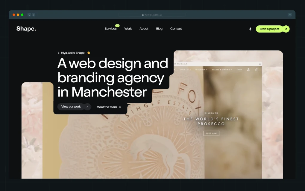
Best for: B2B companies running their website on Craft CMS, looking for flexible, no-contract maintenance support
With over a decade of experience, MadeByShape is one of the more established agencies offering website maintenance services in London, with 250+ clients across the UK and beyond. They've won multiple CSSDA and Awwwards recognitions for their work. Like Thunderclap, they're a full-suite website design agency, making them a good option for those looking for one partner for both design and maintenance.
Why choose MadeByShape for B2B website maintenance?
- Craft CMS specialists: As a Craft CMS Verified Partner, MadeByShape maintains websites on a platform most agencies don't support well. If your site runs on Craft, they know it inside out.
- Hours that roll over: Shape Support plans include a fixed number of hours each month. If you don't use them, they carry over, and hence you don’t have to worry about wasted budget.
- Three maintenance tiers: MadeByShape offers 3 plans: No Contract for one-off requests, Shape Secure for security and uptime, and Shape Support for the full retainer. However, lower tiers have quoted wait times and offer support only via email.
Notable Clients: Sketch Studios, This is Digital, Go2, Social Shepherd, Kent
3. LightHouse Digital
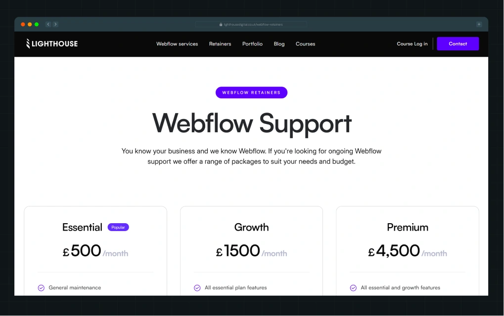
Best for: B2B startups and mid-market companies in London looking for a locally based Webflow maintenance company.
With a decade of experience and 200+ projects launched, Lighthouse Digital is a London-based Webflow Professional Partner headquartered in Shoreditch. Their clients have collectively raised £43 million in VC funding. For startups and scaleups specifically, that's a strong signal they understand what fast-growing companies actually need from a website.
Why choose Lighthouse Digital for B2B website maintenance?
- Three retainer tiers: Their plans start at £500/month for basic maintenance and go up to £4,500/month for full design, development, and multi-site support. The middle tier at £1,500/month is where most growing companies land, covering CMS, animations, custom integrations, and weekly calls.
- Early access to Webflow features: Lighthouse Digital is part of a select group that tests new Webflow features before public launch, meaning they stay ahead of platform changes before they affect your site.
- Free Webflow training for every client: Every client gets access to their Webflow Mastery Course, so your team can handle basic updates without depending on the agency for everything.
Notable Clients: Freetrade, Love Finance, HelloSelf
4. SpotDev
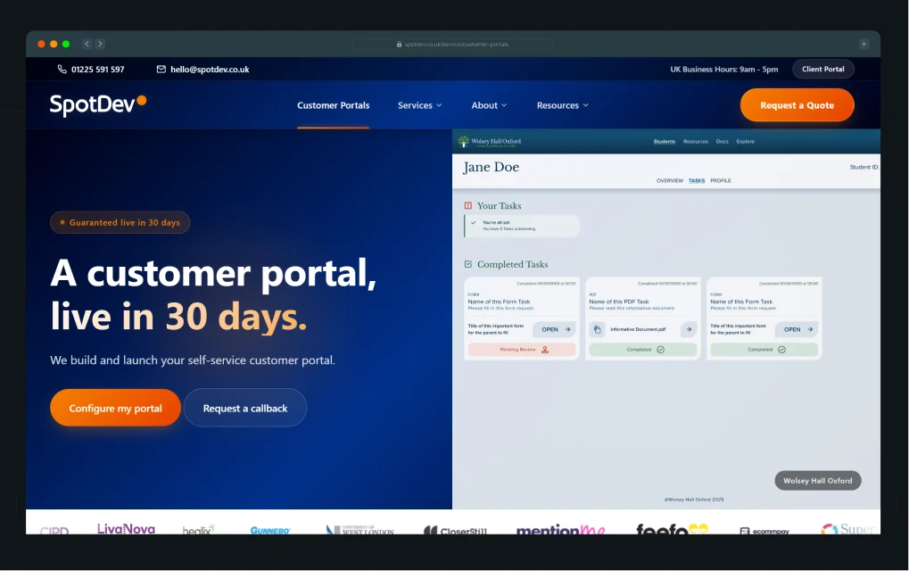
Best for: B2B companies on HubSpot CMS looking for ongoing maintenance.
SpotDev is one of the few website maintenance services in London specializing exclusively in HubSpot CMS for B2B organizations. Like Thunderclap, they audit your entire setup, including CRM integrations and technical infrastructure, before work begins, to make sure the website is built for where your business is headed, not just where it is today.
Why choose SpotDev for B2B website maintenance?
- HubSpot specialists: As a HubSpot Diamond Partner, SpotDev understands the platform at a depth most agencies don't. This helps them diagnose issues proactively, commit fewer errors, and handle integrations without any external help.
- Built-in strategy cadence: Retainer plans come with quarterly check-ins to review progress and adjust priorities. They also offer annual strategy sessions to align your website with your wider business goals.
- Panel of experts: Every retainer comes with a dedicated project manager, UI/UX designer, SEO specialist, developers, QA, and CRM specialist. Urgent issues get resolved within five hours. One thing to note is that SpotDev operates on quarterly and annual contracts, which means there are notice periods to keep in mind when you're ready to renew or exit.
Notable Clients: Abbott Laboratories, Unily, Feefo, Mention Me
{{specficBlog}}
5. Paddle Creative
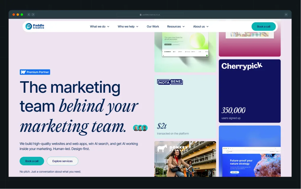
Best for: B2B SaaS, fintech, and tech companies looking for proactive Webflow website maintenance.
Paddle Creative is a Webflow Premium Partner that has worked with 150+ brands across 17 countries. Their maintenance service covers CRO, AI search optimisation, UX design, integrations, and technical support, making them one of the more comprehensive website maintenance services in London for B2B SaaS companies.
Why choose Paddle Creative for B2B website maintenance?
- Two pricing models: Monthly plans offer 5 to unlimited hours per month, with 30 days' notice to cancel. If you don't need a recurring plan, pay-as-you-go lets you purchase hours valid for 12 months. However, monthly plans don't offer hour rollover, so unused hours don't carry forward.
- Paddle Portal: Their proprietary dashboard lets your team submit requests, track progress, and see what's in the queue in real time. This means full visibility on what they are working on without emails or calls.
- Predefined workflow: Their process starts with a technical and performance audit, followed by security checks and strategy setup. This means they take a proactive approach to maintenance instead of doing patchwork.
Notable Clients: Notabene, Swap, Global Expat Pay, Algrano
6. Generate UK
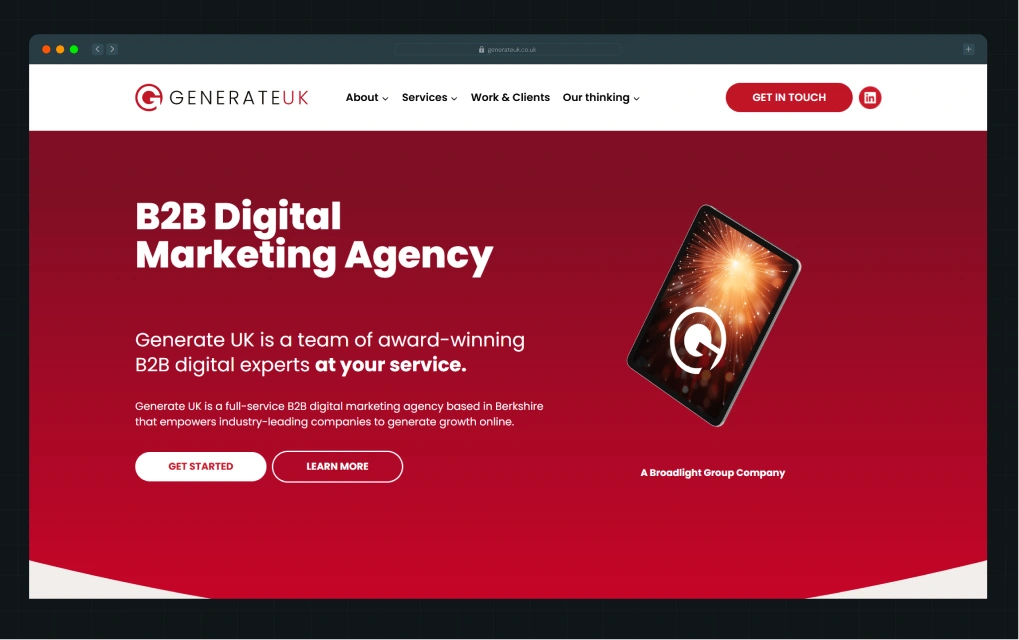
Best for: B2B companies looking for a full-suite marketing agency that handles functions like SEO and PPC while also offering comprehensive website maintenance.
Generate UK is a full-service B2B digital marketing agency with 15+ years of experience working exclusively with B2B companies. Besides maintenance, they offer SEO, PPC, content, and outsourced digital marketing.
This makes them a great choice for companies that don't want too many vendors involved. They are part of the Broadlight Group, a network of growth agencies working with startups, scaleups, and enterprises.
Why choose Generate UK for B2B website maintenance?
- Marketing-led maintenance: They tie website maintenance directly to marketing outcomes, so your site stays aligned with lead-generation goals and not just uptime.
- Customer Service Excellence+ Accreditation: Generate UK is the only UK agency with this accreditation. They've been independently assessed for how they actually work with clients, not just what they claim.
- Full maintenance coverage: Their maintenance covers technical support, content updates, security monitoring, performance optimization, software updates, and backups.
Notable Clients: On-track, Censornet, Thames Valley Chamber of Commerce
7. Multidots
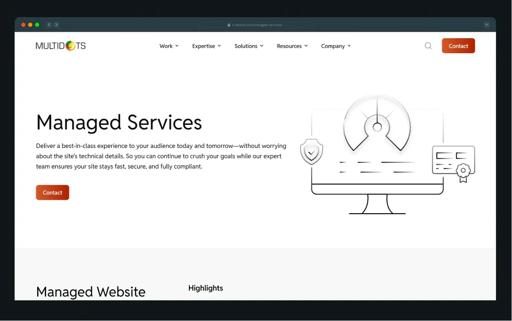
Best for: Enterprise and mid-market B2B companies running large-scale WordPress websites.
With offices in London, the US, and Canada, Multidots is a website maintenance partner with 15+ years of experience maintaining enterprise-grade websites. They are also an Inc. 5000 company and a WordPress VIP Gold Partner, which means they are vetted and trusted to handle WordPress at the highest level of complexity and scale.
Why choose Multidots for B2B website maintenance?
- Built for enterprise WordPress: As a WordPress VIP Gold Partner, Multidots handles complex site architectures, multisite setups, and high-traffic environments that most maintenance agencies aren't equipped for.
- Consistently meets deadlines on large-scale projects: For enterprise teams where delays cost real money, Multidots has a track record of delivering on time. Something few agencies can back up with proof at this scale.
- Three engagement models: Support packages offer 50 to 500 hours with a 6-month validity. Managed maintenance covers ongoing updates, security, and uptime. Dedicated developer plans let you scale your team up or down based on workload.
Notable Clients: News Corp, Accenture, Foursquare, SiriusXM
{{specficService}}
8. Plug & Play
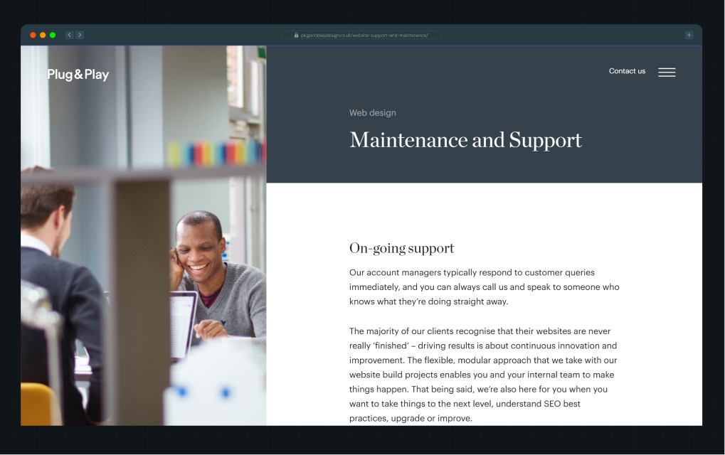
Best for: B2B companies looking for an award-winning London agency that combines website maintenance with digital marketing.
Founded in 2006, Plug & Play is a full-service web design and digital marketing agency with offices across London and Guildford. They have won the Webby Awards People's Choice Award and the Drum Design Awards Best Website Award. They work with established businesses of 15 to 300 employees that have internal marketing teams.
Why choose Plug & Play for B2B website maintenance?
- Maintenance with paid media included: Their maintenance covers SEO, CMS updates, new functionality, cybersecurity, and reporting. They also run paid media like Google Ads as part of their support, which most maintenance agencies don't offer.
- NPS above 40: Their customer service Net Promoter Score sits above 40. For context, anything above 20 is considered good in professional services. Above 50 is excellent. They sit comfortably in between.
- Monthly rolling contracts: Their contracts run month to month with no long-term commitment. If they stop adding value, you leave. That kind of flexibility means they have to keep performing.
Notable Clients: Keelvar, Eco Online, Vungle, BCB, Diffusion PR
9. ViDesigns
.webp)
Best for: B2B companies looking for a Webflow agency with deep SaaS expertise and flexible maintenance retainers that support evolving SaaS marketing strategies.
ViDesigns is a website support and maintenance agency in London, based in Chiswick, that has worked with 300+ B2B SaaS scaleups and enterprises since 2020. They have built their own Webflow tools, Formly and Flowplay,used by 1.85 million users every month.
Why choose ViDesigns for B2B website maintenance?
- Flexible maintenance plans: Retainers start at £500/month, covering bug fixes, CMS edits, technical SEO, and a dedicated Webflow developer. The £1,500/month plan adds training calls and custom documentation. Pay-as-you-go packages start at £1,000 for 10 hours.
- Deep SaaS expertise: Their client list includes SaaS companies like BVNK in fintech, Gather in content, and Datashake in data intelligence. For YC-backed Intryc, they delivered a full rebrand and new site in 8 weeks after the company raised $3.1M in seed funding.
- Built their own Webflow tools: Formly and Flowplay are ViDesigns-built products with 1.85 million monthly users. This is a testament to how deeply they understand the platform.
Notable Clients: Datashake, BVNK, Scaleup Finance, Thrive Learning
How to Choose the Best B2B Website Maintenance Agency?
You've seen the 9 best website maintenance agencies in London. But here’s how you can find the one that’s actually right for you:
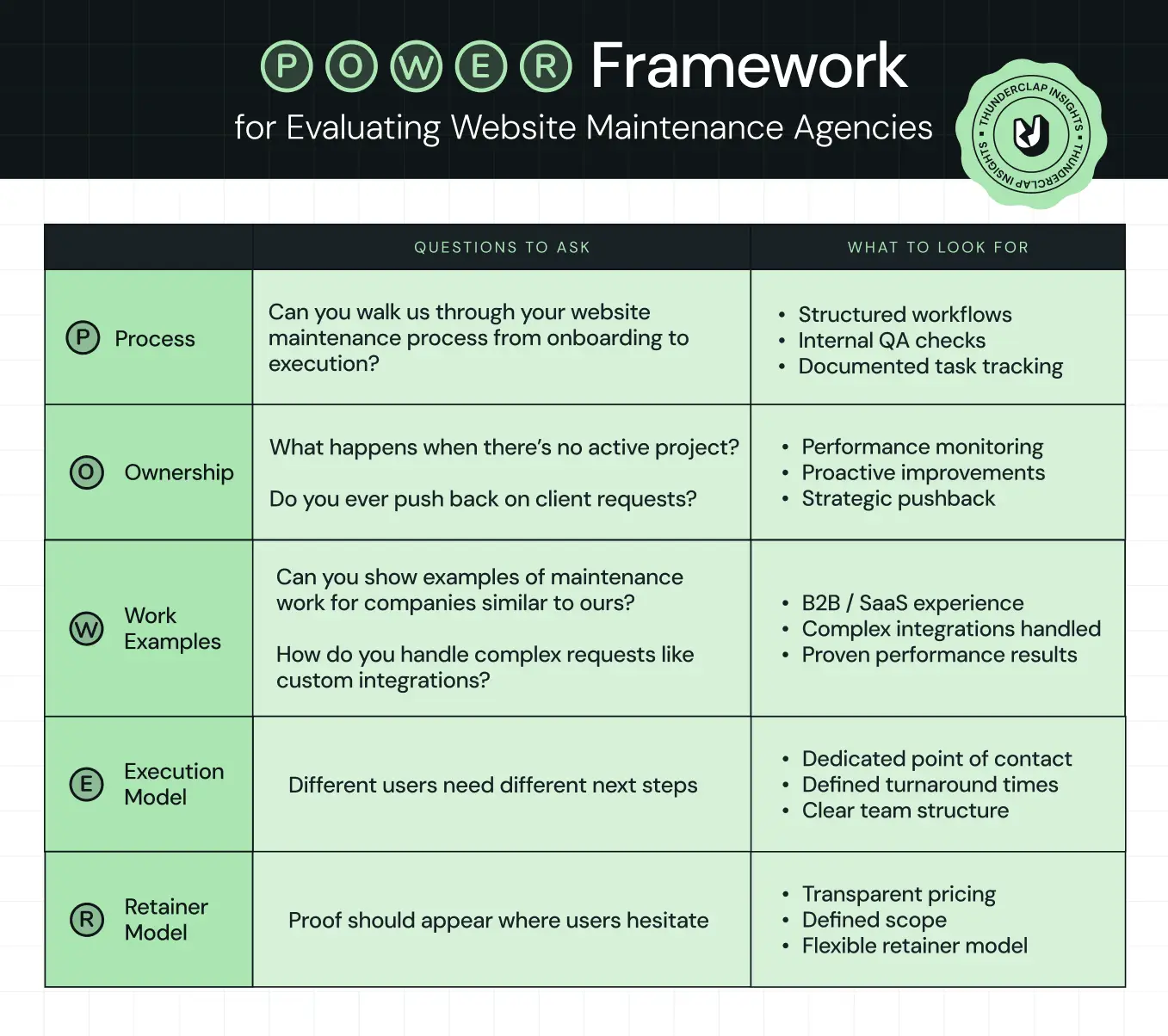
Shortlist 2-3 agencies from the list that match your industry and needs, get on discovery calls, and use what we call the POWER Test. It’s a simple framework built around the exact questions that reveal whether an agency will simply keep your website running or actively help it grow.
If ThunderClap stood out from the list, here’s why companies choose us:
Here's why 88+ brands, including WizCommerce, Vunet, Factors, and roommaster outsource website maintenance to us:
- Website design and maintenance under one roof: As a Webflow Enterprise Partner, we handle everything from brand strategy and website design to ongoing maintenance. Every decision we make is tied to conversions, not just keeping your site alive.
- Flexible plans: Maintenance retainers start at $2,000/month and go up to $4,500/month depending on site complexity, request volume, and level of strategic involvement.
- A team built for B2B: Our in-house team includes product marketing managers, international designers, CRO analysts, SEO specialists, and developers. Whatever your site needs, we have someone who has solved it before.
{{ctaBlock}}
FAQs
1. How much does website maintenance cost in London?
Website maintenance in London typically costs between £500 and £5,000 per month, depending on the agency, scope of work, and level of strategic involvement. Basic Webflow retainers start at £500/month and cover general upkeep. If you're looking for growth-led maintenance that ties your website to conversions and business goals, partners like Thunderclap start at around £1,600/month.
2. Why should I hire a website maintenance company instead of doing it myself?
Maintaining a website isn't just basic upkeep. It includes catching issues before they blow up, monitoring performance, and thinking about long-term scalability. Most in-house teams don't have the bandwidth for that alongside everything else on their plate. A maintenance agency brings predefined workflows and dedicated expertise, so your site stays proactively maintained instead of reactively patched.
3. Why should I hire Thunderclap for website maintenance instead of a London-based agency?
Thunderclap combines growth-led maintenance with deep B2B expertise across SaaS, fintech, AI, and HR tech. Unlike most London agencies, we tie every maintenance decision to your conversions and business goals. With 88+ brands maintained and 140+ projects delivered, we've likely solved your problem before.
4. How do I find the best website support and maintenance company in London?
Start by shortlisting agencies that specialise in your CMS, whether that's Webflow, WordPress, or HubSpot. From there, look for proven B2B experience, transparent pricing, and a structured maintenance process. The 9 website maintenance services in London on this list have all been evaluated against those criteria, so it's a good place to start.
How to Find the Best Web Design Company in Houston, Texas for B2B Brands (6 Best Picks)
B2B website agencies can be people-pleasers. Here’s how:
- They agree to every request you make, even when it hurts your business.
- They call themselves result-driven but talk about illustrations and execution speed, never conversions.
And if you are looking for a web design company in Houston, Texas, this costs you directly. The buyers here don't just evaluate vendors. They vet liability. Every people-pleasing decision your agency makes ends up on your website. And your buyers notice before your sales team does.
That's exactly why we have this list of the best web design companies in Houston for B2B brands, vetted using ThunderClap's W.E.B. Framework (Web Strategy, Execution at Scale, B2B Domain Knowledge). We also share five discovery call questions to determine whether they are truly growth-driven in practice, not just on their website.
What Houston's B2B Buyers Actually Expect From a Website?
Houston now hosts 1,300+ active startups with nearly $12 billion in funding raised since 2017. HealthTech, FinTech, SaaS, and AeroTech dominate the growth. These aren't impulse purchases because compliance teams, investors, and procurement reviewers expect proof, not promises.
Which means the buyers behind these decisions don't casually browse agency websites. They compare. They forward links internally. They ask uncomfortable questions. And they don't make decisions alone.
What that looks like in practice:
- A FinTech buyer needs the website to signal trust before fraud anxiety kicks in.
- A HealthTech decision-maker needs credibility signals that their audit team won't question.
- A SaaS buyer already has your three closest competitors open in another tab.
None of them has time for a website that looks impressive but explains nothing. Choosing a web design company in Houston, Texas, not built for this buying environment costs you more than time. Your team spends the first month explaining context that a primed agency already understands.
How to Find a Web Design Company in Houston, Texas for B2B Brands
Finding a web design agency in Texas is easy. Finding one that actually moves your pipeline is harder. This is because most agencies build websites, but only growth-led web design agencies build buying experiences.
And to find if a website design is truly growth-led, you should zero in on 3 things:
- Their approach to website strategy,
- Execution style,
- B2B domain knowledge.
At ThunderClap, we call it the W.E.B. Framework. And the W.E.B. Framework matters because how a design company spars against these factors decides its potential to be growth-led. For instance, at ThunderClap, we cover all three: strategy, execution, and B2B expertise on every project we take on.
Here’s a breakdown of the W.E.B. Framework and how you can use it to distinguish between a growth-led and a basic web design company in Houston, Texas.
Best Web Design Companies in Houston, Texas for B2B Brands
Sifting through agency websites and making sense of their offerings is no easy task. So we did the dirty work for you. Here are the best web design agencies in Houston for B2B brands, every one evaluated against the W.E.B. framework.
In the next section, we also give you five discovery call questions to ensure they are truly growth-led. (Because we know claiming something and actually doing it are two different things!)
- ThunderClap
- Clear Digital
- Lazarev.agency
- Grafit
- Sweven.design
- Unfold
1. ThunderClap
.webp)
Best for: Mid-market and enterprise B2B brands rebuilding for more demanding buyers, category leadership, or enterprise readiness.
ThunderClap is a B2B web design and development agency and WebFlow enterprise partner that handles everything from website strategy and branding to web development, maintenance, and migration. They have worked with 88+ B2B brands across SaaS, VC, FinTech, HR Tech, AI, HealthTech, and AeroTech and shipped 140+ website projects. They also hold 10+ industry recognitions, including the Webby Awards and CSS Design Awards.
Why ThunderClap
Proven B2B expertise: ThunderClap has built websites for buyers who don't just evaluate vendors, but vet liability. Our work spans HealthTech compliance teams, aerospace procurement leads, and enterprise buyers across industries, where a single wrong vendor choice can have real consequences. This gives us the context that most generalist agencies spend the first month building.
Conversion-driven approach to design: Every project starts with a website audit using CRO tools like Microsoft Clarity and Google Analytics to identify what's working and what's not before a single design decision gets made. Website strategy, copywriting, and wireframes follow. This means your B2B website strategy is built on actual data, not assumptions.
Dedicated account managers on every project: Every project is handled by a dedicated senior account manager who stays involved from brief to launch. No handovers, no context lost in translation, and no back-and-forth between teams trying to piece together what was agreed.
Free post-launch support: We offer 30 days of post-launch support covering technical maintenance, CRO specialist review, and Google Analytics to track whether numbers are improving after launch. This means you don't go live and wonder if it's working.
Notable Clients
roommaster: An 80-year-old hospitality software brand repositioning from legacy product to modern hospitality partner. The risk was real; one wrong move and three decades of earned trust evaporate. ThunderClap led with brand strategy first, restructured positioning, and redesigned the full visual system. Post-launch, they saw an 80% lift in organic traffic and their demo requests nearly doubled.
101 GenAI: A HealthTech platform whose buyers are compliance teams and quality officers. The product was enterprise-ready, but the website wasn't signaling that. ThunderClap rebuilt the brand with healthcare-specific messaging, a hero video showcasing the platform in action, and motion assets that convey enterprise credibility. Investors and partners noticed the shift immediately after launch, and the client rated the project 10/10.
Skyroot Aerospace: India's first private rocket launcher needed a website that matched its ambition and earned the trust of a technically demanding audience. ThunderClap rebuilt the visual identity, introduced WebGL-powered animations, and sharpened messaging around their core USPs to reflect the brand's maturity and global ambitions.
{{specficService}}
2. Clear Digital
Best for: Enterprise B2B brands with complex technical requirements and long sales cycles
Clear Digital is a Silicon Valley-based agency with a satellite office in Houston. Founded 25 years ago, they have worked with 200+ enterprise clients and 15 unicorn B2B tech companies. The pattern recognition they bring to the table is something not many agencies can match.
Why Clear Digital
Enterprise B2B track record: One of the striking things about Clear Digital is how their work spans enterprise brands at major inflection points like IPOs, acquisitions, and market expansions, and the results reflect that. Habu's website redesign supported a $200M acquisition. Viral Nation saw a 104% increase in conversions post-launch.
Proprietary website growth framework: They use their Website Effectiveness Engine to tie brand strategy, UX, content, and technology into one system across design and development. This works especially well for complex products where messaging inconsistency, design gaps, or integration errors can cost deals. However, it's worth noting they don't offer free post-launch support, so factor that in if ongoing optimization matters to you.
Deep technical partnerships: Verified partnerships with Adobe, Drupal, Acquia, and Pantheon mean enterprise tech stack integrations get handled properly. This is highly relevant if your stack has complex requirements that a standard agency can't meet.
Notable Clients: Habu, Viral Nation, Contentstack, Autodesk
3. Lazarev.agency
Best for: AI-first mid-market and enterprise B2B companies with complex products that need UX built for tech-savvy buyers.
Lazarev.agency is one of the top Webflow web design and development agencies in Houston, specializing in AI-first websites and UX for complex B2B products. They have won 120+ design awards, secured $500M+ in funding for clients, and worked with companies such as HP, Boeing, and Shopify.
Why Lazarev.agency
AI-first thinking: Lazarev is one of the few agencies that started building AI-first interfaces before it became a mainstream expectation. As a product design company, primarily, they know what a technically demanding buyer looks for and how to design for that scrutiny.
Research-led process: Like ThunderClap, their design process starts with understanding your business and audience before touching design. Discovery feeds into information architecture, wireframes, Webflow development, and repeated testing with the goal of reducing cognitive load at every step.
Sector depth across complex B2B verticals: Their work spans FinTech, Healthcare, AI, Web3, and Legal Tech, industries where buyer complexity demands more than good-looking pages. This means less trial and error and more decisions backed by patterns they have already built and tested across verticals.
Notable Clients: Accern, Nimble.ai, Sopra Banking Software, Peel Insights, Blockbeat.
4. Grafit
Best for: Mid-market and enterprise B2B tech companies looking for a full-suite growth partner that handles everything from design to growth marketing.
Grafit is a leading web design agency in Texas specializing in web design, Webflow development, branding, motion and video design, CRO, SEO, and growth marketing. They have launched over 100 B2B websites working exclusively with tech companies.
Why Grafit:
Conversion-focused design approach: Grafit starts with ICP analysis, competitor research, user journey mapping, and a success metrics brief. With data as their north star, they have delivered some impressive results. Callstack saw 176% more conversions and 66% more traffic post-launch. Gentrace tripled demo requests after their Series A rebrand.
Design-to-development in 6 weeks: For brands with launch deadlines or tighter timelines, Grafit's 6-week delivery promise is a standout. Every phase has clear deliverables, from strategy to launch.
AI-assisted tech stack: Grafit works with Webflow, Figma, and Semrush alongside AI-powered tools. Every project ships with a full design system and component library, so your marketing team stays independent post-launch.
Notable Clients: Callstack, Gentrace, Jace.ai, Clay, Semrush.
{{specficBlog}}
5. Sweven.design
Best for: Early-stage B2B SaaS startups in Houston looking for a lean, collaborative Webflow team that delivers without the overhead of a large agency.
Founded in 2020 by Keith and Darren, Sweven is a Texas-based Webflow Premium Enterprise Partner offering branding, web design, and Webflow development. In five years, they have launched 70+ Webflow projects backed by 13+ years of collective experience.
Why Sweven:
Founder-led involvement on every project: Both co-founders are directly involved throughout. This means no handovers, no account managers relaying feedback, and no junior teams interpreting your brief. For startups that want direct access to the people doing the work, that matters.
Long-term growth focus: From the start, Sweven ties website strategy to your business goals through custom strategy sessions, structured site mapping, and full-fidelity wireframes. This ensures the website is built to support future campaigns and scale with your marketing needs, not just get you to launch.
Structured five-stage process: Like ThunderClap, they follow a well-defined process from discovery to launch. However, for revisions, they offer 2-3 rounds per phase, with additional revisions billed at $150 per hour. This is worth noting for early-stage teams where predictable costs matter.
Notable Clients: OpsLevel, HeadRace, ClickTime, Cocoon, DataHive.
6. Unfold
.webp)
Best for: B2B startups looking to build their digital presence from website design and development to performance marketing, without enterprise-level budgets.
Unfoldmart is a growth marketing agency in Houston that offers Webflow website development alongside branding, SEO, and performance marketing. They have delivered 250+ brand campaigns and generated $60M+ in revenue for clients across both B2B and B2C.
Why Unfoldmart
Full-service marketing: With performance marketing and SEO alongside web design and development, Unfoldmart is a strong choice for B2B startups that want to get things running without managing multiple vendors.
However, their case studies don't showcase much data-driven outcomes, so it's worth asking for project-specific results during your discovery call.
Strict development standards: Every Webflow build goes through performance testing, SEO checks, responsive design validation, and quality assurance before launch. This means your website is optimized for Core Web Vitals, built for search visibility, and ready to scale content without needing a developer every time.
5-step design and development process: Every project follows discovery and goal alignment, UX planning, Webflow development, SEO and performance optimization, and post-launch maintenance. They offer ongoing Webflow maintenance after launch at a price, with no free post-launch support period.
Notable Clients: SquareOps, VFlowTech, Atmosly, SoftBricks Tech.
5 Questions to Ask During Your Discovery Call With a Website Design Company in Houston, Texas
The W.E.B. framework helps you identify growth-led web design agencies in Houston on paper. But to find out if they are actually conversion-focused in action, you need to ask the right questions during your discovery call. And they are:
1. Can you walk me through a project similar to ours and the results you drove?
Good answer: Takes you through what the client wanted, what the website audit data revealed, the specific decisions made based on that data, and the results they drove.
Red flag: Talks about design aspects like logo, brand colors, speed of execution, and illustrations with no connection to the actual product or long-term business goals.
2. Are there instances where you have pushed back on a client?
Good answer: Honest about times they pushed back, their reasoning, and how it turned out. For instance, at ThunderClap, as a growth-led agency, we push back on UX and messaging decisions that don't align with your long-term goals. We aim to be your strategic partner, not order-takers.
Red flag: "We execute based on what you want." An agency that never pushes back is one that prioritizes keeping you happy over delivering results. That's a vendor relationship, not a growth partnership.
3. How do you map out the new website strategy?
Good answer: Starts with a website audit, even when you say things aren't working. Takes action only with data, using tools such as Microsoft Clarity, Google Analytics, and Search Console to back every decision.
Red flag: Takes your word for it and pulls down the whole website without a second thought.
4. Do you offer copywriting as a service or just design and development?
Good answer: A web design agency with in-house copywriters and CRO specialists is more likely to be conversion-driven. Messaging and design built together produce very different results than a site designed around placeholder copy.
Red flag: "We work with whatever copy you provide" or "We can recommend a freelancer."
5. Do you offer post-launch support?
Good answer: Offers at least one month of post-launch support where they actively monitor key KPIs and make tweaks for performance and conversions.
Red flag: "Yes, we have growth maintenance plans you can opt into." This usually means they love to launch and ghost.
Your B2B Website Should Do More Than Look Good
In Houston, a B2B website that looks good is table stakes. To influence the tech-savvy, highly skeptical, compliance-aware buyers of Houston's HealthTech, FinTech, SaaS, and AeroTech sectors, you need a website that eliminates risk before a single sales call happens.
At ThunderClap, we have done it before, not once, but 88 times over for B2B companies, including enterprise giants like RoomMaster, Razorpay, and Amazon, to high-growth mid-market companies like Factors, Storylane, and FillHQ.
Here, every project starts with one question: what does your buyer need to feel before they book a call?
- For VuNet Systems, that meant a homepage a CIO could forward to their CDO without explanation.
- For Zamp, it meant positioning a fully managed sales tax platform as the trusted compliance partner for CFOs who can't afford to get it wrong.
- For FillHQ, it meant a messaging framework and visual system built specifically for expansion into compliance-first markets like healthcare and finance.
{{ctaBlock}}
FAQs
1. Do you design websites that support long B2B sales cycles?
Yes, every site we build supports long, multi-step buying journeys. As a web design agency in Texas, we design pages that answer the questions buyers bring back after internal meetings. This includes pricing hesitation, competitor comparisons, integration concerns, and the questions that surface when finance or leadership finally gets involved.
2. Why work with a Houston-based web design company?
Houston’s B2B buyers operate in high-scrutiny industries like HealthTech, AeroTech, FinTech, and SaaS. A web design company in Houston, Texas, that understands these buyers focuses on clarity, proof, and trust, and not just pretty visuals that leave serious buyers with unanswered questions.
3. How do I choose the best web design agency in Texas for my B2B company?
To choose the best web design agency in Texas, shortlist redesign agencies using ThunderClap’s WEB Framework. You can also pick from the W.E.B-certified agencies listed in this article. Next, have a discovery call to learn about their expertise, partnership style, services, and results before making your final decision.
4. Can you redesign our website without impacting existing SEO performance?
Yes. ThunderClap ensures every redesign is handled without impacting your existing SEO performance. Ask about this during your discovery call to understand exactly how we approach it for your specific setup.
TL;DR
- SaaS websites fail when they can’t scale, adapt, or convert. Users leave confusing sites, slow pages, or unclear messaging.
- ThunderClap builds B2B SaaS websites that handle growth, CMS updates, integrations, and performance without slowing your team down.
- We combine scalable architecture, maintainable code, and SEO-ready performance to create websites that retain users and drive demos.
- Our work with Amazon, Storylane, Factors, Roommaster, ClearlyRated, Z47, Zenda, Zamp, Dropit, Wizcommerce, DPDZero and other SaaS brands shows that technical depth plus thoughtful UX drives measurable business growth.
- Plenty of agencies can make a site look pretty. ThunderClap builds websites that act like your most reliable growth engine.
If you’ve seen The Social Network, you know how fast things can go sideways when the wrong people are involved. Not the lawsuits part, hopefully, but the part where building something good suddenly gets complicated. Yes, we’re talking about when Eduardo realizes the Winklevoss deal isn’t going to pan out, and Mark is already five steps ahead!
That’s pretty much what picking a dev partner feels like for a SaaS brand. On paper, a lot of teams look great. Scalability, clean code, user-first design, all of that. Then the work starts, and things get slow, messy, or just… off. Which is why more founders are quietly looking at web development companies in Texas.
Over the past couple of years, Texas has become one of the fastest-growing tech ecosystems in the U.S. Cities like Austin, Dallas, and Houston are no longer “emerging” but are actively competing with traditional hubs. In fact, Austin alone accounted for nearly half of Texas companies on Deloitte’s 2025 high-growth tech list, driven largely by software and SaaS innovation.
At the infrastructure level, the shift is even bigger. Texas is now leading a massive wave of AI and cloud infrastructure expansion, with the state expected to host a significant share of new hyperscale data center capacity in the coming years.
If you’d rather skip the trial-and-error phase, here are 8 web development companies in Texas that are actually worth a look.
What B2B SaaS Companies Actually Need From a Web Development Agency
Most web projects still start with the wrong question: “How should this site look?”
But high-performing SaaS teams ask something else entirely: “How will this site scale, adapt, and convert over time?”
See the difference? One focuses on colors and fonts; the other focuses on results, growth, and keeping your users coming back. This means teams build websites that actually scale, adapt, and convert.
There are a few reasons SaaS founders are paying attention to web development companies in Texas.
- Deep SaaS & cloud expertise: Texas firms are building for cloud-native, API-first, and AI-assisted products by default, aligning with modern SaaS needs.
- Builder mindset over buzzwords: Especially in hubs like Austin, teams are known for practical, product-focused execution. Less theory, more shipping.
- Strong talent pipeline (without Bay Area costs): Developers in Texas report high satisfaction despite lower salary benchmarks, largely due to cost-of-living advantages, which directly impact agency pricing and retention. For example, Texas web designers earn about $84,453 annually, with 88% satisfaction, compared with $102,067 in New York (69% satisfaction) and $106,346 in California (85% satisfaction).
Here’s a quick snapshot of what they actually need from a web development agency:
Now, let’s break each one down with examples, stats, and real-world case studies.
Scalable website architecture
Most SaaS websites do not fail because they cannot handle traffic. They fail because they cannot handle change.
As new features roll out, messaging shifts, and integrations expand, what started as a simple structure quickly becomes difficult to navigate. This is where user experience starts to break down, and the impact is immediate. According to Clutch, 49% of consumers will leave a website if the navigation feels confusing.
High-performing SaaS teams approach architecture as a long-term system rather than a collection of pages. They design structures that can support multiple product lines, evolving positioning, and integrations with tools like CRM platforms, analytics systems, and marketing automation software, without forcing constant rebuilds.
You can see the difference when comparing modern SaaS websites to older enterprise platforms, where users often have to click through multiple layers just to understand what the product actually does.
Clean, maintainable code
Texas is increasingly seen as an entry point for emerging design and development talent, with a large share of early-career web designers and a rapidly expanding ecosystem in cities like Dallas–Fort Worth and Austin (which has earned the nickname 'Silicon Hills,' rivaling California's Silicon Valley).
In fast-growing markets like this, strong engineering systems become especially important to ensure consistency as teams scale. A beautiful frontend means nothing if the backend is fragile.
Messy code slows down updates, creates dependency on developers, and builds technical debt that increases over time. And it directly impacts perception. In fact, 28% of users judge a website’s credibility almost immediately. Plus, broken interactions or inconsistent behavior break trust faster than bad design.
Hence, a strong web development agency in Texas should focus on:
- Structured, readable codebases
- Systems that marketing teams can update without friction
- Long-term stability instead of quick fixes
Our work with Wizcommerce illustrates how this approach translates into real impact. Wizcommerce offers AI-assisted sales tools, B2B storefronts, and ERP integrations. When we started, their platform suffered from fragmented systems, outdated tools, and messaging that did not align across teams.
We worked closely with leadership, marketing, and product teams to map buyer journeys and identify operational gaps. Then, we rebuilt the platform to clearly communicate their value to audiences such as business owners, sales leaders, and operations teams.
Ultimately, we delivered a structured, scalable system that reduced friction for internal teams and made the product easier to understand and adopt.
Ayush Barnwal from ThunderClap shares the launch video of the revamped WizCommerce website in his latest LinkedIn post.
CMS and flexibility for marketing teams
Your marketing team should never feel chained to a developer. That means a modern SaaS site needs easy content updates, the ability to create landing pages, and fast iteration cycles.
This is why SaaS companies are increasingly moving toward headless and composable CMS platforms, a shift driven by the need for speed, flexibility, and simpler workflows. According to recent research, 61% of teams still use multiple CMSs to manage content across platforms or regions, but last year also saw a 20% rise in companies consolidating into a single CMS to reduce maintenance overhead and streamline operations.
Modern CMS tools now allow marketers to build and update pages visually, reuse components across campaigns, and publish content across multiple channels without engineering support. Platforms like headless CMSs are designed specifically to reduce dependency on dev cycles and improve time-to-market for campaigns.
In practice, this means faster launches, quicker messaging testing, and greater control for marketing teams without slowing down product or engineering teams.
Performance and technical SEO readiness
A beautiful website is useless if no one can find it or if it frustrates visitors. Development should support fast load speeds, mobile responsiveness, and a clean site structure for SEO.
And this ties directly to credibility. For example, 32% won’t trust a site if they can’t tell who’s behind it, so your “About Us” page and mission statement aren’t optional.
Performance and SEO are part of trust. If your site loads quickly, works everywhere, and makes sense to both humans and search engines, users stick around. That’s the difference between a site that just exists and one that actually drives demos, trials, and revenue.
8 Best Web Development Companies in Texas for B2B SaaS Brands
We reviewed more than 50+ web development companies across Texas, analyzed their case studies, read client feedback, and studied how they handle architecture, integrations, and scalability.
After drawing our conclusions, these are the 8 web development companies we actually trust to build B2B SaaS websites that scale, perform, and drive growth in 2026.
1. ThunderClap
Best for: B2B SaaS and enterprise companies seeking scalable websites with high conversions and maintainable systems
ThunderClap is a premium web development agency with offices in India and a reputation for award-winning work, including Webby and CSS Awards. The team has a proven track record of serving B2B brands such as Amazon, Storylane, Factors, Roommaster, ClearlyRated, Z47, Zenda, Zamp, Dropit, Wizcommerce, and DPDZero.
They provide end-to-end web design and development services, covering strategy, branding, UI/UX design, copywriting, conversion rate optimization (CRO), web development, website migrations, and ongoing maintenance.
What is it best for?
- Website design and development: ThunderClap has managed 129+ enterprise-grade projects and, as a certified WebFlow enterprise partner, has access to exclusive features and ongoing training to stay on top of the platform’s best practices.
- 30-day post-launch support: Clients receive 30 days of free post-launch support. During this period, ThunderClap implements CRO and SEO best practices to optimize site performance and conversions.
- Structured, senior-led oversight: Each project is personally managed through a dedicated account manager, supported by account directors, ensuring clear communication, reduced back-and-forth, and reliable execution throughout the lifecycle.
- 24/7 support: Clients get around-the-clock support via Slack, with full visibility into progress through tools like Notion for project management.
- Scalable designs and competitive timelines: ThunderClap delivers aesthetically pleasing, reusable design systems, with most projects completed in 8 to 12 weeks, balancing speed and quality.
Notable clients
With 144+ websites launched and 10+ industry awards, ThunderClap demonstrates both category expertise in SaaS, fintech, and AI, and cross-industry capability in consulting, commerce, and B2B services.
Their work has helped clients:
- Increase conversions by up to 50%
- Boost engagement by up to 60%
Some of its clients include Storylane (the 6th-fastest-growing SaaS on G2), ClearlyRated (top 500 U.S. SaaS per Inc.), and Deductive AI (raised a $10M seed round). ThunderClap’s projects consistently propel brand professionalism, engagement, and funding success.
2. Devox Software
Best for: Startups and enterprises looking for full-cycle web development, custom solutions, and flexible team scaling
Devox Software is a web development company in Texas offering full-cycle development services, from discovery to deployment and maintenance.
They also provide outsourcing options, allowing companies to quickly scale teams or hire dedicated developers based on project needs.
What is it best for?
- Full-cycle development approach: Covers everything from discovery and architecture planning to testing, deployment, and long-term maintenance
- Flexible team scaling: Offers ready-to-go teams and hiring options within 2–4 weeks for faster project kickoff
- Diverse tech expertise: Works across multiple stacks, including MERN, LAMP, .NET, Python, Angular, React, and cloud platforms
- Strong QA and security focus: Uses comprehensive testing methods and follows strict data security, NDA, and compliance practices
Notable clients
CURE Media, Ferretly, Eurolinx, Active Place, Magma Trading, Optherium, Function4, Lexplore, Stromcore
3. Ariel Digital
Best for: Businesses building custom web apps, SaaS products, or internal tools tailored to specific workflows
As a Texas-based web development company, Ariel Digital specializes in custom web applications, SaaS products, and mobile apps.
Their services include custom web apps, SaaS development, mobile applications, API development, and system integrations, as well as end-to-end support from discovery through post-launch scaling.
What is it best for?
- Custom-built solutions: Tailored apps designed around specific workflows and business needs
- SaaS product development: From MVP to full-scale platforms with billing, user management, and infrastructure
- Integration-focused builds: APIs and system integrations that connect tools and automate workflows
- Agile development approach: Iterative sprints with continuous feedback and faster time to market
Notable clients
Tyler County Hospital, JEDCO, Olympian Properties, Squeaky Clean Maid Service
4. Roars Technologies
Best for:
With 19+ years of experience, Roars Technologies is a product development company known for building scalable digital products across SaaS, healthcare, eCommerce, and more.
They focus on AI-driven solutions, UX-led development, and end-to-end execution from idea to launch.
What is it best for?
- AI-powered product development: Builds intelligent, scalable digital products with AI-driven capabilities
- MVP to scale: Takes products from early-stage prototypes to full-scale platforms
- UX-led development: Uses research and user experience principles to guide product decisions
- End-to-end execution: Covers everything from strategy and design to development and deployment
Notable clients
GymBait.ai, Gypsy, Onus, Company Guru, Parqly
{{specficBlog}}
5. GLIDE Design
Best for: B2B organizations and enterprises looking for high-performing, content-driven websites with strong CMS flexibility
Known for building high-performing, easy-to-manage websites, GLIDE Design combines development, content, and SEO into a single workflow.
Their work often involves rebuilding outdated systems, streamlining content, and fixing navigation issues so users find what they need faster.
What is it best for?
- Performance-focused websites: Improves speed, SEO, and conversion metrics through structured development
- CMS-driven builds: Works across WordPress, Webflow, Shopify, and headless CMS setups
- Content integration: Aligns design, content, and development for consistent site experiences
- End-to-end execution: Covers discovery, development, testing, SEO, and post-launch optimization
Notable clients
WP Engine, Redis, Yeti
6. SaaS Consulting Group
Best for: Mid-market and private-equity-backed businesses needing Salesforce and NetSuite transformations for faster, scalable growth
Recognized as a trusted partner for Salesforce and NetSuite transformations, SaaS Consulting Group helps mid-market and private-equity-backed companies streamline operations and scale efficiently.
They resolve system silos, slow post-merger integration, and revenue visibility gaps, building automated lead-to-cash workflows, real-time reporting, and custom integrations that empower finance, sales, and operations teams.
What is it best for?
- Salesforce & NetSuite optimization: Streamlines CRM and ERP operations for efficiency and growth
- System integration: Eliminates manual workflows with bi-directional platform connectivity
- Revenue visibility: Real-time reporting for ARR, churn, and renewals
- Rapid web deployments: Implements functional, best-practice environments quickly
Notable clients
Private-equity portfolio companies, SaaS businesses, manufacturing and service industry leaders
7. Thinkster
Best for: Texas businesses seeking reliable, high-performance websites that support growth and credibility
Thinkster combines design, development, and maintenance into consistent digital platforms. Their approach ensures fast load times, mobile responsiveness, and clear user navigation while supporting long-term business growth in competitive industries.
Their projects range from custom websites and e-commerce stores to landing pages and WordPress development.
What is it best for?
- Custom website design: Builds sites reflecting brand identity and usability
- WordPress development: Flexible, easy-to-manage platforms for content and scalability
- E-commerce solutions: Structured online stores for smooth transactions and visibility
- Landing pages & campaigns: Guides users toward specific actions efficiently
Notable clients
GWC, Saudamini, Ziva, Sunbridge, DAD, Radharaman Hospital
8. Phenomenon Studio
Best for: Businesses looking for robust, high-performing web solutions that enhance user engagement and drive measurable growth
Phenomenon Studio delivers end-to-end web experiences, from concept and design to development and ongoing support. They focus on building responsive, scalable, and reliable platforms that combine smooth functionality, fast performance, and intuitive navigation.
Their work spans custom websites, web applications, WordPress platforms, admin dashboards, and comprehensive product redesigns.
What is it best for?
- Custom web development: Creating tailored websites that match business goals and brand identity
- Web application development: Developing interactive, efficient, and scalable web apps
- WordPress development: Building flexible and easy-to-manage content platforms
- Admin panel development: Designing feature-rich dashboards for streamlined operations
Notable clients
KlickEx, Isora, Greenow, Nomupay, SaltyCloud
How to Choose the Right Web Development Company in Texas
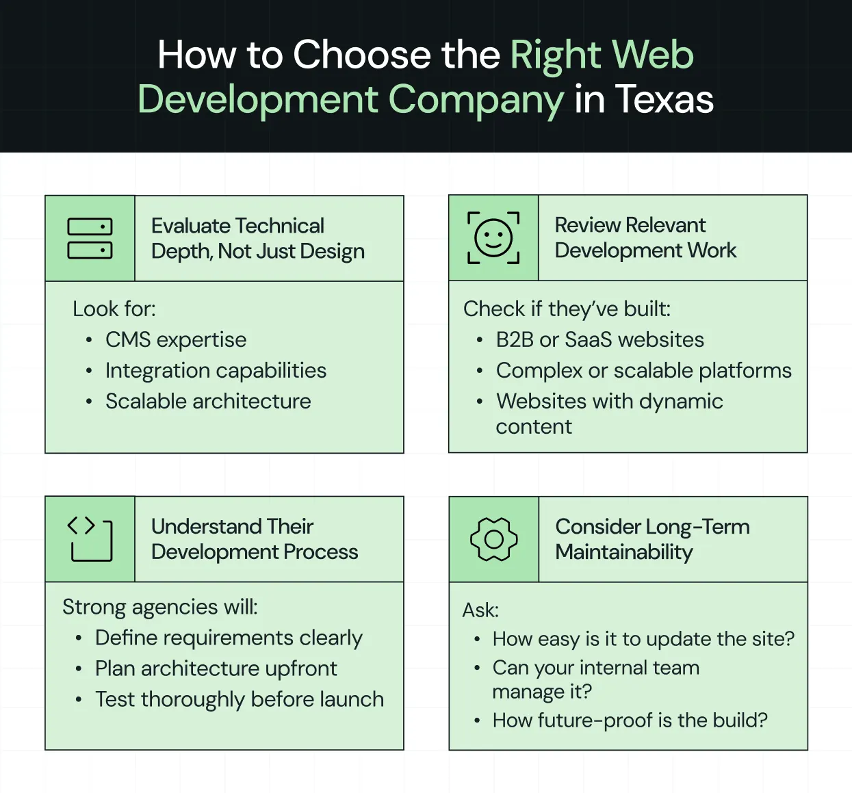
Most companies think they are choosing a web development partner. They’re actually choosing how their website will perform, scale, and evolve for the next few years.
This is why the decision cannot be based on visuals or surface-level impressions alone. Let’s break down what to look for.
{{specficService}}
Evaluate technical depth, not just design
It is easy to be drawn to good design. It is much harder to evaluate the systems behind it.
Many agencies present polished interfaces, but that does not always translate into strong development practices. What you need to understand is whether they can build a system that supports your business as it grows.
This means looking closely at their:
- Expertise with CMS platforms
- Ability to handle integrations with tools like CRM and analytics systems
- Approach to building scalable architectures that do not need to be rebuilt every time your product evolves
A visually appealing site might win attention in the short term, but without technical depth, it quickly becomes difficult to maintain and scale.
This is where Zenda’s transformation stands out. As a B2C fintech SaaS company, they needed a landing experience that balanced trust with clarity while still feeling engaging.
The final site guided users through a clear journey from the hero section to rewards, features, testimonials, and community. Each section was easy to scan, while visuals added personality without distracting from the message. Trust signals like partner badges and stats reinforced credibility, and consistent CTAs guided users toward action.
The experience felt simple and intuitive, and it earned recognition at Awwwards. More importantly, it gave Zenda’s team a structure they could build on without constant redesigns.
Aastha Shad, who leads Brand Design and Communications Marketing at Zenda, shared in a video testimonial how the revamp transformed their website and overall messaging. Ayush explained the project journey on LinkedIn, showing how they brought the site together step by step.
Review relevant development work
An agency that has built simple marketing websites may not be equipped to handle the complexity of a B2B SaaS platform, where multiple audiences, dynamic content, and evolving product narratives need to coexist seamlessly.
This is why it is important to look for work that reflects challenges similar to yours. For example:
- Have they built SaaS or B2B websites before?
- Have they handled platforms with multiple use cases, integrations, or dynamic content structures?
If their past projects don’t mirror the complexity of your SaaS, chances are they won’t be ready when your product scales.
Understand their development process
A strong outcome usually comes from a strong process. The difference between a smooth project and a frustrating one is that the agency clearly defines requirements, plans the architecture early, and tests thoroughly before launch.
Without a structured approach, projects tend to drift. Requirements change mid-way, technical decisions are made too late, and issues only surface after the site goes live, when they’re more expensive to fix. On the other hand, experienced development teams bring clarity early on. They align stakeholders, map out the architecture in advance, and ensure testing is an integral part of the process.
Here’s a quick way to think about where to focus and what to ignore:
Consider long-term maintainability
The launch is not the finish line. Is your website built to keep up after day one?
A site that looks great on day one but is hard to update quickly becomes a challenge for marketing and product teams. Even small changes can require developer intervention, slowing campaigns and limiting agility.
That’s why maintainability has to be part of your evaluation from the start. Ask yourself:
- How easily can your internal team manage the site?
- How flexible is the system for future updates?
- Can the underlying architecture support new features without a major rebuild?
The best development partners build with this in mind. They create systems that let your team move fast, experiment, and iterate without being stuck waiting for every tiny change.
What Does It Cost to Hire a Web Development Company in Texas?
Hiring a professional website development company in Texas is an investment in your SaaS business. Knowing what to expect can help you plan your budget and avoid surprises.
Typical pricing models
Unlike a poncho, web development pricing is rarely ‘one-size-fits-all’. Most agencies offer models like:
- Fixed project pricing: A set fee for a clearly defined project, often used for launches or redesigns
- Retainer-based development: Ongoing monthly support for continuous updates, new features, or iterative improvements
- Ongoing support plans: Includes maintenance, bug fixes, and minor enhancements to keep your site running smoothly
Understanding which model aligns with your goals helps you pay for value, not uncertainty.
Cost based on project complexity
Pricing depends heavily on the complexity of your project. Key factors include:
- Number of pages: More pages mean more design, development, and QA time
- CMS and integrations: Connecting with tools like CRM, analytics, or automation platforms adds engineering work
- Custom functionality: Advanced features like AI dashboards, user portals, or interactive product demos increase scope
In Texas, here’s what the cost of website development typically looks like:
Planning beyond the initial build
Modern SaaS websites evolve with your business, so plan for:
- Maintenance: Regular updates, security patches, and CMS management
- Content updates: New landing pages, product updates, or blog posts
- Performance optimization: Speed, SEO, and usability improvements to keep users happy and engaged
Planning for these ongoing costs keeps your site driving growth instead of becoming a one-time expense.
Ready to Build a Website That Scales With Your SaaS?
The insights we’ve shared here show how top B2B SaaS teams approach architecture, code, CMS, and performance to stay ahead of the curve.
You can use these ideas to evaluate agencies on your own. Or, if you want to move faster and minimize risk, that’s where partnering with the right team makes all the difference.
Why ThunderClap stands out:
- Proven SaaS expertise → We’ve built scalable platforms for B2B companies, handling complex workflows, multi-audience sites, and integrations with tools like CRM, analytics, and automation. We understand the differences that make SaaS websites work.
- Scalable, maintainable builds → We don’t just launch websites. We create systems that your marketing and product teams can update and iterate on without waiting for developers. Every site is built to grow with your business.
- Performance and results-focused → From fast load speeds and technical SEO to clean UX, we deliver websites that retain users and drive conversions. Many clients see 30–50% increases in demo requests or trial signups within months.
Plenty of agencies can hand you a website that looks nice. ThunderClap builds websites that become your most reliable growth engine.
{{ctaBlock}}
FAQs
1. How do I choose the right web development company in Texas for my business?
You should evaluate agencies based on their technical expertise, past experience with SaaS or B2B projects, and their development approach. Choose a team that communicates clearly, plans architecture thoughtfully, and can scale your platform as your business grows.
2. What is the average cost of hiring a web development company in Texas?
The cost depends on project complexity, the number of pages, integrations, and custom features. Simple websites typically start around $1,500–$5,000. Full redesigns range from $5,000 to $25,000, and complex SaaS platforms with multiple integrations can cost $20,000 to $50,000 or more.
3. Do Texas web development companies also provide website design services?
Many agencies offer both design and development services, including UX, visual branding, and front-end implementation. Some focus more on one area than the other, so it is important to review portfolios to confirm they can deliver a functional and visually polished website.

Positioning a B2B product was much easier a decade ago. Competition was sparse, and categories were clear. If you had a decent product, you could carve out space just by showing up.
Take Jira. When it launched in 2002 as "issue tracking for developers," the field was wide open. A few competitors, simple choices.Fast forward to 2026, and Jira competes with Monday, Asana, ClickUp, Linear, and hundreds of project management tools that all claim to do the same thing.
In 2026, B2B brand positioning is like walking a tightrope.
Lean too far left, and you blend in with your competitors: "AI-powered platform for modern teams" could be anyone. Lean too far right, and you create a category so unique that buyers don't even know to search for it.
One drowns you in the sea of sameness. The other leaves you to die alone. That's why knowing how to position your brand in the competitive B2B space matters more than ever.
In this guide, we'll walk you through Thunderclap's IMPACT B2B Brand Positioning Framework, a 6-step framework that has helped B2B brands like Amazon, Factors, Skyroot, and Z47 cut through the noise and create positioning that's clear, compelling, and actually wins deals.
But before that let’s address some basics.
What Is The Difference Between B2B And B2C Brand Positioning?
The difference lies in decision-making and buying cycles. B2C positioning targets individual consumers with emotional triggers and faster decisions. B2B positioning addresses multiple stakeholders, longer evaluation periods, and risk-aware buyers.
But there's a deeper distinction. And Erin Miska, B2B positioning expert and founder of Erin Miska Consulting, puts it perfectly:
"In B2C, brand often is the product. People are buying identity, emotion, belonging, vibe. In B2B, brand is a trust accelerator. It gets you taken seriously. It amplifies a well-positioned value proposition. But if you invest in brand before you have a crisp audience and value prop, you're just amplifying a fuzzy story."
In B2B, brand doesn't replace clarity, it depends on it. That's why having a clear B2B brand positioning matters.
Why B2B Brand Positioning Matters More Than Ever in 2026?
This might ruffle a few feathers, but saying "revolutionize your workflows" had more value in 2005 than in 2026.
One reason is AI. The problem isn't that AI writes bad copy. It's that AI makes it effortless to sound like everyone else. Professional-sounding sentences are now free, which makes them worthless.
But generic website copy is just a symptom. Weak positioning is the real disease. AI doesn't invent vague messaging. It amplifies whatever you feed it.
If your positioning is "we help teams collaborate better," AI will dress it up as "empower your teams to unlock transformative collaboration." Still meaningless, just shinier.
"AI can help you write good copy, but it cannot do the base-level research for you. Your copy is only as good as the information you feed it," says Ayush Barnwal, ThunderClap's Partner and Head of Design.
The companies standing out in 2026 aren't using better AI prompts. They have sharper, more specific positioning that AI can't replicate, only amplify. When your positioning is clear, who you serve, what you do, and why it matters, AI becomes a tool. But when your positioning is vague, AI just helps you blend in faster.
How To Position Your Brand In The Competitive B2B Space in 6 Steps: The IMPACT Framework
Here’s the 6-step IMPACT framework we use to craft positioning, backed by real B2B brand positioning examples from our clients. IMPACT stands for Identify, Map, Pick, Analyze, Craft, and Test.
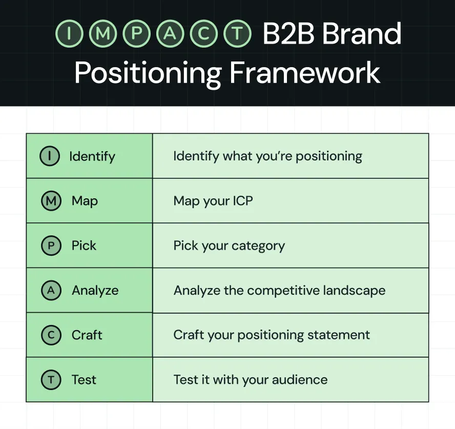
Step 1: Identify What You're Positioning
This might seem obvious, but it's the most overlooked step, especially for companies with multiple products. They jump straight to writing positioning statements without asking: Are we positioning the company? One lead product? A suite?
How to figure out the right b2b brand positioning strategy?
If you have a single product, your company positioning matches your product positioning.
Example: Slack before the Salesforce acquisition is a good example. Slack, the product, was Slack the company.
If you have multiple products, you have two ways to approach this:
1. Lead Product Strategy: Pick one product to lead with. Everything else becomes a cross-sell.
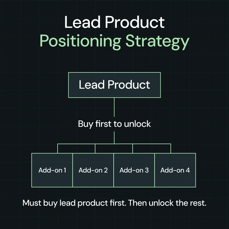
Example: Atlassian does this from the start. Their homepage focuses entirely on Jira, their issue tracking software. They have Confluence and Trello, but those stay in the background. Jira brings most customers in. Once teams use it, Atlassian cross-sells the other products, though each product can be purchased independently.
2. Umbrella Strategy: Position your company around one big idea that ties all your products together.
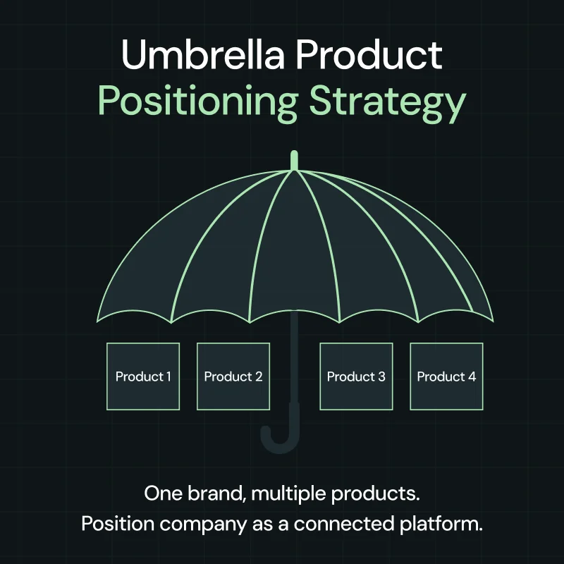
Example: We helped InnQuest, a property management system (PMS) software, on this. After 30 years with multiple product brands, they rebranded to roommaster with a new website design and positioning.
They maintained separate positioning for booking software, channel management, and payments. The rebrand brought them under a single umbrella: an integrated hospitality platform.
Step 2: Map Your ICP
This doesn't mean firmographic details like company size, industry, or geography.
Here's what he means. A B2B SaaS company with 100 employees might fit your target profile on paper. But if they don't have the specific workflow problem you solve, they won't buy.
Companies buy based on the work they need to get done, not their company size. Firmographics tell you who exists, but use cases and categories tell you who's actually ready to buy.
How to define your ICP?
Here are two ways to define your ICP:
- Based on use-case: Start with the workflow your product solves. Then find who does that workflow most often.
Example: Calendly's use case is "schedule meetings without back-and-forth emails." It is mainly used by sales teams, recruiters, customer success managers, consultants, and account executives. The use case tells you exactly who needs it.
In this case, the firmographics alone would say "B2B companies, 50-500 employees." But therapists and university advisors schedule meetings too. This approach helps you find people firmographics would never find.
- Based on category: Start with the category buyers already shop for.
Example: When we revamped Rezolv's website, the category was clear: debt collection software. Banks already knew they needed tech to manage debt recovery.
Rezolv didn't have to explain the category. They just had to position their 7-product stack as better than the legacy solutions banks were using.
The category (debt collection tech) told banks what Rezolv was, while their positioning told them why to pick Rezolv. This is one of many b2b brand positioning examples where starting with category clarity accelerated the entire positioning process.
Step 3: Pick Your Category
Once you know your ICP, the next question is: what category do they already think in?
In other words, this is where you choose your battleground. Your category isn't just a label. It's the mental box buyers put you in when they're evaluating solutions. Pick the wrong box, and you're either invisible or fighting the wrong fight.
And here's the thing: your ICP directly determines your category choice. If you know who you serve and what workflow they're trying to solve, the category becomes obvious.
How to pick your category?
Here are two ways to choose your category, according to Anthony Pierri:
- Anchor to an Existing Tool: Position your product in a category buyers already shop for.
Example: Notion positions itself as a "workspace tool." They don't invent a new category. They anchor to where buyers already look and say: we combine docs, wikis, and project management in one place.
.webp)
- Anchor to an Existing Task/Workflow: Position around what buyers are already trying to do.
Example: When ThunderClap worked with Tagalys to revamp their website, their ICP was clear: Fashion & Lifestyle ecommerce brands.
But the category wasn't about the tool; it was about the workflow. Tagalys anchors to what their buyers are already trying to do: improve product discovery and merchandising on their online stores.
Note: Tool-based categories are easier to explain, but you face direct competition and price pressure. On the other hand, workflow-based categories have less competition but require more buyer education and longer sales cycles.
{{specficService}}
Step 4: Analyze Your Competitive Landscape
Once you choose your battleground, it's important to know its top players, what they do, how they do it, and why they do it.
This isn't about obsessing over them, but understanding them. Yi Lin Pei, product marketing coach and founder of Courageous Careers, actually equates "competitive intelligence to knowing yourself."
It's about finding white space to sharpen your differentiation and find a winning positioning.
Most companies skip this step or do it half-heartedly. They glance at a few competitor homepages, maybe check their pricing, and call it done.
That's not competitive analysis.
How to analyze your competitive landscape?
Once you know who your competitors are, dig into what they're actually saying and what their customers think. Look at their websites and review platforms such as G2, Capterra, and Trustpilot.
The questions you're trying to answer:
- What story are they telling? What value do they promise?
- What features and benefits do they highlight?
- What do their customers love?
- What do their customers complain about?
Example: When we revamped Factors.ai's website and brand identity, we used ThunderClap's Competitor Analysis Framework to analyze competitors such as 6sense, Demandbase, and Dreamdata.
And here's what we found: Most platforms position themselves as enterprise ABM solutions. While customers praised their capabilities, they weren't happy about the ease of use and pricing.
That gap became our design anchor while designing their website, from the social proof marquee to product animations, positioning Factors as a faster, reliable alternative for mid-market B2B teams.
Pro Tip: The "Recurring Complaints" in competitor reviews are gold. That's where you find what the market wants but isn't getting. Own that gap, and you own the positioning.
Step 5: Craft Your Positioning Statement
Now that you know your ICP, category, and competitive gaps, it's time to distill everything into one clear positioning statement.
This statement forms the foundation for every marketing decision you make. It tells you who you are, why you matter to your audience, and keeps you from sliding into vague territory.
At ThunderClap, we use the Onlyness Statement framework from Marty Neumeier to build positioning statements with our clients. It forces you to get specific across six dimensions: what, how, who, where, why, and when.
How to build your positioning statement?
The Onlyness Statement breaks down like this:
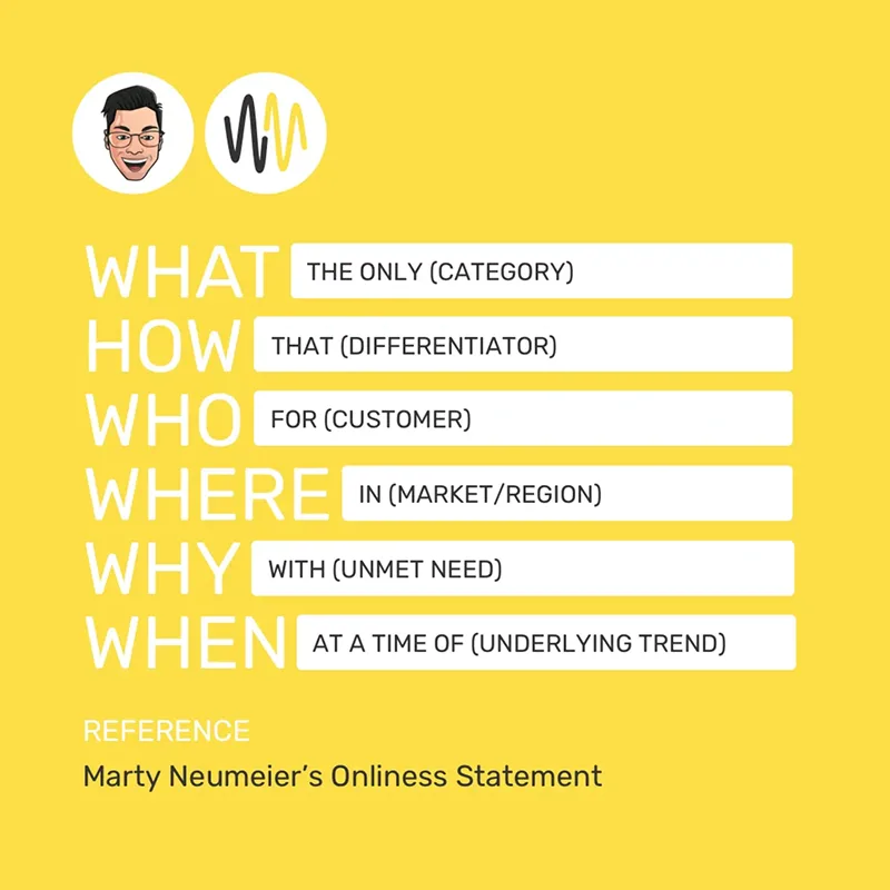
- WHAT: The only [category]
- HOW: That [unique capability or approach]
- WHO: For [specific ICP]
- WHERE: In [geography, if relevant]
- WHY: Who wants to [specific outcome or goal]
- WHEN: At a time when [market context or pain point]
Example: When we helped Deductive.ai craft their positioning statement as part of their website revamp:
- WHAT: The only AI-powered root-cause analysis tool for software teams
- HOW: That connects to your codebase and telemetry to automatically search and reason about production incidents
- WHO: For CTOs and VPs of Engineering at tech companies with 500-1000 employees
- WHERE: Running cloud-native infrastructure
- WHY: Who wants to eliminate hours spent debugging and root-causing incidents
- WHEN: At a time when 90% of software operates in the dark without observability
This positioning statement guided everything from their homepage hero to their landing page design and product animations, helping them achieve 10x more engagement after launch.
This is a strong b2b brand positioning example of how the Onlyness Statement translates abstract product capabilities into clear buyer value.
{{specficBlog}}
Step 6: Test Your Positioning
This is where you decide whether you want positioning that sits well in a Google Doc or one that actually accelerates market differentiation and improves brand recall.
Refining your b2b website strategy without testing your positioning is like launching a product without talking to customers. You might think it's clear, but your buyers might be confused.
How to test your positioning?
Run your positioning by 5-10 people from your ICP. Show them the positioning statement and your current website (in case you are revamping), and ask these questions:
- What type of company is this product for?
- What specific problem does it solve?
- Why would you choose this over alternatives?
- What questions do you still have?
This will help you identify reasons why your current website or positioning doesn't resonate with your ICP.
If 7 out of 10 people correctly identify your ICP, problem, and differentiator, your positioning works. If they're confused or give different answers, you need to revise.
Example: When building ThunderClap's positioning, we found most agencies sell aesthetics, not impact. We tested our positioning with marketing leaders who immediately understood our focus on ROI over design.
That validation allowed us to implement it across our website and landing page.
Pro Tip: If multiple people ask the same question or misunderstand the same thing, that's your signal to clarify before moving forward.
Looking for a B2B brand positioning agency to help you stand out?
The companies winning in b2b tech brand positioning aren't the ones with better products. They're the ones who can explain what they do in 3 seconds, stand out in a crowded market, and give buyers clarity instead of confusion.
At ThunderClap, we've worked with 140+ B2B brands across SaaS, Fintech, AI, and VC to build positioning that accelerates market differentiation. From Storylane, roommaster, and Factors.ai to Deductive.ai and Skyroot, we've helped companies translate complex products into clear, compelling positioning that drives results.
We bring the frameworks, the competitive analysis, and the execution speed that internal teams lack. What takes you 6 months of internal debate, we compress into 8-12 weeks of focused execution.
Our approach is simple: dedicated project managers, usually founders or senior account managers, handle everything from positioning strategy to website launch. No handoffs, no translation loss.
And because we've mapped the competitive landscape across SaaS, Fintech, AI, and VC, we know how to position you for differentiation without costly missteps.
{{ctaBlock}}
FAQs
1. What is B2B brand positioning and why does it matter?
B2B brand positioning defines the space you occupy in your buyers’ minds and explains why they should choose you over alternatives. As buying journeys get more complex, competition increases, and sales cycles grow longer, strong positioning becomes the primary driver of market differentiation in crowded B2B markets.
2. What is the difference between B2B and B2C brand positioning?
The difference lies in decision-making and buying cycles. B2B positioning targets multiple stakeholders, longer evaluation periods, and risk-aware buyers. B2C positioning focuses on individual consumers, faster decisions, and emotional triggers. In B2B, clarity and relevance matter more than novelty.
3. How do you position your brand in a competitive B2B space?
Start by identifying what you’re positioning: a single product, a lead product, or a portfolio. Map your ICP based on workflows and buying context, not firmographics. Pick a category your buyers already understand. Analyze competitors to find gaps. Craft a clear positioning statement, then test it with real buyers.
4. How does B2B tech brand positioning differ from other industries?
B2B tech buyers prioritize ease of use, internal buy-in, integrations, and scalability. Instead of differentiating on features alone, effective tech positioning focuses on how a specific workflow is solved for a defined audience and on the measurable impact on efficiency, adoption, and ROI.
5. What are some good B2B brand positioning examples?
- Factors is clear about who it serves: mid-market B2B revenue teams that want account intelligence without enterprise complexity.
- Storylane keeps its positioning tight by focusing on one thing buyers care about: seeing the product before talking to sales.
- Deductive speaks directly to engineering leaders frustrated by time lost debugging incidents.
- Skyroot avoids abstract innovation talk and positions around dependable access to space.
- Notion makes its value obvious by framing itself as a single workspace replacing scattered tools.
They work because buyers don’t have to decode the message. The positioning is clear, specific, and easy to place in a known category.
The Step-by-Step Website Redesign Process B2B Teams Use to Increase Conversions (Without Killing SEO and Pipeline)
If you lead marketing, growth, or product at a B2B company, you’ve probably said some version of this in the last year:
“Our website doesn’t reflect who we are anymore, but we can’t afford to tank traffic while we fix it.”
Website revamps sit on roadmaps for months, sometimes years. When they finally get funded, the default move is to treat them as a visual refresh. Then, a few months after launch, the numbers look painfully familiar: similar demo volume, similar lead quality, similar buyer confusion.
For B2B teams, a high-performing redesign is about treating the website as revenue infrastructure and running a rigorous website redesign process. This guide does exactly that. It lays out all the steps ThunderClap and other leading B2B teams use to improve conversions, SEO, and UX debt; all without compromising the pipeline.
The P.R.E.C.I.S.E. Framework: ThunderClap’s Lens for Conversion-Led Redesigns
Wynter’s B2B Buyer Journey study found that 97% of buyers check vendor websites and narrow down to roughly 3 vendors they investigate further. Mostly based on what they see and understand online, before talking to sales. Gartner’s recent B2B buying research shows buyers now move through a digital‑first, rep‑light journey before they accept a sales call.
Based upon such evidence, ThunderClap developed the P.R.E.C.I.S.E. Framework: a criteria set developed after revamping 129+ B2B websites across SaaS, fintech, VC, HR, and enterprise tech in India, the US, and the UK.
P.R.E.C.I.S.E. condenses those lessons into 7 parameters that every serious website redesign process should satisfy.
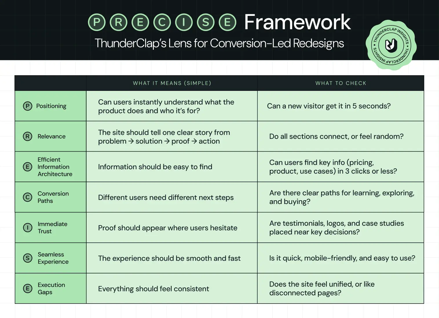
The 9 Core Website Redesign Process Steps for B2B Teams
Think of these website redesign process steps as your spine. Every company’s context is different, but skipping any of these in B2B nearly always comes back to bite SEO, UX, or stakeholders.
Step 1: Diagnose reality before taking opinions
Most redesigns start with opinions:
“Homepage feels outdated.”
“Competitor X looks better.”
That’s exactly how teams miss the problem. A strong website redesign process starts with evidence of where buyers drop off and why. At this stage, you’re not trying to redesign anything. You’re trying to answer:
👉 Where is the current site failing the buyer?
Look for patterns like:
- High-intent pages (pricing, product) with high exit rates
- Traffic landing on blogs but never reaching product pages
- Demo pages with traffic but low conversion
- Mobile users are dropping off faster than desktop users
Example:
Backed by top-tier VCs, Deductive AI engineered a system that cut root-cause time from hours to minutes. But the website didn’t reflect that. So ThunderClap approached it as a diagnosis problem. The team identified the gap: engineers couldn’t quickly grasp how the product worked or why it mattered. They rebuilt the narrative around one idea - no more root cause analysis in the dark, created the copy as per the engineers’ thinking, and showed product behavior upfront.
What this step should produce
By the end of this step, you should have:
- A list of top drop-off points (pages + sections)
- 3-5 hypotheses on why users aren’t converting
- Clear mapping of:
- where traffic comes from
- where it goes
- where it dies
Most teams get this step wrong because they jump straight into design decisions before truly understanding user behavior. There’s also a tendency to over-focus on the homepage, while high-intent pages like pricing or product get overlooked (even though that’s where your biggest conversion leaks usually are).
Step 2: Align stakeholders and pick one primary goal
In an enterprise website redesign, misalignment is more dangerous than poor color choices. Marketing wants more MQLs, sales wants only high‑intent leads, product wants feature education, and leadership just wants the site to look premium. Everyone is right individually, but collectively, the site becomes a compromise rather than a growth asset. At this stage, the question you’re answering is:
👉 What is the one outcome this website redesign must be judged on in the first 90 days after launch?
Look for patterns like:
- Define a single macro-metric (e.g., qualified demos, self-serve signups, high-intent content consumption)
- Select 2-3 supporting metrics (e.g., bounce rate on key pages, SQL volume, trial activation)
- Define your current ICP (segment, size, region, use case)
- Explicitly identify who the website is NOT for anymore
{{specficService}}
Example:
When Visharathan Kugamoorthy, Marketing Director at roommaster, partnered with ThunderClap, the team paused on the most important question: what should a hotel manager feel 3 days after visiting the site? That insight led to the creative direction of hospitality architects, which then shaped the redesign and met with an 80% spike in traffic and demo bookings. Read the entire process breakdown in this LinkedIn post by Ayush Barnwal, Partner & CEO, ThunderClap:
What this step should produce
By the end of Step 2, you should have:
- Primary KPI for the first 90 days post‑launch (e.g., qualified demo requests or self‑serve activations).
- 2-3 secondary metrics agreed by all stakeholders (e.g., bounce rate on pricing, % of visitors reaching product pages, SQL volume from organic).
- ICP and segment priority list (for whom this site is built now, and who is intentionally de‑prioritized).
- A decision‑making model: who decides, who advises, who executes, and how tie‑breakers are handled.
- A short success narrative you could read to the board: If these numbers move by X, this redesign is a win.
Step 3: Build a buyer-led website redesign UX process
Most website redesign UX processes unconsciously orbit internal structure: product lines, squads, or org charts. Buyers don’t care. They arrive with 3 questions in their head:
- Is this for me?
- Can I trust them?
- What should I do next?
In practical terms, that means mapping how different personas move from problem awareness to evaluation to decision, then architecting the site so each click feels like the next logical step in their story, not your backlog.
Look for patterns like:
- Map journeys for 2-3 priority personas only.
- Include discovery, problem framing, solution pages, proof, risk reduction, and conversion in every journey.
- Assign one clear job to each page based on its role in the journey.
- Use the homepage to qualify visitors and direct them forward.
- Use product pages to explain the solution clearly.
- Use pricing pages to reduce hesitation.
- Use case studies to prove outcomes and build trust.
- Use resources to nurture and educate buyers over time.
For 101 GenAI, that meant making the brand as credible as the product. The company was already doing serious enterprise work in healthcare AI, auditing 100% of clinical calls, tracking HEDIS scores, and closing care gaps for US payers and providers. ThunderClap’s job was to turn that narrative into a more trustworthy buyer experience.
“The brand looked more mature. More polished. Investors could see the shift without being told.” – Abhishek Sharma, Strategy Lead, 101 GenAI
What this step should produce
By the end of this step, you should have:
- Buyer-journey maps for your top personas.
- A page-jobs matrix for every key template.
- A draft information architecture built around user intent.
- Conversion paths and CTA rules for each stage of the journey.
- A UX principles doc that keeps the rest of the redesign consistent.
Step 4: Lock positioning and messaging before UI
UI‑first redesigns underperform. Because design does not make your positioning clear, it either amplifies what’s already clear or exposes gaps. In a B2B website redesign process, this is the step where you commit to a concrete narrative: who you serve, what outcome you deliver, how you’re different, and why that matters now.
Look for patterns like:
- Build one core narrative and adapt it into messaging ladders for each persona.
- Use a JTBD lens to connect features directly to outcomes.
- Define category, target audience, main problem, core promise, differentiators, and proof points in that document.
- Map what each persona knows, fears, wants, and needs to hear to move forward.
Example:
When VuNet Systems engaged ThunderClap, leadership was clear: the site had to position them as Business Observability for Banks, not just another monitoring tool. Post‑launch, VuNet reported stronger brand perception, better product positioning, and clearer communication of their differentiation across customers and prospects. Read Ayush Barnwal’s (Partner & CEO, ThunderClap) POV on VuNet revamp.
What this step should produce
By the end of Step 4, you should have:
- A one‑page positioning narrative: category, ICP, problem, promise, and differentiation.
- A JTBD mapping document that ties product capabilities to jobs and outcomes.
- A prioritized proof bank (logos, testimonials, case stats, analyst quotes) mapped to claims you make in your messaging.
Most teams get this step wrong by treating “copy” as a thing you write after design, squeezed into whatever space is left. That’s how you end up with generic headlines, vague benefit statements, and product pages that read like feature inventories instead of compelling stories.
Step 5: Wireframe journeys
Next, turn messaging and IA into wireframes focused on flows. The most impactful wireframes cover:
- Blog/resource → product/solution → proof → pricing → demo
- High‑intent landing pages for campaigns and ABM
- Pricing + FAQ + social proof sequences
Look for patterns like:
A strong website redesign UX process stress‑tests:
- How quickly a visitor can see themselves in your story
- Whether there’s always a logical next click
- Where proof and CTAs appear relative to doubts
Example:
For ClearlyRated, ThunderClap started with a UX audit + user-behavior analysis, which exposed WordPress performance issues, weak product UI, and messaging. After the redesign and migration, they saw a 35% increase in impressions and 33% increase in clicks, alongside a clear improvement in average position on Google. Watch the complete breakdown in the video:
What this step should produce
By the end of Step 5, you should have:
- Low‑ or mid‑fidelity wireframes for all page types (home, product, solution, pricing, case study, resource, high‑intent landing).
- Documented entry and exit points for each template (where traffic comes from, and where it should go next).
- Mobile‑first variants or rules so ensure core flows don’t break on smaller screens.
Most teams get this step wrong by wireframing page‑by‑page in isolation, often with different owners making micro‑decisions that don’t connect. The result is a site where every page looks fine individually, but the end‑to‑end journey feels like jumping between unrelated experiences.
Step 6: Design for UX and scale, not dribbble shots
Only when wireframes and copy are stable should the visual design ramp. This is the step where everyone’s inner aesthete shows up and where things can go off the rails if visual decisions are made for aesthetics alone. The goal is not to create the most creative page; it’s to create a system that can scale across 50-100+ pages, future campaigns, and new product launches without breaking UX.
Look for patterns like:
- A strong design system: typography, spacing, components, and states.
- Customer behavior on different content lengths and viewports.
Example:
For Skyroot Aerospace, ThunderClap designed a consistent system across mission pages, vehicle pages, and their now‑famous Book Your Launch configurator so the whole site feels like one productized launch experience.
Sumil Sudhakaran, Head of Brand & Communications at Skyroot Aerospace, on Ayush Barnwal’s LinkedIn Post.
What this step should produce
By the end of Step 6, you should have:
- Page‑level designs for templates that demonstrate how the system behaves under content.
- Motion/animation guidelines: where to use it, how subtle it should be, and performance constraints.
- A handoff package for development (specs, tokens, and examples) that reduces interpretation risk.
Step 7: Upgrade SEO inside the process
SEO is where many redesigns quietly burn money. Done as an afterthought, a “fresh look” can erase years of compound organic gains in a single deploy. Done well, it’s one of the biggest levers for a long‑term pipeline.
Look for patterns like:
- Full URL inventory and traffic/value mapping.
- 301 redirect plan with testing.
- Metadata, schema, and internal linking migration.
- Content consolidation where cannibalization exists.
- Pre‑ and post‑launch tracking of rankings and organic conversions.
Example:
ThunderClap helped one of India’s top VC firms, with a $3.5 Bn+ portfolio, rebrand their website and sharpen their identity for Indian startup founders. Since launch, they have seen a 50% increase in website engagement, a 54% growth in active users, and a 121% boost in direct traffic.
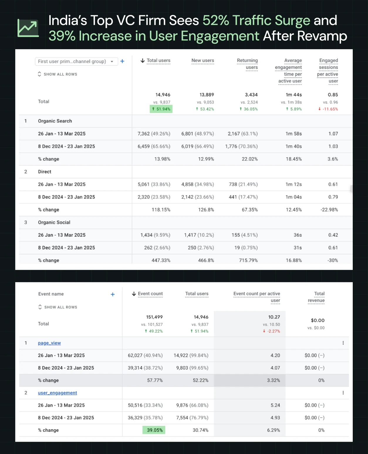
What this step should produce
- A full URL inventory with traffic and value mapping.
- A redirect plan for every changed, merged, or retired URL.
- Metadata, schema, and internal linking migration sheets.
- A content consolidation plan for overlapping pages.
- Pre- and post-launch tracking for rankings, traffic, and organic conversions.
{{specficBlog}}
Step 8: Build in a marketer‑owned tech stack
Our ICP research makes one thing clear: your marketing team wants a site they can own, not one they have to beg dev to update. That’s why many enterprise teams now treat CMS choice and architecture as core steps in the website redesign process.
Look for patterns like:
- Component‑based CMS setups (e.g., Webflow Collections and Symbols).
- Structured content for blogs, case studies, industries, and integrations.
- Guardrails that prevent brand breakage while enabling experimentation.
Example:
When WizCommerce partnered with ThunderClap, the team wanted a site that made their AI-powered wholesale platform (WizOrder, WizShop, WizAI) the obvious choice in a crowded category with 8000+ competitors. The solution was a CMS architecture that let marketers control their own destiny: product pages with structured collections for each module, a homepage that picks a side (wholesalers and distributors), copy written for wholesale buyers, and conversion paths built around evaluation behaviors. Now the team can update offers, spin up new landing pages, or test messaging without dev delays.
What this step should produce
- A CMS architecture with structured content types (products, case studies, industries, integrations).
- A component library and guardrails for non-designers.
- Integration setup for CRM, analytics, and experimentation tools.
- Enablement so marketing can launch and iterate independently.
- Governance rules to prevent brand breakage.
Step 9: Launch as a controlled experiment
Launch day is not the finish line; it’s the starting gun. Treating go‑live as a project end is how sites stay frozen for 3 years until the next painful overhaul. A modern B2B website redesign process treats launch as the beginning of a structured experimentation cycle.
Look for patterns like:
Instead of a big‑bang switch with crossed fingers, plan for:
- A soft launch on a hidden or password‑protected URL for internal QA, stakeholder review, and bug‑bashing.
- A staggered rollout for critical templates (for example, starting with the marketing pages, then migrating legacy resources, then advanced sections).
- Closely monitored analytics in the first days and weeks: KPIs, high‑intent flows, form submissions, 404s, and unexpected drop‑offs.
- A pre‑planned experiment backlog tied to your primary KPI: form variations, CTA tweaks, headline tests, layout adjustments, new proof blocks, or alternate journeys.
Example:
You can learn more about how we built an in-house experimentation muscle for marketing here:
What this step should produce
- A detailed launch checklist (QA items, redirects verified, tracking validated, rollback plan defined).
- A monitoring dashboard for your primary KPI and key supporting metrics.
- A 30‑, 60‑, and 90‑day experiment roadmap prioritized by impact and ease.
- A cadence for reviewing performance with stakeholders (weekly in the first month, then monthly).
Ready to Run This Website Redesign Process on Your Own Site? Start Here.
If you’ve read this far, you already know more than just ‘we need a new homepage’.
You’ve seen how PRECISE gives you a lens, how the 9-step website redesign process turns that lens into execution, and how teams like roommaster, VuNet, Skyroot, and WizCommerce have used it to improve conversions.
Now the question is simple: do you want to run this alone, or with a partner that’s already pressure‑tested it across 140+ B2B websites?
ThunderClap’s 10‑week program does exactly what this blog outlines: strategy, messaging, UX, Webflow development, and CRO, wrapped into a single, accountable team. Clients like Factors AI, Zamp, Veefin, NativeMSG, 101GenAI, and Clearly Rated have seen up to 30% more demo requests and 60% higher user engagement after a full revamp.
If you’re ready to turn your website into a growth engine, this is the moment to move from reading to doing.
{{ctaBlock}}
FAQs
1. When should a B2B company consider a website redesign?
When positioning changes, the product or the audience changes, and the site no longer reflects the current version of the product. Especially if conversions, lead quality, or stakeholder confidence are declining, or if UX and tech debt block campaigns.
2. What is a website redesign process?
A website redesign process is a structured sequence of discovery, strategy, UX, design, SEO, development, and launch steps used to change an existing site into a higher‑performing one without reducing traffic or pipeline.
3. How do B2B teams ensure a redesign doesn’t hurt SEO?
By treating SEO as a core track: auditing URLs and content, planning redirects, preserving high‑value pages, migrating metadata and schema, and monitoring rankings and traffic before and after launch.

TL;DR
- ThunderClap leads the way for B2B web design in Virginia with a strategy-first approach. Their combination of in-house product marketing and Webflow expertise helps clients like Zamp, roommaster, and 101 GenAI achieve measurable results.
- They use the APP framework (Audience → Problem → Proof) to clarify who the site is for, what problem it solves, and how to prove value before starting design.
- Websites are built to convert with clear navigation, logical page flow, repeated CTAs, and proof elements like case studies, metrics, and client logos.
- Here's what you can do to choose the right agency:
- Ask how they clarify your audience, problem, and proof before designing anything.
- Request examples of measurable impact, not just pretty designs.
- Check that their sites are easy to navigate and built to guide visitors toward action.
- Make sure they plan for updates, scalability, and ongoing optimization after launch.
When we first started looking for web design agencies in Virginia, we were struck by how… well, everyone seemed so confident. And we mean EVERYONE.
From Arlington to Richmond, there are agencies that will tell you they can “redefine your brand” or “transform your digital presence,” and sometimes it’s hard not to roll your eyes.
What we realized pretty quickly is that the real challenge is finding an agency that actually gets what your business needs.
Some agencies have portfolios that make you go “wow,” but when you dig deeper, it’s not always clear whether those sites actually drive results or if they’re just shiny screenshots that look nice on Instagram. And yet, there are a few agencies in Virginia that somehow manage beautiful design, smart strategy, and the kind of work that makes you think, “Ah, now that’s how it should be done.”
In this guide, we’ll walk you through what to look for when choosing a web design agency in Virginia, highlight a few examples that really stand out, and give you some tips for making a choice that won’t leave you questioning yourself a month later. (Because, honestly, who has time for that?)
The Real Job of a B2B Web Design Agency (Beyond Visual Design)
A beautiful website might win attention, but in B2B, attention alone doesn’t convert. The real work begins beneath the surface, where structure, clarity, and intent quietly shape how a visitor understands your business.
In fact, a well-designed user interface can boost conversion rates by up to 200%, while a fully optimized UX can push that improvement as high as 400%. The impact comes from design decisions rooted in business thinking.
Translating business value into website clarity
A strong agency helps answer the questions every visitor is silently asking. For example:
- Who is this product really for?
- What problem does it solve?
- Why should I choose this company instead of the competition?
This is especially important in Virginia, where industries such as IT consulting, healthcare, and professional services dominate the economy, and buyers often compare multiple providers before making a decision. In fact, professional and business services alone account for the largest share of Virginia’s GDP ($140.1 billion), highlighting just how competitive and credibility-driven the landscape is.
In such an environment, clarity is a competitive advantage. Whether you're targeting government contracts in Northern Virginia or service-based clients in Richmond or Virginia Beach, your website must quickly communicate value, differentiation, and trust.
If a website looks nice but does not make these answers clear, it is failing at its most important job. That is, first impressions are everything. In less than 20 seconds, 83% of visitors will judge a website’s credibility.
As Ayush Barnwal, Website Revamp Expert at ThunderClap, points out in a recent LinkedIn post, the highest-converting B2B websites ruthlessly prioritize message clarity, strategic differentiation, and the conversion path over flashy visuals. Your site can look award-winning or minimalist…either works if every design decision serves your audience.
Swipe to see his full breakdown →
A trustworthy design can prevent people from bouncing before they even read a word.
Structuring websites around buyer decisions
Visitors come to your website to move through a journey from understanding to trust to action. If that path is confusing or blocked, it’s like driving on a freeway during rush hour with lanes closed.
If you don’t believe us, consider these stats:
- 19% of first-time visitors say ease of navigation is the first thing they notice
- 50% of consumers will leave if they cannot figure out where to go
- 13% say poor navigation makes them unlikely to return
A website that is difficult to navigate does more than frustrate users. It quietly blocks conversions, and in a market where trust, clarity, and local relevance matter, that’s a risk most Virginia businesses can’t afford.
Supporting marketing and sales goals
Modern websites are engines for growth. The right agency builds sites that generate leads, encourage demo bookings, and support long-term content strategies that build authority. Every page, CTA, and pathway should align with how marketing and sales actually work together.
When design meets strategy, the results speak for themselves. A great example of this is our recent work for 101 GenAI. Their website needed to make the brand as credible as the product, which audits clinical calls and closes care gaps for US payers and providers.
After launch, the site strengthened investor and partner conversations and helped enterprise prospects engage with more confidence.
Ayush’s LinkedIn post explains exactly why clarity, strategy, and a strong conversion path matter for B2B websites.
Because at the end of the day, if a website looks good but fails to clearly communicate value, it doesn’t just underperform, it quietly works against your business goals.
5 Signals of a High-Quality Web Design Agency in Virginia
No agency, and we repeat, no web design agency in Virginia or anywhere else, delivers the same level of impact. Some focus on surface-level design, while others drive measurable business outcomes.
After working with over 88+ B2B brands, we’ve identified five clear signals that set the best agencies apart from the rest.
They start with messaging, not mockups
A common mistake businesses make is jumping straight into design. Colors, layouts, and animations get attention, but without clear messaging, they don’t convert. The best agencies slow this down and start with positioning first.
Before a single wireframe is created, they ask the harder questions:
- Who are we speaking to?
- What problem are we solving?
- Why should someone choose you over the alternatives?
Webflow design and development agencies like ThunderClap follow this approach closely.
We do this through a simple 3-step framework called APP:
Audience → Problem → Proof
- First, we get specific about the audience.
Not broad personas, but real buyers with clear stakes. For example, a sales leader is tired of wasting time on unqualified leads, or a founder struggling to stand out from cheaper competitors.
- Next, we define the problem in precise terms.
What exactly is broken today? Maybe prospects cannot differentiate you, or your website is attracting the wrong kind of traffic.
Getting clear on this challenge comes before thinking about solutions.
- Finally, we anchor everything in proof.
This is where differentiation becomes real. Whether you compete on innovation, operational excellence, customer relationships, or cost, your website needs to show it. Through case studies, metrics, and clear value propositions, you give buyers a reason to believe you.
They show before/after work, not just pretty screens
The best agencies don’t just drop a screenshot of a homepage and walk away. They show what changed, why it changed, and what actually improved for the business.
When you land on a redesign case, you should be able to answer: What problem did this solve?
Zamp, a fully managed, enterprise-focused sales tax solution, had a product that delivered exceptional accuracy and onboarding, but its website didn’t reflect that value. We partnered with Zamp to redesign the experience, refining positioning, simplifying messaging, and rebuilding the navigation to guide visitors toward demo bookings. Every design decision focused on making Zamp feel as premium and reliable as the service itself.
Post-launch, Zamp now clearly communicates its value with 99.9% filing accuracy, onboarding that completes in under two hours, and support response times under one hour. Their site reflects the product’s credibility, boosting confidence among enterprise buyers and strengthening recognition from G2. With more than $30 million raised and a fully differentiated brand, Zamp now looks and sounds like the category leader it already is.
Their work is easy to navigate and understand
A beautiful website means nothing if visitors get lost. The best agencies design with clarity in mind, making sure every page has a purpose and every path leads somewhere meaningful.
But here’s what most companies don’t realize. Buyers notice confusion instantly, and they just don’t always say it out loud.
Kiran Kulkarni, Head of Growth at ThunderClap, jokes about this in a LinkedIn post:
It sounds funny, but it reveals something important. When a website is hard to navigate or understand, users judge it quietly and move on.
For example, a Head of Marketing landing on your site is thinking:
- “Can I quickly understand what this company does?”
- “Can I find what I need without digging?”
If the answer is no, the conversation ends before it even begins.
They design for conversion, not just aesthetics
Most B2B websites still follow a brochure-style structure. Home, About, Features, Contact. It looks complete, but it does not reflect how buyers actually evaluate a product.
High-performing websites guide users step by step. They help them understand, evaluate, build trust, and then take action.
We saw this clearly in our work with Factors.ai. During a busy GTM phase, they needed a full website overhaul without slowing down execution. Instead of rebranding from scratch, we focused on creating a more premium experience through structure and visual clarity.
One standout section shows the execution timeline, helping users understand how they move from raw signals to actionable campaigns in just three weeks. Clear and repeated CTAs like “Get a demo” and “Learn more” guide users at every step, while enterprise security badges and recognizable customer logos reinforce trust.
As Tanvi, Product Marketing Lead at Factors.ai, shared:
"ThunderClap delivered our website revamp on tight timelines while maintaining quality. The team was responsive, proactive, and easy to collaborate with."
That is the difference between a site that looks good and a site that converts. Every element works together to help the buyer move forward.
They think beyond launch
A lot of teams treat a website launch as the end of the project, but it is where the real work begins. Your messaging will evolve, new campaigns will come in, and your product will keep changing, so your website needs to keep up with it all.
The problem is that many sites are not built with this in mind. They look great at launch, but even small updates start taking too long. Creating new landing pages becomes a task, SEO efforts feel restricted, and teams end up depending on developers for changes that should have been simple.
The best web design agencies in Virginia think about this early. Instead of locking you into a rigid structure, they design systems that make it easy to update content, launch new pages, and adapt the site as your strategy evolves.
{{specficBlog}}
Examples of Web Design Agencies in Virginia
Let’s walk through this list and help you shortlist the best web design agency in Virginia for your business.
1. ThunderClap
.webp)
ThunderClap is a web development and B2B web design agency trusted by 88+ fast-growing companies, including Amazon, ClearlyRated, Factors, Roommaster, Zamp, Dropit, Wizcommerce, and DPDZero. Rather than focusing purely on aesthetics, ThunderClap emphasizes conversion-focused websites tailored for mid-market and enterprise SaaS, fintech, B2B, and AI companies ($10M+ ARR) that are expanding into new markets or repositioning themselves as category leaders.
They present themselves as a dependable, high-speed execution partner for B2B growth, delivering pixel-perfect, scalable websites through structured QA processes, fast turnaround times, and collaborative workflows that align closely with client goals and timelines.
Core services
- Brand and web design with visually compelling layouts and persuasive copy
- Website development for scalable, easy-to-manage websites
- Webflow maintenance and ongoing support for continuous post-launch improvements
Best for: B2B SaaS, fintech, venture capital, and AI companies ($10M+ ARR) that are expanding into new markets, raising funding, repositioning as category leaders, or seeking high-quality websites that enhance brand perception, generate leads, and scale efficiently without relying on internal teams.
Notable clients
With 144+ websites delivered and 10+ industry awards, ThunderClap demonstrates both strong domain expertise (SaaS, fintech, AI) and versatility across industries (consulting, commerce, B2B services). Their work has helped clients achieve up to a 50% increase in conversions and a 60% boost in engagement.
For instance, ThunderClap supported a leading Indian VC firm with a $3.5B+ portfolio in rebranding Matrix Partners as Z47. The engagement focused on building a unified identity for Indian SaaS, consumer, and fintech founders. After launch, Z47 experienced 60% traffic growth, 50% higher engagement, a 54% increase in active users, and a 121% rise in direct traffic.
You can explore the full breakdown in a LinkedIn post by Ayush:
Why they’re hard to ignore:
ThunderClap follows a structured process that prioritizes positioning, messaging, user experience, and trust-building elements before execution begins. From there, they develop a conversion-focused architecture with clear CTAs, proof-driven content, and intuitive user journeys.
- Discovery and audit phases dive deep into brand identity, product positioning, competitor insights, and CRO opportunities
- Strategy sprints define messaging frameworks and visual systems that communicate value instantly
- Design and development are executed with scalable CMS capabilities and marketing autonomy built in
- Post-launch optimization ensures continuous improvements through performance tracking, iteration, and alignment with pipeline goals
2. COLAB
COLAB creates user-centered digital experiences for organizations where design impacts trust, engagement, and outcomes.
They partner with healthcare systems, nonprofits, associations, and B2B marketing teams undergoing growth, mergers, or rebrands, delivering intuitive, accessible, and maintainable designs that align strategy, design, and development to drive lasting digital impact.
Core services
- UX/UI design and user research
- Design systems and component libraries
- Accessibility-focused digital design
Best for: Organizations seeking thoughtful, user-first digital experiences that improve usability, trust, and long-term maintainability.
Notable clients
The Virginia Home, BrownGreer, Sports Backers, Better Housing Coalition, SouthEast Bank, Arkansas Federal Credit Union, Reputation.com, Appily, Evolent, and Marine Corps Marathon
Why they’re hard to ignore:
COLAB’s design process combines deep user research with iterative collaboration, making sure every design is precise, practical, and aligned with organizational goals. Their commitment to accessible, sustainable design makes digital products resilient over time.
3. New Target
Recognized as a creative and purpose-driven digital agency, New Target specializes in marketing campaigns, branding, website design, and AI solutions.
They help brands, nonprofits, and associations tell their stories online, delivering experiences that deeply connect with audiences, boost engagement, and drive meaningful results.
Core services
- Branding, creative, and visual design
- Website development, integration, and hosting
- Digital marketing and AI-powered solutions
Best for: Brands, nonprofits, and associations looking for a strategic partner to elevate their digital presence and audience engagement.
Notable clients
Nasoya, EcoEducar, Industrial Designers Society of America, Corelight, Metropolitan School of the Arts, Konica Minolta, and the Architect of the Capital
Why they’re hard to ignore:
New Target combines creative storytelling with technology and AI solutions to make every digital experience visually compelling, functional, and strategically aligned with organizational goals.
4. Ironistic
Ironistic delivers high-impact web design and development for organizations ready to turn their websites into powerful assets. Their services span responsive design, app development, custom integrations, CMS implementation, e-commerce, and multimedia, all aimed at increasing engagement, ROI, and audience impact.
They focus on functionality, aesthetics, and adaptability across platforms to elevate every digital presence.
Core services
- Website design and development (responsive, custom, CMS)
- App development and custom integrations
- E-commerce solutions and multimedia production
Best for: Organizations seeking a versatile digital partner to build, revamp, or scale websites and apps that engage audiences and drive measurable results.
Notable clients
They work with small businesses, financial institutions, non-profits, and government contractors.
Why they’re hard to ignore:
Ironistic combines technical expertise with bold, visually compelling designs to produce websites and apps that capture attention, increase engagement, and deliver measurable business impact.
{{specficService}}
5. Foster Web Marketing
Foster Web Marketing helps legal and medical practices overcome operational and marketing challenges through the Perfect Practice System.
Founded by Tom Foster, the agency focuses on building custom intake processes, lead generation, referral networks, and strategic marketing to help practices grow sustainably, reduce chaos, and maximize ROI while attracting the right clients.
Core services
- Intake optimization, lead generation, and conversion systems
- Website design, SEO, and digital marketing
- Operational strategy and practice growth consulting
Best for: Law firms and healthcare practices seeking systematic, results-driven growth rather than generic marketing solutions.
Notable clients
DeLoach, Hofstra & Cavonis, P.A, Keller & Keller, Pete Olson Injury Law, Fowler Pickert, Eisenmenger Norfleet, Hupy and Abraham, S.C, and Smith Strong, PLC
Why they’re hard to ignore:
Foster Web Marketing combines marketing, operations, and strategy to create measurable growth for practices, focusing on solving the underlying systems issues that hold organizations back.
How Businesses Evaluate Affordable Web Design Agencies in Virginia
Finding the right affordable web design agency in Virginia starts with knowing what really matters for your project and your budget.
Now that you have a snapshot of the key factors, here’s how to evaluate agencies effectively:
Understanding what “affordable” really means
Affordable does not mean cheap. In practice, it often translates to a smarter investment that delivers long-term value:
- Good ROI: Your website drives leads, conversions, or engagement that justify the cost.
- Scalable design: Sites are built to grow with your business, not require a rebuild after a year.
- Minimal rework: Thoughtful planning reduces errors, saving time, money, and frustration down the road.
Tradeoffs to be aware of
Lower-cost options can be tempting, but businesses need to understand the compromises they may face:
- Skipping strategy: Some agencies focus solely on aesthetics, without planning user journeys or messaging.
- Reusing templates: Off-the-shelf designs may limit uniqueness or brand differentiation.
- Limited customization: Features or functionality may be constrained by time, resources, or platform restrictions.
When budget-friendly options make sense
Affordable agencies can be a strong choice in the right scenarios:
- Early-stage startups: When testing concepts and validating market fit, simple sites often suffice.
- Simple websites: Brochure-style sites or landing pages don’t require complex features.
- Short-term needs: Temporary campaigns or proof-of-concept projects benefit from lower-cost execution.
Ready to Build a Website That Drives Revenue?
Reading about B2B web design best practices is one thing. Implementing them effectively is another.
At ThunderClap, we help B2B brands convert their underperforming websites into their most powerful revenue engine. We partner with ambitious B2B companies, SaaS platforms, enterprise tech providers, and innovators who see their websites as more than brochures.
Here’s what our proven approach looks like:
- Discovery: We study your buyers, your competitors, and your business goals before we touch a design tool.
- Conversion-focused design: We design experiences that guide users from understanding to action.
- Modern tech: We build on Webflow, so your website works fast, stays flexible, and never traps your team in slow updates.
- Ongoing optimization: We track results, test improvements, and refine performance so your gains grow over time.
Whether you need a total rebuild or a targeted overhaul of your current site, we help you turn those strategies into measurable revenue outcomes.
{{ctaBlock}}
Let us show you what effective B2B web design looks like in action.
FAQs
1. What industries do Virginia web design agencies typically serve?
Virginia agencies commonly serve B2B companies, SaaS firms, professional services, and enterprise organizations. Many agencies also support government contractors and technology companies due to the region’s strong and diverse business ecosystem.
2. Do you build websites optimized for Virginia-based search visibility?
Yes, most agencies follow modern SEO practices to improve visibility in both local and national search results. They optimize site structure, content, and performance to attract relevant traffic and generate qualified leads.
3. Can a Virginia web design agency support both local and national growth?
Yes, modern agencies in Virginia build scalable websites that support expansion beyond local markets. They create structured, conversion-focused experiences that help businesses grow across regions while maintaining strong brand positioning.


Interested in seeing what we can do for your website?


.webp)
