


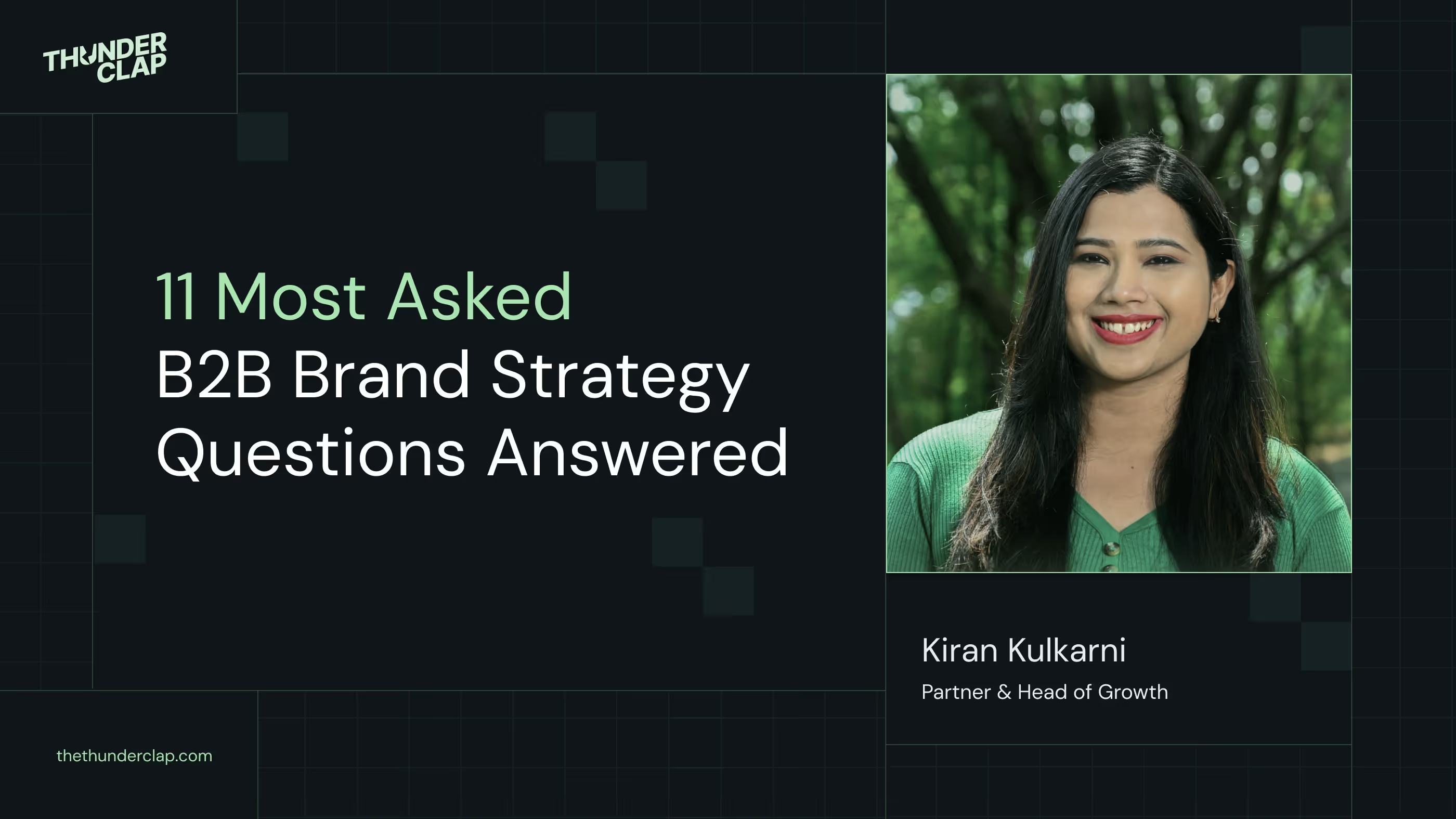
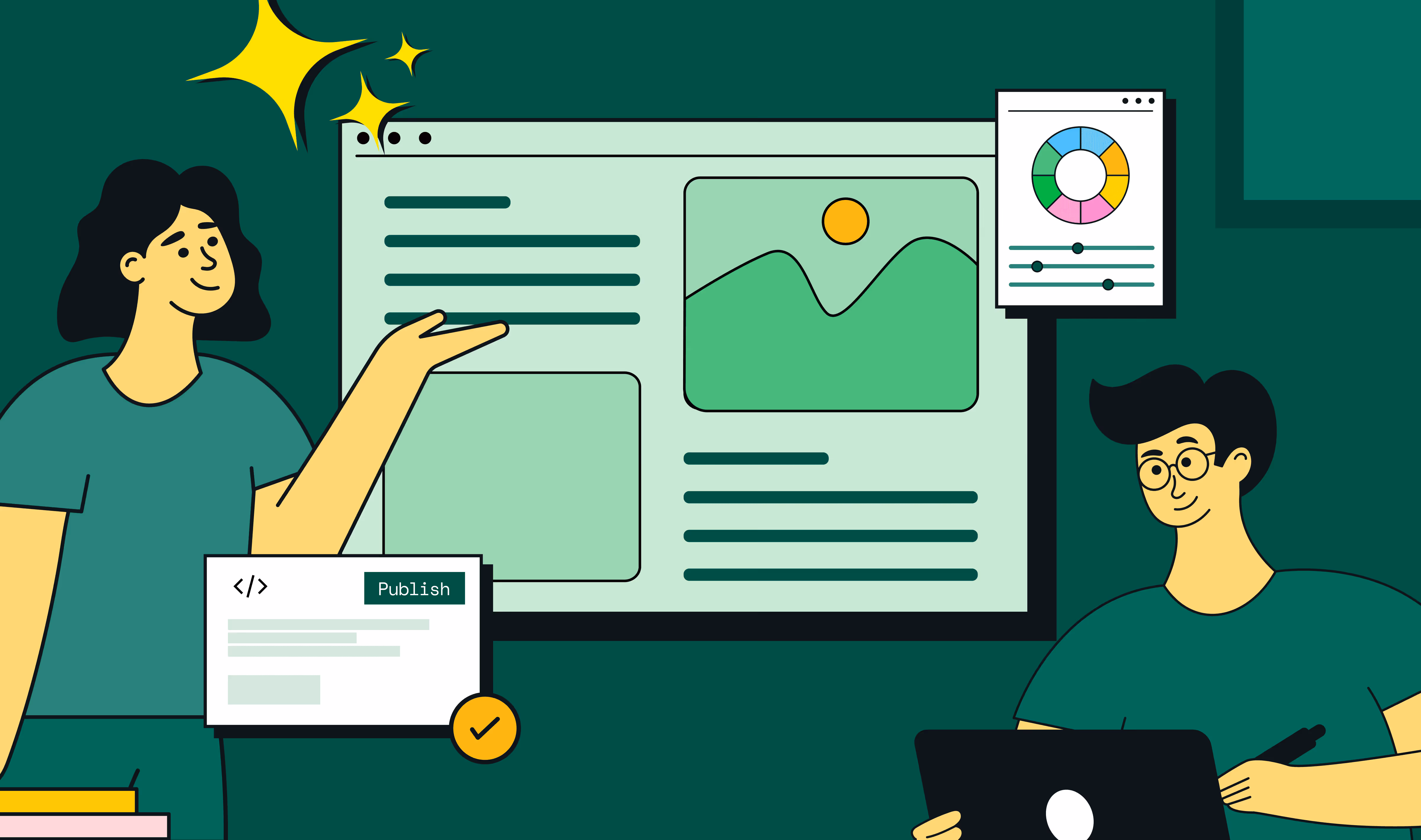
From Click to Customer: Proven Landing Page Conversion Optimization Techniques

You can buy clicks. You can’t buy conversions.
That’s the central tension of SaaS marketing today: teams pour budget into Google Ads, outbound, SEO, and social distribution, but then lose 90% of their visitors on the very first touchpoint: the landing page.
At ThunderClap, we’ve audited hundreds of SaaS landing pages and seen the same story. The landing page doesn’t accelerate interest into action; every campaign dollar leaks away. The difference between an okay landing page and a customer-producing landing page isn’t a prettier design. It’s a scripted sequence: give people a reason to care, remove their doubts, and make the next step effortless.
We call that sequence MAP (Motivate → Assure → Prompt). This blog post breaks each part open, gives exact sentences and structures you can copy, and hands you the small-but-powerful decisions that add up to big lifts.
TL;DR
- SaaS teams lose 90% of traffic at the landing page. Clicks are easy, conversions are hard.
- Generic landing page optimization strategies don’t work for SaaS: CTAs are heavier, buyers are cautious, and switching costs feel high.
- ThunderClap’s MAP framework (Motivate → Assure → Prompt) creates momentum that turns visitors into customers.
- Motivate with outcome-first headlines, Assure with layered proof, and Prompt with frictionless CTAs and short forms.
- ThunderClap has optimized 129+ websites, lifting conversions 40–50% by designing landing pages that act like your best salesperson.
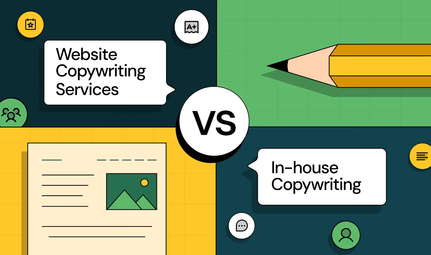
Why generic landing page advice fails SaaS
Most “landing page optimization best practices” you’ll find online assume visitors arrive ready to act. But SaaS buyers aren’t impulse shoppers; they’re cautious, often in multi-stakeholder buying cycles.
We’ve worked on 129+ B2B websites like Amazon, Razorpay, and Factors. When we run CRO reviews before website revamps, three SaaS-specific challenges always surface:
- Commitment-heavy CTAs: Signing up for a trial or booking a demo involves effort and risk.
- Multiple decision-makers: End-users care about usability, while CFOs care about ROI and compliance.
- Perceived switching costs: Adopting new software feels like a big bet. Buyers worry about disruption, onboarding, and wasted time.
That’s why “move the CTA above the fold” won’t cut it. SaaS landing pages need deeper optimization strategies rooted in psychology, buyer journey alignment, and trust-building.
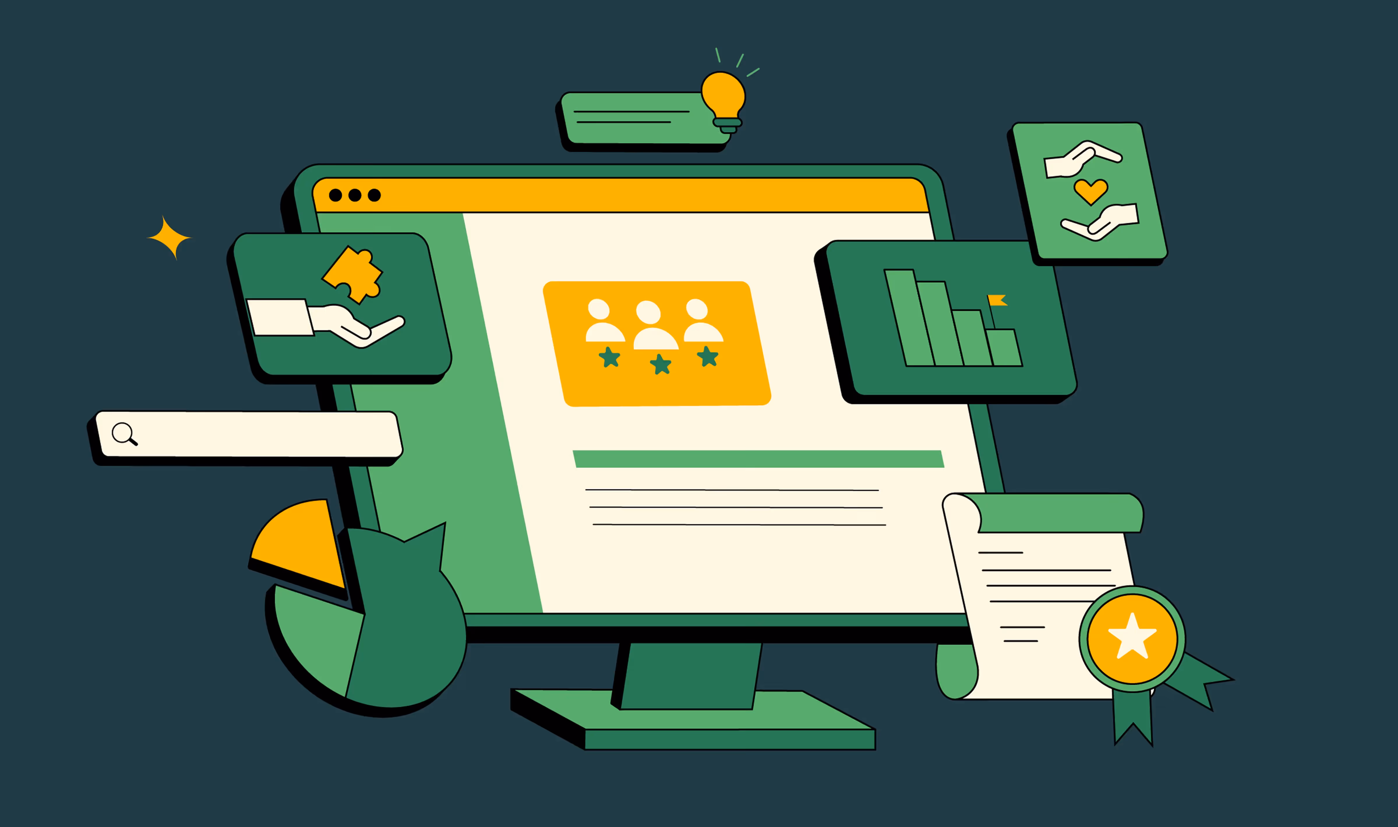
MAP framework for landing page conversion optimization: at a glance
Before diving in, let’s anchor on why we created MAP.
We saw clients struggle because their landing pages were designed in fragments: a headline from marketing, a form from sales, a testimonial tossed in by design. MAP forces coherence. It ensures every piece of the page is doing its job to build momentum: motivate visitors, assure them it’s safe to act, and prompt them clearly toward the next step.
MAP is the landing page optimization system for SaaS that works. It’s design + psychology + friction engineering.
On a landing page, each stage should flow into the next. If Motivate is strong but Assure is weak, readers hesitate; if Assure is strong but Prompt is bad, momentum stalls.
Build all three, and you get conversion velocity.
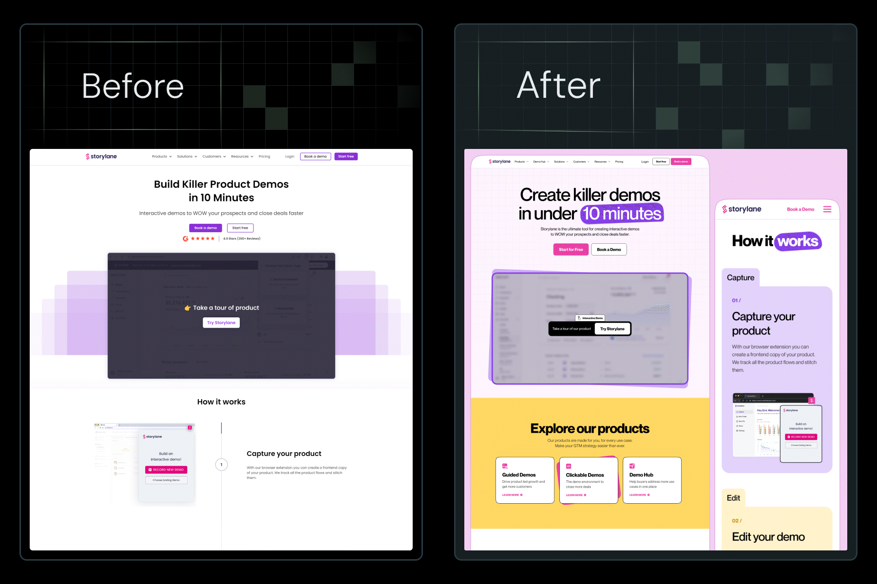
Want to see MAP in action? When we revamped ConsultAdd’s homepage with these strategies, conversions jumped by 60%. Here’s a quick walkthrough of the before and after.
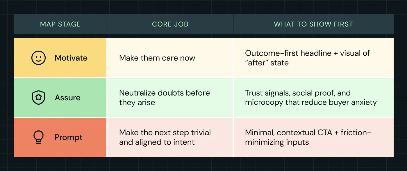
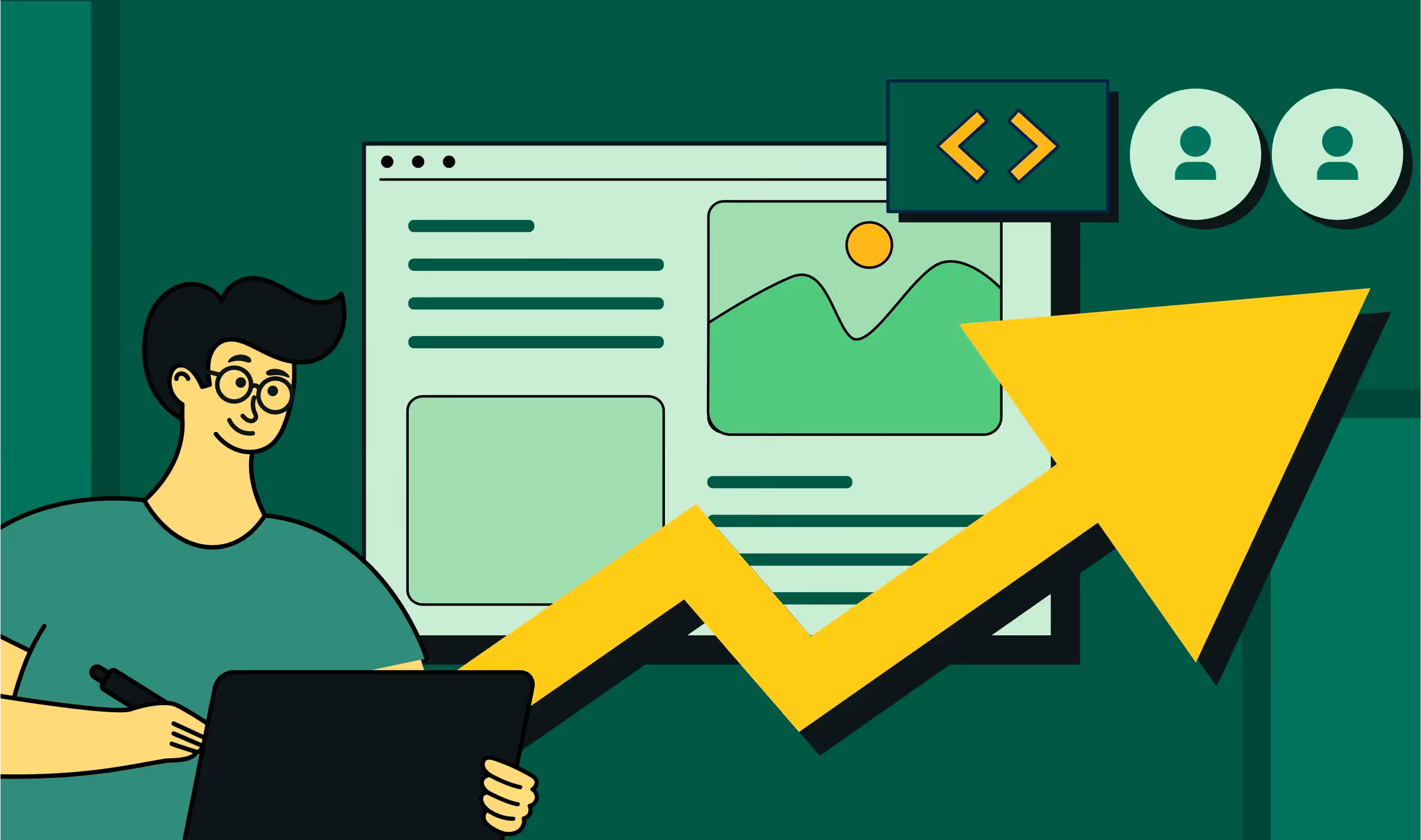
1. MOTIVATE — grab interest and create desire (do this well, and the rest is easier)
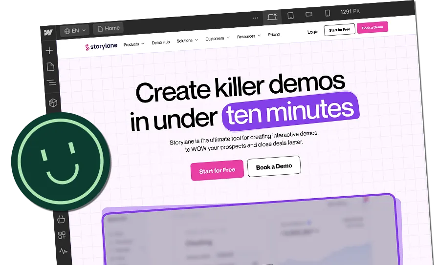
When we optimize SaaS landing pages, we start with the hero. If the hero doesn’t do its job in 3 seconds, the rest doesn’t matter. Motivate is the art of making an immediate, credible, emotional & rational case for action.
The job: make visitors say “this is for me” in under 3 seconds
Visitors usually arrive with a partial intent. They’re curious but not committed. Your hero section needs to close that tiny intent gap fast.
What high-performing motivation looks like
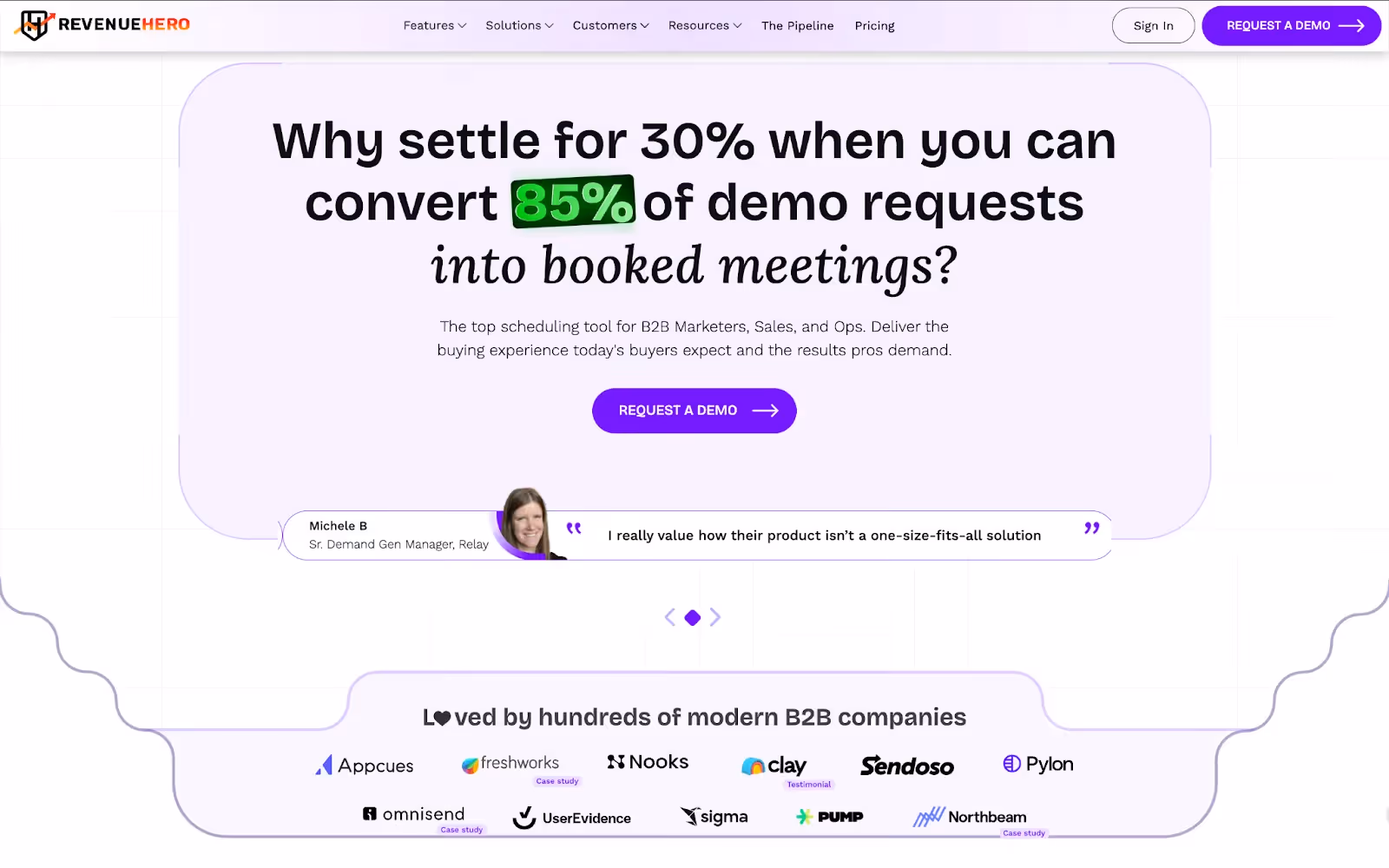
- Outcome-first headline (not product-first)
- Bad: AI-powered analytics platform
- Better: See campaign ROI in minutes — not days.
- Best (more specific): Cut reporting time by 70% and ship results in your first week.
- Bad: AI-powered analytics platform
- Why outcome-first? People buy results. Features justify later; results convert now.
- Single-sentence subhead that removes ambiguity
- Format: What it does + who it helps + one benefit.
- Example: Automated analytics for mid-market B2B marketers (no data science required).
- Format: What it does + who it helps + one benefit.
- Visuals that show the ‘after’ state
- A screenshot with real-looking data (annotated), or a short 15–25 second animated GIF of the product in action.
- Avoid hero imagery that’s purely abstract (people shaking hands, stock photos). Make the result visible.
- A screenshot with real-looking data (annotated), or a short 15–25 second animated GIF of the product in action.
- Small, high-confidence proof immediately visible
- A short line like “Trusted by 400+ marketing teams” or a single logo strip directly under the subhead. That’s not the full trust layer; it’s a signal the brain prefers.
- A short line like “Trusted by 400+ marketing teams” or a single logo strip directly under the subhead. That’s not the full trust layer; it’s a signal the brain prefers.
- Contextualized urgency (when appropriate)
- Not cheap FOMO. Real urgency tied to buyer benefit: “Get white-glove onboarding through July” or “Free automated migration for early adopters.”
- Not cheap FOMO. Real urgency tied to buyer benefit: “Get white-glove onboarding through July” or “Free automated migration for early adopters.”
Here’s an example of a SaaS brand doing this right:
Micro play #1: Our tested headline recipes you can swipe
- [Outcome] + [timeframe] + [social proof hint]
- Automate monthly reports in 10 minutes — used by marketing teams at 200+ companies.
- Automate monthly reports in 10 minutes — used by marketing teams at 200+ companies.
- [Problem to avoid] + [solution]
- Stop losing deals to slow reporting — deliver weekly insights in one click.
- Stop losing deals to slow reporting — deliver weekly insights in one click.
- [Question that names the buyer]
- Are you a Growth Lead? Reduce your reporting backlog by 70%
- Are you a Growth Lead? Reduce your reporting backlog by 70%
Good design in CRO means guiding attention and making action feel effortless. With Zenda, we overhauled their design system to prioritize clarity and proof. The team loved the design, which also got nominated for Awwwards.
A quick UX audit often uncovers hidden blockers: CTAs buried too low, visuals that distract, or forms that feel heavier than they are. From a design and layout lens, put the CTA visually next to the value statement (don’t hide it below the fold). Use a single prominent visual region (screenshot or GIF). We know that the best headline is 8–12 words and the subhead is 12–18 words.
{{specficBlog}}
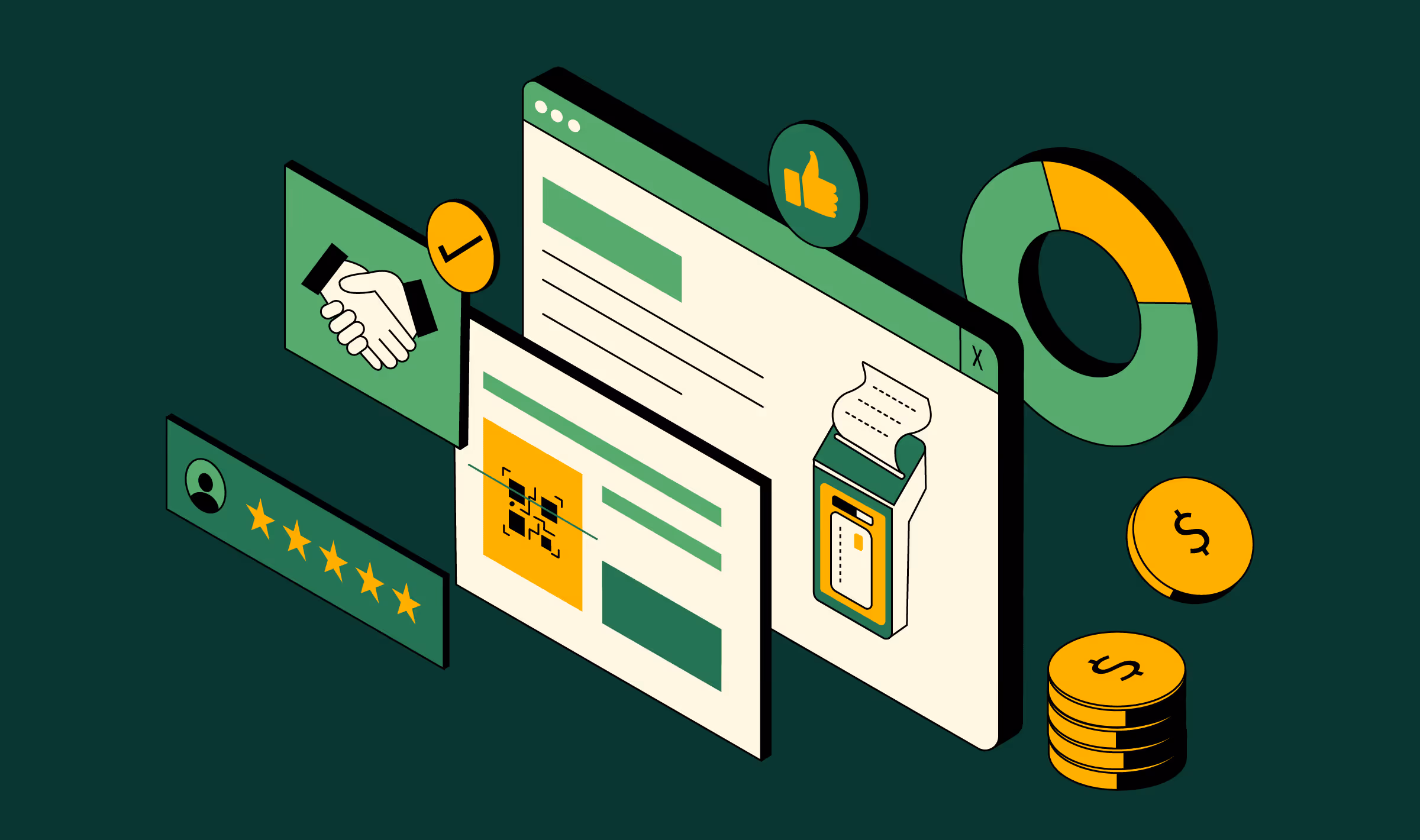
2. ASSURE — neutralize the buyer’s doubts before they arise
Even if your headline convinces, buyers will pause. Their internal checklist may include: Will this work for me? Is it secure? Will onboarding suck? How much will it cost?
Assure answers those questions proactively and precisely, not vaguely.
The job: turn “maybe” into “safe to try”
Assurance is not a single element. It’s an architecture. Those elements must be visible early and be contextually relevant to the CTA.
We used this firsthand when we worked with Storylane on their website revamp.
- Total conversions up 22%
- Conversions per user up 19%
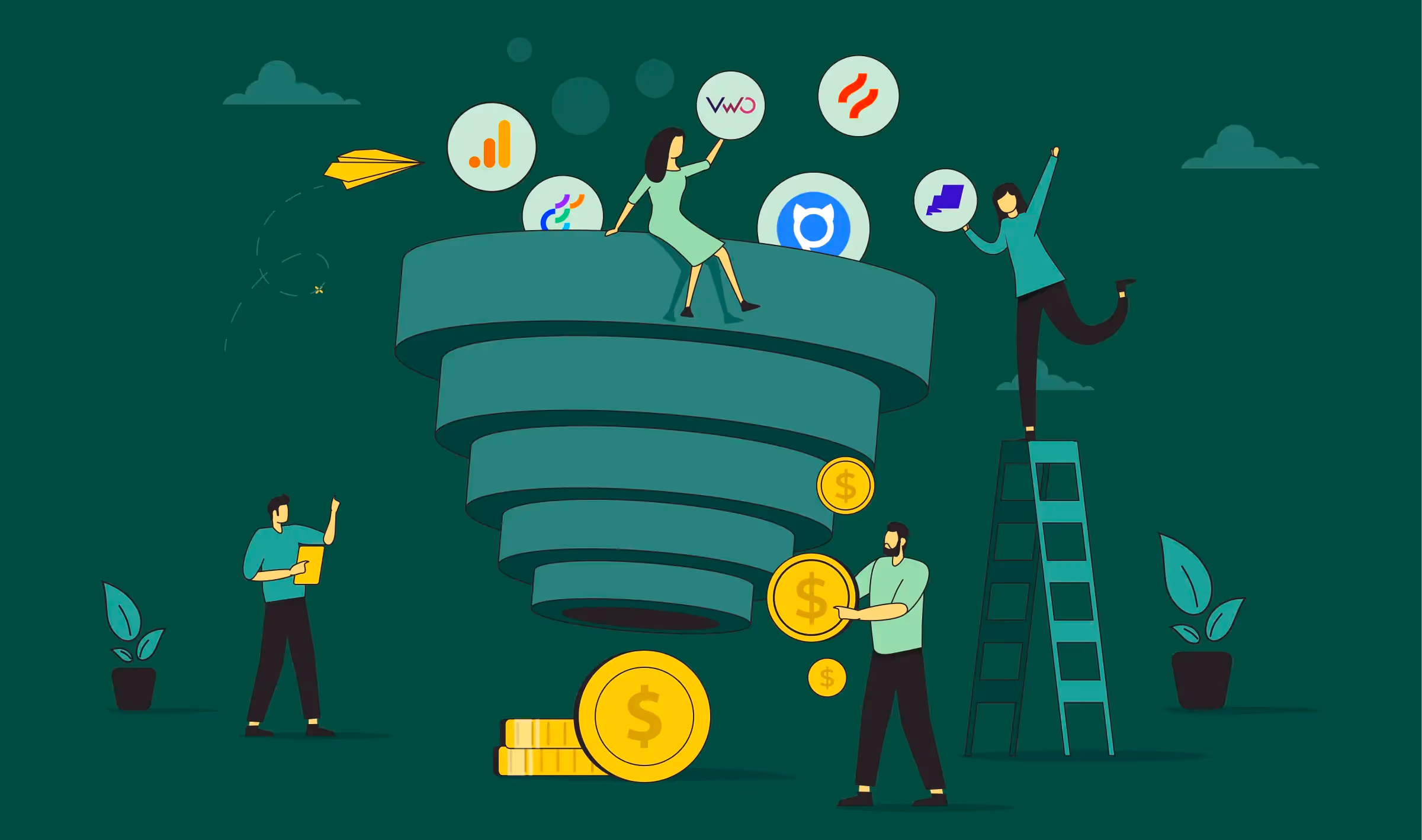
The assurance stack (what to show, and where)
How to choose what to show first
- If you target SMBs: show outcome proof and quick-start promises (time-to-value).
- If you target enterprise: lead with compliance, uptime, and procurement-friendly links.
- If the CTA is a demo: show logos of recognizable customers and a short testimonial from someone in procurement or IT.
Your pricing page is the most visited (and most overlooked) page on your site. We analyzed 50 SaaS pricing pages to create a proven blueprint, complete with insights, a wireframe, and a checklist that you can apply right away. Get the Pricing Page Blueprint.
Also read: 12 Effective Formats of Social Proof for Your B2B SaaS Website
The psychology: remove friction before it appears with micro copy
Buyers imagine worst-case scenarios automatically. If a visitor thinks “I’ll waste time,” your job is to whisper “You won’t.” If they think “This might be insecure,” you must show a credible security signal before they ask.
Three small, measurable tactics you can use today:
- Use a one-line “what happens next” statement above the form (e.g., “We’ll email a 1-click setup link — you’re live in 5 minutes.”)
- For demo CTAs, indicate time commitment (e.g., “Book a 15-minute walkthrough with a solutions engineer.”)
- If you collect sensitive fields, add a privacy microcopy (“We’ll never share your info.”)
Also read: 20 Proven SaaS Conversion Optimization Hacks to Boost Your Sales
3. PROMPT — make the next step irresistible and frictionless
This is where momentum either becomes a conversion or evaporates. The Prompt stage is about aligning the CTA with intent and reducing friction to the absolute minimum.
We use a simple rule here: ask for the least amount of commitment that still moves the deal forward.
Ask for too much and you lose; ask for too little and you waste everyone’s time. The golden rule: ask for the least that reliably moves someone forward.
Common SaaS CTA archetypes and how to design them
One of the most commonly asked questions we receive on how to optimize landing pages is around form design. Here are a few design rules you can implement today:
- Fields: 3–4 fields for initial contact (Name, Work Email, Company, Role). If you must ask more, use progressive profiling later.
- Placeholders and labels: use explicit placeholders (not “Enter text”).
- Button copy > color: use benefit-oriented copy: “Start Free — No Card” or “Book 15-Min Demo”.
- Inline reassurance: place microcopy beneath the button: “No credit card. Cancel anytime.”
Mobile-first inputs: enable number and email keyboards where appropriate; keep taps large.
How to personalize landing pages without creeping out users
Personalization is powerful, but only if it feels relevant, not invasive. At ThunderClap, we run segment-level personalization, not “Hi [FirstName]” gimmicks. We have found the best ways to do this are:
- Firmographic swaps: SMB sees “Perfect for lean teams.” Enterprise sees “Enterprise-grade compliance and SSO.”
- Persona swaps: CFOs see “Calculate ROI” while developers see “See API docs.”
- Campaign-aware text: If the ad mentions HIPAA, the landing page headline references HIPAA compliance.
We tell clients to start with headline + CTA personalization for 2–3 top segments. That’s 80% of the gain with 20% of the complexity.
If you run demos, use ThunderClap’s High-Converting Demo Page Playbook. She studied 30 B2B SaaS brands to find landing page optimization strategies that leading brands are using on demo pages.
Inside the 39-page ebook, you'll find landing page optimization best practices, an editable wireframe you can use to create a high-converting demo page for your SaaS brand, and three ready-to-use prompts to craft a perfect headline for your demo landing page.
Common buyer objections and exact copy to reply with
Objection-handling isn’t just for sales calls. It is also a landing page optimization strategy. By surfacing answers at the exact decision moment (right beside your CTA), you remove friction before it turns into abandonment.
Here are the most common SaaS buyer objections, paired with microcopy ThunderClap has field-tested on client pages to keep momentum alive:
How ThunderClap uses MAP for landing page optimization for SaaS clients
We keep this short: when we implement MAP, we do small surgical changes first (headline, hero visual, CTA microcopy, trust row). Then we prioritize one structural change per conversion flow: replace long demo forms with scheduler widgets, swap 9-field trials to OAuth + email, and move testimonials under the CTA. The lessons above are the same ones we use at scale.
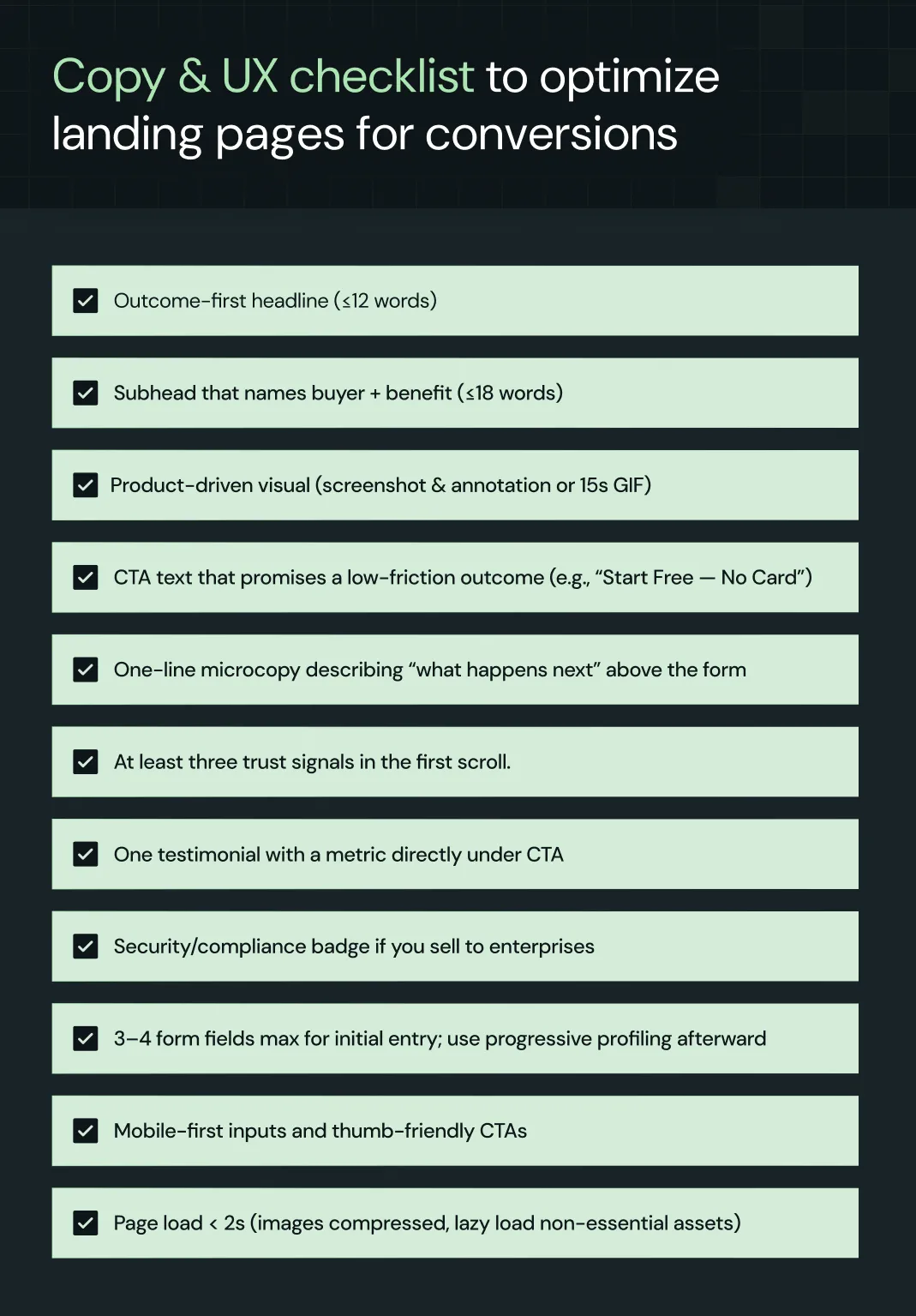
We love checklists because they force discipline. Before shipping any landing page, we apply two.
Copy & UX checklist to optimize landing pages for conversions
Ready to execute our MAP framework to optimize your landing pages for conversions?
The MAP framework we’ve unpacked here shows how SaaS landing pages can stop leaking visitors and start converting customers. You can take these ideas and run with them on your own. Or, if you’d rather move faster and go further, that’s where ThunderClap comes in.
Why ThunderClap? Three reasons set us apart:
- Proven track record in SaaS growth → We’ve optimized 129+ B2B websites and landing pages, partnering with companies like Amazon, Storylane, Factors, and roommaster. Our work consistently transforms static pages into conversion engines.
- Conversion-first methodology → We don’t just redesign. We build momentum architectures that lift demo signups, accelerate trials, and drive pipeline revenue. Many clients see a 40–50% increase in conversions within months.
- Scalable execution → Every project we deliver is built for growth — from Webflow implementations your marketers can own, to playbooks your sales and growth teams can iterate on.
Plenty of agencies can hand you a prettier landing page. ThunderClap hands you a landing page that becomes your most reliable salesperson.
If you’re ready to stop wasting clicks and start turning them into customers, book a consultation with ThunderClap today.
{{ctaBlock}}
FAQs
1. How do I optimize landing pages for conversions when my product has multiple buyer personas?
This is one of the biggest SaaS pain points. A CFO, an end-user, and an IT manager all evaluate your product differently. To optimize landing pages for conversions, personalize at the segment level. Swap headlines and CTAs by persona or firmographic data (e.g., “Calculate ROI” for CFOs, “See API Docs” for developers). This targeted approach is a core landing page optimization strategy that prevents “one-size-fits-all” pages.
2. What landing page optimization strategies actually work if my team has limited design and dev resources?
SaaS marketers often don’t have the luxury of big redesigns. The good news: high-leverage landing page optimization for SaaS doesn’t require full rebuilds. Focus on microcopy around CTAs, place testimonials directly under forms, and integrate a demo scheduler instead of a long request form. These lightweight strategies can deliver a 30–40% conversion lift without major dev work.
3. What metrics should I track to measure the success of landing page optimization?
Many SaaS teams only look at form fills, but that misses the full picture. To measure landing page optimization success, track:
- Conversion Rate (CVR): % of visitors completing your CTA (trial, demo, signup).
- Qualified Conversion Rate: % of conversions that match your ICP.
- Bounce & Scroll Depth: Are visitors engaging or leaving too soon?
- CAC Payback & LTV Impact: Does optimized landing page traffic generate profitable customers?
4. What are the best tools to use for landing page optimization in SaaS?
The right tools make it easier to test and refine quickly without drowning in dev cycles. For SaaS landing page optimization, we recommend:
- Webflow or Unbounce: Build and iterate landing pages without heavy code.
- Hotjar or FullStory: See how visitors actually behave on the page.
Google Optimize or Optimizely: Run A/B tests on headlines, CTAs, and layouts.


.webp)
Browse Similar Articles

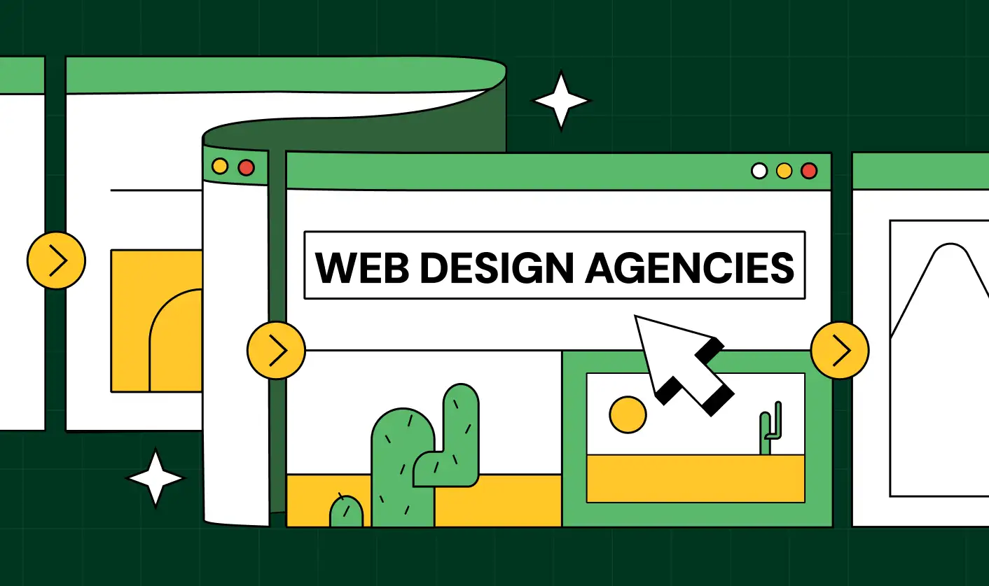
How to Find the Best Web Design Company in Houston, Texas for B2B Brands (6 Best Picks)

.svg)
The Step-by-Step Website Redesign Process B2B Teams Use to Increase Conversions (Without Killing SEO and Pipeline)
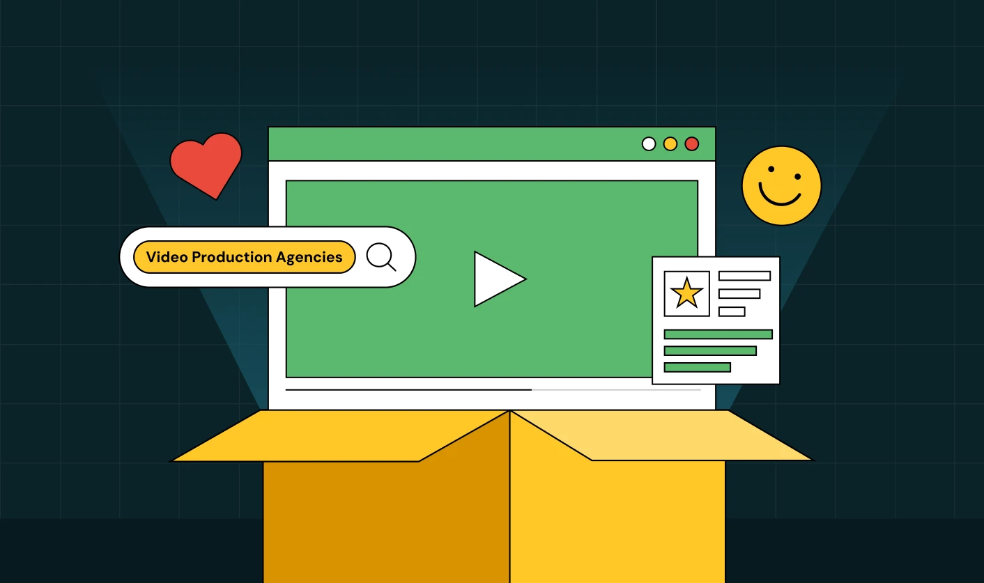
7 Best Video Production Agencies for SaaS Product Walkthroughs and Feature Videos

How to Choose the Best B2B Website Maintenance Company: 9 Questions to Ask Before You Hire One


How to Use Brand Storytelling on Your Website to Close More B2B Deals and Build Buyer Trust


Why Partnering with a B2B Brand Positioning Agency Accelerates Market Differentiation

.avif)
10 Product Marketing Companies Powering the Fastest-Growing SaaS Brands in 2026


Outsourcing Web Design: Cost-Benefit Analysis for Mid-Market & Enterprise Brands
From Leads to Lifetime Value: How Growth Marketing Agencies Scale SaaS Revenue
Webflow vs WordPress: Which Platform Is Better for Your Business Website in 2026?

Fintech Web Design That Builds Trust: 8 UX Principles Every Fintech Site Needs
Optimizing for Intent: How B2B Website Messaging and UX Changes Help Capture Top-Funnel Buyers


From Audit to Action: 8-Step Process to Optimize Your B2B Website Strategy for 2026 Buyers
How to Design a High-Converting Landing Page from Scratch (2026 Edition)


How to Optimize a Landing Page for Maximum ROI: A Step-by-Step Breakdown

AI Landing Pages That Convert: 7 Design Principles Every AI Platform Should Follow


Top 7 Webflow Integrations to Supercharge Your Website's Performance and Conversions


10 Best Web Design and Development Companies in India [B2B Focused for 2026!]

How to Choose the Best Webflow Agency: A Complete Guide for Your Business


Interested in seeing what we can do for your website?


.webp)
