How to Design a High-Converting Landing Page from Scratch (2026 Edition)

Your landing page gets three seconds. Three seconds to convince a visitor that your offer matters, that your solution works, and that clicking your CTA will solve their problem. Miss that window, and you've lost them forever.
At ThunderClap, we've designed hundreds of landing pages for B2B SaaS and tech companies. As a conversion-focused website partner, we know that how to design a landing page goes far beyond making it look good - it requires critical thinking, user psychology, and relentless optimization.
The average landing page conversion rate sits at just 2.35%, but the top 10% convert at over 11.45%. What separates the winners from the rest? They follow proven landing page best practices that we'll break down in this all-inclusive guide.
This isn't about templates or quick fixes. This is about building landing pages that convert visitors into customers. Let's get started.
Why Landing Page Design Makes or Breaks Your Campaigns
Your landing page serves as the bridge between promise and result. You drive traffic through ads, emails, and social campaigns, but if your landing page doesn't deliver, you waste every dollar spent getting people there.
The numbers tell the story:
- 50% of consumers believe website design is crucial to a business's brand
- Optimized landing pages generate a 160% higher conversion rate for actions like sign-ups
- 83% of all landing page visits happen on mobile devices, yet most pages still fail mobile users
Landing page design tips that actually work focus on psychology, not just aesthetics. Your page needs to match visitor expectations, reduce friction, and guide users toward a single, clear action.
As we detail in our SaaS Website Design That Converts guide, conversion-focused design separates growing companies from stagnating ones. Landing pages amplify this principle by removing distractions and laser-focusing on one goal.
Landing Page vs Homepage: Why You Need Both
Before we dive into how to design a landing page, let's clear up a common misconception. Landing pages and homepages serve completely different purposes, and understanding this difference shapes every design decision.
Homepages act as your digital front door. They welcome visitors, provide company overview, and offer multiple paths to explore your business. Homepages handle broad audiences with varying intents and need navigation, multiple CTAs, and information.
Landing pages focus on conversion. They connect directly to specific campaigns, remove distractions, and guide visitors toward one clear action. Landing pages eliminate navigation, reduce options, and match precise visitor expectations.
The key differences:
You need both. Homepages build brand awareness and serve organic traffic. Landing pages convert paid traffic and campaign visitors. Use the right tool for the right job.
Essential Elements of Effective Landing Page Design
1. Compelling Headlines That Convert
Your headline creates the first impression and determines if visitors stay or bounce. Effective landing page design starts with headlines that immediately communicate value and match visitor expectations.
Keep headlines concise: Limit headlines to 8-10 words maximum. Every word must justify its place by adding clarity or benefit.
Lead with benefits, not features: "Reduce Customer Churn by 40%" beats "Advanced Analytics Platform" because it focuses on outcomes visitors care about.
Match your traffic source: Your headline should align with the ad, email, or link that brought visitors to your page. Mismatched expectations kill conversions instantly.
Test different approaches: A/B test benefit-focused vs. solution-focused headlines to see what clicks with your specific audience.
Strong headline examples:
- "Cut SaaS Churn by 40% in 90 Days"
- "Turn Website Visitors Into Customers"
- "Book 5x More Demos This Quarter"
2. Visual Hierarchy
Landing page design tips are guiding visitor attention exactly where you want it. Visual hierarchy creates a logical flow from headline to CTA that feels natural and compelling.
Use the F-pattern: Visitors scan in an F-shaped pattern - across the top, down the left side, and across key sections. Design your layout to match this natural behavior.
Apply contrast effectively: Your CTA button should stand out through color contrast, size, and positioning. Make it impossible to miss without being obnoxious.
Create visual flow: Use arrows, images, and white space to guide eyes toward your conversion goal. Every visual element should either support or direct attention to your CTA.
This connects to our B2B Web Design Best Practices where we discuss how strategic design drives measurable business results.
3. Conversion-Focused Copywriting
Your copy needs to persuade, not just inform. Landing page best practices for copy focus on addressing objections, highlighting benefits, and creating urgency.
Write benefit-driven subheadings: Break up sections with headlines that show specific advantages. "Save 10 Hours Per Week" is more compelling than "Automated Workflows."
Address common objections: Use copy to handle concerns before they become barriers. Include phrases like "No credit card required" or "Cancel anytime" to reduce risk perception.
Create scannable content: Use bullet points, short paragraphs, and bold text to make benefits easy to digest. Visitors scan, they don't read.
Match your audience's language: Use terminology your target customers use, not internal jargon. If they say "lead generation," don't say "prospect acquisition."
4. Trust-Building Social Proof
Effective landing page design leverages social proof to overcome skepticism and build credibility. The right social proof can increase conversions by 15% when placed strategically.
Customer testimonials: Use specific, outcome-focused quotes. "Increased conversions by 40% in three months" beats "Great product!" every time.
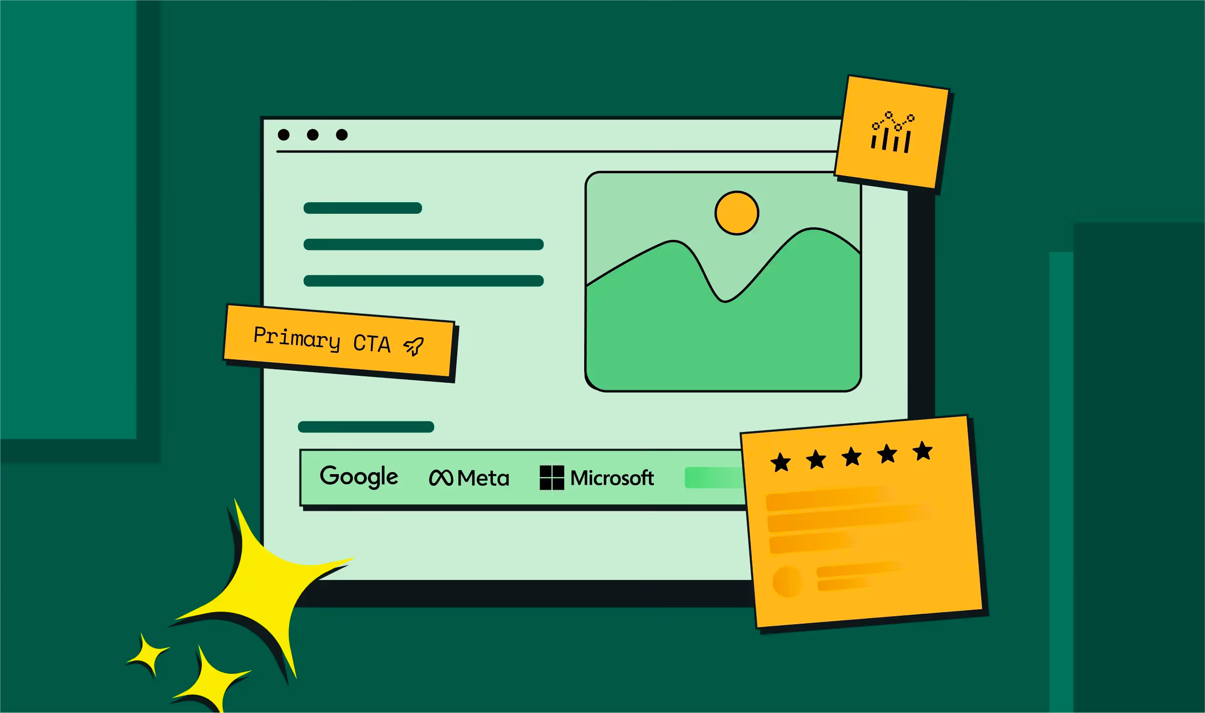
Company logos: Display recognizable client logos near your CTA to build instant credibility. Enterprise buyers especially respond to seeing similar companies.
Usage statistics: Numbers like "Join 10,000+ marketing teams" create social validation and urgency.
Case studies: Link to detailed success stories for visitors who need deeper proof before converting.
Position social proof close to your CTA where it can influence the final decision. As we show in our B2B Conversion Rate Optimization Strategies, social proof placement dramatically impacts its effectiveness.
5. Mobile-First Design Approach
With 83% of landing page visits happening on mobile, mobile optimization isn't optional - it's critical for success.
Design for thumbs: Make buttons large enough to tap easily (minimum 44px). Space interactive elements to prevent accidental clicks.
Optimize load speed: Pages loading in 1-2 seconds hit the conversion sweet spot. Every additional second costs 4.42% of conversions.
Simplify mobile forms: Reduce form fields and use mobile-friendly input types. Single-column layouts work better than complex multi-column designs.
{{specficBlog}}
Step-by-Step Landing Page Design Process
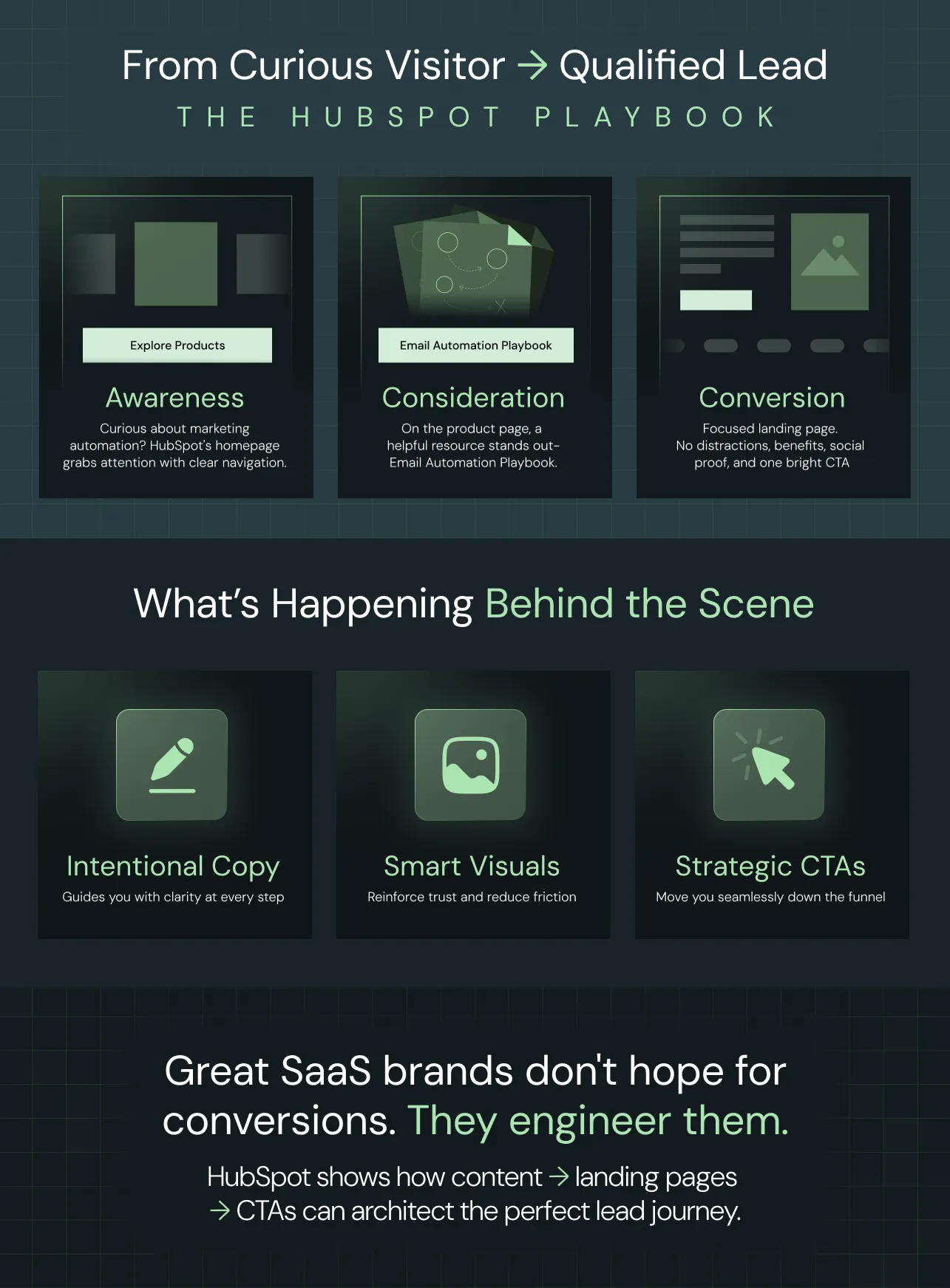
A good example here would be: HubSpot.
Imagine landing on HubSpot’s homepage. You’re looking for marketing automation tips. You are not ready to buy, but curious.
Right away, the site grabs your attention and shows navigation. You click ‘Products’ to learn what’s possible.
Phase 1: Strategy and Planning
Before designing anything, you need clarity on goals, audience, and messaging.
Define your conversion goal: What specific action do you want visitors to take? Be precise - "Download the guide" is clearer than "generate leads."
Understand your traffic source: Visitors from Google Ads have different expectations than email subscribers. Match your page to their context.
Research your audience: What problems do they face? What language do they use? What objections do they have? This research shapes every design decision.
Create your value proposition: Craft a clear statement of what visitors get, why it matters, and how it's different from alternatives.
Phase 2: Content and Copy Creation
With strategy clear, focus on creating persuasive content.
Write your headline: Start with your core benefit and test variations. Make it specific, clear, and compelling.
Develop supporting copy: Create subheadings, bullet points, and descriptions that reinforce your value proposition.
Craft your CTA: Use action words that connect to outcomes. "Start My Free Trial" beats "Submit" every time.
Gather social proof: Collect testimonials, case studies, and usage statistics that build credibility with your target audience.
Phase 3: Design and Visual Elements
Now translate your content strategy into visual design.
Choose your layout: Single-column layouts work best for focus and mobile compatibility. Avoid multi-column designs that create confusion.
Select colors strategically: Use your brand colors but make your CTA button stand out through contrast.
Add compelling visuals: Use images that support your message, not distract from it. Product screenshots, explainer videos, and other graphics for engagement.
Responsive design: Start with mobile and scale up to desktop.
Phase 4: Technical Implementation
Turn your design into a functioning, optimized landing page.
Build for speed: Optimize images, minify code, and use fast hosting. Page speed directly impacts conversions and search rankings.
Set up tracking: Implement conversion tracking, heat mapping, and analytics to measure and optimize performance.
Test functionality: Verify forms work, buttons click, and pages load correctly across all devices and browsers.
This process aligns with our Website Strategy 101 guide, where we detail how strategic thinking helps with better design decisions.
{{specficService}}
Advanced Landing Page Optimization Techniques
1. A/B Testing for Continuous Improvement
Landing page best practices include systematic testing to improve performance over time. Test one element at a time to understand what works for conversions.
Test these elements:
- Headlines and subheadings
- CTA button color, size, and text
- Form length and field requirements
- Social proof placement and type
- Page layout and visual hierarchy
Testing: Run tests until you reach statistics. Small changes can create big improvements, but only data should help make decisions.
Tools like VWO and Optimizely help manage testing, but focus on meaningful improvements, not random changes. As detailed in our CRO Tools guide, the right tools amplify strategy, they don't replace it.
2. Personalization and Dynamic Content
Modern landing page design includes personalization based on visitor characteristics and behavior.
Geographic personalization: Show local phone numbers, currencies, or region-specific offers to increase relevance.
Source-based customization: Display different content for visitors from ads vs. email vs. social media to match their expectations.
Account-based personalization: For B2B companies, customize content for known accounts or company sizes to increase relevance.
Behavioral targeting: Show different CTAs or offers based on pages visited, time on site, or previous interactions.
3. Performance Optimization
Speed and technical performance directly impact conversions and user experience.
Image optimization: Compress images without losing quality. Use modern formats like WebP for faster loading.
Code efficiency: Minify CSS and JavaScript. Remove plugins or scripts that slow page loading.
Hosting optimization: Use content delivery networks (CDNs) and fast hosting providers to reduce load times globally.
Mobile performance: Test loading speed on actual mobile networks, not just fast office connections.
How to Choose the Right Landing Page Builder?
Selecting the ideal landing page builder can make or break your campaign’s success. With so many options, it’s tempting to chase shiny features. But at ThunderClap, we believe your choice should always support your conversion goals and long-term business strategy.
ThunderClap’s Decision-Making Framework
We start by analyzing your core requirements before making any recommendations. For every client, we ask:
- What functionality do you really need?
Custom integrations, advanced analytics, or specialized design features shouldn’t be afterthoughts. We uncover these needs up front and factor them into your builder selection. - How much design flexibility do you require?
Some brands need total creative control. Others benefit from rapid, template-driven deployment. Our web experts help you identify which approach works best with your audience and goals. - Will the platform deliver optimal performance?
Page speed directly affects conversions. We test builder options for fast loading, seamless responsiveness, and reliability across all devices. - How should your landing page connect with other tools?
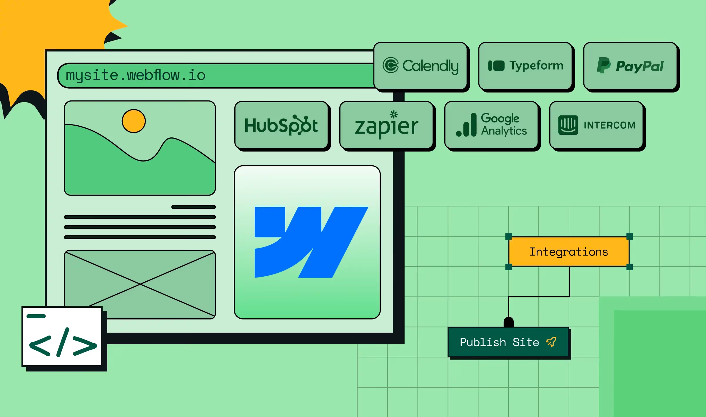
Whether it’s your CRM, marketing automation, or analytics stack, ThunderClap makes sure your landing pages integrate perfectly with the rest of your growth ecosystem.
Why ThunderClap Leads the Way
Our experts don’t just set up your landing pages and call it a day.
We combine strategic platform selection with ongoing optimization and CRO. Your landing page becomes a growth engine and not just a digital flyer.
Curious about our process?
Chat with our team for personalized advice on choosing the builder that fits your marketing ambitions and technical roadmap.
{{ctaBlock}}
Frequently Asked Questions
1. What are the key elements of a high-converting landing page?
A high-converting landing page has a clear headline with a benefit, a bold button with a simple call-to-action, some proof that real people or companies trust you, and a simple, clean design. It should look great and load fast on phones. Most importantly, keep everything focused on one goal and don’t add distractions or too many links.
2. What's the difference between a landing page and a homepage?
A landing page helps you get visitors to take one action, like signing up or downloading something. It’s made for a specific ad, email, or post. There aren’t many choices or links. Landing pages focus on conversion, while homepages focus on exploration. This fundamental difference shapes every design decision.
3. How do I design a landing page for lead generation?
Offer visitors something valuable (like a free report or guide). Only ask for what you really need (usually just name and email at first). Add some proof, like logos or reviews, near your sign-up form. Write copy that makes it super clear what they’ll get. The button should be clear, like “Download the Guide.”
4. How can I test if my landing page is effective?
Don’t just look at one number. Track how many people sign up, how many leave without taking action, how long they stay, and whether the leads are of high quality. Use Google Analytics or Hotjar to see what visitors do on your page. Test changes one at a time, like the headline or button, to see what works best. Compare your numbers to industry averages, and then continue to improve.



.webp)
Browse Similar Articles


Interested in seeing what we can do for your website?


.webp)




.svg)










.avif)

















.avif)