


B2B Marketing Blog
Resources to help you convert more customers

Outsourcing Webflow Maintenance vs. In-House Management: Which is Better?

Kiran Kulkarni

August 1, 2025
7 Best Website Maintenance Companies in India for Growth-Led B2B Teams (2026)

Harsh Barnwal
July 18, 2026
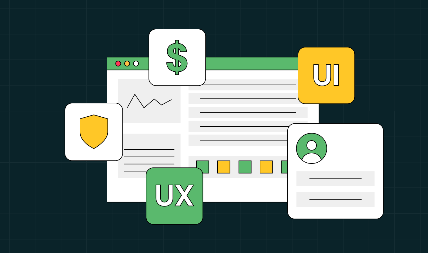
How to Choose a B2B UI/UX Design Agency?

Ayush Barnwal
July 10, 2026
The 6-Step B2B Brand Strategy Framework Built for Growth
Kiran Kulkarni
July 9, 2026
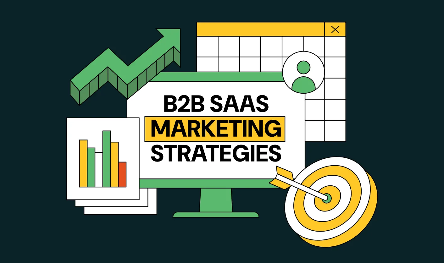
Winning B2B SaaS Marketing Strategies for 2026: From Awareness to ARR
Ayush Barnwal
July 4, 2026


All Articles
Explore by topics
Thank you! Your submission has been received!
Oops! Something went wrong while submitting the form.
.webp)
7 Best Website Maintenance Companies in India for Growth-Led B2B Teams (2026)
Harsh Barnwal
.svg)
July 18, 2026
.webp)

8 Best Healthcare Website Design Agencies for HIPAA-Compliant Sites in 2026
Harsh Barnwal
July 4, 2026

No items found.


Interested in seeing what we can do for your website?


.webp)
It only takes 45 seconds to schedule your free consultation
