









Blogs by Kritika Batra
A strong website has become a critical investment for businesses in Austin’s increasingly competitive market. As more startups, enterprise brands, and tech companies pour into Austin, businesses are investing heavily in websites and digital experiences that can compete in a crowded online marketplace. These 15 web design agencies in Austin have the tools and expertise to help businesses attract, engage, and retain customers online.
These 15 web design agencies in Austin stand out for their ability to help brands attract, engage, and retain customers online.
TL;DR
- The best Austin agencies combine UX research, SEO, branding, conversion strategy, and development into one integrated growth system.
- Many Austin growth-stage companies now hire agencies instead of building in-house teams to access senior UX, SEO, branding, and development talent faster.
- We evaluated 30+ Austin web design agencies based on UX quality, technical expertise, business impact, transparency, and industry experience.
- We also considered client reviews, portfolio strength, and third-party reputation data on platforms such as Clutch, G2, Behance, and Reddit.
The Top 15 Web Design Agencies in Austin You Must Know About
Austin is packed with web design agencies serving everyone from local startups to national brands. While we’ll break down each company in more detail below, these are our top picks based on design quality, technical expertise, client reputation, and overall ability to help businesses grow online.
Each agency brings a different strength to the table, whether that’s enterprise web development, conversion-focused design, B2B branding, or full-scale digital strategy.
Top 15 Web Design Agencies in Austin: At a Glance
- ThunderClap: Best for premium, high-converting websites built for market-leading brands
- Clay Global: Best for premium UI/UX design and enterprise-level digital experiences
- Tilted Chair: Best for creative storytelling and brand-driven website campaigns
- Solid Digital: Best for B2B web design focused on lead generation and long-term growth
- GLIDE: Best for custom WordPress development and scalable business websites
- Toimi: Best for modern UX-focused websites for tech and SaaS companies
- Intuitia: Best for data-driven web strategies and conversion optimization
- Standard Beagle: Best for accessibility-focused web design and nonprofit organizations
- Ariel Digital: Best for conversion-focused custom websites
- Flowtrix: Best for performance-focused websites with strong technical SEO foundations
- Digital Silk: Best for enterprise branding and corporate website redesigns
- Thrive Agency: Best for businesses seeking web design paired with full-service digital marketing
- Makreate: Best for creative web branding and visually driven business websites
- Brightscout: Best for startup branding, product design, and scalable digital experiences
- Lounge Lizard: Best for bold visual design and highly customized brand websites
Research Methodology: The R.A.C.E. Framework
While conducting our research, we evaluated 30+ B2B web design agencies across Austin before narrowing the list down to the 15 strongest performers.
To ensure consistency across both creative and technical benchmarks, we assessed every agency using our proprietary R.A.C.E. Framework, focusing on Results, Accountability, Craft, and Expertise.
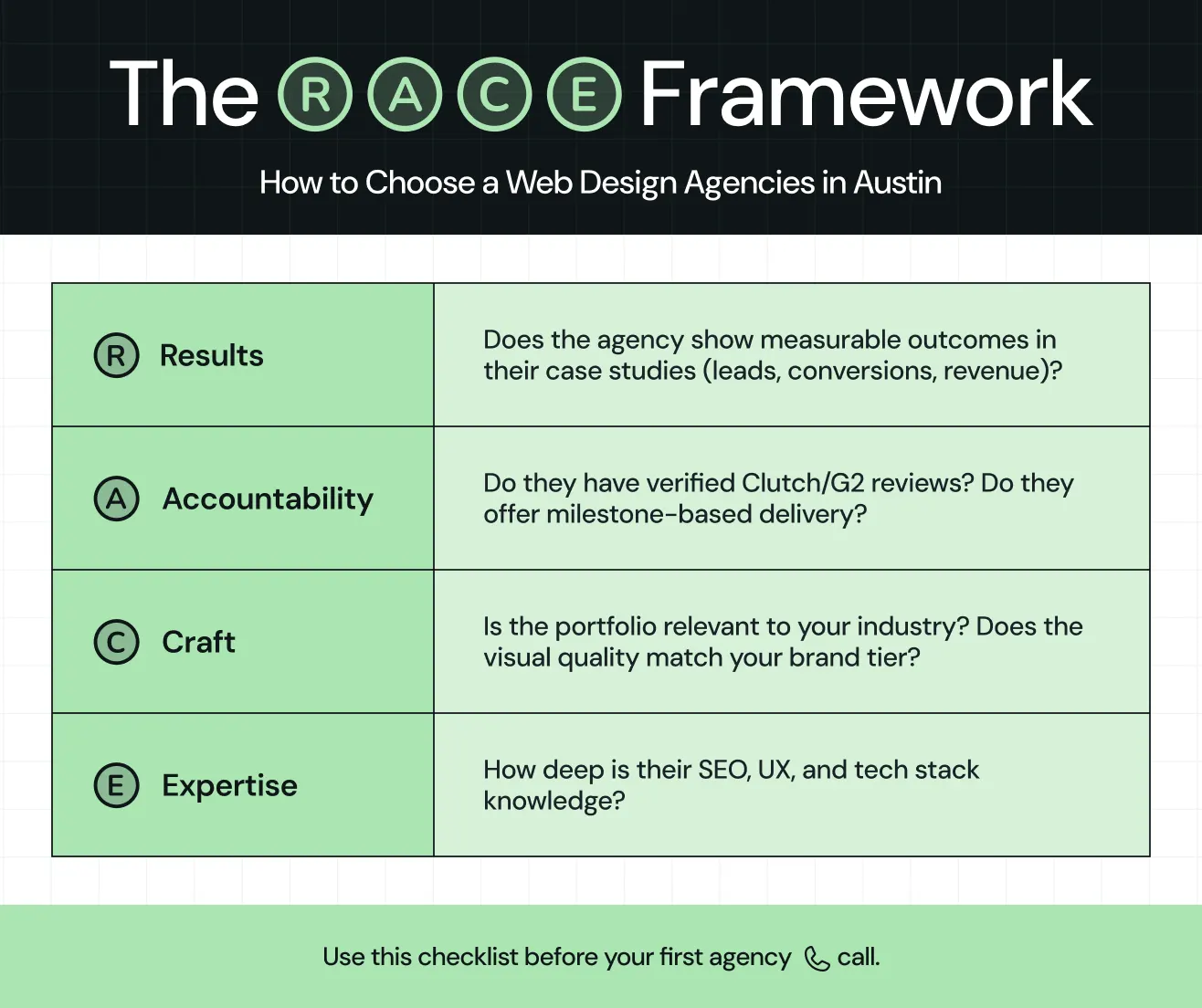
Beyond visual quality, we also examined factors such as UX maturity, SEO capabilities, technical depth, industry relevance, service transparency, and the consistency of client outcomes across projects.
To validate our findings, we cross-checked agency reputation and performance using trusted review platforms such as Clutch.co, G2, Behance, Dribbble, along with community sentiment, case studies, service offerings, and client portfolios published directly by the agencies.
What Makes a Good Web Design Agency in Austin?
A strong web design agency in Austin is not just defined by visual quality or awards, but by how well it connects design decisions to measurable business outcomes. With Austin’s fast-growing tech ecosystem, the best agencies tend to combine research-driven UX, technical depth, and clear commercial thinking.
Based on industry research and the R.A.C.E. Framework, several factors separate top-performing agencies from average ones.
- Evidence of real business impact: Strong agencies show how their work improves outcomes such as conversions, engagement, or lead generation. Case studies that explain the problem, process, and measurable results are far more valuable than purely aesthetic portfolios.
- Deep user research and UX process: High-quality agencies in Austin prioritize understanding user behavior before designing interfaces. This includes user interviews, journey mapping, usability testing, and iterative design. Agencies that skip research often produce visually appealing sites that fail to convert or scale effectively.
- Strong portfolio with relevant industry experience: A credible agency should show diverse, real-world projects across industries such as SaaS, e-commerce, healthcare, or fintech. Their portfolios should include case studies that explain decision-making. Reviewing past work is one of the most reliable ways to assess capability and consistency.
- Technical capability across modern stacks: The best B2B web design agencies in Austin are comfortable working with platforms like WordPress, Webflow, and custom frameworks and can integrate APIs, analytics tools, and performance-optimization techniques.
- Transparency in pricing and process: Reliable agencies are upfront about scope, timelines, and deliverables. They avoid vague proposals and instead define clear phases for research, design, development, and testing.
- Local market understanding: Austin-based agencies often benefit from understanding the city’s unique business environment, from startups in “Silicon Hills” to enterprise tech campuses. This context helps them design websites that align with local consumer behavior and industry expectations.
15 Best Web Design Agencies for Growth-Focused Austin Businesses
These 15 companies rank among the leading web design partners in Austin, known for building visually strong, high-performance websites that drive results.
1. ThunderClap
.webp)
Best for: B2B SaaS, tech companies, and professional services at the growth and mid-market stage looking for performance-driven web builds tied to pipeline outcomes.
ThunderClap is a premium platform-agnostic web design and development agency known for award-winning work, including recognition from the Webby Awards and CSS Awards. The team has a strong track record of partnering with leading B2B brands, including Amazon, Storylane, Factors, roommaster, ClearlyRated, Z47, Zenda, Zamp, Dropit, Wizcommerce, and DPDZero.
Their services span the full end-to-end web lifecycle, including strategy, branding, UI/UX design, copywriting, conversion rate optimization (CRO), website migrations, and ongoing maintenance.
A strong example of this approach is the work done with WizCommerce, an AI-powered platform offering sales tools, B2B storefronts, and ERP integrations. At the start of the engagement, the platform faced fragmented systems, outdated tooling, and inconsistent messaging across teams.
We worked closely with leadership, marketing, and product teams to map buyer journeys and identify key operational gaps. From there, we restructured the platform to communicate value more clearly to core audiences, including business owners, sales leaders, and operations teams.
The final result was a scalable, structured system that reduced internal friction and improved product clarity and adoption across users.
Ayush Barnwal from ThunderClap also shared the launch video of the revamped WizCommerce website in his LinkedIn post.
Website: www.thethunderclap.com/
Rating: 4.9 (G2)
Company Size: Mid-size (11–50)
Services
- Website design and development: ThunderClap has delivered 129+ enterprise-grade projects and, as a certified Webflow Enterprise Partner, leverages advanced platform capabilities along with ongoing training to align with best practices.
- SEO, CRO, and AEO optimization: Beyond design and development, ThunderClap implements SEO, CRO, and Answer Engine Optimization (AEO) best practices to help brands improve search visibility, increase conversions, and remain discoverable across traditional search engines and AI-powered search experiences.
- 30-day post-launch support: Clients receive 30 days of free post-launch support. During this period, ThunderClap implements CRO and SEO best practices to optimize site performance and conversions.
- Structured, senior-led oversight: Each project is personally managed through a dedicated account manager, supported by creative directors, ensuring clear communication, reduced back-and-forth, and reliable execution throughout the lifecycle.
- 24/7 support: Clients get around-the-clock support via Slack, with full visibility into progress through tools like Notion for project management.
- Flexible engagement models: ThunderClap offers both focused project-based engagements and ongoing retainers. This allows clients to choose the structure that best fits their goals, timelines, and internal resources.
- Scalable designs and competitive timelines: ThunderClap delivers aesthetically pleasing, reusable design systems, with most projects completed in 8 to 12 weeks, balancing speed and quality.
What do the customers say
"Working with ThunderClap has been a game-changer. The team delivers exceptional quality at speed, with weekly syncs keeping everything on track. No delays, no missed details - just a website built the right way. Now, we can go full throttle on SEO, organic traffic, and conversions with confidence. 10/10 experience!" - Elise Lee, Head of Marketing, Fast Co
Notable work
With 144+ websites launched and 10+ industry awards, ThunderClap showcases strong expertise across SaaS, fintech, and AI, as well as experience spanning consulting, e-commerce, and B2B services.
Their work has helped clients achieve:
- Up to 50% increases in conversions
- Up to 60% improvements in engagement
Notable clients include Storylane (ranked among the fastest-growing SaaS products on G2), ClearlyRated (featured in the Inc. 5000 list), and Deductive AI (which raised a $10M seed round). Across projects, ThunderClap consistently drives stronger brand positioning, improved user engagement, and measurable business growth.
2. Clay Global
.webp)
Best for: SaaS, AI, and fintech companies at the growth and enterprise stage needing UX-led brand repositioning with a world-class design pedigree.
Clay Global is a San Francisco-headquartered UX/UI design and branding firm with a strong track record serving Austin-area and US-based B2B tech clients. Their process combines deep user research with brand strategy, making them particularly effective for companies preparing for a fundraise, product launch, or competitive repositioning. Their Clutch portfolio shows consistent praise for on-time delivery and measurable market impact.
Website: www.clay.global
Rating: 4.8 (Clutch)
Company Size: Mid-size (11–50)
Services:
- UX/UI design: User-centered digital experiences for web and product platforms.
- Brand identity: Strategic branding and visual identity systems.
- Web design and development: Custom websites focused on performance and growth.
- Design systems: Scalable component libraries and brand consistency frameworks.
- Product design: End-to-end product design from concept to launch.
What do the customers say
“Clay helped us transform our website into a much more modern, intuitive experience with clearer messaging, making it easier for prospects to understand who we are and what we offer. The refreshed brand system also brought a level of consistency and polish across all of our marketing and sales materials that we didn’t have before.” - Associate Creative Director, Vestmark
Notable work: Joe & The Juice, Snapchat, Grayscale, and Vantara & Art Bridges
3. Tilted Chair
.webp)
Best for: CPG, lifestyle, and B2B SaaS brands at the growth and mid-market stages that want a brand strategy deeply embedded in their web experience.
Tilted Chair is a full-service creative and branding agency based in East Austin. They describe their approach as "making brands more human", and it shows in their work that consistently balances strategic depth with creative courage. They're particularly strong for companies that have outgrown their current visual identity and need a brand-plus-web overhaul, not just a redesign.
Website: www.tiltedchair.co
Rating: 5.0 (Yelp)
Company Size: Mid-size (11–50)
Services:
- Brand strategy: Brand positioning, messaging, and strategic direction.
- Advertising: Integrated campaigns across digital and traditional channels.
- Web design and development: Brand-led websites built for engagement and growth.
- Campaign creative: Creative concepts and assets for marketing initiatives.
- Positioning: Market differentiation and competitive brand positioning.
What do the customers say
“This is a great group of talented individuals. I am partners in a few local businesses, and I use Tilted Chair exclusively. They always go above and beyond. They're creative, hard-working, and fun to work with. Everyone here is genuinely nice, and it is always a pleasure to work with them.” - Alicia H.
Notable work: Virdee, Yugo, Contentful, and other multiple CPG and B2B brand repositioning campaigns
4. Solid Digital

Best for: Mid-market and enterprise companies that need a site directly tied to revenue metrics, including pipeline, conversions, and qualified lead volume.
Solid Digital treats web design as a business problem. They begin every engagement with conversion mapping before the design process starts. Their client roster reflects companies that measure success in pipeline generated, not page views. Their approach focuses on websites that load fast, rank well, and directly support lead generation, revenue growth, and long-term digital performance.
Website: www.soliddigital.io
Rating: 4.9 (Clutch)
Company Size: Mid-size (11–50)
Services:
- Custom website development: Custom-built websites aligned with business objectives.
- UI/UX design: User-centered experiences that improve engagement and usability.
- Responsive web design: Optimized experiences across devices and screen sizes.
- Conversion optimization: Conversion-focused design and user journey improvements.
- HubSpot integration: CRM, marketing automation, and website integration services.
What do the customers say
“We enjoyed all of Solid Digital's personal touches to celebrate the launch.” - Program Manager, BioLEAP
Notable work: Mid-market B2B companies across Austin and nationally
5. GLIDE

Best for: B2B SaaS, nonprofits, purpose-led organizations, and Austin-area professional services at the startup and growth stage.
GLIDE has operated in Austin for 22 years, making them one of the longest-standing web design agencies in the city. They combine award-winning design with a performance-focused growth planning process, specializing in UX-led digital experiences that blend storytelling, usability, and conversion-focused strategy. Their work is backed by a deeply structured design process that prioritizes research, accessibility, and measurable user impact.
Website: www.glidedesign.com
Rating: 4.9 (Clutch)
Company Size: Mid-size (11–50)
Services:
- Custom web design: High-performance websites built for usability and conversion.
- Website development: Scalable, accessible builds using modern frameworks and WordPress.
- Data analytics: Performance tracking and insights for continuous optimization.
- Continuous UX improvement: Iterative UX refinement based on user behavior and testing.
- Gutenberg/WordPress development: Custom WordPress builds using Gutenberg for flexible content management.
What do the customers say
"I have worked with GLIDE® on several sites because they simply are the best." - President, Learning & Development Company
Notable work: CarboNet, WP Engine, Cloudsnap, Liquibase.org, Redis, SetSolutions
6. Toimi
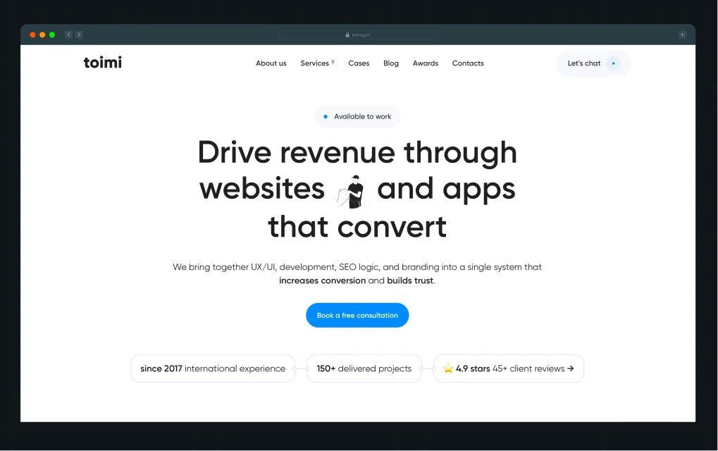
Best for: Austin SaaS and tech startups at the growth stage that want a brand strategy embedded in web architecture from the beginning.
With 8 years of international experience and 150+ delivered projects, Toimi focuses on turning ideas into high-performing digital products that deliver measurable results. Their portfolio spans SaaS platforms, mobile applications, promotional websites, and landing pages, with a consistent focus on performance, UX, and scalable architecture. Across projects, they have delivered measurable improvements, including up to 22% better user experience, up to 40% faster load times, and up to 3x higher lead generation for clients.
Website: www.toimi.pro
Rating: 4.9 (Clutch)
Company Size: Mid-size (11–50)
Services:
- Brand strategy: Positioning and messaging frameworks.
- Web design: High-performance marketing and product websites.
- UX architecture: User journeys and information structure design.
- SaaS positioning: Product-market clarity and messaging for SaaS brands.
What do the customers say
“The Toimi team delivered a unique, creative solution that truly reflects our company’s spirit. Over the course of the project, they proved to be a reliable partner with a strong understanding of the business and an ability to quickly find unconventional solutions.” - Aleksandr Nefedov, CEO, Optimal Group
Notable work: Brealit, Optimal Group, Borodero, and other SaaS B2B tech brands and web repositioning
7. Intuitia

Best for: B2B SaaS and health tech companies at the growth and enterprise stage that need fast, scalable digital product design with proven retention outcomes.
Intuitia is a global UI/UX and product development agency headquartered in Austin, Texas. Their headline stat, 9.6 out of 10 client retention rate, reflects a team that actually delivers. They're known for delivering premium design work 20x faster than traditional agencies, cutting costs by up to 50%, and operating 24/7 across time zones. That kind of operational model matters when you're scaling fast.
Website: www.intuitia.tech
Rating: 5.0 (Clutch)
Company Size: Mid-size (11–50)
Services:
- UI/UX design: User-centered digital interfaces for web and apps.
- Custom software development: End-to-end digital product engineering and builds.
- B2B SaaS design: Scalable SaaS interfaces focused on usability and retention.
- Product design: Full-cycle digital product design from concept to launch.
- Web design: High-performance websites built for conversion and growth.
What do the customers say
"What stood out most was their technical expertise combined with a genuine commitment to quality." - Founder, NOVAT GmbH
Notable work: Kloudify and multiple B2B SaaS platforms; health tech product design across the US and global markets.
8. Standard Beagle

Best for: B2B SaaS and health tech startups and growth-stage companies that need AI-native UX design and scalable digital product thinking.
Standard Beagle is an AI-native UX agency based in Austin, Texas, specializing in B2B SaaS and health tech. They focus on building user-first digital products grounded in research, usability testing, and real user behavior, ensuring every design decision is tied to measurable product outcomes like retention, usability, and engagement. Their work reflects a highly methodical approach to product design, combining UX strategy, accessibility, and iterative validation.
Website: www.standardbeagle.com
Rating: 4.9 (Clutch)
Company Size: Startup (2-10)
Services:
- UX/UI design: User-centered interfaces for web and product experiences.
- Product design: End-to-end digital product design from concept to delivery.
- User research: Behavioral insights and usability testing to guide design decisions.
- B2B SaaS design: Scalable SaaS interfaces focused on usability and retention.
- AI-native interface design: Interfaces optimized for AI-powered and intelligent workflows.
What do the customers say
“We searched online for UX designers in our bugdet. We met with a few and in the end we chose to go with Standard Beagle based on their past projects, interview presentation, design skills and cost estimate.” - Software Dev Engineering Manager, Mednet Solutions
Notable work: RPC, Double A Labs, Buildwitt, Fitwel app
9. Ariel Digital
.webp)
Best for: Custom web design, SEO, and digital marketing for businesses across East Texas, Houston, and beyond.
Ariel Digital builds custom websites that focus on one thing: turning visitors into customers. Every site is designed from scratch with mobile-first UX, fast load speed, and SEO built into the structure from the start.
The team follows a clear process of strategy, design, development, and post-launch support to improve real business performance. Unlike template-based sites, each project is shaped around user behavior, brand goals, and measurable conversions.
Website: www.arieldigitalmarketing.com
Rating: 5.0 (20 reviews on Google)
Company Size: Startup (2-10)
Services:
- Web design: Custom, conversion-focused websites built for performance.
- Custom website development: Clean, responsive builds with scalable architecture.
- UI/UX design: User-centered interfaces optimized for usability and engagement.
- Website maintenance and support: Ongoing updates, security, and performance monitoring.
- App & SaaS development: Custom digital products and scalable SaaS platforms.
What do the customers say
“We needed someone last minute to help us with a website launch. He was willing to step in with less than 48 hours and get our website ready for our biggest sale of the year. 10/10 recommend!” - CT Race Worx
Notable work: Tyler County Hospital, JEDCO, Olympian Properties, Squeaky Clean Maid Service
10. Flowtrix
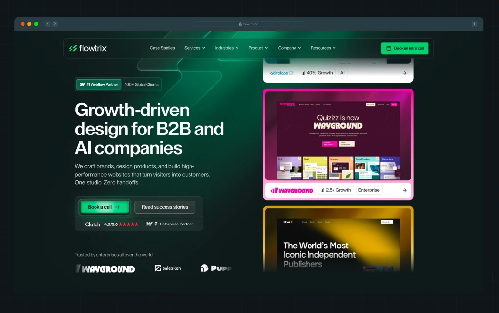
Best for: B2B SaaS and tech companies at the growth and mid-market stage needing Webflow-native design with strong UX thinking and measurable conversion results.
Flowtrix has built a reputation in the B2B SaaS design space with strong emphasis on measurable outcomes. Their work for Amazon's digital signage division (rebuilding signage.amazon.com for mobile conversion and scalability using Webflow) is a meaningful signal of the caliber of work they take on. Clients consistently cite their responsiveness, system-minded approach, and ability to research and understand complex niches without extensive hand-holding.
Website: www.flowtrix.co
Rating: 4.9 (Clutch)
Company Size: Mid-size (11–50)
Services:
- UX website design: High-performance, conversion-focused website experiences for B2B brands.
- Webflow development: Pixel-perfect builds with responsive and scalable implementation.
- SEO optimization: Technical SEO, performance optimization, and search-friendly architecture.
- Figma to Webflow: Accurate translation of designs into production-ready websites.
- Migration services: Seamless platform migrations with SEO and data preservation.
What do the customers say
“Flowtrix has led the website redesign and Webflow implementation for Amazon Signage. The team has handled information architecture (IA) and UX updates, a component-based design system, Webflow development for key pages and templates (homepage, vertical pages, and landing/campaign pages), CMS setup for scalable updates, and site QA and performance improvements to reduce bugs and support a faster marketing launch cadence.” - Sr. Product Marketing Manager, Amazon
Notable work: Amazon, Owlery, Fuxam, Databahn, Akirolabs
11. Digital Silk
.webp)
Best for: Growth-stage and enterprise companies across industries that need a full-service digital partner with a strong conversion and SEO focus.
Digital Silk is a premium web design agency that helps brands grow online with custom websites, brand strategy, and digital marketing. Their award-winning team manages the full process from strategy and UX to design, development, branding, and ongoing optimization. This gives each client a dedicated team and consistent communication throughout the project.
Website: www.digitalsilk.com
Rating: 4.9 (Clutch)
Company Size: Mid-size (51-200)
Services:
- Custom web design and development: Research-led websites built for performance, usability, and conversion.
- Branding: Brand identity systems including visual design, messaging, and positioning.
- eCommerce development: Conversion-focused online stores designed to improve sales performance.
- Digital strategy: Data-driven planning across UX, marketing, and growth channels.
- App development: Custom web and mobile applications built for scalability and user experience.
What do the customers say
"Digital Silk was incredibly attentive to all of our needs throughout the entire project." - Production Coordinator, Media2, Inc.
Notable work: Xerox, Sony, P&G, Microsoft, NFL, McDonald’s, G2 Esports, Paul Stuart, Ventura Foods, and Northwestern University
12. Thrive Agency
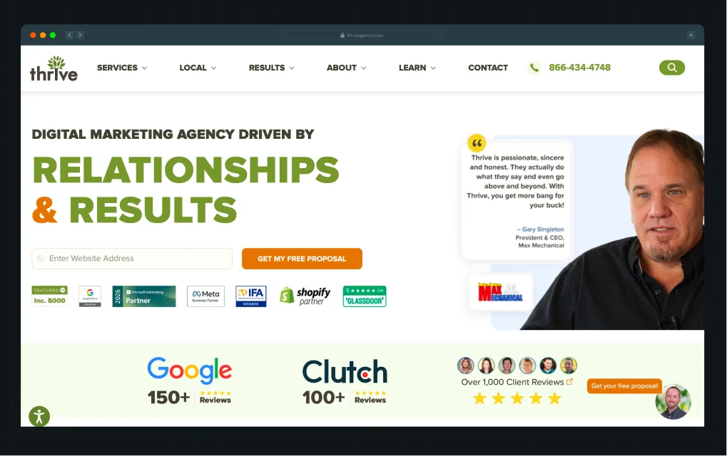
Best for: Medical practices, dental groups, specialty clinics, and wellness brands that need a full-service digital marketing agency with healthcare web design as part of an integrated patient acquisition strategy.
Thrive is one of the most established full-service digital marketing agencies in the United States, with more than 20 years of experience and a team of 160+ employees across 34 states. Their healthcare web design services sit within a broader patient acquisition strategy that includes SEO, PPC, reputation management, and AI-driven SEO, especially as patients increasingly use tools like ChatGPT and Perplexity to find providers.
Website: thriveagency.com
Rating: 4.6 (Clutch)
Company Size: Mid-size (51-200)
Website: www.thriveagency.com
Rating: 4.6 (Clutch)
Company Size: Mid-size (51-200)
Services:
- Custom web design: Conversion-focused websites built to attract and convert high-intent users.
- Web development: Responsive, performance-optimized WordPress builds with clean code and fast load times.
- eCommerce web design: UX-driven online stores designed to reduce drop-off and increase sales.
- Conversion rate optimization (CRO): A/B testing, UX improvements, and CTA optimization to increase leads.
- Website maintenance: Ongoing updates, security, speed optimization, and performance monitoring.
What do the customers say
"They go above and beyond to create a good customer experience, which we appreciate." - Marketing & Events Specialist, Real Estate Company
Notable work: Tandem Psychology, Qualis, Unleash Fido, TruckAC+, Ambler Industries, Sierra Group
13. Makreate

Best for: Startups across SaaS, B2B tech, fintech, AI, ecommerce, and consumer brands.
Makreate is a design and growth agency working with Austin-based SaaS founders, marketing leaders, and product teams. Their services include UX and product design with research-led wireframes and design systems, brand identity work covering naming and visual systems, and marketing websites built on Webflow, WordPress, or custom stacks with a strong focus on conversion and SEO. The agency emphasizes fast execution through fixed-price proposals, 2-week sprints, and consistent communication via daily standups and weekly check-ins, positioning itself as a senior-only team for growth-focused companies.
Website: www.makreate.com
Rating: N/A
Company Size: Startup (2-10)
Services:
- Custom web design: Strategic, conversion-focused website design tailored to business goals and user behavior.
- Web development: Fast, scalable, and responsive websites built for performance and long-term flexibility.
- UI/UX design: User-centered design systems that improve usability, clarity, and product experience.
- Branding: Cohesive brand identity systems including visual direction, messaging, and digital presence.
- Website maintenance: Continuous updates, security, performance monitoring, and reliability improvements.
What do the customers say
"The new website helped us increase conversions and retention, and we received a lot of positive feedback from our customers. I would definitely recommend MAKREATE to anyone looking for a top-notch UX design firm." - Chetan, CEO, BurnCal
Notable work: Clients with established brands undergoing digital-product builds at the brand level
14. Brightscout
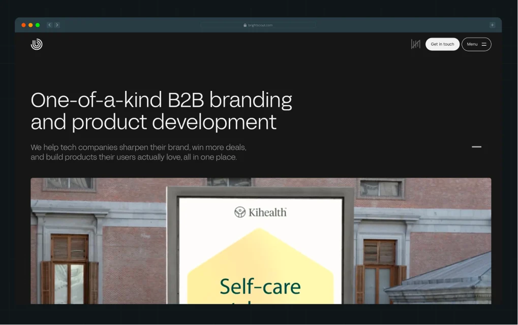
Best for: B2B tech startups and growth-stage companies, particularly in cybersecurity, AI/ML, and developer tools, preparing for fundraising or a major product launch.
Brightscout helps B2B tech companies build high-performing websites that drive pipeline and scale with growth. The team combines strategy, branding, UX/UI design, development, and content to create conversion-focused digital experiences. From planning and wireframes to launch and optimization, they focus on improving performance at every stage.
Website: www.brightscout.com
Rating: 4.9 (Clutch)
Company Size: Mid-size (51-200)
Services:
- Website strategy & planning: Structured information architecture, audience research, and alignment workshops to build a strong foundation for scalable websites.
- UI design systems: High-fidelity interfaces and scalable design systems that ensure consistency, usability, and brand alignment.
- Web development: Full-stack implementation of design systems into fast, responsive, and scalable B2B websites.
- Motion design & illustration: Interactive animations and custom visuals that enhance engagement and improve user navigation.
- Website launch & support: Deployment, monitoring, and ongoing optimization to maintain performance and support continuous growth.
What do the customers say
"BRIGHTSCOUT is PERFECTION. It's kind of crazy. I have goosebumps from how good we look." - Jeannie Christensen, VP Marketing, Kindo
Notable work: Topcon, New Relic, Mistral, IT Solutions
15. Lounge Lizard
.webp)
Best for: Businesses seeking highly creative, performance-driven websites that combine aesthetics, branding, and technical functionality
Lounge Lizard is a full-service web design and digital marketing agency that blends creative direction, UI/UX design, and technical development to build custom, responsive websites. They work across platforms like WordPress, Shopify, Magento, and eCommerce, with a strong focus on SEO, mobile performance, and user engagement.
Website: www.loungelizard.com
Rating: 4.8 (Clutch)
Company Size: Mid-size (11-50)
Services:
- Custom Web Design: Creative, conversion-focused websites that blend brand storytelling, UI/UX design, and performance-driven strategy.
- UX/UI Design: User-centered interfaces designed to improve engagement, usability, and customer journeys across all devices.
- Responsive Web Design: Mobile-optimized, adaptive websites built to deliver seamless performance across screen sizes.
- WordPress Development: Custom WordPress websites with scalable architecture, fast performance, and easy content management.
- eCommerce Web Design: High-performing online stores designed to enhance user experience and maximize sales conversions.
What do the customers say
"Their desire to truly understand our business goals for the new website was impressive." - Former Sales Representative, State Farm
Notable work: Blue Owl, AVA Colorado, Genius World, viLogics, Axium Packaging, Mind Games Fragrance, and Winspire
These 15 web design agencies represent a range of approaches, from design-led studios to full-service digital partners, but the right choice ultimately depends on when and why you should bring in external support
When Should You Hire an Austin Web Design Agency vs. Build In-House?
This is a question that comes up in almost every conversation with Austin growth-stage companies, and the answer isn't about cost alone.
In-house works best when digital product development is continuous and deeply integrated into your company. Agencies are a better fit when you need specialized expertise quickly, or when the website is tied to a major growth milestone and must perform from day one.
Here’s a quick checklist to follow before you hire:
- Can the agency show you 3+ case studies with measurable outcomes in your industry or business stage?
- Do they have verified Clutch reviews from companies at your scale?
- Do they offer milestone-based delivery with defined revision rounds?
- Do they speak to SEO architecture, not just visual design?
- Do they have a clear process for post-launch support and iteration?
If an agency can't answer those questions in the first call, keep looking.
The Verdict: Which Austin Web Design Agency Should You Choose?
Choosing the right web design agency ultimately comes down to your business stage, budget, and what you actually need the website to do.
Choose ThunderClap if:
- You're a B2B SaaS or tech company optimizing for scale, efficiency, and sustained revenue performance
- You want a site that directly impacts pipeline and lead quality
- You need SEO, conversion architecture, and brand aligned from scratch
Choose Brightscout if:
- You're a B2B tech startup preparing for a fundraise or major product launch
- You need brand, web, and product design to move together quickly
- You want a team that operates like an embedded partner, not a vendor
Choose GLIDE if:
- You're a nonprofit, purpose-led org, or Austin-area professional services firm
- You want a team with extensive experience in nonprofit and professional services
- You need strong accessibility, CMS, and ongoing support built into the engagement
For most growth-stage Austin B2B companies that need a credible, conversion-focused website without the complexity of managing multiple vendors, ThunderClap offers a direct path from strategy to a high-performing digital presence. We have revamped 129+ B2B websites and launched 144+ websites across SaaS, fintech, and AI sectors, with conversion improvements of up to 50% for clients.
Our integrated approach to positioning, design, and development helps Austin-based startups and scale-ups modernize outdated websites and turn them into measurable growth channels. We are trusted by companies such as Amazon, Storylane, Factors, Roommaster, Zamp, Dropit, Wizcommerce, and DPDZero.
Work with us to upgrade your Austin digital presence.
{{ctaBlock}}
FAQs
1. What makes a web design agency in Austin stand out?
The agencies that consistently stand out in Austin start with your revenue goal and work backward to design, not the other way around. Look for verified Clutch reviews, documented case studies with measurable outcomes, and a team that talks about conversion architecture and SEO from the first call.
2. How much does web design cost in Austin in 2026?
Austin is one of the most expensive web design markets in Texas, with agency rates typically ranging from $75 to $250 per hour, while freelancers generally charge between $40 and $120 per hour. A custom small business website typically costs between $3,000 and $15,000, while mid-market and enterprise engagements run $15,000 to $150,000+. Full-service national agencies with Austin presence can reach $150,000 for complex builds.
3. Are Austin agencies better for startups or enterprises?
Austin has strong options across both stages. Boutique agencies like Flowtrix, Standard Beagle, and Everything Design are well-suited for startups and growth-stage companies with leaner budgets and faster timelines. ThunderClap is better calibrated for startups, mid-market companies, and enterprise buyers that need process depth and larger team capacity. Match the agency to your stage, not just your budget.
4. What platforms do web design agencies in Austin use?
The most common platforms across Austin's top agencies are WordPress, Webflow, and custom-coded React or Next.js builds. Webflow has seen significant growth in the B2B SaaS space, with agencies like ThunderClap offering specialized Webflow expertise while remaining platform-agnostic across broader web development needs. For enterprise, custom builds with HubSpot CMS or headless CMS architectures are common. Most agencies will recommend a platform based on your content management needs and internal team capabilities.

Leading 5 SaaS Branding Agencies in Florida (That Actually Understand SaaS Growth)
TL;DR
- Most branding agencies lead with visuals and identity, but SaaS companies need positioning and messaging first.
- B2B SaaS has some of the lowest average conversion rates across industries, at just 2.9%, and brand clarity directly affects that number.
- The average B2B software purchase involves up to 13 stakeholders, so your brand has to hold up across multiple conversations, not just one.
- The best Florida branding agencies for SaaS prioritize how a brand communicates, ensuring the message is clear and credible before translating it into a visual identity.
- Within this context, ThunderClap approaches branding as a conversion system rather than a design project, aligning messaging, positioning, and identity to drive measurable outcomes.
What if we tell you most branding advice isn't built for SaaS?
It’s built for consumer brands, retail, and hospitality, the industries where a compelling logo and a sharp color palette can actually influence buying decisions.
SaaS is a different game. Your buyer is methodical, and they’re running a five-tool comparison. They've got a buying committee with 13 stakeholders, a legal team on hold, and a CFO who wants to see the ROI before they even get on a call.
A beautiful brand won't close that deal. A clear one might.
Florida is home to a growing cluster of branding agencies, and with 1089 SaaS companies now based in the state, the demand is only increasing. But only a handful of these agencies truly understand how SaaS buyers think and make decisions.
This guide filters through the branding agencies in Florida and highlights the ones actually worth talking to.
The Uncomfortable Truth
Most branding agencies don’t work for SaaS.
Walk into most branding agency pitches and you’ll see the same pattern. They’ll show you a mood board, talk about brand personality, present 2 or more logo variations, and walk you through the reasoning behind each color choice.
It will probably look great.
The problem is that none of it addresses why your trial-to-paid conversion is stuck, why prospects go quiet after the second demo, or why your homepage takes ten seconds to explain what your product actually does.
They start with visuals, not positioning
Traditional brand agencies operate on a visual-first model. The logo comes before the language. The identity system gets built before anyone has defined what makes the product different or why a skeptical buyer should care.
For consumer brands, that sequence can work. For SaaS, it is backwards.
Because if your positioning is unclear, your design ends up amplifying confusion instead of solving it. You get a brand that looks refined on the surface, but fails to explain differentiation in a way a skeptical buyer can immediately understand.
They optimize for brand perception, not buyer decisions
A strong brand can win awards, generate positive sentiment on LinkedIn, and can make your team feel proud. What it does not automatically do is help a risk-averse procurement manager feel confident enough to move forward.
However, for Florida’s SaaS ecosystem, that risk is increasingly distributed across teams. As of April 2026, these businesses generate a combined $17.1B in revenue, employing 196.4K people, and having collectively raised $5.3B in capital while serving 68.6M customers.
In that kind of market, buying decisions are rarely simple or individual. They are multi-layered, cross-functional, and heavily scrutinized before a contract is ever signed.
This is also where the gap between “branding for perception” and “branding for decisions” becomes most visible.
A recent project with FillHQ illustrates this shift. FillHQ, a HIPAA-compliant eSignature platform serving healthcare, finance, and legal industries, needed a website that could do more than look polished. It had to communicate security, compliance, and workflow automation clearly enough to convert regulated, high-friction buyers into trial users and enterprise demos.
We rebuilt the experience around the buyer journey, focusing on decision-critical elements like automated workflows, audit trails, AI-assisted document generation, and secure data intake. The positioning emphasized compliance standards such as HIPAA, SOC 2, and GDPR, along with efficiency and cost advantages, supported by educational content and case studies to build trust across multiple stakeholders.
The result was a system designed to guide visitors from problem recognition to evaluation and finally to a decision.
A recent LinkedIn post by Kiran Kulkarni, Partner & Head of Growth at ThunderClap, further expands on this work, explaining how FillHQ’s brand and website were rebuilt to serve both existing customers and compliance-first buyers.
This is what SaaS branding looks like when it is built around buyer decisions rather than surface-level perception.
They ignore how SaaS buyers actually evaluate tools
Modern SaaS buying is slow, multi-layered, and increasingly self-directed. According to Gartner’s recent study, 67% buyers now prefer a rep-free or minimal-sales interaction experience, meaning they rely heavily on digital touchpoints before ever speaking to a sales team.
Buyers are relying on websites, documentation, comparisons, peer input, and internal discussions to form a point of view. By the time they reach your team, they are rarely trying to understand what the product is. They are trying to validate whether it is worth the risk. These buying decisions are rarely made by a single person and often involve multiple departments evaluating risk, compliance, and ROI in parallel.
This is where most branding systems fail.
SaaS buyers are comparison-heavy, stakeholder-driven, and deeply risk-averse. In fact, Forrester’s 2024 research also shows that 86% of B2B purchases stall during the buying process. And stalled deals rarely stall because the logo was not strong enough.
It is because something in the story did not survive contact with how real buyers actually make decisions.
What Actually Matters in SaaS Branding (and What to Look for in a Florida Branding Agency)
Not all SaaS branding criteria are created equal. Here's what actually separates useful brand work from expensive decoration.
Clarity beats creativity
Clever taglines and abstract brand language might feel differentiated, but B2B SaaS sits at the bottom of the conversion rate spectrum at just 2.9%, and muddled messaging is a major reason why. Similarly, usability research shows that 88% of users won’t return after a poor first experience, meaning unclear messaging reduces both conversions and kills second chances entirely.
If a first-time visitor to your website can't understand what your product does, who it's for, and why it's different in the first few seconds, the brand has already failed. Clarity isn't the boring option. It's the effective one.
Positioning before identity
Your brand visuals should come from your positioning, not the other way around. Who you're for, what problem you solve, and how you're different from the other four tools on the shortlist are questions that have to be answered before anyone picks a typeface.
This is especially relevant in fast-growing SaaS ecosystems like Florida’s, where post-2024 startup growth (particularly in fintech, healthtech, and AI) has intensified category saturation. In fact, conversion gaps between average and top-performing SaaS companies (often 3–5x higher) are driven more by positioning clarity and content structure than visual design.
In her LinkedIn post, Kiran illustrates this well. For example, in the case of 101 GenAI, a healthcare AI platform operating in a highly regulated environment, the product was built for enterprise from day one, but the brand had not caught up to that reality.
The engagement focused on repositioning the company for regulated healthcare buyers, aligning messaging around compliance, data privacy, and model reliability, and reinforcing credibility signals such as HIPAA alignment and SOC 2 readiness. The outcome was a clearer articulation of enterprise readiness that directly influenced how investors and buyers perceived the company.
Agencies that skip this step produce brands that actively mislead buyers about what kind of company they're dealing with.
Messaging that survives comparison
Research from Wynter found that the median number of stakeholders involved in SaaS purchase decisions is five people.
What matters to them during shortlisting is different from what drives the final decision. That means your messaging has to hold up in multiple contexts simultaneously:
- Landing page
- Sales deck
- G2 review
- Slack thread
Recent SaaS funnel data shows that visitor-to-lead conversion happens within 1–3 days, but full enterprise buying cycles stretch up to ~120 days, meaning your messaging is repeatedly re-evaluated across stages and stakeholders.
If it only works in one format, it won't survive the shortlist phase.
Brand that extends into the full journey
Your website, in-product experience, sales collateral, and customer success touchpoints all need to feel like the same company making the same promise. This matters even more now because end-to-end SaaS conversion (visitor → customer) often lands as low as ~1–1.8%, meaning every inconsistency across the journey compounds drop-off.
A recent example from Wizcommerce shows how this plays out in practice. Wizcommerce processes $100M+ in GMV, powers 700+ sales reps, and serves 300K buyers through AI-powered sales tools, B2B storefronts, and ERP integrations for wholesale businesses.
During discovery, we worked with their leadership, marketing, and product teams to map buyer journeys and identify friction points like fragmented systems, misaligned messaging, and outdated tools slowing down both reps and buyers.
We translated these insights into a scalable digital experience that clearly communicated Wizcommerce’s value across multiple audiences. The platform highlighted their AI sales assistant, storefront capabilities, and ERP integrations while positioning the brand as enterprise-ready, with a structure designed to support both immediate conversion and long-term growth.
As highlighted by Kiran in her LinkedIn post, the revamp focused on aligning the website with the scale and maturity of Wizcommerce’s product.
This made enterprise-grade capabilities, multi-product complexity, and buyer-specific journeys immediately clear from the first interaction.
Leading 5 SaaS Branding Agencies in Florida
Most lists will show you the same “top branding agencies” in Florida. This one doesn’t.
It filters agencies through a SaaS-specific lens, where clarity beats creativity, positioning drives perception, and branding is judged by how well it holds up in real buying decisions.
1. ThunderClap
.webp)
Best for: B2B SaaS, tech, and enterprise companies
ThunderClap leads this list because we focus entirely on B2B branding that drives measurable growth. We’ve won Webby Awards and CSS Design Awards for projects that balance creativity with conversion, proving that strong strategy and design can work together to move the needle.
We begin every engagement with deep market research and competitive analysis to uncover what actually matters to B2B buyers. We define brand architecture, build messaging hierarchies, and sharpen value propositions so every element communicates with precision. We prioritize product clarity throughout, helping buyers quickly understand complex offerings without friction.
Our design team builds visual systems that actively guide users through the sales funnel. We use color psychology, layout structure, and content hierarchy intentionally to drive action. As a platform-agnostic team, we build fast, responsive, and conversion-focused websites tailored to each client’s technical and business needs. After launch, we continue optimizing through A/B testing, analytics, and performance tracking to sustain growth.
When Rezolv’s founders approached us, they had deep technical expertise but no brand, no website, and no clear way to communicate their product. We built their identity from the ground up, starting with a logo and visual system that reflected their problem-solving approach.
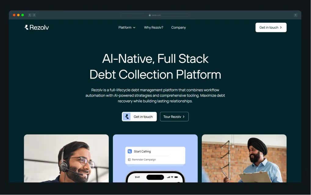
We shaped their B2B website strategy, wrote clear and persuasive messaging, and simplified complex financial workflows without losing credibility. We then developed the site in Webflow, ensuring speed, responsiveness, and conversion readiness from day one.
After launch, Rezolv saw stronger engagement from prospects and faster adoption among target customers.
“As an early-stage company, we needed a clear brand identity and messaging before launching. ThunderClap delivered exactly that! Concise, impactful copy and branding that feels right.” - Karan Mehta, Founder, Rezolv
What they do well
- Build positioning-led brand strategies that align with how B2B buyers evaluate solutions
- Design visual systems that guide users through the funnel and drive conversions
- Develop high-performance Webflow websites optimized for speed, usability, and lead generation
- Continuously improve performance through testing, analytics, and data-driven optimization
Why they stand out
They align positioning, messaging, design, and performance into a single system that drives measurable results across the entire SaaS buying journey.
2. Flocksy
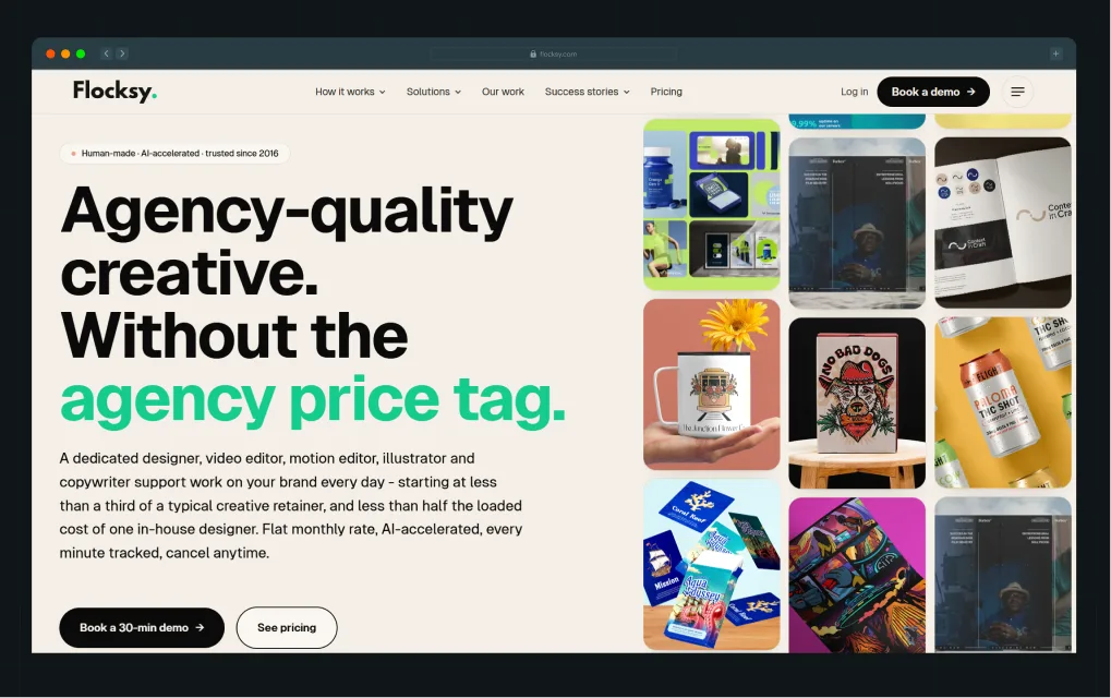
Best for: High-growth SaaS teams needing ongoing creative production at scale
Flocksy operates as a subscription-based creative service that gives SaaS and marketing teams continuous access to design, copywriting, and video production. Instead of traditional project-based branding, it delivers daily creative output through a dedicated team model, supported by AI-assisted workflows and centralized brand profiles.
This makes it especially useful for high-volume content needs, rapid iteration, and maintaining consistency across channels without managing multiple freelancers or agencies.
What they do well
- Deliver high-volume creative output across 140+ services under one system
- Provide dedicated teams that learn and maintain brand consistency over time
- Use AI-assisted briefs and workflows to speed up execution cycles
- Simplify budgeting with flat-rate pricing and predictable delivery
Why they stand out
They function as an always-on creative engine, replacing fragmented freelancer workflows with a scalable, systemized production model.
3. SIX The Agency
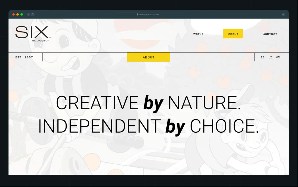
Best for: Companies that want brand storytelling and perception-driven positioning
SIX The Agency positions itself as a branding and communications firm focused on building emotionally resonant brands through strategy, design, and storytelling. Based in Orlando, it works across industries including SaaS and technology, combining brand identity, PR, and digital marketing to shape perception.
Its work emphasizes narrative-driven branding and audience psychology, helping companies differentiate through messaging and experience rather than just visuals.
What they do well
- Build cohesive brand narratives across design, PR, and communications
- Create emotionally driven brand positioning rooted in audience behavior
- Deliver integrated branding across industries including tech and SaaS
- Execute multi-channel brand experiences beyond just websites
Why they stand out
They combine branding, PR, and storytelling into a unified system that shapes how audiences perceive and engage with a brand.
4. Funk Web Development
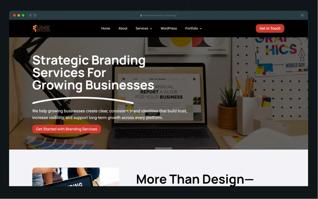
Best for: SaaS companies that need strong web execution and conversion-focused builds
As one of Florida’s best B2B branding agencies, Funk Web Development focuses on building custom websites that prioritize performance, usability, and business outcomes. Their work emphasizes responsive design, modern UX, and conversion-focused development to help companies generate leads and improve digital presence.
They align design decisions with measurable growth metrics such as traffic, engagement, and conversions, rather than purely aesthetic outcomes.
What they do well
- Build responsive, high-performance websites optimized for user experience
- Focus on conversion-driven design rather than just visual appeal
- Improve SEO, usability, and engagement through structured web development
- Deliver end-to-end web solutions aligned with business goals
Why they stand out
They prioritize performance and conversion outcomes, ensuring websites function as growth assets rather than static brand pieces.
5. Starmasa
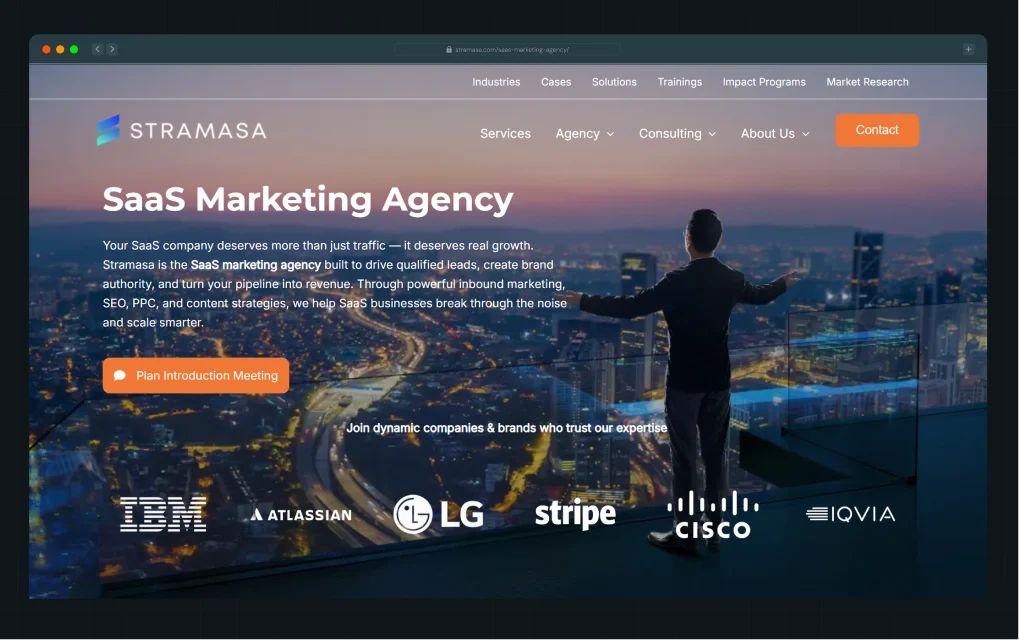
Best for: SaaS companies needing integrated web and branding support
Starmasa is a digital and branding-focused agency that blends web design, development, and marketing to help businesses build a strong online presence. Their approach centers on combining UX design, branding elements, and digital strategy to improve visibility and engagement.
Like many modern Florida agencies, they position websites as growth tools, integrating SEO, performance optimization, and user-centric design to support lead generation and long-term scalability.
What they do well
- Combine branding, UX, and development into unified digital experiences
- Focus on SEO and performance to drive visibility and growth
- Build scalable websites that support long-term digital strategy
- Align design with marketing and lead generation goals
Why they stand out
They bridge branding and digital execution, helping companies turn their website into a consistent growth channel.
Why "Florida Branding Agency" Matters Less Than You Think
Searching for a “Florida branding agency” is a reasonable starting point. But for SaaS companies today, geography plays a much smaller role than most people assume. This shift comes down to how work actually gets done now.
Brand strategy is no longer tied to a single office or location. Talent is distributed. By 2025, 74% of U.S. businesses operate in hybrid or remote models, with roughly 28% of roles are projected to be fully remote and another 44% hybrid. For SaaS, this change is even more pronounced.
SaaS has always been a global business. Your buyers are not local, your competitors are not local, and increasingly, neither is the talent building your brand. Whether your strategist sits in Miami or Austin has little impact on the quality of thinking.
What actually determines fit is much simpler, and much harder to fake.
- First, does the agency understand how B2B SaaS buyers think?
- Second, does their work move people closer to a decision, not just make the brand more memorable?
Those two filters will tell you more about an agency than its location ever will.
That said, working with a Florida-based agency still carries practical advantages, but they’re operational, and not strategic. Proximity can make collaboration easier, and regional pricing often reflects lower overhead compared to premium markets.
Florida itself has also become a more serious player in tech. Cities like Miami have continued to attract startups and capital post-2024, making the state a growing SaaS hub.
But even that momentum does not override the larger shift. Talent is distributed. Strategy is location-agnostic. For SaaS companies, choosing the right agency is less about where they are, and more about how they think.
How to Choose a Branding Agency (If You're a SaaS Company)
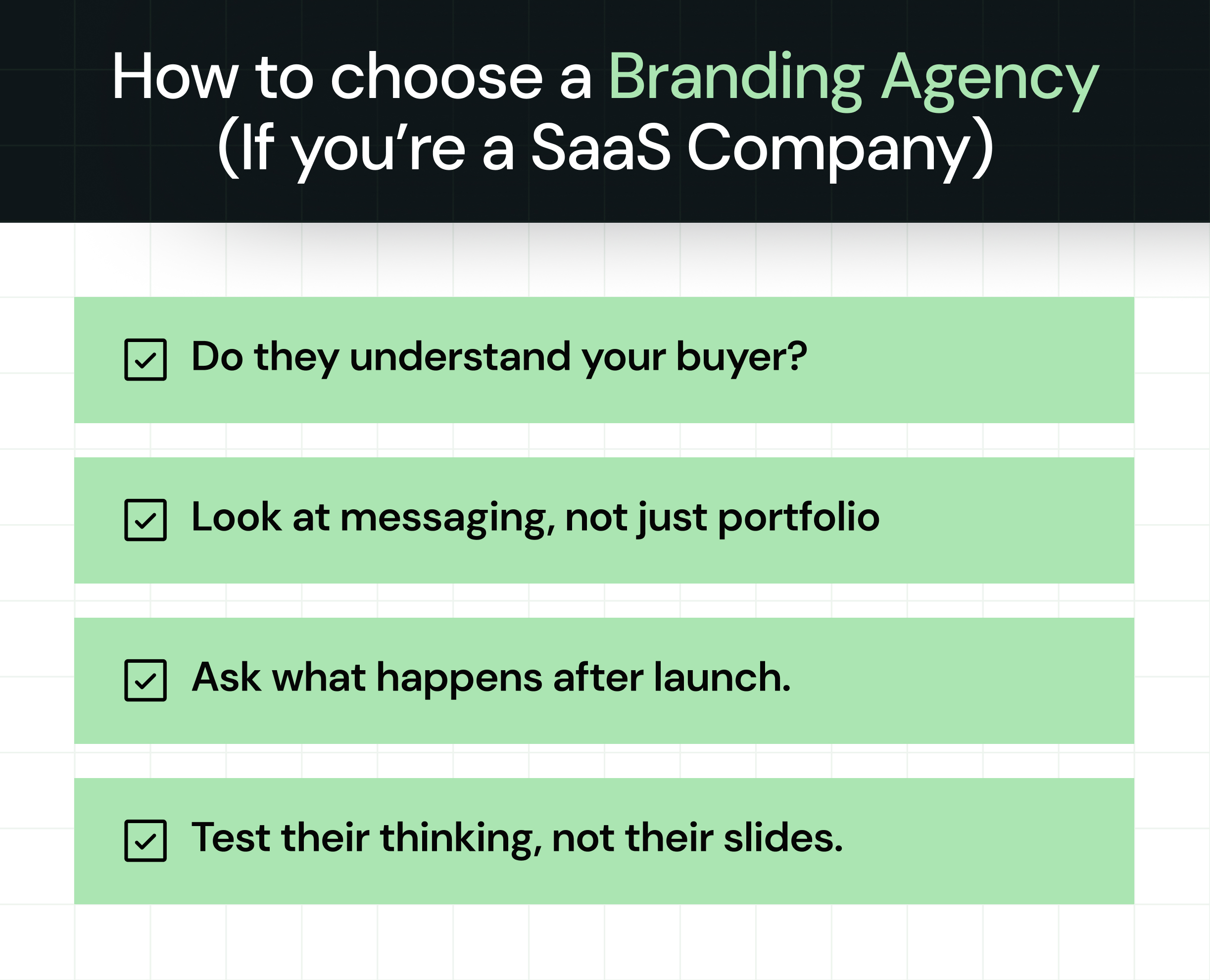
Getting on a call with the right agencies is only half the job. How you run that evaluation will tell you more than any pitch deck.
{{specficService}}
Do they understand your buyer?
Start with your buyer, not your product or category.
A strong agency should be able to explain how your buyers actually make decisions, including how they research options, who else gets involved, where deals tend to slow down, and what builds enough confidence to move forward.
If they cannot clearly articulate this, it becomes difficult for them to build a brand that fits into that decision process.
Look at messaging, not just portfolio
Most agencies lead with visual work, but that only tells part of the story.
Look deeper into how the work was developed. Ask for positioning documents, messaging frameworks, or brand narratives that show how the thinking was structured before design began.
When that layer is missing, the visuals often lack direction, which creates inconsistency when the brand is applied across different channels.
Ask what happens after launch
A brand only starts working once it is implemented across real touchpoints.
It helps to understand how the agency approaches handoff and rollout, especially across the website, sales materials, and product surfaces where most buyer interactions happen.
Without that clarity, execution tends to fragment over time as different teams interpret the brand in different ways.
Test their thinking, not their slides
One of the simplest ways to evaluate an agency is to bring a real problem into the conversation, such as a positioning challenge, a conversion issue, or a segment that is not responding as expected.
Pay attention to how they approach it. The questions they ask, how they structure the problem, and how they arrive at conclusions reveal far more than a polished presentation ever could.
And for some teams, this process leads to a different realization entirely.
After a few conversations, a pattern usually starts to emerge. Some agencies focus on how the brand looks, while others focus on how it performs within real buying situations. The difference becomes clear in how they talk about buyers, how they approach messaging, and how closely they connect brand work to actual growth outcomes.
Can a Branding Agency Actually Improve SaaS Conversions?
Yes, but only under specific conditions.
Branding contributes to conversion when a few fundamentals are in place:
- Positioning is specific enough to attract the right buyer, not just a broad market
- Messaging aligns with how buyers think at each stage of evaluation, from first touch to final decision
- The brand is applied consistently across every touchpoint, including website, sales, product, and customer experience
When these conditions are met, brand work stops being cosmetic and starts influencing how buyers understand, evaluate, and choose your product.
That is when it earns its budget.
Why Some SaaS Teams Choose ThunderClap Over Traditional Branding Agencies
By now, one thing should be clear.
Most branding agencies focus on execution first. They redesign websites, refresh logos, polish interfaces, and create cleaner marketing assets.
But branding, especially in B2B SaaS, rarely starts there.
The strongest B2B branding agencies emerge from a much deeper process of strategic thinking, creative exploration, and visual experimentation. Before you design a single landing page or interface, you need to define how buyers should perceive your company, what emotional signals your brand should communicate, and how your visual identity should express trust, sophistication, innovation, or category leadership.
At ThunderClap, we treat branding as a strategic exercise that shapes how buyers understand, evaluate, and remember your company.
We begin with brand audits, competitor analysis, positioning workshops, archetype exploration, and messaging discovery sessions. These exercises help us identify the gap between how your company currently presents itself and how it needs to position itself in the market.
From there, we move into visual exploration. We develop multiple moodboards, stylecapes, typography studies, color systems, visual references, and creative directions that push your brand into entirely new territories.
One direction may feel bold and disruptive. Another may lean editorial and premium. A third may focus on enterprise-grade structure and technical sophistication. Each direction explores a different interpretation of your company’s personality, positioning, and buyer perception.
We do not create these explorations because every visual decision answers a strategic question:
- Should your brand feel innovative or operationally reliable?
- Should your product appear highly technical or intentionally simplified?
- How can the visual system reduce buyer hesitation?
- What design language helps your company stand apart from competitors?
- How can the identity strengthen category leadership across every touchpoint?
Once we identify the strongest direction, we build a cohesive system around it. Typography, color, spacing, UI patterns, imagery, layouts, motion, and messaging all work together to reinforce a consistent perception across the buyer journey.
A strong example of this approach came through our work with roommaster PMS. After nearly three decades in the hospitality industry, roommaster had outgrown its existing identity. The challenge was to modernize the brand without losing the trust, familiarity, and SEO equity the company had built over the years.
We approached the rebrand with one core idea: reassurance. Through visual exploration across moodboards, typography systems, layouts, and interface directions, we created a calmer, more structured brand identity that felt modern while still familiar to hotel operators. After launch, the rebrand drove a 110% increase in organic traffic and an 80% increase in demo requests.
{{ctaBlock}}
FAQs
1. What makes a branding agency in Florida suitable for SaaS companies?
A Florida branding agency is a strong fit for SaaS when it prioritizes messaging and positioning over visual design. SaaS buyers evaluate tools through detailed comparison and multi-stakeholder review, so your brand needs to communicate value clearly and quickly.
2. Can a branding agency help improve SaaS conversions and growth?
A branding agency can directly improve SaaS conversions when the work goes beyond design. Clear positioning, buyer-aligned messaging, and consistent brand execution across your website, sales process, and product all contribute to moving prospects through a decision faster.
3. What are the benefits of working with a Florida-based branding agency?
Florida-based agencies offer competitive rates compared to coastal markets, proximity to a growing SaaS ecosystem across Miami, Orlando, and Fort Lauderdale, and teams that work within the same time zones as many of their clients.
Fintech websites have a much bigger job than most B2B websites. They need to educate buyers, support onboarding, communicate security and compliance, and earn enough trust for someone to share sensitive financial information. There's very little room for error.
That's what makes choosing a fintech web development company so important. A project can look like it's going well. The designs get approved. Development stays on schedule. The website launches. Then buyers struggle to navigate the product, compliance reviews expose gaps, or the experience simply doesn't build enough trust to convert. By then, you've already invested $15,000-$75,000, and fixing those problems often means bringing in another agency.
The difficult part is that most companies offering fintech web development services look qualified. Every portfolio has polished visuals and recognizable client logos. Much harder to judge is whether an agency understands complex buyer journeys, regulatory requirements, and the product decisions that shape successful fintech websites.
The six questions below will help you evaluate any fintech web development company beyond its portfolio, identify genuine fintech expertise, and avoid an expensive decision you'll have to reverse later.
TL;DR
- Look for category-specific fintech experience (payments, lending, regtech), not generic B2B portfolios
- Prioritize agencies that lead with research and business outcomes over visual design
- Compliance and post-launch support should be built into the process from day one, not bolted on at the end
What Makes Fintech Web Development Different?
Web development for fintech is more complex than traditional B2B web development because every website has to balance regulatory compliance, explain complex financial products, and support long-term scalability.
Here are the three factors that make fintech web development different.
1. Every compliance requirement shapes the user experience
Compliance isn't something a fintech website adds before launch. It influences how customers discover the product, sign up, verify their identity, and complete key actions.
Take KYC onboarding as an example. It determines what information users need to provide, when they provide it, and what they can access next. The same applies to mandatory disclosures, consent flows, and authentication. They're regulatory requirements, but they also shape the user journey.
Research shows that 4 to 7 out of every 10 prospects abandon financial onboarding before completing it, showing how quickly compliance-related friction can become a business problem. Look for a fintech web development company that can balance regulatory requirements with a smooth user experience.
2. Complex financial products need to be easy to understand
Fintech websites need to do more than describe features. Product walkthroughs, calculators, interactive visuals, and educational content help buyers understand how the product works, why it matters, and whether it's the right fit for their needs.
When choosing a fintech web development company, look for experience simplifying complex financial products through website design. The best partners know how to turn technical products into intuitive buying experiences that build confidence and trust.
3. Only the right technical foundation supports long-term growth
Three technical decisions shape how well your fintech website holds up long-term:
- CMS choice: Your CMS determines how quickly your team can publish new pages, update disclosures, and launch products without relying on developers.
- Compliance integrations: Fintech websites often connect with KYC providers, payment gateways, CRMs, and analytics platforms. These integrations need to be reliable, secure, and easy to maintain.
- Security architecture: Security needs to be built into the website from the start through encrypted data handling, secure authentication, and protection against common vulnerabilities.
The right fintech web development company helps you make these decisions early instead of fixing expensive problems later.
4. Performance has to be built in
A two-second lag during KYC verification is enough to make a buyer question whether the website can be trusted with their money. Slow load times don't just hurt rankings. In fintech, they read as a warning sign that something's off with the site itself.
But speed can't come at the cost of compliance. Cutting security checks or KYC steps to shave off load time just trades one risk for another. Look for a fintech web development company that builds fast websites without cutting corners on what they're required to verify.
How to Find the Right Fintech Web Development Company: 6 Questions to Ask
Here are six questions to evaluate whether an agency is the right fit for your fintech brand.
1. Do You Have Experience Working With Fintech Companies Similar to Ours?
A payments company doesn't need the same website as a lending platform. Each serves different buyers, navigates different compliance requirements, and guides users through different conversion journeys. The same is true for a startup launching its first website versus an established fintech looking to improve conversions.
The closer a fintech web development agency's experience is to your category and stage, the faster they'll understand your buyers, regulatory environment, technical constraints, competitive landscape, and business goals. That context influences everything from the user experience and messaging to the technical decisions behind the website.
What a good answer looks like
A strong agency should be able to:
- Share case studies from fintech companies in your category or adjacent verticals
- Explain how their approach changed based on the product, buyer, compliance requirements, and technical constraints
- Explain their experience with the CMS platforms and compliance-heavy integrations your website requires
- Connect their design and development decisions to measurable business outcomes
- Be upfront about whether development is handled in-house or outsourced
- Demonstrate experience across multiple fintech verticals and growth stages
What this looks like in practice
While both our clients, Zenda and Refo, operate in fintech, the problems their websites needed to solve were completely different.
Zenda helps schools and parents manage fee payments, so the website needed to feel simple, approachable, and easy to navigate for people who aren't financial experts.
Refo is an open banking and lending automation platform. The challenge was helping buyers quickly understand a complex platform, connect multiple products and workflows, and feel confident enough to book a demo.
That level of understanding usually comes from working across different fintech verticals and growth stages, not simply having a few fintech logos on a portfolio page.
Potential red flags
- No fintech experience within your specific category
- Generic B2B examples instead of fintech case studies
- No measurable outcomes tied to the work
- Can't explain how their approach changes across fintech segments
2. What Results Have You Helped Fintech Clients Achieve?
Business outcomes matter, but they're only part of the picture. The more revealing question is why the website was built the way it was. The answer gives you a glimpse into how the agency thinks.
Strong fintech web design and development agencies don't just tell you what changed after launch. They explain why they made specific strategy, design, and development decisions.
Maybe they reorganized the navigation because buyers couldn't distinguish between similar products, restructured product pages to make a complex platform easier to understand, or surfaced trust signals earlier because visitors needed reassurance before sharing sensitive information.
Those decisions reveal far more about an agency's expertise than simply saying they increased conversions or built a modern website.
What a good answer looks like
A strong agency should be able to:
- Explain the business problem the site needed to solve, before jumping to the solution.
- Walk through their key decisions and why: navigation, page structure, trust signals, whatever it was.
- Tie those decisions to something specific about that client's product, buyers, or market.
- Connect those decisions to meaningful business outcomes, even when exact metrics are confidential.
What this looks like in practice
Take our client, Zamp, a fully managed sales tax compliance platform. Zamp operates in a crowded category alongside players like Avalara and TaxJar, where many competitors offer similar features and make similar promises.
The challenge wasn't explaining what Zamp does. It was helping CFOs and finance leaders quickly understand why they should choose Zamp over the alternatives. That insight shaped how the website was structured, how information was prioritized, and how buyers moved through the site.
Instead of leading with features, the website was organized around the questions buyers needed answered before trusting a sales tax compliance platform. Every strategy, design, and development decision supported that goal. The website wasn't measured by how modern it looked. It was measured by how effectively it helped buyers understand Zamp's value and take the next step.
Potential red flags
- They jump straight to the solution without explaining the business problem.
- Every project follows the same approach, regardless of the product or buyer.
- They describe what they built, but not why they built it that way.
- Success is measured by how the website looks rather than how it performs for the business.
3. How Do You Approach a Fintech Website Project?
As one fintech buyer put it on Reddit, choosing a development partner was "the highest-stakes decision" of their project because the wrong choice could have legal and reputational consequences. That's why evaluating an agency's process matters just as much as evaluating its portfolio.
For example, deciding where compliance information appears or how a customer onboarding flow works can directly influence whether visitors trust your business enough to take the next step. Without that foundation, it's easy to build a polished website that fails to solve the right business problem.
What a good answer looks like
A strong agency should be able to:
- Explain how they evaluate your existing website before making recommendations.
- Show how buyer research, competitive analysis, and compliance requirements shape the project.
- Explain how those insights influence the website structure, content architecture, user journeys, and development decisions.
- Walk you through how strategy translates into implementation, testing, and launch.
- Explain how integrations across your CMS, CRM, analytics, and marketing stack are planned from the start.
What this looks like in practice
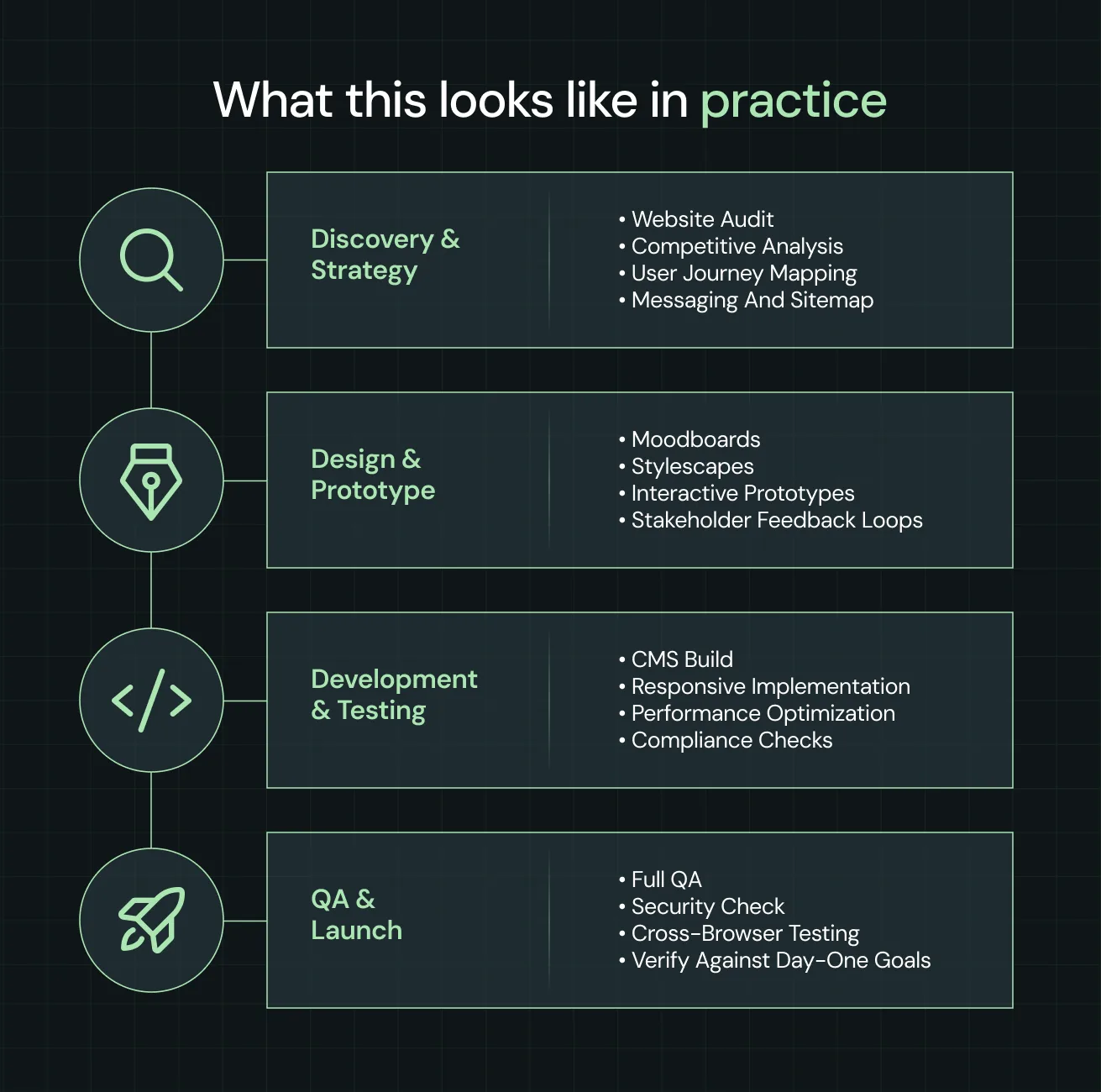
At ThunderClap, every fintech project begins with discovery. We audit the existing website, map user journeys, analyze competitors, and identify conversion gaps before recommending any changes.
Those findings shape the website strategy, including the information architecture, messaging, and user flows. Once the direction is validated, we move into design and prototyping to test ideas before development begins.
From there, the website is built, tested, and optimized for performance, accessibility, and compliance before launch. Every stage is measured against the business goals defined during discovery to make sure the final website doesn't just look good, but performs the way it should.
Potential red flags
- They jump into design before understanding your business.
- Discovery is limited to a kickoff questionnaire.
- They can't explain why key website decisions were made.
- Their process changes depending on who's pitching.
4. How Do You Handle Compliance and Security on a Fintech Website?
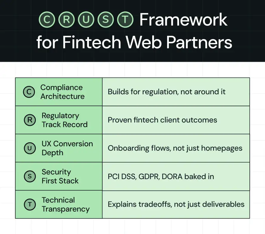
The answer to this question often separates agencies with genuine fintech experience from those applying a generic B2B website process. One way to evaluate their response is through ThunderClap’s CRUST Framework, which highlights the five capabilities every fintech web development agency should have.
What a good answer looks like
A strong agency should be able to:
- Build compliance into the website from the beginning, allowing regulatory requirements to shape website structure, user journeys, and trust signals instead of treating them as a final review.
- Demonstrate experience building websites for regulated fintech businesses, backed by relevant case studies and an understanding of industry-specific compliance requirements.
- Design buyer journeys that balance trust, onboarding, disclosures, and conversion without creating unnecessary friction or overwhelming users.
- Explain how security influences development decisions, from handling sensitive information and integrations to communicating security throughout the website.
- Clearly explain development decisions, trade-offs, and recommendations so you understand why specific approaches were chosen.
What this looks like in practice
Take our client Rezolv, an AI-powered debt collection platform operating in one of fintech's most heavily regulated categories.
Compliance wasn't something we added at the end. It shaped how the website was structured. Data Privacy & Security sits in the main navigation, not in the footer. Certifications don't just display logos; they show validation frequency so visitors know the credentials are current. Even the data ownership section is written for buyers handing over sensitive information, not auditors reviewing a checklist.
They're small decisions, but for someone evaluating risk, they're often the difference between doubt and trust.
Potential red flags
- Compliance is treated as a final review step.
- The agency has little or no experience building websites for regulated fintech businesses.
- User journeys follow generic B2B best practices instead of addressing fintech-specific trust and compliance requirements.
- Security information is difficult to find or treated as an afterthought.
- The agency can't clearly explain the reasoning behind its development decisions.
5. How Do You Measure Success After Launch?
A successful launch doesn't guarantee a successful website. This question reveals whether an agency treats launch as the finish line or the start of continuous optimization. Post-launch optimization determines whether your website continues to improve or gradually loses momentum.
What a good answer looks like
A strong agency should be able to:
- Define success metrics before launch and align them with your business goals.
- Explain how they monitor website performance after launch and how those insights translate into ongoing improvements.
- Show how post-launch support includes landing page conversion optimization, not just bug fixes
What this looks like in practice
At ThunderClap, post-launch support runs for 30 days. During that time, we track Google Analytics and Search Console data to see whether the site is performing the way it should. If the numbers aren't moving, we tell you why and what to change. If they are, we tell you that too.
As Ankita Deb, Accounts Director at ThunderClap, puts it:
"We measure success through a mix of quantitative and qualitative metrics. Quantitative indicators include improvements in conversions, lead quality, organic traffic, and bounce rates. Qualitative metrics include brand perception, messaging clarity, and how easy the new CMS is for internal teams."
Potential red flags
- Success is measured by traffic alone, not pipeline or conversions
- No one is monitoring Google Analytics or Search Console after handover
- Post-launch support requires a new contract
6. How Do You Handle Website Maintenance After Launch?
Fintech regulations don't stay still. When the Digital Operational Resilience Act (DORA) came into effect in 2025, fintech companies had new compliance requirements to communicate on their websites. Some teams updated their pages and moved on. Others found themselves raising tickets, waiting on developers, and turning a simple update into a project.
That's the reality of fintech. A website redesign isn't the end of the journey. Regulations change. Products evolve. New certifications need to be added. New markets need new pages. Maintaining a fintech website goes beyond updating content. It also means keeping the website technically secure, reliable, and compliant as your CMS, plugins, integrations, and third-party tools evolve.
Most agencies focus on keeping the website running. The best partners combine routine technical maintenance with proactive monitoring and optimization, helping you catch security vulnerabilities, broken experiences, and performance issues before they affect your buyers.
What a good answer looks like
A strong agency should be able to:
- Explain what they do between active projects, not just when tickets are raised
- Describe how they handle ongoing technical maintenance, including CMS updates, security patches, plugin and dependency updates, and integration health.
- Show how they monitor performance proactively using CRO tools like Google Analytics, Search Console, and behavior tracking
- Walk you through their handover process so your team can manage content updates, compliance pages, and certifications without raising a ticket every time
- Be clear about turnaround times for standard and urgent requests
What this looks like in practice
At ThunderClap, website maintenance isn't just about fixing what breaks. Between projects, we track analytics and Search Console data, run behavioral checks using tools like Microsoft Clarity, and flag issues before they become problems. A broken form, a slow page, a compliance page that needs updating—we catch it before you do.
Potential red flags
- Goes quiet between active projects.
- Maintenance is limited to reactive bug fixes instead of ongoing technical maintenance.
- No proactive monitoring using analytics or user behavior data.
- No structured handover process after launch.
- Vague about turnaround times for standard and urgent requests.
What to Look for in a Fintech Web Development Company: At a Glance
To find the best fintech web development company, look for proven fintech experience, a research-led process, a strong understanding of compliance and trust, clear post-launch support, and a maintenance approach that can adapt as your business grows.
{{specficService}}
Which Fintech Web Development Agencies Should You Shortlist?
Knowing what to look for is one thing. Finding agencies that actually meet those standards is another. Based on the criteria we've covered, here are three fintech web development agencies worth considering.
{{specficBlog}}
Why Fintech Companies Choose ThunderClap
The questions in this guide reflect the same challenges we've helped fintech clients solve across payments, lending, tax compliance, debt collection, and financial infrastructure. We've worked with companies like Razorpay, Refo, Rezolv, Zamp, and Zenda, each with different products, buyers, and growth goals.
If you're wondering why these fintech companies chose ThunderClap, here are a few reasons:
- Fintech expertise: From payments (Razorpay and Zenda) to lending (Refo), tax compliance (Zamp), and debt collection (Rezolv), we've helped fintech companies tackle very different trust, positioning, and conversion challenges.
- Strategy before design: Every project starts with a website audit, research, positioning, messaging, and user journey mapping so the website solves the right business problem, not just the design problem.
- Proven B2B experience: Our work across fintech, SaaS, AI, HR tech, and venture capital helps us apply proven conversion and messaging principles to complex fintech products.
- End-to-end execution: Strategy, website copy, design, development, and CRO under one roof means fewer handoffs, faster execution, and a more consistent customer experience.
- Post-launch support: We continue tracking performance and supporting improvements after launch so the website keeps delivering results long after go-live.
- Built to scale: Whether you're launching new products, entering new markets, or updating compliance information, your website can evolve without needing a complete rebuild.
{{ctaBlock}}
Frequently Asked Questions on Fintech Web Development
1. Why is security important in fintech web development?
Security is critical in fintech websites because they handle sensitive financial and personal data. Users expect strong security practices to protect their information, support compliance requirements, reduce fraud risks, and build trust in the company.
2. How much does fintech web development cost?
The cost of web development for fintech depends on the scope of the project, integrations, functionality, compliance requirements, and content needs. For a mid-market agency, fintech website projects typically start at around $15,000, with larger, more complex projects costing significantly more.
3. How long does it take to develop a fintech website or platform?
Most fintech and banking web development projects focused on websites take between 8–12 weeks to design and develop. Timelines depend on the number of pages, content requirements, integrations, and stakeholder feedback cycles. Fintech platforms and products typically take several months or longer, depending on the complexity of the functionality, security requirements, integrations, and overall development scope.
4. Do I need a fintech-specific web development company?
A fintech-specific web development company isn't always necessary. However, your agency should understand fintech buyer journeys, trust signals, compliance requirements, and security considerations. That expertise usually leads to a smoother project and a website that better serves fintech buyers.
5. How do you explain a complex fintech product on a website?
To explain a complex fintech product on a website, use clear messaging, real-world examples, product visuals, videos, and trust signals. The goal is to help visitors quickly understand what the product does, who it's for, and why it matters.
6. Will we be able to update the website ourselves after launch?
Yes, you will be able to update the website yourself after launch. Most fintech websites are built on CMS platforms like Webflow, allowing marketing teams to update content and create pages without developers. If you need ongoing support, you can also opt for website maintenance plans offered by web design and development agencies.
The average SaaS buyer forms a first impression within 50 milliseconds (0.05 seconds) of visiting your website. That decision comes from design: how quickly your site communicates value, how trustworthy it feels, and how engaging the experience is.
In 2026, the stakes are higher than ever. SaaS categories are exploding with lookalike competitors. Investors expect growth efficiency, not just growth. Customer acquisition costs are rising. The website has become the conversion engine that determines whether a visitor moves to a free trial, demo, or signup.
Three shifts define SaaS web design today:
- Product-led growth: Users want to see and feel the product before committing.
- Conversion architecture: Design choices (hero layout, pricing clarity, CTA placement) are tied directly to trial → paid conversion.
- Dynamic storytelling: SaaS is complex; motion, illustrations, and micro-interactions simplify the message while building memory.
At ThunderClap, we’ve worked on over 129 B2B websites, including Amazon, Razorpay, Factors, and Storylane, to optimize their websites and boost conversions. In this blog, we go beyond inspiration: covering design trends, B2B vs. B2C approaches, real SaaS examples with takeaways, and a practical checklist you can put to work.
5 SaaS website design trends defining 2026
In SaaS, design trends often respond to how users discover, evaluate, and purchase software. The best SaaS website designs in 2026 share five key traits that are directly tied to growth and conversion.
1. Motion that explains, not distracts
For years, SaaS websites added animations as decoration. Now, the best sites use motion as explanation. Product workflows, pricing toggles, and feature interactions come alive in ways that make value instantly clear.
At ThunderClap, we design every animation to simplify, not distract.
2. Product-led storytelling in the hero section
Another defining move is toward product-led storytelling, especially in the hero section. Instead of vague taglines and stock visuals, leading SaaS brands are putting their products front and center. Screens, demos, or illustrations of real-world use cases show visitors what the tool can do in the first five seconds.
That instant clarity is what turns a bounce into a signup.
3. Trust-centered UX for B2B SaaS
For B2B SaaS website design, the emphasis is shifting toward trust-centered UX. Enterprise buyers aren’t swayed by flashy visuals; they want transparency and proof. Clear pricing layouts, security certifications, customer logos, and ROI calculators are no longer optional.
How you place them (near CTAs, not buried in footers) makes the difference between confidence and doubt.
4. Minimalism with intelligence
At ThunderClap, we view minimalism as a tool for clarity of decision-making. In 2026, minimalism continues to dominate, but it has evolved into a more intelligent form. Whitespace, clean typography, and stripped-down navigation are paired with subtle micro-interactions that guide users through decisions.
5. Websites that double as the first demo
The line between SaaS products and SaaS websites is blurring. More companies are embedding interactive demos directly into their sites, letting visitors test features before signing up. Tools like Storylane (with which we had the pleasure of working on their latest design) have popularized this approach, and forward-looking SaaS websites are incorporating it into their design as a primary conversion path.
Top 10 SaaS web designs to inspire in 2026
Looking at real-world SaaS website design inspiration is the fastest way to see these principles in action. We’ve curated 10 examples of SaaS websites that stand out.
1. Pazo
What stands out
This one’s close to home. Pazo (a retail operations and visual merchandising platform) partnered with ThunderClap for a full website revamp. The hero section puts the product front and center, with a clean phone mockup surrounded by floating UI elements that instantly show how the platform works. As you scroll, bright accents, product illustrations, and a full wall of testimonials create momentum while building trust.
Why it works
Great B2B SaaS website design isn’t about heavy copy. By putting the product in context on a device, Pazo makes its platform feel practical and ready to use. Pairing this with logos and testimonials from brands like Bata, Jockey, and Qualcomm delivers instant social proof.
We decided to use bold orange CTAs (contrasted against a clean background) to keep the conversion path obvious.
Web design inspiration for you
Don’t just tell prospects what your product does. Show it, contextualize it, and back it with proof. Use device mockups, real UI, and customer voices to reduce abstractness.
2. Dropbox
What stands out
We’ve always admired how Dropbox keeps things deceptively simple. Dropbox’s homepage leans hard into product context. Almost every section shows the interface in action.
From the top search bar demo (“Find anything. Protect everything.”) to the clean content previews and sharing flows, the site makes it obvious what Dropbox helps you do. Another standout is the black section midway through, where bold contrast and floating UI cards spotlight testimonials and social proof without feeling heavy.
Why it works
This is SaaS website design at its most confident. By resisting the urge to shout, Dropbox communicates trust and maturity. The clarity of the design makes the product feel intuitive and reliable, while subtle micro-interactions keep it from being flat.
Web design inspiration for you
Don’t bury your interface behind generic illustrations. Use actual product shots in different contexts (search, sharing, security) so visitors see the utility right away. And if you’ve got multiple use cases, vary the background tone to reset attention and keep users scrolling.
3. roommaster
.webp)
What stands out
When roommaster rebranded from InnQuest, they needed more than a fresh logo. They needed a website that reflected the sophistication of a complete hospitality platform.
Our team designed a clean, modern interface that puts the product at the forefront. In the hero, we used crisp typography, subtle gradients, and a clear demo CTA. As you scroll, you will see custom illustrations and modular layouts that explain features, while testimonials and recognizable hotel brand logos build trust.
Why it work
This is a B2B SaaS website design targeting hotel decision-makers. Every section reduces risk: recognizable logos build authority, modular layouts break down complex functionality, and clean illustrations add polish without clutter.
The rebrand feels both modern and enterprise-ready, a combo that helps Roommaster appeal to global hoteliers.
Web design inspiration for you
Lead with a simple promise, then back it up with modular proof, such as feature callouts, recognizable brands, and authentic customer voices.
4. Shopify
What stands out
Shopify’s website feels like a mini ecosystem tour. The home page hero leads with a full-width background video, instantly showing real businesses and real storefronts using Shopify (much stronger than abstract slogans). Scroll down and you see use cases broken into cards (Glossier, Vacation, even local stores) that make the platform feel universal.
One of the boldest sections is the integrations wall: dozens of app icons stacked edge-to-edge, making the platform’s scale impossible to miss.
Why it works
This is a SaaS website design that builds credibility by showing breadth. The video makes Shopify human and relatable, while the customer cards make it aspirational (if Glossier can scale here, so can you).
The integrations wall is clever psychology: it signals reliability through sheer volume, showing visitors that Shopify isn’t a lone tool, it’s a hub that connects everywhere.
Web design inspiration for you
If your SaaS sits at the center of an ecosystem, lean into that visually. Don’t bury integrations in a tab. Put them front and center.
{{specficBlog}}
5. Deductive AI
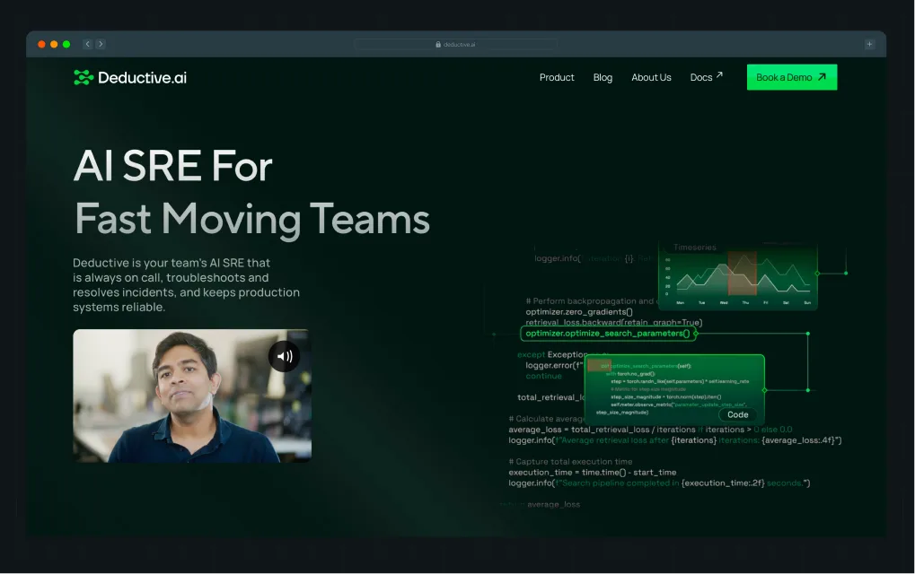
What stands out
Deductive.ai is a stealth-mode startup founded by two ex-MAANG leaders. We partnered with them to build a complete brand identity and redesign the website from the ground up. Post revamp, the website earned industry recognition and drove 10x higher engagement.
Deductive.ai makes an immediate impression with its bold hero line: “No More Root Causing in the Dark.” The dark, neon-accented palette sets a technical and futuristic tone, while animated graphs position the product as a next-gen solution. Visual diagrams and product screenshots explain how the tool integrates with GitHub, Jira, and Splunk, while the “Traditional Way vs Deductive Way” comparison block drives the message home with clarity.
Why it works
For developer and SRE audiences, clarity and credibility matter more than gloss. Deductive.ai uses technical visual language (graphs, dark UI, code snippets) to speak directly to its target users. This site leans into the developer-first design trend, featuring darker palettes, syntax-inspired typography, and the visualization of complex workflows.
Web design inspiration for you
If your product is technical, design it for the user’s environment. Speak the visual language of your buyer while clearly showing how your solution improves their daily workflow.
6. Storylane
.webp)
What stands out
Storylane (a demo automation platform for sales and marketing teams) partnered with ThunderClap to revamp its visual identity and website. The challenge was clear: keep the copy, but inject a personality that matched their bold, innovative brand. We handled everything end-to-end, brand design, website design, and Webflow development.
The result is a playful yet professional site with strong color pops, custom illustrations, and consistent typography that makes the product stand out. Post revamp, Storylane saw a 36% increase in website impressions and a 30% boost in demo requests.
Curious to know more?
📌 Read the full breakdown in this LinkedIn post by Kiran Kulkarni, Partner & Head of Growth at ThunderClap, including the exact design process and before/after insights.
Why it works
This project shows how SaaS website design goes beyond pixels by aligning personality with product. The playful color accents, clean fonts, and filled icons reflect the brand’s maturity and confidence, attracting enterprise buyers while keeping the product approachable.
Web design inspiration for you
If your SaaS site feels flat, the problem may not be the copy or website strategy (it may be the brand personality). Use mood boards to define tone, bring in consistent typography and color systems, and layer in custom illustrations to stand out.
7. Notion
.webp)
What stands out
Notion’s homepage makes one big shift: it’s now an AI-first story. The hero headline, “Work faster with your AI team,” sets the tone immediately. The screenshots below aren’t abstract mockups. Instead, they show real product flows like roadmaps, priorities, and team dashboards.
Another standout is the “Introducing Notion 3.0” block, which stacks product modules in colorful cards (search, notes, projects), making it clear that Notion is an all-in-one workspace, not just a notes app.
And threading through it all: Notion’s signature hand-drawn icons. Playful, sketch-like, and instantly recognizable, they add warmth to what could otherwise feel like a cold AI narrative.
Why it works
This is a SaaS website design that matches product evolution. By putting AI in the spotlight, Notion reframes itself for enterprise relevance while keeping its playful design DNA intact. The modular card layout reduces cognitive load: instead of listing features, it shows digestible “mini use cases.” Partner logos (OpenAI, Ramp, Vercel) build instant credibility with the right audiences.
Web design inspiration for you
If your SaaS is evolving rapidly, let your website clearly reflect that pivot. Lead with your new positioning, then use modular feature cards to help visitors grasp the breadth without feeling overwhelmed.
{{specficService}}
8. ClickUp
What stands out
ClickUp wastes no time showing the sheer scale of its platform. The hero headline is anchored by a dense grid of app modules, laid out like a dashboard, so visitors instantly understand the “everything app” positioning. Midway down, a dark gradient section creates a sharp visual break, shifting the mood and reinforcing the “Work is broken / Let’s fix it” narrative.
The rest of the page is structured with modular feature cards, each paired with gradient-backed illustrations, creating a rhythm that makes an enormous feature set easier to scan.
Why it works
For a product with so many capabilities, the design keeps complexity under control. The grid in the hero visualizes breadth in a way that feels immediate and intuitive. The dark section resets attention and makes the page feel dynamic as users scroll.
Web design inspiration for you
If your SaaS has dozens of features, treat the homepage like a UI system: use structured grids, recurring card layouts, and contrast-heavy sections to maintain variety without overwhelming the visitor.
9. Zenda
.webp)
What stands out
Zenda is one of our favorite B2C SaaS projects because it proves that even something as dry as school fee payments can feel magical. We overhauled their design system to focus on clarity, but kept it fun with bold illustrations, 3D visuals, and little sparks of delight sprinkled throughout the site. Parents immediately see what the app does, and just as importantly, they trust it (thanks to proof woven in everywhere).
The team loved it, and so did the design world. The site went on to get nominated at Awwwards.
Why it works
For fintech SaaS, the design has to balance two things: make the product feel simple and trustworthy, while still standing out. Zenda nails this by turning complex financial tasks into something visually light and approachable. The illustrations explain the use cases better than any paragraph of text could.
Web design inspiration for you
If your SaaS speaks to everyday consumers, don’t be afraid to add personality. A little playfulness, when backed up by proof, goes a long way.
Also read: Top B2B Branding Strategies with Examples from Top Brands
10. Webflow
.webp)
What stands out
Webflow leads with confidence: a bold, high-contrast hero proclaiming “Where creativity drives performance,” paired with a clear dual CTA for both demo and trial. The dark theme gives the page weight, while bursts of color in product screenshots add vibrancy and direction.
Midway through, the site highlights its credibility with customer stories from household names like TED and Rakuten, using video portraits and bold metrics that feel more alive than static testimonials.
Another notable design choice is the heavy use of modular blocks (alternating product feature panels, customer stats, and AI-focused sections), each framed with plenty of breathing room so the site never feels crowded.
Why it works
Webflow’s site is a case study in SaaS website design for platforms that straddle creativity and enterprise authority. The dark theme conveys sophistication, making colorful product visuals pop with energy. By integrating customer proof through video-driven testimonials and quantifiable outcomes, Webflow balances inspiration with trust.
Web design inspiration for you
If your SaaS product sits at the intersection of creative and technical audiences, take a page from Webflow: go bold with contrast, make proof points dynamic through video or interactive formats, and use modular content blocks to pace the story. The result is a homepage that feels cinematic yet practical.
SaaS website design checklist for 2026 founders & designers
At ThunderClap, this is our lens: the best SaaS website design happens when visual hierarchy, interaction design, and motion storytelling all align to reduce friction, build trust, and create lasting recall.
Here’s the design checklist we use to build the best SaaS website designs in 2026. We recommend you do a design audit, and if your site misses more than one of these, it’s not working as hard as it could.
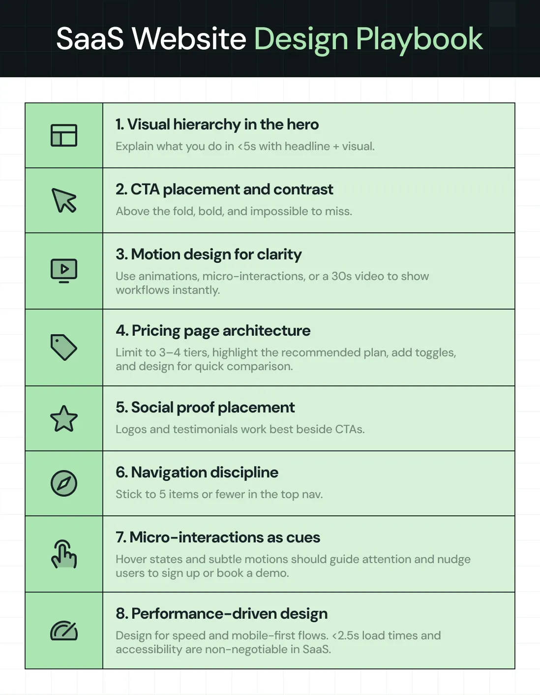
- Visual hierarchy in the hero section → In under 5 seconds, users should know what you do, who it’s for, and the next step. Strong headline + clear subhead + a product visual (screenshot, animation, or demo) arranged with hierarchy ensures instant clarity.
- CTA placement and contrast → Call-to-actions should sit above the fold and be visually distinct. Button color, size, and surrounding whitespace are design choices that make or break conversions.
- Motion design for storytelling → Replace static copy with product illustrations, micro-animations, or a 30–45 sec explainer video. Motion should guide understanding, not distract.
- Pricing page information architecture → Limit to 3–4 tiers, highlight the recommended plan with visual emphasis, add monthly/annual toggles, and design a logical flow down to FAQs. Layout should make comparison effortless.
- Information design for social proof → Client logos, testimonials, and case studies belong next to CTAs, not buried on a separate page. The way you frame proof visually is as much a design decision as it is a content one.
- Navigation and interaction design → Keep the top nav to 5 items or fewer. Use hierarchy and interaction design to create clear, conversion-focused paths (Product, Pricing, Resources, About, CTA).
- Micro-interactions as UX guidance → Hover effects, scroll-triggered animations, and button feedback aren’t flair. They’re design cues that orient users and nudge them toward action.
- Performance-driven design → Optimize images, animations, and layouts for <2.5s load time. Design responsive, mobile-first flows for critical actions like pricing toggles, demo forms, and onboarding. Speed and accessibility are part of design.
Why ThunderClap is the partner behind the best SaaS website design
Looking at these examples makes one thing clear: the best SaaS website design in 2026 isn’t about surface polish. It’s about building a system that communicates value instantly, builds trust through proof, and guides users toward conversion.
That’s exactly what we do at ThunderClap for B2B SaaS, fintech, VC, or AI.
Most teams come to us with websites that don’t match their product maturity due to outdated templates, inconsistent messaging, or designs that hinder conversions. Our job is to fix that with a proven, conversion-first design process.
Here’s how we work:
- Discovery & audit → We start by mapping positioning, messaging, UX, and credibility gaps so we know exactly what’s holding your site back.
- Strategy sprint → Then we design a messaging and visual identity framework that makes your product value crystal clear.
- Design & build → We execute in Webflow, building scalable CMS systems that give marketers control without developer bottlenecks.
- Optimization → Post-launch, we keep improving with CRO experiments, CTA testing, and UX iterations tied directly to pipeline metrics.
This is why 129+ brands like Amazon, Razorpay, Storylane, Factors, Deductive, and Roommaster trust us. The results speak: 30%+ increases in demo requests, 50% conversion lifts, and industry recognition, including Awwwards nominations.
{{ctaBlock}}
FAQs
1. How to design a SaaS website that converts?
Start with clarity in the hero section: headline, subhead, and product visual that explain your value in under 5 seconds. Use one consistent CTA color across the site. Keep navigation lean (5 items max). Place proof elements (logos, testimonials, ROI stats) directly beside CTAs, not hidden elsewhere. Design pricing pages with 3–4 plans, annual/monthly toggles, and clear “recommended” highlights. Every design choice should reduce friction and reinforce trust.
2. What sections should every high-converting SaaS website include?
- Hero section → Clear value proposition + CTA.
- Product visuals → Screenshots, animations, or short video demos.
- Social proof → Logos, testimonials, case studies integrated near CTAs.
- Feature blocks → Modular, scannable sections (not walls of text).
- Pricing page → Transparent, tiered, and interactive (toggles).
- Integrations/compatibility → Proof your SaaS fits into the stack.
- FAQ or objection handling → Design to overcome last-mile doubts.
3. What are some of the best SaaS design agencies in the US?
Some highly regarded agencies with SaaS expertise include:
- ThunderClap → End-to-end SaaS website design, CRO, and Webflow development. Known for work with Pazo, Roommaster, Storylane, Amazon, Deductive, and Zenda.
- Momentum Design Lab → UX-heavy approach, enterprise SaaS focus.
- Toptal Design Network → Curated freelancers, strong for scaling SaaS teams.
- Work & Co → High-end, brand-forward SaaS platforms.
- Clay → Blends strategy + SaaS product design with polished visuals.
4. How do I optimize my CTA for better conversions?
- Placement: First CTA must be above the fold; repeat after major proof sections.
- Contrast: Pick one bold color not used elsewhere. Surround it with whitespace.
- Copy: Use outcome-driven text (“Get Started Free” > “Submit”).
- Context: Pair CTAs with proof — testimonials, logos, ROI stats.
- Mobile-first: Ensure button is thumb-friendly, sticky on scroll if possible.
- Micro-interactions: Add hover states or subtle animations to make CTAs feel alive.
Don’t get us wrong. We love a great-looking landing page. The way the colors pull your eyes exactly where they should go. The bold visuals and thoughtful details make everything feel just right. Honestly, we can talk about this stuff all day.
But we also know looks aren’t the whole story. A page can impress at first glance and still leave people unsure about what to do next. And that’s a problem when you’re trying to build something that performs.
What we care about is what happens after that first impression. Does it make sense right away? Does it guide them without confusion? Does it give them a reason to stay?
Because in the end, what really matters is simple. Effective landing page designs that convert, and a clear understanding of how to design a landing page that drives conversions.
What Is a SaaS Landing Page (And How It’s Different from a Normal Web Page)
In SaaS, a landing page is a focused, goal-driven page designed to turn a specific visitor into a signup, demo request, or trial user. Unlike general web pages that inform or help users explore, it has only one purpose, to make the process as simple and effortless as possible, answer key objections, and guide users to a single clear next step.
In the simplest terms, it’s a page designed to get a user to take action as efficiently as possible. Strong SaaS landing pages do this through clear value propositions, benefit-led copy, intentional visuals, and well-placed social proof that builds trust at the moment it matters most.
Of course, there isn’t a single formula you can follow every time. (Although we’ve got a 3-step guide to help you do it consistently below.) We’ve all seen polished pages that look incredible and just can’t land a single conversion. We’ve also seen pages that look thrown together at the last minute somehow convert like crazy.
Traffic plays a role here, too. A page filled with the wrong audience will struggle, no matter how good it looks. A more relevant audience can quickly change the outcome. Keep this in mind before being too hard on your own results.
Now, before we go further, it helps to see how a SaaS landing page stands apart from a regular web page:
This difference shapes how every section is written and designed. It also explains why a focused page often outperforms a general one.
What Makes a SaaS Landing Page Effective
A SaaS landing page works when it feels instantly clear, relevant, and easy to act on. Visitors do not spend time decoding it. They decide within seconds if it speaks to their problem and if the next step feels worth it.
While no landing pages are exactly the same, successful SaaS pages often share a common structure that supports fast understanding, reduces hesitation, and guides visitors toward a single clear action.
Clarity of value
The first question every visitor asks, consciously or not, is: What is this, and why should I care? You have a few seconds to answer both.
Vague positioning kills conversions before the user even scrolls. "For teams" tells a visitor almost nothing. "For SaaS founders struggling with churn" tells them exactly who this is built for and signals that the product understands their specific problem.
This shift matters because B2B buyers do not start with product interest. They start with problems. Recent research reports that B2B buyers now spend 87% of their journey in independent research before ever speaking to sales, and often more than 70% of the decision process happens digitally. That changes how value needs to show up on the page. It needs to feel relevant without explanation.
This connects directly to modern B2B web design and landing page best practices, where clarity replaces persuasion-heavy language as the primary driver of conversion. Strong landing pages guide attention using spacing, typography, and contrast so that the value proposition is immediately seen, not just read.
Performance that supports conversion
Even the strongest messaging falls apart if the experience feels slow, cluttered, or difficult to navigate. SaaS visitors expect pages to load quickly, respond smoothly, and make actions feel effortless.
Google's research on mobile behavior shows how directly performance impacts engagement. When page load time increases from 1 second to 3 seconds, bounce probability rises by 32%.
As delays continue, the risk increases significantly:
- 1–5 Seconds: Bounce probability increases to 90%
- 1–10 Seconds: Bounce probability increases to 123%
For SaaS companies, this matters because landing pages are often the first interaction users have with the product. Slow-loading visuals, bloated scripts, excessive animations, or confusing layouts create friction before trust is even established.
Effective SaaS landing pages reduce this through lightweight design systems, focused layouts, clear navigation paths, and fast-loading experiences across devices. The goal is not just visual polish. It is helping users move from interest to action without interruption.
Relevance to user intent
Landing pages convert better when they mirror the exact context the visitor came from. A LinkedIn ad, a Google search, or an email campaign all carry different intent signals, and the page needs to continue that same conversation.
When that alignment is strong, visitors feel like they landed in the right place. When it is off, even good copy loses impact because the expectation breaks immediately.
For SaaS funnels, this often looks like:
- Search traffic landing pages focusing on problem-solving
- Paid ads landing pages focusing on speed to outcome
- Email traffic landing pages focusing on expansion or upgrade context
Recent HubSpot research on conversion performance shows that personalized landing experiences consistently outperform generic pages in conversion rate, with segmented messaging driving significantly higher engagement across B2B funnels. The pattern is consistent across industries. Relevance beats persuasion.
Aligning intent and messaging is one of the most effective B2B conversion rate optimization strategies teams can use to immediately improve landing page performance.
Reduction of decision friction
The final ingredient is making the next step feel safe and obvious. SaaS landing pages perform better when they remove unnecessary thinking from the decision moment.
Demo? Trial? Signup?
Each of those asks for a different level of commitment, and the right one depends entirely on the user's readiness.
Asking a cold visitor to start a free trial is like proposing on a first date. In fact, users quickly abandon experiences when the interaction cost feels high, especially on smaller screens, where attention drops faster than in desktop sessions. This cycle directly affects SaaS landing pages where demo requests or signups depend on quick micro-decisions.
The strongest landing pages do not push harder. They make the next step feel simple enough that hesitation fades on its own.
What Are the Elements of a High-Converting SaaS Landing Page
Most high-performing SaaS pages follow a similar structure. You’ll see this pattern across strong SaaS landing page examples, where each element earns its place by removing a specific pain point.
A headline that makes people stay (not bounce)
Your headline is the first real test. Clear beats clever, every time. A good headline answers three things at once:
- What this is
- Who it's for
- What changes for them if they use it
It defines the audience and signals the value in a single breath.
"The operating system for modern work" could describe almost any B2B tool. "Cut your sales cycle in half without adding headcount" names a specific outcome for a specific problem. A well-written headline can lead to a 3x higher conversion rate, which makes it, by far, the highest-leverage word on the page.
A strong example of this is Crazy Egg. The page keeps the headline extremely direct from the start.
It opens with a simple line: See what’s wrong with your website.
It works because it immediately frames a problem the visitor already cares about. It does not explain the product first. It starts with a challenge that the user likely feels, inviting curiosity about how to fix it.
Right under it, the page builds confidence and momentum in a very structured way. It shows scale and credibility without slowing the experience down:
Over 449,000+ websites use Crazy Egg for Heatmaps, Recordings, A/B Testing, Web Analytics, and more.
From there, it moves straight into action. The structure feels natural because each layer answers a question the user is already asking. What is the problem? Can I trust this? What should I do next?
The same principle holds even when the product is more complex, and the value is harder to explain.
When Factors partnered with us, the challenge wasn’t visual. The product already had depth. The real problem was clarity. The landing page did not make that value obvious quickly enough, which made the product feel heavier than it was.
We restructured the page using the same principle as a high-performing narrative flow. It needed to clearly answer what this is, who it’s for, and what changes for the user without altering the core messaging.
The final headline, “Know how your buyers move. Run campaigns that win,” was retained, and we built the page structure around it to improve clarity and impact.
The layout tells a story step by step:
- Why fragmented signals are a problem
- How Factors solves it
- Proof of success through testimonials and client logos
One of our favorite sections is the execution timeline. It walks visitors through the exact journey of using Factors, showing how raw, messy signals turn into clear, usable campaigns in just three weeks. Most B2B pages stop short of this kind of clarity, which is why this section resonates strongly.
To bring in more feeling, the design uses bold patterns, rich color, and human touches like customer quotes that feel authentic rather than scripted. The calls to action remain consistent throughout, with “Get a demo” and “Learn more” placed at natural decision points to guide users without interrupting flow.
As Ayush Barnwal, partner at ThunderClap, noted, the redesign helped Factors establish a premium, globally ready brand.
Supporting copy that makes the value obvious
The supporting copy has one job: expand what the headline promised.
It's not there to be clever or poetic. It's there to answer the logical follow-up question, “Okay, but how?”, in plain language.
This is where many SaaS teams go wrong. They write copy for themselves, using the language of their internal roadmap rather than the language of their users' actual pain.
According to Unbounce's analysis of 41,000 landing pages, copy written at a 5th to 7th-grade reading level converts at 12.9%, while professional-level copy converts at just 2.1%. This means simple copy converts 514% better than professional-level copy with a lot of technicalities.
Consider CloudTalk’s landing page, for example, which provides sales and support teams with unified voice software that offers international coverage and AI voice agents.
What stands out on their landing page is how consistently it prioritizes clarity over complexity:
- Compelling copy: The headline clearly explains what the product does and who it is for. There is no jargon or ambiguity, just immediate context that helps the right users self-identify.
- Proof in numbers: Customer logos and reviews are backed by strong, tangible stats. This turns social proof into something measurable and believable.
- Say it loud: Calls to action like “Start free trial” and “Book a demo” are visually prominent and direct, guiding users without forcing them to search or interpret next steps.
- Clarity over hype: Product visuals highlight AI features like auto-transcriptions and real-time call summaries, each paired with short captions that explain exactly what the user is seeing.
Nothing feels overloaded. The page does not try to explain everything at once. It gives just enough information for the user to feel confident about what they gain. The user does not need to interpret the message, as they understand it immediately.
That is the role of supporting copy.
It should not try to sound smart. It should make the product feel simple.
A CTA that matches how ready the user is
A cold visitor who just discovered your product is not ready to start a free trial. They need context.
"See how it works" or "Watch a 2-minute demo" is a lower-commitment entry point that keeps them in the funnel. A warm visitor who's already compared you to three competitors doesn't need more context, but a clear path to action.
A direct CTA like “Start your free trial” or “Talk to sales” aligns with that intent and gives them a clear next step without unnecessary explanation.
Pages also perform better when they stay focused on a single action. Research shows that pages with one clear CTA convert at 13.5% vs 10.5% for pages with multiple CTAs, a 29% lift simply by removing competing choices.
OpusClip shows how actionable a SaaS hero section and its call-to-action button can become when everything aligns in one motion.
As a page visitor, you can paste a YouTube link and click “Get free clips,” or upload your own file, and the experience begins immediately within the product.
If the goal is to convert more visitors into active users and the product already includes a video or image upload, this approach can fit naturally into that flow.
Product visuals that help users 'get it' instantly
People don't read SaaS landing pages, but scan them thoroughly. A screenshot, a short product flow, or a UI walkthrough communicates more in two seconds than three paragraphs of feature description.
If a user doesn't understand what the product looks like or what it does, they won't convert.
Recent research consistently shows that 91% of users prefer visual content when trying to understand complex interfaces. Visuals shorten the learning curve and improve comprehension speed, which directly impacts decision-making.
The same principle applies to SaaS.
A static feature list leaves too much to interpretation. A well-placed product visual removes that gap. It answers questions before they are asked. What does this look like? How do I use it? What happens when I click this?
A strong example of this comes from ThunderClap’s work for Deductive AI. The interface, system diagrams, and incident flows were all designed to make complex systems feel traceable and easy to follow. The result was a product story that users could quickly understand, along with 10X higher engagement than on the previous website.
You can see the breakdown in Ayush’s LinkedIn post:
ThunderClap applied a similar visual-first approach while redesigning NativeMSG. The product was strong, but the website didn’t reflect its leadership in RCS. Prospects didn’t understand what RCS could actually do. The site relied on feature lists rather than showing outcomes.
The challenge was to make the platform instantly clear, visually compelling, and category-defining.
Here’s what changed:
- Built 40+ visual mockups with real message examples so users could understand RCS in minutes
- Developed a layered visual system inspired by the logo to signal structure, security, and reliability
- Chose a green-focused palette to stand out and reinforce clarity and growth
- Shifted from features to outcomes like engagement, ROI, and conversions across industries
- Created dedicated pages for Creator, Cloud, and Connect to simplify the platform architecture
- Prioritized experience-first storytelling that was educational, interactive, and scalable
As Ayush explained:
“They did not want to be another messaging vendor. They wanted to own RCS entirely. Our visual-first approach helped people understand the product in minutes.”
Kiran Kulkarni, Partner & Head of Growth at ThunderClap, mentioned the revamp helped NativeMSG turn education into a conversion asset and drive a more qualified pipeline.
Strong landing pages don’t treat visuals as decoration. They treat them as an explanation. When users can “get it” without effort, they move forward with confidence.
Proof that makes the decision feel safe
In SaaS, trust is not optional. The user is evaluating not just whether the product works but also whether their peers would make the same choice.
Client logos, customer testimonials, G2 ratings, and outcome-based metrics all serve the same function. That is, they transfer the risk of being wrong from the individual buyer to a crowd of people who've already made a decision.
Landing pages with social proof, such as customer reviews and testimonials, convert 34% better, according to Invesp (2024). Real metrics from real customers do the heavy lifting that generic praise cannot.
Because in B2B, the buyer isn't just evaluating the product, they're evaluating the decision to adopt it in front of their team.
What could be better here than our own landing page?
.webp)
Instead of pushing testimonials to a separate section or page, the proof appears directly within the flow of the landing experience. (Well, we do have a separate web page that showcases our work, in case you want to check it out!) Toward the end of the page, visitors see feedback from multiple clients we’ve worked with across various projects.
The testimonials are outcome-focused, specific, and tied to real people and recognizable companies, which makes the credibility feel grounded rather than performative. By the time users reach this section, they already understand the offer. The social proof helps confirm that others have already made the same decision successfully.
When proof appears early and naturally, it reduces hesitation before it builds. It answers the unspoken question, “Does this really work for people like me?” without forcing the user to look for that answer.
Features explained as outcomes (not just listed)
A feature list reads like a spec sheet. Your user doesn't care about "real-time sync across devices". They’ll definitely care that they'll never lose context when switching from their laptop to their phone.
Hence, translate every feature into the outcome it creates. "What it does" becomes "why it matters," and suddenly the page stops feeling like a datasheet and starts feeling like a pitch from someone who understands the problem.
Slack does it the best through its Slack Connect page.
Instead of describing features in isolation, the page consistently ties them to outcomes. “Secure external collaboration” is immediately reframed as “a better way to work with people outside your company.” The focus moves from capability to benefit.
It then reinforces this with clear, measurable outcomes. For example, teams see:
- 2x faster turnaround on reviews
- 50% reduction in weekly meetings
- 4x faster deal cycles
Even functional capabilities follow the same pattern. Moving conversations out of email becomes faster decision-making. Built-in security becomes a safe collaboration with external partners.
The product does not change. The framing does. That difference is what makes the page persuasive.
{{specficBlog}}
A mid-page reminder of why this matters
By the time users are halfway down the page, many have already half-forgotten what drew them in.
A mid-page reinforcing statement, such as a short, punchy statement tied to the core value proposition, catches those scanners and pulls them back.
But do not mistake it for a summary. It's a reset, a reminder of the stakes before you ask them to act again.
A good SaaS example of this pattern can be seen in Intercom’s Helpdesk product landing page, where the messaging repeatedly re-anchors visitors to the core promise of faster, friction-free customer support.
As users scroll through detailed sections on ticketing, reporting, integrations, onboarding flows, and outbound messaging, Intercom periodically reinforces the bigger outcome behind those features. Mid-page statements such as “Modern software that’s fast and friction-free” and “Outbound messaging that reduces support volume” serve as strategic resets within the experience.
These sections reconnect the visitor to the larger value proposition, reducing support friction, improving team efficiency, and creating a smoother customer experience before moving deeper into product details.
It’s subtle but intentional. Even if a visitor is skimming through integrations, support workflows, or product visuals, the page continuously brings them back to the central promise before the next decision point.
Different Types of SaaS Landing Pages (and When to Use Each One)
Different SaaS landing pages are not just variations in layout. They reflect how ready a user is to take action and how much context they still need before getting there, which is also why they often serve as strong SaaS landing page inspiration across different funnel stages.
The structure changes based on intent, not just design preference, which is why the same product often needs multiple landing page types across its funnel.
Lead capture pages (for collecting interest early)
Lead capture pages are designed to collect contact information, usually in exchange for a specific resource or access point. For example, early-stage startups collect emails before launch, or established SaaS products offering a free template, an ebook, or a product demo request form.
HubSpot's demo request page is a clean example of this done well. The form asks only what's necessary, including email and country of company headquarters, and the navigation disappears entirely, so nothing competes with the single goal.
Visitors know exactly what they're giving and exactly what they're getting.
Click-through pages (for warming users up first)
Click-through pages skip the form entirely. The page builds context, makes the value tangible, and ends with a CTA that moves the user toward the actual conversion point, such as a pricing page, a sign-up screen, or a checkout.
Hotjar's click-through landing page for its click tracking tool works this way. It leads with a bold headline, shows the product working in context, and offers two simple pathways:
- "Get started free"
- "Sign up with Google"
The page's job is to reduce uncertainty, and when it does so well, conversion in the next step takes care of itself.
Demo/product pages (for high-intent users)
These landing pages are made for people who are already interested in the product and are close to making a decision. They do not need a long explanation about what the product does. They want to understand how it works, what benefits it offers, and what the next step looks like before they commit.
The structure is usually simple and conversion-focused. You will often see a short value-focused headline, a few clear benefits, and a form to book a demo, request a call, or start a trial.
Qonto’s demo page is a good example of this. It doesn’t overwhelm users with feature-heavy messaging. Rather, it positions the demo as a guided walkthrough tailored to business operations.
The left side focuses on outcomes such as saving time, financial visibility, and customized guidance, while the right side keeps the action straightforward with a clean demo-booking form. The experience feels transactional, focused, and intentionally built for users already close to making a decision.
How to Design a SaaS Landing Page (a Simple 3-Step Way to Think About It)
Most SaaS landing pages fail long before the design comes into play. They try to explain everything instead of guiding toward a single clear decision, which is usually where users start to drift.
A better approach starts earlier, at the level of thinking, not at the level of layout.
Step 1: Start with the decision, not the design
Before you touch a wireframe or write a headline, ask yourself: What does this user need to believe in order to click?
Not "what does my product do?", but what specific belief needs to shift in this person's head for the decision to feel obvious?
Maybe they need to believe the product will actually save time. Maybe they need to believe it's safe to switch from what they're already using. Maybe they need to believe people like them are already using it.
Start there. Landing pages do not really convert. Decisions do. The page only helps that decision feel clear enough to happen.
Step 2: Figure out what's stopping that decision
Every user who lands on your page and doesn't convert is being blocked by something. It's almost always one of three things:
- Confusion (they don't understand what the product does)
- Trust (they don't believe it works or worry about commitment)
- Complexity (the next step feels like too big a leap)
Your page needs to identify the primary blocker for your audience and address it directly. Every section should remove a specific layer of that friction.
Knowing which one matters most for your audience is what separates a page built on logic from one built on assumption.
Step 3: Build the page to remove that friction
Once you know what needs to be believed and what's standing in the way, map each section of the page to a specific job:
- Headline → creates clarity
- Product visuals → builds understanding
- Social proof → establishes trust
- CTA → triggers action
Good design, in this context, is not about visual aesthetics. It's about removing pain points. A beautiful page that doesn't address the user's real hesitations will always lose to a plain page that does.
What Good vs. Bad Landing Pages Look Like
This is where most SaaS pages quietly reveal their weakness. When you compare them to the best B2B SaaS landing pages, the difference is rarely design quality but clarity of thought, showing up in how the page is structured and what it asks the user to do next.
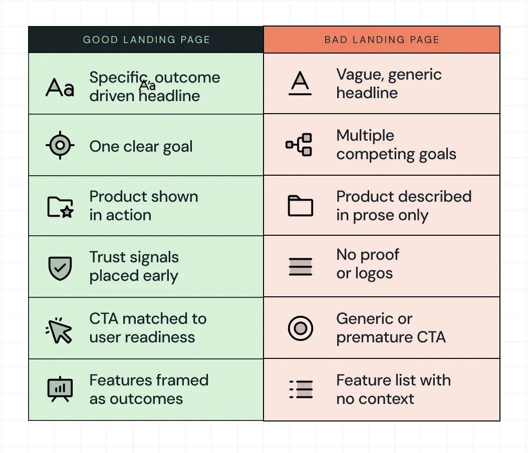
For example:
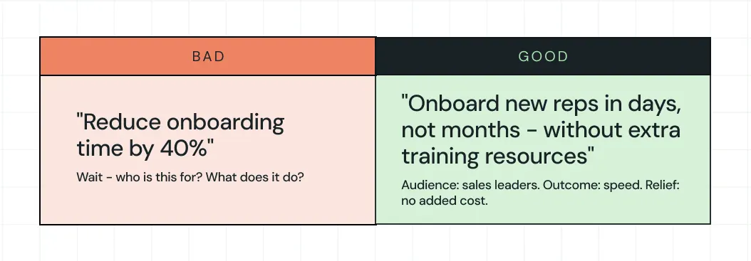
As you can see, the bad page makes the user work to understand. The good page makes the decision feel easy. That's the whole game.
How to Know if Your SaaS Landing Page Is Performing
Conversion rate is the metric everyone watches, but it barely tells even half the story. A page can show a strong conversion rate while generating leads your sales team can't close, and that's a problem just as real as low traffic.
The fuller picture comes from four signals:
- Raw conversion rate: How many visitors take the primary action. The median conversion rate for SaaS landing pages is 3.8%, and to break into the top 25% requires reaching 11.6% or higher, according to Unbounce's analysis.
- Lead quality: Are the people converting the ones your sales team wants to talk to?
- Drop-off patterns: Scroll depth and click maps show exactly where users lose interest, pointing directly to where the messaging breaks down.
- Sales feedback: If leads convert on the page but don't close, the landing page made a promise that the product or the sales conversation couldn't keep. This misalignment lives in the messaging, not the pipeline.
The goal isn't a page that converts at any cost. It's a page that attracts the right people, sets accurate expectations, and hands a qualified, informed lead to the next stage of the funnel.
How ThunderClap Approaches Landing Pages Differently
ThunderClap's approach starts upstream of the page itself. Before any copy is written or any layout is designed, the question is: What decision is this user trying to make, and what's standing in their way?
This thinking translates into how we build every landing page. We treat every page as a core growth level, rather than an isolated asset.
Our process combines creative direction with conversion thinking. It starts with mood boards that define the brand’s personality, then moves into scalable design systems that keep the experience consistent as the product evolves. From there, the page comes to life through custom illustrations, bold yet clean layouts, and storytelling that builds trust at the right moments.
This approach avoids surface-level fixes. It builds pages that stay effective as the business grows.
What you get is simple. Design that reflects your product, systems that scale with you, and decisions grounded in real SaaS and fintech experience.
In fact, we’ve optimized and redesigned 129+ B2B websites like Amazon, Storylane, Factors, roommaster, Zamp, Dropit, and ClearlyRated. Across these projects, the focus stays the same: build landing page experiences that drive real action.
{{ctaBlock}}
FAQs
1. What are the key elements of a high-converting landing page?
A high-converting landing page leads with a clear, specific headline that defines the audience and the value. It backs that up with social proof, a product visual that shows the tool in action, copy focused on outcomes rather than features, and a CTA that matches how ready the visitor actually is to commit.
2. What's the difference between a landing page and a homepage?
A homepage introduces your whole company, invites exploration and serves multiple audiences and goals at once. A landing page guides a specific visitor toward a specific action. Every design decision on a landing page should serve that single goal, and everything that doesn't should be removed.
3. How do I design a landing page for lead generation?
Start with the one belief your visitor needs to hold before they'll give you their contact information. Then, build the page to create that belief, such as a clear value statement, relevant social proof, a low-friction form, and a CTA that makes the trade feel worthwhile. The simpler the ask, the more leads you collect.
4. How can I test if my landing page is effective?
Look at the conversion rate as your baseline, but go deeper:
- Check drop-off points to find where interest fades
- Review lead quality to see if the right people are converting
- Talk to your sales team about what those leads actually say when they arrive
Those three signals together tell you far more than a conversion number alone.
5. What makes a SaaS landing page convert?
A SaaS landing page converts when it removes uncertainty fast. Clear value in the headline, relevant product context, early trust signals, and a CTA that matches intent work together. The smoother the understanding, the easier the decision becomes.
6. How should a SaaS landing page be structured?
A strong SaaS landing page follows a simple flow. It starts with clarity in the headline, builds understanding through visuals, adds trust through proof, and ends with a focused CTA. Each section should remove one specific layer of hesitation.
7. How many sections should a SaaS landing page have?
Most SaaS landing pages work best with 5 to 8 focused sections. Enough to explain value, build trust, and guide action without overwhelming the reader. More sections can work if each one has a clear, distinct job.
8. What is the best CTA for a SaaS landing page?
The best CTA matches user intent at that moment. Early visitors respond to “See how it works,” while high-intent users prefer “Start free trial” or “Talk to sales.” Strong CTAs feel like the next logical step, not a demand.
Should you hire one partner for website design and maintenance, or two?
Many teams separate the two because they appear to be different kinds of work. Website design shapes how a site looks and feels. Maintenance keeps it stable and functional.
In practice, website maintenance goes beyond basic upkeep. It includes reviewing site structure, improving performance, cleaning up CMS logic, maintaining layout consistency, and making sure new pages don't break the design system. That means it often includes both design-led and technical work.
When you see maintenance this way, the decision changes. You're not choosing between creative and technical specialists; you're choosing between one team that handles both, or two teams coordinating around it. In this guide, we discuss both models to help you decide based on how you define maintenance and how often your site changes.
But, What Does Website Maintenance Actually Include?
Don't let the word confuse you. Maintaining a website isn't about bug fixes and security patches. Here's what real website maintenance includes:
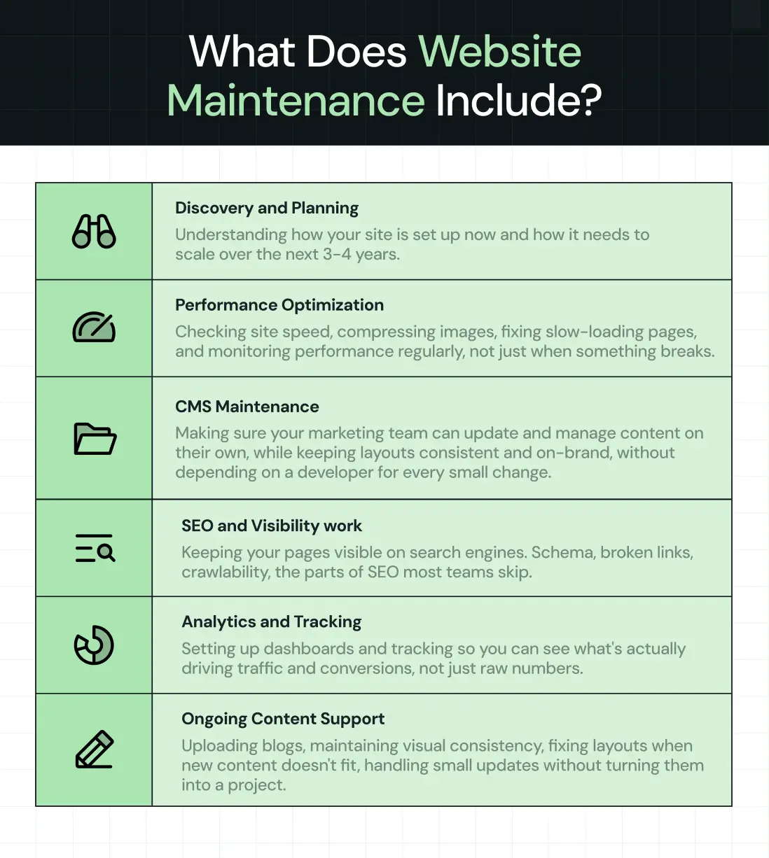
- Discovery and planning: Understanding how your site is set up now and how it needs to scale over the next 3-4 years.
- Performance optimization: Checking site speed, compressing images, fixing slow-loading pages, and monitoring performance regularly, not just when something breaks.
- CMS maintenance: Making sure your marketing team can update and manage content on their own, while keeping layouts consistent and on-brand, without depending on a developer for every small change.
- SEO and visibility work: Keeping your pages visible on search engines. Schema, broken links, crawlability, the parts of SEO most teams skip.
- Analytics and tracking: Setting up dashboards and tracking so you can see what's actually driving traffic and conversions, not just raw numbers.
- Ongoing content support: Uploading blogs, maintaining visual consistency, fixing layouts when new content doesn't fit, handling small updates without turning them into a project.
When Should You Choose One Partner for Website Design and Maintenance
Choosing one partner for website design and maintenance services makes sense if:
1. Your website changes frequently
A single partner managing your website end-to-end means they know your product inside out. This rules out the chance of "why was this built this way?" questions before every update. Since they know the reasoning behind every design, messaging, and conversion decision, things get shipped faster with less chance of breaking.
Case in Point: After revamping the website for Z47, one of India's top VCs backing companies like Ola and Razorpay, we handled ongoing page updates and new additions. Because we built the site, there was no learning curve.
They sent content, we turned around UI design in two days, got approval, and shipped dev in another two with feedback built in. Even UI assets like graphics and visuals moved just as quickly because the design system was set. We just needed direction. No re-onboarding calls or "why should we do this?" discussions.
Here’s a LinkedIn post from Ayush Barnwal, Partner and Head of Design at ThunderClap, about results we delivered for Z47 post revamp:
2. You're planning for growth, not just maintaining what’s there
When the same team handles development and maintenance, it's not a one-time project for them. They make decisions with future growth in mind.
ThunderClap's WebFlow development associate, Jazz Michael, confirms this:
"We ask how they see themselves in the next three or four years, so we develop and maintain the site in such a way that it's very scalable and future-proof."
Case in Point: Unbound came to us for maintenance with five separate sites, one main site, and four event pages. Their team needed two people just to manage updates. We spotted the real issue: the structure itself wasn't built to scale.
We consolidated everything into one site, cutting hosting costs and reducing their internal workload. That kind of structural decision only happens when maintenance is focused on growth rather than just keeping the site running.
3. You need maintenance that drives results, not just fixes issues
Website maintenance that actually moves the needle isn't about patching bugs or updating content. It's about making changes that improve performance, conversions, traffic, and user behavior. When one team owns both design and development, strategic decisions that require both design thinking and technical execution happen without coordination overhead.
Case in Point: roommaster needed forms updated across 30+ pages to track user behavior and improve conversions. Because we handled both sides, we repositioned forms from separate pages to in-page pop-ups (design decision) and set up page-level tracking in their CRM (technical implementation).
The site saw an 80% increase in demo requests and organic traffic. That kind of change happens fast when the team knows the reasoning behind the work, not just what needs to be done.
Here’s a LinkedIn post from Ayush Barnwal, Partner and Head of Design at ThunderClap, where he breaks down roommaster’s website revamp strategy:
4. You want clear ownership and accountability
One team takes complete ownership. There's no "is this a dev or design issue?" discussion. They see the problem, own it, and work to resolve it as fast as possible. With two vendors, this level of clarity is nearly impossible and usually involves a lot of blame game that slows everything down.
For instance, here’s how Aditi Sharma, Director at Zluri, describes working with us:
“ThunderClap team is a delight to work with! They don't feel like vendors but an extension of our team itself. The work quality is top-notch and all deliverables are completed within time.”
Case in Point: After their revamp, we handle ongoing design and development requests for ClearlyRated, including landing pages, reports, guides, and templates. Since the site and design system were built during the revamp, new work doesn’t need much ramp-up.
This means even if the designer working on a request isn’t available the next day, someone else on the team can pick it up and complete it. The design system is documented well enough that they can continue exactly where the other person left off. That continuity only works when the same team owns both design and development.
{{specficBlog}}
When Should You Choose Two Partners for Website Design and Maintenance
Choosing two partners for website design and maintenance services makes sense if:
1. Your website doesn't require ongoing design updates
You can outsource website maintenance to a different vendor if your website only requires occasional updates with minimal to no design changes. Changes of this sort include quarterly content refreshes, security audits and checks, minor bug fixes, or annual compliance updates. Since these are largely dev-led and don’t require deep product context, most teams can handle them.
But most B2B sites don't work this way. They need regular content updates, new pages, layout adjustments, the kind of work that touches design even when it seems purely technical.
A separate maintenance team can still run things if the web design agency provides a proper handoff: CMS walkthroughs, documented components, field notes, and basic version control. If that’s missing, the new team ends up reverse-engineering design decisions every single time they touch the site.
2. You have an internal project manager
With someone to coordinate between teams, outsourcing website design and maintenance to different partners can work. This person serves as the middle layer, passing context between teams, managing timelines, translating design intent into technical requirements, and ensuring nothing gets lost in handoffs.
The project manager needs to understand both design and development well enough to ask the right questions and catch misalignments early. Without that, updates stall and even simple changes stretch from days into weeks. The maintenance team waits for design clarification while the design team waits for technical feedback.
3. Budget is a concern for you
If the budget's tight, it makes sense to hire a premium design partner to build the site, then shift to a lower-cost maintenance team after launch. It lightens the load financially, especially if updates are occasional.
But this only works if the handoff is solid with clear design documentation, component guidelines, and walkthrough videos. Without that, the maintenance team is left guessing. Anything beyond basic edits slows down. Small changes start breaking consistency. Design work gets avoided because no one wants to “mess it up.”
What feels like savings upfront can quietly turn into rework, fixes, and patch jobs later, the kind that cost more time and money than you planned for.
How to Choose the Right Website Design and Maintenance Partner
Once you shortlist web design and development agencies based on their expertise and social proof, get on discovery calls with each of them. During the calls, ask the following questions to understand if they're just vendors or strategic partners that work as an extension of your team, not just until the website goes live, but beyond that as well.
1. What does their maintenance actually include?
Don't just ask if they do maintenance, ask what's in it. Real maintenance goes beyond bug fixes and security patches. It should include performance monitoring, CRO optimization, analytics dashboards, SEO implementation, and ongoing optimization.
Ask them to break down what happens month by month. Are they actively checking site speed? Setting up conversion tracking? Building dashboards so you can see what's actually working? Compressing images and cleaning up backend structure? Or are they just waiting for you to report problems?
If their answer is vague or focuses only on "keeping things running," that's upkeep, not maintenance. Look for website maintenance agencies that actively improve your site over time, not just maintain its current state. The difference shows up in results; one keeps your site stable, the other makes it perform better.
2. Do they think strategically or just execute?
Most agencies do what you ask. Better ones pause to question whether it’s the right move first.
One way to gauge this is through how they respond to your requests. For example, when you describe a feature, page, or change you want made, pay attention to the questions they ask. Do they ask why you need it? Do they try to understand the problem behind the request? Or do they simply move straight to execution?
You can also ask about situations where they’ve pushed back on a client request. What was the context? What alternative did they suggest? Their answer usually reveals whether they think beyond deliverables.
It helps to test long-term thinking too. Do they ask where your site needs to be in the next 3–4 years? Do they consider scalability early, or only solve for what’s in front of them?
If they're not asking these questions during discovery, they're treating your site like a task list, not a growth engine. Strategic partners help you avoid expensive rebuilds by thinking ahead.
3. What's their operational setup?
Good maintenance agencies have clear workflows and processes. They offer everything to ensure seamless collaboration. This includes:
- Dedicated point of contact - One person assigned to your account, not getting passed around.
- Shared task tracker - You can see what's being worked on in real-time without emailing for updates.
- Regular syncs - Weekly or bi-weekly calls, even when there's no active work, so nothing goes silent.

For example, at ThunderClap, we begin the maintenance process by getting on onboarding calls to understand the current setup, then set up dedicated task boards for both teams to access, schedule weekly sync calls, and run internal QA before the client sees anything.
If the agency can't clearly explain how you'll work together day to day, coordination will be messy.
{{specficService}}
4. What kind of results have they driven for past clients?
Ask for a rundown of maintenance projects where they've driven strategic results. If their maintenance work is limited to "uploaded 5 blogs" and "fixed broken link," that tells you something.
Look for specific details that move the conversion needle, like building custom dashboards, optimizing conversion flows, restructuring sites for better scalability, and implementing tracking systems. The kind of work that shows they're thinking about growth, not just keeping the lights on.
For example, a specific result we recently achieved for roommaster was introducing a custom integration not natively supported by HubSpot during their migration from Salesforce to HubSpot, like auto-selecting country fields based on IP address and adding custom form logic to improve data accuracy and user experience.
Finding the Right Website Design and Maintenance Partner
Whether you choose one partner or two, one thing is non-negotiable: find a team that thinks strategically, not just executes tasks.
If your maintenance partner isn't curious enough to ask why you need a change, they'll never think long-term. They'll keep your site running, but they won't make it better. And if your site needs regular updates and strategic improvements, including conversion optimization and performance monitoring, it makes sense to work with the team that designed it. They already know the product, design system, and website strategy behind it.
If you're considering ThunderClap for website design and maintenance services, here's why 88+ B2B brands across SaaS, VC, AI, HR tech, and fintech, including Storylane, Factors, Zamp, FillHQ, and Razorpay, chose us:
1. Proven B2B expertise. We design for the B2B buyer journey, meaning every decision from messaging, website copy, layout, to CTA placement is tied to conversions. We've helped brands reposition for upmarket segments and new geographies.
For instance, Factors came to us when they needed to attract enterprise buyers in the US. We repositioned their messaging, redesigned key conversion paths, and helped them look the part for that audience.
- In-house PMM team + international design talent. We combine strategic product marketing expertise with world-class design standards. Our in-house PMMs ensure messaging clarity while our international designers deliver premium, conversion-focused visuals that stand out in crowded markets.
- 30 days of free post-launch support. To ensure your website achieves the results you wanted, we stay on for a month after launch to make tweaks, optimize for performance, and fine-tune conversions based on real user data.
{{ctaBlock}}
FAQs
1. What is website design and maintenance?
Website design and maintenance covers both building the website and keeping it updated after launch.
This includes UX/UI design, development, CMS setup, and ongoing work like content updates, performance improvements, SEO fixes, and security checks so the site stays relevant and conversion-ready over time.
2. Why is ongoing website maintenance important after launch?
Most B2B websites need regular updates after launch, new pages, content additions, and performance improvements. Behavioral analytics also starts coming in, showing what’s working and what’s not. That’s what guides future changes, so tracking and refining the site becomes essential.
3. Can the same agency handle both website design and maintenance?
Yes, and it’s often the most efficient option. The same team already understands the design system, site structure, and product context, so there’s no second-guessing why something was designed a certain way. This way, they can focus on improving performance and conversions, not just handling upkeep.
4. Does a Webflow website require maintenance?
Yes. Webflow websites still require maintenance. While the platform reduces heavy development work, you still need to keep the site functional and growth-ready by updating the CMS, improving SEO, monitoring performance, integrating with other systems, and making design tweaks. Many businesses bundle website design, hosting, and maintenance with a single partner to simplify ownership and ongoing updates.
5. Is website maintenance only technical work?
No. Website maintenance goes beyond technical upkeep. It includes design updates, CRO improvements, content expansion, analytics tracking, UX enhancements, and SEO work, especially for B2B websites that evolve as the business grows.
6. In-house vs outsourced website design and maintenance: Which is better?
It depends on scale and internal bandwidth. In-house teams work well when updates are frequent and closely tied to product or marketing. Outsourced website design and maintenance services make more sense when you need specialized design, development, and CRO expertise without building a full internal team. Many companies also run a hybrid setup, internal teams handling day-to-day updates while external partners support larger initiatives.
7. What is website design and maintenance?
Website design and maintenance is the process of building a website and keeping it updated after launch. It typically includes UI/UX design, CMS setup, content updates, CRO and SEO improvements, and performance tracking to ensure the website stays optimized for performance and conversions.
8. How much do agencies charge for website design and maintenance?
Agencies usually charge $10,000–$20,000 per website design. Ongoing maintenance is often billed hourly, starting at around $50 per hour. Pricing still varies based on requirements, CMS setup, integrations, and content needs.
Positioning a B2B product was much easier a decade ago. Competition was sparse, and categories were clear. If you had a decent product, you could carve out space just by showing up.
Take Jira. When it launched in 2002 as "issue tracking for developers," the field was wide open. A few competitors, simple choices.Fast forward to 2026, and Jira competes with Monday, Asana, ClickUp, Linear, and hundreds of project management tools that all claim to do the same thing.
In 2026, B2B brand positioning is like walking a tightrope.
Lean too far left, and you blend in with your competitors: "AI-powered platform for modern teams" could be anyone. Lean too far right, and you create a category so unique that buyers don't even know to search for it.
One drowns you in the sea of sameness. The other leaves you to die alone. That's why knowing how to position your brand in the competitive B2B space matters more than ever.
In this guide, we'll walk you through Thunderclap's IMPACT B2B Brand Positioning Framework, a 6-step framework that has helped B2B brands like Amazon, Factors, Skyroot, and Z47 cut through the noise and create positioning that's clear, compelling, and actually wins deals.
But before that let’s address some basics.
What Is The Difference Between B2B And B2C Brand Positioning?
The difference lies in decision-making and buying cycles. B2C positioning targets individual consumers with emotional triggers and faster decisions. B2B positioning addresses multiple stakeholders, longer evaluation periods, and risk-aware buyers.
But there's a deeper distinction. And Erin Miska, B2B positioning expert and founder of Erin Miska Consulting, puts it perfectly:
"In B2C, brand often is the product. People are buying identity, emotion, belonging, vibe. In B2B, brand is a trust accelerator. It gets you taken seriously. It amplifies a well-positioned value proposition. But if you invest in brand before you have a crisp audience and value prop, you're just amplifying a fuzzy story."
In B2B, brand doesn't replace clarity, it depends on it. That's why having a clear B2B brand positioning matters.
Why B2B Brand Positioning Matters More Than Ever in 2026?
This might ruffle a few feathers, but saying "revolutionize your workflows" had more value in 2005 than in 2026.
One reason is AI. The problem isn't that AI writes bad copy. It's that AI makes it effortless to sound like everyone else. Professional-sounding sentences are now free, which makes them worthless.
But generic website copy is just a symptom. Weak positioning is the real disease. AI doesn't invent vague messaging. It amplifies whatever you feed it.
If your positioning is "we help teams collaborate better," AI will dress it up as "empower your teams to unlock transformative collaboration." Still meaningless, just shinier.
"AI can help you write good copy, but it cannot do the base-level research for you. Your copy is only as good as the information you feed it," says Ayush Barnwal, ThunderClap's Partner and Head of Design.
The companies standing out in 2026 aren't using better AI prompts. They have sharper, more specific positioning that AI can't replicate, only amplify. When your positioning is clear, who you serve, what you do, and why it matters, AI becomes a tool. But when your positioning is vague, AI just helps you blend in faster.
How To Position Your Brand In The Competitive B2B Space in 6 Steps: The IMPACT Framework
Here’s the 6-step IMPACT framework we use to craft positioning, backed by real B2B brand positioning examples from our clients. IMPACT stands for Identify, Map, Pick, Analyze, Craft, and Test.
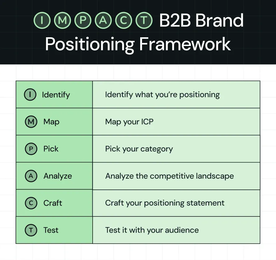
Step 1: Identify What You're Positioning
This might seem obvious, but it's the most overlooked step, especially for companies with multiple products. They jump straight to writing positioning statements without asking: Are we positioning the company? One lead product? A suite?
How to figure out the right b2b brand positioning strategy?
If you have a single product, your company positioning matches your product positioning.
Example: Slack before the Salesforce acquisition is a good example. Slack, the product, was Slack the company.
If you have multiple products, you have two ways to approach this:
1. Lead Product Strategy: Pick one product to lead with. Everything else becomes a cross-sell.
Example: Atlassian does this from the start. Their homepage focuses entirely on Jira, their issue tracking software. They have Confluence and Trello, but those stay in the background. Jira brings most customers in. Once teams use it, Atlassian cross-sells the other products, though each product can be purchased independently.
2. Umbrella Strategy: Position your company around one big idea that ties all your products together.
Example: We helped InnQuest, a property management system (PMS) software, on this. After 30 years with multiple product brands, they rebranded to roommaster with a new website design and positioning.
They maintained separate positioning for booking software, channel management, and payments. The rebrand brought them under a single umbrella: an integrated hospitality platform.
Step 2: Map Your ICP
This doesn't mean firmographic details like company size, industry, or geography.
Here's what he means. A B2B SaaS company with 100 employees might fit your target profile on paper. But if they don't have the specific workflow problem you solve, they won't buy.
Companies buy based on the work they need to get done, not their company size. Firmographics tell you who exists, but use cases and categories tell you who's actually ready to buy.
How to define your ICP?
Here are two ways to define your ICP:
- Based on use-case: Start with the workflow your product solves. Then find who does that workflow most often.
Example: Calendly's use case is "schedule meetings without back-and-forth emails." It is mainly used by sales teams, recruiters, customer success managers, consultants, and account executives. The use case tells you exactly who needs it.
In this case, the firmographics alone would say "B2B companies, 50-500 employees." But therapists and university advisors schedule meetings too. This approach helps you find people firmographics would never find.
- Based on category: Start with the category buyers already shop for.
Example: When we revamped Rezolv's website, the category was clear: debt collection software. Banks already knew they needed tech to manage debt recovery.
Rezolv didn't have to explain the category. They just had to position their 7-product stack as better than the legacy solutions banks were using.
The category (debt collection tech) told banks what Rezolv was, while their positioning told them why to pick Rezolv. This is one of many b2b brand positioning examples where starting with category clarity accelerated the entire positioning process.
Step 3: Pick Your Category
Once you know your ICP, the next question is: what category do they already think in?
In other words, this is where you choose your battleground. Your category isn't just a label. It's the mental box buyers put you in when they're evaluating solutions. Pick the wrong box, and you're either invisible or fighting the wrong fight.
And here's the thing: your ICP directly determines your category choice. If you know who you serve and what workflow they're trying to solve, the category becomes obvious.
How to pick your category?
Here are two ways to choose your category, according to Anthony Pierri:
- Anchor to an Existing Tool: Position your product in a category buyers already shop for.
Example: Notion positions itself as a "workspace tool." They don't invent a new category. They anchor to where buyers already look and say: we combine docs, wikis, and project management in one place.
.webp)
- Anchor to an Existing Task/Workflow: Position around what buyers are already trying to do.
Example: When ThunderClap worked with Tagalys to revamp their website, their ICP was clear: Fashion & Lifestyle ecommerce brands.
But the category wasn't about the tool; it was about the workflow. Tagalys anchors to what their buyers are already trying to do: improve product discovery and merchandising on their online stores.
Note: Tool-based categories are easier to explain, but you face direct competition and price pressure. On the other hand, workflow-based categories have less competition but require more buyer education and longer sales cycles.
{{specficService}}
Step 4: Analyze Your Competitive Landscape
Once you choose your battleground, it's important to know its top players, what they do, how they do it, and why they do it.
This isn't about obsessing over them, but understanding them. Yi Lin Pei, product marketing coach and founder of Courageous Careers, actually equates "competitive intelligence to knowing yourself."
It's about finding white space to sharpen your differentiation and find a winning positioning.
Most companies skip this step or do it half-heartedly. They glance at a few competitor homepages, maybe check their pricing, and call it done.
That's not competitive analysis.
How to analyze your competitive landscape?
Once you know who your competitors are, dig into what they're actually saying and what their customers think. Look at their websites and review platforms such as G2, Capterra, and Trustpilot.
The questions you're trying to answer:
- What story are they telling? What value do they promise?
- What features and benefits do they highlight?
- What do their customers love?
- What do their customers complain about?
Example: When we revamped Factors.ai's website and brand identity, we used ThunderClap's Competitor Analysis Framework to analyze competitors such as 6sense, Demandbase, and Dreamdata.
And here's what we found: Most platforms position themselves as enterprise ABM solutions. While customers praised their capabilities, they weren't happy about the ease of use and pricing.
That gap became our design anchor while designing their website, from the social proof marquee to product animations, positioning Factors as a faster, reliable alternative for mid-market B2B teams.
Pro Tip: The "Recurring Complaints" in competitor reviews are gold. That's where you find what the market wants but isn't getting. Own that gap, and you own the positioning.
Step 5: Craft Your Positioning Statement
Now that you know your ICP, category, and competitive gaps, it's time to distill everything into one clear positioning statement.
This statement forms the foundation for every marketing decision you make. It tells you who you are, why you matter to your audience, and keeps you from sliding into vague territory.
At ThunderClap, we use the Onlyness Statement framework from Marty Neumeier to build positioning statements with our clients. It forces you to get specific across six dimensions: what, how, who, where, why, and when.
How to build your positioning statement?
The Onlyness Statement breaks down like this:
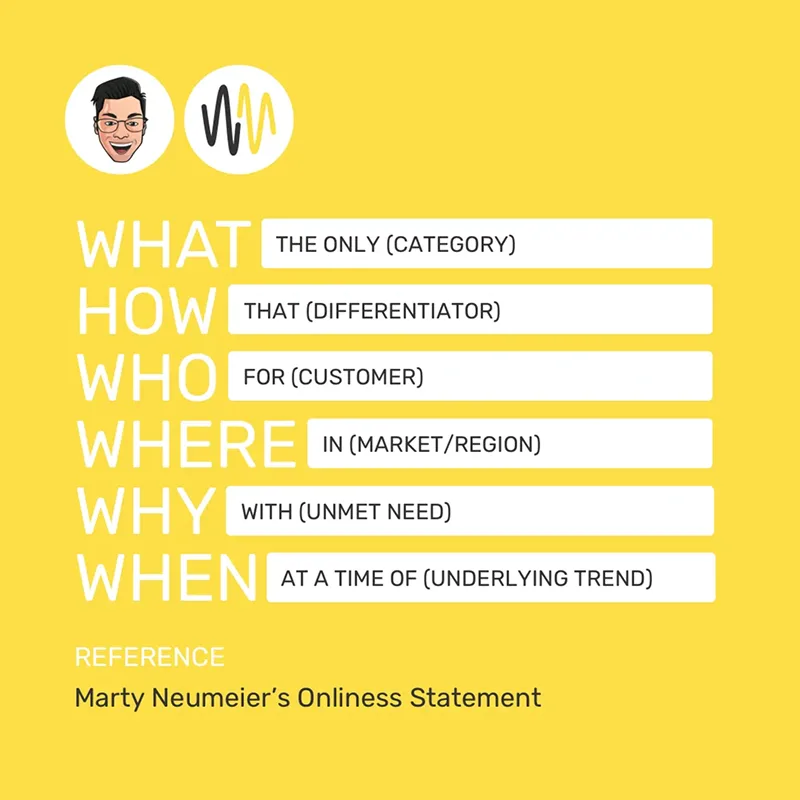
- WHAT: The only [category]
- HOW: That [unique capability or approach]
- WHO: For [specific ICP]
- WHERE: In [geography, if relevant]
- WHY: Who wants to [specific outcome or goal]
- WHEN: At a time when [market context or pain point]
Example: When we helped Deductive.ai craft their positioning statement as part of their website revamp:
- WHAT: The only AI-powered root-cause analysis tool for software teams
- HOW: That connects to your codebase and telemetry to automatically search and reason about production incidents
- WHO: For CTOs and VPs of Engineering at tech companies with 500-1000 employees
- WHERE: Running cloud-native infrastructure
- WHY: Who wants to eliminate hours spent debugging and root-causing incidents
- WHEN: At a time when 90% of software operates in the dark without observability
This positioning statement guided everything from their homepage hero to their landing page design and product animations, helping them achieve 10x more engagement after launch.
This is a strong b2b brand positioning example of how the Onlyness Statement translates abstract product capabilities into clear buyer value.
{{specficBlog}}
Step 6: Test Your Positioning
This is where you decide whether you want positioning that sits well in a Google Doc or one that actually accelerates market differentiation and improves brand recall.
Refining your b2b website strategy without testing your positioning is like launching a product without talking to customers. You might think it's clear, but your buyers might be confused.
How to test your positioning?
Run your positioning by 5-10 people from your ICP. Show them the positioning statement and your current website (in case you are revamping), and ask these questions:
- What type of company is this product for?
- What specific problem does it solve?
- Why would you choose this over alternatives?
- What questions do you still have?
This will help you identify reasons why your current website or positioning doesn't resonate with your ICP.
If 7 out of 10 people correctly identify your ICP, problem, and differentiator, your positioning works. If they're confused or give different answers, you need to revise.
Example: When building ThunderClap's positioning, we found most agencies sell aesthetics, not impact. We tested our positioning with marketing leaders who immediately understood our focus on ROI over design.
That validation allowed us to implement it across our website and landing page.
Pro Tip: If multiple people ask the same question or misunderstand the same thing, that's your signal to clarify before moving forward.
Looking for a B2B brand positioning agency to help you stand out?
The companies winning in b2b tech brand positioning aren't the ones with better products. They're the ones who can explain what they do in 3 seconds, stand out in a crowded market, and give buyers clarity instead of confusion.
At ThunderClap, we've worked with 140+ B2B brands across SaaS, Fintech, AI, and VC to build positioning that accelerates market differentiation. From Storylane, roommaster, and Factors.ai to Deductive.ai and Skyroot, we've helped companies translate complex products into clear, compelling positioning that drives results.
We bring the frameworks, the competitive analysis, and the execution speed that internal teams lack. What takes you 6 months of internal debate, we compress into 8-12 weeks of focused execution.
Our approach is simple: dedicated project managers, usually founders or senior account managers, handle everything from positioning strategy to website launch. No handoffs, no translation loss.
And because we've mapped the competitive landscape across SaaS, Fintech, AI, and VC, we know how to position you for differentiation without costly missteps.
{{ctaBlock}}
FAQs
1. What is B2B brand positioning and why does it matter?
B2B brand positioning defines the space you occupy in your buyers’ minds and explains why they should choose you over alternatives. As buying journeys get more complex, competition increases, and sales cycles grow longer, strong positioning becomes the primary driver of market differentiation in crowded B2B markets.
2. What is the difference between B2B and B2C brand positioning?
The difference lies in decision-making and buying cycles. B2B positioning targets multiple stakeholders, longer evaluation periods, and risk-aware buyers. B2C positioning focuses on individual consumers, faster decisions, and emotional triggers. In B2B, clarity and relevance matter more than novelty.
3. How do you position your brand in a competitive B2B space?
Start by identifying what you’re positioning: a single product, a lead product, or a portfolio. Map your ICP based on workflows and buying context, not firmographics. Pick a category your buyers already understand. Analyze competitors to find gaps. Craft a clear positioning statement, then test it with real buyers.
4. How does B2B tech brand positioning differ from other industries?
B2B tech buyers prioritize ease of use, internal buy-in, integrations, and scalability. Instead of differentiating on features alone, effective tech positioning focuses on how a specific workflow is solved for a defined audience and on the measurable impact on efficiency, adoption, and ROI.
5. What are some good B2B brand positioning examples?
- Factors is clear about who it serves: mid-market B2B revenue teams that want account intelligence without enterprise complexity.
- Storylane keeps its positioning tight by focusing on one thing buyers care about: seeing the product before talking to sales.
- Deductive speaks directly to engineering leaders frustrated by time lost debugging incidents.
- Skyroot avoids abstract innovation talk and positions around dependable access to space.
- Notion makes its value obvious by framing itself as a single workspace replacing scattered tools.
They work because buyers don’t have to decode the message. The positioning is clear, specific, and easy to place in a known category.
Why Partnering with a B2B Brand Positioning Agency Accelerates Market Differentiation
Let's play a game. Open 3 of your competitors' websites right now.
(Seriously, we’ll wait.)
Now answer this: What makes you different from them?
If you can't answer in 3 seconds, or you resort to generic lines like "we're AI-powered" or "we help salespeople sell more," you have a positioning problem.
At Thunderclap, we test this constantly with our brand identity test: remove logos from 5 competitor sites, ask people to identify which is which. They fail 80% of the time.
The B2B sameness problem is real, and it's more than a design issue. Take fintech, the number of corporate blue websites with identical templates and jargon-heavy messaging will blow your mind.
Every B2B marketer knows this is a problem. But fixing it internally? That's where most companies get stuck. Most teams lack the frameworks, competitive intelligence, and buyer psychology data that B2B brand strategy services bring to the table.
That's when a B2B brand positioning agency can help. In this article, we explain how partnering with positioning agencies accelerates market differentiation and how to find the best positioning partners.
Why Partnering With A B2B Brand Positioning Agency Accelerates Differentiation?
Here are four reasons why teams choose to outsource positioning to a B2B brand positioning agency, based on real B2B brand positioning examples.
1. Turn Product Talk Into Buyer Clarity
Most B2B marketers know their product inside out and are convinced that their messaging is clear. But that intimacy creates blind spots because you assume buyers understand your value the same way you do.
Diane Wiredu, founder and messaging strategist at Lion Words, captures this perfectly: "There's a huge disconnect between what B2B companies think they're communicating and what their audience actually understands."
How a B2B Brand Positioning Agency Helps:
A B2B brand positioning agency is like an editor who knows what to cut and what to keep. They help you avoid common mistakes in B2B brand positioning, like feature-dumping or using jargon buyers don't understand. They do this with two things your internal team probably doesn't have:
- Objectivity: Agencies bring an external perspective to your product. Positioning agencies ruthlessly question your jargon and help you find what buyers actually care about, the results or impact.
For example, when you say "AI-powered analytics platform," they'll ask, "But why should your buyers care?" This helps you translate features into outcomes that actually make buyers tick.
- Buyer Psychology Data: Design agencies with proven B2B positioning experience know which positioning angles consistently convert and which ones just sound impressive to internal stakeholders.
After working across dozens of B2B brands from your industry, they've developed pattern recognition that internal teams simply don't have. They've seen which differentiation strategies actually drive the pipeline and which ones fall flat with buyers, even when they look great on paper.
Case in Point:
When ClearlyRated approached us for a website revamp, fixing their messaging wasn't their priority. But our audit revealed the real issue: their product pages explained what the platform did without making it clear why it mattered to buyers.
We rewrote the website copy to lead with business impact for each ICP. Post-launch, they witnessed a 101% increase in active users, 82% increase in total views, and 14% increase in organic clicks. The positioning clarity they didn't know they needed became their biggest lever.
Here’s a LinkedIn post from Ayush Barnwal, Partner and Head of Design at ThunderClap, walking through the design and messaging decisions behind the revamp.
2. Help internal teams move from debate to clear direction
B2B product marketers, this might be too familiar.
According to Anthony Pierri, product marketing expert and co-founder of Fletch PMM, the primary reason most positioning projects fail is weak leadership. “Positioning strategy is almost never a consensus-building exercise. To make a choice requires saying no to things that many team members want”, he adds.
When each stakeholder has a different view of what makes the company unique, you end up with watered-down messaging that pleases internal teams but means nothing to buyers.
How a B2B Positioning Agency Helps:
Positioning agencies have broken this decision gridlock countless times already. They know how to push decisions forward without endless debate. They do this by:
- Using Data to Ground Decisions: Agencies don't rely on personal preferences. If your founder believes the homepage messaging is strong but analytics show a 65% bounce rate on the hero section, they dig into it to understand why. This way, each decision is based on evidence rather than internal assumptions.
- Experience-backed Judgment: When agencies show what has worked or failed for similar companies in their portfolio, it cuts through trial-and-error debates. External validation also means faster executive buy-in than in-house recommendations, where internal politics often slow decision-making.
{{specficBlog}}
Case in Point:
When Karan Mehta and Sonali Jindal (ex-founders of Kissht) reached out to us to design the website for their new fintech venture, Rezolv, they wanted everything about their product on the homepage.
We pushed back. Using data from our other Fintech projects, including Razorpay, we showed them why feature-heavy pages hurt conversions. The key was building conviction in our recommendation with past results, then leading the decision instead of just following what the client said.
Instead of cramming the homepage with features, we focused on the buyer’s core problem and how Rezolv solves it. We then created a dedicated “Why Rezolv” page where interested buyers could dive deeper into the product details.
3. To find differentiation without confusing buyers
According to Yi Lin Pei, product marketing coach and founder of Courageous Careers, "competitive intelligence isn't about knowing your competitors. It's about knowing yourself."
Here's what she means: CI should help you understand how you stack up, what trade-offs buyers are really making, and when you win versus when you lose. It's a mirror that reveals your actual differentiation, not what you hope it is.
Most in-house teams lack the structure to extract this insight. They gather competitor data but never translate it into a clear website strategy that sales and marketing can use.
How a B2B Positioning Agency Helps:
Positioning agencies use structured competitive analysis frameworks to understand where you fit in the market, and what positioning angles are oversaturated. They do this by:
- Differentiating Without Confusion: Agencies know the thin line between standing out and being misunderstood. As Anthony Pierri accurately points out, creating a new category is all fun and games until you realize no one's searching for your product. Agencies find real search demand first, then position you to stand out within that demand, without needing extra explanation.
- Ensuring Brand Consistency Across Touchpoints: Agencies know how to reinforce the same brand experience at every touchpoint. They identify your brand archetype and translate it into a consistent brand personality across your entire website, including homepage, demo pages, product pages, and even web design elements like microcopy.
Case in Point:
When Skyroot, India’s first private rocket launcher, came to ThunderClap, the challenge was simple: stand out in an aerospace category dominated by corporate blue websites and vague “innovation” messaging.
Our competitive analysis showed that Skyroot could stand out as the “bold disruptor” in a space where legacy rocket websites play it safe. We leaned into that and created a futuristic visual identity and messaging that conveyed “new-generation satellite launchers” without losing credibility.
Here’s a peek into their much-talked-about demo page, designed to simulate a real rocket launch experience:
Grab our competitor analysis framework that's helped us position 88+ B2B brands like Factors.ai, Storylane, and RazorPay.
{{specficService}}
4. Launch new websites in weeks, not months
"We knew a website revamp was overdue!" We hear this all the time. It reveals the execution gap problem: positioning decks collect cobwebs while execution drags on for 6-9 months.
Why? Strategy and execution live in different teams, from strategist to designer to copywriter to developer. Each handoff introduces delays and dilutes the positioning. Add competing internal priorities, and by the time you launch, competitors might have already claimed your positioning angle.
How a B2B Positioning Agency Helps:
B2B brand positioning agencies avoid this by owning execution end-to-end through:
- Clear Ownership Throughout the Positioning Project: Good positioning agencies have a dedicated PM who manages everything throughout the project. At ThunderClap, that PM is often a partner or a senior account manager. This ensures nothing gets lost in translation, as the strategist has the expertise to carry decisions from strategy through execution without dilution.
- Tighter Timelines Through Parallel Work: Agencies don't wait for one phase to finish before starting the next. Instead, they run parallel workflows. For example, messaging and wireframes move in parallel, and design starts while copy is being finalized. This compresses timelines from 6-9 months in-house to 4-6 weeks. Missed deadlines hurt their reputation, so execution stays on track.
Case in Point:
When Daryl Pinto, Growth Marketing Manager at Amazon, reached out to build a website and brand identity for Smart Commerce (Amazon's e-commerce website builder for SMBs), the scope was ambitious: brand book, messaging strategy, web pages, and marketing collaterals, all from scratch.
With one PM managing the entire project and parallel workflows, we delivered everything in 8 weeks. No handoffs, no translation loss, no 6-month drag.
So, which of these bottlenecks is slowing you down? If you checked at least one, it’s worth outsourcing your web design and positioning to a leading B2B branding agency.
What To Look For In A B2B Brand Positioning Agency?
Here are four factors you should consider while choosing your B2B brand positioning agency:
1. Process and Expertise
While most agency websites showcase their work, that's just the surface. To really gauge if they're worth their salt, get on discovery calls and ask about their positioning process. A good positioning agency will already have a solid workflow in place with clearly defined phases, fleshed-out frameworks, and deliverables at each step.
Also, ask them to walk you through past positioning projects relevant to your industry. Look at how they arrived at the final positioning angle to see whether they offer options or just impose one on you. Good agencies show 2-3 strategic directions with trade-offs, not one "right answer."
2. Services Included and Scope
Do you need just a positioning strategy, or end-to-end execution through website launch? Different B2B brand strategy services cover different scopes. Most agencies list their services, but it's worth clarifying on discovery calls: what exactly do you get at the end?
Strategy-only agencies deliver a positioning deck and messaging guidelines while you handle implementation. This works if you have an in-house team ready to execute and aren't racing against tight deadlines.
End-to-end partners take you from positioning through website launch, handling strategy, messaging, design, and development under one roof. They also offer faster execution, compared to the 6+ months in-house timeline.
3. Partnership Approach
Before you finalize your deal with a positioning agency, understand if they're order-takers or strategic partners. Order-takers execute your brief without pushback. Strategic partners challenge your assumptions when buyer reality doesn't match your opinions.
They'll always have stories about times when they disagreed with a client's direction. If they don't, they're order-takers.
Here's how ThunderClap's Creative Head, Ragini Ramathan, approaches client feedback:
"We assess what feedback is fair and what might go against what the ICP needs. We state our reasoning and collaborate with the client to come to a conclusion that would best serve the brand. We are on the same team. We want the same win."
Also, watch for agencies promising specific conversion rate improvements. Good agencies focus on what they control, positioning clarity, and messaging. They are honest about what they can't guarantee, like your traffic quality, product-market fit, and pricing.
4. Speed and Accountability
Ask about their typical timelines and collaboration style in advance to set your expectations right. 8-12 weeks is realistic for end-to-end execution from discovery to website launch. Similarly, look for agencies that offer dedicated project managers to ensure clean handoffs, and you're not chasing them for updates.
Also, ask who's leading your project: is it a founder or senior strategist with positioning expertise, or a junior account manager coordinating different teams? The person with strategic expertise should be hands-on throughout, not just "overseeing."
Next Steps: Is Thunderclap The Right Positioning Partner For You?
Positioning isn't something you stumble into. Without structure, competitive landscape analysis, and pattern recognition, you'll just be running in circles.
That's exactly why partnering with a B2B brand positioning agency makes sense. They bring clear workflows, an external perspective, and the pattern recognition that comes from doing this across dozens of companies. They can compress what would take you 6 months of trial-and-error into 12 weeks of focused execution.
At ThunderClap, we've worked with 88+ B2B brands, from early-stage startups to enterprise companies like Factors, Razorpay, Amazon, Deductive AI, and Storylane.
After 140+ website launches across SaaS, Fintech, AI, and VC, we've seen what drives pipeline and what stalls. We know which positioning angles convert and which ones just sound impressive internally.
Our approach is simple: dedicated project managers, usually founders or senior strategists, handle everything from brand discovery to website launch. No handoffs, no translation loss. And because we've already mapped the competitive landscape in your industry, we know how to position you for differentiation without costly missteps.
{{ctaBlock}}
FAQs
1. What is the difference between B2B and B2C brand positioning?
The major difference between B2B and B2C brand positioning lies in what drives buying decisions. B2C brand positioning is largely emotion-driven, while B2B brand positioning must address longer sales cycles and multiple stakeholders. This is why B2B brand strategy services focus heavily on ROI, security, and ease of implementation rather than emotional appeal alone.
2. How do you position your brand in a competitive B2B space?
To position your brand in a competitive B2B space, start by clearly understanding your product and ICP. B2B brand strategy services help bring clarity at this stage. Next, study competitors and identify positioning gaps, as many common mistakes in B2B brand positioning happen when brands skip this step.
Finalize a positioning angle that explains how you solve the buyer’s problem in the clearest way possible. Avoid generic claims or drifting away from the core problem, as this can confuse buyers.
3. How do agencies help B2B companies with digital brand positioning?
B2B brand positioning agencies help B2B companies with digital brand positioning by identifying clear differentiation angles and aligning sales and marketing. They also fix common mistakes in B2B brand positioning, such as inconsistent messaging across digital touchpoints, by translating strategy into clear website narratives, content, and campaigns that build trust.


Interested in seeing what we can do for your website?



.webp)
