


Best B2B Website Designs: What You Should Copy to Increase Conversions

If you have looked at your B2B website recently and thought, “We do not look any better than our competitors,” you are not alone.
The painful truth is that over 70% of B2B buyers complete most of their research before ever contacting your sales team. That makes your website your most important salesperson. Yet, despite countless lists of best B2B website designs, most sites still feel outdated, generic, or unclear about what they actually do.
The gap between high-performing sites and average ones rarely comes down to flashy visuals. It comes down to the best B2B website design practices that respect the buyer journey and make products feel intuitive and credible.
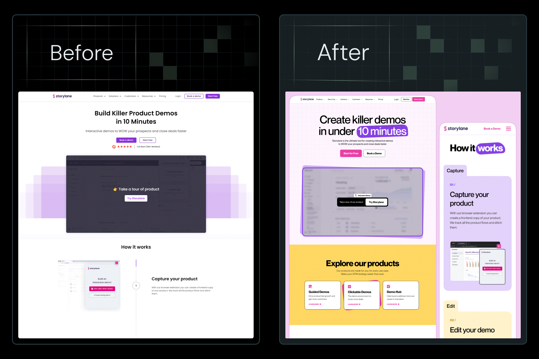
At ThunderClap, we've redesigned over 129 B2B websites for SaaS, fintech, AI, and enterprise tech companies, including Amazon, Razorpay, Storylane, and Factors. Studying everything from the best B2B website design templates to the best website design examples in B2B tech, throughout our work, we've identified clear patterns in what separates websites that drive 50-60% conversion increases from those that quietly drain your pipeline.
In this guide, we’ll break down what the best B2B website designs look like in 2026, analyze 10 standout examples worth learning from, and share a practical framework to audit your own site against the standards used by the best B2B website design agencies in 2025.
TL;DR
- B2B website design in 2026 is shifting from "pretty" to "purposeful". Every design decision should link directly to conversions.
- Median B2B conversion rates sit at 2.9%, but the best-designed websites achieve 5-7% through strategic layout, personalization, and clarity.
- The best B2B website designs of 2026 follow the C.O.N.V.E.R.T. Framework: Clarity, Outcome-focused messaging, Navigation simplicity, Value visibility, Experience consistency, Real social proof, and Testing-driven optimization.
- Most B2B site redesigns fail because they prioritize aesthetics over strategy. Design should support conversion, not ego.
- Website redesigns can deliver 265% ROI for SaaS companies within 10.4 months when executed correctly.
What are the top B2B website design best practices in 2026?
The question "What makes a B2B website design effective?" stops most marketing teams cold because they're measuring the wrong things.
A pretty website doesn't convert. A fast website doesn't convert. Even a website with great content doesn't convert if the design doesn't guide users toward action.
The best B2B website designs are invisible in the best way: they don't make users think. They land, instantly understand your value, and know exactly what to do next.
Here's what separates the best B2B website design practices from wasted pixels:
1. Clarity Over Cleverness
Your headline should answer three questions in 5 seconds: What do you do? Who is it for? Why should I care? If a visitor can't answer all 3 after glancing your hero section, you've already lost them.
Compare these two headlines:
❌ "Solutions that empower modern teams."
✅ "Real-time security monitoring for enterprise SaaS teams. Reduce breach response time from hours to minutes."
The second works because it's specific, benefit-driven, and immediately answers the implied question: "Is this for me?"
2. Outcome-Focused Messaging, Not Feature Lists
Visitors don't care about your 47 features. They care about what changes in their job, their metrics, or their stress levels if they use you.
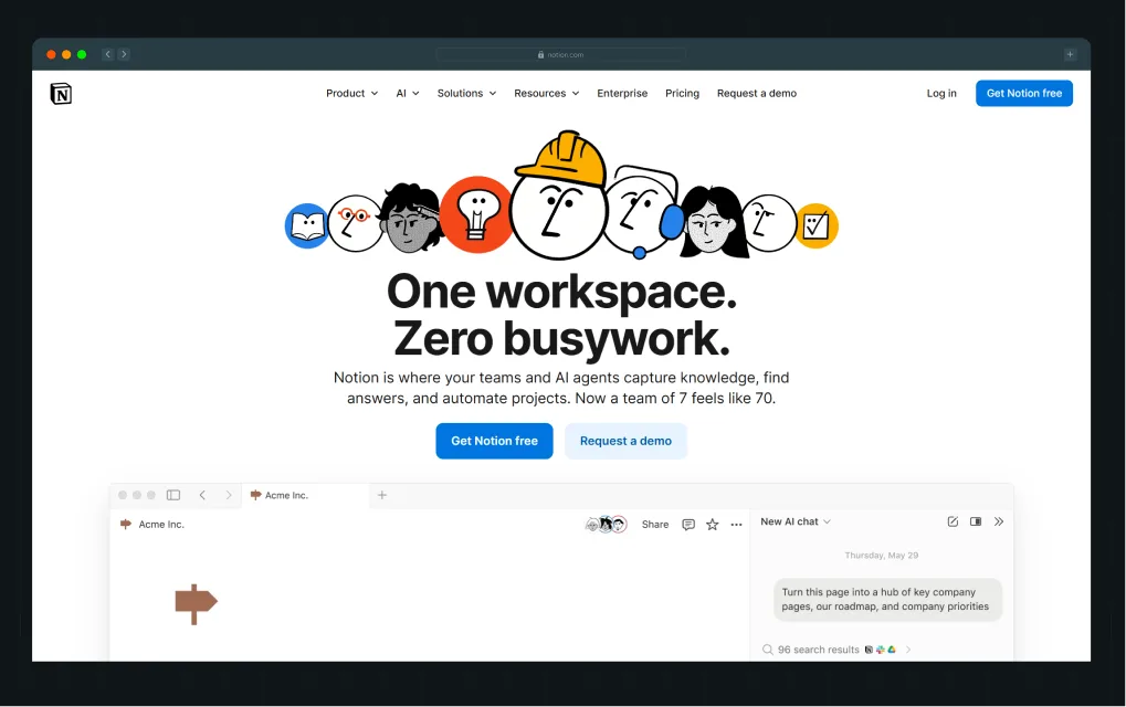
Notion's website, for example, doesn't lead with "Customizable workspace with relational databases." Instead, it shows marketers how to "Stop jumping between apps." That's the outcome. The features come later.
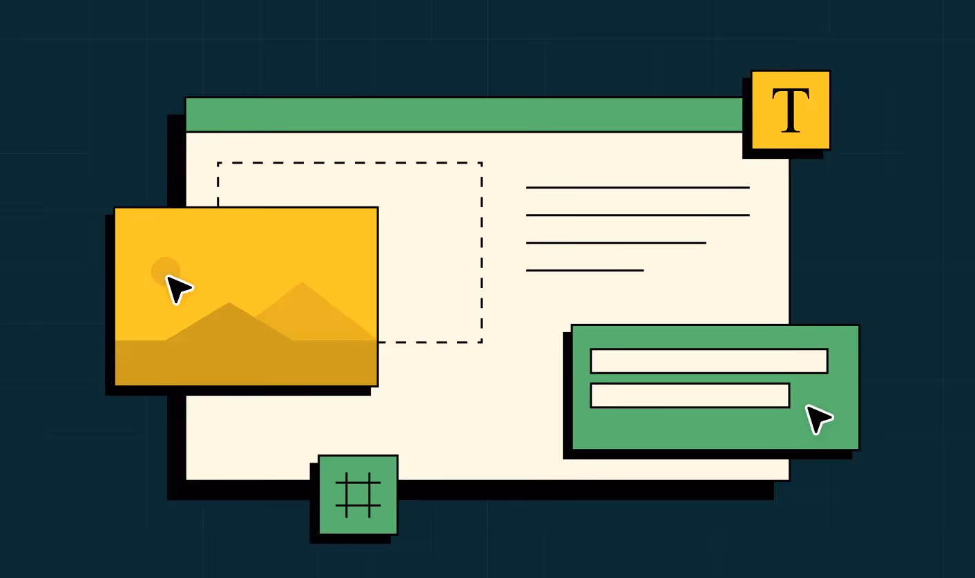
3. Navigation That Respects Intent
In 2026, the best B2B websites assume users know what they want and make it easy to find.
.webp)
Asana's navigation is a masterclass: clean, logical, with only the essential top-level links. If you're a product manager, you find "Solutions" → "Product Management" in two clicks.
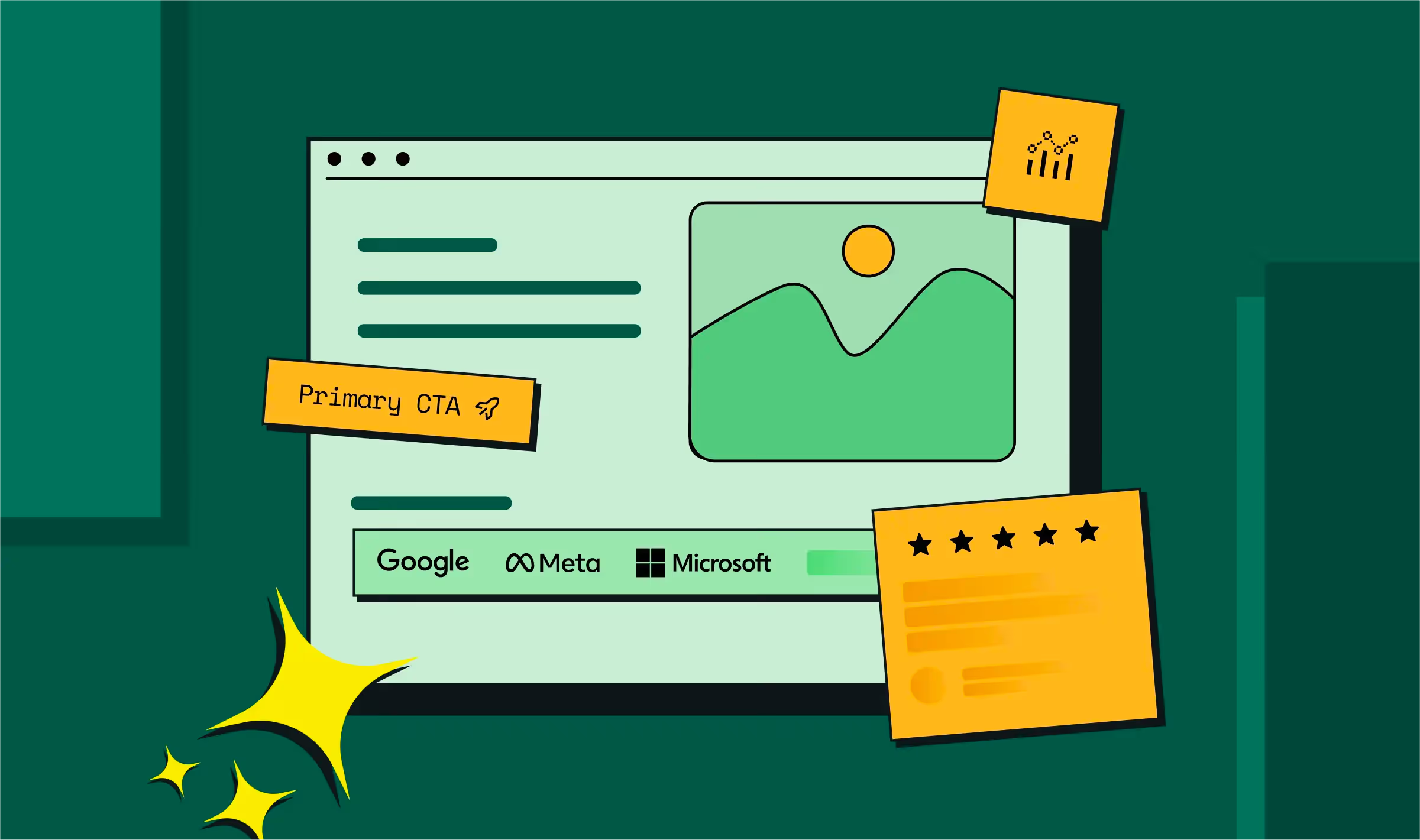
4. Social Proof Distributed Throughout (Not Just In a Testimonials Page)
One client logo on your homepage reassures visitors. But placement of customer logos on relevant service pages, near CTAs, and in case studies builds trust.
Zendesk places client logos not just on the homepage, but on industry-specific pages, product pages, and resource hubs. Repetition builds credibility.
A LinkedIn post by Kiran Kulkarni, Partner & Head of Growth at ThunderClap, shares the B2B website design best practices.
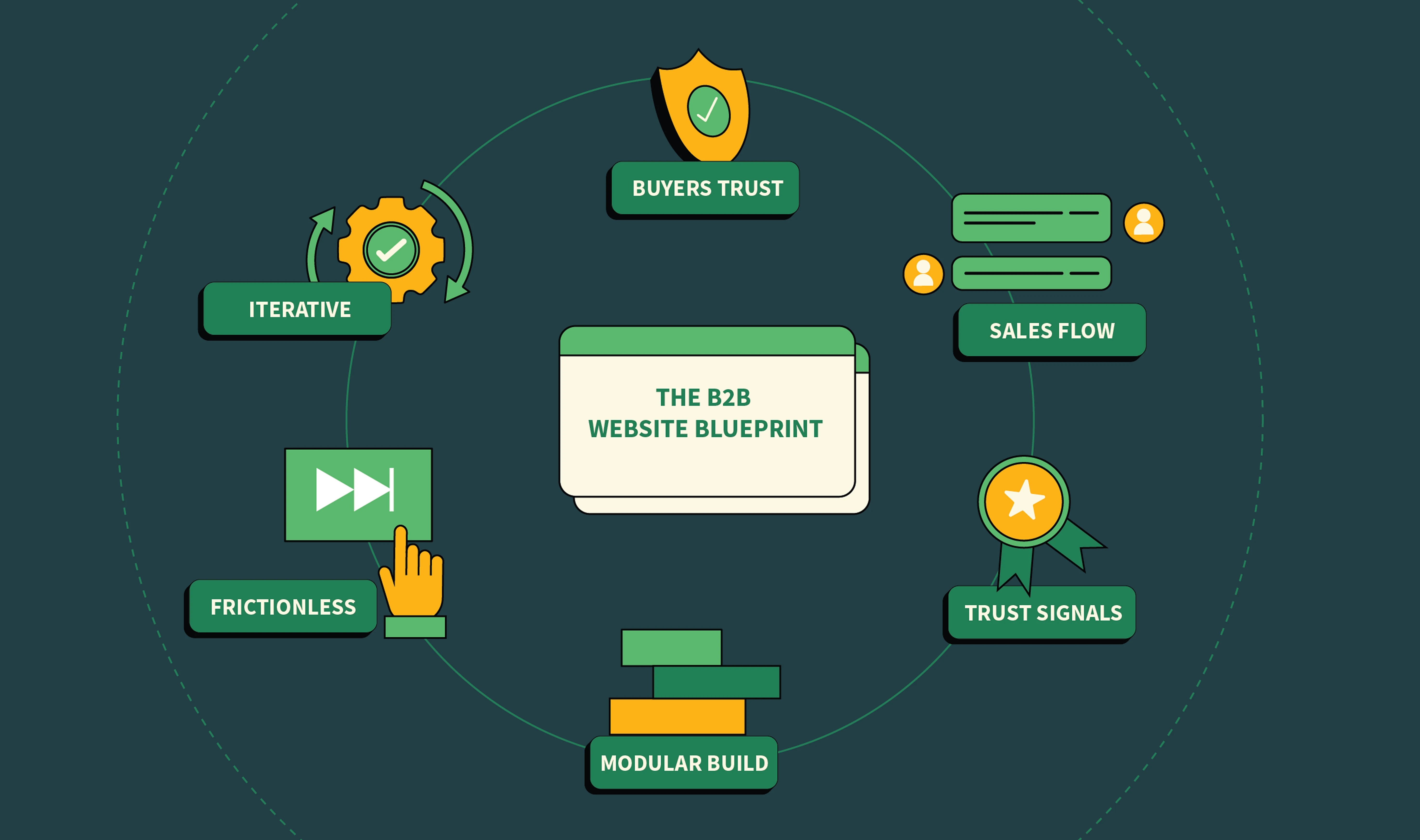
The C.O.N.V.E.R.T. Framework: How ThunderClap Builds High-Converting B2B Designs
Over years of testing what works and what doesn't, we've codified what makes B2B website design convert.
We call it the C.O.N.V.E.R.T. Framework: a structure that guides every design decision toward action.
.webp)
C — Clarity in Value Proposition
Your value proposition sits at the intersection of what you do, who you help, and why they should care.
What you're doing: Defining a single, specific statement that answers the visitor's unspoken question: "Can you solve my problem?"
How to execute:
- Lead with the outcome (not the product name)
- Use concrete language: "Reduce payment processing time by 70%" beats "Streamline payment workflows"
- Remove adjectives like "innovative," "best," or "cutting-edge." They sound like every other site
Example:
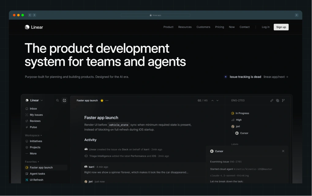
Linear's homepage is not the most feature-rich, not the most scalable, but it's on point. That's clarity.
O — Outcome-Focused Layout
Every section should build toward a single outcome: getting the visitor to the next step (demo, trial, consultation, contact).
What you're doing: Structuring your page so information flows like a conversation.
How to execute:
- Start with the problem (acknowledge their pain)
- Show why it matters (tie it to business impact)
- Present the solution (yours)
- Prove it works (social proof, case studies, metrics)
- Make the next step obvious (CTA)
Example:
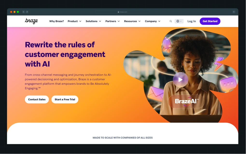
Braze's pages follow this exact flow. They lead with a conversational hook, then immediately show what using it looks like, then social proof, then CTA. No detours.
N — Navigation Simplicity
The best B2B website designs in 2026 treat navigation for user intent, not a map of your org chart.
What you're doing: Ruthlessly cutting menu items and organizing by buyer need, not internal structure.
How to execute:
- Limit top-level navigation to 5-7 items
- Use persona-based language ("For Developers," "For Marketers"), not department names
- Make mega menus work for you: organize by use case or buyer stage, not alphabetically
- Sticky navigation on long pages so users can navigate without scrolling back up
Example:
Asana keeps it simple: Product, Solutions, Resources, Pricing. No "Platform," no "Enterprise," no submenus. If you know what you're looking for, you find it in two clicks.
V — Value Visibility
Every page should make it obvious what value lives there and why the visitor should care.
This is where most B2B sites fail. They assume context: "The user clicked Solutions, so they know what they're going to read." They don't.
What you're doing: Making the purpose of every page crystal clear within the first few lines.
How to execute:
- Use descriptive page headers that answer: "Why should I spend time here?"
- Show expected outcomes early: "See how 6,000+ brands increased signups by 35%"
- Organize heavy content with subheadings, callouts, and visual breaks
- Use white space intentionally; crowded pages feel low-value
Example:
.webp)
Monday.com's solutions page clearly separates use cases (Marketing, Product, HR, etc) and shows exactly what each department gets. No guessing.
{{specficService}}
E — Experience Consistency
Visitors shouldn't feel like they've left your site when they move from page to page. Consistency builds trust.
What you're doing: Maintaining visual identity, messaging tone, and UX patterns across every page.
How to execute:
- Keep color palettes, typography, and iconography consistent
- Use the same CTA language and placement patterns
- Maintain the same design language from the homepage to the landing pages to the blog
- Ensure interactive elements (buttons, forms, toggles) behave the same everywhere
Example:
.webp)
Factors AI nails this. Whether you're on their homepage, a solution page, or pricing, the design language is identical. Consistent color use (the flaming orange!), consistent spacing, consistent interactions.
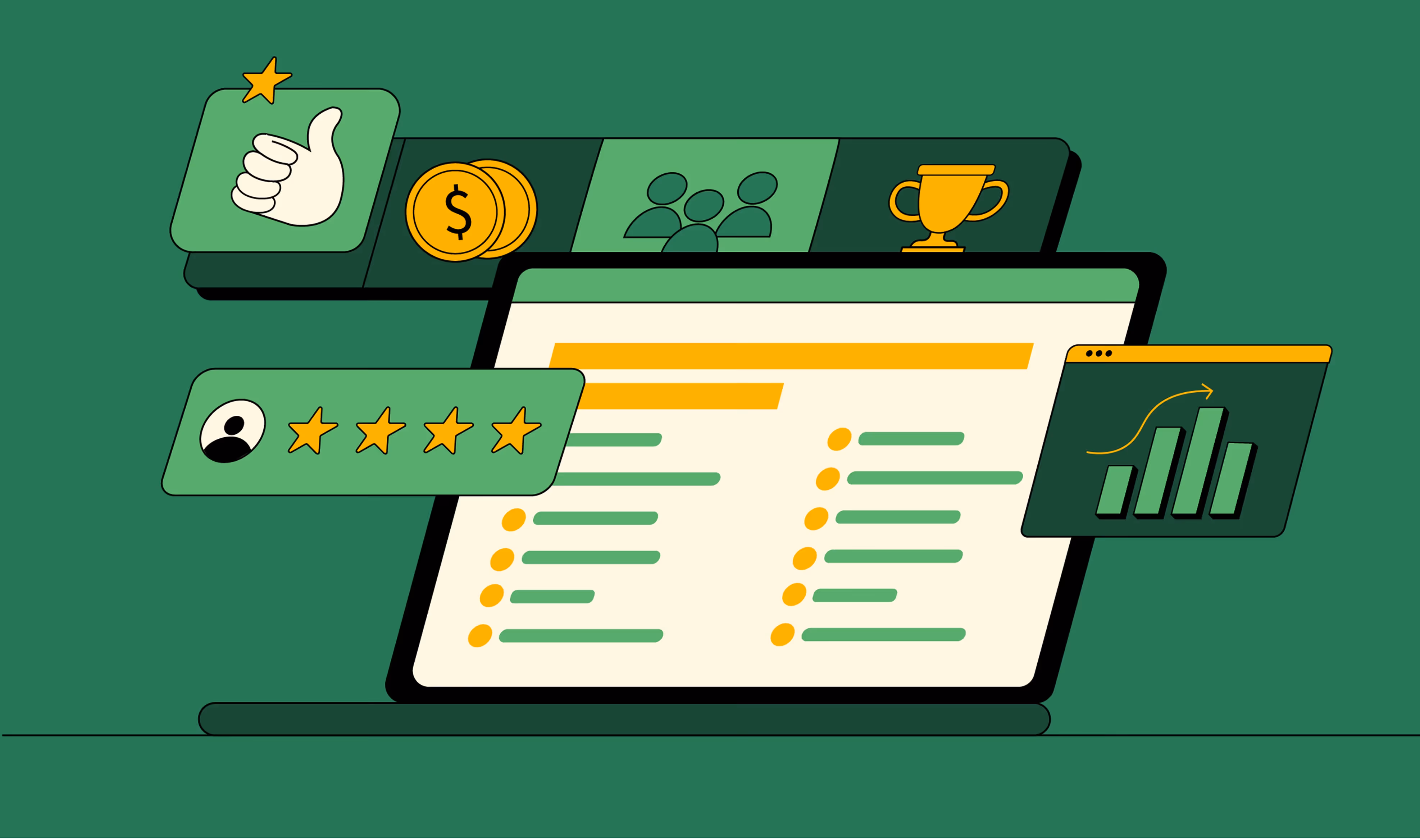
R — Real Social Proof
What you're doing: Distributing genuine, specific social proof throughout your site.
How to execute:
- Use customer logos on the homepage, but more importantly, on relevant product/solution pages
- Feature case studies near the bottom-of-funnel pages (pricing, comparison pages)
- Use video testimonials where possible
- Refresh social proof regularly; outdated logos hurt credibility
Example:
Razorpay's site uses social proof strategically. Global company logos on the homepage build brand legitimacy, but industry-specific logos appear on industry pages. Trust is contextual.
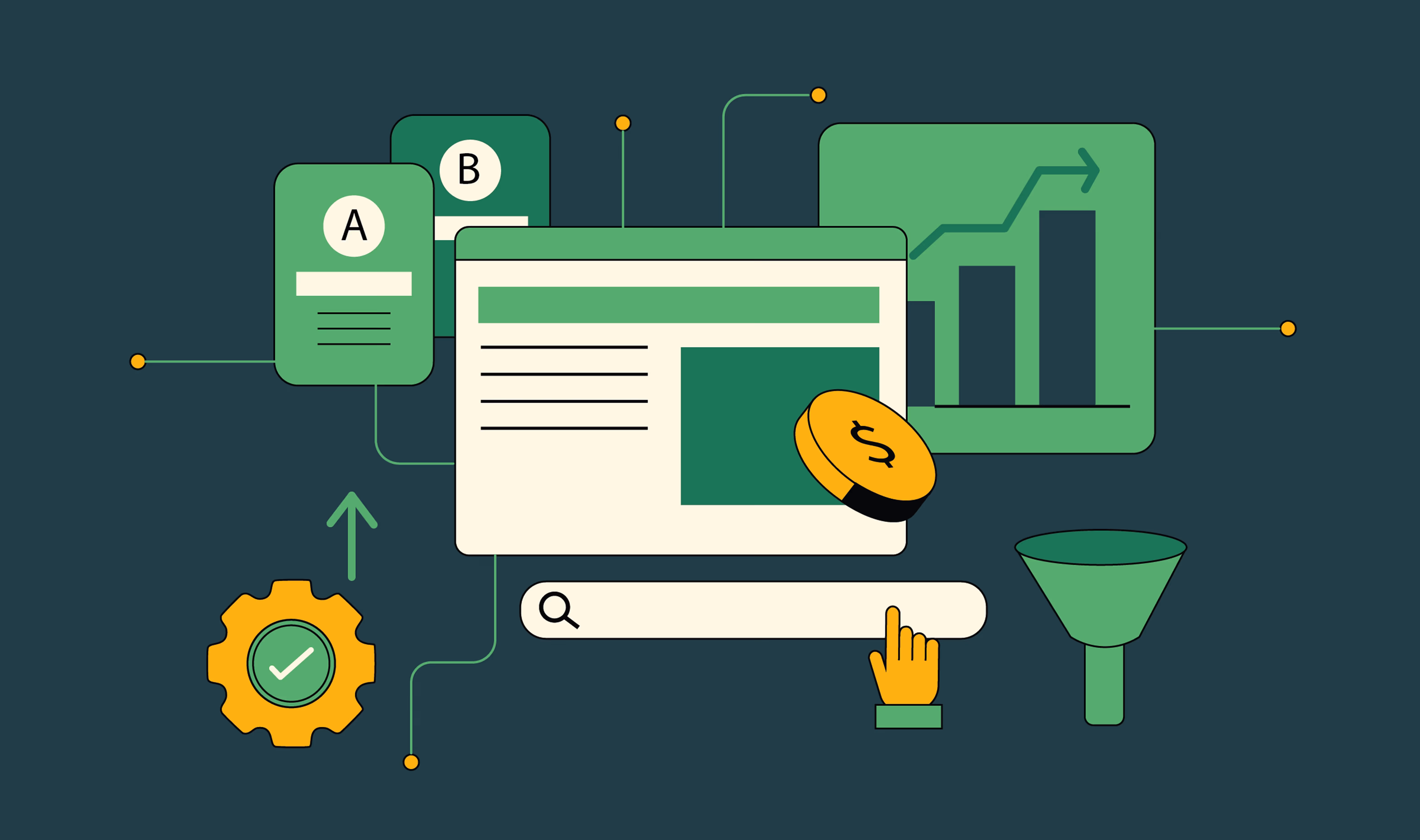
T — Testing-Driven Optimization
Design shouldn't be a one-time project. The best B2B websites are living, breathing systems that improve constantly through data.
What you're doing: Building a testing culture into your design process so every iteration is validated by real user behavior.
How to execute:
- A/B test high-impact elements: CTAs, hero images, headline copy, form fields
- Use heatmaps to understand scroll behavior (which sections get ignored?)
- Track conversion paths and drop-off points
- Test one element at a time so you know what moved the needle
- Implement winners, validate learning, iterate
The Best B2B Tech Website Design Templates of 2026: Examples You Can Learn From
We've analyzed dozens of top-performing B2B websites to find the patterns that actually work.
Here are 4 that nail the fundamentals and are worth studying closely.
1. Hotjar
What they do: Website analytics platform
Why it works: Hotjar's landing pages focus ruthlessly on one conversion goal per page.
Value prop is crystal clear. CTAs are placed above the fold and repeated in the middle; not pushy, just persistent.
What to copy:
- Define one primary conversion goal per page
- Repeat your CTA 2-3 times without feeling aggressive
- Use form optimization: ask for only essential info upfront
- Design forms to feel like tools, not gatekeeping
Conversion angle: Focused pages convert better than trying to please everyone.
{{specficBlog}}
2. Lattice
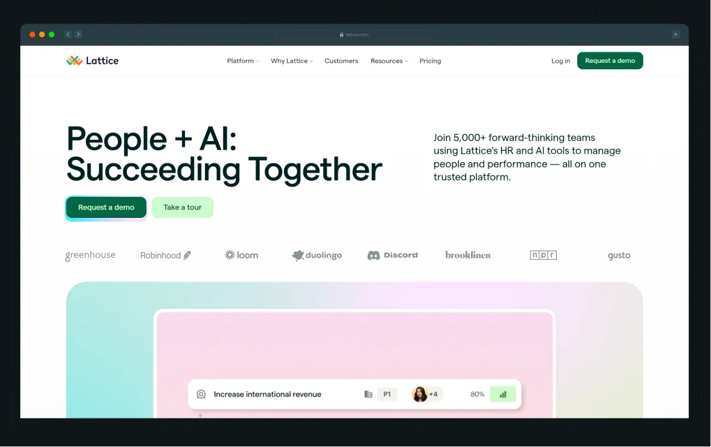
What they do: HR/people management platform
Why it works: Lattice balances modern, visually engaging design with professional credibility. The site uses contemporary color palettes, thoughtful animations, and clean typography.
What to copy:
- Invest in a custom design that feels fresh but not experimental
- Use animation intentionally: entrance effects and hover states that add, not distract
- Modern typography (system fonts for speed, serif accents for sophistication)
- Data visualization and custom illustrations specific to your domain
Conversion angle: Design that feels current increases perceived value and trust.
3. Rippling
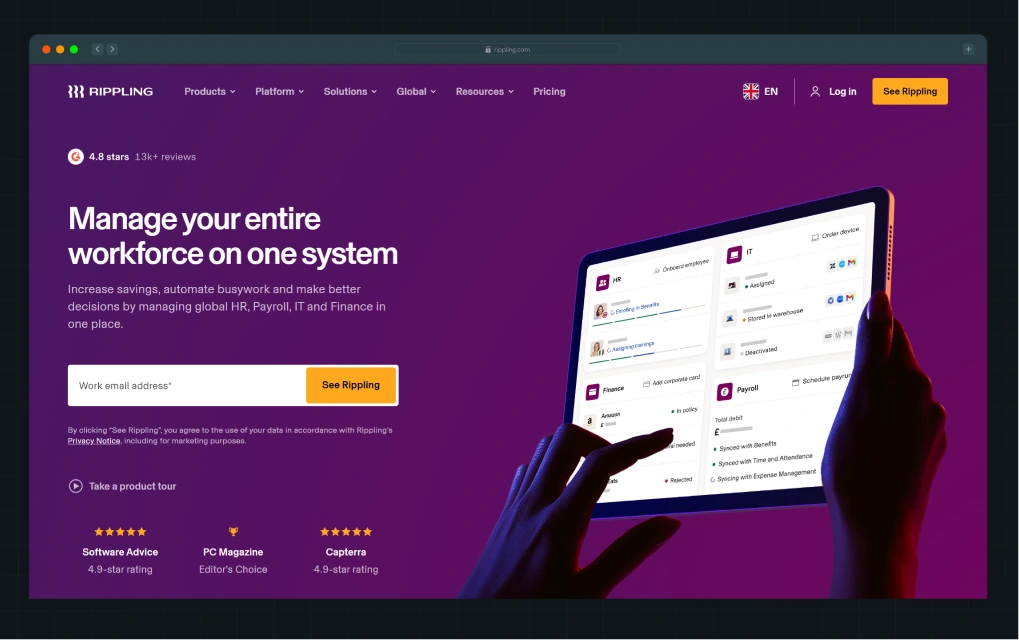
What they do: HR/IT management platform
Why it works: Rippling's website is simple everywhere, especially in forms. They ask for minimal info upfront, use clear CTAs, and design for mobile-first users who may be signing up from their phone during a busy workday.
What to copy:
- Reduce form fields by 50% (seriously)
- Only ask for the required information at the first step
- Progressive profiling: gather more details after they're engaged
- Show what happens next: "Takes 3 minutes to set up"
Conversion angle: Form is the #1 killer of B2B conversions. Every field you add, conversions drop.
4. Scale
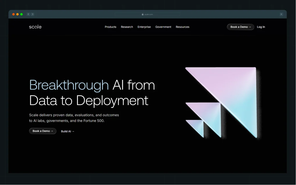
What they do: Data labeling platform for AI/ML teams
Why it works: Scale's homepage immediately catches attention with a bold headline, vibrant text-on-dark background, and subtle 3D animations that feel high-tech without being distracting. Their trust bar features recognizable logos. The result? Visitors don't bounce.
What to copy:
- Lead with a bold, specific headline (not generic positioning)
- Use color contrast strategically: light text on dark backgrounds can be striking
- Incorporate subtle motion that doesn't feel gimmicky
- Feature 5-10 recognizable customer logos early to build immediate credibility
- A compelling hero section is your first chance to make an impression; don't waste it
Conversion angle: A scroll-stopping hero reduces bounce rate and buys time to convert.
Also read: 9 Best Conversion Rate Optimization Tools for B2B Companies in 2026
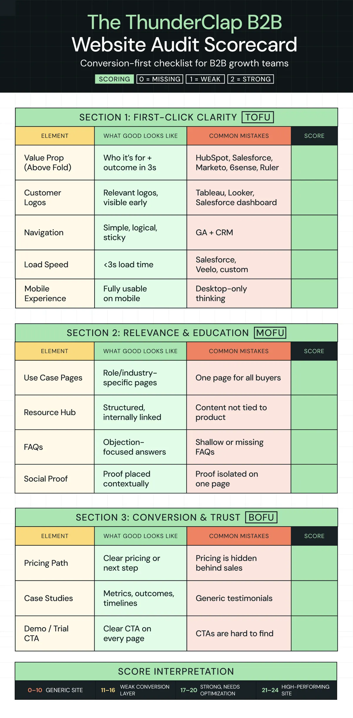
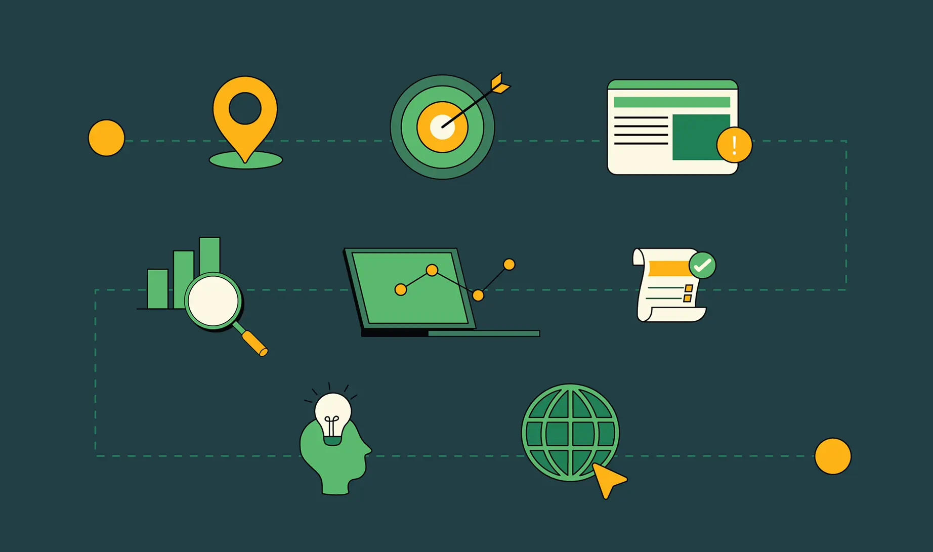
Bonus: What Features Should Every B2B Website Include? (The Non-Negotiables)
If you're auditing your B2B website right now and asking, "What features should every B2B website include?", here is a ready-to-use scorecard.
Take your brand from simply 'online' to high-performing with ThunderClap
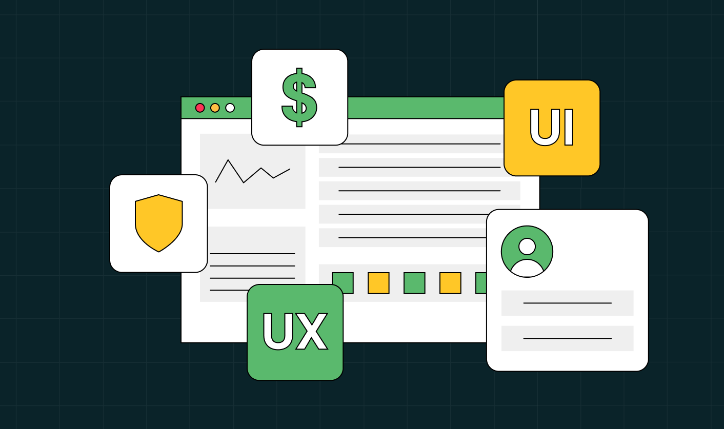
At ThunderClap, we don't measure website success by pretty screenshots or awards. We measure it by business impact.
Our clients see:
- 36% increase in search impressions (Visibility)
- 10x engagement improvement (UX)
- Up to 50-60% conversion increase (Lead Conversion)
- 15-25% reduction in CAC (Earning Potential)
The key: every redesign investment should map to at least three of these five areas. If it doesn't, it's probably cosmetic.
{{ctaBlock}}
FAQs
1. What makes a B2B website design effective?
Effective B2B website design guides visitors toward a decision seamlessly. It answers three questions immediately: What do you do? Who is it for? Why should I care? It then uses layout, social proof, and clear CTAs to move visitors toward the next step. The best designs feel invisible. Users don't notice the design; they just make decisions faster.
2. What features should every B2B website include?
Every B2B website should include: (1) crystal-clear value proposition above the fold, (2) customer logos/social proof, (3) role-specific or industry-specific pages, (4) resource hub with guides and case studies, (5) transparent pricing, (6) demo/trial CTA on every page, (7) FAQ section, (8) mobile optimization, (9) fast load times, (10) clear navigation, (11) specific case studies with metrics, and (12) trust signals (awards, certifications, customer testimonials).
3. How often should a B2B website be redesigned?
Don't redesign often. Optimize constantly. Full redesigns make sense every 3-5 years. But every 3-6 months, you should be testing and iterating on high-impact elements. Every 6-12 months, refresh content and messaging. A full redesign should only happen if your positioning has fundamentally changed, your technology stack is failing, or you're rebranding. At that point you can choose one the best website redesign agencies to collaborate with to strategically optimize your website.


.webp)
Browse Similar Articles
The Ultimate Fintech B2B Positioning Guide for 2026 (That Actually Drives Conversions)

.svg)
Mapping the B2B Buyer Journey to Improve Conversions Across Every Touchpoint
.webp)
7 Best Website Maintenance Companies in India for Growth-Led B2B Teams (2026)

.webp)

8 Best Healthcare Website Design Agencies for HIPAA-Compliant Sites in 2026

How to Find the Best Web Design Company in Houston, Texas for B2B Brands (6 Best Picks)
Positioning That Wins: How to Make Complex B2B Products Clear and Compelling

The Step-by-Step Website Redesign Process B2B Teams Use to Increase Conversions (Without Killing SEO and Pipeline)
7 Best Video Production Agencies for SaaS Product Walkthroughs and Feature Videos

How to Choose the Best B2B Website Maintenance Company: 9 Questions to Ask Before You Hire One
How to Choose a Web Design Company in San Francisco in 2026 (with Examples)

10 Best Web Design Companies in Florida in 2026 and How to Choose the Right One
How to Use Brand Storytelling on Your Website to Close More B2B Deals and Build Buyer Trust

SaaS CRO Best Practices: What High-Growth Brands Do Differently to Win Conversions

How a Rebranding Agency Can Redefine Your B2B SaaS Identity and Boost Pipeline
B2B Marketing Trends in 2026 That Directly Influence Pipeline and Revenue

Top 7 Video Marketing Agencies Driving B2B SaaS Brand Awareness in 2026
Why Partnering with a B2B Brand Positioning Agency Accelerates Market Differentiation

The Complete Website Redesign Checklist for B2B SaaS Teams Ready to Scale
.avif)
9 Best Webflow Development Agencies in India for 2026 (In-Depth Review)
10 Product Marketing Companies Powering the Fastest-Growing SaaS Brands in 2026
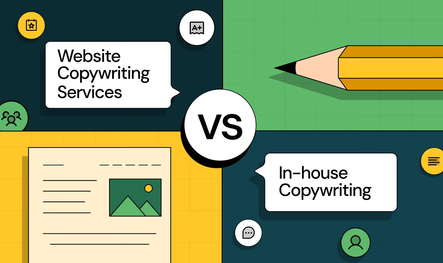
Website Copywriting Services vs In-House: What's Right for Your Business?

How to Choose a Marketing Agency That Understands B2B SaaS Growth Metrics


How to Choose a Video Marketing Agency That Understands B2B Storytelling
Outsourcing Web Design: Cost-Benefit Analysis for Mid-Market & Enterprise Brands
From Leads to Lifetime Value: How Growth Marketing Agencies Scale SaaS Revenue
Build a B2B Website Strategy That Aligns with Sales and Marketing Goals

Webflow vs WordPress: Which Platform Is Better for Your Business Website in 2026?
Fintech Web Design That Builds Trust: 8 UX Principles Every Fintech Site Needs
Optimizing for Intent: How B2B Website Messaging and UX Changes Help Capture Top-Funnel Buyers


12 Best B2B Web Development Agencies in the US to Build Scalable Websites

From Audit to Action: 8-Step Process to Optimize Your B2B Website Strategy for 2026 Buyers
How to Design a High-Converting Landing Page from Scratch (2026 Edition)

From Click to Customer: Proven Landing Page Conversion Optimization Techniques

How to Write Website Copy That Converts: A Step-by-Step Guide for 2026

How to Optimize a Landing Page for Maximum ROI: A Step-by-Step Breakdown


AI Landing Pages That Convert: 7 Design Principles Every AI Platform Should Follow

From Traffic to Pipeline: B2B Website Growth Strategy for Scaling Teams
B2B Website Optimization Strategy: Speed, UX, SEO, and CRO in One Playbook


Outsourcing Webflow Maintenance vs. In-House Management: Which is Better?


SaaS Website Design That Converts: 7 Must-Have Elements to Win More Signups
Top 7 Webflow Integrations to Supercharge Your Website's Performance and Conversions

Outsourcing Web Development: Cost-Benefit Analysis for Startups & Enterprises


Interested in seeing what we can do for your website?


.webp)
