















Top B2B Website Design Principles That Turn Visitors into Qualified Leads


You can attract traffic all day, but you can’t force a stranger to turn into a qualified lead.
That’s the quiet frustration within B2B marketing teams. They build smarter funnels, run cleaner ads, invest in content, and still watch great prospects disappear the moment they hit the website. Not because the offer is bad. Or, because the product lacks power. The website just doesn’t carry the weight and reassure. Hence, it doesn’t convert.
At ThunderClap, we have rebuilt over 129 B2B websites for SaaS, fintech, AI, and enterprise tech teams. We worked with brands like Amazon, Storylane, Factors, Deductive AI, and Zenda, and even created landing pages that AI flagged for measurable performance gains. After seeing hundreds of user journeys up close, we’ve learned a few hard truths about what actually drives conversions:
- Buyers want proof, not poetry
- Navigation often serves internal politics rather than buyer flow
- Pages lack intent signals and don’t guide the visitor toward a natural CTA path
- Messaging is vague, generic, or misaligned with the ICP's pain points
It’s evident that a high-converting B2B website behaves, gets attention, builds trust, and clearly shows the next step. That’s what this guide breaks down. The website design principles that turn curious visitors into qualified leads who actually want to talk to you.
TL;DR
- B2B teams lose visitors in the first few seconds because buyers can’t understand the product or the value fast enough.
- Cluttered messaging, weak proof, and dead-end pages kill momentum and make great prospects walk away.
- ThunderClap’s TLA Framework fixes this by stacking Clarity, Proof, Conversion, and Flow into a system that guides every visitor toward action. Here’s how it works:
- Clarity tells them what you do
- Proof earns their trust
- Conversion gives them the right CTA
- Flow moves them through the journey without any dead ends
- ThunderClap has rebuilt 129+ B2B websites and consistently lifts conversions by turning your site into a buyer-ready engine that sells for you.
The ThunderClap Lead Architecture Framework
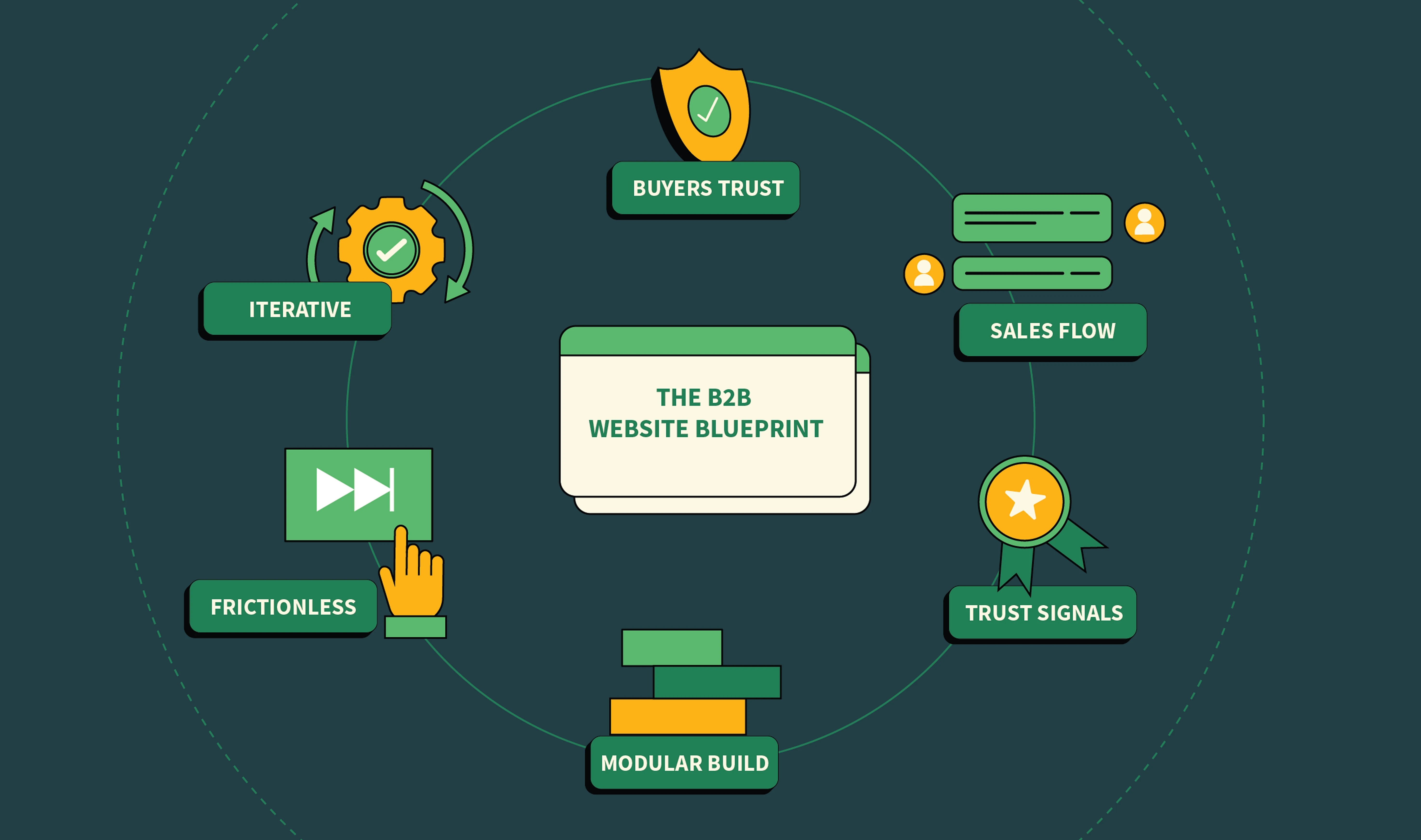
High-performing B2B websites aren’t built by chance. They follow a deliberate system designed for how B2B buyers actually make decisions. At ThunderClap, we call this the ThunderClap Lead Architecture (TLA Framework), a four-part approach that ensures every visitor understands, trusts, and takes the next step.
Here’s the framework in action:
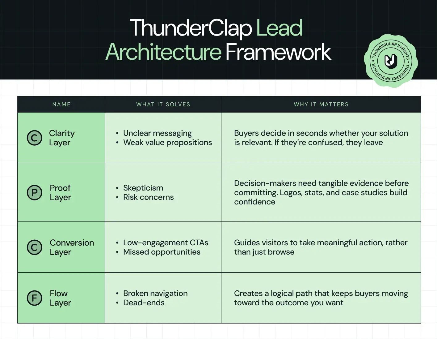
Every B2B site we’ve built, from SaaS platforms to enterprise tech, follows this framework. Skip a layer, and visitors hesitate. Nail all four, and your website becomes a lead-generating engine, not just an online brochure.
The TLA Framework is the backbone of our design process. In the following sections, we’ll dive into each layer and explain how it solves real buyer problems while boosting conversions.
Also read: 20 Proven SaaS Conversion Optimization Hacks to Boost Your Sales
Principle #1: Clarity Beats Cleverness (Clarity Layer)
Your website has only five seconds to make someone stop scrolling and pay attention. In that tiny window, visitors need answers to three simple questions:
- What do you do?
- Who is it for?
- Why should I care?
If your messaging is clever but unclear, you lose them instantly. Clarity means stripping away fluff and giving visitors exactly what they need upfront:
- Hero messaging that is straightforward and outcome-driven
- Subheadline that explains the benefit, not the feature
- Scannable page layout with enough whitespace to breathe
- Product visuals or simple UI animations that show how the solution works
But why does clarity matter so much? Because B2B buyers are decisive yet impatient. According to a 2025 report, conversion rates for B2B websites average only 2%–5%, while top performers reach 5%–11.45%. Another study found that 90% of B2B buyers compare 2–7 sites before making a decision, and that 80% of B2B purchase decisions are driven by UX, not just price or product.
Even minor tweaks in hero messaging, images, or CTA clarity can yield measurable gains. For example, refining your hero section headline and subheading can improve conversions.
When we redesigned ClearlyRated’s website, the original hero section tried to list multiple awards and features. It looked impressive but left visitors guessing what the product actually delivered.
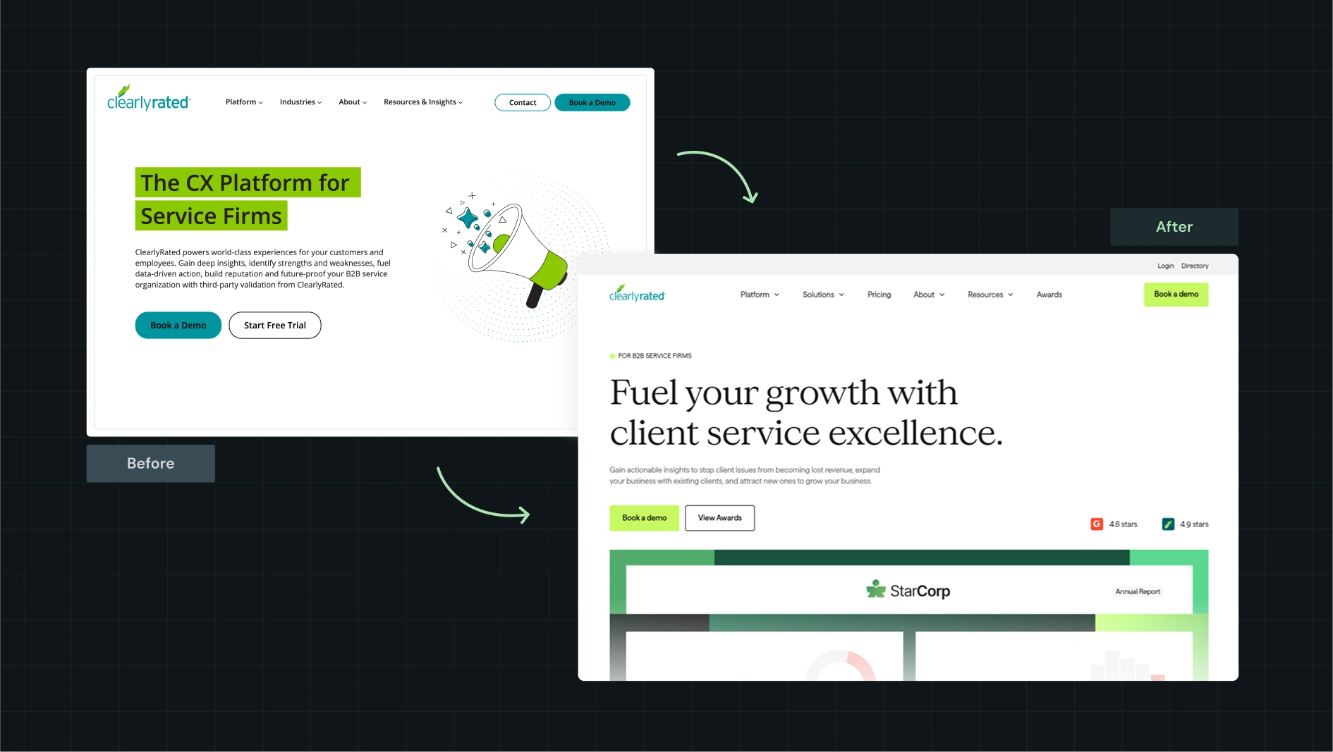
We rewrote the hero in outcome-first language, emphasizing how verified reviews build trust and drive higher sales. The subheadline highlighted the measurable results clients could achieve, and we paired it with a clean visual of the platform interface. The layout allowed the eye to quickly scan from the headline to the visual.
Within weeks, the website engagement metrics showed visitors immediately understood the product’s value. Clarity turned confusion into curiosity, and curiosity into action.
Principle #2: Proof Converts Skeptical B2B Buyers (Proof Layer)
B2B buyers are naturally cautious. They won’t trust a bold claim unless there’s evidence to back it up. That means proof must be where visitors can see it and absorb it without having to think too hard.
Good proof on a page can include:
- Client logos above the fold to show credibility immediately
- Compliance badges like SOC 2 or ISO to signal reliability
- Short, results-driven testimonials that highlight real outcomes
- Case studies that reflect challenges your target buyers face
- Live status pages or integration links to demonstrate functionality
When we worked on the RecruiterFlow project, we built a flexible Webflow system that made it easy for their team to manage pages, publish content, and stay aligned across the buyer journey. Here’s what we did:
- Migrated pages, ebooks, webinars, customer stories, and case studies to a unified system
- Added HubSpot tracking so the team could see how users engaged with each asset
- Set up a responsive design that worked seamlessly with their WordPress blog
- Created reusable components, a style guide, and training videos so the team could run fast without friction
This kind of foundation matters because your proof only shines when your website supports it. Clean structure, strong tracking, and easy updates help every content format, whether it’s videos, case studies, or testimonials, work harder across the funnel. With the new system, RecruiterFlow’s team could clearly and confidently showcase proof, guiding skeptical visitors toward demos and conversions.
Here’s our proof placement blueprint showing exactly where each element belongs and how it impacts leads:
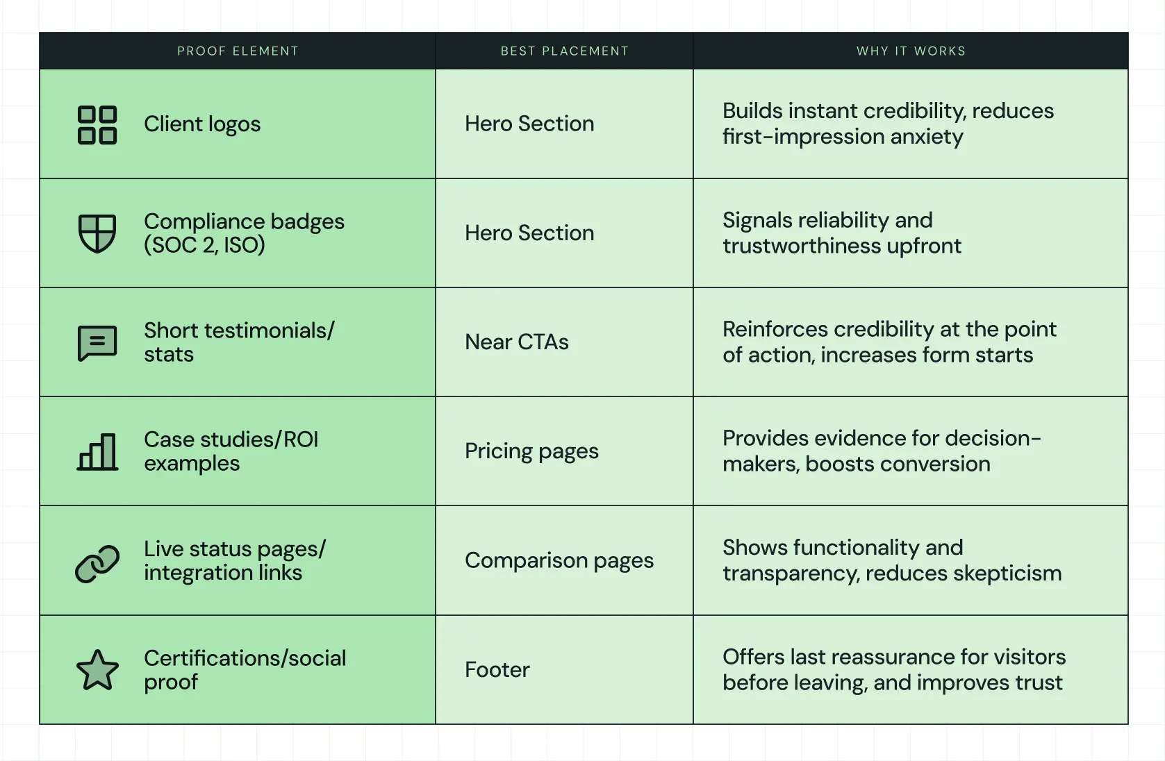
For example, RecruiterFlow showcases strong social proof at the bottom of their pages, combining testimonials with industry recognitions.
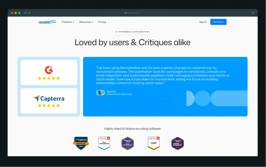
This strengthens credibility across multiple touchpoints, helping skeptical buyers feel confident and guided toward conversion.
{{specficBlog}}
Principle #3: Conversion Architecture (Conversion Layer)
One CTA doesn’t work for B2B. Visitors have different needs and intentions at varying points in their journey. Conversion architecture means giving multiple entry points for them to take action without feeling forced:
- Ungated demo videos to explore the product quickly
- ROI calculators or industry guides for evaluators who need context
- Instant booking calendars for prospects ready to speak with sales
- Full demo requests for those prepared to commit
According to a 2025 analysis of 1,000+ B2B website A/B tests, CTAs rank among the most critical conversion elements across B2B sites. The data shows that when a B2B web design agency experiments with the placement, copy, and structure of CTAs, they consistently separate high performers from the rest.
A great example is the Avanti Fellows website, a student-centric platform packed with media and interaction. Qamar Aziz, our Webflow Lead and GSAP Developer, put it best when he said,
“Avanti Fellows needed a visually rich site with sliders, animated elements, and interactive content. Their previous WordPress site was replaced with Webflow, allowing us to replicate the Figma designs with full animation support.”
Here’s what that looked like in practice:
- Migrating from WordPress to Webflow to eliminate plugin issues
- Rebuilding five animated pages with Lottie files and interactive sliders
- Setting up media and student resource pages with thoughtful motion
The result was a visually engaging site that matched their Figma designs with smooth, intentional animations. The combination of smooth animations, clear navigation, and media-rich content made it easy for visitors to take the next step, whether that was watching a demo, exploring resources, or booking a session.
{{specficService}}
Principle #4: Journey Flow Dictates Lead Quality (Flow Layer)
The order in which visitors see information matters more than fancy visuals or color schemes. Flow dictates how naturally a visitor moves from curiosity to decision.
Good flow includes:
- Navigation organized around buyer intent, not product features
- Prominent placement of pricing, product, solutions, and proof
- No dead-end pages; every page suggests a logical next step
- Comparison and alternatives pages integrated into the navigation
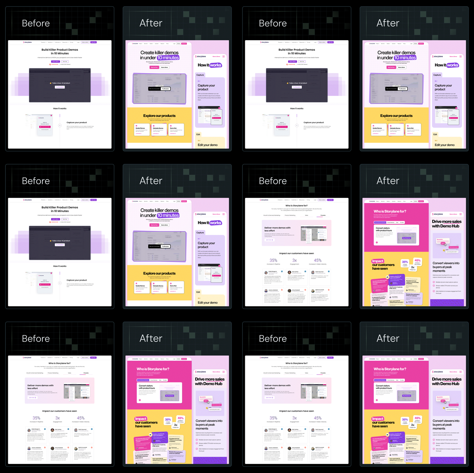
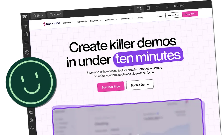
When we redesigned Storylane’s site, we realized trust sometimes comes from personality, not rewrites. We introduced mood boards, a clean yet playful visual identity, and custom illustrations. We even restructured the navigation to mirror the buyer journey: awareness → evaluation → decision.
The copy stayed untouched, yet impressions rose by 36% and demo requests increased by 30%.
That is the power of thoughtful B2B web design supporting your narrative. Each page guided visitors naturally through awareness, evaluation, and decision stages, while visual identity and illustrations made the journey intuitive and memorable. Comparison pages and alternative solutions were seamlessly integrated, allowing visitors to answer questions without friction. Flow ensured buyers reached the right information at the right time, boosting engagement metrics and overall lead quality.
Here’s a complete breakdown in this LinkedIn post by Kiran Kulkarni, Partner and Head of Growth at ThunderClap, where she shares the detailed process and before-and-after results.
B2B Website Design Is a System, Not a Homepage Makeover
A B2B website can look clean and modern, but that doesn’t mean it works. As a Webflow Enterprise Partner, we see too many sites that shine visually yet leave visitors confused, skeptical, or unsure of the next step. High-converting B2B websites follow an architecture that guides visitors through clarity, proof, conversion, and flow, so every interaction counts.
Take a moment to audit your own site using the TLA Framework. Ask yourself:
- Are visitors getting your message in five seconds?
- Do they see proof that builds trust?
- Are CTAs helping them act at the right time?
- Does the journey feel natural and simple?
Answering these questions can reveal gaps that hold back leads and growth.
If you want your website to actually generate qualified leads and reflect the thoughtfulness of your brand, talk to the team that builds systems that work. As the best B2B website design agency, ThunderClap helps clients turn browsers into meetings.
{{ctaBlock}}
FAQs
1. How is B2B website design different from B2C design?
B2B website design focuses on guiding thoughtful, careful buyers who often involve multiple stakeholders. Unlike B2C, the goal isn’t quick impulse purchases. It requires clear messaging, proof, and structured conversion paths. A B2B web design agency builds sites that speak to business decision-makers while keeping the experience simple, intuitive, and focused on driving qualified leads.
2. How long does it take to design and develop a B2B website?
The timeline varies depending on complexity, features, and content needs. At ThunderClap, as a leading SaaS web design agency, typical projects take 6 to 12 weeks from concept to launch. This includes research, messaging, design, development, and testing, giving the site time to perform fully for visitors and for lead generation.
3. Why do B2B companies need a specialized website design agency?
B2B websites must clearly communicate value, prove credibility, and guide visitors toward actions that matter. Inexperienced designers often miss these subtle but critical points. Working with the best B2B website design agency, like ThunderClap, ensures your site converts with structure, clarity, and intent while supporting your sales and marketing efforts every step of the way.



.webp)
Browse Similar Articles





Leading 5 SaaS Branding Agencies in Florida (That Actually Understand SaaS Growth)

.svg)


How to Turn Your B2B Website into a Self-Serve Growth Engine? (PLG Ready in 2026)


9-Step Website Copy Audit Checklist to Improve Conversions (Examples from Top B2B Brands)

.webp)

How to Choose the Right Fintech Web Development Company for Your Business

%20Audit%20That%20Actually%20Improves%20Revenue.webp)
How to Do a Conversion Rate Optimization (CRO) Audit That Actually Improves Revenue
Web Design Agency vs. Freelancer vs. In-House: What Actually Works in 2026
5 CRO Agencies in London and How to Choose the Best CRO Agency for Your Business

The Ultimate Fintech B2B Positioning Guide for 2026 (That Actually Drives Conversions)
Mapping the B2B Buyer Journey to Improve Conversions Across Every Touchpoint
.webp)
7 Best Website Maintenance Companies in India for Growth-Led B2B Teams (2026)

.webp)

8 Best Healthcare Website Design Agencies for HIPAA-Compliant Sites in 2026


How to Find the Best Web Design Company in Houston, Texas for B2B Brands (6 Best Picks)


Positioning That Wins: How to Make Complex B2B Products Clear and Compelling
The Step-by-Step Website Redesign Process B2B Teams Use to Increase Conversions (Without Killing SEO and Pipeline)

7 Best Video Production Agencies for SaaS Product Walkthroughs and Feature Videos

How to Choose the Best B2B Website Maintenance Company: 9 Questions to Ask Before You Hire One




How to Choose a Web Design Company in San Francisco in 2026 (with Examples)

10 Best Web Design Companies in Florida in 2026 and How to Choose the Right One

How to Use Brand Storytelling on Your Website to Close More B2B Deals and Build Buyer Trust

SaaS CRO Best Practices: What High-Growth Brands Do Differently to Win Conversions

How a Rebranding Agency Can Redefine Your B2B SaaS Identity and Boost Pipeline
B2B Marketing Trends in 2026 That Directly Influence Pipeline and Revenue

Top 7 Video Marketing Agencies Driving B2B SaaS Brand Awareness in 2026

Why Partnering with a B2B Brand Positioning Agency Accelerates Market Differentiation

The Complete Website Redesign Checklist for B2B SaaS Teams Ready to Scale
.avif)
9 Best Webflow Development Agencies in India for 2026 (In-Depth Review)

10 Product Marketing Companies Powering the Fastest-Growing SaaS Brands in 2026
Website Copywriting Services vs In-House: What's Right for Your Business?

How to Choose a Marketing Agency That Understands B2B SaaS Growth Metrics


How to Choose a Video Marketing Agency That Understands B2B Storytelling

Outsourcing Web Design: Cost-Benefit Analysis for Mid-Market & Enterprise Brands

From Leads to Lifetime Value: How Growth Marketing Agencies Scale SaaS Revenue
Build a B2B Website Strategy That Aligns with Sales and Marketing Goals

Webflow vs WordPress: Which Platform Is Better for Your Business Website in 2026?
Fintech Web Design That Builds Trust: 8 UX Principles Every Fintech Site Needs

Optimizing for Intent: How B2B Website Messaging and UX Changes Help Capture Top-Funnel Buyers



12 Best B2B Web Development Agencies in the US to Build Scalable Websites

From Audit to Action: 8-Step Process to Optimize Your B2B Website Strategy for 2026 Buyers
How to Design a High-Converting Landing Page from Scratch (2026 Edition)

From Click to Customer: Proven Landing Page Conversion Optimization Techniques

How to Write Website Copy That Converts: A Step-by-Step Guide for 2026

How to Optimize a Landing Page for Maximum ROI: A Step-by-Step Breakdown


AI Landing Pages That Convert: 7 Design Principles Every AI Platform Should Follow
From Traffic to Pipeline: B2B Website Growth Strategy for Scaling Teams


B2B Website Optimization Strategy: Speed, UX, SEO, and CRO in One Playbook




Interested in seeing what we can do for your website?



.webp)
