















How to Design a SaaS Landing Page That Converts


Don’t get us wrong. We love a great-looking landing page. The way the colors pull your eyes exactly where they should go. The bold visuals and thoughtful details make everything feel just right. Honestly, we can talk about this stuff all day.
But we also know looks aren’t the whole story. A page can impress at first glance and still leave people unsure about what to do next. And that’s a problem when you’re trying to build something that performs.
What we care about is what happens after that first impression. Does it make sense right away? Does it guide them without confusion? Does it give them a reason to stay?
Because in the end, what really matters is simple. Effective landing page designs that convert, and a clear understanding of how to design a landing page that drives conversions.
What Is a SaaS Landing Page (And How It’s Different from a Normal Web Page)
In SaaS, a landing page is a focused, goal-driven page designed to turn a specific visitor into a signup, demo request, or trial user. Unlike general web pages that inform or help users explore, it has only one purpose, to make the process as simple and effortless as possible, answer key objections, and guide users to a single clear next step.
In the simplest terms, it’s a page designed to get a user to take action as efficiently as possible. Strong SaaS landing pages do this through clear value propositions, benefit-led copy, intentional visuals, and well-placed social proof that builds trust at the moment it matters most.
Of course, there isn’t a single formula you can follow every time. (Although we’ve got a 3-step guide to help you do it consistently below.) We’ve all seen polished pages that look incredible and just can’t land a single conversion. We’ve also seen pages that look thrown together at the last minute somehow convert like crazy.
Traffic plays a role here, too. A page filled with the wrong audience will struggle, no matter how good it looks. A more relevant audience can quickly change the outcome. Keep this in mind before being too hard on your own results.
Now, before we go further, it helps to see how a SaaS landing page stands apart from a regular web page:
This difference shapes how every section is written and designed. It also explains why a focused page often outperforms a general one.
What Makes a SaaS Landing Page Effective
A SaaS landing page works when it feels instantly clear, relevant, and easy to act on. Visitors do not spend time decoding it. They decide within seconds if it speaks to their problem and if the next step feels worth it.
While no landing pages are exactly the same, successful SaaS pages often share a common structure that supports fast understanding, reduces hesitation, and guides visitors toward a single clear action.
Clarity of value
The first question every visitor asks, consciously or not, is: What is this, and why should I care? You have a few seconds to answer both.
Vague positioning kills conversions before the user even scrolls. "For teams" tells a visitor almost nothing. "For SaaS founders struggling with churn" tells them exactly who this is built for and signals that the product understands their specific problem.
This shift matters because B2B buyers do not start with product interest. They start with problems. Recent research reports that B2B buyers now spend 87% of their journey in independent research before ever speaking to sales, and often more than 70% of the decision process happens digitally. That changes how value needs to show up on the page. It needs to feel relevant without explanation.
This connects directly to modern B2B web design and landing page best practices, where clarity replaces persuasion-heavy language as the primary driver of conversion. Strong landing pages guide attention using spacing, typography, and contrast so that the value proposition is immediately seen, not just read.
Performance that supports conversion
Even the strongest messaging falls apart if the experience feels slow, cluttered, or difficult to navigate. SaaS visitors expect pages to load quickly, respond smoothly, and make actions feel effortless.
Google's research on mobile behavior shows how directly performance impacts engagement. When page load time increases from 1 second to 3 seconds, bounce probability rises by 32%.
As delays continue, the risk increases significantly:
- 1–5 Seconds: Bounce probability increases to 90%
- 1–10 Seconds: Bounce probability increases to 123%
For SaaS companies, this matters because landing pages are often the first interaction users have with the product. Slow-loading visuals, bloated scripts, excessive animations, or confusing layouts create friction before trust is even established.
Effective SaaS landing pages reduce this through lightweight design systems, focused layouts, clear navigation paths, and fast-loading experiences across devices. The goal is not just visual polish. It is helping users move from interest to action without interruption.
Relevance to user intent
Landing pages convert better when they mirror the exact context the visitor came from. A LinkedIn ad, a Google search, or an email campaign all carry different intent signals, and the page needs to continue that same conversation.
When that alignment is strong, visitors feel like they landed in the right place. When it is off, even good copy loses impact because the expectation breaks immediately.
For SaaS funnels, this often looks like:
- Search traffic landing pages focusing on problem-solving
- Paid ads landing pages focusing on speed to outcome
- Email traffic landing pages focusing on expansion or upgrade context
Recent HubSpot research on conversion performance shows that personalized landing experiences consistently outperform generic pages in conversion rate, with segmented messaging driving significantly higher engagement across B2B funnels. The pattern is consistent across industries. Relevance beats persuasion.
Aligning intent and messaging is one of the most effective B2B conversion rate optimization strategies teams can use to immediately improve landing page performance.
Reduction of decision friction
The final ingredient is making the next step feel safe and obvious. SaaS landing pages perform better when they remove unnecessary thinking from the decision moment.
Demo? Trial? Signup?
Each of those asks for a different level of commitment, and the right one depends entirely on the user's readiness.
Asking a cold visitor to start a free trial is like proposing on a first date. In fact, users quickly abandon experiences when the interaction cost feels high, especially on smaller screens, where attention drops faster than in desktop sessions. This cycle directly affects SaaS landing pages where demo requests or signups depend on quick micro-decisions.
The strongest landing pages do not push harder. They make the next step feel simple enough that hesitation fades on its own.
What Are the Elements of a High-Converting SaaS Landing Page
Most high-performing SaaS pages follow a similar structure. You’ll see this pattern across strong SaaS landing page examples, where each element earns its place by removing a specific pain point.
A headline that makes people stay (not bounce)
Your headline is the first real test. Clear beats clever, every time. A good headline answers three things at once:
- What this is
- Who it's for
- What changes for them if they use it
It defines the audience and signals the value in a single breath.
"The operating system for modern work" could describe almost any B2B tool. "Cut your sales cycle in half without adding headcount" names a specific outcome for a specific problem. A well-written headline can lead to a 3x higher conversion rate, which makes it, by far, the highest-leverage word on the page.
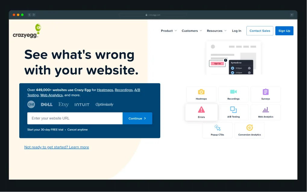
A strong example of this is Crazy Egg. The page keeps the headline extremely direct from the start.
It opens with a simple line: See what’s wrong with your website.
It works because it immediately frames a problem the visitor already cares about. It does not explain the product first. It starts with a challenge that the user likely feels, inviting curiosity about how to fix it.
Right under it, the page builds confidence and momentum in a very structured way. It shows scale and credibility without slowing the experience down:
Over 449,000+ websites use Crazy Egg for Heatmaps, Recordings, A/B Testing, Web Analytics, and more.
From there, it moves straight into action. The structure feels natural because each layer answers a question the user is already asking. What is the problem? Can I trust this? What should I do next?
The same principle holds even when the product is more complex, and the value is harder to explain.
When Factors partnered with us, the challenge wasn’t visual. The product already had depth. The real problem was clarity. The landing page did not make that value obvious quickly enough, which made the product feel heavier than it was.
We restructured the page using the same principle as a high-performing narrative flow. It needed to clearly answer what this is, who it’s for, and what changes for the user without altering the core messaging.
The final headline, “Know how your buyers move. Run campaigns that win,” was retained, and we built the page structure around it to improve clarity and impact.
The layout tells a story step by step:
- Why fragmented signals are a problem
- How Factors solves it
- Proof of success through testimonials and client logos
One of our favorite sections is the execution timeline. It walks visitors through the exact journey of using Factors, showing how raw, messy signals turn into clear, usable campaigns in just three weeks. Most B2B pages stop short of this kind of clarity, which is why this section resonates strongly.
To bring in more feeling, the design uses bold patterns, rich color, and human touches like customer quotes that feel authentic rather than scripted. The calls to action remain consistent throughout, with “Get a demo” and “Learn more” placed at natural decision points to guide users without interrupting flow.
As Ayush Barnwal, partner at ThunderClap, noted, the redesign helped Factors establish a premium, globally ready brand.
Supporting copy that makes the value obvious
The supporting copy has one job: expand what the headline promised.
It's not there to be clever or poetic. It's there to answer the logical follow-up question, “Okay, but how?”, in plain language.
This is where many SaaS teams go wrong. They write copy for themselves, using the language of their internal roadmap rather than the language of their users' actual pain.
According to Unbounce's analysis of 41,000 landing pages, copy written at a 5th to 7th-grade reading level converts at 12.9%, while professional-level copy converts at just 2.1%. This means simple copy converts 514% better than professional-level copy with a lot of technicalities.
Consider CloudTalk’s landing page, for example, which provides sales and support teams with unified voice software that offers international coverage and AI voice agents.
What stands out on their landing page is how consistently it prioritizes clarity over complexity:
- Compelling copy: The headline clearly explains what the product does and who it is for. There is no jargon or ambiguity, just immediate context that helps the right users self-identify.
- Proof in numbers: Customer logos and reviews are backed by strong, tangible stats. This turns social proof into something measurable and believable.
- Say it loud: Calls to action like “Start free trial” and “Book a demo” are visually prominent and direct, guiding users without forcing them to search or interpret next steps.
- Clarity over hype: Product visuals highlight AI features like auto-transcriptions and real-time call summaries, each paired with short captions that explain exactly what the user is seeing.
Nothing feels overloaded. The page does not try to explain everything at once. It gives just enough information for the user to feel confident about what they gain. The user does not need to interpret the message, as they understand it immediately.
That is the role of supporting copy.
It should not try to sound smart. It should make the product feel simple.
A CTA that matches how ready the user is
A cold visitor who just discovered your product is not ready to start a free trial. They need context.
"See how it works" or "Watch a 2-minute demo" is a lower-commitment entry point that keeps them in the funnel. A warm visitor who's already compared you to three competitors doesn't need more context, but a clear path to action.
A direct CTA like “Start your free trial” or “Talk to sales” aligns with that intent and gives them a clear next step without unnecessary explanation.
Pages also perform better when they stay focused on a single action. Research shows that pages with one clear CTA convert at 13.5% vs 10.5% for pages with multiple CTAs, a 29% lift simply by removing competing choices.
OpusClip shows how actionable a SaaS hero section and its call-to-action button can become when everything aligns in one motion.
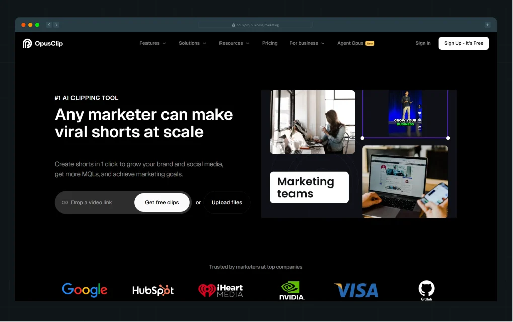
As a page visitor, you can paste a YouTube link and click “Get free clips,” or upload your own file, and the experience begins immediately within the product.
If the goal is to convert more visitors into active users and the product already includes a video or image upload, this approach can fit naturally into that flow.
Product visuals that help users 'get it' instantly
People don't read SaaS landing pages, but scan them thoroughly. A screenshot, a short product flow, or a UI walkthrough communicates more in two seconds than three paragraphs of feature description.
If a user doesn't understand what the product looks like or what it does, they won't convert.
Recent research consistently shows that 91% of users prefer visual content when trying to understand complex interfaces. Visuals shorten the learning curve and improve comprehension speed, which directly impacts decision-making.
The same principle applies to SaaS.
A static feature list leaves too much to interpretation. A well-placed product visual removes that gap. It answers questions before they are asked. What does this look like? How do I use it? What happens when I click this?
A strong example of this comes from ThunderClap’s work for Deductive AI. The interface, system diagrams, and incident flows were all designed to make complex systems feel traceable and easy to follow. The result was a product story that users could quickly understand, along with 10X higher engagement than on the previous website.
You can see the breakdown in Ayush’s LinkedIn post:
ThunderClap applied a similar visual-first approach while redesigning NativeMSG. The product was strong, but the website didn’t reflect its leadership in RCS. Prospects didn’t understand what RCS could actually do. The site relied on feature lists rather than showing outcomes.
The challenge was to make the platform instantly clear, visually compelling, and category-defining.
Here’s what changed:
- Built 40+ visual mockups with real message examples so users could understand RCS in minutes
- Developed a layered visual system inspired by the logo to signal structure, security, and reliability
- Chose a green-focused palette to stand out and reinforce clarity and growth
- Shifted from features to outcomes like engagement, ROI, and conversions across industries
- Created dedicated pages for Creator, Cloud, and Connect to simplify the platform architecture
- Prioritized experience-first storytelling that was educational, interactive, and scalable
As Ayush explained:
“They did not want to be another messaging vendor. They wanted to own RCS entirely. Our visual-first approach helped people understand the product in minutes.”
Kiran Kulkarni, Partner & Head of Growth at ThunderClap, mentioned the revamp helped NativeMSG turn education into a conversion asset and drive a more qualified pipeline.
Strong landing pages don’t treat visuals as decoration. They treat them as an explanation. When users can “get it” without effort, they move forward with confidence.
Proof that makes the decision feel safe
In SaaS, trust is not optional. The user is evaluating not just whether the product works but also whether their peers would make the same choice.
Client logos, customer testimonials, G2 ratings, and outcome-based metrics all serve the same function. That is, they transfer the risk of being wrong from the individual buyer to a crowd of people who've already made a decision.
Landing pages with social proof, such as customer reviews and testimonials, convert 34% better, according to Invesp (2024). Real metrics from real customers do the heavy lifting that generic praise cannot.
Because in B2B, the buyer isn't just evaluating the product, they're evaluating the decision to adopt it in front of their team.
What could be better here than our own landing page?
.webp)
Instead of pushing testimonials to a separate section or page, the proof appears directly within the flow of the landing experience. (Well, we do have a separate web page that showcases our work, in case you want to check it out!) Toward the end of the page, visitors see feedback from multiple clients we’ve worked with across various projects.
The testimonials are outcome-focused, specific, and tied to real people and recognizable companies, which makes the credibility feel grounded rather than performative. By the time users reach this section, they already understand the offer. The social proof helps confirm that others have already made the same decision successfully.
When proof appears early and naturally, it reduces hesitation before it builds. It answers the unspoken question, “Does this really work for people like me?” without forcing the user to look for that answer.
Features explained as outcomes (not just listed)
A feature list reads like a spec sheet. Your user doesn't care about "real-time sync across devices". They’ll definitely care that they'll never lose context when switching from their laptop to their phone.
Hence, translate every feature into the outcome it creates. "What it does" becomes "why it matters," and suddenly the page stops feeling like a datasheet and starts feeling like a pitch from someone who understands the problem.
Slack does it the best through its Slack Connect page.
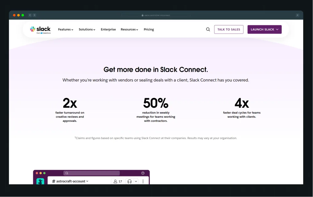
Instead of describing features in isolation, the page consistently ties them to outcomes. “Secure external collaboration” is immediately reframed as “a better way to work with people outside your company.” The focus moves from capability to benefit.
It then reinforces this with clear, measurable outcomes. For example, teams see:
- 2x faster turnaround on reviews
- 50% reduction in weekly meetings
- 4x faster deal cycles
Even functional capabilities follow the same pattern. Moving conversations out of email becomes faster decision-making. Built-in security becomes a safe collaboration with external partners.
The product does not change. The framing does. That difference is what makes the page persuasive.
{{specficBlog}}
A mid-page reminder of why this matters
By the time users are halfway down the page, many have already half-forgotten what drew them in.
A mid-page reinforcing statement, such as a short, punchy statement tied to the core value proposition, catches those scanners and pulls them back.
But do not mistake it for a summary. It's a reset, a reminder of the stakes before you ask them to act again.
A good SaaS example of this pattern can be seen in Intercom’s Helpdesk product landing page, where the messaging repeatedly re-anchors visitors to the core promise of faster, friction-free customer support.
As users scroll through detailed sections on ticketing, reporting, integrations, onboarding flows, and outbound messaging, Intercom periodically reinforces the bigger outcome behind those features. Mid-page statements such as “Modern software that’s fast and friction-free” and “Outbound messaging that reduces support volume” serve as strategic resets within the experience.
These sections reconnect the visitor to the larger value proposition, reducing support friction, improving team efficiency, and creating a smoother customer experience before moving deeper into product details.
It’s subtle but intentional. Even if a visitor is skimming through integrations, support workflows, or product visuals, the page continuously brings them back to the central promise before the next decision point.
Different Types of SaaS Landing Pages (and When to Use Each One)
Different SaaS landing pages are not just variations in layout. They reflect how ready a user is to take action and how much context they still need before getting there, which is also why they often serve as strong SaaS landing page inspiration across different funnel stages.
The structure changes based on intent, not just design preference, which is why the same product often needs multiple landing page types across its funnel.
Lead capture pages (for collecting interest early)
Lead capture pages are designed to collect contact information, usually in exchange for a specific resource or access point. For example, early-stage startups collect emails before launch, or established SaaS products offering a free template, an ebook, or a product demo request form.
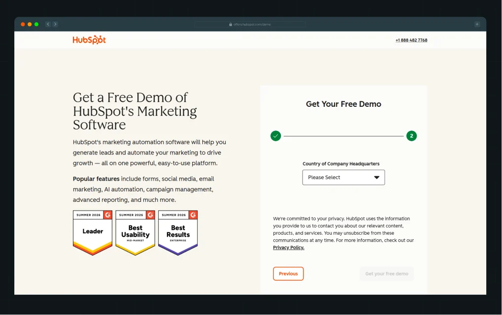
HubSpot's demo request page is a clean example of this done well. The form asks only what's necessary, including email and country of company headquarters, and the navigation disappears entirely, so nothing competes with the single goal.
Visitors know exactly what they're giving and exactly what they're getting.
Click-through pages (for warming users up first)
Click-through pages skip the form entirely. The page builds context, makes the value tangible, and ends with a CTA that moves the user toward the actual conversion point, such as a pricing page, a sign-up screen, or a checkout.
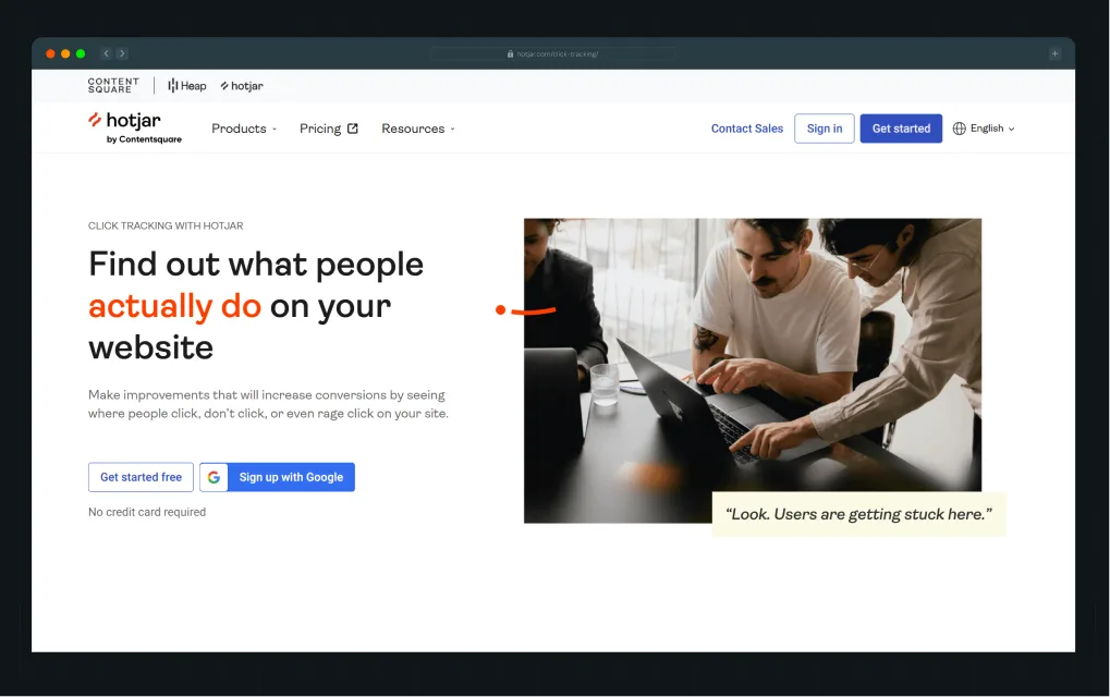
Hotjar's click-through landing page for its click tracking tool works this way. It leads with a bold headline, shows the product working in context, and offers two simple pathways:
- "Get started free"
- "Sign up with Google"
The page's job is to reduce uncertainty, and when it does so well, conversion in the next step takes care of itself.
Demo/product pages (for high-intent users)
These landing pages are made for people who are already interested in the product and are close to making a decision. They do not need a long explanation about what the product does. They want to understand how it works, what benefits it offers, and what the next step looks like before they commit.
The structure is usually simple and conversion-focused. You will often see a short value-focused headline, a few clear benefits, and a form to book a demo, request a call, or start a trial.
Qonto’s demo page is a good example of this. It doesn’t overwhelm users with feature-heavy messaging. Rather, it positions the demo as a guided walkthrough tailored to business operations.
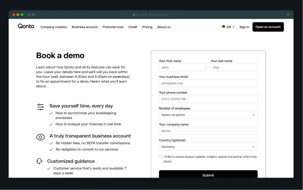
The left side focuses on outcomes such as saving time, financial visibility, and customized guidance, while the right side keeps the action straightforward with a clean demo-booking form. The experience feels transactional, focused, and intentionally built for users already close to making a decision.
How to Design a SaaS Landing Page (a Simple 3-Step Way to Think About It)
Most SaaS landing pages fail long before the design comes into play. They try to explain everything instead of guiding toward a single clear decision, which is usually where users start to drift.
A better approach starts earlier, at the level of thinking, not at the level of layout.
Step 1: Start with the decision, not the design
Before you touch a wireframe or write a headline, ask yourself: What does this user need to believe in order to click?
Not "what does my product do?", but what specific belief needs to shift in this person's head for the decision to feel obvious?
Maybe they need to believe the product will actually save time. Maybe they need to believe it's safe to switch from what they're already using. Maybe they need to believe people like them are already using it.
Start there. Landing pages do not really convert. Decisions do. The page only helps that decision feel clear enough to happen.
Step 2: Figure out what's stopping that decision
Every user who lands on your page and doesn't convert is being blocked by something. It's almost always one of three things:
- Confusion (they don't understand what the product does)
- Trust (they don't believe it works or worry about commitment)
- Complexity (the next step feels like too big a leap)
Your page needs to identify the primary blocker for your audience and address it directly. Every section should remove a specific layer of that friction.
Knowing which one matters most for your audience is what separates a page built on logic from one built on assumption.
Step 3: Build the page to remove that friction
Once you know what needs to be believed and what's standing in the way, map each section of the page to a specific job:
- Headline → creates clarity
- Product visuals → builds understanding
- Social proof → establishes trust
- CTA → triggers action
Good design, in this context, is not about visual aesthetics. It's about removing pain points. A beautiful page that doesn't address the user's real hesitations will always lose to a plain page that does.
What Good vs. Bad Landing Pages Look Like
This is where most SaaS pages quietly reveal their weakness. When you compare them to the best B2B SaaS landing pages, the difference is rarely design quality but clarity of thought, showing up in how the page is structured and what it asks the user to do next.
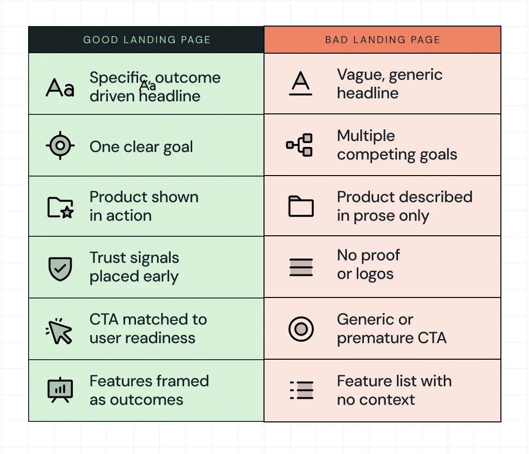
For example:
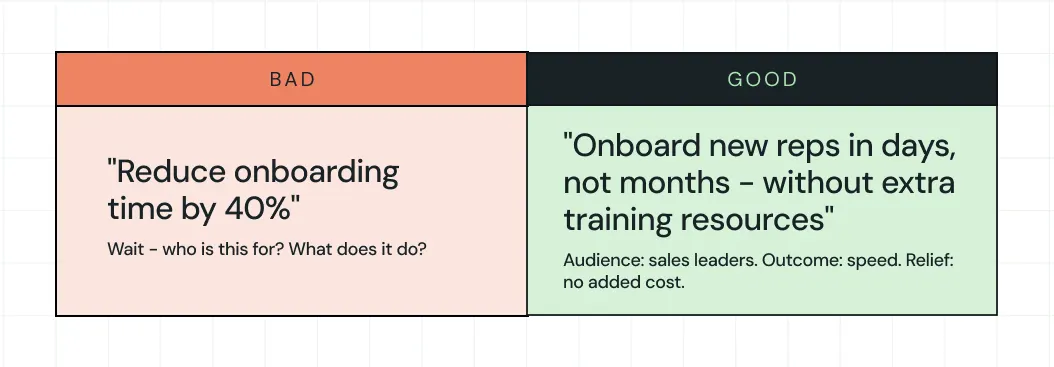
As you can see, the bad page makes the user work to understand. The good page makes the decision feel easy. That's the whole game.
How to Know if Your SaaS Landing Page Is Performing
Conversion rate is the metric everyone watches, but it barely tells even half the story. A page can show a strong conversion rate while generating leads your sales team can't close, and that's a problem just as real as low traffic.
The fuller picture comes from four signals:
- Raw conversion rate: How many visitors take the primary action. The median conversion rate for SaaS landing pages is 3.8%, and to break into the top 25% requires reaching 11.6% or higher, according to Unbounce's analysis.
- Lead quality: Are the people converting the ones your sales team wants to talk to?
- Drop-off patterns: Scroll depth and click maps show exactly where users lose interest, pointing directly to where the messaging breaks down.
- Sales feedback: If leads convert on the page but don't close, the landing page made a promise that the product or the sales conversation couldn't keep. This misalignment lives in the messaging, not the pipeline.
The goal isn't a page that converts at any cost. It's a page that attracts the right people, sets accurate expectations, and hands a qualified, informed lead to the next stage of the funnel.
How ThunderClap Approaches Landing Pages Differently
ThunderClap's approach starts upstream of the page itself. Before any copy is written or any layout is designed, the question is: What decision is this user trying to make, and what's standing in their way?
This thinking translates into how we build every landing page. We treat every page as a core growth level, rather than an isolated asset.
Our process combines creative direction with conversion thinking. It starts with mood boards that define the brand’s personality, then moves into scalable design systems that keep the experience consistent as the product evolves. From there, the page comes to life through custom illustrations, bold yet clean layouts, and storytelling that builds trust at the right moments.
This approach avoids surface-level fixes. It builds pages that stay effective as the business grows.
What you get is simple. Design that reflects your product, systems that scale with you, and decisions grounded in real SaaS and fintech experience.
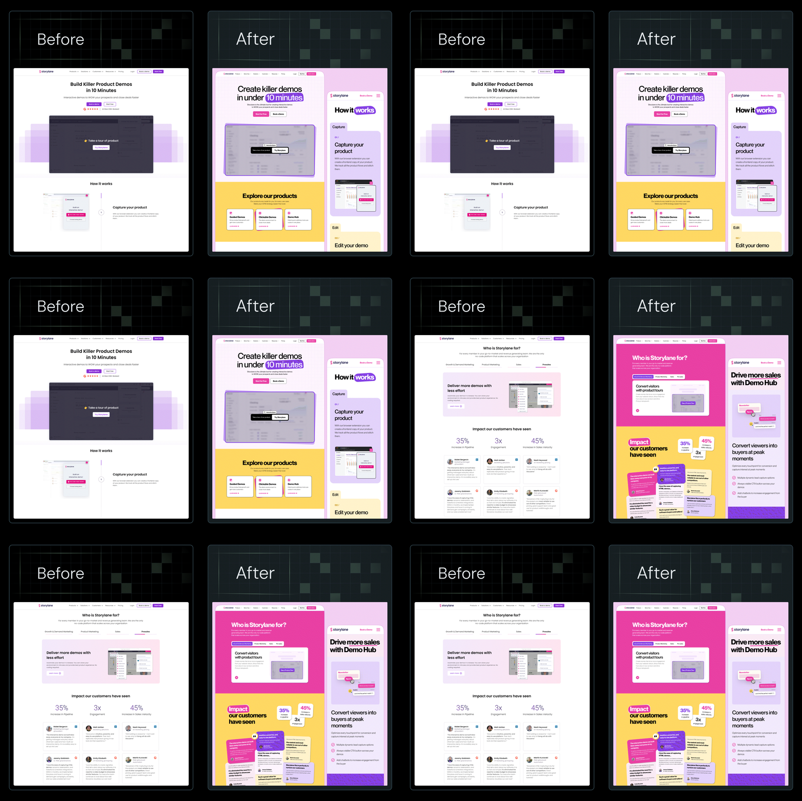
In fact, we’ve optimized and redesigned 129+ B2B websites like Amazon, Storylane, Factors, roommaster, Zamp, Dropit, and ClearlyRated. Across these projects, the focus stays the same: build landing page experiences that drive real action.
{{ctaBlock}}
FAQs
1. What are the key elements of a high-converting landing page?
A high-converting landing page leads with a clear, specific headline that defines the audience and the value. It backs that up with social proof, a product visual that shows the tool in action, copy focused on outcomes rather than features, and a CTA that matches how ready the visitor actually is to commit.
2. What's the difference between a landing page and a homepage?
A homepage introduces your whole company, invites exploration and serves multiple audiences and goals at once. A landing page guides a specific visitor toward a specific action. Every design decision on a landing page should serve that single goal, and everything that doesn't should be removed.
3. How do I design a landing page for lead generation?
Start with the one belief your visitor needs to hold before they'll give you their contact information. Then, build the page to create that belief, such as a clear value statement, relevant social proof, a low-friction form, and a CTA that makes the trade feel worthwhile. The simpler the ask, the more leads you collect.
4. How can I test if my landing page is effective?
Look at the conversion rate as your baseline, but go deeper:
- Check drop-off points to find where interest fades
- Review lead quality to see if the right people are converting
- Talk to your sales team about what those leads actually say when they arrive
Those three signals together tell you far more than a conversion number alone.
5. What makes a SaaS landing page convert?
A SaaS landing page converts when it removes uncertainty fast. Clear value in the headline, relevant product context, early trust signals, and a CTA that matches intent work together. The smoother the understanding, the easier the decision becomes.
6. How should a SaaS landing page be structured?
A strong SaaS landing page follows a simple flow. It starts with clarity in the headline, builds understanding through visuals, adds trust through proof, and ends with a focused CTA. Each section should remove one specific layer of hesitation.
7. How many sections should a SaaS landing page have?
Most SaaS landing pages work best with 5 to 8 focused sections. Enough to explain value, build trust, and guide action without overwhelming the reader. More sections can work if each one has a clear, distinct job.
8. What is the best CTA for a SaaS landing page?
The best CTA matches user intent at that moment. Early visitors respond to “See how it works,” while high-intent users prefer “Start free trial” or “Talk to sales.” Strong CTAs feel like the next logical step, not a demand.



.webp)
Browse Similar Articles

Leading 5 SaaS Branding Agencies in Florida (That Actually Understand SaaS Growth)

.svg)
How to Turn Your B2B Website into a Self-Serve Growth Engine? (PLG Ready in 2026)

9-Step Website Copy Audit Checklist to Improve Conversions (Examples from Top B2B Brands)

.webp)
How to Choose the Right Fintech Web Development Company for Your Business
Top B2B Website Design Principles That Turn Visitors into Qualified Leads
%20Audit%20That%20Actually%20Improves%20Revenue.webp)
How to Do a Conversion Rate Optimization (CRO) Audit That Actually Improves Revenue
Web Design Agency vs. Freelancer vs. In-House: What Actually Works in 2026
5 CRO Agencies in London and How to Choose the Best CRO Agency for Your Business
The Ultimate Fintech B2B Positioning Guide for 2026 (That Actually Drives Conversions)
Mapping the B2B Buyer Journey to Improve Conversions Across Every Touchpoint
.webp)
7 Best Website Maintenance Companies in India for Growth-Led B2B Teams (2026)

.webp)
8 Best Healthcare Website Design Agencies for HIPAA-Compliant Sites in 2026

How to Find the Best Web Design Company in Houston, Texas for B2B Brands (6 Best Picks)
Positioning That Wins: How to Make Complex B2B Products Clear and Compelling
The Step-by-Step Website Redesign Process B2B Teams Use to Increase Conversions (Without Killing SEO and Pipeline)
7 Best Video Production Agencies for SaaS Product Walkthroughs and Feature Videos
How to Choose the Best B2B Website Maintenance Company: 9 Questions to Ask Before You Hire One

How to Choose a Web Design Company in San Francisco in 2026 (with Examples)

10 Best Web Design Companies in Florida in 2026 and How to Choose the Right One
How to Use Brand Storytelling on Your Website to Close More B2B Deals and Build Buyer Trust
SaaS CRO Best Practices: What High-Growth Brands Do Differently to Win Conversions

How a Rebranding Agency Can Redefine Your B2B SaaS Identity and Boost Pipeline
B2B Marketing Trends in 2026 That Directly Influence Pipeline and Revenue
Top 7 Video Marketing Agencies Driving B2B SaaS Brand Awareness in 2026
Why Partnering with a B2B Brand Positioning Agency Accelerates Market Differentiation

The Complete Website Redesign Checklist for B2B SaaS Teams Ready to Scale
.avif)
9 Best Webflow Development Agencies in India for 2026 (In-Depth Review)
10 Product Marketing Companies Powering the Fastest-Growing SaaS Brands in 2026
Website Copywriting Services vs In-House: What's Right for Your Business?

How to Choose a Marketing Agency That Understands B2B SaaS Growth Metrics


How to Choose a Video Marketing Agency That Understands B2B Storytelling
Outsourcing Web Design: Cost-Benefit Analysis for Mid-Market & Enterprise Brands
From Leads to Lifetime Value: How Growth Marketing Agencies Scale SaaS Revenue
Build a B2B Website Strategy That Aligns with Sales and Marketing Goals
Webflow vs WordPress: Which Platform Is Better for Your Business Website in 2026?
Fintech Web Design That Builds Trust: 8 UX Principles Every Fintech Site Needs
Optimizing for Intent: How B2B Website Messaging and UX Changes Help Capture Top-Funnel Buyers

12 Best B2B Web Development Agencies in the US to Build Scalable Websites

From Audit to Action: 8-Step Process to Optimize Your B2B Website Strategy for 2026 Buyers
How to Design a High-Converting Landing Page from Scratch (2026 Edition)
From Click to Customer: Proven Landing Page Conversion Optimization Techniques
How to Write Website Copy That Converts: A Step-by-Step Guide for 2026

How to Optimize a Landing Page for Maximum ROI: A Step-by-Step Breakdown

AI Landing Pages That Convert: 7 Design Principles Every AI Platform Should Follow
From Traffic to Pipeline: B2B Website Growth Strategy for Scaling Teams
B2B Website Optimization Strategy: Speed, UX, SEO, and CRO in One Playbook




Interested in seeing what we can do for your website?



.webp)
