













Top 10 SaaS Web Design Inspirations in 2026


The average SaaS buyer forms a first impression within 50 milliseconds (0.05 seconds) of visiting your website. That decision comes from design: how quickly your site communicates value, how trustworthy it feels, and how engaging the experience is.
In 2026, the stakes are higher than ever. SaaS categories are exploding with lookalike competitors. Investors expect growth efficiency, not just growth. Customer acquisition costs are rising. The website has become the conversion engine that determines whether a visitor moves to a free trial, demo, or signup.
Three shifts define SaaS web design today:
- Product-led growth: Users want to see and feel the product before committing.
- Conversion architecture: Design choices (hero layout, pricing clarity, CTA placement) are tied directly to trial → paid conversion.
- Dynamic storytelling: SaaS is complex; motion, illustrations, and micro-interactions simplify the message while building memory.
At ThunderClap, we’ve worked on over 129 B2B websites, including Amazon, Razorpay, Factors, and Storylane, to optimize their websites and boost conversions. In this blog, we go beyond inspiration: covering design trends, B2B vs. B2C approaches, real SaaS examples with takeaways, and a practical checklist you can put to work.
5 SaaS website design trends defining 2026
In SaaS, design trends often respond to how users discover, evaluate, and purchase software. The best SaaS website designs in 2026 share five key traits that are directly tied to growth and conversion.
1. Motion that explains, not distracts
For years, SaaS websites added animations as decoration. Now, the best sites use motion as explanation. Product workflows, pricing toggles, and feature interactions come alive in ways that make value instantly clear.
At ThunderClap, we design every animation to simplify, not distract.
2. Product-led storytelling in the hero section
Another defining move is toward product-led storytelling, especially in the hero section. Instead of vague taglines and stock visuals, leading SaaS brands are putting their products front and center. Screens, demos, or illustrations of real-world use cases show visitors what the tool can do in the first five seconds.
That instant clarity is what turns a bounce into a signup.
3. Trust-centered UX for B2B SaaS
For B2B SaaS website design, the emphasis is shifting toward trust-centered UX. Enterprise buyers aren’t swayed by flashy visuals; they want transparency and proof. Clear pricing layouts, security certifications, customer logos, and ROI calculators are no longer optional.
How you place them (near CTAs, not buried in footers) makes the difference between confidence and doubt.
4. Minimalism with intelligence
At ThunderClap, we view minimalism as a tool for clarity of decision-making. In 2026, minimalism continues to dominate, but it has evolved into a more intelligent form. Whitespace, clean typography, and stripped-down navigation are paired with subtle micro-interactions that guide users through decisions.
5. Websites that double as the first demo
The line between SaaS products and SaaS websites is blurring. More companies are embedding interactive demos directly into their sites, letting visitors test features before signing up. Tools like Storylane (with which we had the pleasure of working on their latest design) have popularized this approach, and forward-looking SaaS websites are incorporating it into their design as a primary conversion path.
Top 10 SaaS web designs to inspire in 2026
Looking at real-world SaaS website design inspiration is the fastest way to see these principles in action. We’ve curated 10 examples of SaaS websites that stand out.
1. Pazo
What stands out
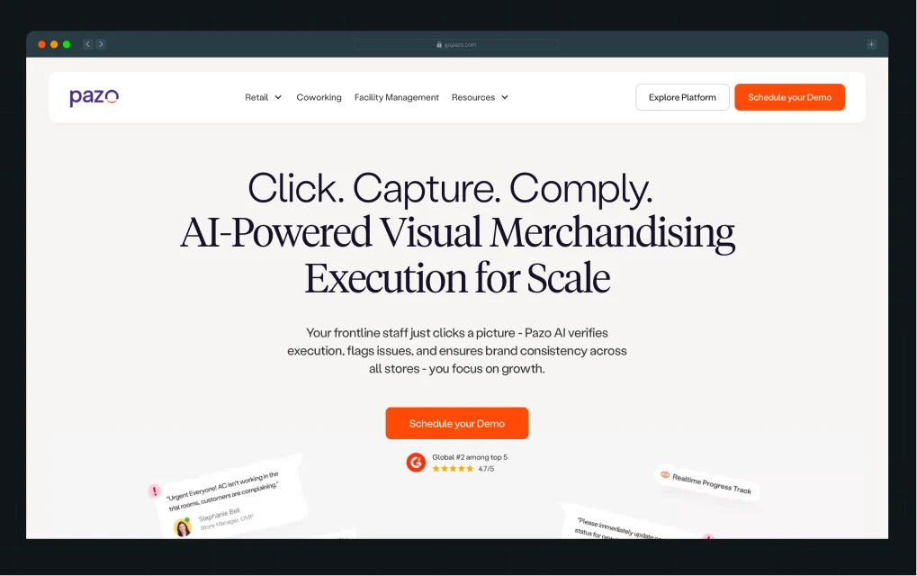
This one’s close to home. Pazo (a retail operations and visual merchandising platform) partnered with ThunderClap for a full website revamp. The hero section puts the product front and center, with a clean phone mockup surrounded by floating UI elements that instantly show how the platform works. As you scroll, bright accents, product illustrations, and a full wall of testimonials create momentum while building trust.
Why it works
Great B2B SaaS website design isn’t about heavy copy. By putting the product in context on a device, Pazo makes its platform feel practical and ready to use. Pairing this with logos and testimonials from brands like Bata, Jockey, and Qualcomm delivers instant social proof.
We decided to use bold orange CTAs (contrasted against a clean background) to keep the conversion path obvious.
Web design inspiration for you
Don’t just tell prospects what your product does. Show it, contextualize it, and back it with proof. Use device mockups, real UI, and customer voices to reduce abstractness.
2. Dropbox
What stands out
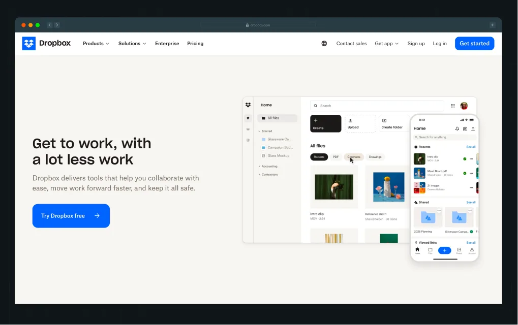
We’ve always admired how Dropbox keeps things deceptively simple. Dropbox’s homepage leans hard into product context. Almost every section shows the interface in action.
From the top search bar demo (“Find anything. Protect everything.”) to the clean content previews and sharing flows, the site makes it obvious what Dropbox helps you do. Another standout is the black section midway through, where bold contrast and floating UI cards spotlight testimonials and social proof without feeling heavy.
Why it works
This is SaaS website design at its most confident. By resisting the urge to shout, Dropbox communicates trust and maturity. The clarity of the design makes the product feel intuitive and reliable, while subtle micro-interactions keep it from being flat.
Web design inspiration for you
Don’t bury your interface behind generic illustrations. Use actual product shots in different contexts (search, sharing, security) so visitors see the utility right away. And if you’ve got multiple use cases, vary the background tone to reset attention and keep users scrolling.
3. roommaster
.webp)
What stands out
When roommaster rebranded from InnQuest, they needed more than a fresh logo. They needed a website that reflected the sophistication of a complete hospitality platform.
Our team designed a clean, modern interface that puts the product at the forefront. In the hero, we used crisp typography, subtle gradients, and a clear demo CTA. As you scroll, you will see custom illustrations and modular layouts that explain features, while testimonials and recognizable hotel brand logos build trust.
Why it work
This is a B2B SaaS website design targeting hotel decision-makers. Every section reduces risk: recognizable logos build authority, modular layouts break down complex functionality, and clean illustrations add polish without clutter.
The rebrand feels both modern and enterprise-ready, a combo that helps Roommaster appeal to global hoteliers.
Web design inspiration for you
Lead with a simple promise, then back it up with modular proof, such as feature callouts, recognizable brands, and authentic customer voices.
4. Shopify
What stands out
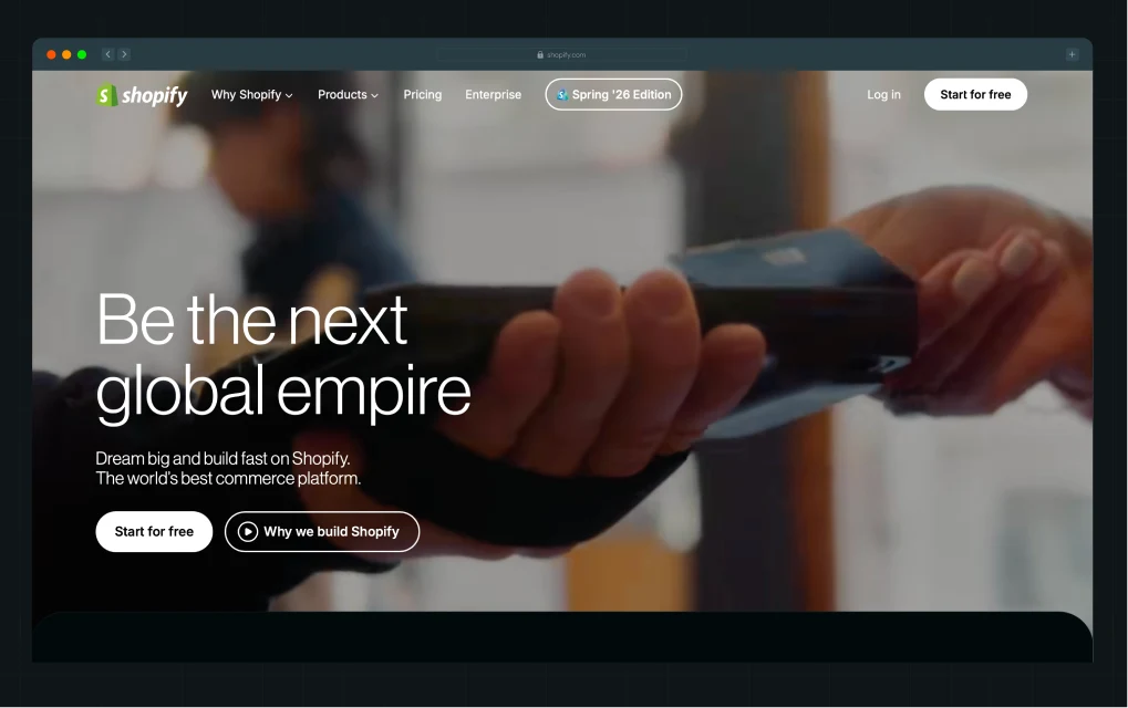
Shopify’s website feels like a mini ecosystem tour. The home page hero leads with a full-width background video, instantly showing real businesses and real storefronts using Shopify (much stronger than abstract slogans). Scroll down and you see use cases broken into cards (Glossier, Vacation, even local stores) that make the platform feel universal.
One of the boldest sections is the integrations wall: dozens of app icons stacked edge-to-edge, making the platform’s scale impossible to miss.
Why it works
This is a SaaS website design that builds credibility by showing breadth. The video makes Shopify human and relatable, while the customer cards make it aspirational (if Glossier can scale here, so can you).
The integrations wall is clever psychology: it signals reliability through sheer volume, showing visitors that Shopify isn’t a lone tool, it’s a hub that connects everywhere.
Web design inspiration for you
If your SaaS sits at the center of an ecosystem, lean into that visually. Don’t bury integrations in a tab. Put them front and center.
{{specficBlog}}
5. Deductive AI
What stands out
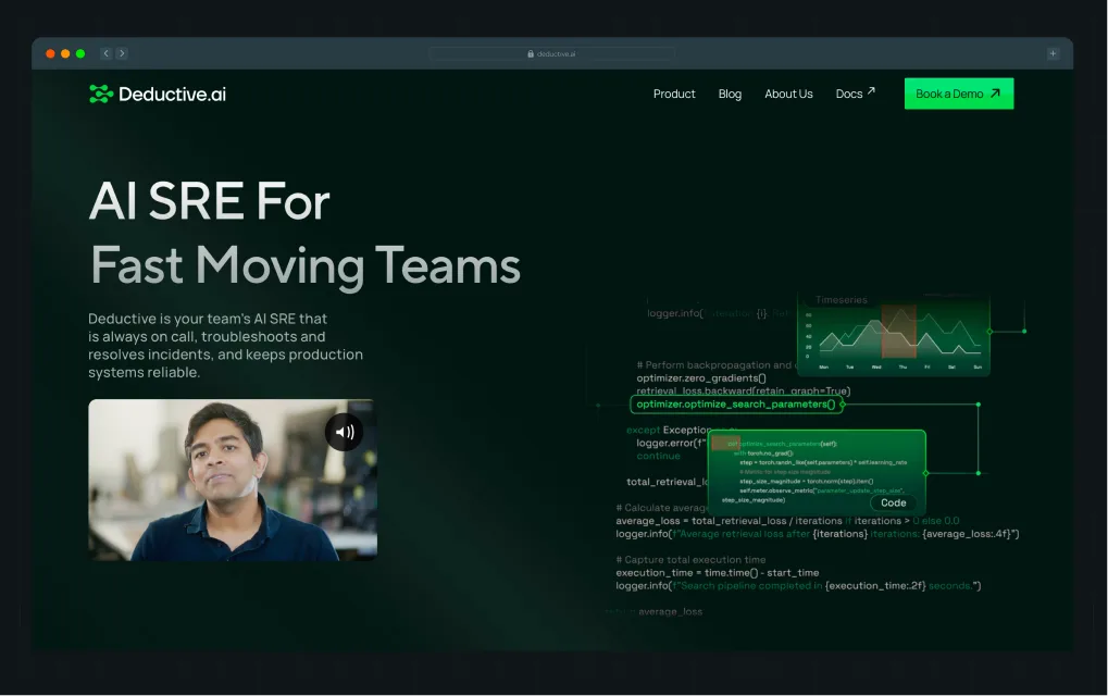
Deductive.ai is a stealth-mode startup founded by two ex-MAANG leaders. We partnered with them to build a complete brand identity and redesign the website from the ground up. Post revamp, the website earned industry recognition and drove 10x higher engagement.
Deductive.ai makes an immediate impression with its bold hero line: “No More Root Causing in the Dark.” The dark, neon-accented palette sets a technical and futuristic tone, while animated graphs position the product as a next-gen solution. Visual diagrams and product screenshots explain how the tool integrates with GitHub, Jira, and Splunk, while the “Traditional Way vs Deductive Way” comparison block drives the message home with clarity.
Why it works
For developer and SRE audiences, clarity and credibility matter more than gloss. Deductive.ai uses technical visual language (graphs, dark UI, code snippets) to speak directly to its target users. This site leans into the developer-first design trend, featuring darker palettes, syntax-inspired typography, and the visualization of complex workflows.
Web design inspiration for you
If your product is technical, design it for the user’s environment. Speak the visual language of your buyer while clearly showing how your solution improves their daily workflow.
6. Storylane
.webp)
What stands out
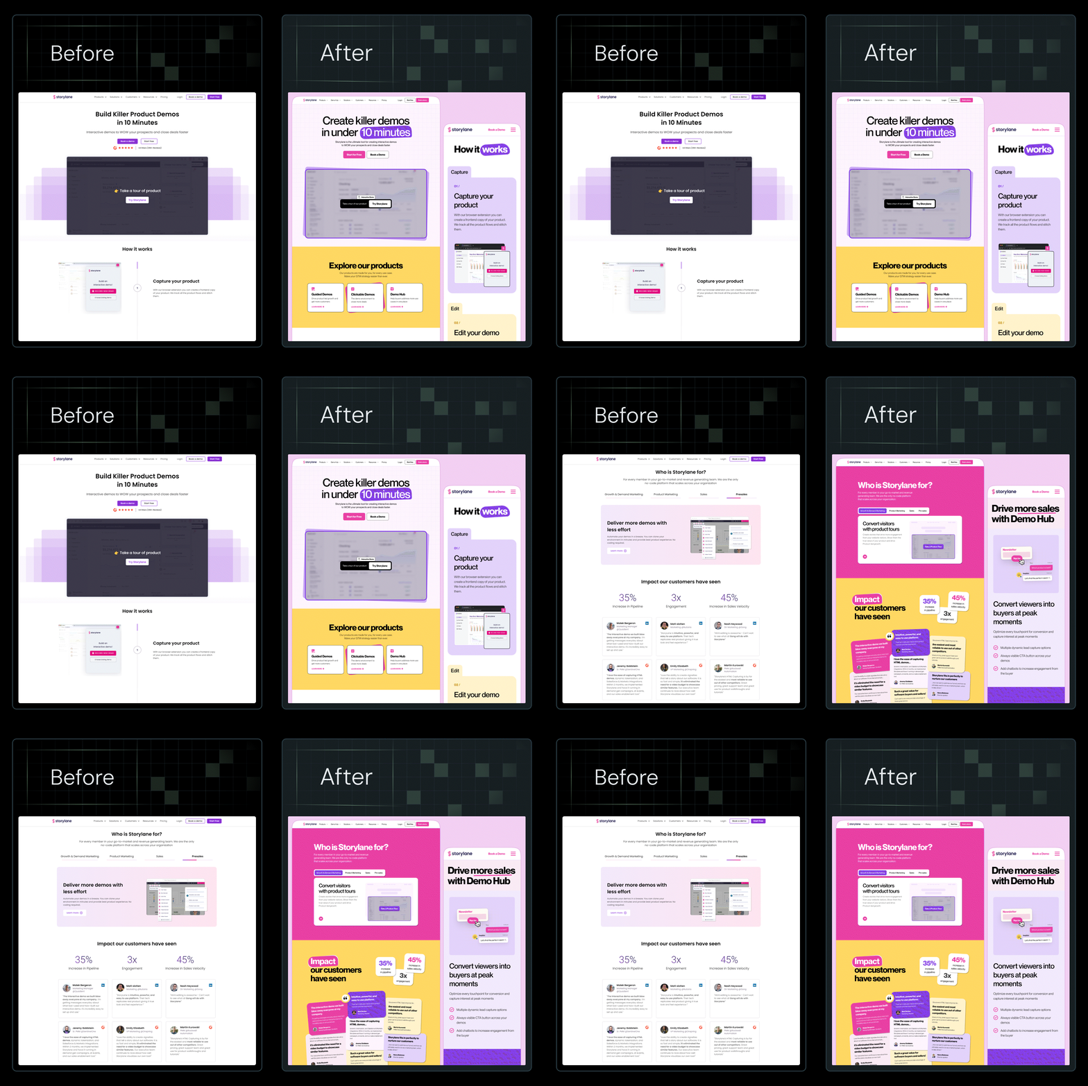
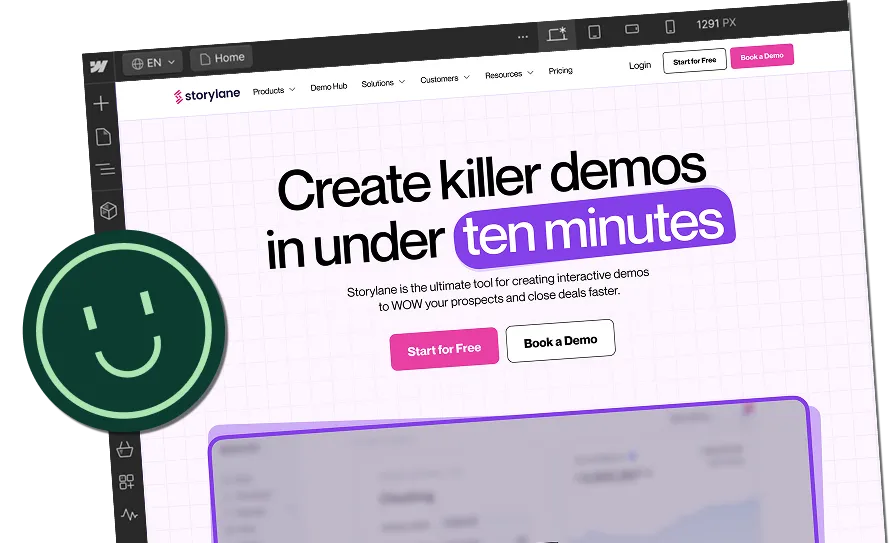
Storylane (a demo automation platform for sales and marketing teams) partnered with ThunderClap to revamp its visual identity and website. The challenge was clear: keep the copy, but inject a personality that matched their bold, innovative brand. We handled everything end-to-end, brand design, website design, and Webflow development.
The result is a playful yet professional site with strong color pops, custom illustrations, and consistent typography that makes the product stand out. Post revamp, Storylane saw a 36% increase in website impressions and a 30% boost in demo requests.
Curious to know more?
📌 Read the full breakdown in this LinkedIn post by Kiran Kulkarni, Partner & Head of Growth at ThunderClap, including the exact design process and before/after insights.
Why it works
This project shows how SaaS website design goes beyond pixels by aligning personality with product. The playful color accents, clean fonts, and filled icons reflect the brand’s maturity and confidence, attracting enterprise buyers while keeping the product approachable.
Web design inspiration for you
If your SaaS site feels flat, the problem may not be the copy or website strategy (it may be the brand personality). Use mood boards to define tone, bring in consistent typography and color systems, and layer in custom illustrations to stand out.
7. Notion
.webp)
What stands out
Notion’s homepage makes one big shift: it’s now an AI-first story. The hero headline, “Work faster with your AI team,” sets the tone immediately. The screenshots below aren’t abstract mockups. Instead, they show real product flows like roadmaps, priorities, and team dashboards.
Another standout is the “Introducing Notion 3.0” block, which stacks product modules in colorful cards (search, notes, projects), making it clear that Notion is an all-in-one workspace, not just a notes app.
And threading through it all: Notion’s signature hand-drawn icons. Playful, sketch-like, and instantly recognizable, they add warmth to what could otherwise feel like a cold AI narrative.
Why it works
This is a SaaS website design that matches product evolution. By putting AI in the spotlight, Notion reframes itself for enterprise relevance while keeping its playful design DNA intact. The modular card layout reduces cognitive load: instead of listing features, it shows digestible “mini use cases.” Partner logos (OpenAI, Ramp, Vercel) build instant credibility with the right audiences.
Web design inspiration for you
If your SaaS is evolving rapidly, let your website clearly reflect that pivot. Lead with your new positioning, then use modular feature cards to help visitors grasp the breadth without feeling overwhelmed.
{{specficService}}
8. ClickUp
What stands out
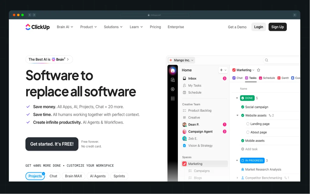
ClickUp wastes no time showing the sheer scale of its platform. The hero headline is anchored by a dense grid of app modules, laid out like a dashboard, so visitors instantly understand the “everything app” positioning. Midway down, a dark gradient section creates a sharp visual break, shifting the mood and reinforcing the “Work is broken / Let’s fix it” narrative.
The rest of the page is structured with modular feature cards, each paired with gradient-backed illustrations, creating a rhythm that makes an enormous feature set easier to scan.
Why it works
For a product with so many capabilities, the design keeps complexity under control. The grid in the hero visualizes breadth in a way that feels immediate and intuitive. The dark section resets attention and makes the page feel dynamic as users scroll.
Web design inspiration for you
If your SaaS has dozens of features, treat the homepage like a UI system: use structured grids, recurring card layouts, and contrast-heavy sections to maintain variety without overwhelming the visitor.
9. Zenda
.webp)
What stands out
Zenda is one of our favorite B2C SaaS projects because it proves that even something as dry as school fee payments can feel magical. We overhauled their design system to focus on clarity, but kept it fun with bold illustrations, 3D visuals, and little sparks of delight sprinkled throughout the site. Parents immediately see what the app does, and just as importantly, they trust it (thanks to proof woven in everywhere).
The team loved it, and so did the design world. The site went on to get nominated at Awwwards.
Why it works
For fintech SaaS, the design has to balance two things: make the product feel simple and trustworthy, while still standing out. Zenda nails this by turning complex financial tasks into something visually light and approachable. The illustrations explain the use cases better than any paragraph of text could.
Web design inspiration for you
If your SaaS speaks to everyday consumers, don’t be afraid to add personality. A little playfulness, when backed up by proof, goes a long way.
Also read: Top B2B Branding Strategies with Examples from Top Brands
10. Webflow
.webp)
What stands out
Webflow leads with confidence: a bold, high-contrast hero proclaiming “Where creativity drives performance,” paired with a clear dual CTA for both demo and trial. The dark theme gives the page weight, while bursts of color in product screenshots add vibrancy and direction.
Midway through, the site highlights its credibility with customer stories from household names like TED and Rakuten, using video portraits and bold metrics that feel more alive than static testimonials.
Another notable design choice is the heavy use of modular blocks (alternating product feature panels, customer stats, and AI-focused sections), each framed with plenty of breathing room so the site never feels crowded.
Why it works
Webflow’s site is a case study in SaaS website design for platforms that straddle creativity and enterprise authority. The dark theme conveys sophistication, making colorful product visuals pop with energy. By integrating customer proof through video-driven testimonials and quantifiable outcomes, Webflow balances inspiration with trust.
Web design inspiration for you
If your SaaS product sits at the intersection of creative and technical audiences, take a page from Webflow: go bold with contrast, make proof points dynamic through video or interactive formats, and use modular content blocks to pace the story. The result is a homepage that feels cinematic yet practical.
SaaS website design checklist for 2026 founders & designers
At ThunderClap, this is our lens: the best SaaS website design happens when visual hierarchy, interaction design, and motion storytelling all align to reduce friction, build trust, and create lasting recall.
Here’s the design checklist we use to build the best SaaS website designs in 2026. We recommend you do a design audit, and if your site misses more than one of these, it’s not working as hard as it could.
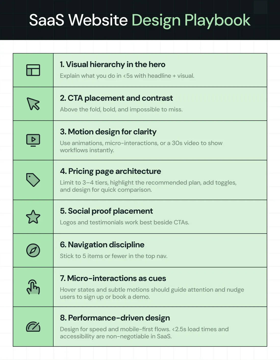
- Visual hierarchy in the hero section → In under 5 seconds, users should know what you do, who it’s for, and the next step. Strong headline + clear subhead + a product visual (screenshot, animation, or demo) arranged with hierarchy ensures instant clarity.
- CTA placement and contrast → Call-to-actions should sit above the fold and be visually distinct. Button color, size, and surrounding whitespace are design choices that make or break conversions.
- Motion design for storytelling → Replace static copy with product illustrations, micro-animations, or a 30–45 sec explainer video. Motion should guide understanding, not distract.
- Pricing page information architecture → Limit to 3–4 tiers, highlight the recommended plan with visual emphasis, add monthly/annual toggles, and design a logical flow down to FAQs. Layout should make comparison effortless.
- Information design for social proof → Client logos, testimonials, and case studies belong next to CTAs, not buried on a separate page. The way you frame proof visually is as much a design decision as it is a content one.
- Navigation and interaction design → Keep the top nav to 5 items or fewer. Use hierarchy and interaction design to create clear, conversion-focused paths (Product, Pricing, Resources, About, CTA).
- Micro-interactions as UX guidance → Hover effects, scroll-triggered animations, and button feedback aren’t flair. They’re design cues that orient users and nudge them toward action.
- Performance-driven design → Optimize images, animations, and layouts for <2.5s load time. Design responsive, mobile-first flows for critical actions like pricing toggles, demo forms, and onboarding. Speed and accessibility are part of design.
Why ThunderClap is the partner behind the best SaaS website design
Looking at these examples makes one thing clear: the best SaaS website design in 2026 isn’t about surface polish. It’s about building a system that communicates value instantly, builds trust through proof, and guides users toward conversion.
That’s exactly what we do at ThunderClap for B2B SaaS, fintech, VC, or AI.
Most teams come to us with websites that don’t match their product maturity due to outdated templates, inconsistent messaging, or designs that hinder conversions. Our job is to fix that with a proven, conversion-first design process.
Here’s how we work:
- Discovery & audit → We start by mapping positioning, messaging, UX, and credibility gaps so we know exactly what’s holding your site back.
- Strategy sprint → Then we design a messaging and visual identity framework that makes your product value crystal clear.
- Design & build → We execute in Webflow, building scalable CMS systems that give marketers control without developer bottlenecks.
- Optimization → Post-launch, we keep improving with CRO experiments, CTA testing, and UX iterations tied directly to pipeline metrics.
This is why 129+ brands like Amazon, Razorpay, Storylane, Factors, Deductive, and Roommaster trust us. The results speak: 30%+ increases in demo requests, 50% conversion lifts, and industry recognition, including Awwwards nominations.
{{ctaBlock}}
FAQs
1. How to design a SaaS website that converts?
Start with clarity in the hero section: headline, subhead, and product visual that explain your value in under 5 seconds. Use one consistent CTA color across the site. Keep navigation lean (5 items max). Place proof elements (logos, testimonials, ROI stats) directly beside CTAs, not hidden elsewhere. Design pricing pages with 3–4 plans, annual/monthly toggles, and clear “recommended” highlights. Every design choice should reduce friction and reinforce trust.
2. What sections should every high-converting SaaS website include?
- Hero section → Clear value proposition + CTA.
- Product visuals → Screenshots, animations, or short video demos.
- Social proof → Logos, testimonials, case studies integrated near CTAs.
- Feature blocks → Modular, scannable sections (not walls of text).
- Pricing page → Transparent, tiered, and interactive (toggles).
- Integrations/compatibility → Proof your SaaS fits into the stack.
- FAQ or objection handling → Design to overcome last-mile doubts.
3. What are some of the best SaaS design agencies in the US?
Some highly regarded agencies with SaaS expertise include:
- ThunderClap → End-to-end SaaS website design, CRO, and Webflow development. Known for work with Pazo, Roommaster, Storylane, Amazon, Deductive, and Zenda.
- Momentum Design Lab → UX-heavy approach, enterprise SaaS focus.
- Toptal Design Network → Curated freelancers, strong for scaling SaaS teams.
- Work & Co → High-end, brand-forward SaaS platforms.
- Clay → Blends strategy + SaaS product design with polished visuals.
4. How do I optimize my CTA for better conversions?
- Placement: First CTA must be above the fold; repeat after major proof sections.
- Contrast: Pick one bold color not used elsewhere. Surround it with whitespace.
- Copy: Use outcome-driven text (“Get Started Free” > “Submit”).
- Context: Pair CTAs with proof — testimonials, logos, ROI stats.
- Mobile-first: Ensure button is thumb-friendly, sticky on scroll if possible.
- Micro-interactions: Add hover states or subtle animations to make CTAs feel alive.



.webp)
Browse Similar Articles
Leading 5 SaaS Branding Agencies in Florida (That Actually Understand SaaS Growth)
.svg)
How to Turn Your B2B Website into a Self-Serve Growth Engine? (PLG Ready in 2026)

9-Step Website Copy Audit Checklist to Improve Conversions (Examples from Top B2B Brands)

.webp)

How to Choose the Right Fintech Web Development Company for Your Business
Top B2B Website Design Principles That Turn Visitors into Qualified Leads
%20Audit%20That%20Actually%20Improves%20Revenue.webp)
How to Do a Conversion Rate Optimization (CRO) Audit That Actually Improves Revenue
Web Design Agency vs. Freelancer vs. In-House: What Actually Works in 2026
5 CRO Agencies in London and How to Choose the Best CRO Agency for Your Business
The Ultimate Fintech B2B Positioning Guide for 2026 (That Actually Drives Conversions)
Mapping the B2B Buyer Journey to Improve Conversions Across Every Touchpoint
.webp)
7 Best Website Maintenance Companies in India for Growth-Led B2B Teams (2026)

.webp)
8 Best Healthcare Website Design Agencies for HIPAA-Compliant Sites in 2026

How to Find the Best Web Design Company in Houston, Texas for B2B Brands (6 Best Picks)
Positioning That Wins: How to Make Complex B2B Products Clear and Compelling
The Step-by-Step Website Redesign Process B2B Teams Use to Increase Conversions (Without Killing SEO and Pipeline)
7 Best Video Production Agencies for SaaS Product Walkthroughs and Feature Videos
How to Choose the Best B2B Website Maintenance Company: 9 Questions to Ask Before You Hire One
How to Choose a Web Design Company in San Francisco in 2026 (with Examples)

10 Best Web Design Companies in Florida in 2026 and How to Choose the Right One
How to Use Brand Storytelling on Your Website to Close More B2B Deals and Build Buyer Trust
SaaS CRO Best Practices: What High-Growth Brands Do Differently to Win Conversions

How a Rebranding Agency Can Redefine Your B2B SaaS Identity and Boost Pipeline
B2B Marketing Trends in 2026 That Directly Influence Pipeline and Revenue
Top 7 Video Marketing Agencies Driving B2B SaaS Brand Awareness in 2026
Why Partnering with a B2B Brand Positioning Agency Accelerates Market Differentiation

The Complete Website Redesign Checklist for B2B SaaS Teams Ready to Scale
.avif)
9 Best Webflow Development Agencies in India for 2026 (In-Depth Review)
10 Product Marketing Companies Powering the Fastest-Growing SaaS Brands in 2026
Website Copywriting Services vs In-House: What's Right for Your Business?

How to Choose a Marketing Agency That Understands B2B SaaS Growth Metrics

How to Choose a Video Marketing Agency That Understands B2B Storytelling
Outsourcing Web Design: Cost-Benefit Analysis for Mid-Market & Enterprise Brands

From Leads to Lifetime Value: How Growth Marketing Agencies Scale SaaS Revenue
Build a B2B Website Strategy That Aligns with Sales and Marketing Goals
Webflow vs WordPress: Which Platform Is Better for Your Business Website in 2026?
Fintech Web Design That Builds Trust: 8 UX Principles Every Fintech Site Needs
Optimizing for Intent: How B2B Website Messaging and UX Changes Help Capture Top-Funnel Buyers

12 Best B2B Web Development Agencies in the US to Build Scalable Websites

From Audit to Action: 8-Step Process to Optimize Your B2B Website Strategy for 2026 Buyers
How to Design a High-Converting Landing Page from Scratch (2026 Edition)
From Click to Customer: Proven Landing Page Conversion Optimization Techniques
How to Write Website Copy That Converts: A Step-by-Step Guide for 2026

How to Optimize a Landing Page for Maximum ROI: A Step-by-Step Breakdown

AI Landing Pages That Convert: 7 Design Principles Every AI Platform Should Follow
From Traffic to Pipeline: B2B Website Growth Strategy for Scaling Teams
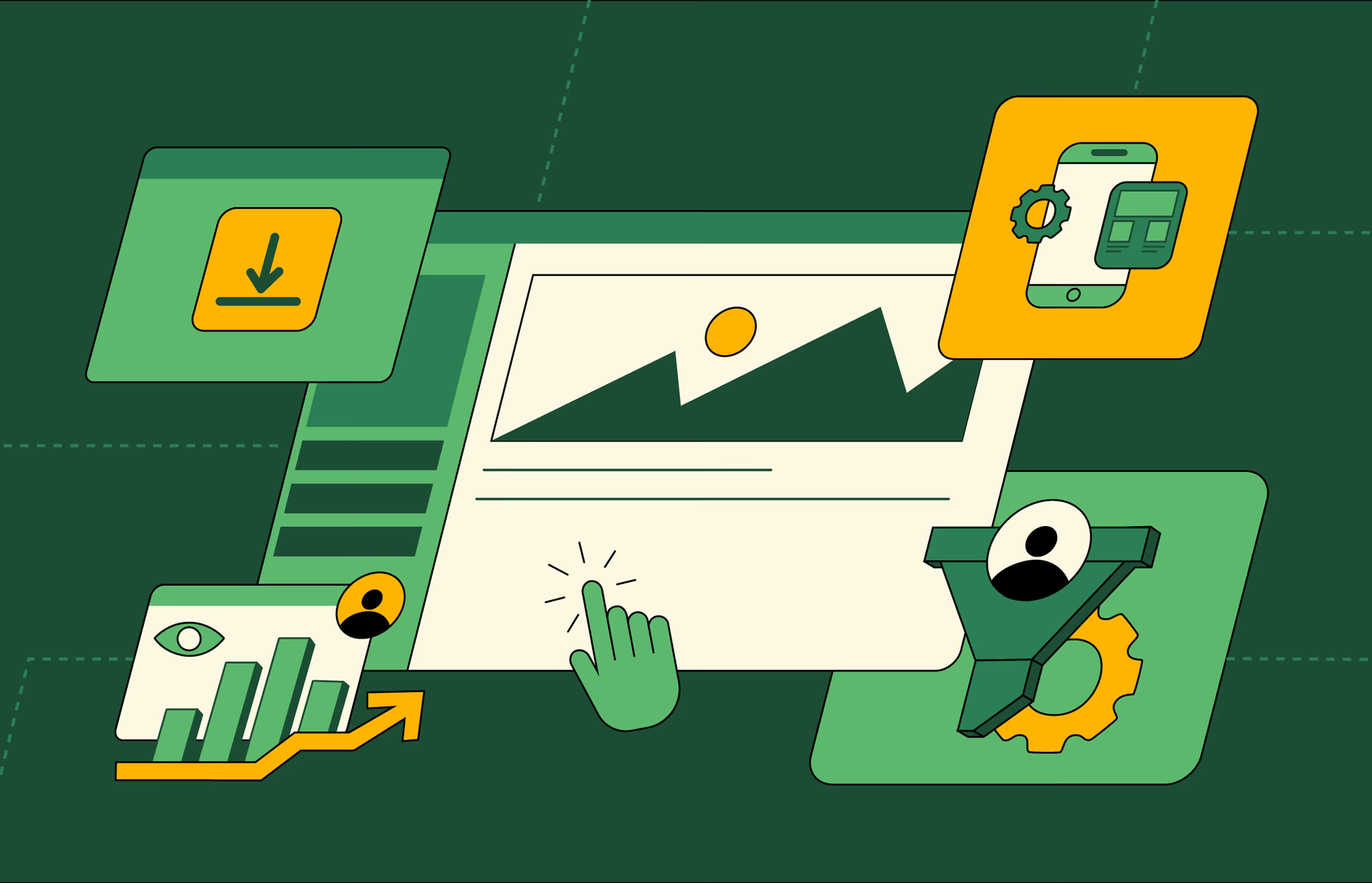
B2B Website Optimization Strategy: Speed, UX, SEO, and CRO in One Playbook



Interested in seeing what we can do for your website?



.webp)
