















CTA Best Practices: How to Design Calls-to-Action That Actually Convert


Your website gets thousands of visitors every month. Your content engages readers, your design looks neat, and your value proposition shines crystal clear. But here’s the hard truth: if your calls-to-action (CTAs) don’t work, none of that matters.
At ThunderClap, we help hundreds of B2B SaaS and tech companies buff their underperforming websites into conversion-driven assets. As a conversion-first website partner, we see how the smallest CTA tweaks result in growth. The difference between a 2% and 8% conversion rate goes beyond numbers - it separates companies wanting to hit targets from those scaling predictably.
This all-in-one guide walks you through everything you need to know about CTA best practices that move the needle. We’ll cover design principles, copywriting tactics, placement strategies, and examples from high-converting B2B websites.
Let’s get started.
Why CTAs Form the Backbone of Conversion-Focused B2B Websites
Your CTA creates the moment of truth. Interest gets into action here, visitors become leads here, and browsers become buyers here. Yet research shows that 70% of small business websites lack clear or effective CTAs. Companies don’t just miss opportunities; they leave money on the table.
The numbers tell the story:
- Clear, specific CTAs increase conversion rates by up to 161%
- CTAs with urgency elements see a 332% increase in conversions
- Multiple CTAs on a page lead to a 20% increase in conversions when you place them strategically
But here’s what most B2B companies get wrong: they treat CTAs as afterthoughts. They slap a generic “Learn More” button on their homepage and wonder why conversions flatline.
You should treat CTAs as assets. They guide users through your conversion funnel and address specific intent at each stage. When you do this right, you turn your website from a brochure into a growth engine.
Just like we discussed in our B2B Website Optimization Strategy guide, every element of your website should drive conversions - and CTAs lead that charge.
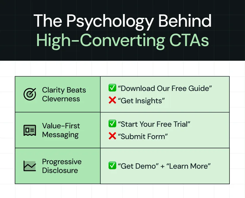
Before we dive into tactical CTA best practices, let’s understand what makes people click. Effective CTAs tap into fundamental psychological principles:
- Clarity Beats Cleverness: Users want to know exactly what happens when they click. “Download Our Free Guide” is more informative than “Get Insights” because it removes uncertainty.
- Value-First Messaging: The best CTAs lead with benefit, not process. “Start Your Free Trial” focuses on the outcome, while “Submit Form” focuses on the action.
- Progressive Disclosure: Not every visitor feels ready for a high-commitment action. You capture users at different funnel stages when you offer multiple CTA options like “Get Demo” and “Learn More.”
At ThunderClap, we call this the Conversion Confidence Framework.
Every CTA should answer three questions:
- What will I get?
- Why should I trust you?
- What happens next?
CTA Design Principles That Drive Conversions
Visual Hierarchy and Contrast
Your CTA needs to stand out without looking obnoxious. CTA button best practices start with a visual design that guides attention naturally.
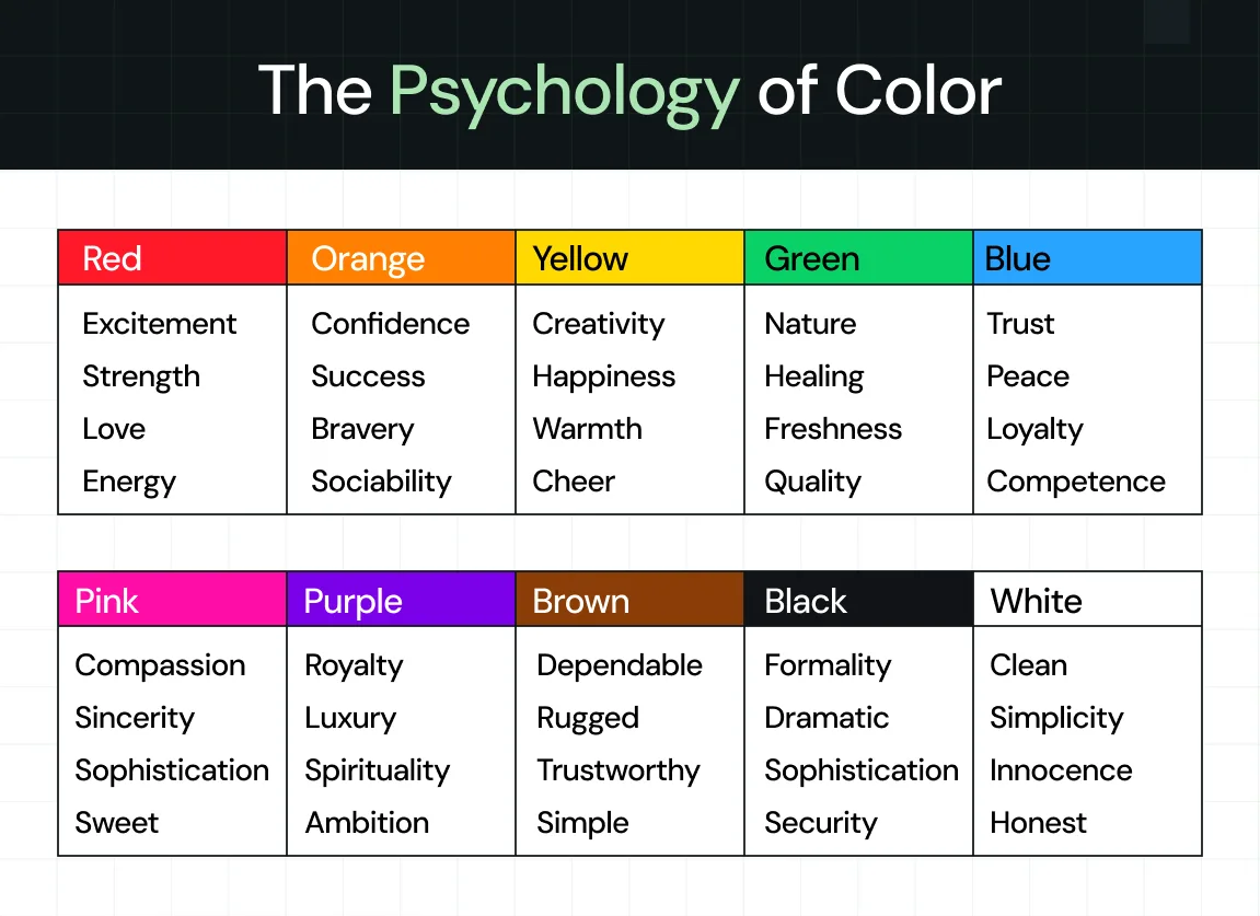
- Color Psychology: Use contrasting colors that pop against your background. Research shows that changing button color alone can raise conversions. Orange, green, and red perform well, but contrast matters more than the specific hue.
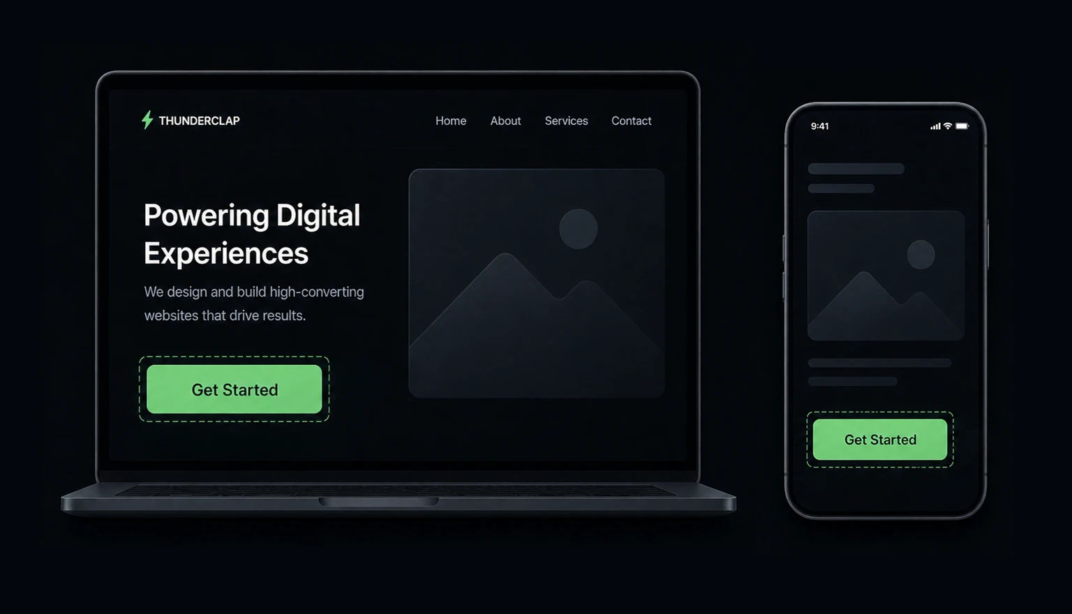
- Size: CTAs should look noticeable and feel easy to click, especially on mobile. We recommend a minimum of 44px by 44px, but bigger buttons can also increase clicks.
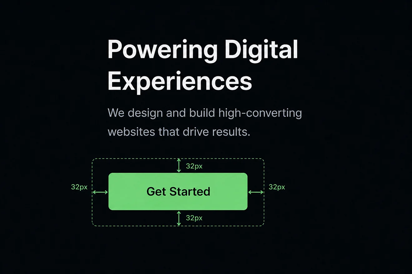
- White Space: Give your CTAs breathing room. You can improve conversion rates by up when you place elements with adequate white space and minimal visual clutter. White space doesn’t waste space!
This connects directly to what we cover in our SaaS Website Design That Converts guide - mobile optimization makes or breaks your conversion performance.
{{specficBlog}}
Button Shape and Style
- Familiarity breeds trust. Stick to conventional button shapes - rectangles with slightly rounded corners over creative shapes. Users recognize these as clickable elements because we’ve conditioned them to do so.
- Visual Depth: Subtle shadows or gradients can make buttons feel more clickable and prominent. But keep it minimal - no heavy effects.

CTA Copywriting That Converts
Action-Oriented Language
The strongest CTAs use powerful, specific verbs that create momentum. Instead of generic phrases like “Click Here” or “Submit,” use action words that connect to outcomes:
- “Start Building” instead of “Schedule a Demo”
- “Book Your Strategy Call” instead of “Contact Us”
- “Download the Playbook” instead of “Learn More”
First-Person vs. Second-Person Copy
Research consistently shows that first-person CTAs outperform second-person alternatives.
“Start My Free Trial” converts better than “Start Your Free Trial” because it creates ownership and personal investment in the outcome.
Benefit-Driven Messaging
The best CTA best practices don’t just tell users what to do - they tell them what they’ll get:
- “Get My Conversion Audit (combines action + benefit)
- “Download the Growth Framework” (specific + valuable)
- “Start My 14-Day Trial” (clear timeframe + ownership)
Urgency and Scarcity
When you use urgency authentically, you can dramatically increase conversions. CTAs with urgency elements see up to 332% higher conversion rates. But avoid fake countdown timers or manufactured scarcity - B2B buyers spot these tactics immediately.
You can use these effective urgency tactics:
- Limited-time offers with deadlines
- Limited spots for webinars or consultations
- Seasonal promotions tied to business cycles
- Early-bird pricing for events or launches
Above-the-Fold Placement
CTAs placed above the fold perform better than those below the fold. But “above the fold” doesn’t just mean the hero section - it means visible without scrolling on the user’s specific device.
For B2B websites, this typically means:
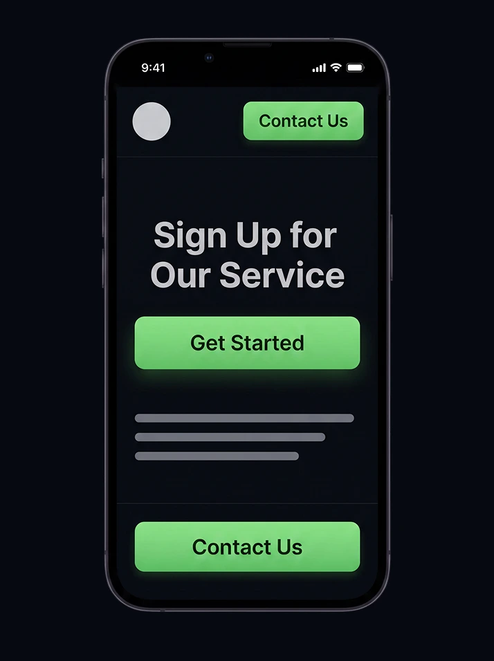
- Primary CTA in the hero section
- Secondary CTA in the navigation
- Sticky CTA that follows scroll (for longer pages)
As we detail in our Above the Fold Optimization insights blog, you need to make your most important elements immediately visible and compelling.
The Multi-CTA Strategy
Contrary to popular belief, landing page CTA best practices often include multiple CTAs when you do them strategically.
The key involves the CTA hierarchy:
- Primary CTA: Your main conversion goal (demo request, trial signup)
- Secondary CTA: Lower-commitment option (resource download, newsletter)
- Navigation CTA: Always accessible fallback option
Content-Integrated CTAs
Instead of relegating CTAs to sidebars or footers, include them in your content flow at natural decision points.
- After explaining a key benefit
- Following social proof or testimonials
- At the end of the problem/solution explanations
- Before and after case studies
Website CTA Best Practices for Different Page Types
Homepage CTAs
Your homepage CTA sets the tone for your entire conversion funnel. Website CTA best practices for homepages include:
- Hero Section: Your primary CTA should reflect your main business goal. For SaaS companies, this typically means “Start Free Trial” or “Book a Demo.”
- Value Proposition: Your CTA should directly connect to your headline. If your headline promises to “Build Websites 3x Faster,” your CTA might say “Start Building Faster.”
- Consistency: Use the same primary CTA throughout your homepage.
Landing Page CTAs
Landing pages have one job: convert visitors. Landing page CTA best practices require laser focus:
- Single Goal: Each landing page should have one primary objective. Everything - copy, design, CTAs - should stick with that goal.
- Form Integration: For lead generation pages, embed CTAs directly with forms.
- Trust Signals: Surround CTAs with relevant social proof, security badges, and risk-reduction copy (“No credit card required,” “Cancel anytime”).
Product Page CTAs
Product pages require different CTA strategies based on user intent:
- Free Trial CTAs: “Start Your Free Trial” or “Try [Product] Free” work well for SaaS products.
- Demo Request CTAs: For B2B solutions, “See [Product] in Action” or “Get a Custom Demo” for personalized sales conversations.
- Resource CTAs: “Download the ROI Calculator” or “Get the Implementation Guide” for users who need more information before committing.
Personalization and Dynamic CTAs
Behavioral Targeting
The most effective CTAs adapt to user behavior.
- Traffic Source: Visitors from paid ads see different CTAs than organic visitors
- Page History: Users who’ve visited pricing pages get trial-focused CTAs
- Company Size: Enterprise visitors see “Enterprise Demo” while SMBs see “Quick Demo”
Geographic Personalization
B2B buyers prefer local relevance. Social proof, such as testimonials, case studies, and logos, can also be personalized. You can use simple geographic personalization like:
- “Book a Call with Our US Team”
- “Download the GDPR Compliance Guide” (for EU visitors)
- Currency-specific pricing CTAs
Account-Based CTAs
For enterprise B2B companies, you can improve conversion with personalized CTAs based on known accounts:
- “See How [Company Name] Uses [Product]”
- “Get [Company Name]’s Custom ROI Report”
- “Book a Call About [Company Name]’s Growth”
At ThunderClap, we recommend some tools in our Best CRO Tools guide for A/B testing your CTAs for continuous improvement.
CTA Examples from High-Converting B2B Websites
Monday.com
Uses “Get Started” with supporting copy that addresses objections (“No credit card needed”)
.webp)
HubSpot
Positions “Get Started Free” with clear value proposition
.webp)
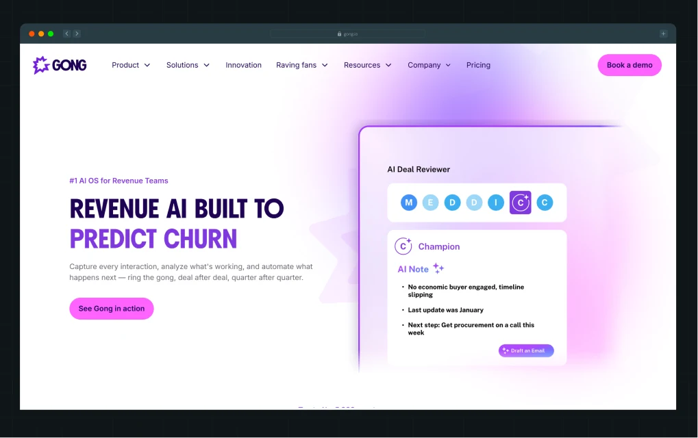
Gong
Maintains “Book a Demo” with consistent messaging across the entire site
Deductive
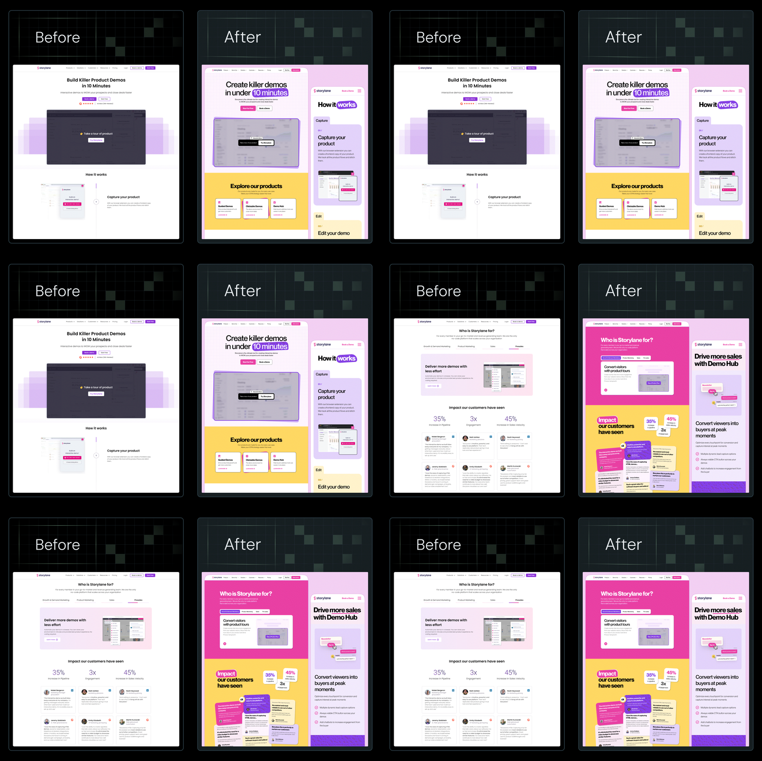
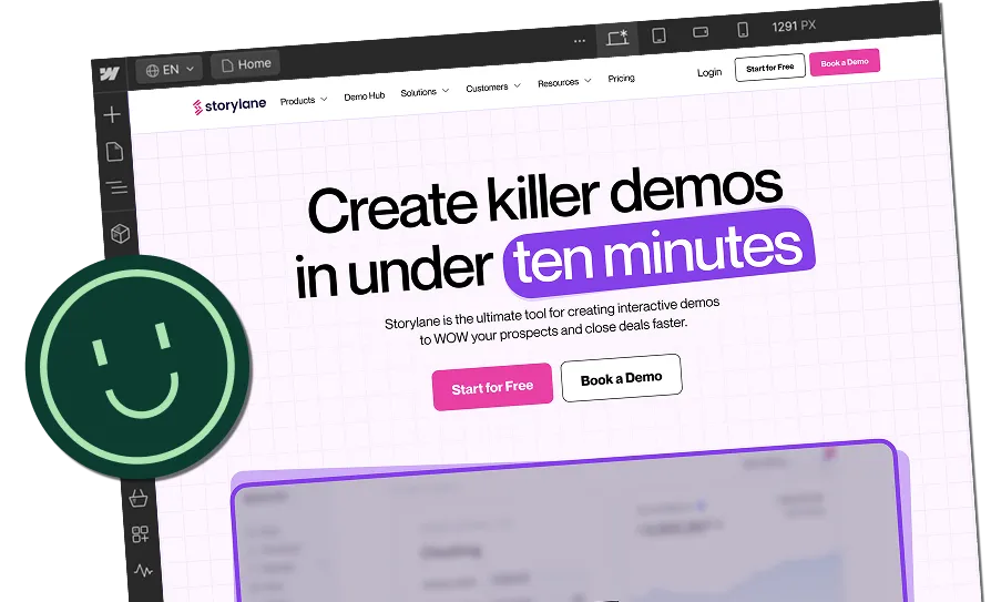
They use “See Deductive in Action,” which communicates the demo experience.
.webp)
{{specficService}}
Measuring CTA Performance
Key Metrics to Track
- Click-Through Rate (CTR): Percentage of visitors who click your CTA
- Conversion Rate: Percentage of CTA clicks that complete your goal
- Revenue Attribution: Dollar value generated from CTA clicks
- Engagement Quality: Time spent on site after clicking CTA
Setting Up Proper Tracking
- Google Analytics: Set up conversion events for each CTA
- Heatmap Analysis: Use Hotjar or similar tools to see visual CTA performance
- A/B Test Results: Track statistical significance and segment performance
- Attribution Modeling: Understand the full customer journey from CTA click to close
Optimization Based on Data
You should make regular CTA optimization data-backed:
- Weekly CTA performance reviews
- Monthly A/B test result analysis
- Quarterly CTA checks
- Annual CTA audit
Ready to turn your website into a Conversion-Engine?
The CTA best practices we’ve covered in this guide represent hundreds of tests, thousands of data points, and results from high-converting B2B websites.
But here’s the reality: implementing these strategies takes expertise, time, and ongoing optimization. Most marketing teams are already stretched thin managing campaigns, creating content, and hitting growth targets.
That’s where ThunderClap steps in.
We specialize in building conversion-focused websites that turn visitors into customers. Our strategy process includes CTA optimization; our team creates buttons that actually get clicked. Our CRO and Growth Support ensure your CTAs continue to improve over time.
We don’t just make websites look good - we make them work harder for your business. From strategic CTA placement to behavioral targeting, we implement best practices for CTA buttons and landing page CTAs that drive measurable growth.
{{ctaBlock}}
See how ThunderClap can help you implement these CTA best practices and build a website that converts visitors into customers. No generic sales pitch - just strategic advice on optimizing your conversion funnel.
Frequently Asked Questions
1. What makes a CTA more likely to convert?
The most effective CTAs have 4 elements: action words, benefits, visuals, and placement. The key involves removing uncertainty. Users should know exactly what will happen when they click, what they’ll receive, and why it matters to them. Successful CTAs also leverage social proof - surrounding buttons with testimonials, statistics, or trust signals.
2. How do I know if my CTA is working?
- Conversion rate: Percentage of CTA clicks that complete your goal
- Quality of traffic: Time spent on site and pages viewed after clicking
- Revenue attribution: Value generated from CTA traffic
- Comparative performance: How your CTAs perform against benchmarks
3. Where should I place CTAs on my website or landing page?
CTA placement depends on page type and user intent. Research shows that CTAs placed above the fold perform 304% better than those below, but this doesn’t mean stuffing your hero section with buttons. Place your primary CTA in the hero section, repeat it after key value propositions, and include it in your navigation.



.webp)
Browse Similar Articles





Leading 5 SaaS Branding Agencies in Florida (That Actually Understand SaaS Growth)

.svg)

How to Turn Your B2B Website into a Self-Serve Growth Engine? (PLG Ready in 2026)


9-Step Website Copy Audit Checklist to Improve Conversions (Examples from Top B2B Brands)

.webp)

How to Choose the Right Fintech Web Development Company for Your Business

Top B2B Website Design Principles That Turn Visitors into Qualified Leads
%20Audit%20That%20Actually%20Improves%20Revenue.webp)
How to Do a Conversion Rate Optimization (CRO) Audit That Actually Improves Revenue
Web Design Agency vs. Freelancer vs. In-House: What Actually Works in 2026
5 CRO Agencies in London and How to Choose the Best CRO Agency for Your Business
The Ultimate Fintech B2B Positioning Guide for 2026 (That Actually Drives Conversions)
Mapping the B2B Buyer Journey to Improve Conversions Across Every Touchpoint
.webp)
7 Best Website Maintenance Companies in India for Growth-Led B2B Teams (2026)

.webp)
8 Best Healthcare Website Design Agencies for HIPAA-Compliant Sites in 2026



How to Find the Best Web Design Company in Houston, Texas for B2B Brands (6 Best Picks)

Positioning That Wins: How to Make Complex B2B Products Clear and Compelling
The Step-by-Step Website Redesign Process B2B Teams Use to Increase Conversions (Without Killing SEO and Pipeline)
7 Best Video Production Agencies for SaaS Product Walkthroughs and Feature Videos

How to Choose the Best B2B Website Maintenance Company: 9 Questions to Ask Before You Hire One




How to Choose a Web Design Company in San Francisco in 2026 (with Examples)

10 Best Web Design Companies in Florida in 2026 and How to Choose the Right One

How to Use Brand Storytelling on Your Website to Close More B2B Deals and Build Buyer Trust

SaaS CRO Best Practices: What High-Growth Brands Do Differently to Win Conversions

How a Rebranding Agency Can Redefine Your B2B SaaS Identity and Boost Pipeline
B2B Marketing Trends in 2026 That Directly Influence Pipeline and Revenue

Top 7 Video Marketing Agencies Driving B2B SaaS Brand Awareness in 2026

Why Partnering with a B2B Brand Positioning Agency Accelerates Market Differentiation

The Complete Website Redesign Checklist for B2B SaaS Teams Ready to Scale
.avif)
9 Best Webflow Development Agencies in India for 2026 (In-Depth Review)

10 Product Marketing Companies Powering the Fastest-Growing SaaS Brands in 2026
Website Copywriting Services vs In-House: What's Right for Your Business?


How to Choose a Marketing Agency That Understands B2B SaaS Growth Metrics


How to Choose a Video Marketing Agency That Understands B2B Storytelling

Outsourcing Web Design: Cost-Benefit Analysis for Mid-Market & Enterprise Brands

From Leads to Lifetime Value: How Growth Marketing Agencies Scale SaaS Revenue

Build a B2B Website Strategy That Aligns with Sales and Marketing Goals

Webflow vs WordPress: Which Platform Is Better for Your Business Website in 2026?
Fintech Web Design That Builds Trust: 8 UX Principles Every Fintech Site Needs

Optimizing for Intent: How B2B Website Messaging and UX Changes Help Capture Top-Funnel Buyers


12 Best B2B Web Development Agencies in the US to Build Scalable Websites

From Audit to Action: 8-Step Process to Optimize Your B2B Website Strategy for 2026 Buyers
How to Design a High-Converting Landing Page from Scratch (2026 Edition)

From Click to Customer: Proven Landing Page Conversion Optimization Techniques

How to Write Website Copy That Converts: A Step-by-Step Guide for 2026

How to Optimize a Landing Page for Maximum ROI: A Step-by-Step Breakdown


AI Landing Pages That Convert: 7 Design Principles Every AI Platform Should Follow
From Traffic to Pipeline: B2B Website Growth Strategy for Scaling Teams


B2B Website Optimization Strategy: Speed, UX, SEO, and CRO in One Playbook




Interested in seeing what we can do for your website?



.webp)
