















9-Step Website Copy Audit Checklist to Improve Conversions (Examples from Top B2B Brands)


If a buyer landed on your website for the first time today, what would they actually walk away knowing about you? Would they understand what you do and who it's for? Or would they get hit with “supercharge your workflow” and “unlock seamless growth,” the same vague claims they just read on three competitor websites?
Running a website copy audit matters more now because generic messaging could keep you off your buyer’s shortlist entirely. More buyers use AI tools to research and compare products before visiting vendor websites. If your messaging is vague, those tools have little reason to recommend you.
That's why we created this 9-step website copy audit checklist, straight from our product marketing manager, Priyanka Chakraborty. It's the same framework we use when building websites for B2B brands like roommaster, WizCommerce, Freehand, and Factors, from strategy and messaging through design and development.
For each step, we also explain what to look for, using real examples from B2B brands like Clay, ClickUp, Wispr Flow, etc., along with a 3-step audit checklist.
What Is a B2B Website Copy Audit?
A B2B website copy audit is a review of your website's messaging to determine whether it clearly explains what your product does, who it's for, what sets it apart, and why buyers should choose you.
It also checks whether your positioning is clear, your messaging reflects customer needs, and your pages answer buyers' key questions. It shows whether your website attracts the right buyers and gives them enough confidence to book a demo or talk to sales.
The audit can also include a web content audit and content gap analysis to check whether the right pages and information exist in the first place and whether buyers can find the answers they need to evaluate your business.
More specifically, a website copy audit reviews the following:
A copy audit is also one of the first steps when building or redesigning a website. What you uncover shapes the messaging and content architecture first, then the UX, design, and development decisions that follow.
Instead of guessing whether your headline needs work, you can identify whether the real issue is your positioning, customer language, proof, or information hierarchy.
When Should You Perform a Website Copy Audit?
While regular copy audits are good practice, some events call for an immediate review. Here are the most important trigger events you should watch out for:
What Are The 9 Steps In A B2B Website Copy Audit (With Examples From B2B Brands)?
Here’s the 9-step website copy audit checklist we use at ThunderClap, straight from our product marketing manager, Priyanka Chakraborty.
We primarily focus on nine areas: hero clarity, buyer fit, reasons to change, brand memorability, buyer language, social proof, content hierarchy, CTAs, and AI readiness. For each one, we break down what to look for, how it works on real B2B websites, and three steps you can use to audit your own copy.
1. Make Sure Your Hero Says What You Do in 10 Seconds
When the right buyer lands on your website, they should quickly know what you do, who it's for, and why it matters. According to Wynter, 96% of CMOs visit vendor websites before making a purchase. 80% of them reach sales calls already familiar with the vendor.
As one CMO put it, “I never go into a demo blind anymore. I've already done my homework.”
Your hero should make that homework easier. But how direct you need to be depends on what buyers already know about your product and category.
A brand like HubSpot can say, “Where go-to-market teams grow better,” because buyers already know the company and its products. For a lesser-known company, such a broad copy can leave buyers guessing.
Here’s what you can do to avoid it:
1. Lead With a Problem Buyers Already Recognize
This works best when buyers know the problem but don't yet know your category or see your type of solution as the obvious answer.
- Eyebrow: Set the category or product context.
- Headline: Name the broken status quo.
- Subhead: Explain what you do and the outcome.
Case in Point:
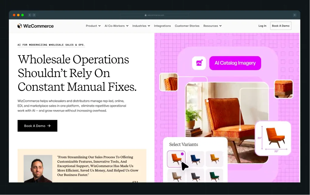
One of our clients, WizCommerce, an AI commerce platform company, uses this approach. Wholesale teams already know manual work is the problem. The hero starts there, then shows how the product reduces that work and helps grow revenue.
2. Lead With Capabilities Buyers Already Understand
When buyers already understand the problem and category, repeating the pain adds little. Use that space to show what your product helps them do instead.
- Eyebrow: Name what buyers can do with your product.
- Headline: State the outcome they want.
- Subhead: Explain what makes your approach different.
Case in Point:
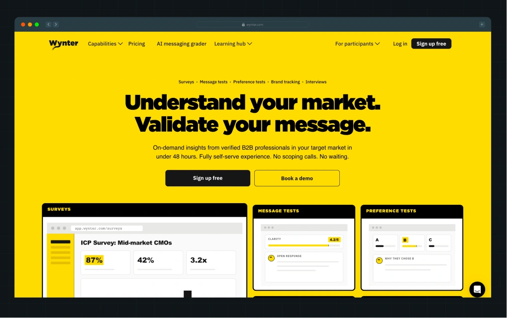
Wynter does this well. The eyebrow copy shows what buyers can do, the headline states the outcome, and the subhead adds the differentiator: insights from verified B2B professionals in under 48 hours.
Run These 3 Checks
- Show only the hero to someone who knows your space but not your product. Ask what you sell, who it's for, and why it matters.
- Remove the logo and compare it with three competitors. Flag any line they could use unchanged.
- Read the eyebrow, headline, and subhead separately. Each should add something that the previous one didn't.
2. Help the Wrong Buyers Rule Themselves Out
Getting your ICP right doesn't mean every lead you attract will be a good fit. Take LinkedIn outreach tools. “Built for sales teams” could mean a founder sending a few messages a week, a 20-person SDR team running outbound, or an agency managing dozens of client accounts.
They're all sales teams, but they don't all need the same product. So, how do you help the wrong buyers figure that out before they book a demo?
Here are two ways:
1. Show Who Gets the Most Value
Be clear about the scale or type of work your product is built for.
Case in point:
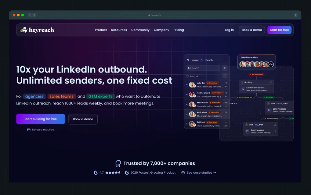
HeyReach makes it clear right from the hero that it's built for agencies, sales teams, and GTM experts looking to reach 1,000+ leads weekly. Features like unlimited senders and account rotation make the point even clearer: this is a tool for running LinkedIn outreach at scale.
2. Make Deal-Breakers Easy to Find
Don't make buyers book a demo to find out your product is missing something they need.
Case in point:
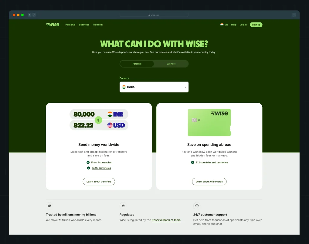
Wise has a dedicated availability page where buyers can check which features are available in their country. If the service they need isn't supported where they live, they'll know right away rather than finding out later.
Run These 3 Checks
- Pull up the leads your sales team disqualified in the last few months. Write down the top 3 reasons.
- Check whether your website answers those questions before someone reaches the demo form.
- Ask someone who fits your broad ICP but not your best-fit customer to browse the site. Can they tell the product isn't really built for them?
3. Give Buyers a Clear Reason to Change
Buyers come to your website with a simple question: Is this better than how I do things today? Their current alternative isn't always a competitor. It could be a legacy tool, a spreadsheet, several disconnected products, a manual process, or simply doing nothing.
Your copy should make that comparison easy. Show buyers what falls short today, how your product changes the way they get the job done, and what improves as a result.
How you do that depends on what buyers are replacing.
1. Show Why Your Product Beats the Tool They Use Today
When buyers already use a product in your category, compare against the gaps they know firsthand. Don't stop at claiming you're faster, smarter, or easier to use. Show what they can do with your product that they couldn't do before.
Case in Point:
.webp)
Factors does this in its “Why teams switch” section. Legacy tools track accounts. Factors identifies the actual buyers inside them. The comparison makes the reason to switch clear without relying on generic claims.
2. Show How You Improve the Job Buyers Do Today
When buyers are replacing a messy process built around manual work, disconnected tools, and workarounds, show what's broken and how your product offers a better way.
Case in Point:
.webp)
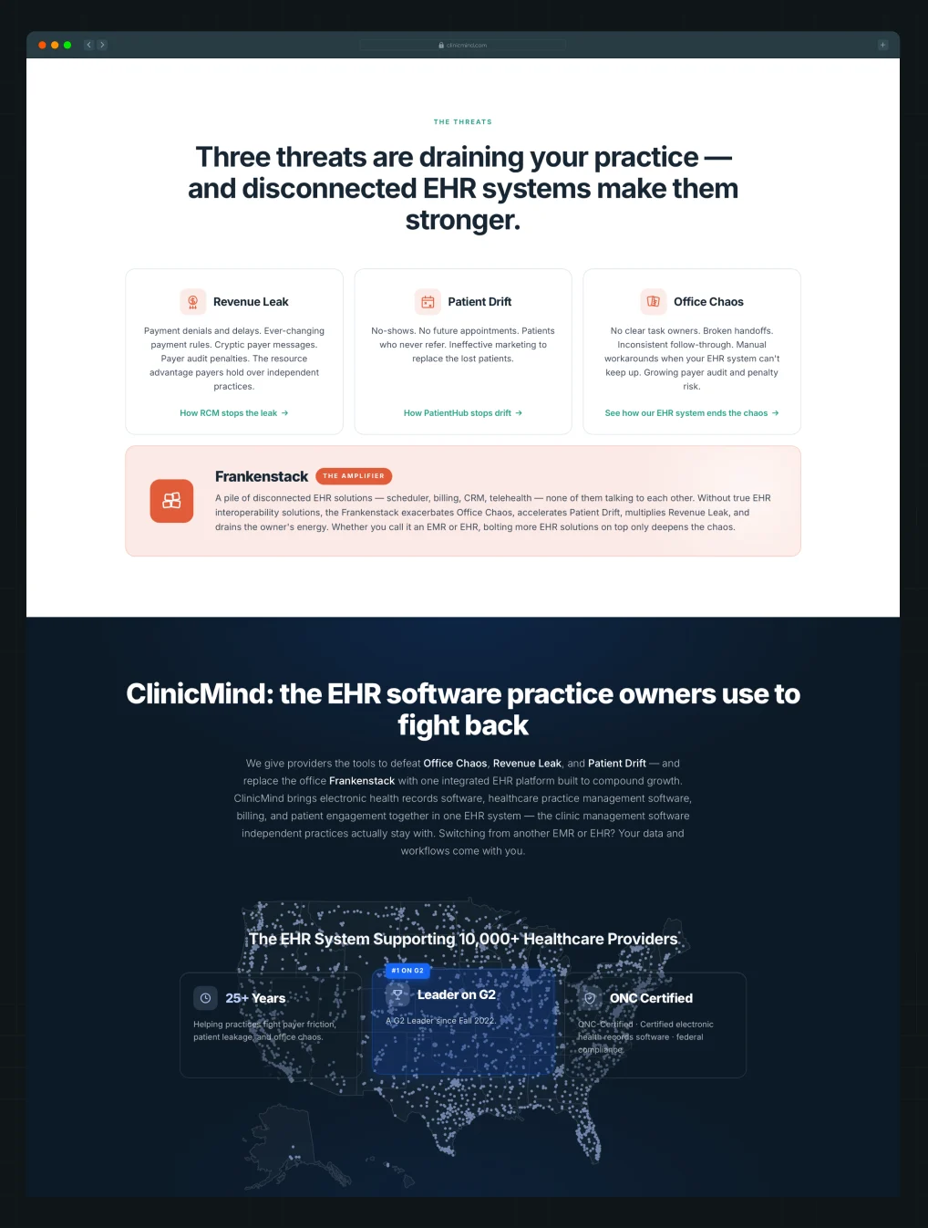
ClinicMind names three problems practice owners face and shows how disconnected tools make them worse. The " From → To section then shows the specific improvements buyers can expect.
Run These 3 Checks
- Identify the main alternative your product competes against: a direct competitor, legacy tool, manual process, disconnected stack, or doing nothing.
- Check whether your copy clearly shows what falls short with that alternative and how your product helps buyers do the job better.
- Flag broad claims like “work smarter” or “drive efficiency.” Replace them with specific changes buyers can compare with their current way of working.
4. Make Your Brand Stand Out From Competitors
When Wynter surveyed 100 B2B SaaS marketing leaders in 2025, only 6% said their brands were very distinctive. The other 94% felt they blended in to some degree. That's the risk. Buyers may understand what you sell and still forget your brand minutes later.
To be remembered, you need to give buyers something they won't find on every competitor's website. That could come from what you do differently or simply how your brand looks and sounds.
Here are two ways to do that:
1. Find Something Competitors Aren't Already Saying
Most B2B products could lead with several stories: category, capabilities, approach, or outcomes. If competitors use the same SaaS marketing strategies and lead with similar stories, find a product strength worth owning in your brand messaging.
Case in Point:
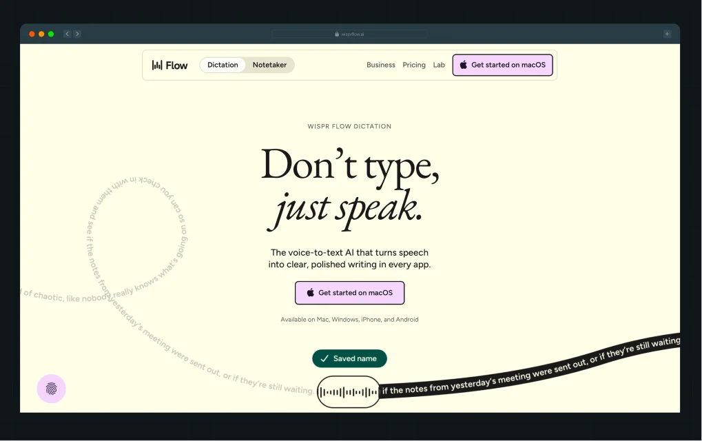
Wispr Flow could lead with AI or voice dictation. Instead, “Speak naturally. Write perfectly.” leads with the experience buyers want and gives them something clearer to remember.
2. Make Your Brand Look and Sound Like Itself
You don't always need a product feature nobody else has. How you write and design the website can also make your brand easier to remember.
Case in Point:
.webp)
Factors, one of our SaaS website design clients, does this well. Lines like “AI that's not on shrooms” give the brand a voice buyers can recognize. The design carries the same personality throughout the website, making Factors harder to confuse with other ABM platforms.
Run These 3 Checks
- Compare your website with five competitors. Flag claims, language, and visual patterns that feel interchangeable.
- Write down one thing you want buyers to remember about you. Check whether the copy and design make that clear.
- If you can't find anything worth emphasizing, the problem may go deeper than website copy. Use a brand strategy framework to revisit your positioning, differentiation, and what you want buyers to remember about you.
{{specficService}}
5. Use Buyer Language Instead of Generic Buzzwords
Jargon and buzzwords often get treated as the same problem. They’re not. As Diane Wiredu, messaging strategist and founder of Lion Words, puts it, “When you know your buyers well, you use jargon to make a connection and show you get their world.”
Jargon helps the right buyers understand you. If your buyers use a term every day, replacing it with simpler language can make your copy less useful.
Buzzwords do the opposite. Words like “seamless,” “supercharge,” and “next-generation” sound impressive but tell buyers very little. The difference is simple: does the word help your buyer understand something specific?
Case in Point:
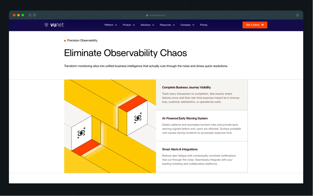
VuNet, one of ThunderClap’s SaaS clients, uses terms like “alert fatigue,” “monitoring silos,” and “root cause analysis.” To outsiders, these terms may sound technical. To SRE and IT Ops teams, they describe the work they do every day.
Run These 3 Checks
- Pull five sales calls or interviews. List repeated technical terms and check whether your website uses them.
- Highlight vague claims like “seamless” or “innovative.” Ask how? If the copy doesn't answer, replace it with what the product does.
- Compare three competitor homepages. Flag repeated words and claims, then check whether yours says anything more specific.
6. Give Buyers Enough Proof to Believe You
Most social proof on B2B websites is overused to the point of becoming white noise. Buyers expect a logo wall near the top of the page or a conversion cue that says, “Trusted by 100+ marketers.”
According to Casey Hill, CMO at DoWhatWorks, “In B2B, we often see plain logo bars, star ratings, and quote testimonials lose in A/B testing. One reason is that these signals are easy to fake.”
That doesn't mean social proof isn't important. But before adding another testimonial or logo, think about what buyers actually want proof of. It usually comes down to three questions:
1. Do companies like mine use this?
2. Did the product deliver the outcome being promised?
3. Is it better than the alternative I'm considering?
Here are three ways to make your proof work harder:
1. Make Your Logo Wall Say Something
Don't just show who uses your product. Use the logos to tell buyers something useful.
Case in Point:
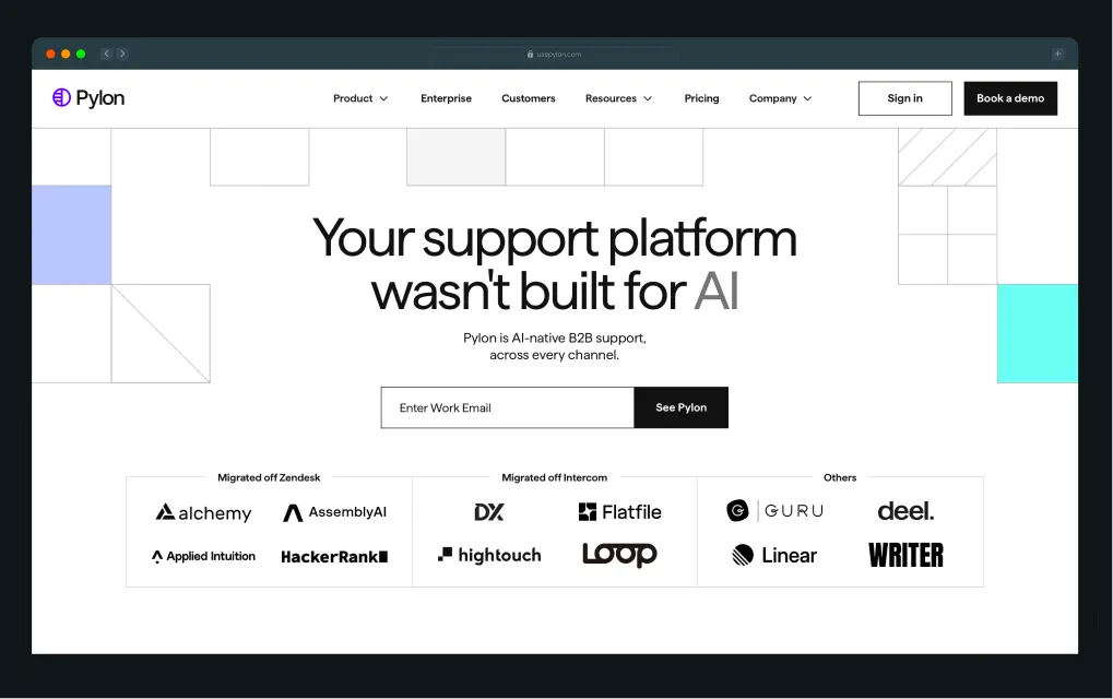
Pylon groups its logos by customers who “Migrated off Zendesk,” “Migrated off Intercom,” and “Others.” This turns a standard logo wall into evidence that companies are switching from the alternatives buyers are likely considering.
2. Put Proof Next to the Claim It Supports
Don't make buyers connect a product claim in one section with a testimonial they saw three folds later.
Case in Point:
.webp)
Clay backs its claim about launching GTM plays faster with a specific customer result: Rippling achieved 2x better cold email performance. The proof sits right beside the capability it supports.
3. Let Customers Answer Buyers' Questions
Your own copy isn't always the most convincing way to handle common questions and objections.
Case in Point:
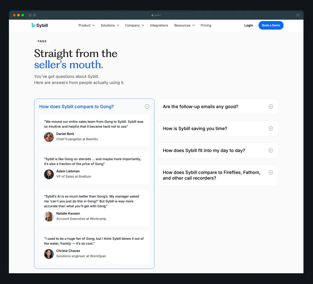
Sybill uses customer testimonials to answer questions like “How does Sybill compare to Gong?” and “Are the follow-up emails any good?” Buyers get answers from people who have actually used the product, rather than from claims made by the company selling it.
Run These 3 Checks
- Review your logo wall. Does it tell buyers anything beyond who uses your product?
- Check your major claims. Is there specific, relevant proof nearby?
- List your buyers' biggest questions and objections. Could customer proof answer any of them better than your own copy?
7. Answer Buyers’ Questions in the Right Order
At ThunderClap, we train our internal PMM team to review website copy through a few basic buyer questions:
- What is it?
- Who is it for?
- What’s in it for me?
- Why should I believe you?
- Why should I act now?
- What should I do next?
But we don’t turn these questions into a fixed homepage template. As Priyanka explains,
“Every industry is different.” A fintech buyer may already understand the problem they’re trying to solve, while buyers in a newer category like healthcare AI may need more education before they can evaluate the product.”
Here are two things to consider when deciding your content hierarchy:
1. Start With What Buyers Need to Understand First
Some buyers already know the problem and category. Others need more context before they can evaluate your product.
Case in Point:
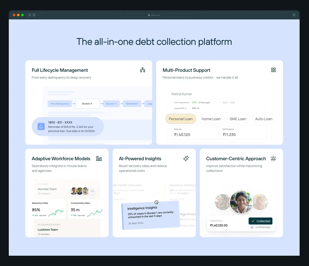
One of ThunderClap’s clients, Rezolv, a fintech debt collection platform, serves buyers who already understand the problem. So the website quickly shows what the platform can do and how it brings the entire debt collection process into one place.
.webp)
While our healthtech client, 101 GenAI, needs to educate buyers first. The website shows why auditing only a fraction of clinical interactions is a problem, then explains how AI helps and where the product fits into healthcare workflows.
{{specficBlog}}
2. Give Important Buying Questions Enough Space
If an issue can affect whether buyers move forward, don’t bury it.
Case in Point:
.png)
Both Rezolv and 101 GenAI handle sensitive data, so security and compliance get dedicated sections covering certifications, data protection, deployment, and access controls.
Run These 3 Checks
- List the questions buyers need answered before moving forward. Check whether each gets enough space.
- Rank them by when buyers need the answer. Check whether the section order matches.
- Ask sales what buyers still ask after visiting the website. Move missing or buried answers earlier.
8. Make the Next Step Clear and Easy to Take
Multiple CTAs are the norm on B2B websites. Buyers can book a demo, start a free trial, watch a demo, check pricing, or talk to an AI agent. But each CTA should make it clear what buyers will get when they click.
Generic CTAs like “Learn More” don't. In one A/B test, Glean saw a 166% increase in click-through rate after replacing “Learn More” with specific CTAs like “Watch Video,” “See Product Overview,” and “See Forrester Report.”
Clear CTA copy is only one part of making the next step easy. Here are two more things to check:
1. Make Self-Serve Paths Easier to Navigate
If you sell multiple products or features, don't drop buyers into a large product and make them figure out where to start.
Case in Point:
.webp)
ClickUp lets buyers choose the capabilities they want, such as Projects, Chat, or Scheduling, before activating their workspace. Buyers can start with what they came for instead of figuring out the entire product first.
2. Answer Questions Buyers Have Before They Click
Think about what could make someone hesitate: How long will this take? What will it cost? Do I need a credit card? What happens after I sign up? Answer the questions that matter next to the CTA.
Case in Point:
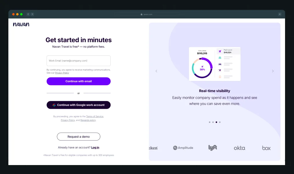
Navan says buyers can “Get started in minutes” and that Navan Travel is “Free. No platform fees.” Buyers know how long it takes and what it costs before signing up.
Run These 3 Checks
- Click every CTA on your key pages. Does the button clearly tell buyers what they'll see or do next?
- Try your self-serve flow as a new buyer. Is it obvious where to start based on what you came to do?
- List the questions buyers ask before signing up or booking a demo. Does the copy around the CTA answer them?
9. Make Sure AI Tools Can Understand and Recommend Your Business
Forrester surveyed nearly 18,000 buyers and found that generative AI and conversational search now play a bigger role in buyer research than vendor websites, product experts, and sales teams.
So, the website you're auditing isn't only being read by buyers anymore.
Everything we've covered so far still matters. Your website needs to clearly explain what you do, who you help, why buyers should choose you, and why they should believe you.
But now, AI tools need to find and understand that information well enough to recommend it to you.
As Axel Sukianto, VP of Marketing at Truescope, puts it, “Your marketing has two audiences now: the human buyer and the AI deciding whether to recommend you to them.”
That adds two more things to your audit:
1. Make Sure the Right Information Exists
AI tools can't recommend you for questions your website doesn't answer. Use a web content audit and content gap analysis to find missing pages and information, then create dedicated pages for the ICPs, use cases, comparisons, and buying questions you want to be found for.
Case in Point:
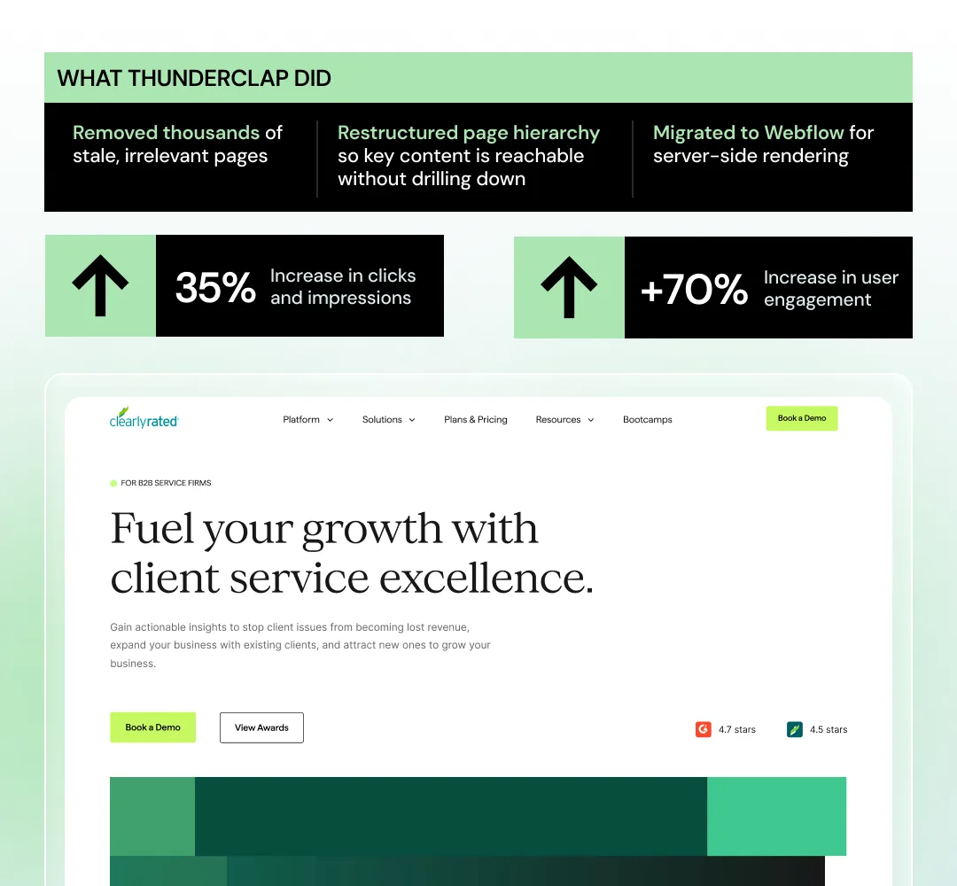
ClearlyRated had thousands of stale pages that made important content harder to find. ThunderClap removed irrelevant pages and restructured the site so key information was easier to reach.
2. Make Your Business Easy to Understand
Having the right pages isn't enough. Clearly state what your product is, who it's for, and what makes it different. Keep that information consistent across your website.
Case in Point:
.png)
For roommaster, ThunderClap added FAQs, spruced up the content, and ensured the product was described consistently across pages. These changes helped improve its visibility in AI search.
→ Want to go deeper? Check out this LinkedIn post by Margarita Loktionova, created in collaboration with ThunderClap, where we share the 6-part AI readiness framework we use to audit client websites.
Run These 3 Checks
- Ask three AI tools what you do, who you're for, and when they'd recommend you. Flag wrong or missing answers.
- Check whether your website covers the ICPs, use cases, comparisons, and buying questions you want to be found for.
- Review key pages. Is your product, category, and audience described clearly and consistently?
Use Our 9-Step B2B Website Copy Audit Scorecard
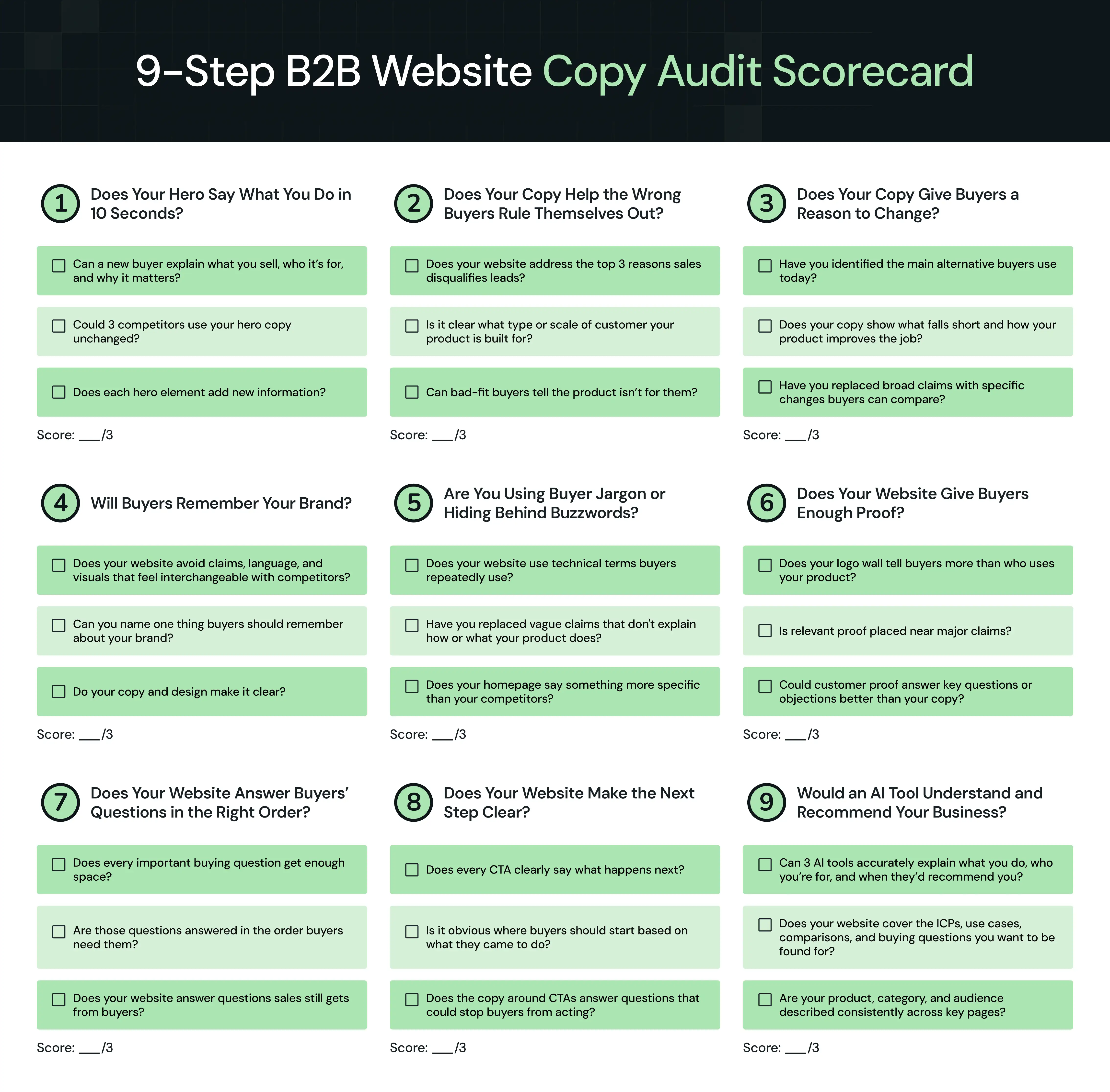
Use this website copy audit scorecard to see how well your messaging holds up across the nine areas covered above. Give yourself 1 point for every “Yes,” then add up your score out of 27 to identify your biggest gaps.
You’ve Audited Your Website Copy. What’s Next?
A website copy audit can show you why buyers aren't converting, why sales keep getting bad-fit leads, or why your website sounds like every competitor's. But fixing those problems isn't always as simple as rewriting the copy.
An unclear hero could point to weak positioning. A forgettable website may need a stronger brand, not punchier headlines. A messy content hierarchy may mean you don't understand what buyers need to know and when.
That's why our B2B website strategy starts before copy, design, or development. We research the market and buyers, sharpen the positioning and messaging, plan the content architecture and UX, then design and develop the website around it. We're also platform-agnostic. Whether the right build calls for Webflow, WordPress, Framer, or another stack, we choose the platform based on the business, content, and technical requirements.
So far, 100+ B2B brands across SaaS, fintech, AI, VC, and HRTech, including Factors, VuNet Systems, WizCommerce, and roommaster, have trusted ThunderClap with their websites.
Here’s why:
- Proven B2B experience: roommaster saw an 80% increase in demo requests after its revamp. ClearlyRated saw 35% more clicks and impressions.
- In-house PMMs: Our PMMs have experience across SaaS, fintech, healthtech, and all major B2B industries. They know whether your website needs sharper category differentiation, stronger category leadership, brand storytelling, or simply needs to catch up with your brand's current maturity.
- 30-day post-launch support: Every website comes with 30 days of free post-launch support. We track what's working, spot what isn't, and help you improve the website after it goes live.
{{ctaBlock}}
Frequently Asked Questions (FAQs)
1. What is a website copy audit?
A B2B website copy audit reviews whether your messaging clearly explains what you do, who it’s for, what makes you different, and why buyers should choose you. It also checks whether your website reflects customer needs, answers key questions, attracts the right buyers, and gives them enough confidence to take action.
2. What are the key elements of a website copy audit?
A website copy audit should review hero clarity, buyer fit, reasons to change, brand memorability, buyer language, social proof, content hierarchy, CTAs, and AI readiness.
3. How often should you audit your website copy?
Audit your website copy at least once a year and whenever your product, positioning, ICP, or market changes. Also, run an audit before a website redesign or when conversions drop, lead quality declines, or buyers keep asking questions your website should answer.
4. What tools can you use for a website copy audit?
Use CRO tools like GA4 and Search Console to spot performance gaps, Clarity or Hotjar to track visitor behavior, Wynter for message testing, and ChatGPT or Perplexity to check whether AI tools accurately understand and recommend your business.
5. Who should run a website copy audit?
You can run a website copy audit in-house with help from a product marketer or outsource it to a web design and development agency with B2B messaging expertise. The right external team can often spot gaps your internal team may overlook.



.webp)
Browse Similar Articles




Leading 5 SaaS Branding Agencies in Florida (That Actually Understand SaaS Growth)

.svg)

How to Turn Your B2B Website into a Self-Serve Growth Engine? (PLG Ready in 2026)

.webp)

How to Choose the Right Fintech Web Development Company for Your Business

Top B2B Website Design Principles That Turn Visitors into Qualified Leads
%20Audit%20That%20Actually%20Improves%20Revenue.webp)
How to Do a Conversion Rate Optimization (CRO) Audit That Actually Improves Revenue

Web Design Agency vs. Freelancer vs. In-House: What Actually Works in 2026
5 CRO Agencies in London and How to Choose the Best CRO Agency for Your Business
The Ultimate Fintech B2B Positioning Guide for 2026 (That Actually Drives Conversions)
Mapping the B2B Buyer Journey to Improve Conversions Across Every Touchpoint
.webp)
7 Best Website Maintenance Companies in India for Growth-Led B2B Teams (2026)

.webp)

8 Best Healthcare Website Design Agencies for HIPAA-Compliant Sites in 2026

How to Find the Best Web Design Company in Houston, Texas for B2B Brands (6 Best Picks)

Positioning That Wins: How to Make Complex B2B Products Clear and Compelling
The Step-by-Step Website Redesign Process B2B Teams Use to Increase Conversions (Without Killing SEO and Pipeline)
7 Best Video Production Agencies for SaaS Product Walkthroughs and Feature Videos
How to Choose the Best B2B Website Maintenance Company: 9 Questions to Ask Before You Hire One

How to Choose a Web Design Company in San Francisco in 2026 (with Examples)

10 Best Web Design Companies in Florida in 2026 and How to Choose the Right One
How to Use Brand Storytelling on Your Website to Close More B2B Deals and Build Buyer Trust
SaaS CRO Best Practices: What High-Growth Brands Do Differently to Win Conversions

How a Rebranding Agency Can Redefine Your B2B SaaS Identity and Boost Pipeline

B2B Marketing Trends in 2026 That Directly Influence Pipeline and Revenue

Top 7 Video Marketing Agencies Driving B2B SaaS Brand Awareness in 2026
Why Partnering with a B2B Brand Positioning Agency Accelerates Market Differentiation

The Complete Website Redesign Checklist for B2B SaaS Teams Ready to Scale
.avif)
10 Best Webflow Development Agencies in India for 2026 (In-Depth Review)

10 Product Marketing Companies Powering the Fastest-Growing SaaS Brands in 2026
Website Copywriting Services vs In-House: What's Right for Your Business?

How to Choose a Marketing Agency That Understands B2B SaaS Growth Metrics

How to Choose a Video Marketing Agency That Understands B2B Storytelling

Outsourcing Web Design: Cost-Benefit Analysis for Mid-Market & Enterprise Brands

From Leads to Lifetime Value: How Growth Marketing Agencies Scale SaaS Revenue
Build a B2B Website Strategy That Aligns with Sales and Marketing Goals

Webflow vs WordPress: Which Platform Is Better for Your Business Website in 2026?
Fintech Web Design That Builds Trust: 8 UX Principles Every Fintech Site Needs
Optimizing for Intent: How B2B Website Messaging and UX Changes Help Capture Top-Funnel Buyers


12 Best B2B Web Development Agencies in the US to Build Scalable Websites

From Audit to Action: 8-Step Process to Optimize Your B2B Website Strategy for 2026 Buyers
How to Design a High-Converting Landing Page from Scratch (2026 Edition)
From Click to Customer: Proven Landing Page Conversion Optimization Techniques
How to Write Website Copy That Converts: A Step-by-Step Guide for 2026

How to Optimize a Landing Page for Maximum ROI: A Step-by-Step Breakdown

AI Landing Pages That Convert: 7 Design Principles Every AI Platform Should Follow
From Traffic to Pipeline: B2B Website Growth Strategy for Scaling Teams
B2B Website Optimization Strategy: Speed, UX, SEO, and CRO in One Playbook




Interested in seeing what we can do for your website?



.webp)
