


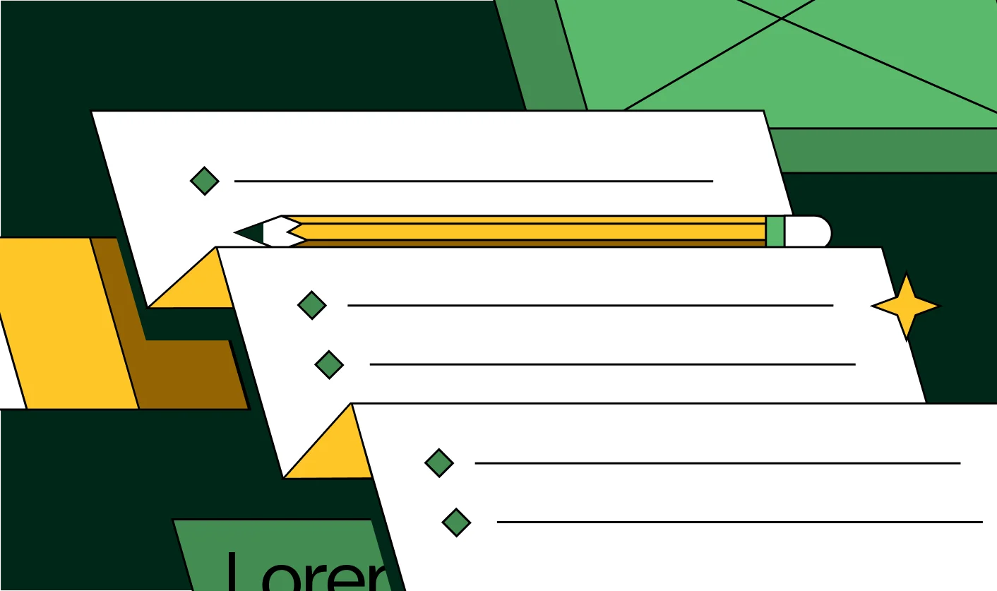
The Step-by-Step Website Redesign Process B2B Teams Use to Increase Conversions (Without Killing SEO and Pipeline)

If you lead marketing, growth, or product at a B2B company, you’ve probably said some version of this in the last year:
“Our website doesn’t reflect who we are anymore, but we can’t afford to tank traffic while we fix it.”
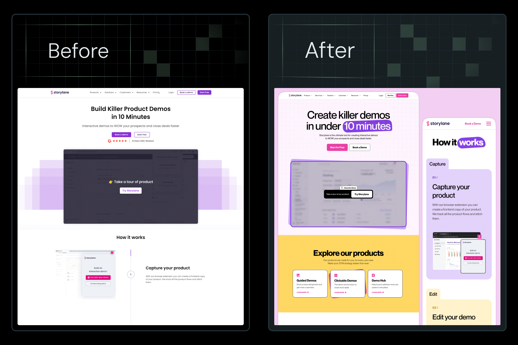
Website revamps sit on roadmaps for months, sometimes years. When they finally get funded, the default move is to treat them as a visual refresh. Then, a few months after launch, the numbers look painfully familiar: similar demo volume, similar lead quality, similar buyer confusion.
For B2B teams, a high-performing redesign is about treating the website as revenue infrastructure and running a rigorous website redesign process. This guide does exactly that. It lays out all the steps ThunderClap and other leading B2B teams use to improve conversions, SEO, and UX debt; all without compromising the pipeline.
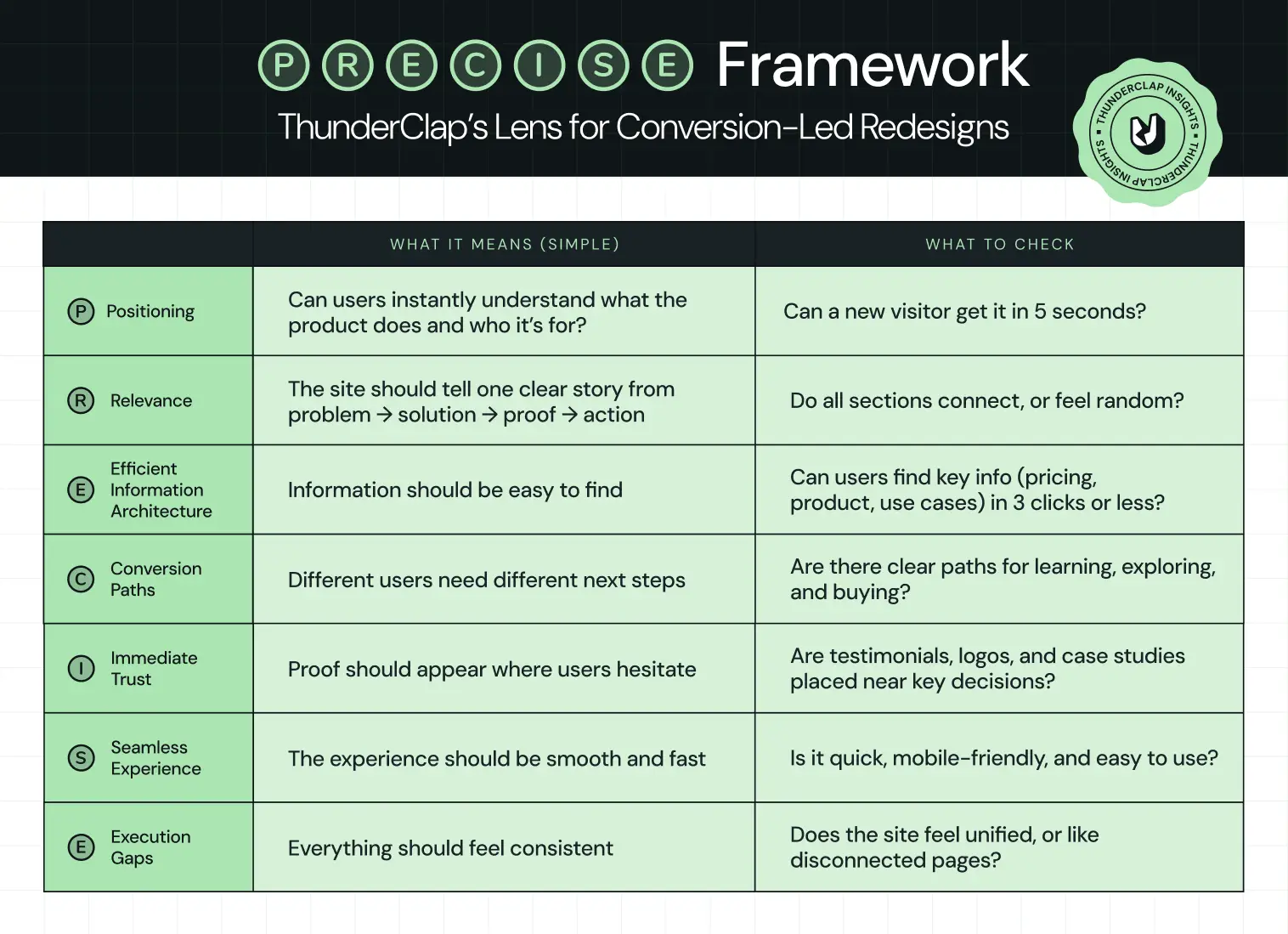
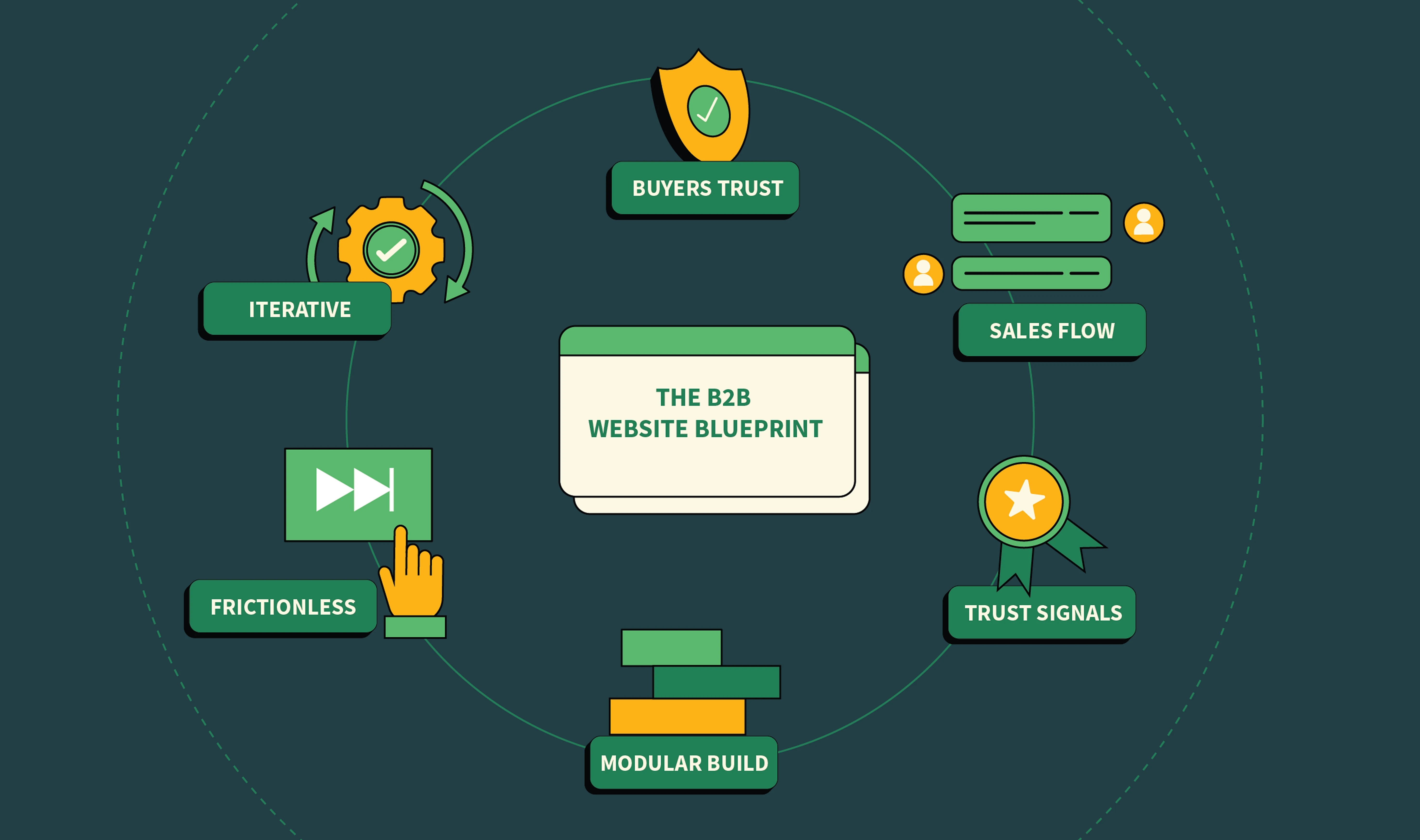
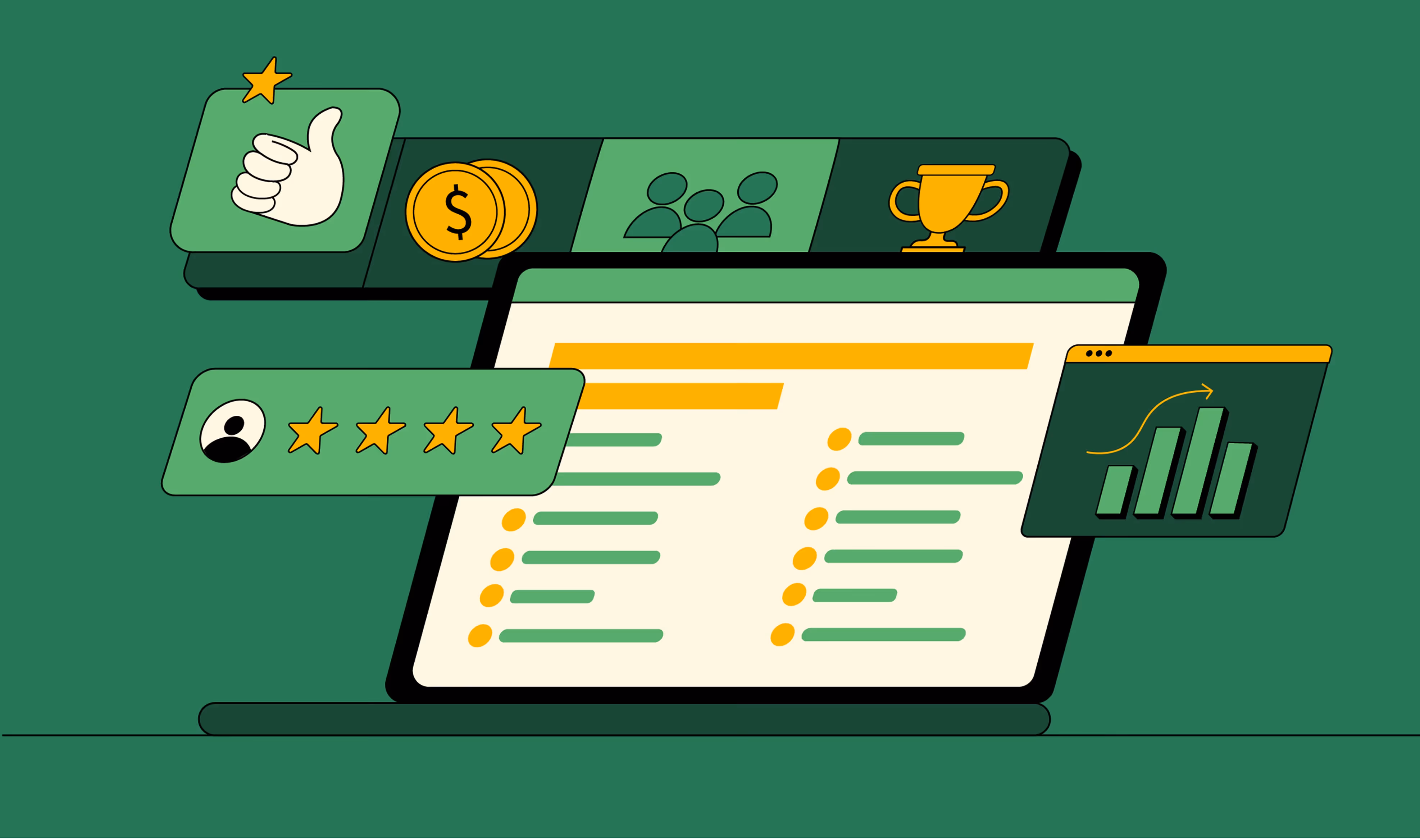
The P.R.E.C.I.S.E. Framework: ThunderClap’s Lens for Conversion-Led Redesigns
Wynter’s B2B Buyer Journey study found that 97% of buyers check vendor websites and narrow down to roughly 3 vendors they investigate further. Mostly based on what they see and understand online, before talking to sales. Gartner’s recent B2B buying research shows buyers now move through a digital‑first, rep‑light journey before they accept a sales call.
Based upon such evidence, ThunderClap developed the P.R.E.C.I.S.E. Framework: a criteria set developed after revamping 129+ B2B websites across SaaS, fintech, VC, HR, and enterprise tech in India, the US, and the UK.
P.R.E.C.I.S.E. condenses those lessons into 7 parameters that every serious website redesign process should satisfy.
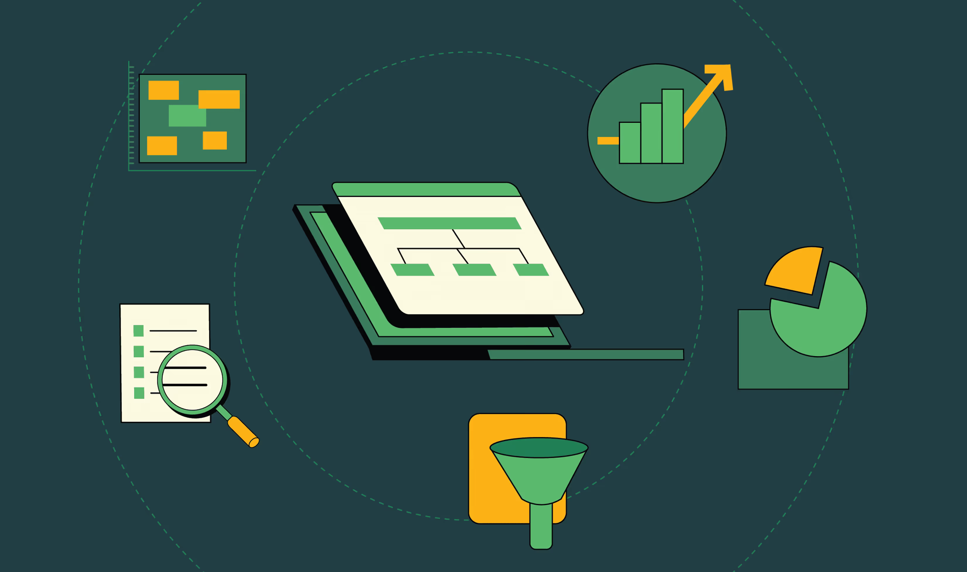
The 9 Core Website Redesign Process Steps for B2B Teams
Think of these website redesign process steps as your spine. Every company’s context is different, but skipping any of these in B2B nearly always comes back to bite SEO, UX, or stakeholders.
Step 1: Diagnose reality before taking opinions
Most redesigns start with opinions:
“Homepage feels outdated.”
“Competitor X looks better.”
That’s exactly how teams miss the problem. A strong website redesign process starts with evidence of where buyers drop off and why. At this stage, you’re not trying to redesign anything. You’re trying to answer:
👉 Where is the current site failing the buyer?
Look for patterns like:
- High-intent pages (pricing, product) with high exit rates
- Traffic landing on blogs but never reaching product pages
- Demo pages with traffic but low conversion
- Mobile users are dropping off faster than desktop users
Example:
Backed by top-tier VCs, Deductive AI engineered a system that cut root-cause time from hours to minutes. But the website didn’t reflect that. So ThunderClap approached it as a diagnosis problem. The team identified the gap: engineers couldn’t quickly grasp how the product worked or why it mattered. They rebuilt the narrative around one idea - no more root cause analysis in the dark, created the copy as per the engineers’ thinking, and showed product behavior upfront.
What this step should produce
By the end of this step, you should have:
- A list of top drop-off points (pages + sections)
- 3-5 hypotheses on why users aren’t converting
- Clear mapping of:
- where traffic comes from
- where it goes
- where it dies
Most teams get this step wrong because they jump straight into design decisions before truly understanding user behavior. There’s also a tendency to over-focus on the homepage, while high-intent pages like pricing or product get overlooked (even though that’s where your biggest conversion leaks usually are).
Step 2: Align stakeholders and pick one primary goal
In an enterprise website redesign, misalignment is more dangerous than poor color choices. Marketing wants more MQLs, sales wants only high‑intent leads, product wants feature education, and leadership just wants the site to look premium. Everyone is right individually, but collectively, the site becomes a compromise rather than a growth asset. At this stage, the question you’re answering is:
👉 What is the one outcome this website redesign must be judged on in the first 90 days after launch?
Look for patterns like:
- Define a single macro-metric (e.g., qualified demos, self-serve signups, high-intent content consumption)
- Select 2-3 supporting metrics (e.g., bounce rate on key pages, SQL volume, trial activation)
- Define your current ICP (segment, size, region, use case)
- Explicitly identify who the website is NOT for anymore
{{specficService}}
Example:
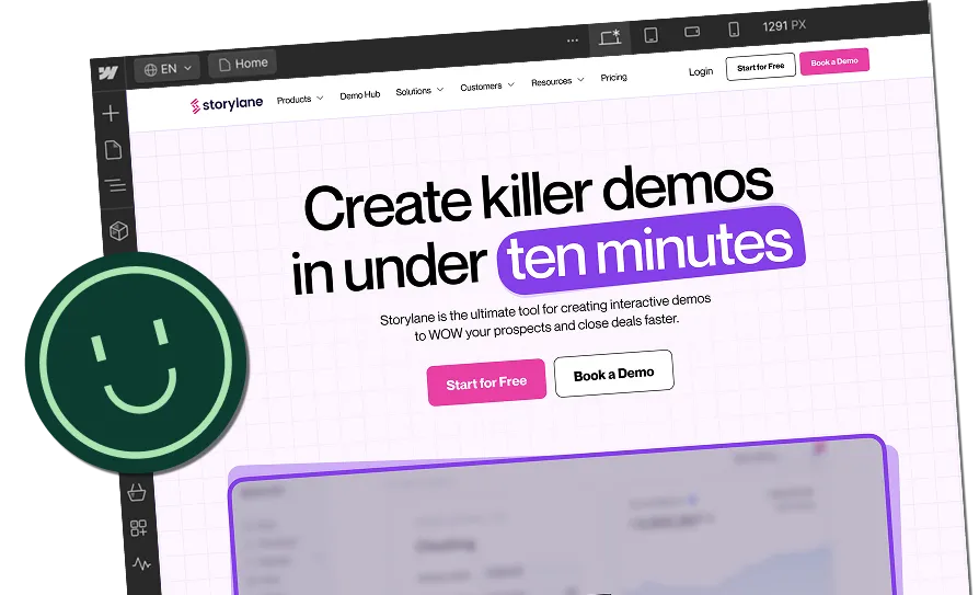
When Visharathan Kugamoorthy, Marketing Director at roommaster, partnered with ThunderClap, the team paused on the most important question: what should a hotel manager feel 3 days after visiting the site? That insight led to the creative direction of hospitality architects, which then shaped the redesign and met with an 80% spike in traffic and demo bookings. Read the entire process breakdown in this LinkedIn post by Ayush Barnwal, Partner & CEO, ThunderClap:
What this step should produce
By the end of Step 2, you should have:
- Primary KPI for the first 90 days post‑launch (e.g., qualified demo requests or self‑serve activations).
- 2-3 secondary metrics agreed by all stakeholders (e.g., bounce rate on pricing, % of visitors reaching product pages, SQL volume from organic).
- ICP and segment priority list (for whom this site is built now, and who is intentionally de‑prioritized).
- A decision‑making model: who decides, who advises, who executes, and how tie‑breakers are handled.
- A short success narrative you could read to the board: If these numbers move by X, this redesign is a win.
Step 3: Build a buyer-led website redesign UX process
Most website redesign UX processes unconsciously orbit internal structure: product lines, squads, or org charts. Buyers don’t care. They arrive with 3 questions in their head:
- Is this for me?
- Can I trust them?
- What should I do next?
In practical terms, that means mapping how different personas move from problem awareness to evaluation to decision, then architecting the site so each click feels like the next logical step in their story, not your backlog.
Look for patterns like:
- Map journeys for 2-3 priority personas only.
- Include discovery, problem framing, solution pages, proof, risk reduction, and conversion in every journey.
- Assign one clear job to each page based on its role in the journey.
- Use the homepage to qualify visitors and direct them forward.
- Use product pages to explain the solution clearly.
- Use pricing pages to reduce hesitation.
- Use case studies to prove outcomes and build trust.
- Use resources to nurture and educate buyers over time.
For 101 GenAI, that meant making the brand as credible as the product. The company was already doing serious enterprise work in healthcare AI, auditing 100% of clinical calls, tracking HEDIS scores, and closing care gaps for US payers and providers. ThunderClap’s job was to turn that narrative into a more trustworthy buyer experience.
“The brand looked more mature. More polished. Investors could see the shift without being told.” – Abhishek Sharma, Strategy Lead, 101 GenAI
What this step should produce
By the end of this step, you should have:
- Buyer-journey maps for your top personas.
- A page-jobs matrix for every key template.
- A draft information architecture built around user intent.
- Conversion paths and CTA rules for each stage of the journey.
- A UX principles doc that keeps the rest of the redesign consistent.
Step 4: Lock positioning and messaging before UI
UI‑first redesigns underperform. Because design does not make your positioning clear, it either amplifies what’s already clear or exposes gaps. In a B2B website redesign process, this is the step where you commit to a concrete narrative: who you serve, what outcome you deliver, how you’re different, and why that matters now.
Look for patterns like:
- Build one core narrative and adapt it into messaging ladders for each persona.
- Use a JTBD lens to connect features directly to outcomes.
- Define category, target audience, main problem, core promise, differentiators, and proof points in that document.
- Map what each persona knows, fears, wants, and needs to hear to move forward.
Example:
When VuNet Systems engaged ThunderClap, leadership was clear: the site had to position them as Business Observability for Banks, not just another monitoring tool. Post‑launch, VuNet reported stronger brand perception, better product positioning, and clearer communication of their differentiation across customers and prospects. Read Ayush Barnwal’s (Partner & CEO, ThunderClap) POV on VuNet revamp.
What this step should produce
By the end of Step 4, you should have:
- A one‑page positioning narrative: category, ICP, problem, promise, and differentiation.
- A JTBD mapping document that ties product capabilities to jobs and outcomes.
- A prioritized proof bank (logos, testimonials, case stats, analyst quotes) mapped to claims you make in your messaging.
Most teams get this step wrong by treating “copy” as a thing you write after design, squeezed into whatever space is left. That’s how you end up with generic headlines, vague benefit statements, and product pages that read like feature inventories instead of compelling stories.
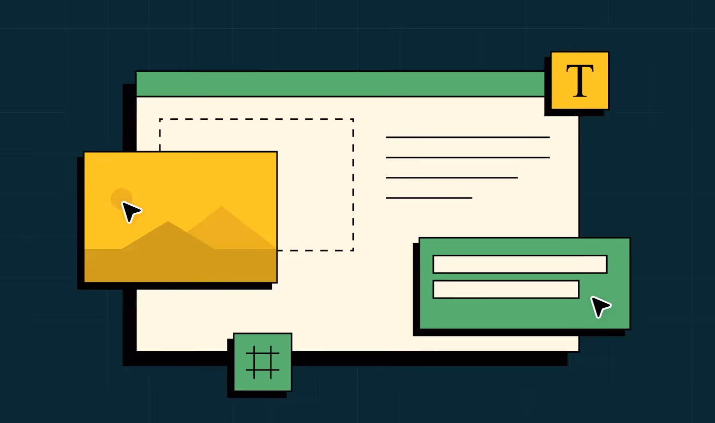
Step 5: Wireframe journeys
Next, turn messaging and IA into wireframes focused on flows. The most impactful wireframes cover:
- Blog/resource → product/solution → proof → pricing → demo
- High‑intent landing pages for campaigns and ABM
- Pricing + FAQ + social proof sequences
Look for patterns like:
A strong website redesign UX process stress‑tests:
- How quickly a visitor can see themselves in your story
- Whether there’s always a logical next click
- Where proof and CTAs appear relative to doubts
Example:
For ClearlyRated, ThunderClap started with a UX audit + user-behavior analysis, which exposed WordPress performance issues, weak product UI, and messaging. After the redesign and migration, they saw a 35% increase in impressions and 33% increase in clicks, alongside a clear improvement in average position on Google. Watch the complete breakdown in the video:
What this step should produce
By the end of Step 5, you should have:
- Low‑ or mid‑fidelity wireframes for all page types (home, product, solution, pricing, case study, resource, high‑intent landing).
- Documented entry and exit points for each template (where traffic comes from, and where it should go next).
- Mobile‑first variants or rules so ensure core flows don’t break on smaller screens.
Most teams get this step wrong by wireframing page‑by‑page in isolation, often with different owners making micro‑decisions that don’t connect. The result is a site where every page looks fine individually, but the end‑to‑end journey feels like jumping between unrelated experiences.
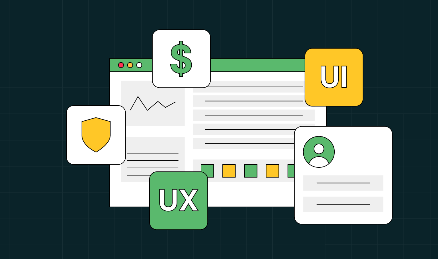
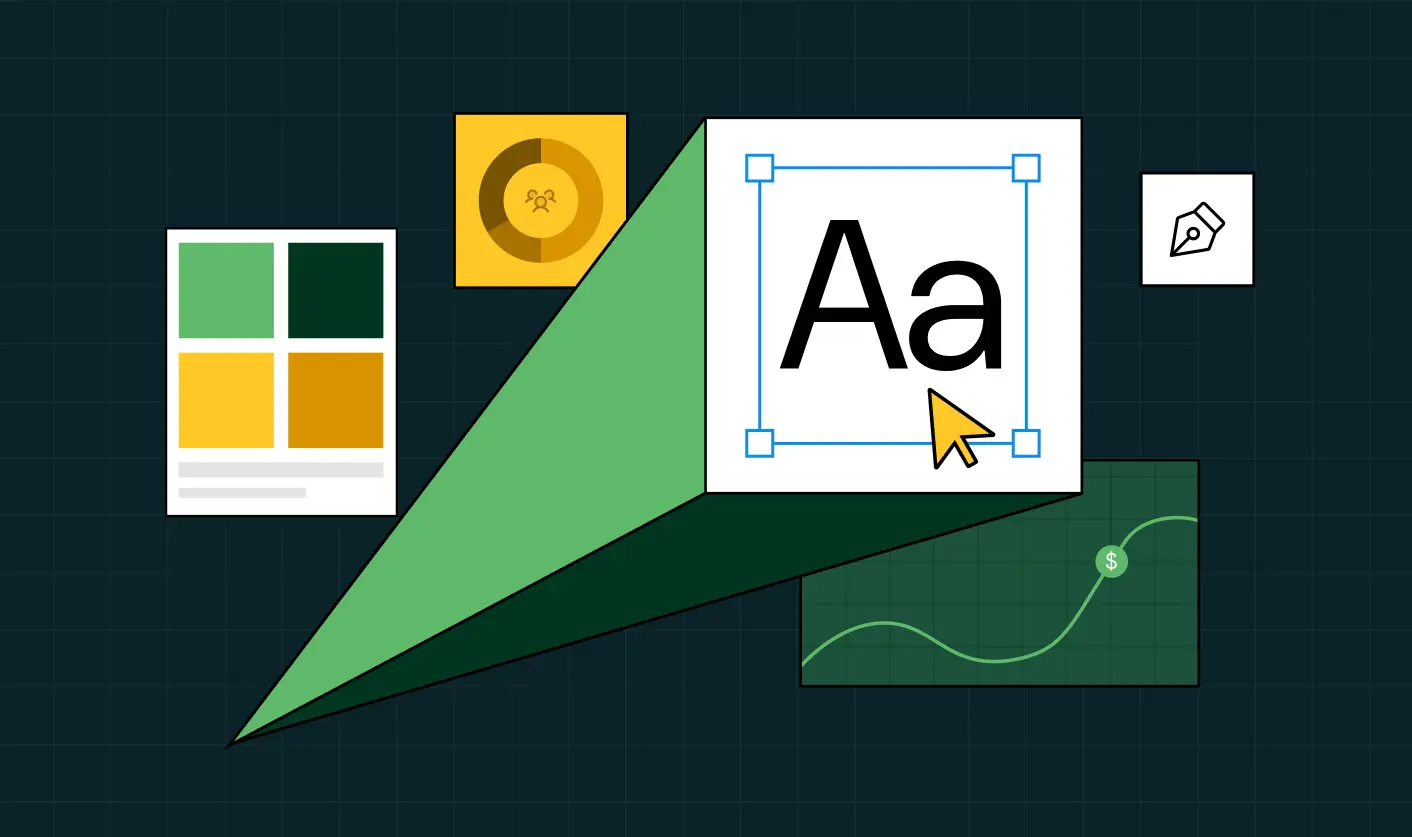
Step 6: Design for UX and scale, not dribbble shots
Only when wireframes and copy are stable should the visual design ramp. This is the step where everyone’s inner aesthete shows up and where things can go off the rails if visual decisions are made for aesthetics alone. The goal is not to create the most creative page; it’s to create a system that can scale across 50-100+ pages, future campaigns, and new product launches without breaking UX.
Look for patterns like:
- A strong design system: typography, spacing, components, and states.
- Customer behavior on different content lengths and viewports.
Example:
For Skyroot Aerospace, ThunderClap designed a consistent system across mission pages, vehicle pages, and their now‑famous Book Your Launch configurator so the whole site feels like one productized launch experience.
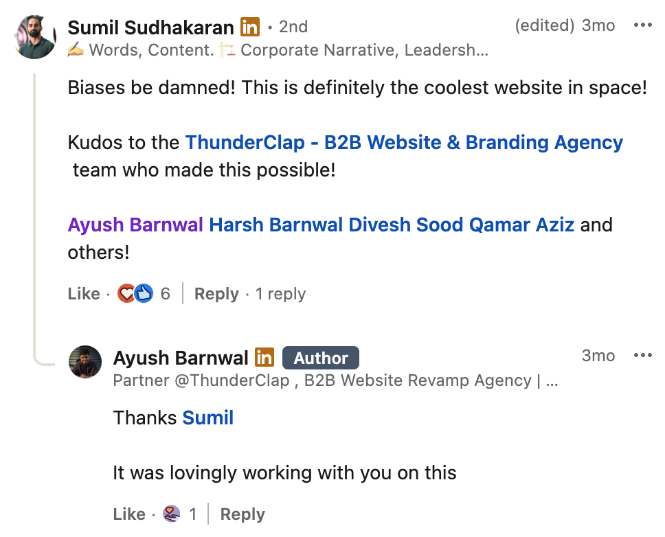
Sumil Sudhakaran, Head of Brand & Communications at Skyroot Aerospace, on Ayush Barnwal’s LinkedIn Post.
What this step should produce
By the end of Step 6, you should have:
- Page‑level designs for templates that demonstrate how the system behaves under content.
- Motion/animation guidelines: where to use it, how subtle it should be, and performance constraints.
- A handoff package for development (specs, tokens, and examples) that reduces interpretation risk.
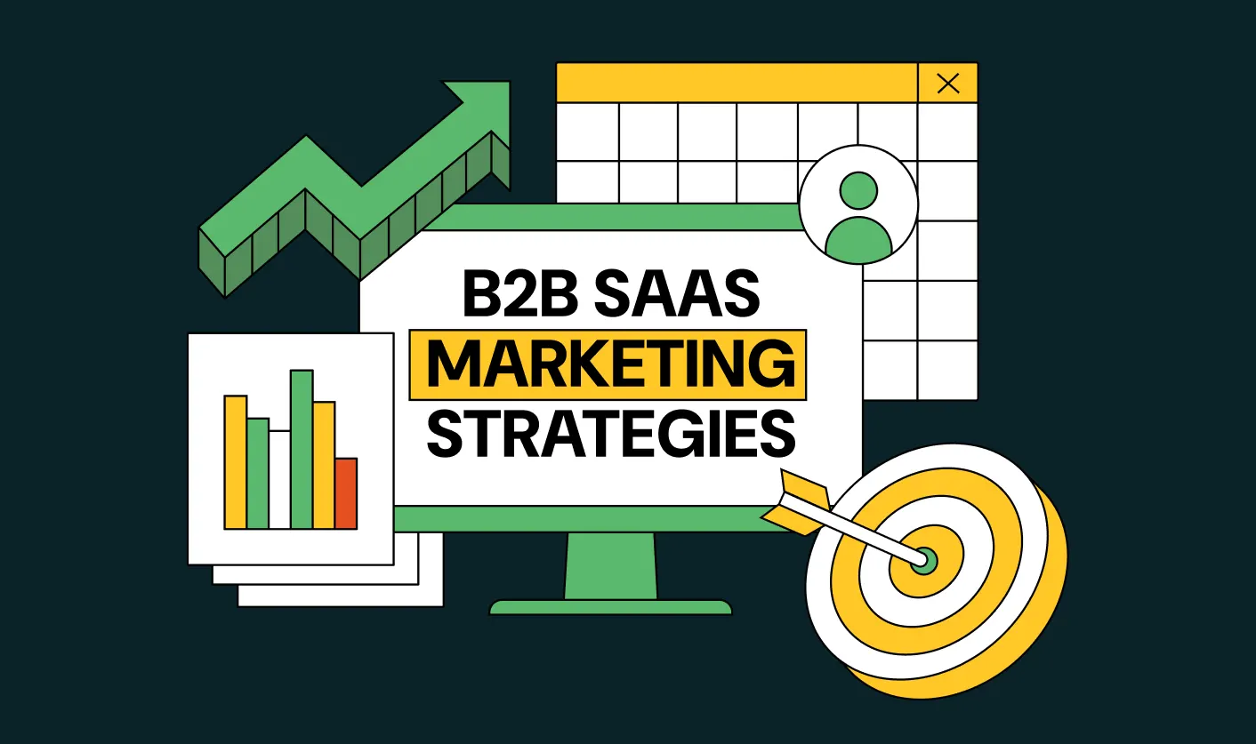
Step 7: Upgrade SEO inside the process
SEO is where many redesigns quietly burn money. Done as an afterthought, a “fresh look” can erase years of compound organic gains in a single deploy. Done well, it’s one of the biggest levers for a long‑term pipeline.
Look for patterns like:
- Full URL inventory and traffic/value mapping.
- 301 redirect plan with testing.
- Metadata, schema, and internal linking migration.
- Content consolidation where cannibalization exists.
- Pre‑ and post‑launch tracking of rankings and organic conversions.
Example:
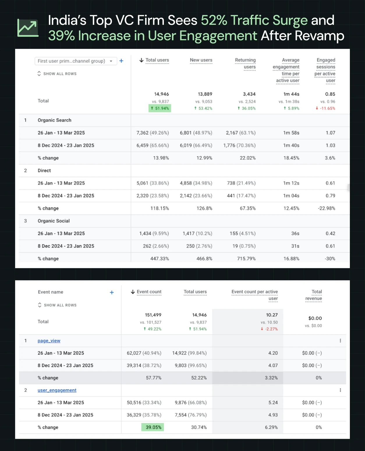
ThunderClap helped one of India’s top VC firms, with a $3.5 Bn+ portfolio, rebrand their website and sharpen their identity for Indian startup founders. Since launch, they have seen a 50% increase in website engagement, a 54% growth in active users, and a 121% boost in direct traffic.
What this step should produce
- A full URL inventory with traffic and value mapping.
- A redirect plan for every changed, merged, or retired URL.
- Metadata, schema, and internal linking migration sheets.
- A content consolidation plan for overlapping pages.
- Pre- and post-launch tracking for rankings, traffic, and organic conversions.
{{specficBlog}}
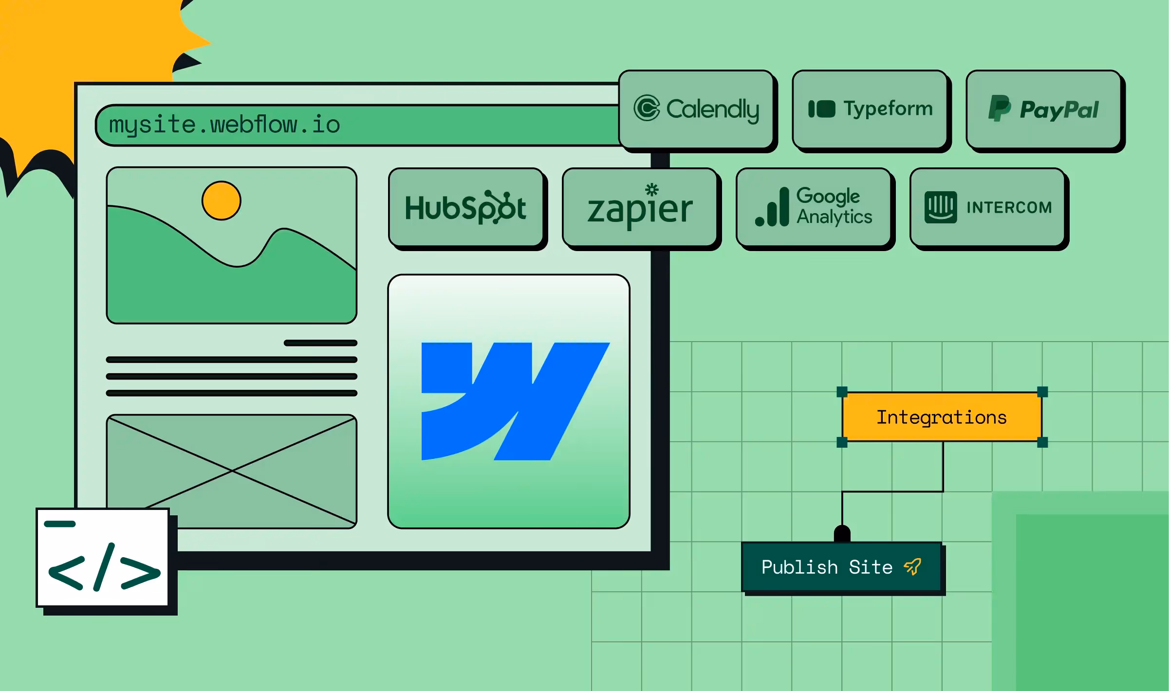
Step 8: Build in a marketer‑owned tech stack
Our ICP research makes one thing clear: your marketing team wants a site they can own, not one they have to beg dev to update. That’s why many enterprise teams now treat CMS choice and architecture as core steps in the website redesign process.
Look for patterns like:
- Component‑based CMS setups (e.g., Webflow Collections and Symbols).
- Structured content for blogs, case studies, industries, and integrations.
- Guardrails that prevent brand breakage while enabling experimentation.
Example:
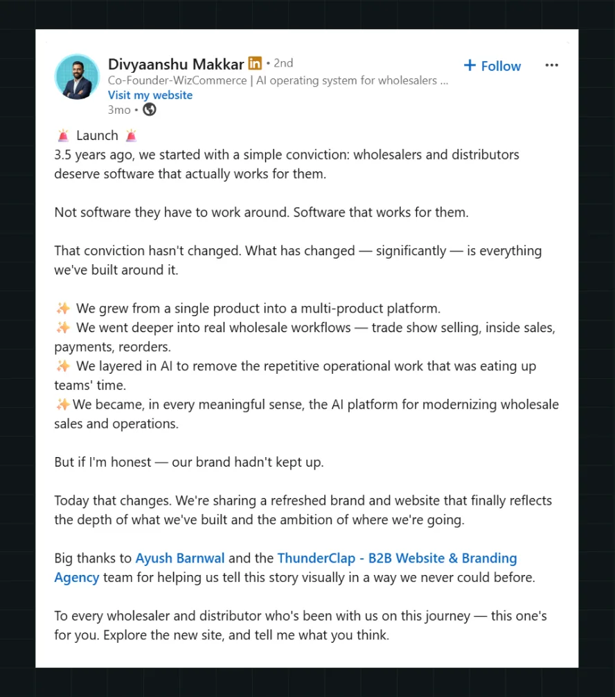
When WizCommerce partnered with ThunderClap, the team wanted a site that made their AI-powered wholesale platform (WizOrder, WizShop, WizAI) the obvious choice in a crowded category with 8000+ competitors. The solution was a CMS architecture that let marketers control their own destiny: product pages with structured collections for each module, a homepage that picks a side (wholesalers and distributors), copy written for wholesale buyers, and conversion paths built around evaluation behaviors. Now the team can update offers, spin up new landing pages, or test messaging without dev delays.
What this step should produce
- A CMS architecture with structured content types (products, case studies, industries, integrations).
- A component library and guardrails for non-designers.
- Integration setup for CRM, analytics, and experimentation tools.
- Enablement so marketing can launch and iterate independently.
- Governance rules to prevent brand breakage.
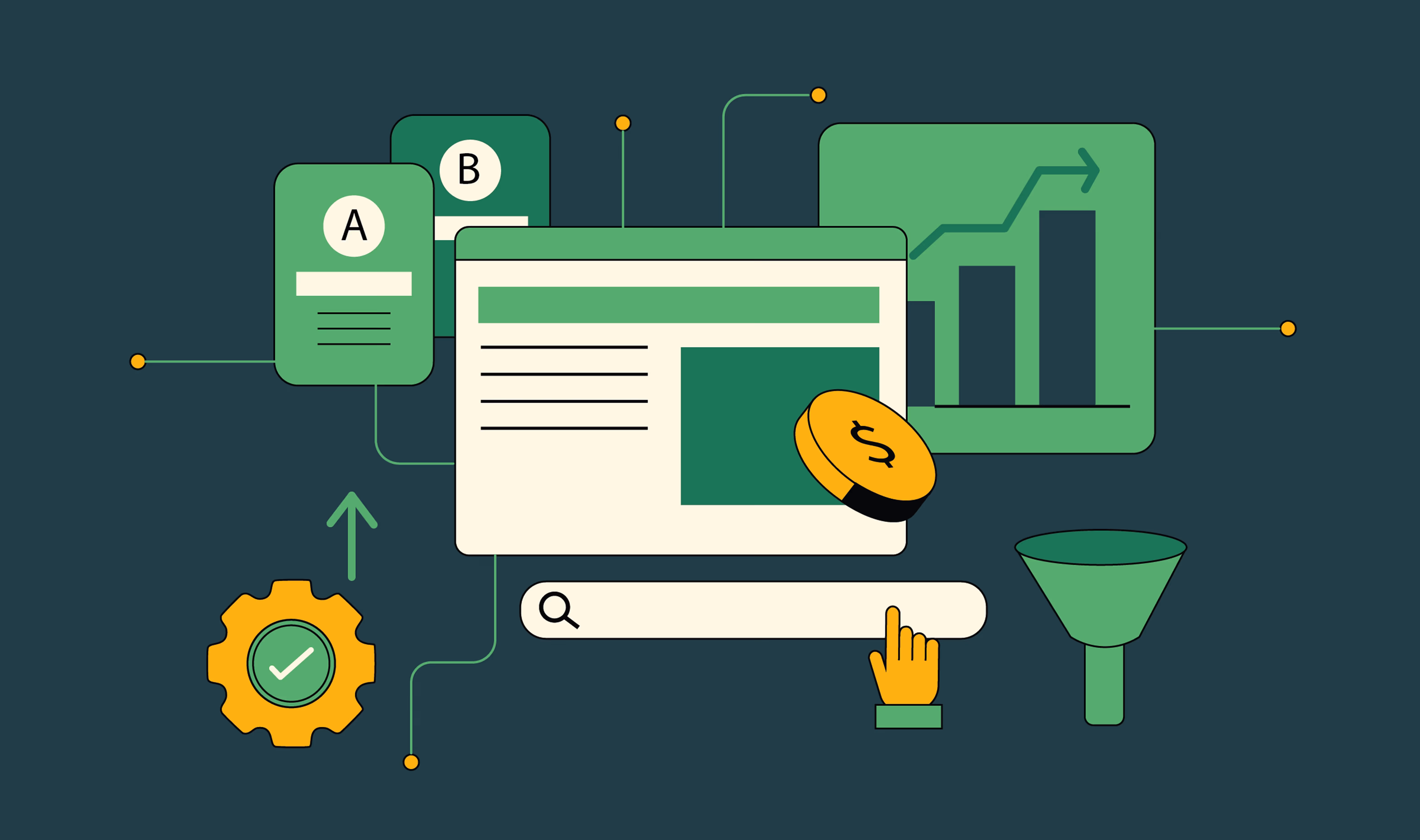
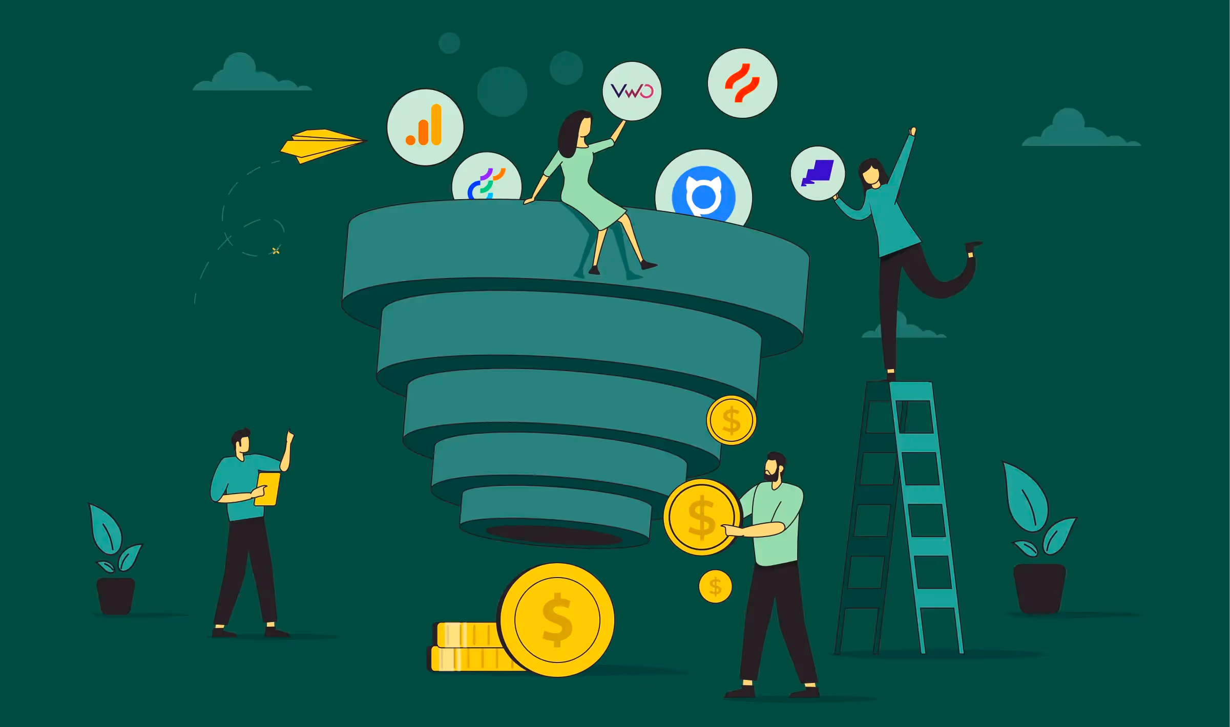
Step 9: Launch as a controlled experiment
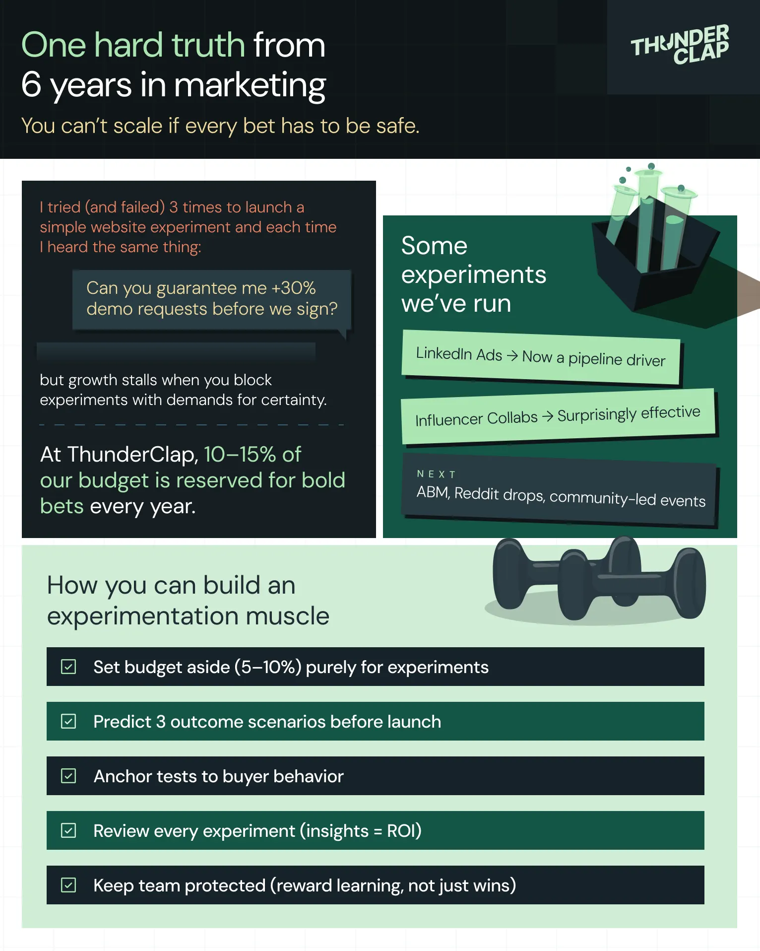
Launch day is not the finish line; it’s the starting gun. Treating go‑live as a project end is how sites stay frozen for 3 years until the next painful overhaul. A modern B2B website redesign process treats launch as the beginning of a structured experimentation cycle.
Look for patterns like:
Instead of a big‑bang switch with crossed fingers, plan for:
- A soft launch on a hidden or password‑protected URL for internal QA, stakeholder review, and bug‑bashing.
- A staggered rollout for critical templates (for example, starting with the marketing pages, then migrating legacy resources, then advanced sections).
- Closely monitored analytics in the first days and weeks: KPIs, high‑intent flows, form submissions, 404s, and unexpected drop‑offs.
- A pre‑planned experiment backlog tied to your primary KPI: form variations, CTA tweaks, headline tests, layout adjustments, new proof blocks, or alternate journeys.
Example:
You can learn more about how we built an in-house experimentation muscle for marketing here:
What this step should produce
- A detailed launch checklist (QA items, redirects verified, tracking validated, rollback plan defined).
- A monitoring dashboard for your primary KPI and key supporting metrics.
- A 30‑, 60‑, and 90‑day experiment roadmap prioritized by impact and ease.
- A cadence for reviewing performance with stakeholders (weekly in the first month, then monthly).
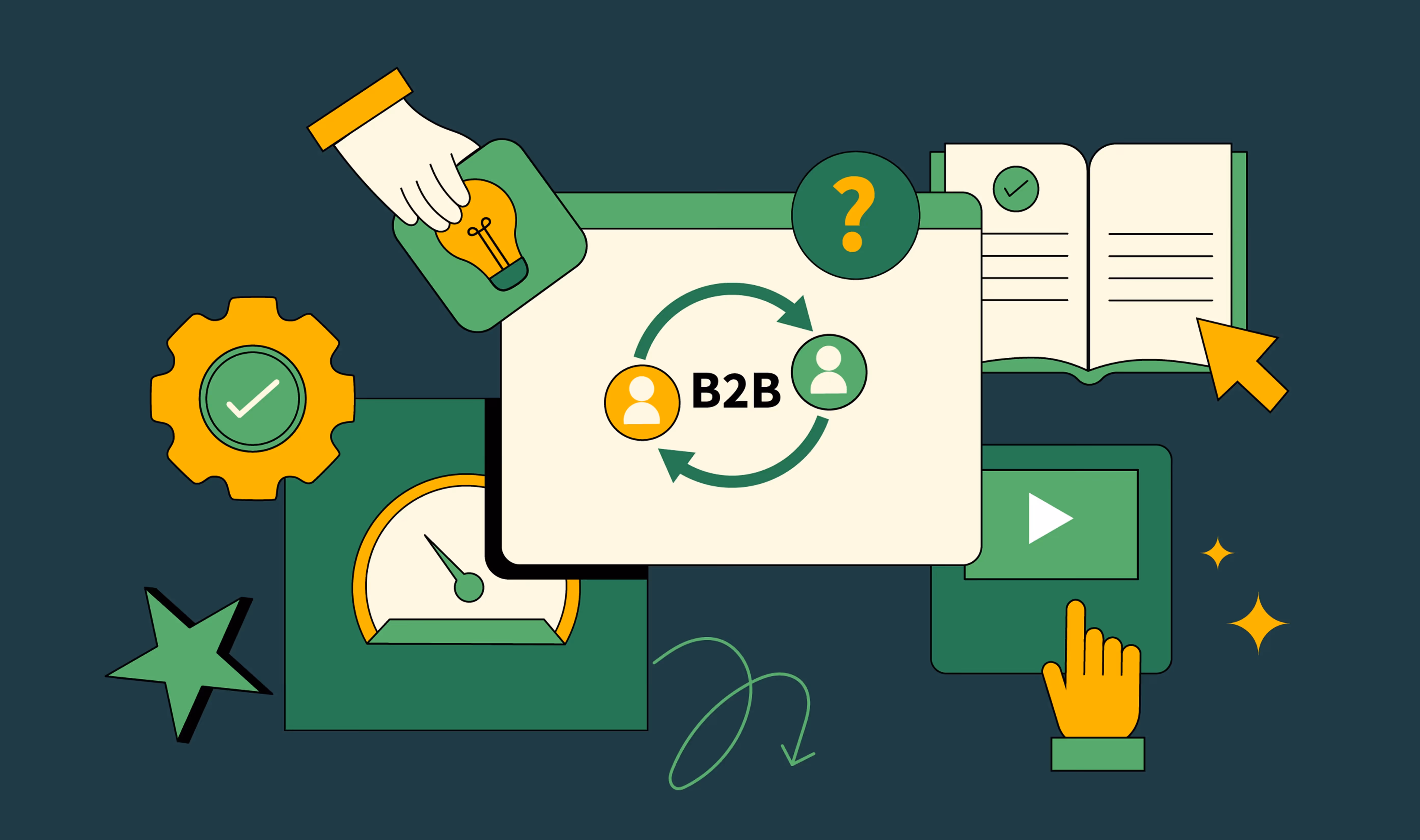
Ready to Run This Website Redesign Process on Your Own Site? Start Here.
If you’ve read this far, you already know more than just ‘we need a new homepage’.
You’ve seen how PRECISE gives you a lens, how the 9-step website redesign process turns that lens into execution, and how teams like roommaster, VuNet, Skyroot, and WizCommerce have used it to improve conversions.
Now the question is simple: do you want to run this alone, or with a partner that’s already pressure‑tested it across 140+ B2B websites?
ThunderClap’s 10‑week program does exactly what this blog outlines: strategy, messaging, UX, Webflow development, and CRO, wrapped into a single, accountable team. Clients like Factors AI, Zamp, Veefin, NativeMSG, 101GenAI, and Clearly Rated have seen up to 30% more demo requests and 60% higher user engagement after a full revamp.
If you’re ready to turn your website into a growth engine, this is the moment to move from reading to doing.
{{ctaBlock}}
FAQs
1. When should a B2B company consider a website redesign?
When positioning changes, the product or the audience changes, and the site no longer reflects the current version of the product. Especially if conversions, lead quality, or stakeholder confidence are declining, or if UX and tech debt block campaigns.
2. What is a website redesign process?
A website redesign process is a structured sequence of discovery, strategy, UX, design, SEO, development, and launch steps used to change an existing site into a higher‑performing one without reducing traffic or pipeline.
3. How do B2B teams ensure a redesign doesn’t hurt SEO?
By treating SEO as a core track: auditing URLs and content, planning redirects, preserving high‑value pages, migrating metadata and schema, and monitoring rankings and traffic before and after launch.


.webp)
Browse Similar Articles
.webp)
7 Best Website Maintenance Companies in India for Growth-Led B2B Teams (2026)

.svg)
.webp)
8 Best Healthcare Website Design Agencies for HIPAA-Compliant Sites in 2026


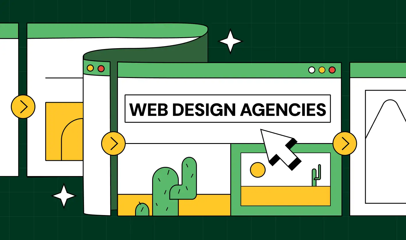
How to Find the Best Web Design Company in Houston, Texas for B2B Brands (6 Best Picks)

Positioning That Wins: How to Make Complex B2B Products Clear and Compelling


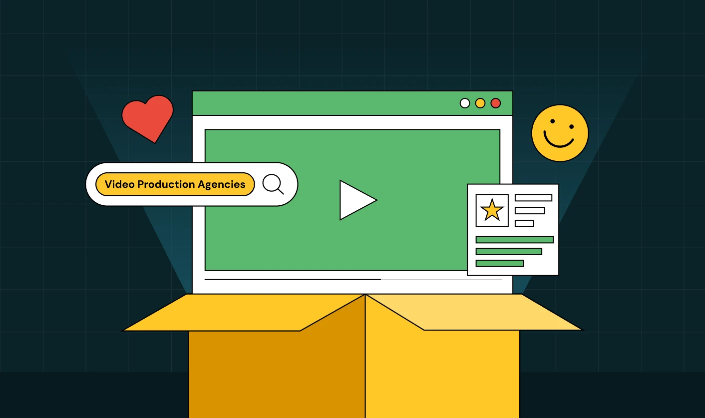
7 Best Video Production Agencies for SaaS Product Walkthroughs and Feature Videos


How to Choose the Best B2B Website Maintenance Company: 9 Questions to Ask Before You Hire One


How to Choose a Web Design Company in San Francisco in 2026 (with Examples)

10 Best Web Design Companies in Florida in 2026 and How to Choose the Right One
How to Use Brand Storytelling on Your Website to Close More B2B Deals and Build Buyer Trust

SaaS CRO Best Practices: What High-Growth Brands Do Differently to Win Conversions

How a Rebranding Agency Can Redefine Your B2B SaaS Identity and Boost Pipeline

B2B Marketing Trends in 2026 That Directly Influence Pipeline and Revenue
Top 7 Video Marketing Agencies Driving B2B SaaS Brand Awareness in 2026
Why Partnering with a B2B Brand Positioning Agency Accelerates Market Differentiation

The Complete Website Redesign Checklist for B2B SaaS Teams Ready to Scale

.avif)
9 Best Webflow Development Agencies in India for 2026 (In-Depth Review)
10 Product Marketing Companies Powering the Fastest-Growing SaaS Brands in 2026
Website Copywriting Services vs In-House: What's Right for Your Business?

How to Choose a Marketing Agency That Understands B2B SaaS Growth Metrics


How to Choose a Video Marketing Agency That Understands B2B Storytelling
Outsourcing Web Design: Cost-Benefit Analysis for Mid-Market & Enterprise Brands
From Leads to Lifetime Value: How Growth Marketing Agencies Scale SaaS Revenue
Build a B2B Website Strategy That Aligns with Sales and Marketing Goals

Webflow vs WordPress: Which Platform Is Better for Your Business Website in 2026?
Fintech Web Design That Builds Trust: 8 UX Principles Every Fintech Site Needs

Optimizing for Intent: How B2B Website Messaging and UX Changes Help Capture Top-Funnel Buyers


12 Best B2B Web Development Agencies in the US to Build Scalable Websites

From Audit to Action: 8-Step Process to Optimize Your B2B Website Strategy for 2026 Buyers

How to Design a High-Converting Landing Page from Scratch (2026 Edition)

From Click to Customer: Proven Landing Page Conversion Optimization Techniques

How to Write Website Copy That Converts: A Step-by-Step Guide for 2026

How to Optimize a Landing Page for Maximum ROI: A Step-by-Step Breakdown


AI Landing Pages That Convert: 7 Design Principles Every AI Platform Should Follow

From Traffic to Pipeline: B2B Website Growth Strategy for Scaling Teams
B2B Website Optimization Strategy: Speed, UX, SEO, and CRO in One Playbook


Outsourcing Webflow Maintenance vs. In-House Management: Which is Better?


SaaS Website Design That Converts: 7 Must-Have Elements to Win More Signups
Top 7 Webflow Integrations to Supercharge Your Website's Performance and Conversions

Outsourcing Web Development: Cost-Benefit Analysis for Startups & Enterprises


Interested in seeing what we can do for your website?


.webp)
