













9 High-Converting Website Hero Sections (With Breakdown)



Your hero section has five seconds to make a stranger care. Most B2B companies spend those five seconds hedging (cramming in every feature, every audience, every "just in case" line) and walk away with a visitor who's still not sure what they do. That's not a bounce rate problem. That's revenue walking out the door before your sales team ever gets a shot at it.
And because everyone from the CEO to the intern has an opinion on the homepage, it usually stays broken for months, bleeding pipeline while nobody's brave enough to just fix it.
In this blog, we're breaking down 9 examples of good website hero sections that refused to play it safe. We'll look at the choices each brand makes with copy, visuals, proof, motion, and CTAs, and why they work for their particular product and buyers.
And no, this isn't another roundup of the same website hero section examples recycled across every top-ranking blog. We started with Product Hunt and dug through 50 product websites across sales and marketing, fintech, compliance, productivity, and AI to find examples that took distinctly different approaches to website hero section design.
But first, let's start with the basics.
Key Takeaways
- A high-converting hero section helps buyers understand what you do, why it matters, and what to do next without trying to explain everything at once.
- The strongest hero sections make deliberate choices about what buyers need to understand, see, and believe first, whether that's clarity, proof, objection handling, or a product visual.
- Examples of good website hero sections show that different buyer problems call for different strategies: Wynter uses layered copy for clarity, Artisan surfaces objections early, Peec makes a new category tangible, Albato creates separate paths for different audiences, and VuNet uses motion to explain an abstract product.
What Is a Hero Section of a Website?
A hero section is the first fold of your website, the above-the-fold content visitors see first. It sits at the top of the homepage, before any scrolling, and usually spans the full width of the screen, taking up most or all of the screen. In just 5 seconds, it needs to explain what the product does, who it's for, why they should care, and what to do next.
Here are the key components of the hero section of a website:
- Eyebrow copy: Sits above the headline and frames what follows, whether that's the category, the audience, or the brand's angle.
- Headline: Carries the core value proposition, the single clearest reason the visitor should care.
- Subheadline: Builds on the headline with the how or why, giving the promise proof or mechanism.
- Visual: The screenshot, animation, or video that shows the product or outcome instead of just describing it.
- CTA: Points to the next step, matched to how ready the visitor is to act.
The problem isn't knowing what a hero section should contain. It's deciding what your audience needs to understand first and in what order.
Why Do B2B Companies Still Get Hero Sections Wrong?
At ThunderClap, we’ve worked on 140+ B2B website redesigns so far. Across those projects and conversations with product marketers refining their SaaS marketing strategies, the same three problems keep showing up.
1. When they copy what works for someone else
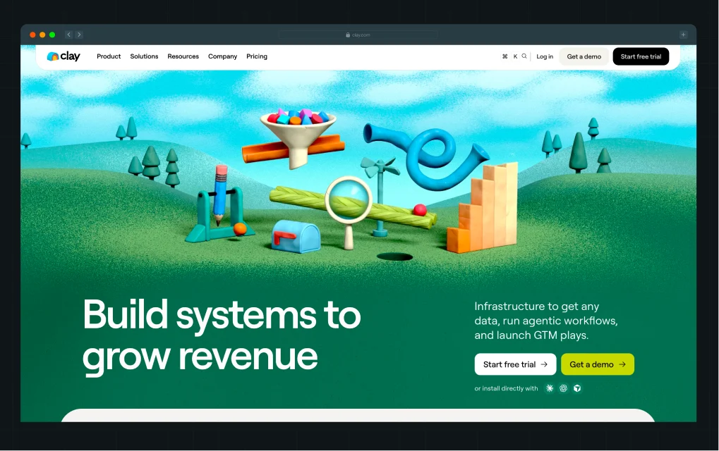
What works for an established brand won't always work for a new one. Take Clay, whose hero opens with “Build systems to grow revenue.” It's vague, but Clay can afford to be.
Many visitors already know the brand from LinkedIn, peers, or their community. A newer company doesn't have that context. Use the same headline, and visitors may simply wonder what you do.
Brand awareness, audience context, and product positioning all change how much your hero needs to explain. Here’s a LinkedIn post from Kiran Kulkarni, Partner and Head of Growth at ThunderClap, breaking down why Clay can take this approach.
2. When they outsource the groundwork to AI
This is a real B2B marketing trend. Teams move faster on execution while positioning gets less rigor, not more.
AI website builders can generate a hero section in under a minute. But trusting AI to figure out your positioning, understand buyer context, and decide what visitors need to hear first is another story. That's how you end up playing buzzword bingo with “AI-powered,” “end-to-end,” and “seamless.”
As Ayush Barnwal, Partner and Head of Design at ThunderClap, puts it:
“AI is great when you already have a point of view. Give it your research, rough ideas and hypotheses, and it can help you get somewhere faster. Ask it to come up with the point of view itself, and don't be surprised when your hero sounds like it was written for every SaaS company at once.”
3. When every stakeholder gets an equal say
"But we aren't just that." “Shouldn't we mention this too?” “We do much more.”
Almost every B2B homepage goes through some version of this. Maybe that's why one Reddit user called the homepage “the most political piece of marketing property there is.”
And when product marketers lack the research to push back, or the CEO has the final say, the hero section of a website usually suffers first. A few messaging reviews can turn a focused hero into a committee-approved list of everything the company does.
The answer isn't shutting stakeholders out. It's giving someone ownership of the message and enough evidence to defend it. Otherwise, every review becomes a negotiation over what gets added.
How Are Great B2B Brands Getting Their Hero Sections Right? 9 Examples to Learn From
Here are 9 best hero section website examples from B2B brands that get those fundamentals right in different ways. For each one, we'll look at how the copy and design help buyers understand the product, what builds trust or makes the message easier to grasp, and whether the next step is clear.
1. Wynter: Explain Your Value Proposition in Under 5 Seconds
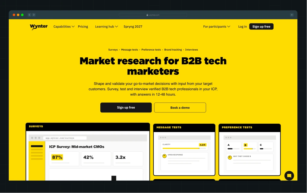
Wynter, the B2B messaging research platform, is one of the best examples of SaaS website hero section inspiration because it does what a hero is supposed to do. As Casey Hill, CMO of Do What Works, puts it, a homepage should quickly tell visitors what a product does, why it's different, and ideally, how it works.
A quick skim of Wynter's hero does exactly that. The H1, subheading, and eyebrow each answer the next obvious question in a buyer's mind.
What Wynter gets right
- The H1 makes a clear promise: “Understand your market. Validate your message.” tells visitors exactly what they can achieve with Wynter instead of making vague promises about revenue or growth.
- The subheading answers what visitors get and why they should choose Wynter: Fast, on-demand insights from verified B2B professionals give the promise a clear advantage over traditional research.
- The eyebrow answers how Wynter delivers on that promise: Surveys, message tests, preference tests, brand tracking, and interviews show the different ways teams can get those insights.
- The CTAs make the first step feel less intimidating: “Sign up for free” gives visitors a low-risk way to try Wynter, while “Book a demo” is there for those who want more help.
What could be improved
- The product visuals sit lower on the page, so the hero relies on copy before visitors see what the research experience actually looks like.
Key takeaways
- Lead with a specific outcome, then use the rest of the hero to show what makes achieving it possible.
- Name a differentiator (speed, source, or method) that gives buyers a reason to choose you over their current alternative.
- Check that each line in the hero is doing a different job (what/why/how). If two lines do the same job, cut one.
2. Factors.ai: Use Hero Animation to Tell the Product Story
Factors.ai positions itself as an AI-powered ABM platform. The hero section of the website combines a clear product promise with an animated visual showing how teams can identify and act on in-market accounts.
When we redesigned Factors' website, the challenge wasn't just making an ABM platform look good. Its copy already had a distinctive voice: “AI that's not on shrooms. Hallucination who?”, but the product deals with serious buyer data. The design needed personality without making it feel lightweight.
That led to ‘the marketing compass’, a visual language built around helping marketers navigate the messy B2B buyer journey. The watchtower in the hero gives teams a bird's-eye view of the accounts and signals worth acting on.
What Factors.ai gets right
- The copy answers three questions: Who is this for? What is it? What can it help me do? “ABM team's AI brain and execution layer” is backed by specific jobs, from identifying accounts to launching campaigns.
- The product animation complements the copy: The watchtower turns Factors' core value of visibility into buyer activity into something you can grasp at a glance.
- The CTAs account for different levels of buyer intent: Free trial, interactive demo, contact sales, and talk to an agent acknowledge that not everyone evaluates a B2B product the same way.
What could be improved
- The eyebrow “AI Account Based Marketing Platform” names the category, but the rest of the hero already does that work with more personality.
Key takeaways
- When the category is complex and covers multiple JTBDs, use the copy to answer who it's for, what it is, and what it helps them do, in that order.
- If the product's value is hard to picture, an animation or visual metaphor can carry weight that copy alone can't.
- Give buyers different entry points based on how ready they are to evaluate; not everyone wants to talk to sales first.
3. Artisan: Handle Buyer Objections Above the Fold
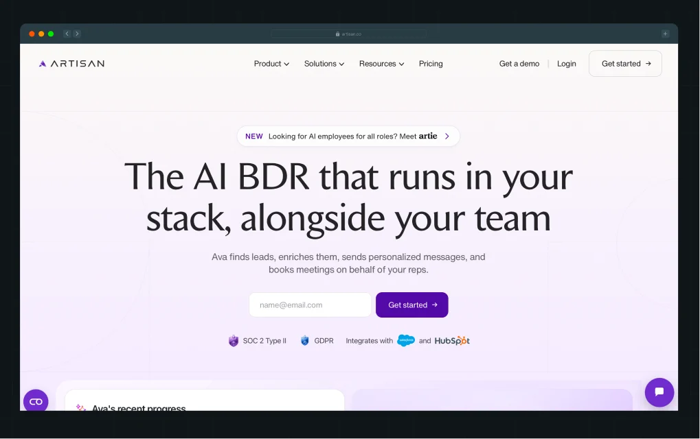
Artisan sells an AI BDR called Ava into a market where “AI SDR” can mean anything from an email generator to a fully autonomous agent. Its hero makes Ava's role clear, then answers buyers' questions about how it fits into their team and whether they can trust it with their pipeline.
What Artisan gets right
- It makes a new category easier to place: “The AI BDR that runs in your stack, alongside your team” gives Ava a familiar role and makes it clear that the product works with an existing sales setup rather than asking buyers to rethink their entire workflow.
- Trust signals show up early for a reason: An AI agent handling outreach and customer data naturally raises questions around integrations, compliance, and security. Artisan surfaces those before asking visitors to commit.
- Proof comes before the pitch: “See what customers achieve with Ava” lets visitors see how other teams are using Ava before asking them to get started.
What could be improved
- “Get started” suggests a self-serve product experience, but the form leads to a meeting schedule page. The call to action sets a different expectation from what follows.
- Ava and “AI BDR” are introduced together. The connection is clear once you read the hero, but a visitor scanning quickly may need an extra second to connect the product name to what it is.
Key takeaways
- When you're entering a category buyers don't fully trust yet, reassure them the product works within their existing team and tools, not around them.
- If your product touches sensitive data or workflows, surface trust signals early to get ahead of objections before buyers have to ask.
- Make sure your CTA sets the right expectation. If clicking “Get started” leads to a sales call, use language that sets that expectation upfront.
4. Peec AI: Make a New Category Easier to Understand
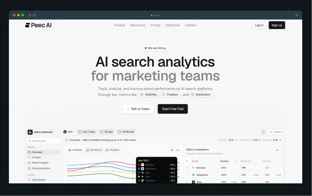
Peec AI helps marketing teams understand how their brand performs across AI search. AI visibility is becoming a familiar idea, but “AI search analytics” still leaves a question open: what does the product actually track?
Peec answers that question through its above-the-fold content, calling out Visibility, Position and Sentiment, then showing those same metrics in the product visuals below.
What Peec gets right
- The hero explains what Peec tracks: “Visibility, Position and Sentiment” give marketers three concrete ways to think about AI search performance instead of leaving “AI search analytics” as an abstract category.
- The product visuals pick up where the copy leaves off: Those same metrics appear in the product, so visitors can see what tracking them actually looks like.
- The CTAs match two buying paths: “Talk to Sales” works for teams still figuring out the category, while “Start Free Trial” gives hands-on evaluators a way to explore it themselves.
What could be improved
- The hero lacks social proof. In an emerging category, even a signal like “Used by X+ SEO teams” can reassure buyers that others are already using the product.
Key takeaways
- When you're in an emerging category, spell out exactly what the product tracks or measures, instead of leaving them to guess what's behind the label.
- Use the same terms and metrics in your visuals as your copy, so buyers can see clearly what the product actually does.
- If the category itself is new, anchor it to something buyers already know, then show how yours is different. (e.g. using familiar analytics terms to explain a new kind of search analytics)
{{specficBlog}}
5. Gong: Show Multiple Product Outcomes Without Turning the Hero Into a Feature List
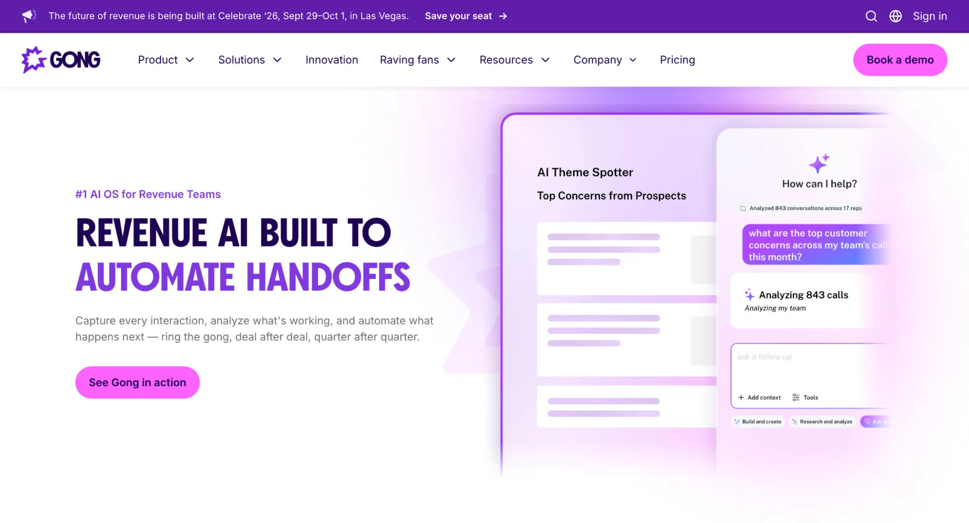
Gong has grown from a conversation intelligence tool into a broader revenue platform spanning forecasting, deal risk, and enablement. That makes the hero section of the website harder to get right. Pick one outcome, and you miss part of the product. List everything and the message becomes a feature dump.
Gong takes a middle path with a scrolling headline that cycles through outcomes like automating handoffs, predicting churn, and closing deals faster. The copy and product visuals then show what sits behind those promises.
What Gong gets right
- The scrolling headline stays relevant to the same buyer: “Revenue AI” anchors the message, while each outcome speaks to a different goal revenue teams care about. The message changes, but the audience doesn't.
- The copy below does the explaining: The headline shows what Gong can help achieve. The subheading explains how, through capturing interactions, understanding what's working, and automating what happens next.
- The motion has context: The product visual changes with the headline, so each outcome feels connected to something Gong actually does rather than copy rotating for attention.
- The CTA keeps things simple: “See Gong in action” gives visitors one clear next step.
What could be improved
- The first outcome still matters. If visitors land on one they don't care about, they may leave before the headline rotates.
Key takeaways
- When your product spans multiple outcomes, cycle through them one at a time instead of cramming them into a single line that ends up describing none of them well.
- Keep one thing constant across the rotation (a category name or brand line), so it still feels like one message, not several different pitches.
- Matching the visual to each headline can build trust, but it makes users track two things at once. Do it only when each headline needs its own proof.
6. Rezolv: Give Buyers a Product Preview With an Explainer Video
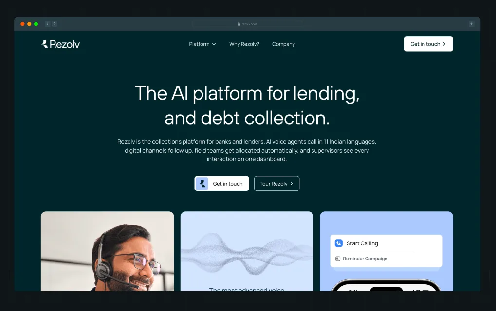
Rezolv is a debt collection platform for banks and NBFCs, with a suite of seven products covering different parts of the collections process. It is a good example of websites with a video background in the hero section. It pairs a clear category statement with an explainer video that shows a key feature in action.
When Rezolv partnered with ThunderClap, its founders, Karan Mehta and Sonali, wanted the website to work like a product demo. They wanted buyers to get enough of a look at Rezolv’s capabilities upfront to understand the product before exploring it further. The hero section of website is the first place this idea comes to life.
What Rezolv gets right
- The copy gives buyers a complete picture quickly: The H1 and subhead establish the category, audience, and how the platform works. Instead of stopping at “AI-powered collections,” the subhead gets specific about features like voice agents in 11 languages, digital follow-ups, field allocation, and supervision.
- The video tackles the questions behind the AI claim: “AI voice agents” is easy to say but raises questions about what they sound like and how they actually work. The video lets buyers judge the capability for themselves while focusing on one of Rezolv’s most important features.
- The CTA continues the product story: “Tour Rezolv” takes buyers to a dedicated page where they can explore the platform’s features in more detail. The hero creates interest; the next page does the deeper product explaining.
What could be improved
- Bring proof closer to the product claim. A customer logo, recovery metric, or similar proof point near the CTA could give buyers another reason to trust what they’re seeing.
Key takeaways
- In case of a suite of products, pick the one that gives buyers the clearest sense of what your platform can do, rather than trying to preview the whole platform.
- When a product claim depends on what it looks like in action, let buyers experience it for themselves through a video or product preview.
- For early-stage startups, build a dedicated product page that works like a demo if setting up self-serve options isn't practical yet.
{{specficService}}
7. Albato: Let Different Buyers Choose Their Own Experience
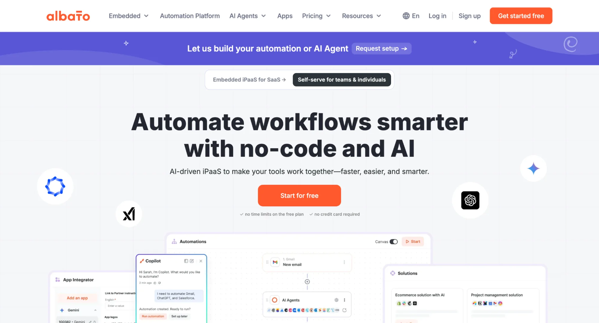
Albato, a Zapier-like automation platform, sells to two audiences. Teams and individuals use it to automate workflows, while software companies use its embedded offering to add integrations and AI agents to their products.
Instead of making one hero work for both, Albato lets visitors choose between two experiences and changes the messaging accordingly.
What Albato gets right
- The experience selector keeps two stories separate: Software companies learn about adding Albato to their product, while teams and individuals focus on automating their own work.
- The proof matches what each buyer cares about: SaaS companies see G2 reviews, security, uptime, and white-label features. Self-serve users get reassurance that they can try the product with “No time limits” and “No credit card.”
- The visuals change with the experience: Software companies see how Albato could appear inside their product, while self-serve users see the workflow builder they'd use to create automations.
- The next step fits each buyer: Companies get “Let's talk,” while self-serve users can “Start for free” and try the product right away.
What could be improved
- Software companies only get a “Let's talk” option. A product tour or interactive demo would let buyers explore Albato before committing to a sales call.
Key takeaways
- When you sell to two distinct buyer segments, create separate paths for each instead of writing one hero that tries to speak to both.
- Change the messaging, information architecture, and visuals based on what each buyer needs to know.
- Show different proof for different segments. Software companies care about security and uptime. Self-serve users respond better to low-friction signals like "no credit card required."
8. VuNet: Use Motion to Visualize an Abstract Concept
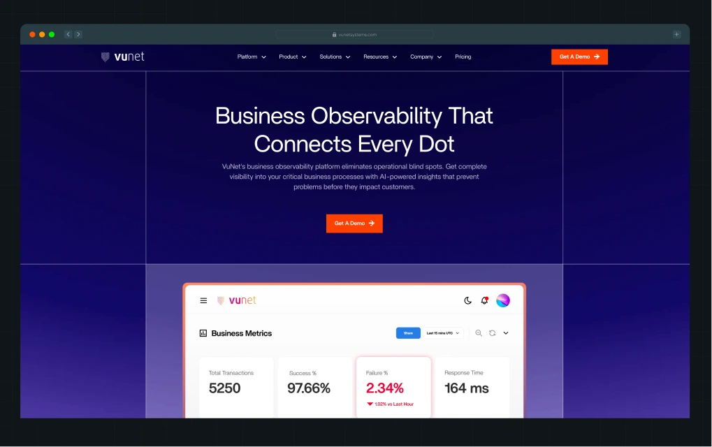
VuNet Systems is a business observability platform built for banks. It connects what's happening across the technology stack to what's happening in an actual banking journey, from a transaction failure or slowdown to its root cause and customer impact.
That's a lot to land with one audience, let alone three: CIOs care about business impact, SREs want root cause, and digital banking leaders care about customer experience.
When ThunderClap redesigned VuNet's website, the goal wasn't to cram everything into the first screen. Instead, the above-the-fold optimization focused on getting the big idea across first, before bringing the product into view.
Here's a LinkedIn post from Ayush Barnwal, Partner at ThunderClap, explaining how we approached the VuNet redesign.
The hero gives buyers the big picture first, in copy alone, then brings the product into view once the message has landed. It's a good example of how websites with a video background hero section can use motion to explain a product, rather than add visual interest.
What VuNet gets right
- The copy gets the stage to itself first: nothing competes with the headline and subhead, so visitors get the idea before being asked to parse the product behind it.
- The video makes an abstract word concrete: "observability" means nothing on its own. Watching a transaction get traced to its root cause shows what the word actually does, which copy alone struggles to convey.
- One video serves three audiences at once: business impact, root cause, and customer experience all show up in the same clip, so the hero doesn't have to pick one buyer to speak to first.
What could be improved
- The hero could use more proof. A bank logo or scale metric near the CTA would make the claim more credible in the moment, not just plausible.
Key takeaways
- For websites of complex products, let the copy have the hero to itself first. Don't ask buyers to process a visual and an abstract idea at the same time.
- Use product animations that mirror how the product actually works, so multiple stakeholders can each see what matters to them in the same visual.
- If the hero makes a big enterprise claim, put proof in the same fold instead of making buyers scroll for it.
9. WizCommerce: Lead With the Problem When the Category Falls Flat
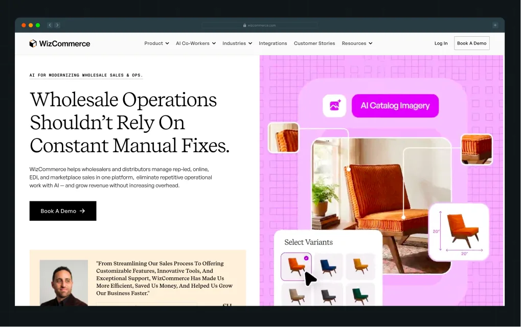
WizCommerce helps wholesalers and distributors manage sales and operations across rep-led, online, EDI, and marketplace channels. Its hero starts with a problem these buyers already recognize: “Wholesale Operations Shouldn’t Rely on Constant Manual Fixes.”
This problem-led direction also shaped how ThunderClap approached the redesign. Here’s a closer look at how we approached the WizCommerce redesign on LinkedIn.
The visual was built around the copy rather than treated as a separate element, showing how WizCommerce brings the different parts of a wholesale operation together.
The result is a hero where the copy and design tell the same story. The headline introduces the problem, the subhead explains the solution, and the visual shows its scope.
What WizCommerce gets right
- The headline names a problem, not a category: Buyers don't need to understand “AI for wholesale ops” first. They just need to recognize the pain of manual fixes to see the product as relevant.
- The subhead earns the claim: It names the specific channels, including rep-led, online, EDI, and marketplace, that the platform unifies before promising less manual work and more revenue. The payoff feels backed by something concrete.
- The visual shows the scope of the platform: Rather than focusing on one feature, the visual reflects the broader operation WizCommerce is designed to manage.
- The chat widget carries the problem-led approach further: It asks visitors which problem they’re dealing with, giving passive visitors a simple reason to start a conversation instead of leaving.
What could be improved
- Bring proof closer to the product claim. The testimonial proof sits below the fold, so visitors have to scroll to find it rather than seeing it alongside the initial claim.
Key takeaways
- When your category name is unfamiliar to explain anything on its own, skip it and lead with a problem buyers already recognize instead.
- Use chat widgets to give passive visitors a reason to engage instead of leaving without taking action.
- Capture their email after the chat has provided some value, rather than asking for it through a form upfront.
Is Your Hero Section of Website Working?
These 9 hero section examples show how differently a hero can work depending on the product, audience, and buying journey. Wynter relies on clarity, Peec AI makes a new category easier to understand, Artisan handles buyer objections above the fold, Albato changes the experience for different buyers, and VuNet uses motion to make an abstract concept easier to grasp.
But they all make deliberate choices about what visitors see first, what needs to be shown rather than told, and what actually gets them to take the next step. Wondering if the hero section on your website does the same?
Here's the checklist we use at ThunderClap to audit every B2B hero section and make sure it's conversion-ready:
ThunderClap's The 6-Question Hero Section Audit Checklist
Need Help Fixing Your Hero Section?
If your audit shows gaps across multiple areas, a headline rewrite alone won't fix them. Good hero section design is rarely about one element. You might need to experiment with A/B testing, rethink the messaging or visuals, or go back to the page structure itself.
And if that sounds like a lot, that's where ThunderClap can help. We've worked with 88+ B2B brands, including roommaster, Cashfree, Freehand, VuNet Systems, Skyroot, WizCommerce, Resolv, and Factors, to position complex products better and build high-converting website experiences that help buyers move forward.
Why work with us?
- We know B2B: We've worked across SaaS, AI, fintech, HRTech, and VC, and understand the messy positioning and buying challenges that come with complex products.
- We don't jump straight into design: We dig into your market, buyers, competitors, brand, and current website strategy first, so we're fixing the actual problem, not just making the page look better.
- You get PMMs in the room: Our in-house product marketers work alongside designers throughout the process, bringing positioning and messaging into the work from day one.
{{ctaBlock}}
FAQs
1. How do you write a hero section that communicates value in under five seconds?
To write a hero section that communicates value in under five seconds, lead with the clearest version of your value proposition. Visitors should quickly understand what you do, who it's for, and why it matters. Don't make the headline carry every detail. Use the subheading and visuals to add context.
2. Should a website hero section focus on features, benefits, or outcomes?
A website hero section should focus on whatever helps the buyer understand why the product matters fastest. For complex products, that often means leading with the outcome and bringing features in later. Product features can still work above the fold when they're the clearest way to prove the value proposition.
3. How can you align your hero section with your brand positioning strategy?
To align your hero section with your brand positioning strategy, start with what makes your product relevant to a specific buyer. The messaging, visuals, proof, and call to action should all reinforce that position. If the positioning is unclear, changing the headline alone won't fix the hero.
4. What elements increase conversions in a website hero section?
Elements that increase conversions in a website hero section include a clear value proposition, relevant visuals, proof, and a call to action that matches buyer intent. The key is not adding everything at once. Strong visual hierarchy and information architecture help buyers process each element in the right order.
5. How can A/B testing improve hero section performance?
A/B testing can improve hero section performance by showing which changes actually help buyers move forward. Test meaningful differences, such as positioning, messaging, visuals, proof, or calls to action. Don't test random button colors in isolation when the bigger problem could be that buyers don't understand the page.
6. Where is the hero section of a website?
The hero section is the first fold of your website, the above-the-fold content visitors see first. It sits at the top of the homepage, before any scrolling, and usually takes up most or all of the screen.
7. What is the size of the hero section of a website?
A hero section usually spans the full width of the screen and takes up about 60–100% of the viewport height. On desktop, a common starting point is 1920 × 1080px, while mobile layouts are often taller, around 800 × 1200px. Most websites use flexible heights such as 100vh so the hero adapts to different screen sizes.




Browse Similar Articles










Leading 5 SaaS Branding Agencies in Florida (That Actually Understand SaaS Growth)



How to Turn Your B2B Website into a Self-Serve Growth Engine? (PLG Ready in 2026)

9-Step Website Copy Audit Checklist to Improve Conversions (Examples from Top B2B Brands)



How to Choose the Right Fintech Web Development Company for Your Business

Top B2B Website Design Principles That Turn Visitors into Qualified Leads

How to Do a Conversion Rate Optimization (CRO) Audit That Actually Improves Revenue
Web Design Agency vs. Freelancer vs. In-House: What Actually Works in 2026
5 CRO Agencies in London and How to Choose the Best CRO Agency for Your Business
The Ultimate Fintech B2B Positioning Guide for 2026 (That Actually Drives Conversions)

Mapping the B2B Buyer Journey to Improve Conversions Across Every Touchpoint

7 Best Website Maintenance Companies in India for Growth-Led B2B Teams (2026)



8 Best Healthcare Website Design Agencies for HIPAA-Compliant Sites in 2026

How to Find the Best Web Design Company in Houston, Texas for B2B Brands (6 Best Picks)
Positioning That Wins: How to Make Complex B2B Products Clear and Compelling
The Step-by-Step Website Redesign Process B2B Teams Use to Increase Conversions (Without Killing SEO and Pipeline)
7 Best Video Production Agencies for SaaS Product Walkthroughs and Feature Videos

How to Choose the Best B2B Website Maintenance Company: 9 Questions to Ask Before You Hire One


How to Choose a Web Design Company in San Francisco in 2026 (with Examples)

10 Best Web Design Companies in Florida in 2026 and How to Choose the Right One
How to Use Brand Storytelling on Your Website to Close More B2B Deals and Build Buyer Trust
SaaS CRO Best Practices: What High-Growth Brands Do Differently to Win Conversions

How a Rebranding Agency Can Redefine Your B2B SaaS Identity and Boost Pipeline

B2B Marketing Trends in 2026 That Directly Influence Pipeline and Revenue

Top 7 Video Marketing Agencies Driving B2B SaaS Brand Awareness in 2026

Why Partnering with a B2B Brand Positioning Agency Accelerates Market Differentiation

The Complete Website Redesign Checklist for B2B SaaS Teams Ready to Scale

10 Best Webflow Development Agencies in India for 2026 (In-Depth Review)

10 Product Marketing Companies Powering the Fastest-Growing SaaS Brands in 2026
Website Copywriting Services vs In-House: What's Right for Your Business?

How to Choose a Marketing Agency That Understands B2B SaaS Growth Metrics


How to Choose a Video Marketing Agency That Understands B2B Storytelling

Outsourcing Web Design: Cost-Benefit Analysis for Mid-Market & Enterprise Brands

From Leads to Lifetime Value: How Growth Marketing Agencies Scale SaaS Revenue
Build a B2B Website Strategy That Aligns with Sales and Marketing Goals

Webflow vs WordPress: Which Platform Is Better for Your Business Website in 2026?
Fintech Web Design That Builds Trust: 8 UX Principles Every Fintech Site Needs

Optimizing for Intent: How B2B Website Messaging and UX Changes Help Capture Top-Funnel Buyers


12 Best B2B Web Development Agencies in the US to Build Scalable Websites

From Audit to Action: 8-Step Process to Optimize Your B2B Website Strategy for 2026 Buyers
How to Design a High-Converting Landing Page from Scratch (2026 Edition)


Interested in seeing what we can do for your website?