













10 Pricing Page Design Examples That Increase Conversions in 2026

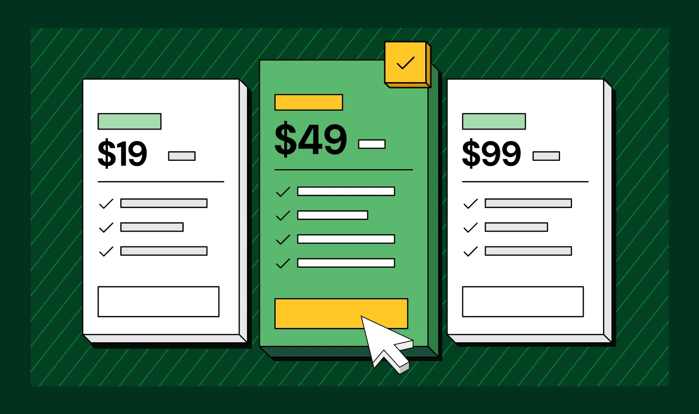

Most B2B teams redesign their pricing page more than once before it converts, and the sticking point is rarely the price itself. It's the layout decisions around it, how many tiers to show, when to put a number in front of a Contact Sales button, and where to place the enterprise plan. Incorrect structural decisions can freeze demo signups at the most critical moment.
Pricing transparency is the single change B2B buyers want most from vendors, the number one ask cited in TrustRadius's 2025 Buyer Research Report. Confusing layouts can lose qualified prospects before your sales rep ever gets a chance to save the deal.
Understanding smart pricing strategy, applying price anchoring, and offering clear choices for custom pricing and enterprise pricing transforms standard layouts into high-performing conversion assets. Study these 10 real pricing page design examples, from Notion's per-seat clarity to PostHog's real-time cost calculator, to discover pricing page design inspiration that drives immediate sign-ups.
TL;DR
- A good SaaS pricing page design turns ambiguity into a decision within seconds, using clear tiers, visible pricing, and proof placed exactly where buyers need it.
- Price anchoring, the decoy effect, and a clearly explained custom pricing tier for enterprise buyers are the psychological levers that shape how a page converts.
- Enterprise and custom pricing need a different disclosure strategy than self-serve tiers, so showing a number isn't always the safer choice.
These 10 real SaaS pricing page design examples, from Typeform and Slack to B2B platforms ThunderClap has redesigned, show what to copy and why each choice works.
Why Does SaaS Pricing Page Design Matter for Conversions?
The pricing page is rarely a page a buyer visits once, out of curiosity, on the way to somewhere else. Gartner research found that 67% of B2B buyers now prefer a purchase process with no sales rep involved. The pricing page now carries more of that selling weight than it used to.
Corporate Visions tracked how far along a buyer's journey typically runs before first vendor contact and found it moved from 69% in 2024 to 61% in 2025. Buyers reach out to sales later every year, which means the pricing page does more of the convincing before a rep joins the conversation.
Conversion data reinforces the point. Recent research from Unbounce's Conversion Benchmark Report puts average SaaS pricing page conversion at 3% to 5% for signups or demo requests, while top performers reach 7% to 10%. A weak pricing page can therefore cost conversions in measurable ways, not just impressions.
Benjamin Richards, Sales Director at Aaron Sansoni Group International, makes a similar point from a sales perspective. In a LinkedIn post, he argues that pricing pages need to sell the value behind the price, answer objections early, and connect pricing to business outcomes.
He also points to his experience with client funnels and pricing tests, arguing that plan names, badges, and layout tweaks cannot compensate for unclear value.
Dhruv Pandey, Senior Product Marketing Manager at ThunderClap, sees the same gap from inside product marketing teams. In a LinkedIn post, he recalls being asked early in his career to justify a website structure without a framework to back his opinions.
He cites the Product Marketing Alliance’s State of Product Marketing report, which found 52% of PMM teams now own their website and other customer-facing assets.
As he puts it, “The role changed, but the playbook didn’t.” For pricing page design, the people responsible often make high-stakes layout calls on instinct.
Your pricing page is high-stakes because buyers use it to assess cost, value, plans, and fit. Strong pricing page design brings those answers together and gives buyers a clear path forward. The next question is what separates pricing pages that convert from those that lose potential customers.
Also read: B2B Website Optimization Strategy: Speed, UX, SEO, and CRO in One Playbook
What Makes a Pricing Page Design Effective?
A pricing page has to do more than display plans and prices. It needs to help buyers understand their options, compare them quickly, and feel confident about choosing one.
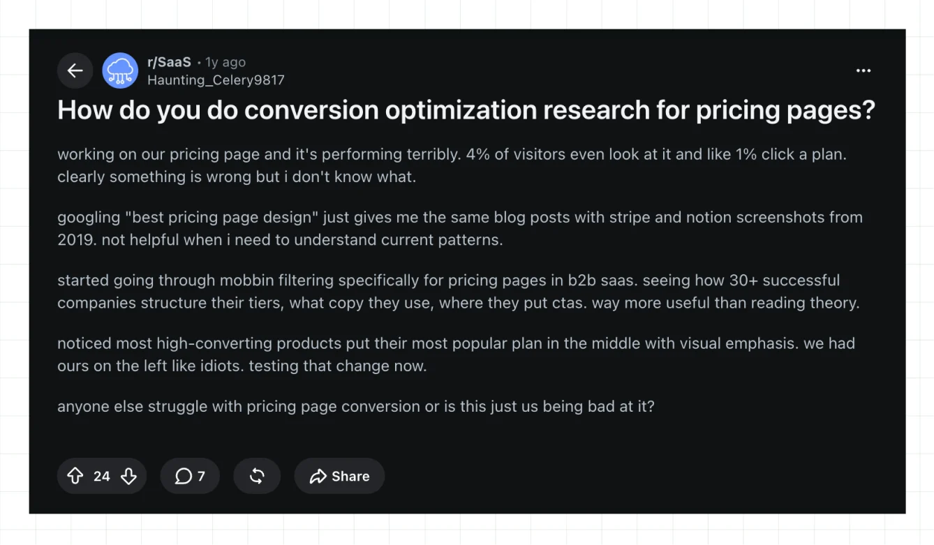
A recent r/SaaS discussion shows how quickly poor pricing-page structure can become a conversion problem. The original poster, Haunting_Celery9817, said only 4% of visitors reached their pricing page and roughly 1% clicked a plan.
After finding generic searches for “best pricing page design” unhelpful, they reviewed more than 30 successful B2B SaaS pricing pages on Mobbin to study how companies structured their tiers, wrote their copy, and positioned CTAs. They noticed that many products gave their most popular plan stronger visual emphasis and were testing that approach on their own page.
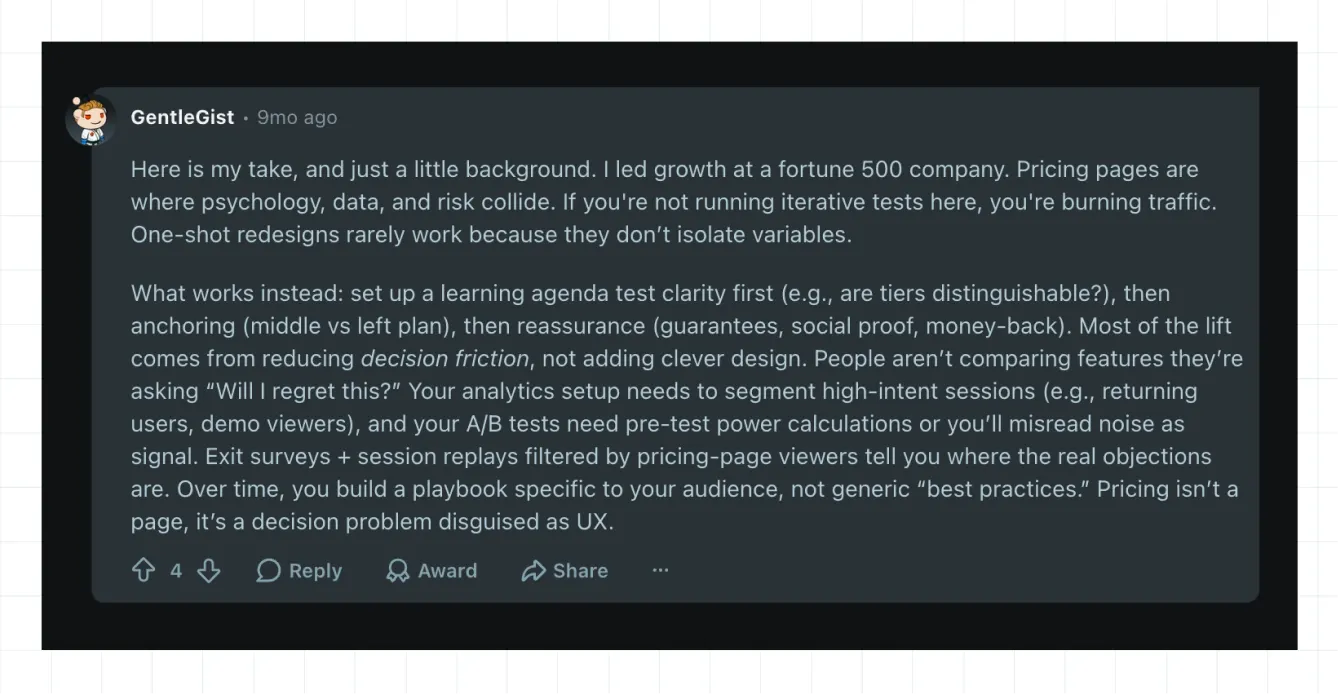
Another commenter, GentleGist, who said they had led growth at a Fortune 500 company, argued that pricing-page optimization should be treated as an ongoing testing process rather than a one-time redesign. They recommended testing tier clarity first, followed by price anchoring and reassurance through elements such as guarantees and social proof. They also suggested segmenting high-intent sessions, using exit surveys and session recordings to uncover objections, and running properly designed A/B tests.
These observations point to four areas that deserve particular attention when building a pricing page:
- Clear tier structure: Three or four tiers reduce decision paralysis. Five or six force a visitor to compare every column, and comparison fatigue kills momentum before a click happens.
- Price anchoring: Robert Cialdini's principles of persuasion explain how people often rely on mental shortcuts when making decisions. In particular, anchoring describes how an initial reference point can influence how people perceive subsequent options. On a pricing page, a higher-priced plan can establish that reference point, making lower-priced plans appear more reasonable by comparison. Show the highest tier first or give it strong visual emphasis, then let visitors compare the remaining plans against that anchor.
- Enterprise and custom pricing disclosure: Showing a number versus routing to Contact Sales is a strategic choice. It is never just a UI default. A number builds trust with self-serve buyers. A gated tier protects margin on deals that need custom scoping.
- Trust signals placed at the decision point: Logos and testimonials sitting only at the bottom of the page do less work than the same proof placed next to the specific tier a buyer is hesitating over.
For a deeper walkthrough of how these principles apply across an entire B2B site, see the ultimate pricing page blueprint for B2B SaaS.
Which Pricing Page Design Examples Can You Replicate for Your Own Site??
These 10 pages each solve a specific conversion problem, so they’re not random gallery entries chosen for looks alone. We selected five widely recognized B2B products and five ThunderClap client sites, and then applied the same scrutiny to every page. We looked at what conversion problem each page addresses, what design mechanism it uses, and how that mechanism moves the buyer forward.
1. Notion
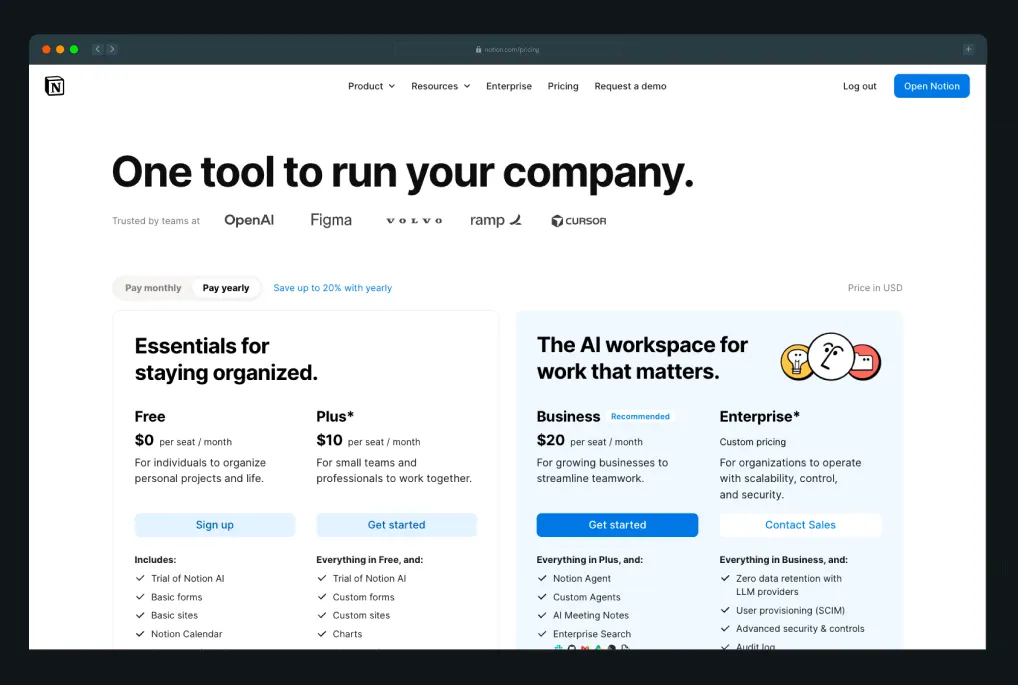
Notion's pricing page pairs feature-based tiering with per-seat pricing to serve two buyer motions on one page: an individual organizing personal notes and a team evaluating a company-wide rollout. Notion groups its four tiers into two visual pairs instead of one flat lineup: “Essentials for staying organized” bundles Free and Plus, and “The AI workspace for work that matters” bundles Business and Enterprise. The pairing does the explaining for you. A visitor instantly knows which card describes their situation before reading a single feature line.
Why it works:
- Free tier lowers the barrier to entry: Visitors can start using the workspace without a card, giving solo users a chance to build a habit before they consider a paid plan.
- Grouped tiers give the pricing page a clearer structure: Notion pairs Free and Plus under Essentials, then Business and Enterprise under the AI workspace, so a visitor self-sorts into the right half of the page before comparing individual cards.
- Customer proof appears beside the pricing table: A real customer quote, giving buyers relevant social proof while they compare plans.
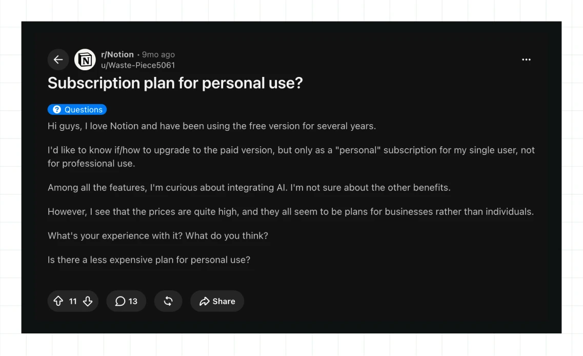
A recent r/Notion thread captures this tension well. Waste-Piece5061, upgrading after years on the free plan, described every paid tier as built for business use over personal use, and asked openly if the AI features were worth the extra cost.
2. Slack
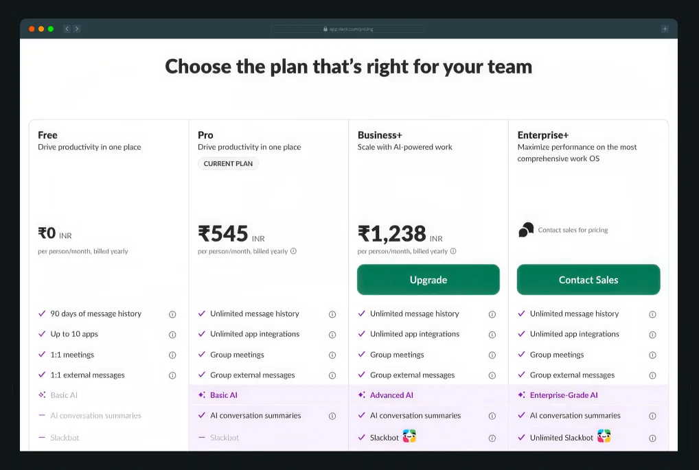
Slack uses four tiers, with three visible prices and one Contact Sales option. Free costs nothing, while Pro and Business+ show per-user pricing with an automatic monthly discount. Enterprise+ directs buyers to Contact Sales as the only tier without a listed price.
Why it works:
- Each tier gives its AI capabilities a distinct name: Pro offers Basic AI, Business+ offers Advanced AI, and Enterprise+ offers Enterprise-grade AI. Clear labels help buyers understand what they gain as they move up the pricing page.
- The Contact Sales option applies to one tier: Three self-serve plans show their prices before buyers reach the Enterprise+ option, keeping the SaaS pricing page design transparent for most visitors, a structure that enterprise web design best practices and examples often recommend for products that serve both self-serve and enterprise buyers on the same page.
- The feature comparison table uses clear categories: Productivity, AI-powered work, Automation, Security, Compliance, and Administration, helping buyers find specific requirements such as SCIM or HIPAA compliance without scanning every row.
3. Cashfree Payments
Payment gateway pricing often buries transaction rates behind a “Contact Sales” wall. Cashfree puts its pricing upfront. Regular merchants currently get a limited-time 0% platform fee, with the standard 1.95% rate shown alongside it. Enterprise customers get a separate path for custom, volume-based pricing.
When ThunderClap revamped their website, we also broke fees down by payment mode. Merchants can click through UPI, cards, netbanking, wallets, and EMI to view the exact fee for each option. We also moved the visual identity toward glassmorphism, gradients, and geometric elements.
Prasad Ramesh, Senior Product Marketing Manager at ThunderClap, names the gap this breakdown closes. In a LinkedIn post ahead of Global Fintech Fest, he wrote, “Most fintech sites are built to look credible. Fewer are built to qualify.” A merchant who checks the exact UPI or card fee knows within seconds if Cashfree fits their volume. The pricing page does that qualifying before a sales call ever happens.
Why it works:
- Clear fee breakdowns: Cashfree separates pricing by payment mode. A merchant can check the cost of UPI, cards, netbanking, wallets, or EMI based on the payment methods they use.
- Transparent promotional pricing: The page pairs the limited-time 0% platform fee with the standard 1.95% rate. Merchants can see the promotional offer and the rate they can expect after it ends.
- Consistent product visuals: ThunderClap carried its custom visual system into the pricing experience. Product-specific visuals help explain what each fee covers and extend the same visual storytelling across the site.
4. Typeform
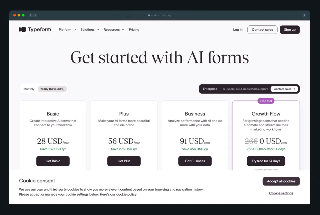
Typeform runs four tiers, Basic, Plus, Business, and Growth Flow, each scaled by response volume and feature depth rather than seat count, so the price buyers see tracks the thing that actually drives their cost: how many people respond. Enterprise sits apart as a comparison strip below the main cards, with callouts for AI-powered request handling and enterprise-grade security that justify the Contact Sales step before a buyer even reaches it.
Typeform also offers Contacts & Automations as a separate add-on, priced at $25/month for 2,400 contacts and $ 75/month for 12,000.
Why it works:
- Response volume anchors the pricing strategy: Buyers can connect cost to usage, giving Typeform a clearer pricing model than a flat per-seat structure.
- The Enterprise comparison strip gives buyers useful context before the sales conversation: Expert setup, AI-handled request routing, and security explain the value of enterprise pricing before a buyer reaches the Contact Sales button.
- The separate Contacts & Automations add-on keeps the core tiers focused: Buyers who need CRM-style automation can pay for the additional capability without adding it to every core plan.
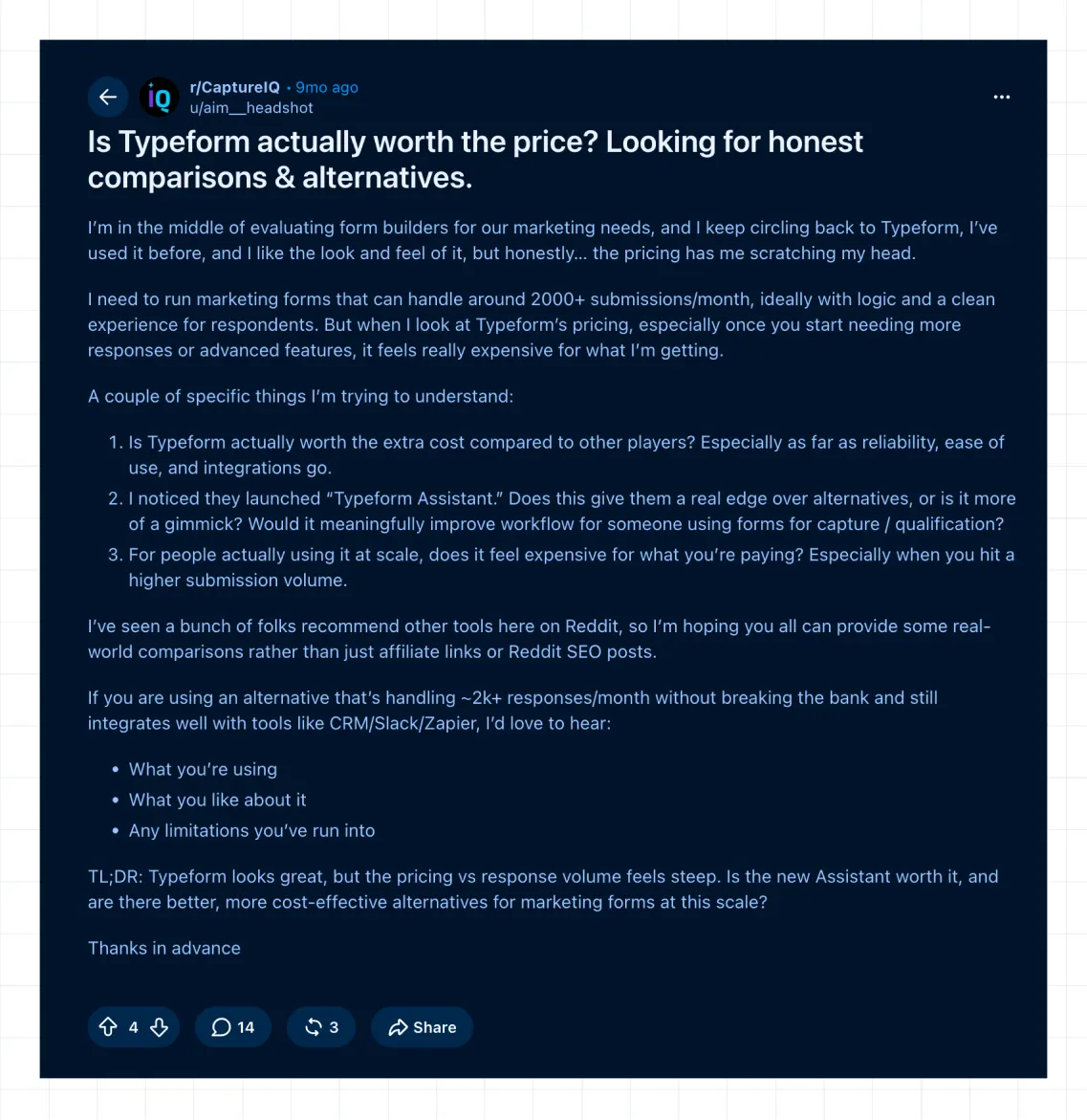
A recent r/CaptureIQ thread raised concerns about Typeform’s cost once submission volume passes 2,000 per month, with one longtime user saying pricing “really starts to hurt” at that point.
5. ClearlyRated
ThunderClap designed and built ClearlyRated's current website. When Stephen Banbury joined as VP of Marketing, he planned to scale ClearlyRated's growth channels, but the site, rebuilt just three months earlier, still wasn't ready.
For the pricing page, ClearlyRated now has three tiers, Establish, Expand, and Transform, with every plan custom-based. The page shows no visible price, yet it provides a detailed comparison across Administration, Net Promoter Score, Analysis & Insights, Online Directory, and Third-Party Validation. A separate Add-Ons section covers capabilities such as AI Insights and premium support.
Why it works:
- The comparison table gives buyers substance when the page withholds pricing: Buyers can evaluate differences across tiers, users, program audiences, and integrations before contacting sales.
- Industry-specific messaging gives each audience a relevant path through the site: Staffing firms and accounting firms encounter language built around their own needs, giving the SaaS pricing page design more context.
- Clear section headers make a long comparison easier to navigate: Administration, NPS, Analysis & Insights, Online Directory, and Third-Party Validation help buyers find specific capabilities without scanning every row.
6. Zamp
When ThunderClap rebuilt Zamp’s brand, the goal was simplifying a complex product without burying buyers in technical detail. That same principle carried straight into the pricing page: sales tax is complicated enough on its own, and the page was never going to make understanding the cost another hurdle on top of it.
The pricing page picks up the brand’s value proposition word for word "Sales tax is complex. Paying for it shouldn't be." It largely delivers on that promise, pairing straightforward messaging with a simple pricing structure.
Three tiers appear side by side: Free, U.S., and U.S. + Canada. The Free plan offers a self-serve path, while the two paid tiers direct buyers to Contact Sales.
Why it works:
- The Free tier offers useful functionality from the start: Buyers get a nexus assessment, liability review, and expert consultation before entering a sales conversation.
- The comparison table uses eight clear categories: Assess and Diagnose, Tax Calculation, Nexus and Registrations, Filing and Remittance, Audit and Risk, Reporting, Integrations, and Support, helping buyers find specific capabilities quickly.
- A CFO testimonial appears above the closing CTA: Matthew Rehurek of The Budgeting Company says Zamp's pricing model helped him budget sales tax across his portfolio with zero surprises. The specific customer perspective gives the final decision more context.
Zamp's clear CTA structure also reflects the broader website work ThunderClap completed. The earlier site had a fragmented visual identity, which the internal team described as a Frankenstein mix of styles. Following CTA best practices, ThunderClap rebuilt the logic around one dominant action per tier, giving the pricing page design a clear connection to the wider conversion journey.
7. PostHog
Most usage-based pricing pages ask you to trust the number. PostHog would rather let you build it yourself, and it has a sense of humor about the whole thing while it's at it. The headline says “97% of companies use PostHog for free,” and the page backs it up with generous monthly allowances across every product, including 1M events, 5K session replays, and 1M feature flag requests.
The allowances reset automatically, and PostHog asks for a card only when you actually need more.
Why it works:
- A real pricing calculator helps buyers estimate costs: Visitors can adjust sliders for identified and anonymous events across Analytics, Session Replay, and AI Observability, then see an estimated total before contacting sales. For usage-based products, the calculator adds useful clarity to the pricing page UI design.
- A founder note gives the pricing strategy a human voice: James Hawkins explains how PostHog prices against competitors, avoids loss-leader tactics, and operates without VC pressure. The explanation gives buyers more context than another block of polished marketing copy.
- The “Then why would I pay?” section addresses a natural objection: PostHog places free-tier limits beside paid-tier billing controls, giving buyers a clear view of what changes as usage grows.
- The “Shameless CTA” section adds humor to the pricing page design: Fake urgency banners and a fake “endorsed by Kim K” badge poke fun at familiar marketing tactics while the page still makes a clear case for PostHog.
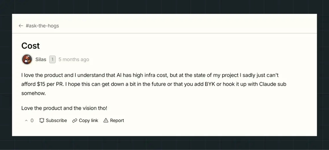
Here's where it gets more interesting, though. PostHog takes its pricing strategy into public conversations with customers. A user named Silas posted on PostHog's own community forum saying he loved the product but genuinely couldn't afford the $15-per-PR cost of its AI code review tool at his project's current stage, and asked whether a bring-your-own-key option might help.
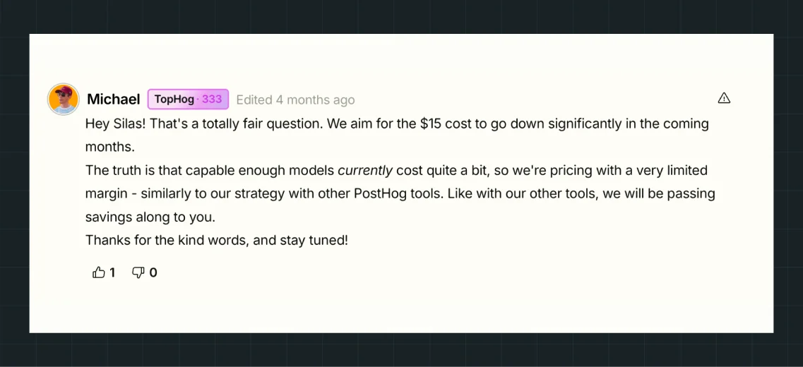
PostHog team member Michael replied directly, saying the $15 cost should fall significantly in the coming months and explaining how the company is pricing the feature at a thin margin right now because the underlying AI model costs are still high, the same approach it takes across its other tools.
That’s a level of pricing transparency most SaaS companies would never let a customer see, let alone respond to on the record.
That's a level of pricing transparency most SaaS companies would never let a customer see, let alone respond to on the record.
8. nativeMsg
RCS enables rich, app-like messaging, but its underlying technology can be difficult for buyers to understand. That creates a challenge for any pricing page: how do you make complex pricing models easy to understand and compare?
At ThunderClap, we redesigned nativeMsg’s pricing page to address this challenge. Rather than overwhelming buyers with technical details, we structured the page around subscriber count as the core pricing metric, making it easier to understand what each plan offers and where it fits.
The page offers four tiers: Starter at $199, Growth at $799 (labelled Most Popular), Pro at $2,999, and Enterprise with custom pricing. Each card brings subscriber, message, conversation, and seat limits together, allowing buyers to compare plans without hunting for key information.
A dedicated “Two things count: messages and conversations” section explains exactly what triggers a charge, giving buyers the context they need before comparing plans.
Why it works:
- The pricing model defines usage clearly: A dedicated “what counts against your plan” section explains messages and conversations in plain language. A worked example for non-RCS-capable numbers gives buyers a concrete reference before they contact support.
- The page publishes overage rates: A specific table lists rates for test messages, media messages, and per-minute conversations. Buyers can see the exact costs associated with usage beyond their plan limits.
- The page separates one-time costs: A dedicated setup section covers carrier approval, brand verification, and phone number registration. Buyers can distinguish these one-time charges from the recurring subscription tiers.
nativeMsg earlier site left prospects confused about what RCS actually does, and its pricing page inherited that confusion since buyers couldn’t tell what they were paying for. ThunderClap rebuilt the pricing page around the same clarity-first approach used across the rest of the site, defining messages and conversations in plain language instead of assuming buyers already knew the terms.
9. Zapier
Zapier used to sell automation. Now it sells "AI orchestration," and the pricing page rebuilt itself to match. A single usage slider up top lets you drag to your expected task volume and watch the page react, while a tab switches between the core Platform and two separate add-ons, Agents and Chatbots, keeping the products easy to compare.
Four tiers follow, including Free at $0, Professional starting at $19.99, Team at $69, and Enterprise on a custom quote. Every single task, whether it's a Zap step, an AI call, code, or SDK, now draws from the same shared pool instead of separate budgets per product.
Why it works:
- One shared task pool gives buyers one number to track: Zaps, AI steps, code runtime, and SDK calls all draw from the same allocation, giving the pricing strategy a simpler structure across the platform.
- “About task usage rates” explains how task consumption works: The section shows why one action can consume multiple tasks, with AI model calls and connector types affecting usage differently. Buyers get the context before they need to contact support.
- “Our commitment to flexible, risk-free pricing” explains the value behind each tier: Higher tiers reduce cost per task, and buyers can downgrade or upgrade. Clear downgrade terms can ease concerns around committing to a plan.
Here's the thing about pooling everything into one task number, though, it can bite you the moment AI enters the mix. A Reddit thread in r/zapier tells that story exactly.
A Redditor named Brief-Country9608 had been on the Professional plan for over a year with no issues, then added OpenAI nodes to three workflows, and the bill jumped from $30 to $160 in a single month. In fact, one workflow consumed 400 tasks in a week.
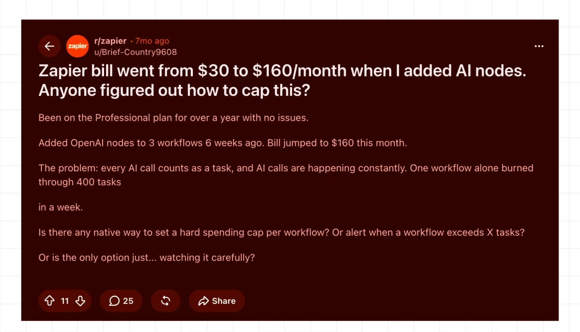
A detailed reply from No_Sir701 confirmed that Zapier lacks a native spending cap for individual workflows and offers account-wide alerts at 80% and 100% usage. They recommended treating AI steps as a separate cost risk, adding pre-checks before expensive calls, and tracking task volume by workflow.
The discussion highlights a practical consideration for any SaaS pricing page design built around pooled usage.
10. Paytient
Healthcare affordability is a complex product to price, and most companies either hide the number entirely or bury it in financial jargon. When we worked on Paytient’s website at ThunderClap, the focus was on making that complexity easier to navigate without losing the information buyers need to make a decision.
Paytient takes a transparent approach. Its two self-serve tiers, Essential and Plus, show real numbers upfront, including healthcare purchasing power, cost per employee, and a flat monthly platform fee, all presented in a single view. Enterprise and Custom plans cater to larger or more complex setups, directing buyers to sales while still displaying a starting monthly cost.
Why it works:
- Three numbers give buyers enough detail to calculate costs: The $2,000 purchasing power, $10 per employee per month, and $100 monthly platform fee let buyers estimate spend based on their headcount.
- A dedicated “What happens next?” section explains the onboarding journey: Sign up, Launch, and Optimize each include product screenshots, giving buyers a clear view of the experience after signup.
- Social proof appears throughout the page: A named executive testimonial, client logos, and a statistic about members accessing care they might otherwise have delayed give buyers evidence before they reach the FAQ section.
The FAQ placement also reflects a key change from Paytient's earlier site. The original site buried important product information inside long FAQ accordions at the bottom of the page. Visitors had to search for basic answers during the conversion journey. ThunderClap reworked the page around structured, in-flow messaging and explained each step before visitors needed to ask. The new structure addressed the drop-off point the old page created.
What Pricing Page Best Practices Go Beyond These Examples?
A few tactical details can improve conversions yet rarely get much attention in pricing page design teardowns.
- CTA copy deserves attention at the word level: “Start Free Trial” and “Get Started” can perform differently across buyer intent. A sticky CTA also keeps the next step visible as buyers scroll, removing the need to return to the top of the page.
- Give monthly and annual toggles a clear position near the pricing table: Show the savings as a specific number, such as “Save 20%,” and make the difference easy to understand at a glance. A vague “billed annually” label gives buyers less useful information.
- Comparison table tooltips can clarify unfamiliar features: Feature names alone may leave buyers unsure about what a capability actually does. A short hover explanation can answer the question at the comparison point and keep buyers within the pricing page UI.
- Build mobile pricing layouts for vertical browsing: Stack tier cards vertically and use expandable sections for longer feature lists. Buyers can see the tier name and price first, then open the details they need. Shrinking a wide comparison table to phone width rarely produces a readable experience.
- Give the FAQ section on your pricing page its own role: Keep five to seven questions after the tier comparison and use the section to address common objections. Place decision-critical information higher on the page, where buyers can access it without opening an accordion.
What Metrics Should You Track on a Pricing Page?
A well-designed pricing page can look polished and still underperform. Visitor behavior data show where buyers engage, where they leave, and which parts of the page support the conversion journey. Tracking these metrics also gives you an in-depth look at how your pricing page supports broader SaaS CRO best practices for conversions across your website.
- Conversion rate: The average pricing page converts at 3.8%, according to HockeyStack’s analysis of pricing and demo pages. Pages that gate pricing behind a form convert at 4.6%, against 2.8% for transparent pages. Transparent pages still send 1.7x more of their leads into the pipeline. If you sit below 3.8%, test tier clarity and CTA copy first. If you gate pricing, track submit-to-pipeline as well, because a high form-fill rate can hide weak leads.
- Bounce rate: Pricing pages average a 39% bounce rate in the same report, with 42% on transparent pages and 35% on gated ones. A rate well above 40% suggests visitors can’t match a tier to their needs quickly. Tighten your headline and tier labels before you touch the price.
- Time on page: HockeyStack found pricing page visitors stay about 1.8x longer than demo page visitors. Visitors on transparent pricing pages also view 4.26 pages per session, against 2.57 on gated pages. Long time on page with few CTA clicks signals comparison friction. Add tooltips or a “Best for” line to each tier.
- CTA click-through rate: Published benchmarks for pricing page CTA clicks are thin, so measure yours against your own conversion rate. Your click-through rate should sit well above it. A wide gap points to friction after the click, such as a long form or an extra checkout step.
- Scroll depth: Contentsquare’s Digital Experience Benchmarks put the average scroll rate at 50.5% of the page on desktop and 45.2% on mobile. The average visitor stops around the middle of your pricing page. Keep the enterprise tier, the main CTA, and your top objection-handling FAQ above that point.
{{specficBlog}}
What Are the Most Common Pricing Page Design Mistakes?
Even strong pricing page design can lose buyers when a few small choices make the page harder to understand or compare.
Growth Consultant Justin Hammond made a similar point on LinkedIn, arguing that "most pricing pages don't have a pricing problem, they have a clarity problem”.
A few of his recommendations directly echo the patterns below, including keeping plans to around three and labeling a tier “Most Popular” only when real data supports the claim.
- Too many tiers: Five or six plans can create analysis paralysis. Three or four plans give buyers a clearer path to a decision.
- Hidden pricing with no stated reason: Hiding prices can erode trust quickly, especially when buyers encounter a form with no explanation. If you use custom pricing, explain why the sales conversation helps buyers get the right plan.
- Feature overload without benefit framing: A long feature list forces buyers to translate product capabilities into business value themselves. Group related features and connect key capabilities with the outcomes buyers care about.
- Static pricing with no testing: A pricing page can drift away from buyer behavior when teams launch it once and never revisit it. Test tier structure, CTA copy, price anchoring, and other elements of your pricing strategy as you gather real conversion data.
Also read: B2B Website Optimization Strategy: Speed, UX, SEO, and CRO in One Playbook
Which Pricing Page Approach Is Right for You?
The right pricing page UI design approach depends more on your business stage than your category.
- A startup can keep its pricing page design simple with three self-serve tiers, a generous free plan, and one clear default choice.
- A growth-stage company can add a usage calculator alongside its tiers, giving technical and price-sensitive buyers a way to estimate costs without a sales call.
- An enterprise-focused product can use custom pricing with sales-assisted disclosure, while plain-language context helps buyers understand what the sales conversation covers.
These choices also support SaaS landing page design that converts by giving buyers a clear path from pricing to action. A blank price box offers little on its own.
Five of the best pricing page design examples above come from ThunderClap’s own work, and they show how pricing page design can support the wider conversion journey.
If your pricing page still leaves you unsure about these decisions, book a pricing page audit with ThunderClap for specific recommendations based on your page.
Frequently Asked Questions
1. What makes a pricing page effective?
An effective pricing page pairs a clear tier structure with price anchoring, an honest enterprise pricing disclosure strategy, and trust signals placed exactly where you decide.
2. What is the best pricing page layout?
There's no single best pricing page layout, the right one depends on business stage. A startup usually needs three simple self-serve tiers. A growth-stage company benefits from a usage calculator alongside its tiers. An enterprise-focused product needs a sales-assisted custom tier with real context, well beyond a generic three-column table copied from a template. It's the same business-stage logic ThunderClap applies when redesigning a client's pricing page, rather than defaulting to one template for every account.
3. How do I design a high-converting pricing page?
You can design a high-converting pricing page by starting with three or four tiers, anchoring with your highest tier shown first or made visually dominant, placing proof next to the tier a buyer hesitates over, and giving your enterprise tier a plain-language description of who it serves. A blank Contact Us box earns nothing on its own.
4. What metrics should I track on a pricing page?
The key metrics to track on a pricing page include conversion rate, bounce rate, time on page, CTA click-through rate, and scroll depth. Together, these metrics show how visitors interact with your pricing page, where they lose interest, and how effectively the page moves them toward the next step.
5. What is price anchoring and how does it apply to pricing page design?
Price anchoring places a higher-priced option prominently on the page, shaping how visitors perceive the cost of other plans. A higher anchor can make a middle or lower tier feel more accessible by comparison. In pricing page design, you can use price anchoring through tier order, visual emphasis, or a clearly positioned premium plan. It remains an underused psychological lever across many B2B pricing pages.
6. How many pricing tiers should a pricing page have?
A pricing page should have three to four tiers for most self-serve products, but the right number depends more on business stage than on a fixed rule. A true startup can often convert well with two, a simple free tier and one paid plan, while a product serving multiple buyer sizes may need a fourth tier specifically to isolate enterprise complexity from the rest.
7. Should enterprise or custom pricing be shown publicly or hidden behind a “Contact Sales” button?
Hide the number only when the deal genuinely requires custom scoping, and even then, never hide the context. A one-sentence description of who the tier serves and why it's priced differently builds more trust than a number, while a blank Contact Us box with nothing else reads as evasive. It rarely reads as premium.




Browse Similar Articles







Leading 5 SaaS Branding Agencies in Florida (That Actually Understand SaaS Growth)



How to Turn Your B2B Website into a Self-Serve Growth Engine? (PLG Ready in 2026)

9-Step Website Copy Audit Checklist to Improve Conversions (Examples from Top B2B Brands)



How to Choose the Right Fintech Web Development Company for Your Business
Top B2B Website Design Principles That Turn Visitors into Qualified Leads

How to Do a Conversion Rate Optimization (CRO) Audit That Actually Improves Revenue
Web Design Agency vs. Freelancer vs. In-House: What Actually Works in 2026
5 CRO Agencies in London and How to Choose the Best CRO Agency for Your Business
The Ultimate Fintech B2B Positioning Guide for 2026 (That Actually Drives Conversions)
Mapping the B2B Buyer Journey to Improve Conversions Across Every Touchpoint

7 Best Website Maintenance Companies in India for Growth-Led B2B Teams (2026)



8 Best Healthcare Website Design Agencies for HIPAA-Compliant Sites in 2026

How to Find the Best Web Design Company in Houston, Texas for B2B Brands (6 Best Picks)
Positioning That Wins: How to Make Complex B2B Products Clear and Compelling
The Step-by-Step Website Redesign Process B2B Teams Use to Increase Conversions (Without Killing SEO and Pipeline)

7 Best Video Production Agencies for SaaS Product Walkthroughs and Feature Videos

How to Choose the Best B2B Website Maintenance Company: 9 Questions to Ask Before You Hire One

How to Choose a Web Design Company in San Francisco in 2026 (with Examples)

10 Best Web Design Companies in Florida in 2026 and How to Choose the Right One
How to Use Brand Storytelling on Your Website to Close More B2B Deals and Build Buyer Trust
SaaS CRO Best Practices: What High-Growth Brands Do Differently to Win Conversions

How a Rebranding Agency Can Redefine Your B2B SaaS Identity and Boost Pipeline
B2B Marketing Trends in 2026 That Directly Influence Pipeline and Revenue

Top 7 Video Marketing Agencies Driving B2B SaaS Brand Awareness in 2026
Why Partnering with a B2B Brand Positioning Agency Accelerates Market Differentiation

The Complete Website Redesign Checklist for B2B SaaS Teams Ready to Scale

10 Best Webflow Development Agencies in India for 2026 (In-Depth Review)

10 Product Marketing Companies Powering the Fastest-Growing SaaS Brands in 2026
Website Copywriting Services vs In-House: What's Right for Your Business?

How to Choose a Marketing Agency That Understands B2B SaaS Growth Metrics


How to Choose a Video Marketing Agency That Understands B2B Storytelling

Outsourcing Web Design: Cost-Benefit Analysis for Mid-Market & Enterprise Brands
From Leads to Lifetime Value: How Growth Marketing Agencies Scale SaaS Revenue
Build a B2B Website Strategy That Aligns with Sales and Marketing Goals

Webflow vs WordPress: Which Platform Is Better for Your Business Website in 2026?
Fintech Web Design That Builds Trust: 8 UX Principles Every Fintech Site Needs

Optimizing for Intent: How B2B Website Messaging and UX Changes Help Capture Top-Funnel Buyers


12 Best B2B Web Development Agencies in the US to Build Scalable Websites

From Audit to Action: 8-Step Process to Optimize Your B2B Website Strategy for 2026 Buyers


Interested in seeing what we can do for your website?