













10 Best Venture Capital Websites in 2026 for Design Inspiration (Detailed Breakdowns + Templates)



The best venture capital websites help founders decide, in seconds, whether to reach out. It's often a founder's first stop to vet a firm: what they invest in, who they back, what they offer beyond capital. So a confusing or all-style-no-substance website costs you real deal flow.
The stakes are only rising: global VC investment hit $227.4 billion in Q2 2026 alone, but deal volume actually dropped from the previous quarter, meaning capital (and founder attention) is concentrating into fewer, more competitive bets.
Yet most VC websites still tip too far one way: all flash or all information, with neither built to move a founder to act. In this guide, we analyze 10 of the best venture capital websites in 2026 using The Fund 5, ThunderClap’s framework for evaluating VC websites. We also share 5 ready-to-use page templates and the most common UX mistakes to avoid.
TL;DR
- A great VC website covers six things: your investment philosophy, team, portfolio, sectors, insights, and a clear way to pitch you.
- ThunderClap’s Fund 5 framework checks how well a VC website works across messaging clarity, visual hierarchy, information architecture, user experience, and the conversion funnel.
- Common UX mistakes on VC websites include vague investment criteria, hard-to-find partners, and unclear next steps for founders.
What Is a Venture Capital Website?
A venture capital website is a marketing asset that helps VC firms attract promising founders, build credibility with potential investors, and strengthen partner relationships. It’s like a digital pitch that explains their investment philosophy, the companies they invest in, and why founders should work with them.
What should a great venture capital website include?
We’ve built websites for VC firms like Z47 and Elevation Capital and audited over 25 more VC websites. The ones that work all get six things right.
1. Your investment philosophy
Why should a founder pick you over the next fund? Say it upfront, in your website copy, ideally in the hero. Z47 backs founders over market trends. Y Combinator believes investors should advise, not act like bosses. Either way, a founder knows within seconds what kind of partner they’re getting.
2. Your team
Founders don’t pitch a fund. They pitch a person. So tell them who’s behind it: what each partner has built, what they care about, and which stages they invest in. A fintech founder at Seed shouldn’t have to read 20 bios to find the one partner who’s backed three companies like theirs.
3. Your portfolio
Who have you backed, and what did the journey look like? A wall of logos doesn’t say much. One line about where a company started, like how small the team was when you first met or what the product looked like then, helps a founder picture themselves in that story.
4. Your sectors
Spell out exactly where you invest, like fintech at Seed or climate at Series B. A founder should be able to tell in one glance whether they fit your thesis, instead of guessing and sending a pitch you’ll never read.
5. Your news and insights
What are you thinking about right now? Share your views, founder advice, and portfolio news, such as funding rounds, launches, and acquisitions. It shows founders you’re still involved after the investment is made, not just at the term sheet.
6. A clear way to pitch you
So a founder likes what they see. Now what? Give them one obvious next step, like a “Pitch us” button or a direct line to the right partner, and repeat it where it makes sense across the website. Saying “reach out” without saying how is the fastest way to lose them.
These six elements are the foundation. The harder part is presenting them clearly, memorably, and in a way that gets founders to act. That’s what the framework below helps you check.
How to Evaluate Your Venture Capital Website’s Effectiveness
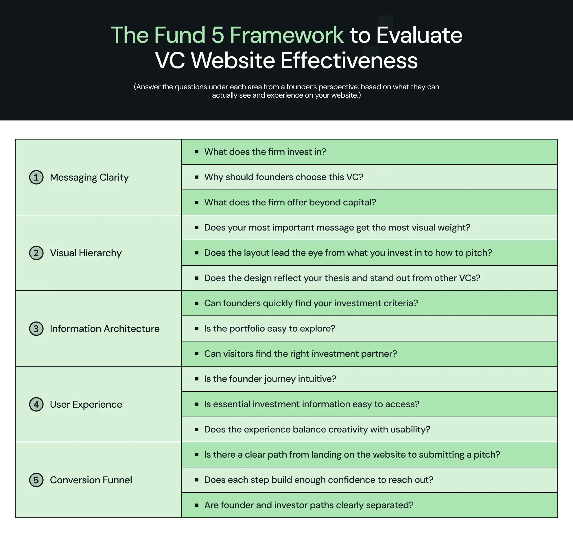
The best venture capital websites say what they stand for clearly, guide the eye to what matters most, make information easy to find, and lead founders straight to a pitch. We grouped these patterns into The Fund 5, a framework that checks a VC website across messaging clarity, visual hierarchy, information architecture, user experience, and the conversion funnel.
Which Are the Best Venture Capital Websites in 2026? (10 Examples With Detailed Breakdowns)
Here are the top 10 venture capital websites from across the globe ranked based on our Fund 5 framework. Every website on our list was tested for messaging clarity, visual hierarchy, information architecture, user experience, and conversion funnel.
1. Y Combinator
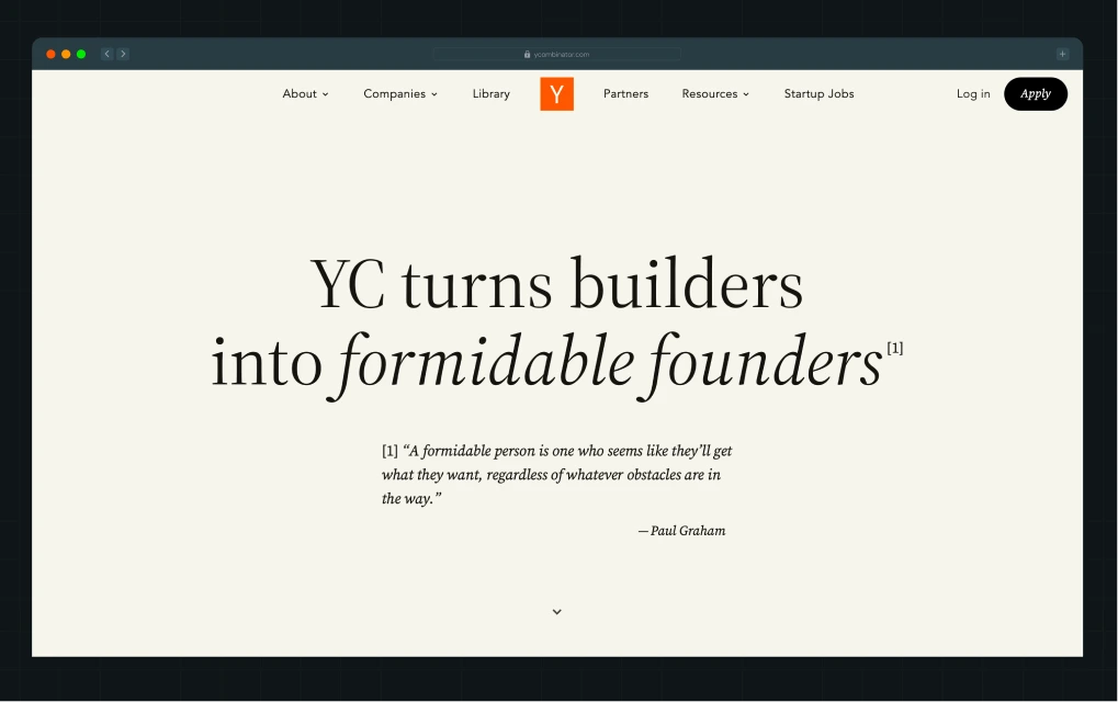
Y Combinator is one of the world’s best-known startup accelerators and venture capital firms. It has backed companies such as Airbnb, Stripe, and OpenAI, and supports ambitious startups across industries, from AI and software to fintech, healthcare, and biotech.
Why we like this design
1. Positioning that focuses on founder transformation
YC’s headline, “YC turns builders into formidable founders,” talks about what founders can become, not just what the firm does.
2. Before-and-after photos as social proof
Side-by-side photos show founders from Airbnb, Stripe, and OpenAI in their early days and today. Seeing how far they’ve come makes the journey feel possible for founders just starting out.
3. Visual hierarchy that moves from promise to proof
The headline and founder photos get the most space, while company logos and valuation figures come further down. Visitors see the promise first, then the proof.
4. Directories that make a large network easy to browse
The startup and founder directories let visitors filter by batch, location, industry, and company size, so they can quickly find companies and people relevant to them.
5. A conversion funnel that eases founder doubts
Founder stories and partner profiles build trust before the Apply button. Reassurance copy, “We fund companies with no revenue, product, or fully baked idea,” then nudges founders still on the fence.
2. Greylock
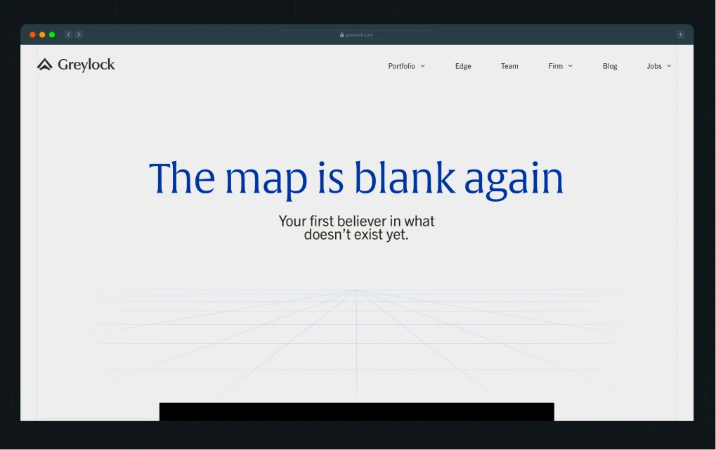
Greylock is a global venture capital firm that supports ambitious technology founders from the earliest stages. Its portfolio covers enterprise and consumer technology, including AI, cybersecurity, infrastructure, SaaS, fintech, marketplaces, and healthcare.
Why we like this design
1. Imagery that carries the brand idea
“The map is blank again” sits on a textured map background, and the same texture returns in later sections. The visual metaphor of uncharted territory runs through the page, making the brand idea feel consistent.
2. A hero video that adds emotion
Founders talk about starting small, failing, and pushing through. Motion makes the first impression more human and gives founders a glimpse of the journey behind building a company.
3. Candid founder stories backed by portfolio proof
Large, unstaged founder photos and one-line origin stories show companies before they became household names. A compact logo grid follows, connecting these stories to Greylock’s wider track record.
4. Images that lead, text that supports
Full-width photos take the most space, with short captions beneath them, so visitors take in each story at a glance before reading a word.
5. Dedicated pages that explain support beyond capital
The Firm, Specialists, and Team pages show the people and expertise available to founders, across talent, marketing, and leadership.
3. Elevation Capital
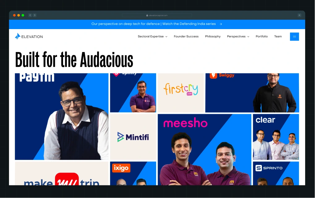
Elevation Capital is an India-focused venture capital firm backing startups from seed to growth. It invests across sectors, including consumer, fintech, healthcare, SaaS, and consumer internet, with companies such as Paytm, Swiggy, and Unacademy in its portfolio.
Why we like this design
1. A hero and portfolio grid with real energy
The rotating headline previews each section below, so founders grasp the positioning in seconds. Founder photos beside varied logo tiles make the track record feel personal.
2. A bold, consistent visual system
A tall, condensed typeface and a blue, black, and white palette carry across the website, making Elevation instantly recognizable wherever founders see it.
3. Founder stories that prove early belief
Company stories, from Urban Company to Meesho, show how Elevation backed these businesses early. Founders see its investment conviction through real examples, not just claims.
4. Numbers that answer a founder’s real question
Elevation shows its founders are four times more likely to raise their next round, speaking to what founders worry about beyond the first cheque.
5. Directories that are easy to search
Founders can filter the portfolio by sector and stage, and the team by expertise and stage, so the right partner is a few clicks away.
4. Accel
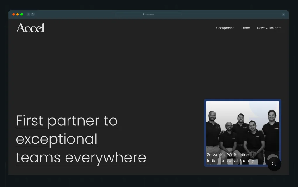
Accel is a global venture capital firm behind companies such as Facebook, Anthropic, and Webflow. It backs businesses across enterprise software, SaaS, AI, cybersecurity, fintech, and consumer technology, with teams across the US, Europe, and India.
Why we like this design
1. A one-line hero with nothing competing for attention
A monochrome palette and a single headline, “First partner to exceptional teams everywhere,” let the message land instantly, signaling a firm confident enough to skip the hard sell.
2. Minimal design that keeps the focus on content
Generous whitespace and very few decorative elements keep every page uncluttered, giving portfolio stories, team profiles, and insights room to stand out.
3. Navigation built around what founders check first
The menu sticks to Companies, Team, and News & Insights, so founders reach track record, people, and thinking in one click.
4. Team cards made for quick scanning
Portrait photos, location tabs, and tags for each partner’s base, specialty, and focus let founders shortlist the right person without opening a single profile.
5. Portfolio stories that do the selling
Articles like the one on Linear cover growth, profitability, and new funding, showing how Accel backs companies through results, not claims.
5. Antler
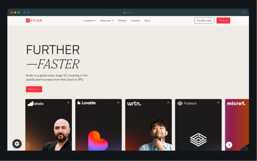
Antler is a global early-stage venture capital firm that backs founders across markets, including India, Australia, Singapore, Japan, the UK, the US, Canada, and Brazil. It invests across industries, including technology, fintech, healthcare, consumer, climate, and deep tech.
Why we like this design
1. Visual hierarchy that guides attention
The red, white, black, and muted palette gives the website a confident identity, while red draws attention to key actions like the “Pitch Us” CTA.
2. Information architecture built around two audiences
The website gives founders and investors separate journeys, with relevant information and clear next steps for each.
3. An interactive animated globe that highlights global presence
The globe marks Antler’s locations, with links to regional websites. Founders can quickly check whether Antler operates in their country.
4. A searchable portfolio that builds social proof
Visitors can browse and filter backed companies by sector, year, and location, making Antler’s investment track record easier to explore.
5. Regional pages that answer local questions
Each regional page covers local programs, residency options, teams, founder stories, statistics, and FAQs, helping founders understand what Antler offers in their market before reaching out.
6. Z47
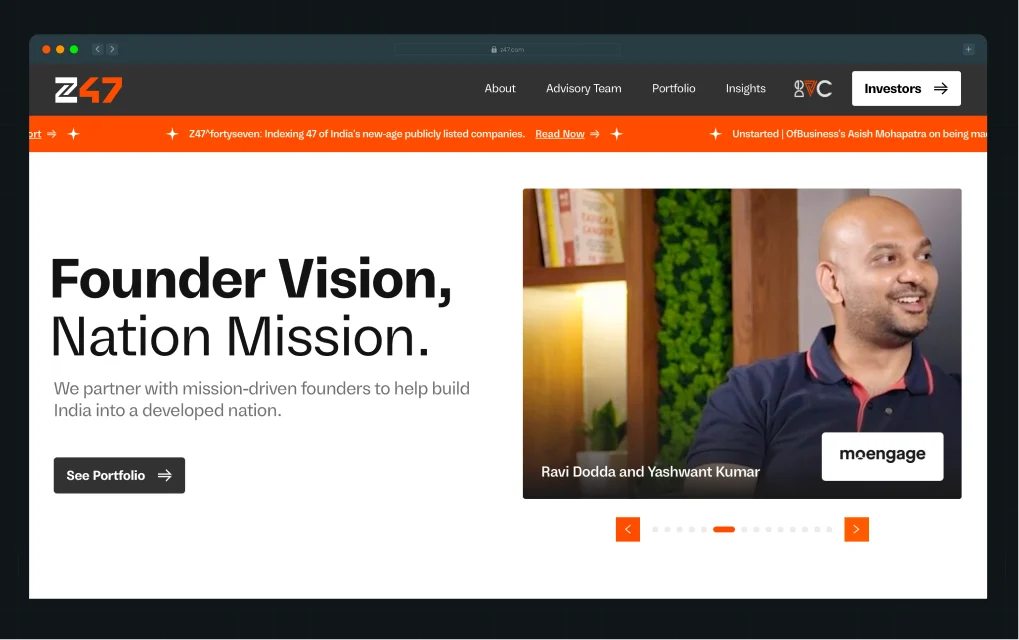
Z47 is an India-focused VC firm backing technology startups serving Indian consumers and global markets. Its mission is to help India become a developed nation by 2047. It invests from Seed to Series B across fintech, consumer tech, SaaS, AI, frontier tech, and B2B businesses.
Why we like this design
1. A visual identity that reinforces the mission
The “Founder Vision. Nation Mission.” headline introduces Z47’s ambition to help build a developed India by 2047. The bold orange, black, and white palette carries that ambition into the visual design, giving the brand an energetic, distinctive look.
2. Portfolio cards that tell a bigger story
Rather than simply displaying company logos, the cards explain the larger idea or problem behind each business. Founder portraits and editorial-style collages make the stories more personal.
3. Sector pages that connect investments to the mission
Each page links an investment area to Z47’s wider vision, helping visitors understand how its portfolio fits into the bigger picture.
4. Partner profiles that go beyond introductions
Each profile works like a mini website, with background, philosophy, and public appearances that help founders find the right partner and shape a pitch.
5. An FAQ that sets expectations around outreach
The FAQ explains how founders can reach out and signals that referrals are the quickest route in.
Behind the Brand: Z47
Z47 approached ThunderClap during a major identity shift, moving away from Matrix Partners while its US and Chinese counterparts retained the name. It wanted an identity that felt distinctly Indian and spoke directly to Indian founders.
Vineet Kanabar, VP of Marketing at Z47, asked us to bring this positioning to life through the website. After the website revamp, the website saw a 60% increase in website traffic.
Here’s a video from Ayush Barnwal, co-founder at ThunderClap, where he walks you through the new website and the thinking behind it.
7. Sequoia
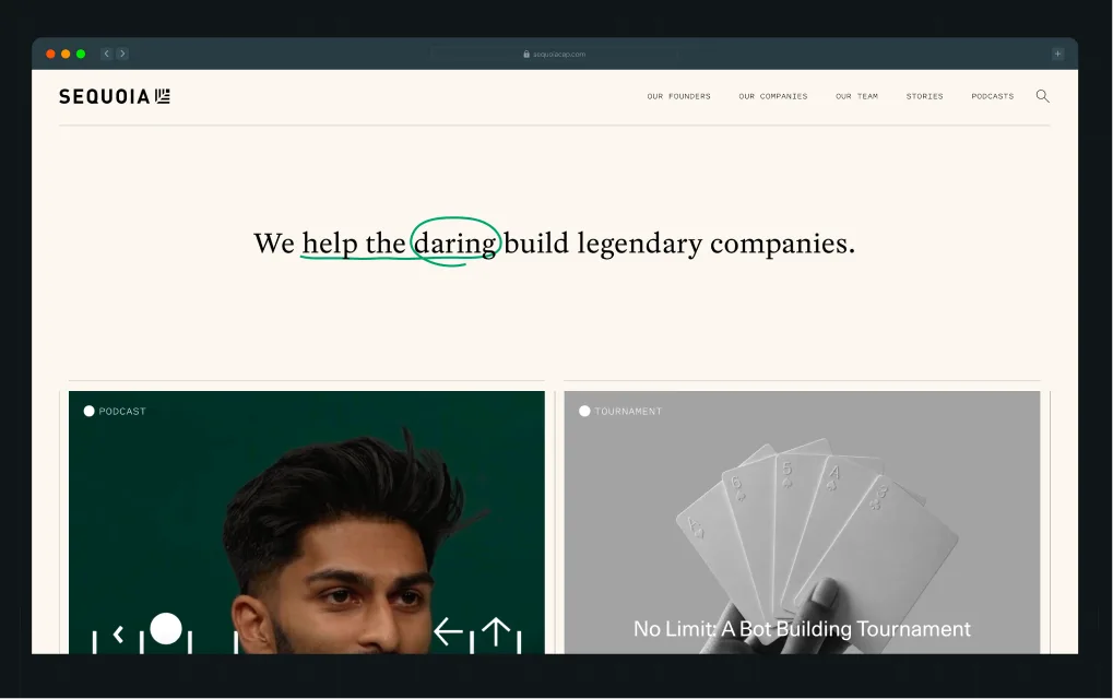
Sequoia is a Silicon Valley-based venture capital firm with a long history of backing well-known companies like Apple, Google, and OpenAI. It invests across technology categories, including AI/ML, consumer, enterprise, fintech, and healthcare.
Why we like this design
1. Messaging backed by real examples
The homepage headline, “We help the daring build legendary companies,” is supported by what follows. Founder stories show who Sequoia backs, portfolio news shows how those companies grow, and Arc, its early-stage program, demonstrates how it supports founders.
2. Visual details that add personality
Photography and editorial visuals do much of the storytelling, while handwritten strokes give Sequoia’s otherwise minimal website a distinctive look.
3. A founder directory that makes its network visible
The filterable Our Founders page lets visitors explore the people and companies in Sequoia’s network.
4. Partner profiles that help founders find the right person
Profiles cover each partner’s background, investment interests, and portfolio companies, giving founders useful context before reaching out.
5. Direct routes to contact
The “Get in touch” CTA on partner profiles leads straight to email, making it easy to contact the right partner.
{{specficBlog}}
8. First Round Capital
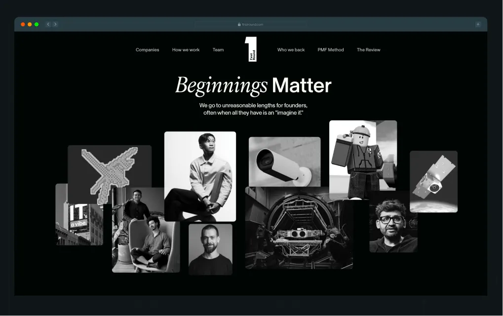
First Round Capital is a San Francisco-based seed-stage VC firm, with offices in New York and Philadelphia. It backs AI, consumer, enterprise, fintech, hardware, and healthcare companies like Uber, Roblox, and Notion.
Why we like this design
1. A hero that establishes the brand story
“Beginnings Matter” tells founders that First Round backs companies from the very start, often at the idea stage. A monochrome collage of founders and companies it has backed, like Notion and Clay, proves it before visitors scroll.
2. Typography that gives the brand personality
Bold sans-serif paired with expressive serif type creates a distinctive, editorial feel that stays easy to scan.
3. A restrained palette with a striking accent
Black and warm off-white keep things clean, while mint green highlights the FAQ tabs and featured content, adding energy without clutter.
4. A homepage hierarchy built around founder needs
FAQs, practical articles, and the PMF Method follow the hero, taking visitors from the brand story to answers on timing, fit, and round size, then to useful resources.
5. Content that demonstrates practical expertise
The PMF Method page and its advice articles show the kind of hands-on guidance founders can expect, rather than relying only on broad claims about founder support.
9. Radical Ventures
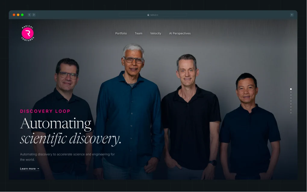
Radical Ventures is a venture capital firm focused on AI and deep tech, backing companies like Cohere, World Labs, and Waabi across AI infrastructure, robotics, healthcare, scientific discovery, and autonomous systems.
Why we like this design
1. Visual storytelling that establishes the category
Cinematic imagery and headlines like “Automating scientific discovery” and “Frontier inference clusters” make Radical’s AI focus tangible, without falling back on generic tech visuals.
2. A distinctive visual identity
Deep navy, bright pink accents, and elegant serif headlines give the website a premium, futuristic feel, while clean sans-serif navigation keeps it from feeling overly decorative.
3. Information architecture built around its ecosystem
Portfolio, Team, Velocity, and AI Perspectives give visitors four clear routes to explore its investments, people, founder support, and industry insights.
4. A portfolio grid that makes the breadth of investments visible
The structured directory makes the portfolio easy to scan, while acquisition and IPO labels add context without opening individual company pages.
5. A case study that proves founder support
Velocity and its Cohere case study show how Radical supports companies across talent, go-to-market, compute, community, brand, and finance, going beyond broad claims.
10. DCVC
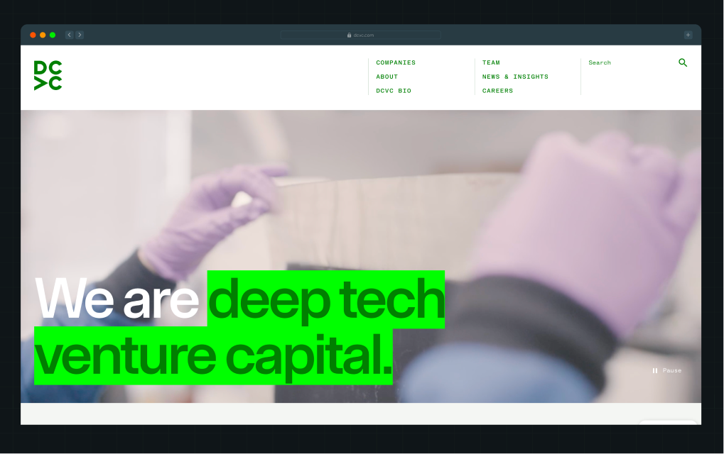
DCVC has backed deep tech founders since 2010, investing across AI, computational biology, energy and climate, agriculture, defense, and space. Its portfolio includes Fervo Energy, Pivot Bio, and Radiant.
Why we like this design
1. Positioning that makes its specialization immediately clear
“We are deep tech venture capital” leaves no room for ambiguity, while the supporting copy shows the hard problems DCVC backs founders to solve.
2. A bold color palette that reinforces the brand
Fluorescent green works like a highlighter on key phrases, while deep green and dark sections break up the off-white page, giving each idea its own block.
3. Portfolio highlights that explain the technology
Instead of logos alone, featured companies come with what they do and the year DCVC first invested, while exit labels show outcomes.
4. Copy that turns expertise into a memorable line
The statement “We have more published scientists than MBAs” is an unusual but memorable way to communicate the team's technical depth. The Meet the Team link gives visitors a route to explore that expertise.
5. Navigation and hierarchy that make breadth easy to explore
A clear menu leads into a homepage that moves from portfolio proof to team credentials, recent posts, and media coverage.
These 10 examples work for different reasons, but they share a few things: clear positioning, easy-to-navigate content, and a structure built around what founders and investors want to know. Now, let's look at how to bring these elements into your own website, page by page.
How Should You Structure a Venture Capital Website?
A good venture capital website needs different pages for different audiences and journeys. Here are 5 tried-and-tested templates for different VC website pages you can steal.
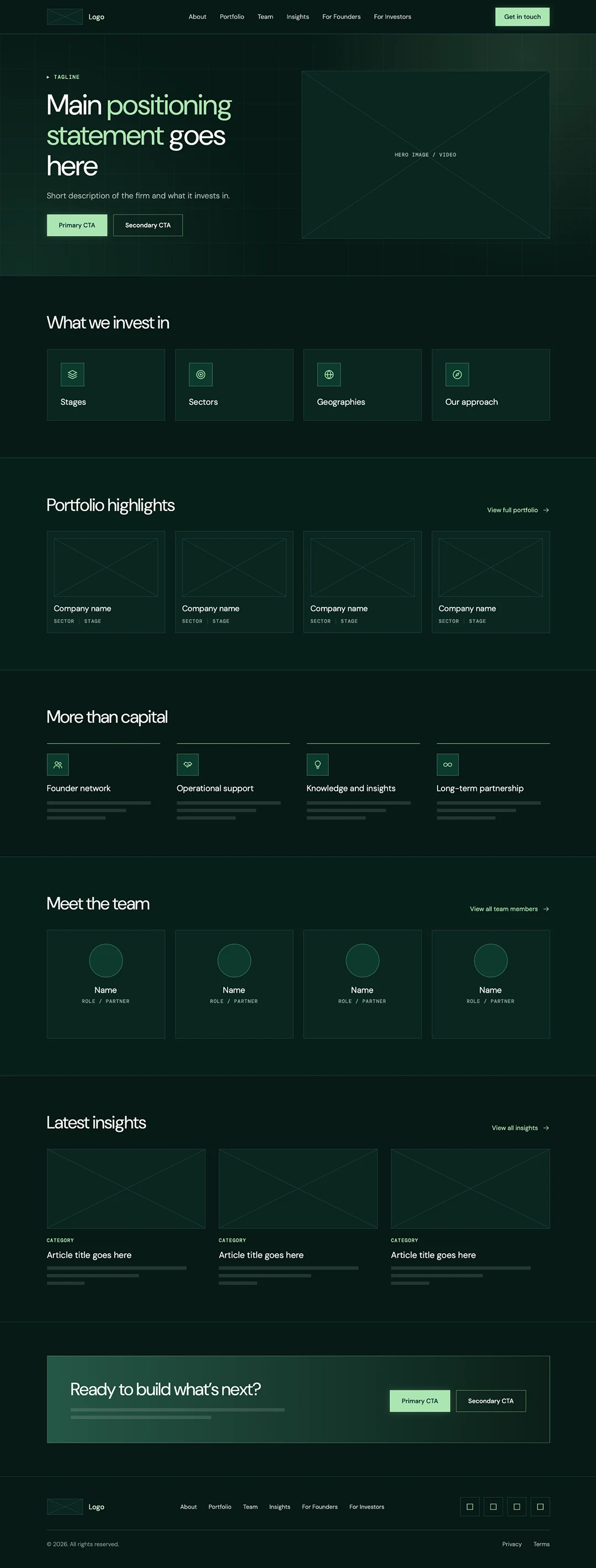
1. Homepage
Your homepage should show what the firm does, who it works with, and where to go next, without overwhelming visitors. Y Combinator does this well, making its positioning clear while giving founders easy access to what they need.
What it should include: What the firm does, what it invests in, portfolio highlights, founder support, team, insights, and key CTAs.
Also read: What Makes a High-Converting Homepage Design? (12 Key Elements)
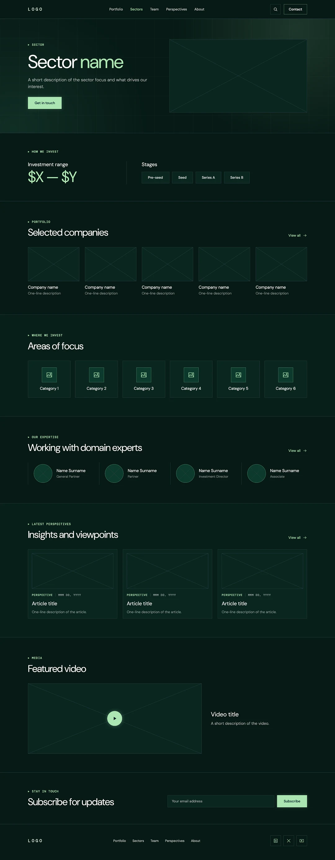
2. Individual Sector Page
A dedicated sector page helps founders understand whether their business aligns with your investment focus. It also allows your firm to demonstrate its knowledge of a particular industry.
Z47 is a good example of connecting sector-specific investment interests to a larger mission.
What it should include: What the firm invests in within the sector, investment stages, relevant companies, focus areas, sector experts, perspectives, and media.
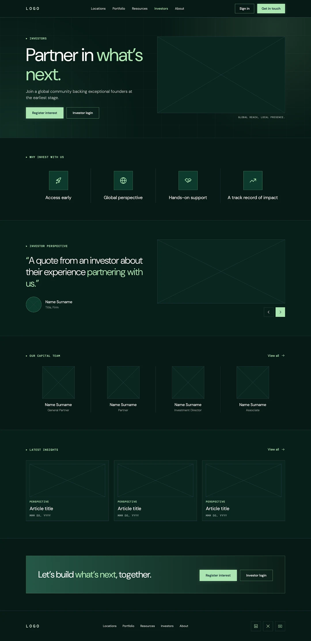
3. Investor Page
An investor page should help prospective LPs understand your investment strategy, assess your track record, and learn about the people managing the fund.
Antler offers a useful example of separating the investor journey from the founder journey, making it easier for each audience to find relevant information.
What it should include: Why investors should consider the firm, investment strategy, track record, investor testimonials, capital team, insights, and investor CTAs.
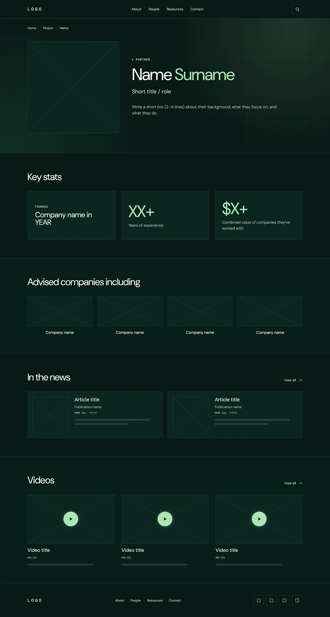
4. Individual Partner Profile
Partner profiles help founders identify the people they could potentially work with. They should go beyond a short bio to show each partner's experience, investment interests, and relevance to a particular founder or sector.
Sequoia is a good example of making partner backgrounds, investment interests, and portfolio connections easy to access.
What it should include: Partner background, investment focus, experience, relevant companies, media coverage, and videos.
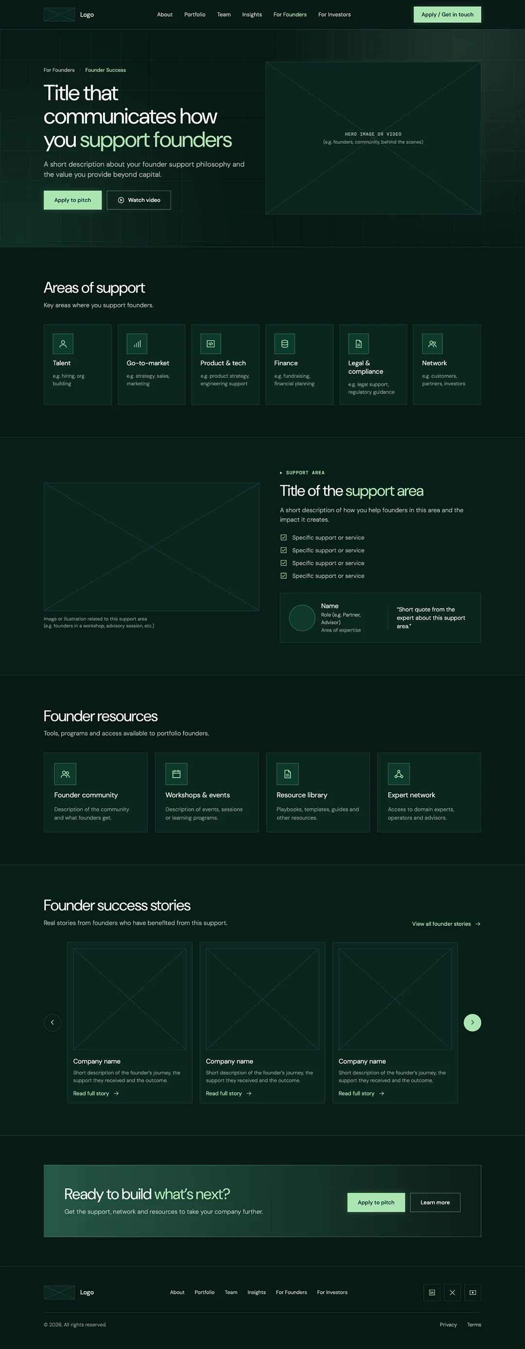
5. Founder Success Page
A founder success page should make your support tangible, showing what help looks like at each stage instead of just claiming it. For instance, Greylock does this with dedicated pages for areas like talent, marketing, and leadership.
What it should include: Areas where founders get support, specific services, founder resources, success stories, and a final CTA.
But a good structure is only half the job. A good structure is only half the job. Sometimes even well-planned websites lose founders through small UX mistakes.
What Are the Most Common UX Mistakes on Venture Capital Websites?
Here are some of the most common UX mistakes we found across the VC websites we analyzed.
1. Being vague about investment criteria
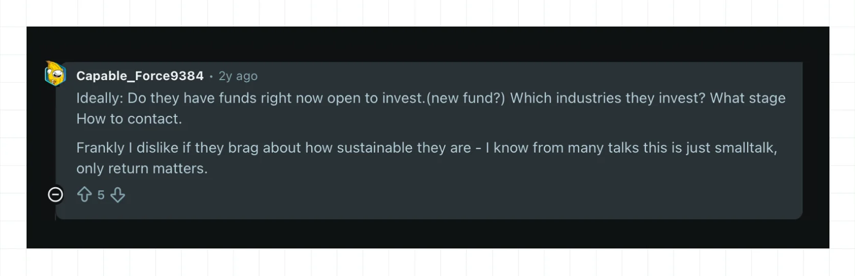
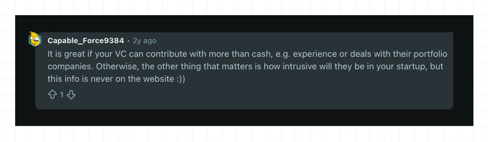
Founders should not have to dig through multiple pages to decide whether a VC is relevant. Reddit discussions show that founders look for stage, sector, geography, and current investment activity. They also check portfolios for competitors, conflicts, and relevant connections. Make these details easy to find through clear information architecture, strong visual hierarchy, and user experience design that puts investment criteria up front.
2. Making it hard to find the right partner
Knowing that a VC invests in your space is only the beginning. Founders also want to know which partner understands their market. As Connor Murphy, founder of Bridge Your Network and Angel Invest Partner, points out in his LinkedIn post:
“Founders aren’t afraid to email cold. They just want to do it confidently — with clarity around who to talk to, and how to position their story.”
When this information isn’t readily available, founders scan team pages, search LinkedIn, and rely on mutual connections to piece things together. He adds that sometimes this clarity is all a founder needs to take the next step, with or without an introduction.
Make partner profiles more useful by connecting each person’s investment focus, expertise, and relevant portfolio companies, so founders know exactly who to reach out to.
3. Making the next step unclear
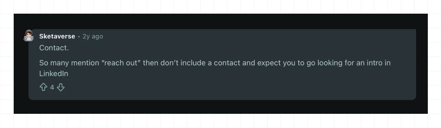
A founder shouldn't have to jump through hoops to figure out how to reach you. One Reddit discussion specifically calls out firms that say “reach out” without providing an obvious contact route. Make the conversion funnel simple by following CTA best practices—submit a pitch, contact the right partner, or learn what happens next.
4. Talking more about the fund than founders
Founders increasingly look for support beyond capital. If you offer help with hiring, customer introductions, marketing, finance, or other areas, show it instead of simply claiming it.
Dedicated founder-success pages can make that value much easier to understand. This is also an opportunity for brand storytelling and social proof. Show the actual resources, relationships, and outcomes founders can access.
5. Prioritizing aesthetics over usability
A distinctive visual identity can make a VC memorable, but personality shouldn't override core website design principles.
Looking for the Best Venture Capital Website Design Partner?
Now that you’ve seen some of the best venture capital website designs in 2026, you know what a great VC website looks like. Use The Fund 5 to assess whether your current website attracts and converts the right founders. If it falls short, the five website templates we shared are a good place to start.
But if you need a full-service venture capital website design agency, ThunderClap can help. We look at your current website performance, positioning, and competitors before developing a website strategy built around your goals. That’s why 100+ B2B brands, including Amazon, Elevation Capital, Z47, Cashfree, Factors, roommaster, and Vunet Systems, have trusted us with their branding and web design.
- Proven B2B expertise: Our team has worked across VC, SaaS, fintech, HR tech, and AI, giving us experience with complex B2B businesses and their audiences.
- In-house PMM support: Our PMMs help sharpen your positioning and turn it into a brand that supports differentiation, category leadership, or growth.
- 30-day launch support: We stay involved after launch, tracking your website metrics for the first 30 days to see what’s working and what needs improvement.
{{ctaBlock}}
Frequently Asked Questions
1. How is a venture capital website different from a financial services website?
A venture capital website is different from a financial services website in its purpose. Financial services websites focus on showing customers how their money is protected and why they can trust the service. Venture capital websites focus on communicating an investment philosophy and attracting founders and investors who share that vision.
2. What are the most common UX mistakes on venture capital websites?
Common UX mistakes on venture capital websites include being vague about investment criteria, making it hard to find the right partner, hiding the next step, focusing too much on the fund, and prioritizing aesthetics over usability.
3. What can B2B brands learn from venture capital website design?
B2B brands can learn to make their websites easier to understand. The best VC websites explain what they do, who they work with, and why it matters without making visitors work to find the answers.
4. How do top VC firms balance storytelling and usability?
Top VC firms balance storytelling and usability by using strong messages to create interest, then making useful information easy to find. YC does this with founder stories, clear CTAs, and separate startup and founder directories.
5. How can VC websites make it easier for founders to find the right partner?
VC websites can make it easier for founders to find the right partner by showing each partner’s expertise, investment stage, and relevant portfolio companies. This gives founders enough context to identify the right person without searching through the entire website.
6. What should VC websites include to make pitching or contacting the firm easier?
VC websites should make pitching or contacting the firm easier by giving founders a clear next step. A strong primary CTA, supported by relevant links across the website, can make submitting a pitch or reaching the right person straightforward.
7. What are some of the best venture capital website examples in 2026?
According to ThunderClap's Fund 5 analysis, which looks at messaging clarity, visual design, information architecture, user experience, and conversion effectiveness, the best venture capital websites are Y Combinator, Greylock, Elevation Capital, Accel, Antler, Z47, Sequoia, First Round Capital, Radical Ventures, and DCVC.




Browse Similar Articles

















Leading 5 SaaS Branding Agencies in Florida (That Actually Understand SaaS Growth)



How to Turn Your B2B Website into a Self-Serve Growth Engine? (PLG Ready in 2026)


9-Step Website Copy Audit Checklist to Improve Conversions (Examples from Top B2B Brands)



How to Choose the Right Fintech Web Development Company for Your Business

Top B2B Website Design Principles That Turn Visitors into Qualified Leads



How to Do a Conversion Rate Optimization (CRO) Audit That Actually Improves Revenue
Web Design Agency vs. Freelancer vs. In-House: What Actually Works in 2026

5 CRO Agencies in London and How to Choose the Best CRO Agency for Your Business

The Ultimate Fintech B2B Positioning Guide for 2026 (That Actually Drives Conversions)

Mapping the B2B Buyer Journey to Improve Conversions Across Every Touchpoint

7 Best Website Maintenance Companies in India for Growth-Led B2B Teams (2026)




8 Best Healthcare Website Design Agencies for HIPAA-Compliant Sites in 2026




How to Find the Best Web Design Company in Houston, Texas for B2B Brands (6 Best Picks)

Positioning That Wins: How to Make Complex B2B Products Clear and Compelling
The Step-by-Step Website Redesign Process B2B Teams Use to Increase Conversions (Without Killing SEO and Pipeline)
7 Best Video Production Agencies for SaaS Product Walkthroughs and Feature Videos


How to Choose the Best B2B Website Maintenance Company: 9 Questions to Ask Before You Hire One




How to Choose a Web Design Company in San Francisco in 2026 (with Examples)

10 Best Web Design Companies in Florida in 2026 and How to Choose the Right One

How to Use Brand Storytelling on Your Website to Close More B2B Deals and Build Buyer Trust

SaaS CRO Best Practices: What High-Growth Brands Do Differently to Win Conversions

How a Rebranding Agency Can Redefine Your B2B SaaS Identity and Boost Pipeline

B2B Marketing Trends in 2026 That Directly Influence Pipeline and Revenue

Top 7 Video Marketing Agencies Driving B2B SaaS Brand Awareness in 2026

Why Partnering with a B2B Brand Positioning Agency Accelerates Market Differentiation

The Complete Website Redesign Checklist for B2B SaaS Teams Ready to Scale


10 Best Webflow Development Agencies in India for 2026 (In-Depth Review)

10 Product Marketing Companies Powering the Fastest-Growing SaaS Brands in 2026
Website Copywriting Services vs In-House: What's Right for Your Business?


How to Choose a Marketing Agency That Understands B2B SaaS Growth Metrics


How to Choose a Video Marketing Agency That Understands B2B Storytelling

Outsourcing Web Design: Cost-Benefit Analysis for Mid-Market & Enterprise Brands

From Leads to Lifetime Value: How Growth Marketing Agencies Scale SaaS Revenue

Build a B2B Website Strategy That Aligns with Sales and Marketing Goals

Webflow vs WordPress: Which Platform Is Better for Your Business Website in 2026?

Fintech Web Design That Builds Trust: 8 UX Principles Every Fintech Site Needs


Optimizing for Intent: How B2B Website Messaging and UX Changes Help Capture Top-Funnel Buyers




12 Best B2B Web Development Agencies in the US to Build Scalable Websites


Interested in seeing what we can do for your website?