













12 Website CTA Examples That Increase Conversions


A visitor doesn’t become a lead because they liked your homepage. They become a lead because your website gave them a clear next step at the right moment. That's the job of your website’s CTAs. If you’re a B2B SaaS marketer, every button, banner, and form on your site should move someone closer to booking a demo, starting a free trial, or speaking with sales, rather than leaving them wondering what to do next. At ThunderClap, we’ve designed websites for 100+ B2B brands, and the CTAs that convert almost always follow the same few patterns.
Strong website CTA design reduces friction throughout the conversion funnel, increases website engagement, and gives every page a measurable goal. The highest-performing CTAs pair clear copy with thoughtful placement, persuasive design, and continuous A/B testing to improve click-through rate (CTR) and overall conversion rate optimization (CRO).
Below are 12 real website CTA examples, why each one works, and how you can apply the same principles to increase conversions on your own site.
TL;DR
- Match the CTA to the page’s intent. Someone on your pricing page is ready for “Talk to Sales.” Someone reading a blog post wants a checklist.
- Put proof right before the ask. The strongest examples below place a number, a logo strip, or a client result directly above the button.
- Test copy before color. Changing one word in a CTA has lifted clicks by 90% in a single test. Color only wins when it adds contrast.
Which Website CTA Examples Are Worth Copying?
Here are all 12 at a glance, with the CTA type, the exact button copy, and why each one works.
Each one is broken down in detail below, along with what a weaker version would look like.
What is a CTA on a Website, and Why Does It Matter for B2B?
A call-to-action (CTA) is the button, link, or banner that prompts a visitor to take a specific next step: booking a demo, starting a trial, downloading a resource. For B2B companies, a website CTA is the bridge between content that builds trust and a pipeline that drives revenue. Every stage of your conversion funnel depends on it.
A visitor might read your homepage, pricing page, or a case study and decide your solution is worth considering. Without a clear next step, that momentum disappears, and so does the opportunity.
One of the most important B2B marketing trends is that buyers complete more of their evaluation before ever speaking with sales. They're comparing vendors, reading case studies, and independently building a shortlist, which makes every CTA section on a website an opportunity to move a qualified visitor one step closer to a conversation.
HubSpot's analysis of more than 330,000 CTAs found that personalized CTAs converted 202% better than basic ones. It’s an older study, and it measured “Smart CTAs” that change based on who’s looking. On a B2B site, that means a first-time visitor sees “See How It Works,” a returning visitor who’s already read two case studies sees “Book a Demo,” and an existing customer sees an invite to explore a new feature instead of a sales pitch.
{{specficBlog}}
What are the Different Types of CTAs on a Website?
Most B2B sites use a mix of the nine CTA types below. Each does a different job in the visitor journey, and every one of them shows up in the examples that follow.
- Social proof CTA block: A CTA placed right next to customer logos, a usage stat, or testimonials, so the trust signal and the next step land together.
- Video CTA: A CTA paired with a short product video, so visitors can see the product before they commit.
- Blog inline CTA: A boxed offer or button inside a blog post, placed right after the section that proves the reader’s problem.
- Navigation CTA: A persistent button in the header for your highest-intent action, such as "Talk to a Strategist."
- Hero CTA: The primary CTA above the fold. It gives visitors a clear next step from the moment they land on the page.
- In-content (inline) CTA: It is placed within the page after a section that has built interest or answered a key question.
- Exit-intent CTA: A pop-up that appears when a visitor is about to leave the site. It works best when the offer is relevant and genuinely valuable.
- Footer CTA: The final call-to-action on the page, giving visitors one more opportunity to take the next step after they've consumed the content.
- Sticky CTA: A CTA that stays visible as users scroll, making it easy to take action on long landing pages and blog posts.
12 Website CTA Examples That Drive Conversions (With Design Notes)
These 12 website CTA examples are pulled from real B2B SaaS homepages, each with the type, what makes it work, the conversion principle behind it, and what a weaker version would look like.
1. Hero CTA: "Book a Demo"
Your hero CTA sets the direction for the rest of the page. Clear copy, strong visual context, and a single primary action make it easier for visitors to take the next step.
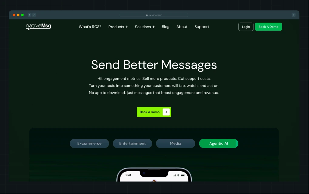
nativeMsg already had a strong product, but its website wasn't making that value immediately clear. The homepage leaned heavily on feature explanations, making it harder for visitors to understand the product and decide on a next step.
As part of the redesign, ThunderClap rebuilt the hero section to focus on visual education. The team kept "Book a Demo" as the primary website CTA throughout the homepage, giving visitors one clear next step. To support that action, they added 40+ product mockups across the site so visitors could understand the product in seconds, built dedicated pages for each product offering to simplify the buying journey, and used a strategic green color system to draw attention to important actions, including the CTA.
The result was a homepage that communicated the product in under a minute, making the hero CTA a natural next step rather than asking visitors to commit before they understood the value.
What a weaker version looks like: Swap "Book a Demo" for a generic "Contact Sales" link, drop the product mockup, and the visitor is left to imagine what they're even asking for. Fewer people take that leap.
2. Hero CTA: "Start Free Trial"
A trial CTA asks for more commitment than a demo request, so it only works once the visitor already understands what they're trying to do. Pairing it with a lower-friction option gives both a way in.
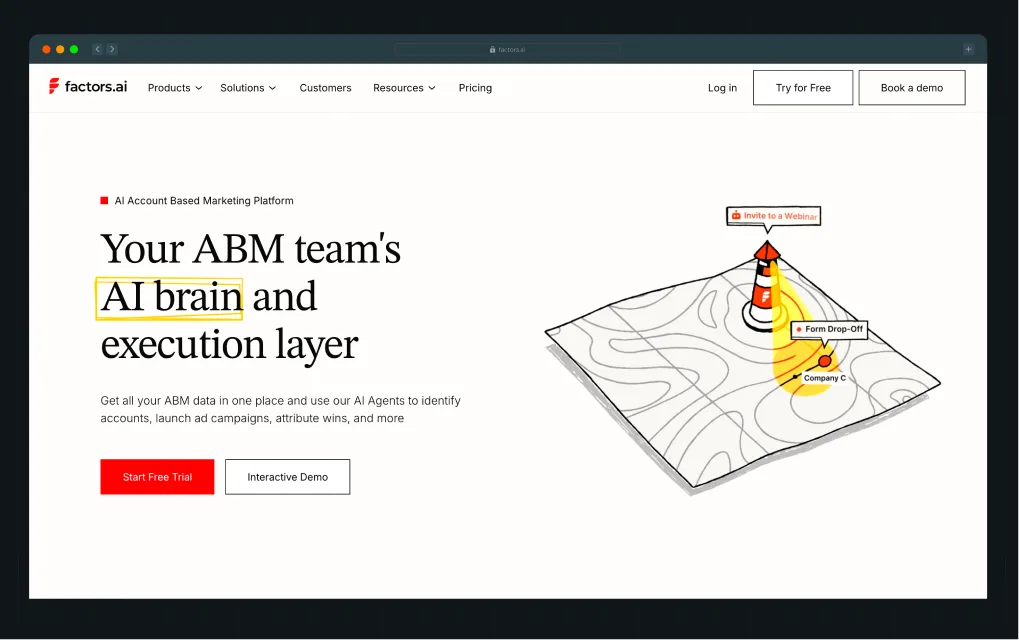
Factors.ai uses a dual website CTA, with "Start Free Trial" as the primary action and "Interactive Demo" as a lower-commitment alternative. This works because it matches two intent levels at the top of the funnel without forcing a single decision.
When ThunderClap redesigned the Factors.ai landing page, the problem wasn’t the CTA itself. It was when and how it appeared in the decision journey. Visitors saw “Start Free Trial” before they understood what the product actually did, which weakened their intent to convert.
To fix this, the team rebuilt the page so the CTA only became meaningful after context was established:
- First, they clarified the problem: Fragmented signals in account-based marketing
- Then, they showed the solution: How Factors unifies and interprets those signals
- Finally, they added proof: Testimonials and client logos to reduce perceived risk
“Start Free Trial” works only when the visitor already understands the product and feels low uncertainty about it. Without that context, it feels like a commitment. With it, it feels like a natural next step.
That’s why this hero CTA performs well here. It’s supported by a page structure that explains the product first, then introduces the action once the value is already clear.
What a weaker version looks like: Lead with "Start Free Trial" before explaining what Factors actually solves, and ask visitors to commit before they have a reason to.
3. In-content CTA: "Request a Website and Marketing Review"
A strong in-content CTA offers something specific that visitors can immediately understand. The clearer the outcome, the easier it becomes to click.
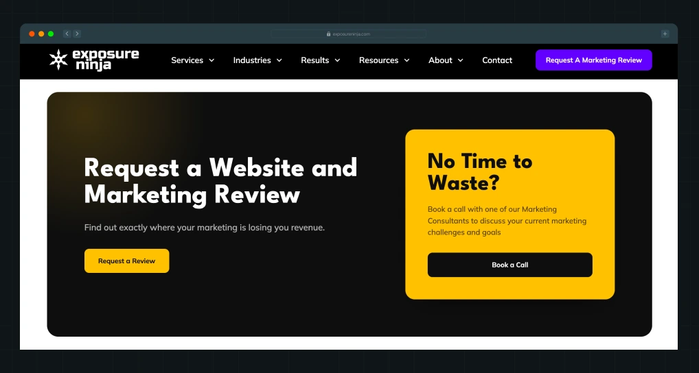
Exposure Ninja, a digital marketing agency, places its "Request a Website and Marketing Review" CTA after explaining the agency's approach and expertise. The offer tells visitors exactly what they will receive, while the supporting copy focuses on uncovering where their marketing is losing revenue. The page also reinforces the offer with a secondary "Book a Call" panel for visitors who are ready to speak with a consultant.
A clearly named deliverable gives visitors a reason to act because they know what they are requesting before they fill out a form.
What a weaker version looks like: A button that simply says "Contact Us" leaves visitors wondering what happens next. A specific offer creates clearer expectations and gives people a stronger reason to click.
4. Navigation CTA: "Talk to a Strategist"
A navigation CTA gives high-intent visitors an easy way to take action from any page. The wording should explain who they'll speak with and what kind of help they'll receive.
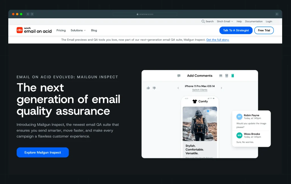
Sinch Email on Acid places "Talk To A Strategist" directly in the website header beside its "Free Trial" CTA. Visitors who are still exploring the platform can continue browsing, while those who need guidance can jump straight into a conversation with an expert. The CTA feels more valuable than a generic contact link because it promises strategic advice rather than just a sales conversation.
A consultative CTA builds confidence by setting clear expectations before the visitor clicks.
What a weaker version looks like: A navigation link that simply says "Contact" gives visitors very little context. A CTA that introduces the type of expert they will speak with creates a stronger reason to reach out.
5. In-content CTA: "Start for Free"
A CTA works harder when it sits right after a number, not a claim. Visitors don't have to trust your word; they can see the outcome first and decide the CTA is worth clicking.
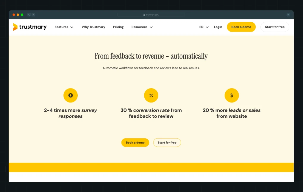
Trustmary, a feedback and review automation platform, places three outcome stats directly above its “Book a Demo” and “Start for Free” buttons. Trustmary reports 2 to 4x more survey responses, a 30% conversion rate from feedback to review, and 20% more leads or sales from the website. Each number ties to a real outcome a visitor is likely trying to solve, so by the time they reach the CTA, it reads less like a pitch and more like the next step after the proof they've just seen.
Pairing quantified results with two CTAs, one high-commitment, one low, lets the visitor choose their own level of readiness without either button feeling like the wrong ask.
What a weaker version looks like: Drop the three stats, lead straight with “Contact Us,” and the same button now asks for trust upfront instead of earning it.
6. In-content CTA: “Download the Free Checklist”
A checklist is a quick win. Visitors know they'll get something practical they can use immediately, which makes the CTA feel valuable without requiring a big commitment.
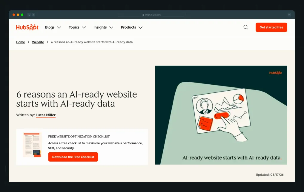
HubSpot layers a single checklist offer through its blog posts. In “6 reasons an AI-ready website starts with AI-ready data”, a “Download the Free Checklist” box for its Website Optimization Checklist sits at the top. A one-line text CTA for the same checklist follows the first paragraph, and a boxed version appears again after the first section. By the time readers hit the boxed offer, they’ve already learned why the topic matters and are looking for a way to act on it. The checklist increases the article's value and provides readers with a simple resource they can refer back to later.
A practical resource turns curiosity into action by giving visitors something they can apply right away.
What a weaker version looks like: A button that says "Subscribe" asks visitors to commit without offering an immediate benefit. A downloadable checklist gives them a clear reason to share their details.
{{specficService}}
7. Popup CTA: Exit-Intent "30-min Free Consultation"
Exit-intent popups get a bad name because most of them interrupt people with a generic discount or newsletter ask. They work when the offer is specific, relevant to the page, and worth more than what the visitor was about to leave with.
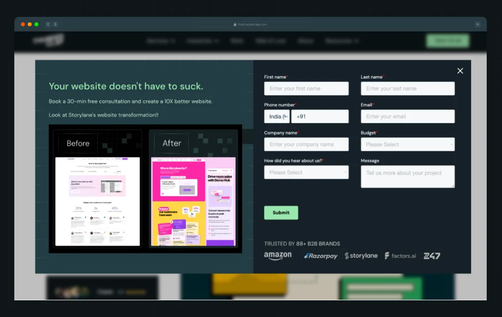
ThunderClap displays this popup when a visitor is about to leave the website. Instead of showing a generic discount or newsletter signup, the popup offers a 30-minute free consultation and reinforces the offer with a real before-and-after website transformation. Brand logos further strengthen credibility before visitors decide whether to submit the form.
The CTA gives visitors a compelling reason to stay by offering expert feedback just as they are about to leave.
What a weaker version looks like: A pop-up that only asks visitors to subscribe or contact the company gives them very little reason to change their decision. A free consultation supported by visual proof and client logos creates a much stronger incentive to engage.
8. Social proof CTA block: "X Online Businesses Use [Company Name]"
A logo strip builds trust, but it only converts that trust into action if a CTA sits close enough to catch the visitor while the credibility is still fresh in their mind.
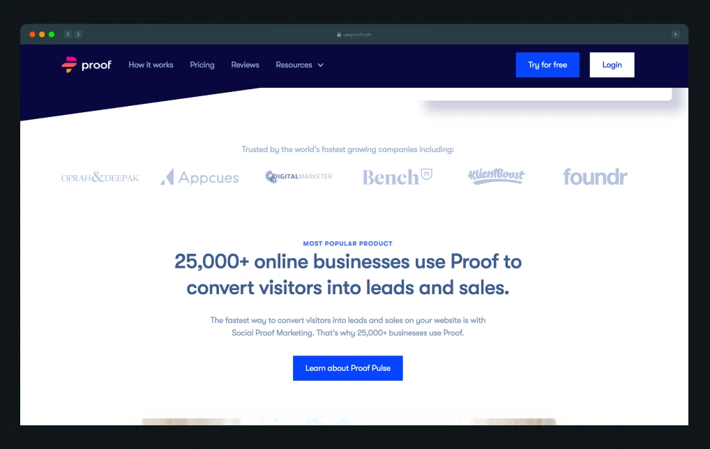
Proof, a website personalization and social-proof platform, follows its customer logo strip with a “25,000+ online businesses use Proof” headline. It puts a “Learn about Proof Pulse” button directly beneath it, with “Try for free” pinned in the header. A new visitor registers the trust signal and sees the next step in the same glance, which is the whole point of pairing social proof with a CTA. Logos, usage stats, and other website testimonials and trust signals do the most work when the next step sits right next to them.
The stat and the logos do the convincing; the CTA just has to be close enough to catch the visitor while that's still true.
What a weaker version looks like: Show the logo strip on its own screen with the nearest CTA a full scroll away, and the visitor has moved on mentally before they ever reach a button.
9. Sticky CTA: "Book a Demo"
A sticky CTA solves one specific problem: a visitor who's engaged enough to scroll shouldn't have to scroll back up to act on that engagement.
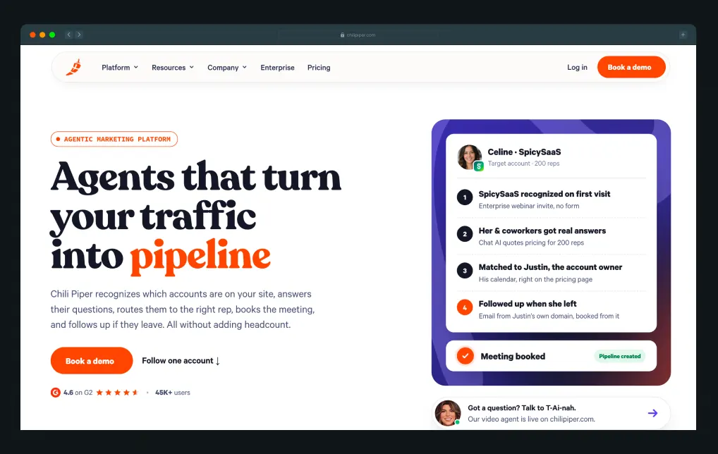
Chili Piper, a website conversion and meeting-scheduling platform, keeps its “Book a demo” button in a header that stays pinned to the top of the screen as you scroll. Example 4 was about what a header CTA should say. Chili Piper’s is a good lesson in where it should stay. Whether a visitor is on the first screen or the fifth, the button is always one click away, so they never have to scroll back up once they’re convinced.
It’s a fitting choice for a company that sells demo bookings. In its Gong case study, Chili Piper reports that Gong saw a 70% lift in demo request form conversions and a 5x increase in demo requests. Keeping its own CTA in view at all times is Chili Piper practicing what it sells.
A visitor who scrolls through five sections of proof shouldn't have to scroll back to the top just to act on what convinced them.
What a weaker version looks like: Put "Book a Demo" only in the hero and let it disappear once the visitor scrolls past it, so the moment they're most convinced is the moment the CTA is hardest to find.
10. Footer CTA: "Book a Demo"
A footer CTA is the last thing a visitor sees on the page, after all proof points have already been shown. It works best when it states the outcome plainly instead of repeating a generic ask.
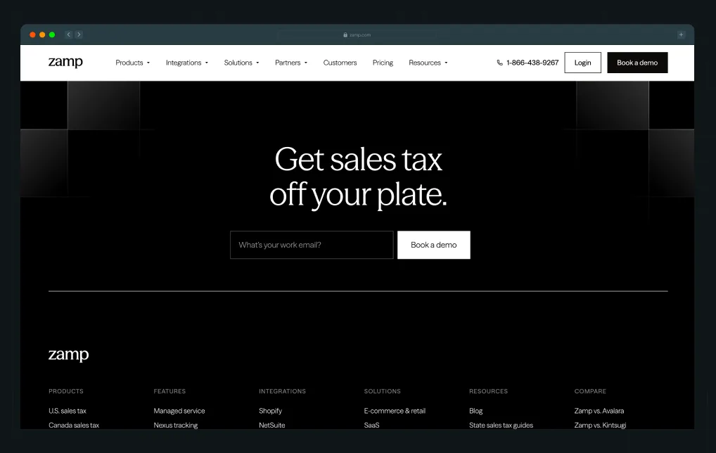
Zamp, a sales tax compliance platform, closes its homepage with a full-width "Book a Demo" CTA beneath client logos, security credentials, and product proof. When ThunderClap partnered with Zamp, the company already had strong credentials, including 99.97% filing accuracy and more than $30 million in funding. Before the redesign, though, its website didn’t look like it belonged to a company at that level. The brand felt fragmented, and visitors weren’t being guided toward “Book a Demo.”
ThunderClap restructured the site around finance decision-makers, introduced clearer messaging, created persona-driven user journeys, and surfaced transparent pricing to build trust before visitors reached the footer. By the time they see the "Book a Demo" CTA, they've already been given enough context and proof to take the next step with confidence.
In the three months after launch, contact form fills rose 112.8% (from 133 to 283) and visits to the booking page rose 54.4%, compared with the three months before.
What a weaker version looks like: End the page with a logo strip and no CTA, leaving visitors with proof but no obvious next step.
11. Blog inline CTA: "Try Supademo for Free Now"
An inline blog CTA works best right after the section that proves the reader’s problem, while that proof is still on screen.
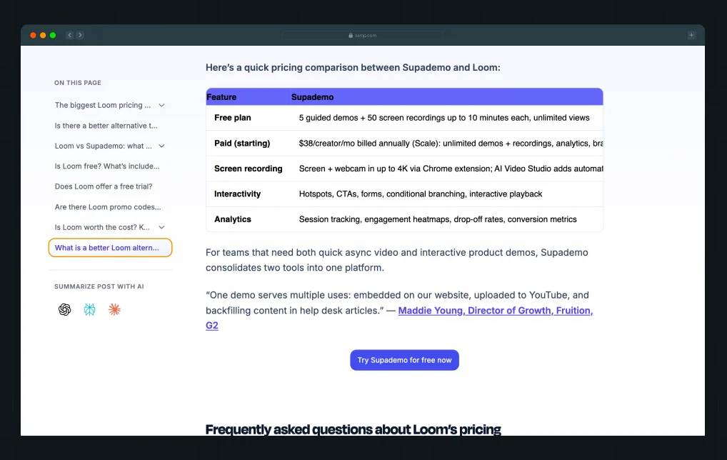
Supademo, an interactive demo platform, runs a post breaking down Loom’s pricing changes. Right after a side-by-side table comparing what each tool’s free plan includes, it drops a “Try Supademo for free now” button. The reader has just seen the gap for themselves, so the ask reads as the obvious next step rather than an interruption.
What a weaker version looks like: Park the same button in a sidebar, far from the comparison table, and the reader who just did the math has already moved on by the time they notice it.
12. Video CTA: "Get Loom For Free"
Some products are easier to understand when people can watch them in action. A video CTA reduces uncertainty by showing how the product works before asking visitors to commit.
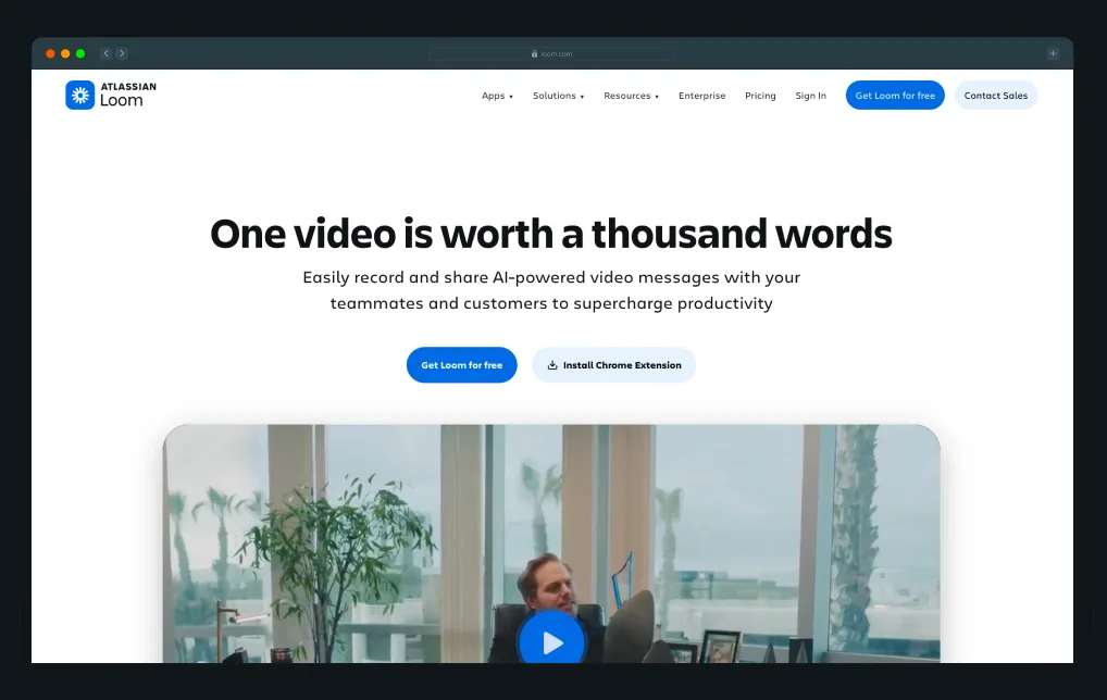
Loom, now part of Atlassian, puts “Get Loom for free” and “Install Chrome Extension” in its hero, with a one-minute product video directly underneath. A visitor who isn’t ready to sign up can press play, see how recording and sharing actually work, and find the same button right above the video when they’re done.
A short product video helps visitors picture themselves using the product, making the next step feel more natural.
What a weaker version looks like: A button that simply says "Learn More" leaves visitors searching for answers on their own. A product demonstration removes that uncertainty by showing exactly how the product works.
Suggested Read: How to Optimize a Landing Page for Maximum ROI: A Step-by-Step Breakdown
What Makes a High-Converting CTA Design for a Website?
A CTA can say the right thing and still get ignored if the design works against it. Of all the website design elements, the CTA carries the most weight for conversion. Most CTA best practices come down to the design choices below.
- Use contrast, not camouflage: If your brand color is navy, a navy CTA button disappears into it. In a widely cited HubSpot test, a red button beat an identical green one by 21% on a mostly green page. CXL’s review of button color studies spells out the real lesson: no color wins everywhere, and what moves clicks is how much the button stands out from the page around it.
- Use directional cues to pull the eye toward the CTA: Whitespace, visual hierarchy, and arrows reduce friction by making it obvious where visitors should click.
- Copy specificity beats generic labels: A label like “See how we cut onboarding time in half” gives visitors a reason to click that “Learn more” doesn’t. If you can’t write a specific label, the problem usually sits upstream, in the website copy around the button.
- Size and padding matter: Too small and it gets missed. Too large, and it looks like an ad. Your CTA should be the largest interactive element in its zone, no larger.
Where Should You Place CTAs on a Website for Maximum Conversions?
Even the best CTA copy won't perform if it's placed in the wrong spot. The right placement depends on the purpose of each page.
- Homepage: Include a primary hero CTA, another CTA midway through the page supported by social proof, and a final CTA in the footer. Avoid adding multiple competing CTAs in the hero section.
- Product or service pages: Place your main CTA above the fold, then repeat it after your case study or testimonials section when visitors have more confidence.
- Blog posts: Add an inline CTA early, right after the section that answers the reader’s main question, and another at the end. When HubSpot tracked where its blog leads came from, 47% to 93% of a post’s leads came from a single text CTA, usually placed in the intro, while end-of-post banners brought in just 6%. You should also skip the sidebar, since Grow & Convert puts sidebar CTAs at roughly 0.5% to 1.5% conversion, tied for the lowest of any placement it measured.
- Pricing pages: Keep the focus on one clear CTA. Too many options can dilute the action you want visitors to take.
- Case study pages: Place a CTA immediately after the results section. A message like "Want results like this? Let's talk" works well because it builds on the credibility you've just established.
Attention drops fast below the hero. In Nielsen Norman Group’s eyetracking research, people spent 57% of their viewing time above the fold and only 17% on the next screen down. That’s why a sticky navigation CTA, combined with a mid-page CTA backed by proof, often outperforms relying solely on the hero CTA. If the issue goes beyond CTA placement, a well-planned website redesign helps position CTAs within your page architecture for better conversions.
How Do You A/B Test CTAs to Improve Website Conversions?
A/B testing takes the uncertainty out of CTA optimization, but only if you test the right variables and follow a consistent process.
- Test in order of impact: Test CTA copy first, then placement, then CTA type, and leave button color for last. CXL recommends testing contrast, copy, and offer before hue, because most color “wins” turn out to be contrast wins. Webflow Optimize, VWO, and other CRO tools make these tests easy to set up.
- Run a clean test: Change one variable at a time. Run each test for at least two weeks, and wait until you've collected around 100 conversions per variant. Then check significance with a tool like CXL’s A/B test calculator before choosing a winner, since 100 conversions can be too few to detect a small difference.
- Track the right metrics: Click-through rate (CTR) shows whether people notice your CTA, while the conversion rate on the destination page tells you whether those clicks turn into leads or customers. Scroll depth helps you understand whether visitors even reach the CTA.
- Even small changes in wording can produce meaningful results: In a test Michael Aagaard ran with Unbounce, changing the button from “Start your free 30 day trial” to “Start my free 30 day trial” lifted click-through by 90% over three weeks. PartnerStack saw its conversion rate climb from 6.66% to 14.09% after swapping “Book a Demo” for “Get Started” on its homepage. Neither test required a design overhaul.
Rather than treating A/B testing as a one-time project, make it an ongoing practice.
A Deep Dive: 20 Proven SaaS Conversion Optimization Hacks to Increase Your Sales
What are the Most Common CTA Mistakes That Kill B2B Conversions?
Most CTA problems aren't technical. They're strategic decisions that quietly reduce conversions over time. The first mistake is the most common, and the data on it is clear. Unbounce’s analysis of 18,639 landing pages found that pages with a single CTA converted at 13.5% on average, and the rate fell to 10.5% as more links and CTAs were added.
How Does a Web Design Agency Approach CTA Optimization?
Most teams treat CTAs as a finishing touch, choosing the copy after the page is designed. A conversion-focused agency works the other way around. It starts by asking what action the page should drive and what visitors need to believe before they'll take it.
CTA optimization is as much about messaging as it is about design. If the page doesn't build trust or clearly communicate value, changing the button text won't improve conversions.
At ThunderClap, we've applied this approach across 140+ B2B websites, helping SaaS companies turn more traffic into qualified leads through stronger positioning, clearer messaging, and ongoing optimization.
{{ctaBlock}}
Frequently Asked Questions
1. Why are CTAs important for website conversions?
CTAs are important for website conversions as they turn passive browsing into clear action by giving visitors a defined next step. Without them, users may consume content and leave without moving further down the funnel. A well-placed CTA guides visitors and makes the intended action obvious.
2. How many CTAs should a page have?
One primary CTA, repeated as often as the page length needs. A long homepage can show the same “Book a Demo” in the header, after the proof section, and in the footer without hurting conversions, because it’s still one action. What hurts is offering several different actions with equal weight. If you need a second option, make it visibly secondary and lower-commitment, like an interactive demo next to a free trial.
3. What are the best CTA examples for B2B websites?
The best CTA examples for B2B websites focus on outcomes, low friction, or social proof. Examples include “See how we helped X double demo requests,” “Get a free audit, no sales call,” or “Join 400+ marketing teams.” Generic labels like “Learn more” usually perform worse.
4. Can A/B testing improve CTA performance?
Yes, A/B testing improves CTA performance when teams test one variable at a time and measure results beyond clicks. At ThunderClap, we run structured CRO tests across CTA copy, layout, and funnel flow to identify where users lose intent, then optimize the full path.
5. Where should a CTA go on a landing page?
Put the primary CTA above the fold so visitors can act right away, then repeat it after your strongest proof, like a case study result or testimonial, and once more at the end. Eyetracking research from Nielsen Norman Group shows people spend most of their viewing time on the first screen, so the top CTA matters most. The repeats catch visitors who need more convincing first.




Browse Similar Articles
AI-Generated Website Not Converting? Here’s What’s Missing (and How to Fix Yours)


10 Best Venture Capital Websites in 2026 for Design Inspiration (Detailed Breakdowns + Templates)







Leading 5 SaaS Branding Agencies in Florida (That Actually Understand SaaS Growth)

How to Turn Your B2B Website into a Self-Serve Growth Engine? (PLG Ready in 2026)

9-Step Website Copy Audit Checklist to Improve Conversions (Examples from Top B2B Brands)


How to Choose the Right Fintech Web Development Company for Your Business
Top B2B Website Design Principles That Turn Visitors into Qualified Leads

How to Do a Conversion Rate Optimization (CRO) Audit That Actually Improves Revenue
Web Design Agency vs. Freelancer vs. In-House: What Actually Works in 2026
5 CRO Agencies in London and How to Choose the Best CRO Agency for Your Business
The Ultimate Fintech B2B Positioning Guide for 2026 (That Actually Drives Conversions)
Mapping the B2B Buyer Journey to Improve Conversions Across Every Touchpoint

7 Best Website Maintenance Companies in India for Growth-Led B2B Teams (2026)


8 Best Healthcare Website Design Agencies for HIPAA-Compliant Sites in 2026

How to Find the Best Web Design Company in Houston, Texas for B2B Brands (6 Best Picks)
Positioning That Wins: How to Make Complex B2B Products Clear and Compelling
The Step-by-Step Website Redesign Process B2B Teams Use to Increase Conversions (Without Killing SEO and Pipeline)
7 Best Video Production Agencies for SaaS Product Walkthroughs and Feature Videos
How to Choose the Best B2B Website Maintenance Company: 9 Questions to Ask Before You Hire One


How to Choose a Web Design Company in San Francisco in 2026 (with Examples)

10 Best Web Design Companies in Florida in 2026 and How to Choose the Right One
How to Use Brand Storytelling on Your Website to Close More B2B Deals and Build Buyer Trust
SaaS CRO Best Practices: What High-Growth Brands Do Differently to Win Conversions

How a Rebranding Agency Can Redefine Your B2B SaaS Identity and Boost Pipeline
B2B Marketing Trends in 2026 That Directly Influence Pipeline and Revenue

Top 7 Video Marketing Agencies Driving B2B SaaS Brand Awareness in 2026
Why Partnering with a B2B Brand Positioning Agency Accelerates Market Differentiation

The Complete Website Redesign Checklist for B2B SaaS Teams Ready to Scale

10 Best Webflow Development Agencies in India for 2026 (In-Depth Review)

10 Product Marketing Companies Powering the Fastest-Growing SaaS Brands in 2026
Website Copywriting Services vs In-House: What's Right for Your Business?

How to Choose a Marketing Agency That Understands B2B SaaS Growth Metrics


How to Choose a Video Marketing Agency That Understands B2B Storytelling

Outsourcing Web Design: Cost-Benefit Analysis for Mid-Market & Enterprise Brands
From Leads to Lifetime Value: How Growth Marketing Agencies Scale SaaS Revenue
Build a B2B Website Strategy That Aligns with Sales and Marketing Goals

Webflow vs WordPress: Which Platform Is Better for Your Business Website in 2026?
Fintech Web Design That Builds Trust: 8 UX Principles Every Fintech Site Needs
Optimizing for Intent: How B2B Website Messaging and UX Changes Help Capture Top-Funnel Buyers


Interested in seeing what we can do for your website?